
Current Integration Issues
The Duck Curve
The Duck Curve is a classic example of having a lot of something when you might not need it as much as you used to. In California, electricity loads peak in the mid-day when commercial and residential air conditioning peaks as a result of warm weather. This mid- to late-afternoon peak coincides quite nicely with the fact that the solar resource is also at its greatest when the sun is high in the sky. The electricity generation eco-system in California responded by building a lot of roof-top, commercial and utility scale solar to capture this resource as well as meet environmental energy generation targets. This led to a significant proliferation of solar generation, which provided huge amounts of energy in the middle of the day, thereby depressing the mid-day peak and moving it to the late afternoon with a significant ramp. Please see the figure below, which shows the net loads on the CAISO during the March-May time frame. Kind of looks like a duck, no?
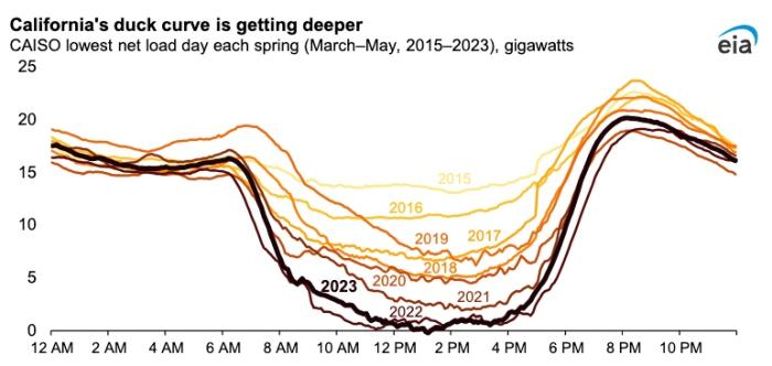
This graph shows, in gigawatts, CAISO's lowest net load day each spring for March through May from 2015 - 2023. The x-axis shows time of day and the y-axis shows gigawatts from 0 to 25 in increments of 5. The general form of the lines on the graph (one for the trend for each year, 2015 - 2023) takes the form of a duck's silhouette (raised tail, low belly, high head and beak - it looks like a wide letter U). The data shows that the lowest loads always occur at mid day, and that the curve has been getting steadily deeper since the spring of 2015. The lowest gigawatt measure in the spring of 2015 was about 15 (at around 2 pm) but has continually dipped and hit 0 gigawatts at around 1 pm in the spring of 2023.
This phenomenon poses two significant problems for the energy market. First, grid stress - the system has to be able to meet that ramp in net usage from HE1600-HE1900 which is very steep. Second, economics - how does the market price a resource for which there may be zero demand, as is shown above?
The Falcon Curve is a potential problem that we could face as we start to electrify heating and domestic hot water in the cold climates around the world. A significant portion of the energy consumed in the northern states and in Canada goes to provide heating in cold climates. One very simple decarbonization strategy for the decarbonization of heating is the installation of air source heat pumps. This strategy appears attractive currently because the electric system is built to provide enough electricity for a currently high summer peak. So currently, there is enough electric system transmission and distribution capacity to meet demand for the addition of a certain level of air source heat pumps. Unfortunately, these air source heat pumps do not operate as well when temperatures get lower. As we approach a greater saturation rate with air source heat pumps, virtually all systems will become winter peaking, which will cause the annual energy demand to be much higher than it currently is in the winter months. This phenomenon was actually experienced in Texas in February 2021 during Winter Storm Uri when electric heating demand skyrocketed when temperatures plummeted. If there had not been blackouts, it is entirely possible that the Texas grid would have posted an all-time peak in the winter even in a climate as usually warm as Texas is. The curve below kind of looks like a Falcon, eh?
The Falcon Curve, the silhouette of which (sort of) resembles a bird in flight -- lifted wings on either side of a head - shows that if we electrify, then during cold months, our energy usage will become much greater than it currently is in the summer months. Consequently, when we graph this useage on an annual basis, it etches out a silhouette resembling a falcon.
The challenges of renewable energy integration are many, but these examples provide a look at how people are thinking about them. I challenge you as a student of EME 801 to begin to use some of the tools we developed in class and during the project to think about challenges you face and how you might meet them. Enjoy.