As introduced above, unlike reference maps, thematic maps are usually made with a single purpose in mind. Often, that purpose has to do with revealing the spatial distribution of one or two attribute data sets (e.g., to help readers understand changing U.S. demographics as with the population change map). Alternatively, thematic maps can have a decision-making purpose (e.g., to help users make travel decisions as with the real-time traffic map).
In the rest of this chapter, we will explore different types of thematic maps and consider which type of map is conventionally used for different types of data and different use goals. A primary distinction here is between maps that depict categorical (qualitative) data and those that depict numerical (quantitative) data.
3.2.1 Mapping Categorical Data
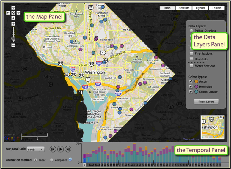
As mentioned in the section on color schemes, categorical data are data that can be assigned to distinct non-numerical categories. For example, the category of a beach could not be described as two times the value of a wetland; it is different in kind rather than amount. In mapping categorical data, cartographers often focus on displaying the different categories or classes through shape or color hue. The CrimeViz map application (CrimeViz) developed in the GeoVISTA Center at Penn State visualizes violent crimes reported from the District of Columbia Data Catalog (DC Data Catalog). Every crime location is displayed as a circular point, where each crime category is differentiated through hue (arson: orange, homicide: purple, sexual abuse: blue). This interactive map application allows map users to explore and find new patterns across space and time.
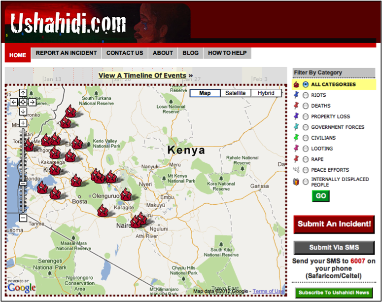
Aside from altering color to represent different categories on a map, changing the shape of a point symbol can help map users differentiate different groups. The Ushahidi (signifying “testimony” in Swahili) website developed an online crowd sourcing map application. Following the election in 2008, many Kenyans believed the new president manipulated votes in his favor, which led to violence throughout the country. Users of the Ushahidi website were prompted to report acts of violence in Kenya. Their map, automatically generated from the reports, displays different types of incidents by varying the shape of the point feature (fire: all categories, push pin: specific type of violence, dove: peace efforts, people: displaced people). In addition, each subcategory of violence (represented by push pins) is contrasted by differing hues (blue: riots, orange: deaths, and so on). The tools to create this mapping application have been distributed for free around the world and are now used for a wide array of crisis mapping applications. One recent example is their application to generate maps of sexual violence in Syria (Women Under Siege: Syria Crowdmap); and for those who read Japanese, the tools were applied to the Japan Earthquake and subsequent nuclear disaster.
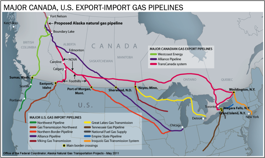
Categorical aspects of linear features can also be visualized on a map. In the figure below, different gas pipelines owned by various companies are depicted in different color hues. The dashed pink line in the top left of the figure represents a proposed gas line from Alaska that could send up to 4.5 billion cubic feet of natural gas a day to the conterminous United States. In this map, the cartographer uses the process of map abstraction for the purpose of displaying the current and proposed gas pipeline network. First, only necessary features (pipelines, territories and major cities) are selected for display in order to produce a clean and legible map. Next, the linear pipeline network is classified into several groups based upon distinct companies. The map is simplified by visualizing only major cities important to the gas pipeline network. The width of the pipeline is constant across the entire system, exaggerating the actual width (if the width of lines represented real-world diameter of the pipes proportionally, the real pipes would be 16 miles across). Finally, the classified/categorical data (the different pipeline companies) is symbolized by different color hues to represent the qualitative difference among the categories.
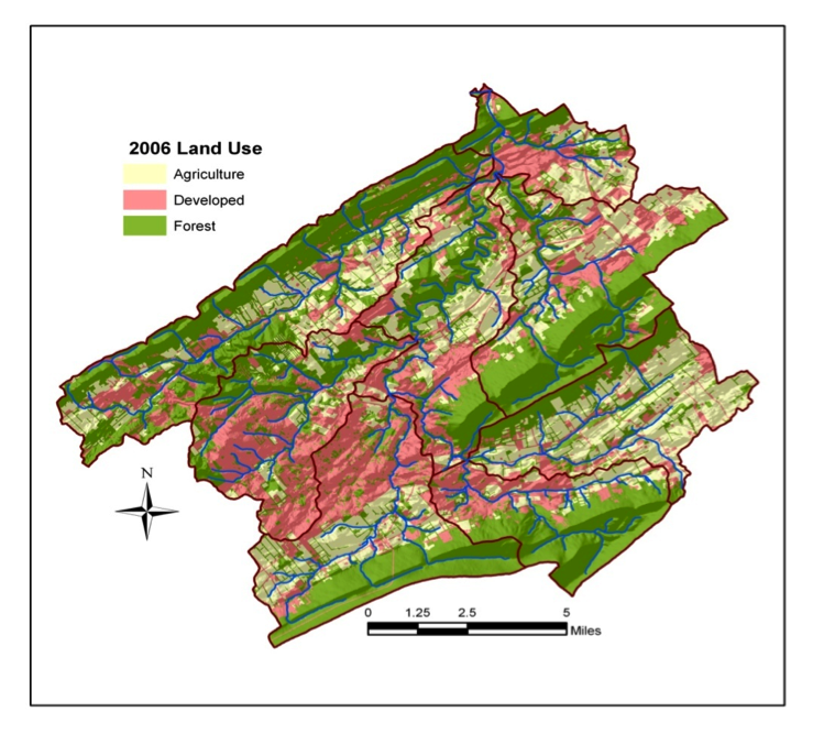
The maps above focus on depiction of specific discrete entities, things that have a label we use when discussing them. Categorical maps can also represent characteristics of extended areas or territories. In this case, rather than categorizing discrete entities, we categorize the characteristics of the place, and those places may or may not have precise boundaries. A prototypical example is a land use map in which all areas of the map fall into one of a set of distinct land use categories. The most common method to depict this kind of data is to fill the area with a color or a texture. Below is an example in which land use is depicted very abstractly. All places are assigned to one of only three categories: agriculture, forest, or developed.
Practice Quiz
Registered Penn State students should return now take the self-assessment quiz about Mapping Categorical Data.
You may take practice quizzes as many times as you wish. They are not scored and do not affect your grade in any way.
3.2.2 Mapping numerical data
When data are numerical, the mapping focus is typically on representing at least relative rank order among the entities depicted, with some maps trying to represent magnitudes in a direct way. A wide array of map types has been developed over the years to represent numerical data. Here, we will introduce some of the most common map types you are likely to encounter. There is a growing number of online tools that you can use to generate these common map types yourself.
We begin by introducing one of the most common thematic map types for numerical data, the choropleth map. This is followed by a brief discussion of the U.S. Census as an important source of numerical data that is depicted on choropleth thematic maps as well as on other thematic map types. We then introduce three important additional map types you are likely to encounter frequently: proportional symbol maps, dot maps, and cartograms.
Try This: Thematic Mapping of Flu Trends
Google collects certain search terms that users input because they are key indicators of flu among users. Visit Google Flu Trends and explore current flu trends around the world that have been numerically classified from minimal to intense activity and mapped. Pick a country that has flu activity. Do you see any geographic patterns within the country? How does this year compare to the past?
3.2.2.1 Choropleth mapping
Choropleth maps are among the most prevalent types of thematic maps. Choropleth maps represent quantitative data that is aggregated to areas (often called “enumeration units”). The units can be countries of the world, states of a country, school districts, or any other regional division that divides the whole territory into distinct areas. The term choropleth is derived from the Greek; khōra 'region' + plēthos 'multitude' (thus, be careful not to mix up “choro”, which has no ‘l’, with the “chloro” of chlorophyll or chlorine). Choropleth maps depict quantities aggregated to their regions by filling the entire region with a shade or color. Typically, the quantities are grouped into “classes” (representing a range in data value) and a different fill is used to depict each class (see section 3.2.6 for more on data classification). The goal of choropleth maps is to depict the geographic distribution of the data magnitudes; ideally the choice of fill will communicate the range from low data magnitudes to high magnitudes through an obvious change from light to dark as in Figure 3.18 below. Choropleth maps should use either a sequential color scheme (as below) or a diverging color scheme depending upon whether there is a meaningful break point in the data from which values diverge or the data simply range from low to high (see section 2.1.5.2 above).
To generate eye-catching maps with easily distinguishable data classes, choropleth maps often combine color hue differences with a change in color lightness (as with the yellow, through orange, to dark red scheme depicted in Figure 3.18 above). But many maps get produced without following that cartographic rule, leading to some very colorful but misleading maps as shown in the pair below.
Choropleth maps are most appropriate for representing derived quantities, as represented in Figure 3.18 above. Derived quantities relate a data value to some reference value. Examples include density, average, rate, and percent. A density is a count divided by the area of the geographic unit to which the count was aggregated (e.g., the total population divided by the number of square kilometers to produce population/square mile, as in Figure 3.18). An average is a measure of central tendency, specifically the mean value calculated as a total amount divided by the number of entities producing the amount (e.g., the average income for a county calculated by totaling the income of all people in the country and dividing by the number of people). A rate is a quantity that tells us how frequently something occurs, a value compared to a standard value (e.g., Bradford County, PA had a rate of 45.1/100,000 deaths due to colorectal cancer among women over the period of 1994-2002). A percent is the proportion of a total (and can range from 0-100%). While choropleth maps are best for these derived quantities, you will also encounter choropleth maps used for counts (e.g., the number of crimes committed, votes cast in an election, etc.). When you do, it is important to read the map with caution because big regions are likely to have high totals just because they are big.
3.2.2.2 Census Data
Some of the richest sources of attribute data for thematic mapping, particularly for choropleth maps, are national censuses. In the United States, a periodic count of the entire population is required by the U.S. Constitution. Article 1, Section 2, ratified in 1787, states (in the last paragraph of the section shown below) that “Representatives and direct taxes shall be apportioned among the several states which may be included within this union, according to their respective numbers ... The actual Enumeration shall be made [every] ten years, in such manner as [the Congress] shall by law direct." The U.S. Census Bureau is the government agency charged with carrying out the decennial census.

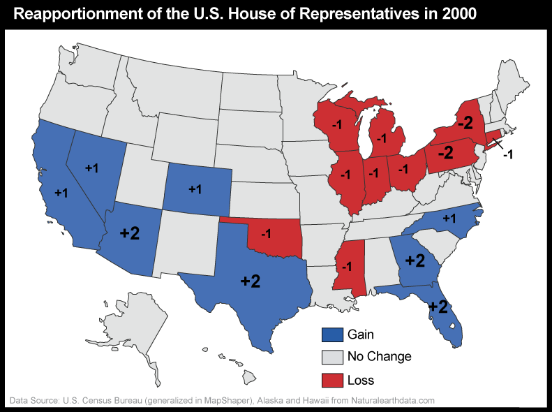
The results of the U.S. decennial census determine states' portions of the 435 total seats in the U.S. House of Representatives. The thematic map below (Figure 3.22) shows states that lost and gained seats as a result of the reapportionment that followed the 2000 census. This map, focused on the U.S. by state, is a variant on a choropleth map. Rather than using color fill to depict quantity, color depicts only change and its direction, red for a loss in number of Congressional seats, gray for no change, and blue for a gain in number of Congressional seats. Numbers are then used as symbols to indicate amount of change (small -1 or +1 for a change of 1 seat and larger -2 or +2 for a change of two seats). This scaling of numbers is an example of the more general application of “size” as a graphic variable to produce “proportional symbols” – the topic we cover in detail in the section on proportional symbol mapping below.
Congressional voting district boundaries must be redrawn within the states that gained and lost seats, a process called redistricting. Constitutional rules and legal precedents require that voting districts contain equal populations (within about 1 percent). In addition, districts must be drawn so as to provide equal opportunities for representation of racial and ethnic groups that have been discriminated against in the past. Further, each state is allowed to create its own parameters for meeting the equal opportunities constraint. In Pennsylvania (and other states), geographic compactness has been used as one of several factors. Article II, Section 16 of the Pennsylvania Constitution says:
§ 16. Legislative districts.
The Commonwealth shall be divided into 50 senatorial and 203 representative districts, which shall be composed of compact and contiguous territory as nearly equal in population as practicable. Each senatorial district shall elect one Senator, and each representative district one Representative. Unless absolutely necessary no county, city, incorporated town, borough, township or ward shall be divided in forming either a senatorial or representative district. (Apr. 23, 1968, P.L.App.3, Prop. No.1). Source: Constitution of Pennsylvania
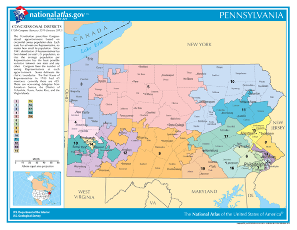
Whether districts determined each decade actually meet these guidelines is typically a contentious issue and often results in legal challenges. Below, the Congressional District map for PA that defines the boundaries of districts for the 112th Congress illustrates how irregular districts can be. District 12 has a particularly interesting shape.
Beyond the role of the census of population in determining the number of representatives per state (thus in providing the data input to reapportionment and redistricting), the Census Bureau's mandate is to provide the population data needed to support governmental operations, more broadly including decisions on allocation of federal expenditures. Its broader mission includes being "the preeminent collector and provider of timely, relevant, and quality data about the people and economy of the United States". To fulfill this mission, the Census Bureau needs to count more than just numbers of people, and it does. We will discuss this in more detail later (in section 3.3, Thinking about aggregated data: Enumeration versus samples).
3.2.2.3 Proportional Symbol Mapping
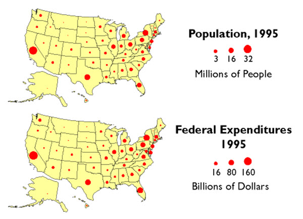
Besides reapportionment and redistricting, U.S. Census counts also affect the flow of billions of dollars of federal expenditures, including contracts and federal aid, to states and municipalities. In 2011, for example, some $486 billion of Medicaid funds were distributed according to a formula that compared state and national per capita income. $93 billion worth of highway planning and construction funds were allotted to states according to their shares of urban and rural population. And $120 billion of Unemployment Compensation was distributed from the Federal level. The thematic maps below (using historical data from 1995) illustrate the strong relationship between population counts and the distribution of federal tax dollars using proportional symbols (symbols in which the graphic variable of size is used to depict data magnitude).
There are two types of point features that are typically depicted with proportional symbols: features for which the data represents a geographic position directly (e.g., gallons of oil from individual oil wells), and features that are geographic areas to which data are aggregated and the data magnitudes are assigned to a representative point within the area (e.g., the geographic centroid of a state as in the examples above). In either case, the area of the symbol is scaled to represent the data magnitude, sometimes with a bit of exaggeration to adjust for a general tendency of human vision to underestimate differences in area. A variant on this direct data-to-symbol scaling groups values into categories first, then scales the symbol to represent the mean for the category, assigning a symbol to each place to represent the category range that the mean for the place falls within (see Figure 3.25 below).
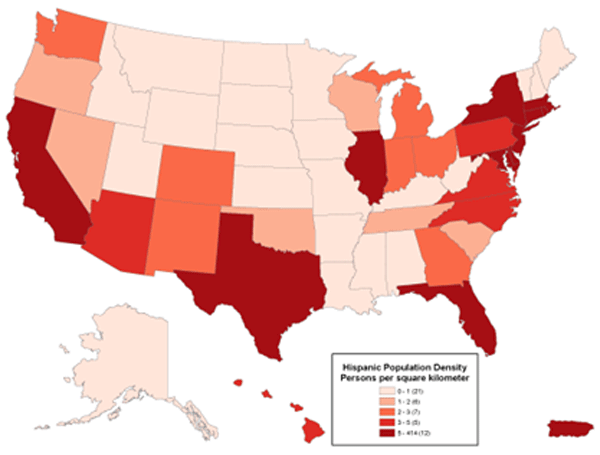
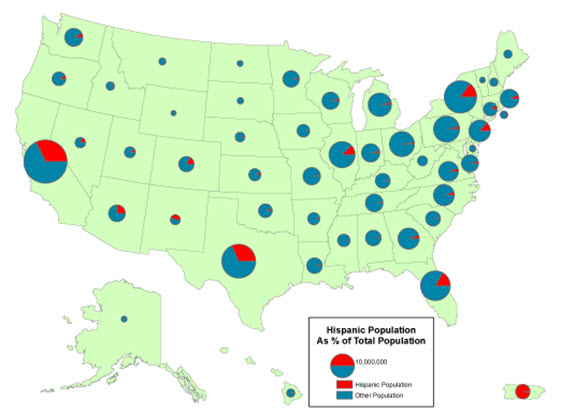
One important characteristic of proportional symbols is that they can easily be designed to represent more than one data value per location. Among the most common example is a “pie chart map” in which a circle is scaled proportionally to some total, and the size of wedges within the circle is scaled to depict a proportion of a total for two or more sub-categories. The map below uses circle size to depict population totals in each state, and the pie slices then depict the proportion of that total who identify as Hispanic compared to those who are non-Hispanic.
Practice Quiz
Registered Penn State students should return now take the self-assessment quiz about Choropleth Mapping, Census Data, and Proportional Symbol Mapping.
You may take practice quizzes as many times as you wish. They are not scored and do not affect your grade in any way.
3.2.2.4 Dot Mapping
For data that represent an area, proportional symbols are a fairly extreme abstraction. They provide a very simple overview of data magnitudes geographically but hide any geographic variation that might occur inside the enumeration units to which the data are aggregated. An alternative is the dot map. Dot maps depict magnitude by frequency rather than the size of symbol and add the depiction of geographic distribution by use of the graphic variable of location. Specifically, dot maps assign one to many dots per enumeration area to represent a specific count in each area. The difference between a dot map and a simple map of point features is that each dot represents more than one entity and the locations are representative of the distribution rather than being exact locations. Specifically, dots that represent some count are placed within enumeration units to represent generally where the feature or attribute occurs.
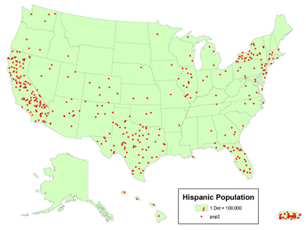
In the example below, the dot map depicts the size of the Hispanic population by the number of dots per state. Each dot represents 100,000 people in this case, and the general geographic distribution of the Hispanic population within the state is signified by the position of the dots. Not surprisingly, dot maps can vary substantially in how well the distribution of dots on the map represents the actual distribution of the phenomena in the world. Cartographers typically use secondary sources of information to help them decide on the appropriate locations for the dots (e.g., land use maps, satellite images, or statistics collected for smaller geographic units like counties). But, the position of dots usually is based on an educated estimate of distribution rather than on any direct measurement of where the people (in this case) or automobiles or bushels of wheat (or the many other kinds of things we can count) actually are.
3.2.2.5 Cartograms
A cartogram can be considered a special case of proportional symbol mapping. But, in this case, the “symbol” that is scaled in proportion to a data magnitude is the geographic area for which data are aggregated. Cartograms are unusual enough that they attract viewer attention, making them a popular mapping method with the media, particularly during election years. Their primary weakness (in addition to distorting geography so that no standard measurements such as distance among places are accurate), is that they cannot be interpreted correctly unless the map reader knows the actual geographic shapes of the map units so that sizes can be related to the places they represent.
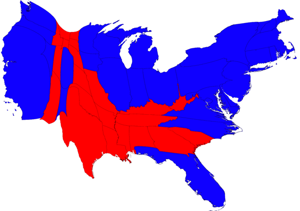
The map below shows the results of the 2008 Presidential election, with a red state signifying a majority of votes for John McCain, the republican candidate, and blue states a majority for Barack Obama, the democratic candidate. This cartogram scales the areas of each shape to represent its respective total population, visually showing how the majority of the United States voted.
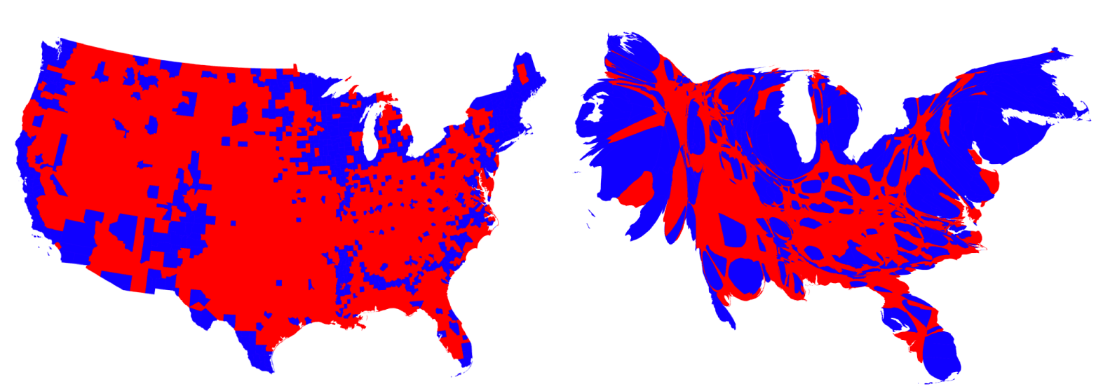
The following maps illustrate the power that some cartograms can have in helping users visually comprehend a phenomenon. While the map on the left depicts the majority vote results by county (with a vast majority of counties for the Republican candidate), the cartogram on the right shows the areas again depicted by population (this time with the country rather than state level data), revealing the larger number of Democratic support. The map on the left gives a distorted view (even though it does not look distorted) because a majority of counties won by the Republican candidate were low in population and many were large in area.
For more election cartogram examples, visit University of Michigan 2008 election site.
Try This: Practice Identifying Mapping Techniques
Visit the National Geographic Earthpulse map. On the left-hand side, you will find numerous check boxes for different thematic maps. Choose two thematic maps and identify at least two cartographic techniques (any that have been discussed in the chapter) the cartographer used when creating this map. For instance, in the map above (Figure 3.30), the cartographer used a qualitative color scheme (blue and red) on a choropleth map to show different categories (democratic or republication majority vote) for each U.S. state.
3.2.2.6 Numerical Data Classification
As discussed above (and in Chapter 1), all maps are abstractions. This means that they depict only selected information, but also that the information selected must be generalized due to the limits of display resolution, comparable limits of human visual acuity, and especially the limits imposed by the costs of collecting and processing detailed data. What we have not previously considered is that generalization is not only necessary, it is sometimes beneficial; it can make complex information understandable.
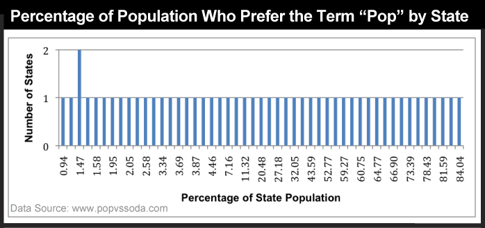
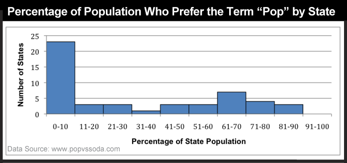
Consider a simple example. The graph below (Figure 3.31) shows the percent of people who prefer the term “pop” (not soda or coke) for each state. Categories along the x axis of the graph represent each of the 50 unique percentage values (two of the states had exactly the same rate). Categories along the y axis are the numbers of states associated with each rate. As you can see, it's difficult to discern a pattern in these data; it appears that there is no pattern.
The following graph (Figure 3.32) shows exactly the same data set, only grouped into 10 classes with equal 10% ranges). It's much easier to discern patterns and outliers in the classified data than in the unclassified data. Notice that people in a large number of states (23) do not really prefer the term “pop” as they are distributed around 0 to 10 percent of users who favor that term. There are no states at the other extreme (91-100%), but a few states whose vast majority (81-90% of their population) prefer the term pop. Ignoring the many 0-10% states where pop is rarely used, the most common states are ones in which about 2/3 favor the term; looking back to Figure 3.13, these are primarily northern states, including Pennsylvania. All of these variations in the information are obscured in the unclassified data.
As shown above, data classification is a generalization process that can make data easier to interpret. Classification into a small number of ranges, however, gives up some details in exchange for the clearer picture, and there are multiple choices of methods to classify data for mapping. If a classification scheme is chosen and applied skillfully, it can help reveal patterns and anomalies that otherwise might be obscured (as shown above). By the same token, a poorly-chosen classification scheme may hide meaningful patterns. The appearance of a thematic map, and sometimes conclusions drawn from it, may vary substantially depending on the data classification scheme used. Thus, it is important to understand the choices that might be made, whether you are creating a map or interpreting one created by someone else.
Many different systematic classification schemes have been developed. Some produce mathematically "optimal" classes for unique data sets, maximizing the difference between classes and minimizing differences within classes. Since optimizing schemes produce unique solutions, however, they are not the best choice when several maps need to be compared. For this, data classification schemes that treat every data set alike are preferred.
Two commonly used classification schemes are quantiles and equal intervals. The following two graphs illustrate the differences.
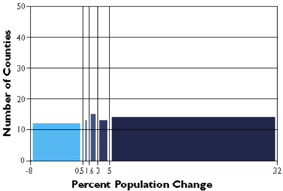
The graph above groups the Pennsylvania county population change data into five classes, each of which contains the same number of counties (in this case, approximately 20 percent of the total in each). The quantiles scheme accomplishes this by varying the width, or range, of each class. Quantile is a general label for any grouping of rank ordered data into an equal number of entities; quantiles with specific numbers of groups go by their own unique labels ("quartiles" and "quintiles," for example, are instances of quantile classifications that group data into four and five classes respectively). The figure below, then, is an example of quintiles.
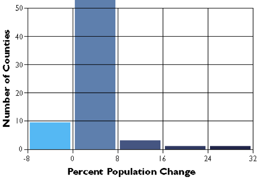
In the second graph, the data range of each class is equivalent (8.5 percentage points). Consequently, the number of counties in each equal interval class varies.
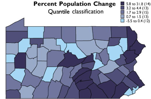
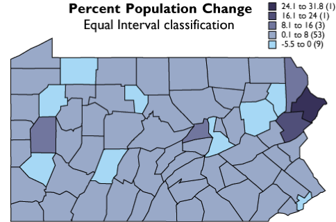
As you can see, the effect of the two different classification schemes on the appearance of the two choropleth maps above is dramatic. The quantiles scheme is often preferred because it prevents the clumping of observations into a few categories shown in the equal intervals map. Conversely, the equal interval map reveals two outlier counties that are obscured in the quantiles map. Due to the potentially extreme differences in visual appearance, it is often useful to compare the maps produced by several different map classifications. Patterns that persist through changes in classification schemes are likely to be more conclusive evidence than patterns that shift. Patterns that show up with only one scheme may be important, but require special scrutiny (and an understanding of how the scheme works) to evaluate.
Practice Quiz
Registered Penn State students should return now take the self-assessment quiz about Dot Mapping, Cartograms, and Data Classification.
You may take practice quizzes as many times as you wish. They are not scored and do not affect your grade in any way.
3.2.3 Thinking about aggregated data: Enumeration versus samples
Quantitative data of the kinds depicted by the maps detailed in the previous section come from a diverse array of sources. In the U.S., one of the most important sources is the U.S. Bureau of the Census (discussed briefly above). Here we focus in on one important distinction in data collected by the Census and by other organizations, a distinction between complete enumeration (counting every entity) and sampling.
Sixteen U.S. Marshals and 650 assistants conducted the first U.S. census in 1791. They counted some 3.9 million individuals, although as then-Secretary of State Thomas Jefferson reported to President George Washington, the official number understated the actual population by at least 2.5 percent (Roberts, 1994). By 1960, when the U.S. population had reached 179 million, it was no longer practical to have a census taker visit every household. The Census Bureau then began to distribute questionnaires by mail. Of the 116 million households to which questionnaires were sent in 2000, 72 percent responded by mail. A mostly-temporary staff of over 800,000 was needed to visit the remaining households, and to produce the final count of 281,421,906. Using statistically reliable estimates produced from exhaustive follow-up surveys, the Bureau's permanent staff determined that the final count was accurate to within 1.6 percent of the actual number (although the count was less accurate for young and minority residences than it was for older and white residents). It was the largest and most accurate census to that time. (Interestingly, Congress insists that the original enumeration or "head count" be used as the official population count, even though the estimate calculated from samples by Census Bureau statisticians is demonstrably more accurate.) As of this writing, some aspects of reporting from the decennial census of 2010 are still underway. Like 2000, the mail-in response rate was 72 percent. The official 2010 census count, by state, was delivered to the U.S. Congress on December 21, 2010 (10 days prior to the mandated deadline). The total count for the U.S. was 308,745,538, a 9.7% increase over 2000.
In the first census, in 1791, census takers asked relatively few questions. They wanted to know the numbers of free persons, slaves, and free males over age 16, as well as the sex and race of each individual. (You can view replicas of historical census survey forms at Ancestry.com) As the U.S. population has grown, and as its economy and government have expanded, the amount and variety of data collected has expanded accordingly. In the 2000 census, all 116 million U.S. households were asked six population questions (names, telephone numbers, sex, age and date of birth, Hispanic origin, and race), and one housing question (whether the residence is owned or rented). In addition, a statistical sample of one in six households received a "long form" that asked 46 more questions, including detailed housing characteristics, expenses, citizenship, military service, health problems, employment status, place of work, commuting, and income. From the sampled data the Census Bureau produced estimated data on all these variables for the entire population.
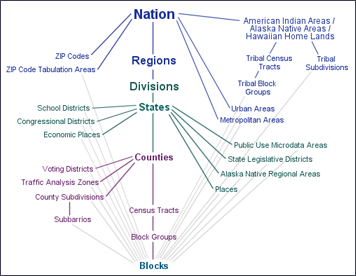
In the parlance of the Census Bureau, data associated with questions asked of all households are called 100% data and data estimated from samples are called sample data. Both types of data are aggregated by various enumeration areas, including census block, block group, tract, place, county, and state (see the illustration below). Through 2000, the Census Bureau distributes the 100% data in a package called the "Summary File 1" (SF1) and the sample data as "Summary File 3" (SF3). In 2005, the Bureau launched a new project called American Community Survey that surveys a representative sample of households on an ongoing basis. Every month, one household out of every 480 in each county or equivalent area receives a survey similar to the old "long form." Annual or semi-annual estimates produced from American Community Survey samples replaced the SF3 data product in 2010.
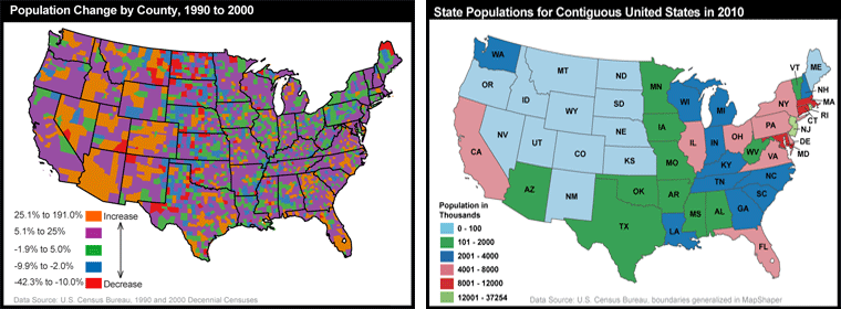
To protect respondents' confidentiality, as well as to make the data most useful to legislators, the Census Bureau aggregates the data it collects from household surveys to several different types of geographic areas. SF1 data, for instance, are reported at the block or tract level. There were about 8.5 million census blocks in 2000. By definition, census blocks are bounded on all sides by streets, streams, or political boundaries. Census tracts are larger areas that have between 2,500 and 8,000 residents. When first delineated, tracts were relatively homogeneous with respect to population characteristics, economic status, and living conditions. A typical census tract consists of about five or six sub-areas called block groups. As the name implies, block groups are composed of several census blocks. American Community Survey estimates, like the SF3 data that preceded them, are reported at the block group level or higher. Figure 3.38 details the many geographic unit types that are used to organize data and how they relate. The unit types down the center of the diagram nest, with each higher type composed of some number of the lower type as outlined above for blocks, block groups, and census tracts.
Try This: Acquiring U.S. Census Data via the World Wide Web
The purpose of this practice activity is to guide you through the process of finding and acquiring 2000 census data from the U.S. Census Bureau data via the Web. Your objective is to look up the total population of each county in your home state (or an adopted state of the U.S.).
- Go to the U.S. Census Bureau site at Census.gov.
- At the Census Bureau home page, hover your mouse cursor over the Explore Data tab and select Explore Data Main. American FactFinder is the Census Bureau's primary medium for distributing census data to the public. Click on the link for it (an image with label at the top of the page).
- On the American FactFinder homepage, select "Guided Search" - Get Me Started. In the first step, choose "I'm looking for information about people" then click "NEXT".
- Click the Topics search option box. In the Select Topics overlay window, expand the People list. Next expand the Basic Count/Estimate list. Then choose Population Total. Note that a Population Total entry is placed in the Your Selections box in the upper left, and it disappears from the Basic Count/Estimate list.
Close the Select Topics window. - The list of datasets in the resulting Search Results window is for the entire United States. We want to narrow the search to county-level data for your home or adopted state.
Click the Geographies search options box. In the Select Geographies overlay window that opens, under Select a geographic type:, click County.
Next select the entry for your state from the Select a state list, and then from the Select one or more geographic areas.... list select All counties within your state> .
Last click ADD TO YOUR SELECTIONS. This will place your All Counties… choice in the Your Selections box.
Close the Select Geographies window. - The list of datasets in the Search Results window now pertains to the counties in your state. Take a few moments to review the datasets that are listed. Note that there are SF1, SF2, ACS (American Community Survey), etc., datasets, and that if you page through the list far enough you will see that data from past years is listed. We are going to focus our effort on the 2010 SF1 100% Data.
- Given that our goal is to find the population of the counties in your home state, can you determine which dataset we should look at?
There is a TOTAL POPULATION entry, probably on page 2. Find it, and make certain you have located the 2010 SF1 100% Data dataset. (You can use the Narrow your search: slot above the dataset list to help narrow the search.)
Check the box for it and click View.
In the new Results window that opens, you should be able to find the population of the counties in your chosen state.
Note the row of Actions:, which includes Print and Download buttons.
I encourage you to experiment some with the American FactFinder site. Start slow, and just click the BACK TO SEARCH button, un-check the TOTAL POPULATION dataset and choose a different dataset to investigate. Registered students will need to answer a couple of quiz questions based on using this site.
Pay attention to what is in the Your Selections window. You can easily remove entries by clicking the red circle with the white X.
On the SEARCH page, with nothing in the Your Selections box, you might try typing “QT” or “GCT” in the Narrow your search: slot. QT stands for Quick Tables, which are preformatted tables that show several related themes for one or more geographic areas. GCT stands for Geographic Comparison Tables, which are the most convenient way to compare data collected for all the counties, places, or congressional districts in a state, or all the census tracts in a county.
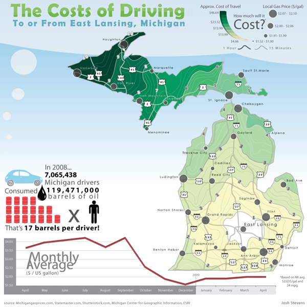
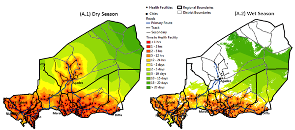
3.2.4 Example Thematic Maps Produced at Penn State
Below, you will find several thematic maps produced by graduate students or faculty in the Department of Geography at Penn State to provide an idea of the variety that exists. Thematic maps cover a virtually unlimited range of topics and goals since they can depict any “theme” that varies from place to place. Thus, the examples below and the ones to follow in the rest of the chapter provide just a hint of what is possible.
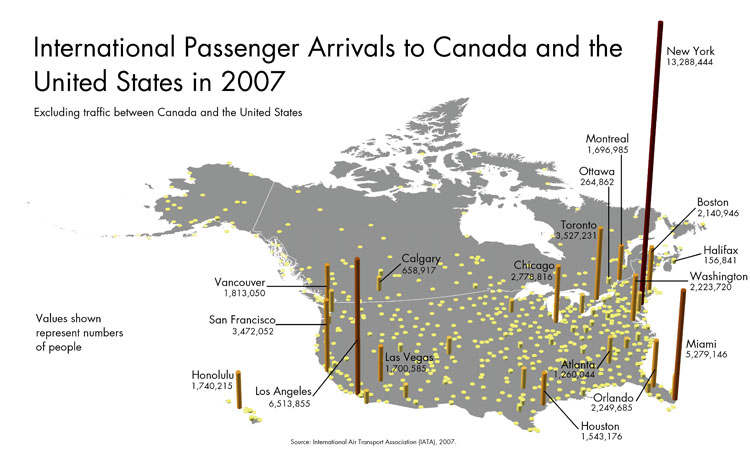
In the map below, size, or height of each column, is the key graphic variable used to represent the total number of international passenger arrivals at each airport in Canada and the United States. This is a very direct representation similar to thinking about piling up a stack of pennies, with one for every airline passenger.
Try This: The Purpose of Thematic Mapping
Find a thematic map online and identify both the theme and purpose of the map.
Practice Quiz
Registered Penn State students should return now take the self-assessment quiz about Aggregated Data.
You may take practice quizzes as many times as you wish. They are not scored and do not affect your grade in any way.