Today, maps can be produced easily through a wide range of online tools by anyone with access to the Internet. Maps used in most activities (from urban planning, through geological exploration or environmental management, to trip planning and navigation), however, are still typically produced by professionals with expertise in mapping or in the phenomena being depicted on the maps. The academic and professional field that focuses on mapping is called “cartography.” Cartography has been defined by the International Cartographic Association as “the discipline dealing with the conception, production, dissemination and study of maps.” One useful conceptualization of cartography is as a process that links map makers, map users, the environment mapped, and the map itself. One characterization of this process is depicted in Figure 3.4 below.
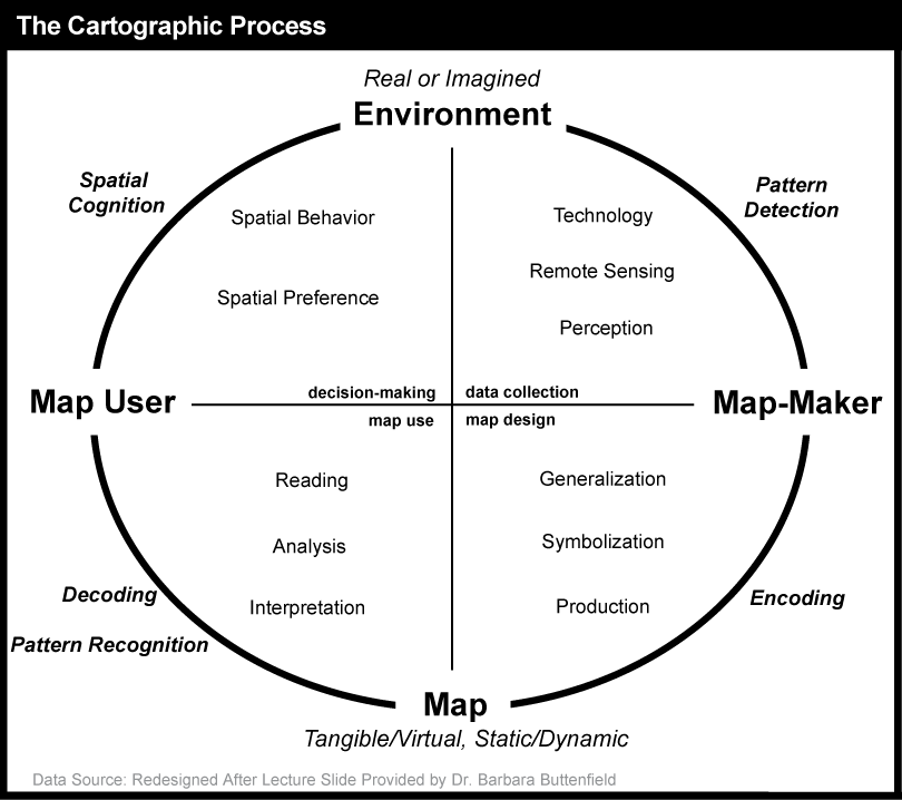
The cartographic process is a cycle that begins with a real or imagined environment. As map makers collect data from the environment (through technology and/or remote sensing), they use their perception to detect patterns and subsequently prepare the data for map creation (i.e., they think about the data and its patterns as well as how to best visualize them on a map). Next, the map maker uses the data and attempts to signify it visually on a map (encoding), applying generalization, symbolization, and production methods that will (hopefully) lead to a depiction that can be interpreted by the map user in the way the map maker intended (its purpose). Next, the map user reads, analyzes, and interprets the map by decoding the symbols and recognizing patterns. Finally, users make decisions and take action based upon what they find in the map. Through their provision of a viewpoint on the world, maps influence our spatial behavior and spatial preferences and shape how we view the environment.
In the cartographic process as outlined above, the fundamental component in generating a map to depict the environment is itself a process – the process of map abstraction. This is the topic we discuss next.
Practice Quiz
Registered Penn State students should return now take the self-assessment quiz about the Overview.
You may take practice quizzes as many times as you wish. They are not scored and do not affect your grade in any way.
3.1.1 Map Abstraction
It has become possible to map the world on the head of a pin, or even a smaller space, as shown here: Art of Science: World on the Head of a Pin, but, most details get left out. Even to achieve a screen-sized map of the world on your computer, map abstraction is fundamental to representing entities in a legible manner. The process of map abstraction includes at least five major (interdependent) steps: (a) selection, (b) classification, (c) simplification, (d) exaggeration, and (e) symbolization (Muehrcke and Muehrcke, 1992).
3.1.1.1 Selection
Depending on a map’s purpose, cartographers (map makers) select what information to include and what information to leave out. As Phillip Muehrcke (an Emeritus Professor of Geography from the University of Wisconsin) details, the cartographer must answer four questions: Where? When? What? Why? As an example (Figure 3.5), a cartographer can create a map of San Diego (where) showing current (when) traffic patterns (what) so that an ambulance can take the fastest route to an emergency (why).
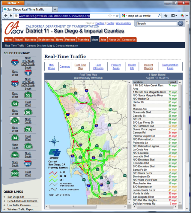
The map in Figure 3.5 shows how a cartographer selected specific highways to include along with a few other features; these other features include a very generalized representation of the terrain, a few major rivers and lakes, and an indication of the area included in each of several communities (in pastel colors). The objective is to help drivers pick efficient routes by depicting the highways and whether traffic is moving quickly (green) or stalled (red). Other information is kept to a minimum and visually pushed to the background; that extra information is included to provide context for the primary focus (the highways and traffic on them).
3.1.1.2 Classification
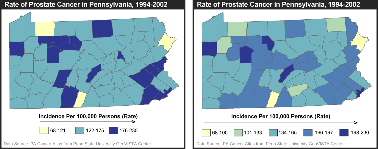
Classification is the grouping of things into categories, or classes. By grouping attributes into a few discernible classes, new visual patterns in the data can emerge and the map becomes more legible. In the example above, the highways are classified into those without traffic detectors (gray) and those with traffic detectors (in color) and furthermore, within the latter, into slow (red), intermediate (yellow), and fast (green) travel conditions. There are many kinds of data classification used on maps; we will focus specifically on classification of numerical map data in more detail later on in the chapter. As a preview of some of the things map readers must consider about classification, the example below shows one dataset for the rate of prostate cancer by county in Pennsylvania mapped using a different number of classes. As you can see, different patterns emerge depending upon how many classes the cartographer chooses to visualize. One must be critical when looking at maps because changing the map classification can change what appears to be true. In How to Lie With Maps, Mark Monmonier discusses how mapmakers intentionally and unintentionally lie through techniques such as map classification, among others.
3.1.1.3 Simplification
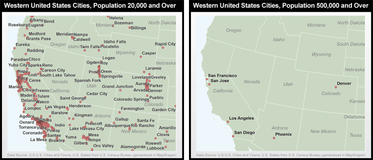
Cartographers also need to simplify the features on a map beyond the tasks of feature type selection and feature classification in order to make a map more intelligible. This includes choosing to delete, smooth, typify, and aggregate entities within feature types. In the process of deleting entities, imagine creating a map of cities for the United States. As illustrated in Figure 3.7, attempting to include every city in the U.S. would render the map illegible. Map makers must delete, for instance, cities below a certain population (as done in the map on the right) in order to better serve the purpose of the map. In this case, if the purpose was to show the most populous cities, a fixed population threshold produces a very appropriate result. If, however, the purpose was to show the most important cities in the region, then an arbitrary population threshold does not work since, for example, Salt Lake City is just as important to Utah as Phoenix is to Arizona.
Smoothing is the act of eliminating unnecessary elements in the geometry of features, such as the superfluous details of a nation’s shoreline that can only be seen at a larger, zoomed-in regional scale. Typification depicts just the most typical components of the mapped feature. The visibility map above is a good example of typification in which the actual geographic shape of state boundaries is replaced with what might be considered a caricature that retains only key aspects of each state’s shape. Going beyond the simplification processes that act on one feature at a time, aggregation combines multiple features into one. Imagine a river composed of numerous meandering streams at a large scale (i.e., zoomed in), but when moving to a smaller scale (i.e., zooming out), the streams are merged into one larger river as it becomes impossible to maintain the detail. If you visit Google Maps and zoom in to Harrisburg, Pennsylvania, you will find the Susquehanna River flowing through the middle of the capital. As you zoom out to a smaller scale, you will view the various smaller streams of the Susquehanna begin to collapse into a single blue line as the details of the river aggregate.
Try This: Practice Simplification in MapShaper
The purpose of this practice activity is to show you a visual example of simplification and smoothing of geographic features in the online MapShaper application.
- Go to the MapShaper site at MapShaper.org.
- Choose one of their sample layers (World Countries or Provinces of Thailand) tab and select OK.
- Choose a simplification method of your choice, and use the slider at the bottom of the page to increase the level of simplification of the mapped features.
I encourage you to experiment with the various methods and settings to see how simplification eliminates unnecessary elements as you move through different map scales.
3.1.1.4 Exaggeration
Deliberate exaggeration of map features is often performed in order to allow certain features to be seen. For instance, on a standard paper highway map of Pennsylvania (the fold-up kind you might have in the glove box of your car, thus about 3 feet across when unfolded), interstate highways are printed at roughly 0.035 inches in width. That sounds pretty small, right? But, if the width of the printed road relative to the map width was the same as the width of the actual highway relative to the width of Pennsylvania, it would mean that the Interstate was nearly 2000 feet wide! This is a typical case of exaggeration to create an abstraction that is useful for travel.
3.1.1.5 Symbolization
In the final process of creating a map, the cartographer symbolizes the selected features on a map. These features can be symbolized in visually realistic ways, such as a river depicted by a winding blue line. But many depictions are much more abstract, such as a circle or star representing a city. Map symbols are constructed from more primitive “graphic variables, the elements that make up symbols. Below, we provide a brief overview of these core graphic variables; then we focus on how color in particular is used (or should be used).
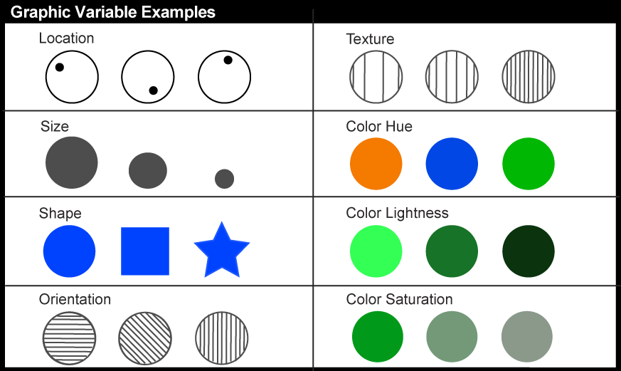
3.1.1.5.1 Graphic Variables
Given the large variety of maps that exist, it might be surprising to learn that the visual appearance of all maps starts from a very small set of display primitives from which all those variations can be constructed. We call these primitives graphic variables because each represents a “graphic” (visible) feature of a map symbol that can be “varied.” While different cartographers have identified a slightly different set of primitives, most agree that there are somewhere between 7 and 12 of them from which all maps symbolization can be constructed. The most commonly cited primitives that can be varied for map symbols are: location, size, shape, orientation, texture, and three components of color – color hue (red, green, blue, etc.), color lightness (how light or dark the color is), color saturation (how pure the color hue is). By convention, each of these "graphic variables" is used to represent particular categories of data variation.
3.1.1.5.2 Color Schemes
As you can see above, three of the graphic variables are components of color. Color is particularly important for map symbolization today since so many maps are seen online where color is always available and nearly always used. While most maps you will see use color to depict data (as well as in aesthetic ways), many maps do not use color in the most logical ways in relation to the data being depicted. Well-designed maps use variations in the three color variables in ways that reflect the kinds of variations in the underlying data they represent. Below, we provide a few simple guidelines that will allow you to recognize maps that use color in logical as well as illogical ways. Recognizing the latter is particularly important so that you are not misled by maps you encounter.
To help cartographers (and others) select good colors for maps, Dr. Cynthia Brewer and Dr. Mark Harrower developed Color Brewer (ColorBrewer2.org), a web app designed to help users pick colors based on data type, number of data classes, and mode of map presentation (i.e., printing, photocopying). The color schemes have been tested with users who have color deficiency (about 8% of the population; difficulty distinguishing red from green is the most common). The web app allows users to interact with a map template by changing colors, background, borders, and terrain. There are three main color scheme forms a user can choose from: sequential, diverging, and categorical. Each is appropriate for specific kinds of data as detailed below.
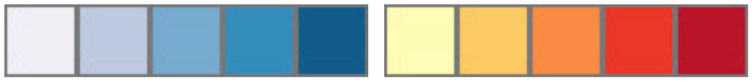
Sequential color schemes should be employed when data is arranged from a low to a high data value (e.g., data for mean annual income by county in Pennsylvania). This sequential scheme aligns colors from light (depicting low data values) to dark (depicting high data values) in a step-wise sequence. Sequential schemes can rely on only color lightness as shown below (Figure 3.9) at left or may add some color hue variation to enhance differences in categories will retaining the clear visual ordering as shown at right. As an example, Figure 3.10 uses a 4-class purple sequential scheme to depict Avian Influenza, with a focus on Eurasia.

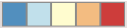
Diverging color schemes highlight an important midrange or critical value of ordered data as well as the maximum and minimum data values. Two contrasting dark hues converge in color lightness at the critical value. This is the scheme used for the population change map in Figure 3.3 above in which the critical dividing point is zero change.
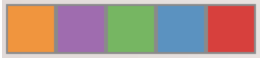
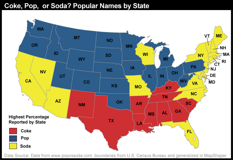
Unlike the ordered data mentioned in the previous color schemes, qualitative color schemes are used to present categorical data, or data belonging to different categories. Different hues visually separate each of the different classes, or categories. The map in Figure 3.13 employs a qualitative color scheme of three different colors (red, blue, green) to represent different categories (coke, pop, and soda respectively).
Practice Quiz
Registered Penn State students should return now take the self-assessment quiz about Cartographic Process.
You may take practice quizzes as many times as you wish. They are not scored and do not affect your grade in any way.