Maps are both the raw material and the product of geographic information systems (GIS). All maps represent features and characteristics of locations, and that representation depends upon data relevant at a particular time. All maps are also selective; they do not show us everything about the place depicted; they show only the particular features and characteristics that their maker decided to include. Maps are often categorized into reference or thematic maps based upon the producer’s decision about what to include and the expectations about how the map will be used. The prototypical reference map depicts the location of “things” that are usually visible in the world; examples include road maps and topographic maps (depicting terrain). The U.S. Geological Survey (USGS) website below (Figure 3.1) provides examples of the standard topographic map produced today along with other example reference maps and a wide range of other information (see: National Map).
Thematic maps, in contrast, typically depict “themes.” They generally are more abstract, involving more processing and interpretation of data, and often depict concepts that are not directly visible; examples include maps of income, health, climate, or ecological diversity. There is no clear-cut line between reference and thematic maps, but the categories are useful to recognize because they relate directly to how the maps are intended to be used and to decisions that their cartographers have made in the process of shrinking and abstracting aspects of the world to generate the map.
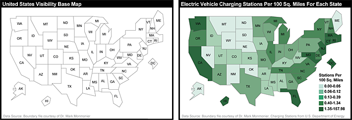
For example, with a highway map (another example of a typical reference map), we expect the cartographer to take great care in accurately depicting road location, since the map’s main purpose is to act as a reference to the road network. In contrast, on a thematic map of U.S. unemployment rates focused on those rates, the base information such as state boundaries can be quite abstract without impeding our ability to understand the map. In Mapping it Out: Expository cartography for the humanities and social sciences, Mark Monmonier proposed the U.S. visibility map (Figure 3.2), adjusting the areas and shape of each state in order to help map users see all states, especially smaller states such as Rhode Island.
A flat sheet of paper is an imperfect but useful analog for geographic space. Notwithstanding the intricacies of spherical coordinate systems and map projections (see chapter 2.3 and 2.4), it is a fairly straightforward matter to plot points that stand for locations on the globe. Representing the attributes of locations on maps is sometimes not so straightforward, however. Abstract graphic symbols must depict, with minimum ambiguity, the quantities and qualities of the locations they represent. Over more than a century, with particular attention to thematic maps, cartographers have adopted and tested map symbolization principles through which geographic data are transformed into useful information. These principles focus on how color, size, shape, and other components of map symbols are used to represent characteristics of the geographic data depicted. As one example, the map below (Figure 3.3) uses variations in color to represent geographic differences in population change over a decade in the U.S.
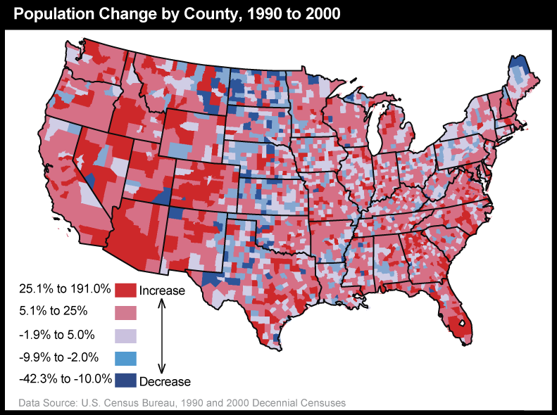
The map above makes it easy to see where the U.S. population changed, by county, from 1990 to 2000 as well as where there was little change. To gain a sense of the power of thematic maps in transforming data into information, we need only to compare the map above to a list of population change rates for the more than 3,000 counties of the U.S. that it is based upon. The thematic map reveals geographic patterns that would be virtually impossible to recognize from the table.
Maps of people, like the one above, are just one example of the nearly infinite variety of thematic maps that can be generated from today’s geographic data. This chapter will introduce the “cartographic process” through which maps are generated and then examine thematic maps specifically through exploration of diverse examples and introduce the most common (and a few uncommon) thematic mapping methods and how to interpret them.
Objectives
Students who successfully complete Chapter 3 should be able to:
- understand the core components of the cartographic process;
- understand the basic “graphic variables” of map symbolization and how they are used;
- recognize thematic maps of different types, identify their purpose, and interpret maps within each type;
- understand the data requirements of different thematic map types and recognize maps that depict data in inappropriate or otherwise misleading ways;
- understand the implications of data categorization for what maps show (and do not show) about the phenomenon in the world that the map and data behind it represent;
- select the most appropriate map type to represent a given set of data.
Table of Contents
- The Cartographic Process
- Thematic Maps
- Summary
- Glossary
- Biblography
Chapter lead author: Jennifer M. Smith.
Portions of this chapter were drawn directly from the following text:
Joshua Stevens, Jennifer M. Smith, and Raechel A. Bianchetti (2012), Mapping Our Changing World, Editors: Alan M. MacEachren and Donna J. Peuquet, University Park, PA: Department of Geography, The Pennsylvania State University.