Overlay (and Beyond)
Now that you’ve got a grasp on the basics about thinking like a geographer and understanding geographic information, it’s time to focus on how to understand geography through analysis.
The most basic method of spatial analysis uses a really simple technique: overlay. It’s exactly as it sounds – all you do is stick one layer (number of people currently talking too loudly on their cell phone) on top of another layer (one that shows Starbucks locations) and compare the results (look, lots of people talking too loudly are standing in/around a Starbucks!). You could do this with lots of layers and end up with a composite overlay that lets you explore all sorts of possible relationships.
Overlay analysis also goes beyond simply looking at where two things overlap. You could also do overlay analysis to extract just the area where two things intersect, to delete any areas where two or more things intersect, to join two datasets into one larger dataset, and more. Check out some of the options here at the ARC GIS Resources page, if you’re interested.
Put A Ring On It
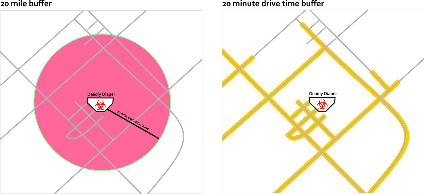
In the previous example, I mentioned the area around a Starbucks location. Identifying these areas is part of another common spatial analysis technique. Buffering identifies areas of interest around locations based on distance or time. This could include a 20-mile radius around a terribly disgusting diaper that my daughter creates, or an irregular shape that shows the places that are reachable within a 20-minute drive of my house if I try to escape this terrifying situation.
Surface Analysis and Interpolation (Heat Maps Are Not Always Hot)
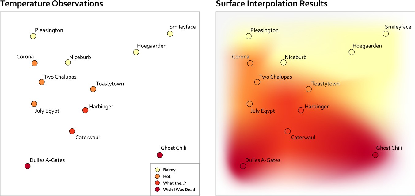
Another common spatial analysis scenario occurs when you’ve got lots of individual observations and you want to create a map that shows the overall trends that correspond to an area. Let’s say you have a bunch of temperature readings for a collection of cities and small towns. In the maps shown below, you can see what I can do just using colors assigned to each point observation. You can get a sense of the overall pattern this way, but temperature doesn’t just exist at discrete points, does it? It’s a continuous phenomenon, so it would be nicer to show this data in a way that communicates this aspect more clearly.
In the map on the right hand side you can see how this would look if you interpolate between those observations to estimate the overall pattern of temperatures in this region. There are many mathematical methods for interpolating between values and creating surfaces (hence the label “surface interpolation” below). These types of maps are frequently called heat maps, after the “hot” color scheme normally used in their design. A more correct name would be "density surface," but cartographers seem to have lost that battle, as heat map is way more popular (it sounds cool, so why let the actual name for things get in the way?). I don’t know what you should do if you want to create a heat map to show the density of ice bars in Scandinavia.
In the Geospatial Revolution video you'll watch later in this lesson, you will learn about John Snow’s famous map of a cholera outbreak in London. Dr. Snow’s work revealed that cholera cases were happening close to one particular water source. A set of spatial observations that differ from the expected variation around a point or region is called a cluster. In the example from John Snow, the cluster was detected based on his intuition. Today we have the advantage of mathematical methods that can detect clusters automatically. More importantly, these methods can help us identify spatial clusters that are unlikely or impossible to detect through our own intuition or visual inspection alone. While it’s outside the scope of this course to learn the inner-workings of cluster detection, I do want you to know that today the folks who work in epidemiology would never rely on their intuition alone to detect clusters. They’ve got fancy software that uses fancy space-time math to do that.