Rain Causes Lung Cancer (No, It Doesn’t)
Now that you know a bit more about ways to do spatial analysis, I want you to understand some all-too-common ways in which these analyses can fall apart if you’re not careful.
Most of the analysis techniques mentioned earlier in this lesson will cause you (or the people who read your maps) to start making assumptions about the correlation between observations. To put it plainly, just because there appears to be co-occurrence between two things, it doesn’t mean that one of things is causing the other to happen.
To explore this pitfall further, let’s check out a wacky example that we wrestled with here at the GeoVISTA Center back in the early 2000s. At the time we had a research project with cancer epidemiologists from the National Cancer Institute. Dan Carr from George Mason University (who was also working with the same folks at NCI at the same time) had discovered a really intriguing pattern while trying to explore geographic patterns of cancer mortality and its possible correlation to a bunch of social, economic, and environmental variables. Here’s what he found – lung cancer mortality correlates quite well with… mean annual precipitation. Yeah. Rain. Does that sound plausible to you?
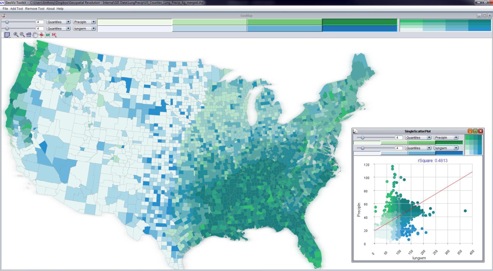
You can see the in map above (created using the GeoViz Toolkit) that there are a lot of counties that show up as dark blue/green. This is a bivariate (two variable) choropleth map. The Y-axis here (with green category colors) is used to show the precipitation variable, and the X-axis (with blue category colors) shows the lung cancer mortality rates. When you see the dark blue/green color at the high end of both X and Y axes, you’re looking at counties that are high in both of those variables. Places that are only green or only blue are lower on the other respective variable. The scatterplot shown in the bottom right corner shows the data distribution of both variables. You probably can’t read the correlation measure, but it says that the R-squared value is .48 – this was a strong correlation measurement compared to most of the known relationships between lung cancer mortality and other variables (poverty and smoking show strong associations too, for example).
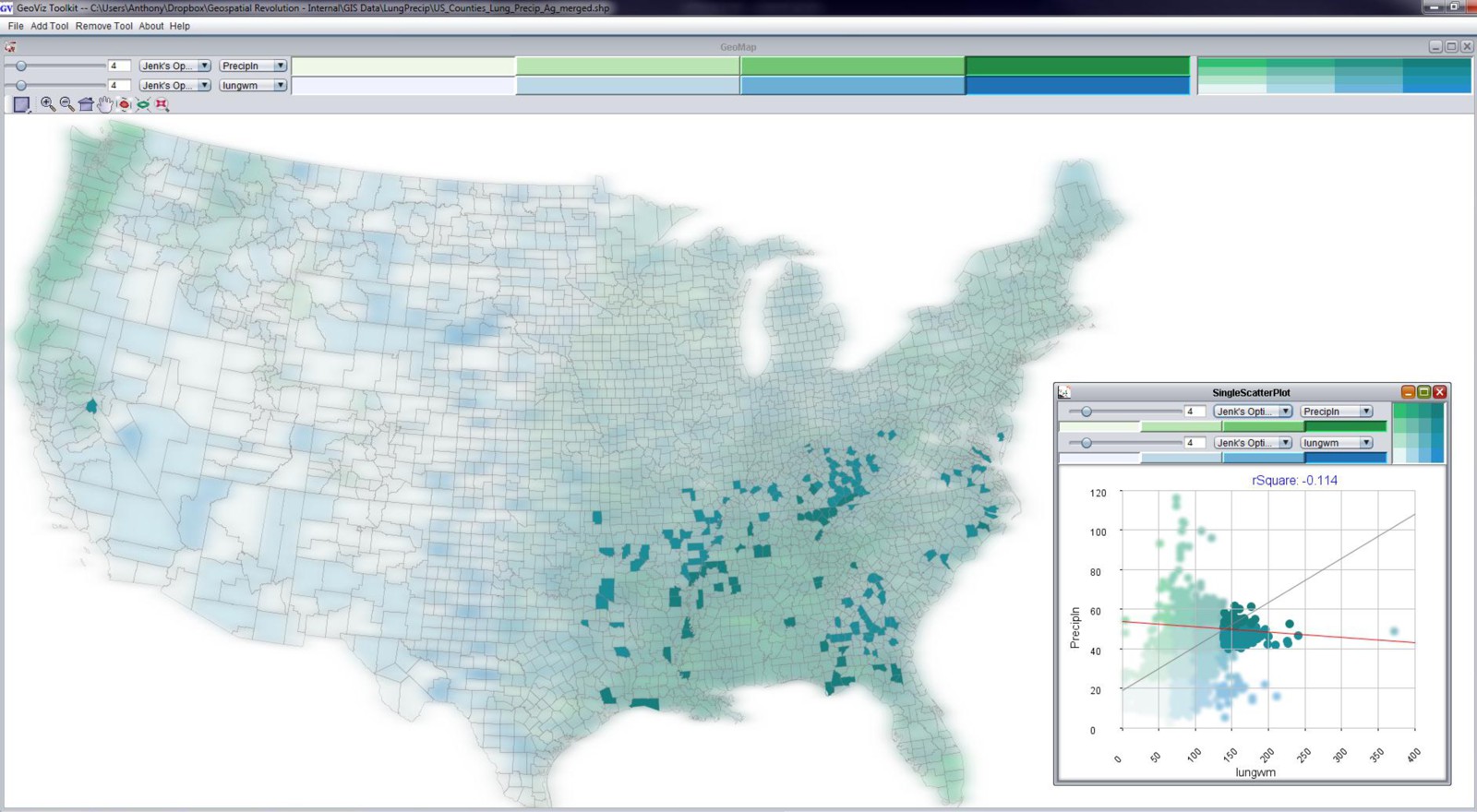
When I select just the counties that are both high in precipitation and high in lung cancer mortality, you get the map above. Most of the counties are located in the Southeast United States. We spent awhile working with Dan Carr and the epidemiologists at NCI to try and tease this apart further, to no avail. There’s nothing there to report – it’s just correlation, nothing causal. It’s not that rain has any real impact on lung cancer mortality. It just happens to rain more where there are people who meet a range of other risk factors. This is a perfect example to demonstrate how correlation is not the same as causation.
Playing Tricks with Scale
Another major pitfall here relates to the scale at which you conduct spatial analysis. Depending on the scale at which you look at a Geographic pattern, you can derive completely different results from the exact same underlying data. This is called the “Modifiable Areal Unit Problem” or MAUP in acronym form (and said aloud it sounds like the noise that comes out of your throat after eating too many nachos).
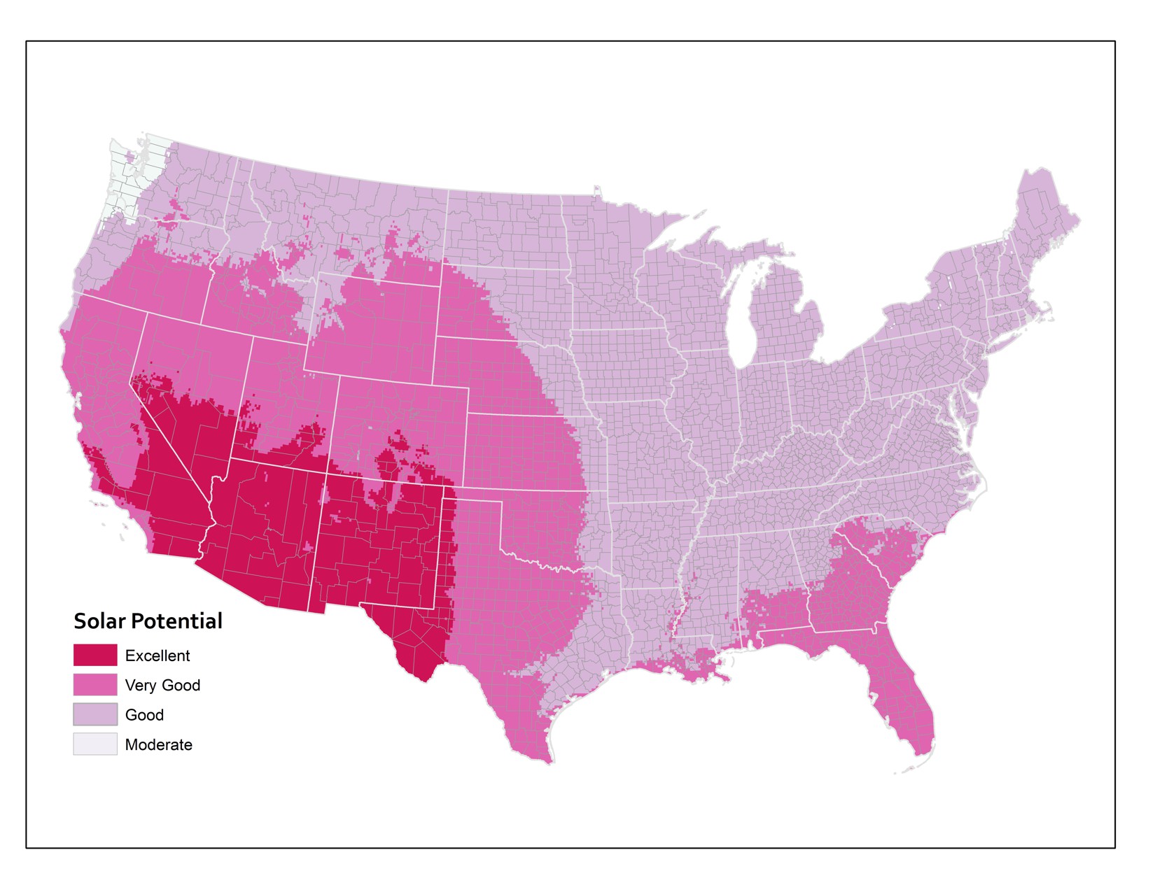
Let’s explore this issue now by looking at some data about Solar Potential in the lower 48 United States. Solar Potential refers to the suitability of a particular place to develop solar power. The data I’m working with here is from the National Renewable Energy Laboratory (NREL). The first map shows the average annual solar potential by States. You can see right away that some states look better than others.
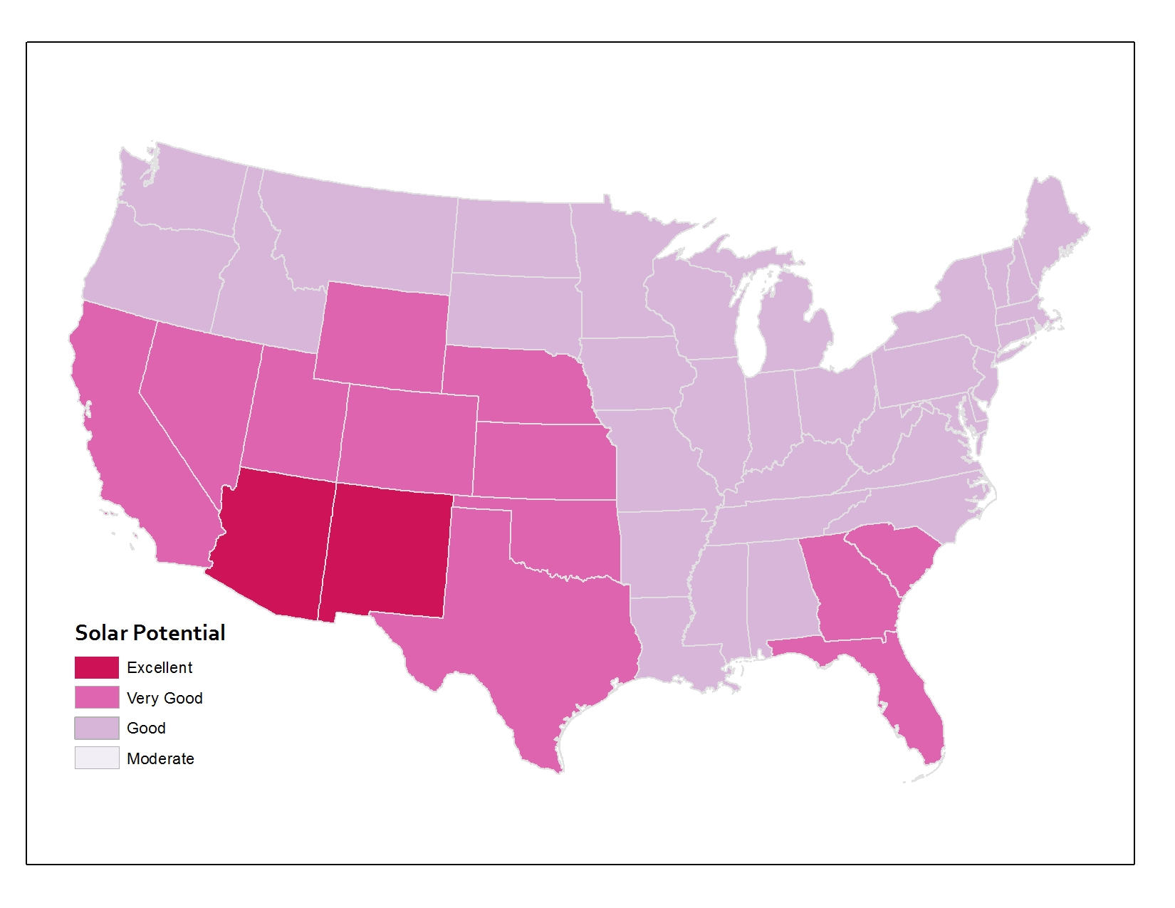
But what if I use the same underlying data and instead of aggregating to States, I come up with measures for counties instead? You can see the map below showing the same data if it’s represented at the county level. The picture is already a lot more nuanced than the state map, right? A lot of states that were shown in one color up above actually include members of several categories when you look at the data by county.
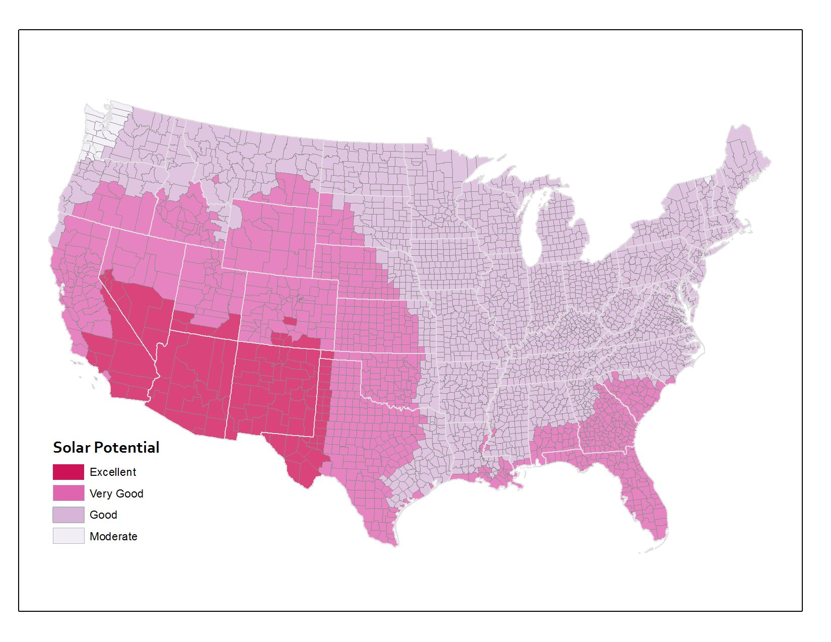
And the third map here shows the original underlying data that the other two maps were based on. The original data source calculates solar potential in 10 kilometer grid cells. So that’s why things look a bit rough at the edges. This is actually the most precise measurement level, however. I’ve overlaid the state and county boundaries so that you can see how the raw data compares to the units by which we typically try to aggregate things.