Real Time Data, Social Media Mapping, and Finding The Best Place For Things
This week, your reading and lectures focused on understanding geography through analysis. You learned about map overlays, buffer zones, heat maps, and other methods. You also learned that simply having a plethora of spatial analysis tools at your fingertips to apply to your maps does not mean you can let the tools do the work with your brain taking a much needed coffee break. On the contrary, with the power you have comes responsibility: You need to consider things like the scale that is appropriate for analyzing your data, mapping totals vs. mapping rates, and correlation vs. causation.
This week’s lab gives you the opportunity to practice these concepts in ArcGIS Online. You will be evaluating relationships among different variables. You will examine maps that show geolocated social media in all of its ephemeral glory. You will analyze data using tables and maps. And you’ll do some spatial analysis, including the creation of buffers and routes.
Analyzing Real Time Weather Data
Real-time data is increasingly available, and much of it also includes geographic data. Let’s analyze some weather-related real time data by opening Esri’s public information map on severe weather.
This map should look similar to the map below. Note that this map is an example of a live map embedded in a web page. If you are using a browser with language settings other than English, this may not work for you. In that case, please check out this similar example.
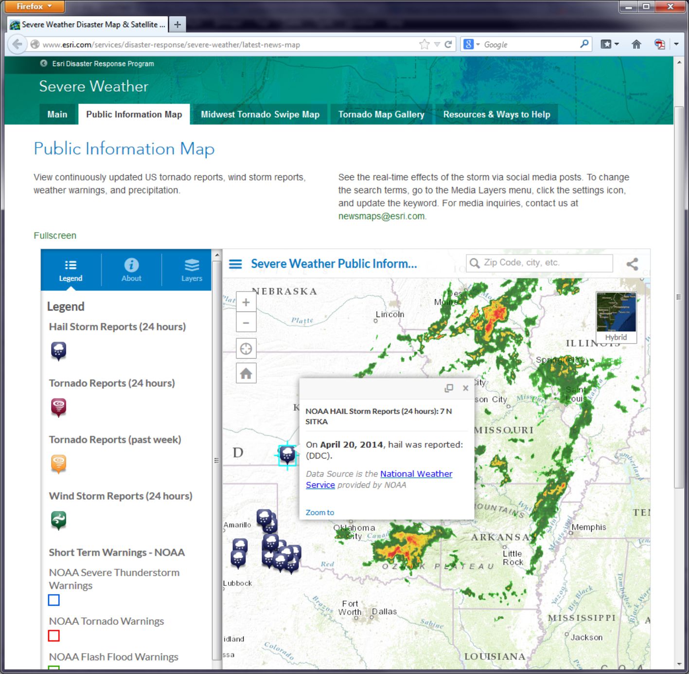
- How would you say that tornadoes, wind storms, hail storms, and precipitation are related in space and in time?
Now head over to Esri’s Flood public information map.
This information on flood warnings and observed floods comes in part from USGS stream gauges along rivers. These stream gauges upload data to a national network which is then fed in as a live web mapping service in ArcGIS Online. Click on the “i” information button and then the link to More Information to explore details about where the data are coming from.
- Which agency provides the flood data? How often is it updated?
- Can you find a relationship between where precipitation is falling and floods on the map?
Think about how the duration of precipitation and the time between when precipitation falls and when a flood might start to occur. Then think about how the size of the watershed that is drained by the rivers that flow by a particular gauging station influences the river height at that gauging station. Several factors influence the relationship between precipitation and floods as displayed on a map. You can examine the other Esri disaster response program maps on Esri's disaster response page.
- Can you find a spatial and temporal relationship between data layers on the hurricanes and cyclones, wildfires, or earthquakes pages?
In the next section you will examine geospatially-oriented social media related to severe weather events. Who knew that thunderstorms would cause a Flickr apart from the lights going out in your house?
Mapping Social Media
Social media frequently contains geographic information, because social media posts are often sent from devices that can snag a location from a GNSS. Therefore we can make maps showing social media in many cases. Entire platforms like Ushahidi and Tweak The Tweet are built around the use of social media mapping. So let’s see what we can do with it ourselves.
Head over to the Esri severe weather public information page.
Click the Layers button in the panel on the left side of the map and scroll down until you see Media Layers. Notice that you have a choice of Instagram, Flickr, Twitter, and Webcams. On Flickr, click on the gear icon to look at the Flickr Search Settings. Notice that it is currently set to storm or tornado. Change it to hail or tornado and select Search.
- Can you find any correlation between the locations of hail and the locations of tornadoes?
Zoom to different scales and pan the map to explore multiple locations, and see if you can observe any patterns (or lack thereof). Next, change the Flickr settings search term to Oklahoma. You may expect that your results will only show Oklahoma, but what happens if someone refers to Oklahoma in a photograph they take in Pennsylvania? If the search term you use is in the metadata that the sender of the post, video, or photograph provided, it will appear on the map, even if the post did not originate from the place listed in the post.
- What are a few benefits and limitations associated with gathering and using data from social media?
Raw Data Analysis
Let's have a look now at the information behind the map, which is stored as a table.
The Human Development Index (HDI) is a composite statistic used by the United Nations to rank countries by level of "human development." It can be considered a synonym of the older terms “standard of living” or “quality of life,” and countries can be thought of as "very high human development," "high human development," "medium human development," and "low human development" in terms of the UN HDI. This index is used to make decisions on policy issues for economic, social, political, and cultural development worldwide.
You can read about the HDI here: Human Development Reports
- What benefits (or limitations) do you see from these documents about the HDI?
- Where do you think HDI will be highest and lowest around the world?
Now navigate to ArcGIS Online. Log in using the account you set up in Lesson 2.
Copy and paste this web link into your browser navigation bar: http://www.arcgis.com/home/webmap/viewer.html?webmap=da264828e12741948799e9d8ffac3a48. You can also just click the link here and it should open the map just fine. You want to make sure you're logged in, though, because later you'll want to save the changes you make to this map.
- Is your hypothesis about where HDI will be highest and lowest supported by what you see on the map?
Next, click the little arrow to the right of the HDI 2006 layer and select Show Table. Use the Sort Ascending or Descending Order function on the HDI2006 column to answer the following questions (note that some countries come up as -99, which is the value assigned when there is missing data):
- What country is the lowest in HDI? What is its HDI rank?
- What country has the #1 HDI Rank? What is its HDI value?
Now click Table Options at the top right of the table view and choose Filter. In the following dialog box, select Human Development Index 2006 (HDI2006) from the first dropdown list. Then select is less than from the second dropdown. And finally, enter .5 into the Value field. Click Apply Filter when you're ready.
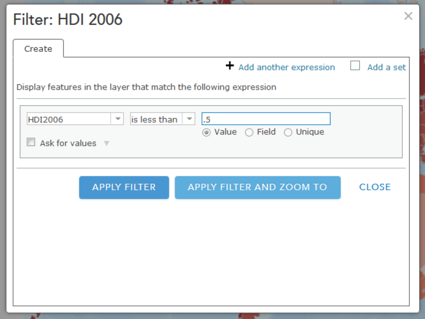
You should now see only the filtered countries on your map that have an HDI of less than .5. Now is a good time to try out other filtering operations that you think might be interesting. You might also want to save this map (every Map is sacred).
Spatial Analysis
Note: Some of the apps you'll try in this section of the assignment will take a little while to return results. Please be patient! Clicking lots of times really fast won't help.
This week you read about one type of spatial analysis called buffering. Click this link to try creating your own buffers: http://developers.arcgis.com/en/javascript/samples/util_buffergraphic/
Let’s say you are seeking to start a new boat repair service (Salt Lake Sloops or Saline Sails) near the Great Salt Lake, Utah, and you want to locate your service within 25 kilometers of the lake to maximize the number of potential customers. Under the Buffer Parameters heading, set the distance to 25 kilometers. Then use the Freehand Polygon tool to trace the outline of the Great Salt Lake in the north-northwest section of Utah.
- Would Salt Lake City be included in your list of cities to consider? What about Provo?
Another kind of buffer is a temporal buffer, which calculates the amount of time required to walk, bicycle, or drive to or from a certain location. Open this map to create some buffers to show drive times:
http://developers.arcgis.com/en/javascript/samples/gp_servicearea/
Click on a location in Lawrence, Kansas and wait for the drive time buffer to appear. Click on Interstate Highway 70 (a limited access highway) and note the differences. Click just north of the river and note the effect of the river on access to areas south of it. Observe that the drive time buffers depend not only on the street density, but they have intelligence beyond street location: they take into account one-way streets, stop signs and stop lights, traffic volume, speed limit, and terrain. Pan the map to a rural area outside Lawrence and click on the map in that location.
- What is the difference in the amount of terrain someone could reach in 1, 2, and 3 minutes from a rural area vs. from an urban area?
Now that you've seen how drive times might be helpful for understanding service areas, let's check out what happens when you use a similar method to explore attributes about people in a particular area. Open this map to explore population in Census Block groups within 1 mile from whichever place you click.
Each of the purple dots represents a block that is included in the total count of the population within the 1 mile buffer. Notice that at the upper right of the display you can see the total population inside this buffer. You can use this sort of data to drive a more sophisticated service like this one:
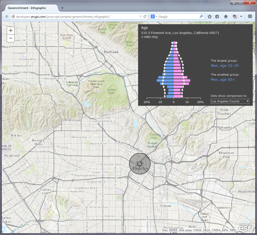
http://developers.arcgis.com/javascript/samples/geoenrichment_infographic/
In this example, when you click on the map a population pyramid is created for the buffer area. You can compare the population categories for each place vs. all of Los Angeles, California, or the entire United States. A good way to start exploring this example is to click first right on the center of downtown Los Angeles. Take note of the overall shape of the pyramid. Next, try clicking on Bel Air (to the northwest of Downtown LA, home of the Fresh Prince). What differences do you see? What other data would you want to have to explore these differences further?
Viewsheds and Zonal Statistics
Viewsheds are another type of buffer. Viewsheds indicate how much terrain is visible from specified locations. Viewsheds are important not only in planning scenic overlooks along trails and highways, but help in everyday decisions such as siting cell phone towers, determining how much terrain would be in shadow if a certain high-rise were to be constructed, helping plan safe roadway curves, and much more.
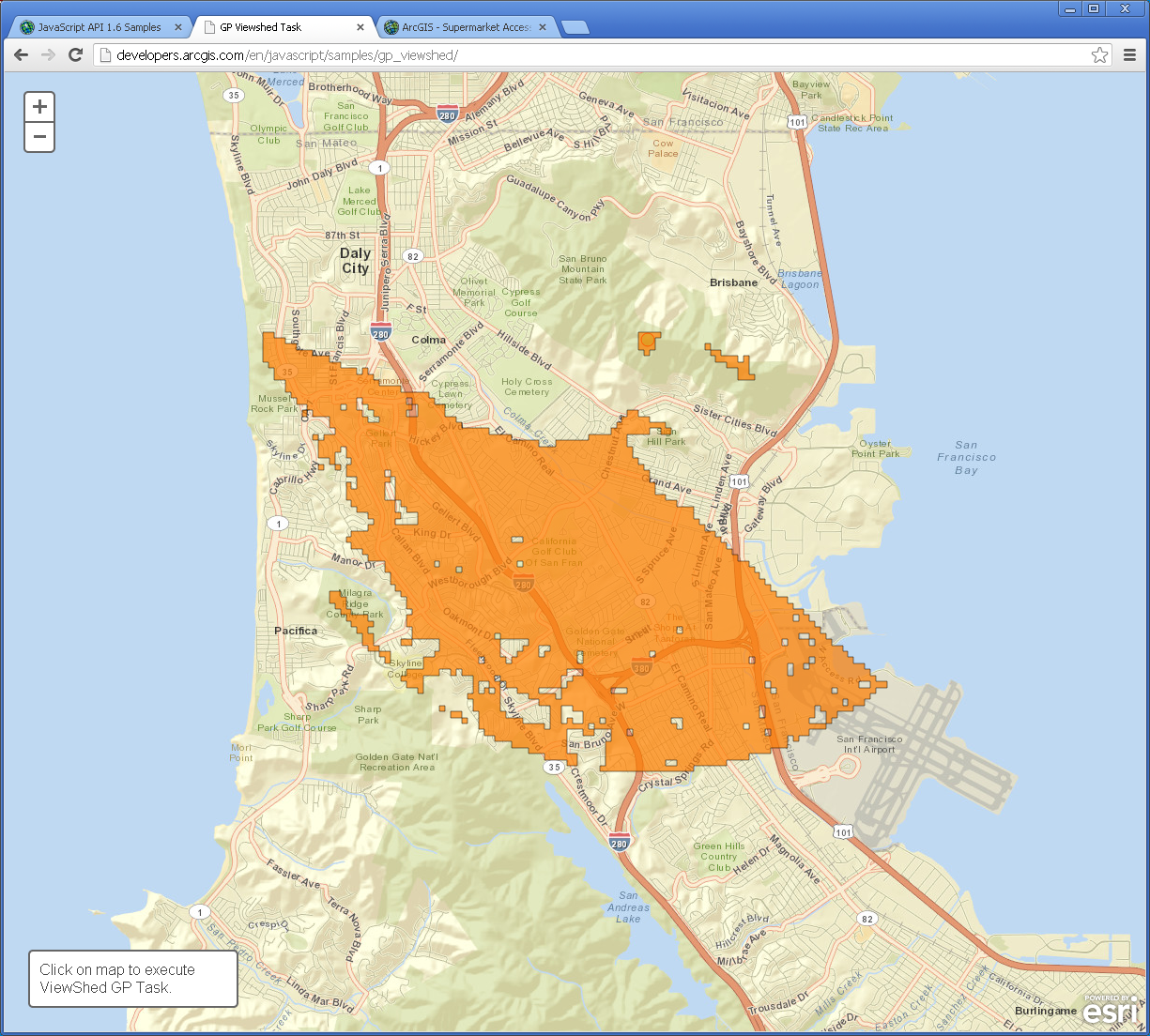
Use this map to create your own viewsheds.
This map service shades the terrain viewable within 5 miles of your chosen point. Let's say you are interested in taking photographs in San Francisco but you only have two hours to do so, since you’re on a layover at SFO on your way to Sydney. You want to be as efficient as possible, choosing locations that allow you a magnificent view. Click several locations on the map and observe the viewshed for each location. Your viewshed should be better if you click on one of San Francisco’s hills. For example:
- Judging from the shape of this viewshed, would you be standing on a south-facing hillside or a north-facing hillside?
Click on the Golden Gate Bridge (leading northward from San Francisco on US 101).
- Why is the 5-mile viewshed so much greater in area at this location?
Another type of spatial analysis that computes and summarizes data from rasters is called zonal statistics. Try this little application to summarize population in specific areas.
Click on the words Summarize Population in the lower left section of the map and then draw a polygon that encompasses Atlanta, Georgia.
- What is the population in and around Atlanta?
- Why is your result different each time you draw the polygon?
- What aspect of the population data layer influences the results you receive from these area calculations?
Routing
Finally, we also have a whole set of functions to determine the best route and the closest facilities to specific locations. This is important for a wide range of applications, from emergency services bringing people in an ambulance to the nearest hospital to finding the nearest competitor for your planned new Taco & Donut Gastropub (Carnitas & Crullers).
Open the following map: http://developers.arcgis.com/en/javascript/samples/routetask_closest_facility/ and click on the map.
What is the closest competing restaurant to your chosen point? Change the choice under the map to find the routes to show the two closest facilities instead of just one.
- Can you think of an application where knowing where two or more closest facilities would be really important?
Often, as in the case of the Kansas River that you earlier examined in Lawrence, Kansas, there are barriers. Barriers may be physical (rivers or mountains), or they may be human-caused, such as construction projects, one-way streets, or a blockage due to a car accident.
Examine this map on route barriers. (if you do not have access to a browser that can display Adobe Flash, then you can try something similar which uses Javascript)
Let's assume you are running a bicycle courier service in downtown San Diego. Your pick up point is at 1st Avenue and Market Street. Your destination is at 10th Avenue and Market Street. Add these 2 stops and have the map calculate your route, shown in blue. Now let’s say there is construction at 8th Avenue and Market. Use Add Barriers and add a barrier at 8th Avenue and Market (2 blocks West of 10th and Market).
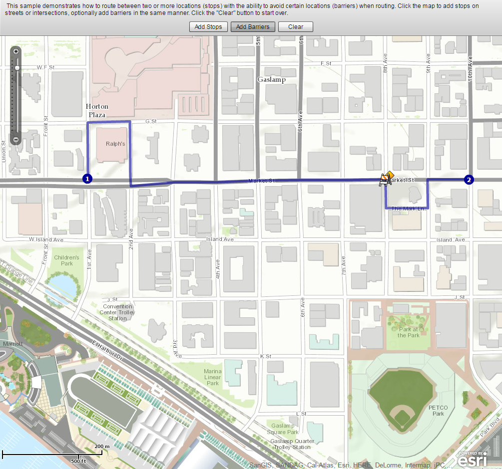
- What changed on your map after you added a barrier?
Supermarket Sweep
Open the following map that incorporates point, line, and polygon data and some of the spatial analysis techniques that you have been exploring above:
This map shows access to supermarkets. The supermarkets have been buffered for walking (1 mile) and driving (10 minutes), and aggregated poverty data is also shown. If you click on the Legend button you'll see that supermarkets and farmers' markets are also shown. Notice how the symbology changes as you zoom out from Detroit to the county level.
- What is the purpose of this map? Why is access to supermarkets a concern in Detroit?
- How has at least one of the spatial analysis techniques you have been exploring in this lab been used to create this map?
Wrap Up
Wow, you're a mapping machine now. In this lab you analyzed real time data and studied the relationships among different variables. You also worked a bit with mapping social media. You used a variety of spatial analysis techniques including buffers, viewsheds, drive time analyses, and routing algorithms. You pretended like you were repairing boats, running a restaurant, and working as a bike courier. It would be cool to have all of that on one resume.
Credit Where It's Due
This lab was developed by Joseph Kerski and Anthony Robinson.