Mapping Rates, Not Totals
A stunningly common analytical mistake by newbie mapmakers is to neglect normalization when you’re working with population-dependent data. Let me to say that in normal-people language instead: if you map something about people without calculating the rate based on the how many people live at that place, you’ll get a really stupid map. Same goes for if you’re mapping something about dogs (how many of them have breath that smells like dead fish? – there’s one at my house, for sure). You’d want to normalize your observations against the total number of dogs that could be mapped.
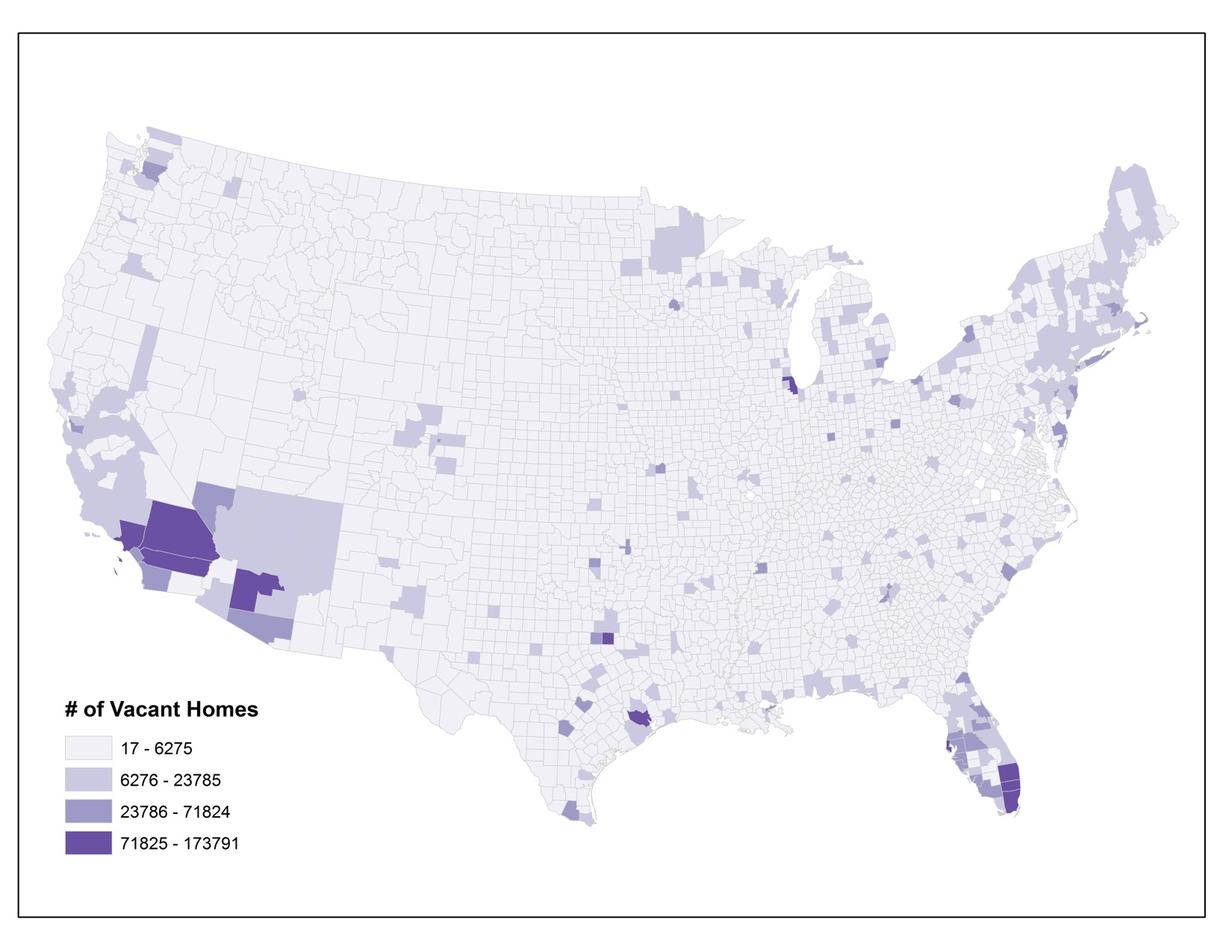
Check out what happens if you don’t normalize your data. This map shows the number of vacant houses by county in the lower 48 United States (you can find this data, along with tons of other stuff at the U.S. Census website). What does it tell you? It looks like there are lots of vacant houses in and around major cities. And that’s it.
Here’s a version of this map that’s been normalized. I calculated the proportion of vacant homes to the overall population in each county (in thousands). That gives me a rate, rather than a raw total value. Now I can see which counties have high percentages of vacant homes, relative to all other places. It turns out that there’s an interesting pattern happening in northern Michigan, Wisconsin, and Minnesota where vacant homes are more common per person than in many other parts of the country. I did a little digging around and I think I know why – can you figure it out? If you think you have the answer, post it in the forums and debate the possible reasons with your classmates. There are different reasons why different counties across the country might have a lot of vacant homes, of course, but I think there are a few key reasons why these particular counties show this pattern.
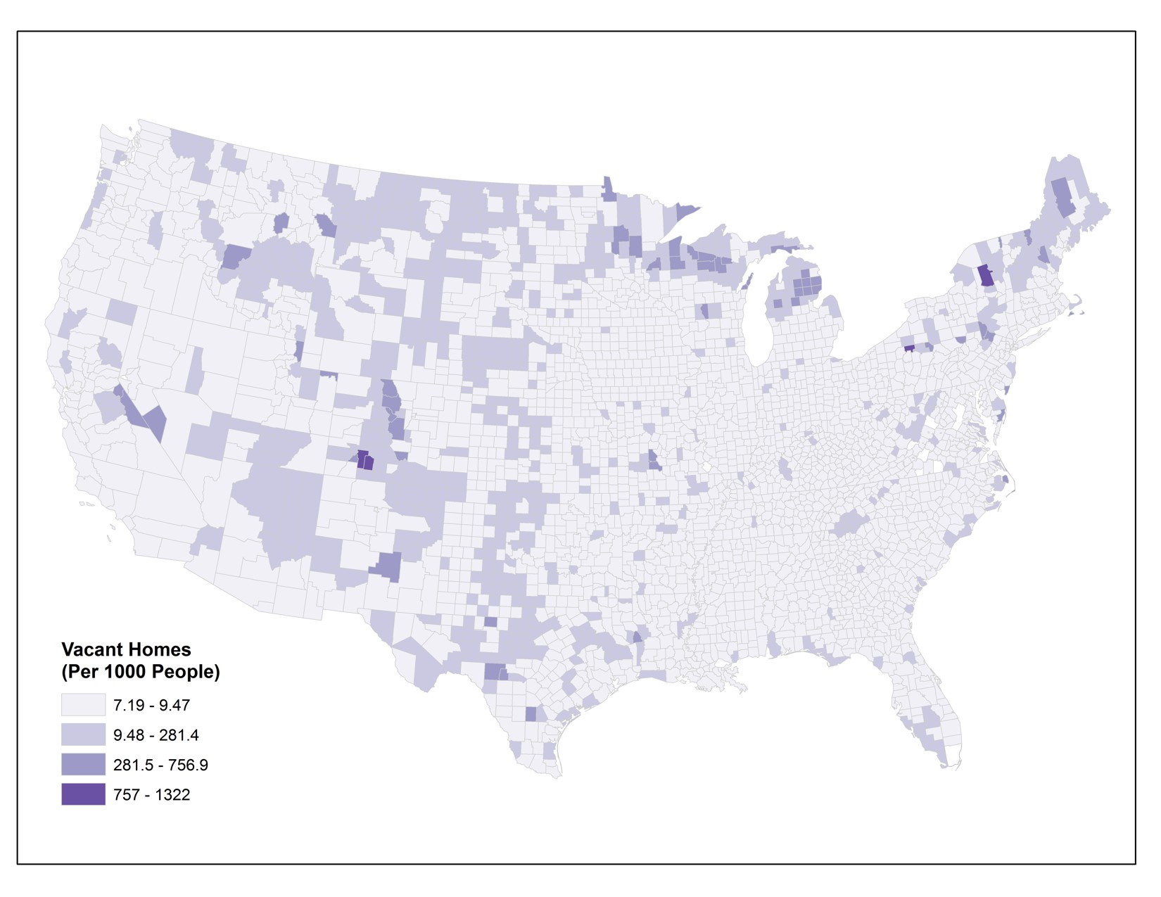
A normalized map is much more useful, right? If you don’t normalize data for choropleth maps like these, you’ll end up having a zillion versions of the first map above – where there are more people, more houses, more dogs, whatever – you’ll have more of the thing you’re interested in and it’ll always just highlight the major population centers. This phenomenon is called population dependence because the thing you want to know about (nasty dog breath), will vary depending entirely on the size of the overall population (number of dogs that are breathing).