Designing a Layout
When you design a map, you need to carefully consider the relative balance of all of its visual elements. You have the map itself, and perhaps you have multiple maps (an inset showing where the location of interest is in relation to the rest of the world, for example). You’ll also probably have a title, a legend, scale bar, source information, and other little bits and pieces. Map nerds (cartographers) call those bits and pieces (aside from the main map) marginalia. The act of sorting things out so that clarity is maximized is called establishing a visual hierarchy. Consider the two examples below from Designing Better Maps: A Guide for GIS Users by Cindy Brewer to see what this means in practice. It’s all about shaping the layout items around your message. The map on the top has all of the necessary elements, but they’re not balanced on the page. The example on the bottom shows the same elements arranged in a way that promotes clarity and harmony in the map design. The first example is a bad layout. The second one is a good layout.
Symbolization
By this point you’ve encountered a wide range of ways in which things can be represented on maps. You’ve worked a lot with choropleth (colored-area) maps in labs and you’ve seen a lot of those as examples in the course content. There are many other ways to show stuff though, and I want you to be aware of some of the most common methods.
Point Symbols
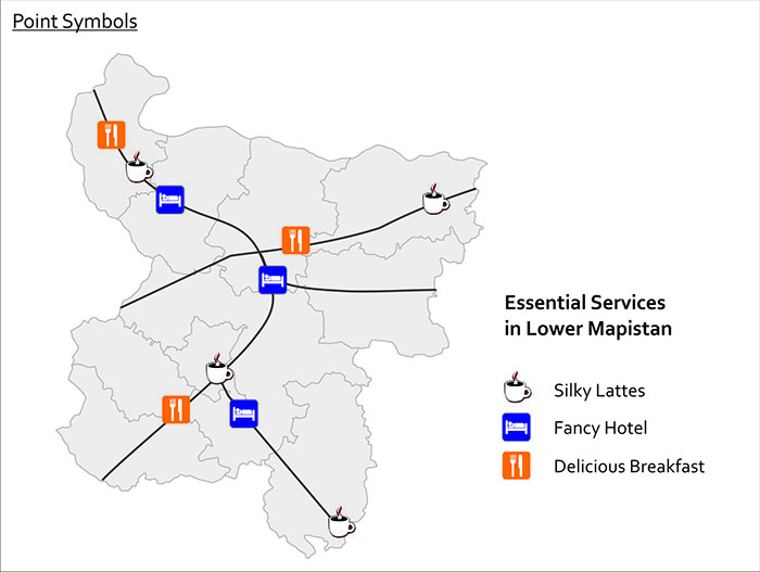
One of the simplest things you can do is to use icons to represent point features. We call these point symbols, and they can range from very detailed in their design (you could even use small photographs if you really wanted to), to very abstract and iconic. Here’s an example of point symbols used to show the locations of important services in Lower Mapistan. Good resources for point symbols include MapBox’s Maki set and our own Penn State Symbol Store.
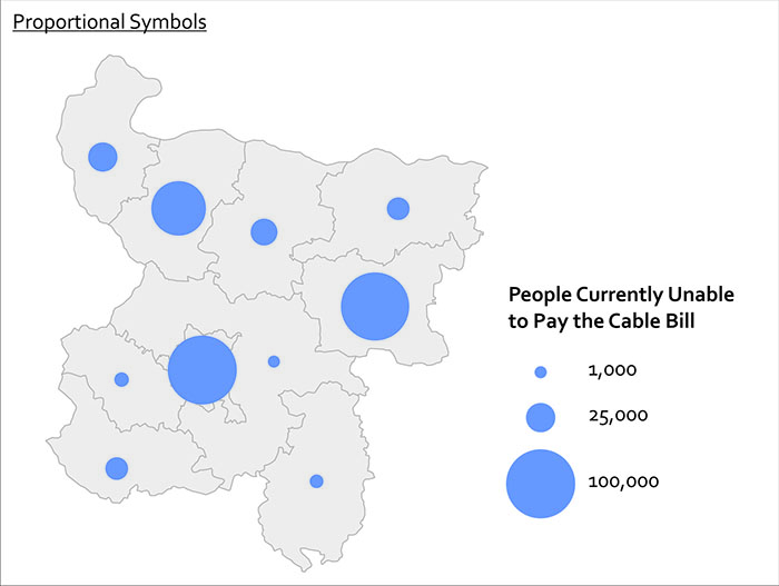
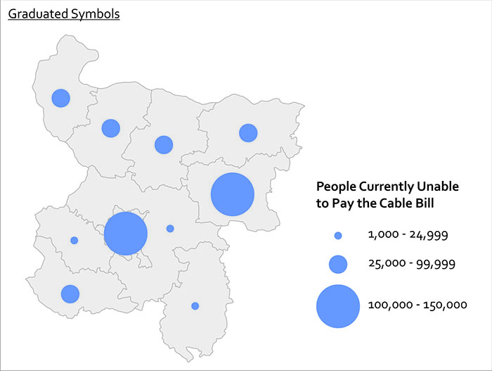
Proportional & Graduated Symbols
Another form of point symbol is one that changes its size based on underlying data values. These are called proportional symbols when you size each symbol in relation to its attribute value. In a proportional symbol map it’s possible for every symbol to be a slightly different size, since size relates to the data value itself. In contrast, graduated symbols use preset symbol sizes to represent a category of values. It’s usually easier for people to make quick comparisons with graduated symbols, while proportional symbols do a nicer job of revealing the underlying diversity in your dataset. You can see the difference here with this map of cable bill delinquency. Both methods are good to use if you want to map raw values rather than rates (remember our previous work on normalization?).
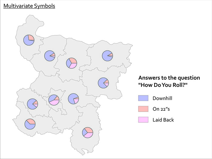
Quite often you want to show more than one thing at a time with your symbols. You can use bar charts, pie charts, and other fancy things like cartograms and bivariate choropleth maps to show more than one variable at once. Pie charts work reasonably well if you just have a few variables you want to show.