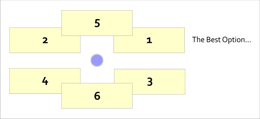
While it’s a bit outside of the scope of this introductory class, I’d be doing you a disservice if I didn’t at least briefly describe the role of labeling and type design on maps. Cartographers often spend a huge amount of effort just trying to decide where to locate labels on a map layout (the map itself and its marginalia). Normally there are too many labels to show in too small of a space, so we need to design a clear visual hierarchy by varying the characteristics of text to emphasize the important bits and de-emphasize the less important bits. Fortunately for you, there are some easy rules to follow – the graphic here shows the priority you should place on label location.
And when you’re faced with the daunting task of choosing among zillions of fonts for the text on your map, Ben Sheesley from Axis Maps has created a great little tool called TypeBrewer (in the spirit of ColorBrewer). Avoid Comic Sans and Papyrus (the default font choice for restaurant menus around the world, unfortunately), please.