Match Colors To Your Data
The best way to get you thinking about color design on maps is to think first about the data you’re trying to show. There are four primary levels of measurement associated with data, but I can make it even simpler for you. Are you dealing with numerical data or are you dealing with categorical data? In the former case you might have conducted a neighborhood census to count the number of households that leave their children’s toys in the front lawn. In the latter case you might be recording what all of your coworkers consider their favorite curse word. Mine rhymes with “duck.”
When you’re choosing colors for a map, you have three major categories to choose from. Color schemes exist for sequential (less-to-more), diverging (+ / - deviation from an average value), and categorical (movie genres in your Netflix queue) data. And fortunately for you, very clever folks have already done all sorts of science around designing effective color schemes for each of these three types. I’m extremely lucky to work quite a bit with Cindy Brewer here at Penn State, who developed something fabulous called ColorBrewer, which is a handy web-tool you can use to choose and preview color schemes. Go try it now.
These color schemes work well for all sorts of things outside of mapping. I’ve even used them to choose paint colors at home (we have a green kitchen that couples nicely with a purple wall, like one of Cindy’s diverging color schemes shows). Note that ColorBrewer gives you the ability to choose schemes that are still OK for colorblind viewers, suitable for printing, and usable with a digital projector. 5-8% of males are colorblind, and ~1% of females are colorblind, so it's a really important audience to consider when designing anything. You can use tools like VisCheck to predict what a colorblind person will see when they come across your image.
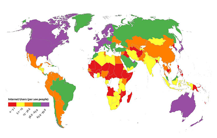
Below I’ve made two examples to show you why thinking about your data first makes color scheme selection easy. I’ve got data here showing the number of Internet Users per 100 people by country. In the first map, you see a sequential color scheme from ColorBrewer. In the second map I’ve used a categorical color scheme from ColorBrewer. Which one is super-easy to understand? The first one, right? The categorical one doesn’t work – you have to study it over and over to determine which places are high and low, respectively, and at a glance you could not interpret this map easily.
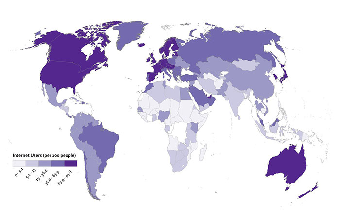
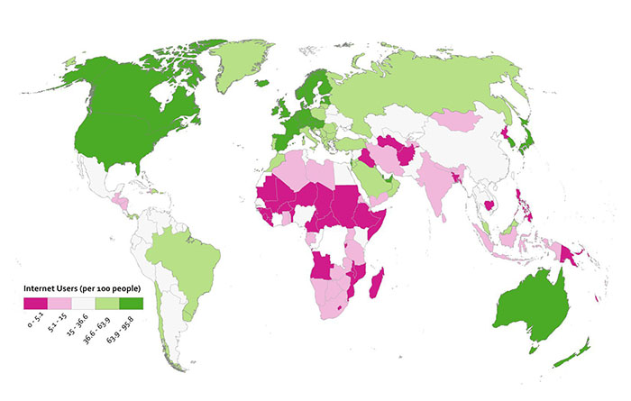
Diverging color schemes are really useful for when you want to show which places are above and below an average value. A lot of the time what you want to do with a map is to convince people to pay attention to particularly high and low outliers in your data, not the stuff that is expected or normal. You can see here what happens when I use a ColorBrewer diverging scheme for the Internet User dataset. I think you’ll agree that this works nicely to show which places are above and below the middle category.
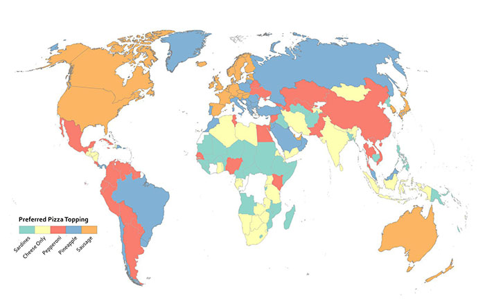
Since this is numerical data that’s not appropriate to represent with a categorical color scheme, I cooked up another example here to show you when using a categorical color scheme would make sense. I may have completely made up this data myself, or it may be absolutely accurate. You decide.
Rainbows Kill People, So Stop Using Them On Maps
Do I have your attention? Good. Resist the urge to use continuous rainbow color schemes to assign colors to things on your map. They’re formally referred to as spectral color schemes, as they typically use most of the named colors in the visible spectrum. They’re also a type of qualitative color scheme. You see them all the time on maps, and they’re a default choice of many folks when visualizing nearly anything you can imagine. They are almost always the wrong choice.
Here’s why they’re awful – 99% of the time when you see them, they have been applied to data that is sequential or divergent in nature, not qualitative. For example, they’re used a lot to show different levels of rainfall on weather maps. Ask yourself this question; how much more does purple represent than orange? See what I mean? You have to learn how to interpret data categories on a map that uses a rainbow of colors to represent something sequential (more or less rain) – it’s never intuitive. A spectral scheme also emphasizes variation where there may not be anything significant. It may also hide the variation you’re actually supposed to be revealing with your data. They don’t work well for color blind users, either. Many others (misleading maps) aside from me have elaborated on these and other reasons to stop the rainbow scourge (here’s one example (no more rainbow scales), and another (color and design)).
They’re popular in part because they result in very bold-looking, colorful maps. More exciting ≠ better when it comes to making any kind of data graphic (such as a map). It’s much more intuitive to have your color scheme match closely with the kind of data you’re using. If it’s a “less-to-more” dataset as in the rainfall example, then you should be using something that goes from a light to dark range with the same hue.
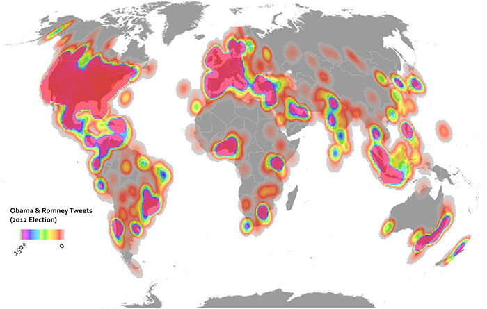
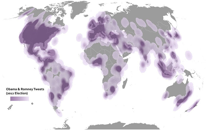
Here are two examples showing some Twitter data from the 2012 U.S. Election. In the above map I’ve used the terrible rainbow thing to symbolize my data. It looks really bright and exciting. All it’s supposed to show though is where things are high and low, so you have to study the color scheme closely to see what bright yellow means in comparison to bright purple, and so on. The map below uses a single hue increasing in saturation in a sequential manner. It’s more subtle, but it’s also more honest when it comes to showing what’s really in this data, and the reader will have no problem identifying the trend immediately.
But don’t just rely on my rant here – check out what scientists have learned from studying doctors as they try to interpret heart scanning images using spectral schemes vs. sequential schemes. Doctors make worse decisions (ones that would impact serious healthcare decisions) using rainbow color schemes. People could die, so don’t use rainbows on maps.