Closing Remarks
.jpg#metadata)
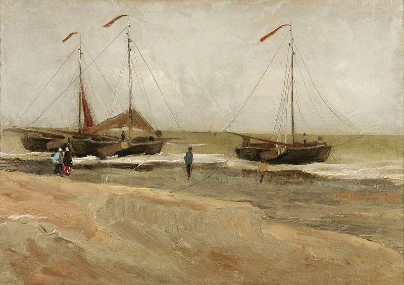
“As you can see, I am immersing myself in color—I've held back from that until now; and I don't regret it.” -Vincent van Gogh to Theo van Gogh, September 3, 1882 in speaking of a sketch of this work, The Beach of Scheveningen
Analyzing How Others Have Used Their Palettes
In this Lesson, we are quite granular in the analysis of whatever sustainability source material may be laid before us. With highly structured filings, we are able to have highly structured analyses, and with less-structured filings and information, we take a more blended and philosophical approach to extract as much meaning as possible. We are quite literally immersing ourselves in the colors of sustainability to find areas of opportunity on which to innovate. Our research is rarely a finite, directed highway, but far more often an exploration of winding and converging paths through which we find areas of interest. Many times, these areas represent opportunity.
As we have discussed before, there is this perception that creative people create. They lock themselves in rooms and somehow exude these brilliant thoughts onto their respective canvases, and that those who rely on weaknesses like "analysis" or "deconstruction" or "comparison" somehow fall short.
One would never conceive that van Gogh, arguably one of humanity's most important artists, actually thought about his work or analyzed his own creative process, correct? His letters show otherwise.
Here is an excerpt from later in the letter noted above, referring to another sketch of a wooded area:
Painting it was hard graft. There are one and a half large tubes of white in the ground — yet that ground is very dark — in addition red, yellow, brown ochre, black, terra sienna, bistre, and the result is a red-brown that varies from bistre to deep wine-red and to pale, blond reddish. Then there are also mosses and an edge of fresh grass that catches the light and sparkles brightly and is very difficult to get. There at last you have a sketch which — whatever may be said about it — I maintain has some meaning, says something.
While making it I said to myself: let me not leave before there's something of an autumn evening in it, something mysterious, something with seriousness in it.
However, because this effect doesn't last, I had to paint quickly. The figures were done with a few vigorous strokes with a firm brush — in one go. I was struck by how firmly the slender trunks stood in the ground — I began them using a brush, but because of the ground, which was already impasted, one brushstroke simply disappeared. Then I squeezed roots and trunks into it from the tube, and modeled them a little with the brush. Yes, now they stand in it — shoot up out of it — stand firmly rooted in it. In a sense I'm glad that I've never learned how to paint. Probably then I would have learned to ignore effects like this. Now I say, no, that's exactly what I want — if it's not possible then it's not possible — I want to try it even though I don't know how it's supposed to be done.
Here is one of the world's greatest painters interspersing a discussion of the tactics of colors and his attention to shaping the paint to create satisfactory trunks (and later, complaining about the cost of paint), with philosophy and his uncertainty and concern about being able to execute his final vision. This creative and strategic struggle lies at the foundation of the Clouds and Roots Model: Tangible tactics must be linked to higher level strategies and visions to be effective, and vice versa. We will spend time in what seems like frustrating and messy minutia and analysis, and then be struck with a vision of what could be possible... but then face the stark reality that it may not be possible or feasible.
What is important is that although the final products may seem beautiful and elegant and masterfully executed, the creative process is messy and far more rigorous than one might imagine.
If it were an easy, clean, or defined process, it would be paint-by-numbers. No one is remembered for their paint-by-numbers artistry.
A Modern Example of the Rigor and Analysis of Creation
In this discussion of the rigor and analysis underlying elegant, powerful, interesting creations from humble tactics and analyses, I'd like to also offer a modern example of the creative process. In this case, our look into the creative process is with Aaron James Draplin, the mind behind DDC, a one-man logo design house in Portland. He has done work for companies from K2 and Burton Snowboards to Nike, and I thought this unfiltered look into the thought and rigor underlying creation was especially illuminating. (I can tell you from experience, logo design is far, far harder than it looks.) Please watch the following 16:14 video.
Video: Aaron Draplin Takes On a Logo Design Challenge (16:14)
We'll start by me getting the lens cap off that thing from all the professionals here in the shop. Hi, I'm Aaron James Draplin, and welcome to the Draplin Design Company. Here we are. Let's get going. (rock music) Here at the Draplin Design Company, I mean, it's basically just me, doing whatever it takes to make cool stuff. (rock music) Along the way, a full line of spirited merch, plastic things with DDC all over it, and of course, Field Notes. It's just a little book, and there's some staples, and some paper, you know, and nice little edges and rounded corners.
(rock music) I am surrounded by tons and tons of things. I've had to go dig it up in the deadest, weirdest places, you know, places where you have to, like, talk to people, and other sketchy stuff like that. Out there in the world, you're digging around, you're looking at stuff, you're going to find stuff like that. (rock music) We're in this world where those programs, they offer you a million, million options, and you see too much used.
When you go back and you look at this old world, there's just sort of reminders of just a simple little logo, a simple couple little shapes. I like things that worked 40 years ago, and then work right now in the smack dab of 2014. (rock music) Okay, you guys. Lynda.com has sort of challenged me to make a logo. I picked one called All Base, right? All Base would be, and the story goes, they're from Tennessee, and there's a sort of heritage component, where they've been doing business for a lot of years.
It's slab concrete. All Base Concrete Foundations, right? What if they came to me and said, "We've been doing business for 100 years, "and we don't want to look like 2014. "We want to look like something "maybe our grandparents might have signed off on "50 or 60 years ago." With any logo, just start writing the name out. Lower case, upper case. We're just kind of taking a look at what we're working with here. Now maybe there's something about it being this heritage quality, where you're going to do this handwritten thing.
But you quickly, quickly, quickly, just this way, kind of say, well, there's maybe something there that we go explore, right? Now listen. This is sketching. This is meant to be fast and fun, and just kind of like free. Your hand is freer here than it would be on your illustrator. Now, of course, you look at that and you kind of say, that A, you know. What if we just make them a killer, burly A? It's this big slab of concrete. There's already colors that start coming to mind, these grays, maybe a little bit of earth tones, or wet concrete or something.
Right there you already have a color palette. You start making notes about stuff. So you're just kind of saying, all right, concrete, grays. You're just sort of writing stuff down. When you make this logo, there's like a sense to me that All Base needs to pretend that All Base is as big as their biggest competitor. Right? But more often than not in my life, they're smaller and crustier. Right? Design can elevate them. There's a sort of subversive quality to that. When my buddies in the band come to me, it's a fight.
It's a fight to say, "We're not funded. "How am I even getting paid?" But we're going to make them look as good, or even better, or more considered, than the guys in the major label. That's been my life forever now. The same thing sort of here. Let's go take a look at - We've looked at what things look like out there. You see a certain vernacular and a certain flavor. But what's most appropriate for these guys. What if we start making some slabs here? I'm thinking of sediment and layers and things underground and stuff.
You take a look at that thing and you say, okay, we've got a little A happening right there. There's so many ways you could take it. You think of, like, what are the basics of an A. This, this, and this. Well, if we take that guy, and there's our big old foundation. Something's coming out of that thing. Now, listen, I already hit a couple things just in the last two minutes that I wasn't expecting. That's the magic of a pencil on paper. On Field Notes.
On Field Notes. $9.95 for three, you guys. Come on, get it together. (rock music) So listen, I love books. You can see behind me I have a big old library here. But to trace back, the things that have been super critical in my half-wit career, it's two books here by Mr. Kuweyama, any which one of these pages, there's just, you can see I have beat this thing pretty good.
But there's just this sense of like ... There's just this sense of clarity. I'll just go dig around these things to look at the simplicity. Because listen, first thing to remember, all this has been done before. But yet, any one of these in the right context in 2014, it'll feel just as fresh today. Now, I don't think that works the same when you take something made in 2014, and try to go back there to the dawn of sort of like corporate design.
This is the stuff that I love. Corporate Identity Manual. It's just like, man ... Corporate's a weird word, especially in this town of Portland, Oregon. But you can't mess with the sort of bedrock of understanding how a logo works all over the world. Or let me just see if I can find something cool here. Oh, man, that is great. How to handle it. This idea of like, okay, here's this Louisiana Pacific.
They made this killer logo. But you really got to think, they're going to be on trucks. Big trucks, little trucks, sides of trucks, hoods of trucks. Here's how they go and look. It's one thing to design that logo, and have it just floating on this PDF, and you're sort of drunk of white space and negative space and just floating. Rarely will you see it that way. The way you're going to see it is on some stupid little Instagram in the corner, right? Or on a guys business card, or embroidered on his sweatshirt or something. That's where you're going to see it.
So at all times, show context, show context. (rock music) Okay, we're going to take a couple of those sketches that we busted out pretty quick, and we're just going to go try to rebuild it. So let's just start. Everything is a basic shape. So take this guy, and remember, command and dupe, and pull it off to the side. Then you kind of say, well, I want a little triangle out of my Symbols palette.
I've got these guys already built for quickness sake. So we're just going to jump in here, and kind of say, okay, let's get a color that kind of weird. Let's make a little line here. That's going to be our little separators here. Let's just get these things to snap on these edges, because all we're using is we're just going to try to go make four equal parts. There's one, two, three, four. So we'll grab these lines and pull them out.
We're going to center everything. The top line and the bottom line snap to these top and bottom edges. But we want to go through and make sure that those little guys are equidistant, so there you go. Now we're just going to be ... Before we do anything, we're going to click and drag and dupe it. Because here's the thing. When you look at that, you don't want to go and start tearing this thing apart until you, to make sure, because what if you have to take a step back. You have to make sure that you've got that thing. Because now we're going to look at that sketch. We're going to put these other little lines in here. Just real quick, real fast.
We're going to click and drag again. We're going to grab all that stuff. We're going to make it white. We've got a logo that we're already starting to build there, right? Look at that. That's starting to work. Then you can quickly take this little guy off to the side, group it all. Make a tiny little version of it, and then kind of just see how the feel. There's already something starting to happen there. Now it becomes the fun part. We've got something to work with. Now maybe that top was just a little too much.
We can take that little guy, and kind of scootch it in a little bit. Say, okay, that's cool. Now pull it off here to the side. Let those guys go white. And then start messing with some of this stuff, to make these big old slabs. So maybe there's an A that's starting to happen. But it's kind of getting this pyramid thing going. But now as you step back, that's another version right there. That's just a little different than what we were having happening right here.
So you can kind of see here. I've built this thing pretty quick. When you go look at your outline version, all that math is all nice and intact. You've got it live. Always keep it live. Because now if we go grab a piece of type, something's starting to happen already. It's just some big extended Akzidenz-Grotesk. So now to quickly take a look at that thing and say, wait a second. I kind of liked this one sketch where I had the A kind of working off some of the different pieces back there.
Let's go plop one in there. So we'll go grab a little triangle. We just started one right here. We're going to get rid of this guy. We're going to snap it to the bottom of here. We're going to get that thing in there. We're going to bring it down. We'll get rid of this other guy, and kind of say, okay, now we're getting into some zones here. You kind of say, all right. Maybe it's a little too much. But remember, now we've got those pieces. We can always go back to where we were.
So we can go back and say, all right. Let's try this real quick. You can take a version over here, and just quickly say, well, let's go try it to where we have the triangles on the inside of there also. So quick ways to do it are just go through, flatten that guy. What do you call it? What do you even call that thing? Just sort of minus front. Go grab those two right there.
This is just to be fast, because the math isn't going to be totally perfect. But if you got your math right, things might start to feel good. You can see here, I was doing this. All these angles were all the same, because I was using parts and pieces to subtract and minus and kind of pathfind my way out of it. You start hitting right here, you're saying, all right, man. We've got an A. We've got a little base. There's your All Base A, maybe. As we're working through this stuff, there's all sorts of pieces you can start building. Now I put it in some shapes.
I put a little type next to it. You can see there. Man, that thing's feeling pretty good. As I start working my way over, it's like, what if there's a gradation? What if there's this little base part that's a little bit darker? We've got some quick ideas of what this thing could be. There it is working in concrete. Here it is laid over a photo. Here it is as just a nice shape, and then a nice piece of type next to it. If the type isn't, if we're not feeling it, okay, that's okay, that's okay.
Because there's a lot of ways you can do it. You can do it something like this, and bring this guy in a little bit smaller, and just let it be, like, there's your patch on your hat, already done. But the cool part is, if we pull this guy out of here, it'll work that way, too. As a way to test this stuff, I have all these things built in my symbol palettes, just to kind of say, all right. Those first t-shirts for all the worker guys there.
We're just going to make some shirts for the dudes out loading up the cement. Bam. You know, we were hitting something over here, and maybe that's it right there. That might feel like a little tent or something, but we're just going fast. Now let's just grab this guy real quick, and plop something in there. Now it's not going to be quite right. But when you take this guy, and put that guy on a t-shirt, and you can kind of say, wow, man, that might work, too.
That might work, too. The thicknesses need a little bit of work. But I left all those guys live in there. So you can kind of take this and say, all right, I want that thickness to be brought up just a little bit more, so there's all three equidistant pieces. There's something starting to happen. If it isn't feeling right, you can kind of take a look at what these things could be. Here it is sort of 1960. Here's a big old house industries. Maybe to modernize this thing, if you look at some of these characters, they're these nice, big, chiseled edges.
There might be something there. Let's just get those colors all feeling right. Make sure it's all nice and centered up. You know, somethings starting to happen. At all time, as you're going through, what we're going to do is we're going to quickly take another big blast of color, and see what it feels like on a dark value. So at all times you want to make sure that this thing feels good on a dark value also.
Nowith you kind of say, well, that's kind of hard to read. That's kind of hard to read. So, okay, let's give it just a little bit of hierarchy. There's our logo. Here's our name. Stuff is starting to happen. (light rock music) That was what? A couple minutes of sketching. Bring it into the machine. Tuning things up. Seeing how things felt. I know if I go another 20 minutes, or another couple of days, that we're going to hit something and be able to show them seven, eight strong directions.
Complete with a nice rationale of why we did what we did, and what we were thinking. It's kind of like a volume knob. To kind of say, here it is, what we think it could work right now. But we get out into the ether a little bit, and it might be really fun that way. That's just sort of my job to show them a range. It all comes from here, and then quickly building it here, and then getting into a nice presentation, and well, sealing a deal. (rock music) When I went freelance in 2004 it was hard to leave, because you left health insurance.
You left 401K's. But equally my horizon opened, to where I could take on little crusty things, and then take on things that were maybe for no money. But later on trick design into hiring me. So that leap for me was just sort of like, it just really freed me up. Has freelance always been perfect? Not even close, you know. I've had guys stiff me. The client completely do like a big old 180, and you lose all the work you've done. But that's what we're up against.
I've found that in my life, working for myself, working with my buddies, has been just more, like a reason to want to get up in the morning. I feel better about it. I feel excited. I feel engaged. I can dream. I turned 40, and your bones hurt, and your back hurts, and your feet hurt, and whatever the hell else. It doesn't matter, because I need to make some new little logo for something. I can't wait to see how the sticker turned out, with the cool little kiss cut in the back, as much as the poster with six colors and flash printing and weird paper, and then how to ship them here.
Every time I turn around, there's something to deal with here. I love that little world I've sort of built for myself.
Our approach to deconstruction and analysis needs to be just as thought out and rationed as our creative process. This is why we devote a significant part of our time together to analysis, philosophy, and theory. In our next lesson, we take the next step–merging the analytical and the creative as we classify the results of our research and analysis into clusters of opportunity we refer to as White, Gray, and Black Spaces.
Applying Our Analytical Lens
To refresh ourselves, our goals specifically for this Lesson are to:
- critically evaluate sustainability filings and stated strategies through the lens of an organization's stated mission, vision, and values;
- articulate the role GRI plays–and does not play–in an organization's sustainability reporting;
- analyze filings through omission, indicator, narrative, and commission analyses;
- propose public sustainability filings as a platform for innovation and competitive advantage;
- discern what the major filings do–and do not–require an organization to do to comply.
To these ends, this week's case will allow us to open the palette a bit and find our own areas of interest and perform our own critical analysis using available data.