Global Energy Consumption
Since we are going to be modeling the future of global energy consumption, we should first familiarize ourselves with the recent history of energy consumption.
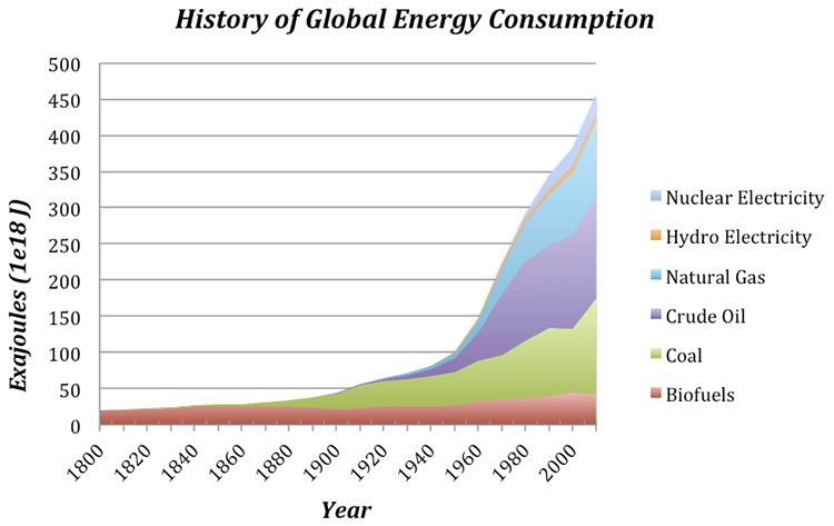
Question: Why has our energy consumption increased over this time period?
Here, we will explore a few possibilities, the first of which is global population increase — more people on the planet leads to a greater total energy consumption. To evaluate this, we need to plot the global population and the total energy consumption on the same graph to see if the rise in population matches the rise in energy consumption.
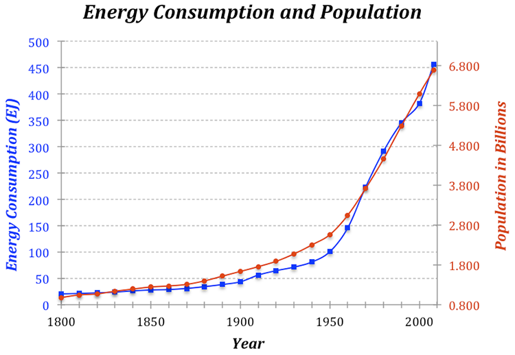
The two curves match very closely, suggesting that population increase is certainly one of the main reasons for the rise in energy consumption. But is it as simple as that — more people equals more energy consumption?
If the rise in global energy consumption is due entirely to population increase, then there should be a constant amount of energy consumed per person — this is called the per capita energy consumption. To get the per capita energy consumption, we just need to divide the total energy by the population (in billions) — so we’ll end up with Exajoules of energy per billion people.
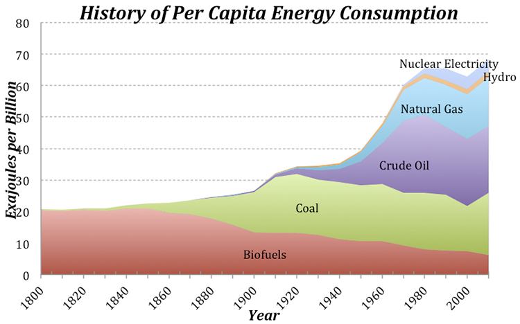
Today, we use about 3 times as much energy per person than in 1900, which is not such a surprise if you consider that we have many more sources of energy available to us now compared to 1900. Note that at the same time that the population really takes off (see Fig. 5), the per capita energy consumption also begins to rise. This means that the total global energy consumption rises due to both the population and the demand per person for more energy.
Let’s try to understand this per capita energy consumption a bit better. We know that the global average is 74 EJ per billion people, but how does this value change from place to place? There are some huge variations across the globe — Afghans use about 4 GJ per person per year, while Icelanders use 709 GJ per person. Why does it vary so much? Is it due to the level of economic development, or the availability of energy, or the culture, or the climate? You can come up with reasons why each of these factors (and others) might be important, but let’s examine one in more detail — the economic development expressed as the GDP (the gross domestic product, which reflects the size of the economy) per capita.
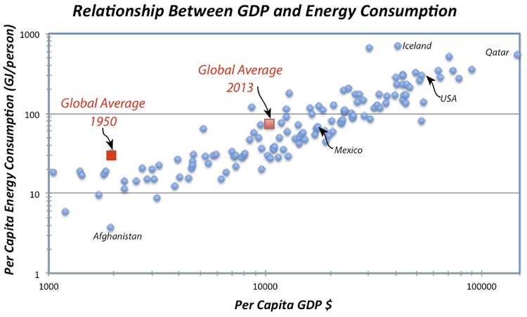
The obvious linear trend to these data suggests that per capita energy consumption is a function of GDP, while the fact that it is not a tight line tells us that GDP is not the whole story in terms of explaining the differences in energy consumption. Not surprisingly, we are near the upper right of this plot, consuming more than 300 GJ per person per year. Iceland’s economy is not as big per person as ours and yet they consume vast amounts of energy per person, partly because it is cold and they have big heating demands, but also because they have abundant, inexpensive geothermal energy thanks to the fact that they live on a huge volcano. Many European countries with strong economies (e.g., Germany) use far less energy per person than we do (168 GJ compared to our 301 GJ), in part because they are more efficient than us and in part because they are smaller, which cuts down on their transportation. A big part of the reason they are more efficient than us is that energy costs more over there — for instance, a gallon of gas in Italy is about $8. Our neighbor, Mexico, has a per capita energy consumption that is just about the global average.
Pay attention to the two red squares in Fig. 7 — these show the global averages in terms of GDP and energy consumption per person for two points in time. The trend is most definitely towards increasing GDP (meaning increasing economic development) and increasing energy consumption per person. Economic development is definitely a good thing because it is tied to all sorts of indicators of a higher quality of life — better education, better health care, better diet, increased life expectancy, and lower birth rates. But, economic growth has historically come with higher energy consumption, and that means higher carbon emissions.
Now that we’ve seen what some of the patterns and trends are, we are ready to think about the future.