Environmental scientists and engineers consider many geological, climatological, hydrological, and surface and subsurface land use criteria to determine whether a plot of land is suitable or unsuitable for a LLRW facility. Each criterion can be represented with geographic data, and visualized as a thematic map. In theory, the site selection problem is as simple as compiling onto a single map all the disqualified areas on the individual maps, and then choosing among whatever qualified locations remain. In practice, of course, it is not so simple.
There is nothing new about superimposing multiple thematic maps to reveal optimal locations. One of the earliest and most eloquent descriptions of the process was written by Ian McHarg, a landscape architect and planner, in his influential book Design With Nature. In a passage describing the process he and his colleagues used to determine the least destructive route for a new roadway, McHarg (1971) wrote:
...let us map physiographic factors so that the darker the tone, the greater the cost. Let us similarly map social values so that the darker the tone, the higher the value. Let us make the maps transparent. When these are superimposed, the least-social-cost areas are revealed by the lightest tone. (p. 34).
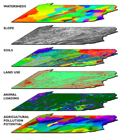
The process that McHarg describes has become known as map overlay. Storing digital data in multiple "layers" is not unique to GIS; computer-aided design (CAD) packages and even spreadsheets also support layering. What's unique about GIS, and important about map overlay, is its ability to generate a new data layer as a product of existing layers. In the example illustrated in Figure 9.3 below, analysts at Penn State's Environmental Resources Research Institute estimated the agricultural pollution potential of every major watershed in the state by overlaying watershed boundaries, the slope of the terrain (calculated from USGS DEMs), soil types (from U.S. Soil Conservation Service data), land use patterns (from the USGS LULC data), and animal loading (livestock wastes estimated from the U.S. Census Bureau's Census of Agriculture).
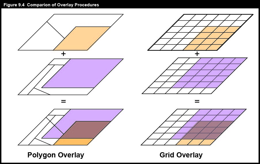
As illustrated in Figure 9.4, map overlay can be implemented in either vector or raster systems. In the vector case, often referred to as polygon overlay, the intersection of two or more data layers produces new features (polygons). Attributes (symbolized as colors in the illustration) of intersecting polygons are combined. The raster implementation (known as grid overlay) combines attributes within grid cells that align exactly. Misaligned grids must be resampled to common formats.
Polygon and grid overlay procedures produce useful information only if they are performed on data layers that are properly georegistered. Data layers must be referenced to the same coordinate system (e.g., the same UTM and SPC zones), the same map projection (if any), and the same datum (horizontal and vertical, based upon the same reference ellipsoid). Furthermore, locations must be specified with coordinates that share the same unit of measure.