Required Reading:
- Chapter 8, "Point Patterns and Cluster Detection," pages 247 - 260.
- Chapter 2.4, "Moving window/kernel methods", pages 28 - 30
Introduction to point patterns
It should be pointed out that the distinction between first- and second-order effects is a fine one. In fact, it is often scale-dependent, and often an analytical convenience, rather than a hard and fast distinction. This becomes particularly clear when you realize that an effect that is first-order at one scale may become second-order at a smaller scale (that is, when you 'zoom out').
The simplest example of this is when a (say) east-west steady rise in land elevation viewed at a regional scale is first-order, but zooming out to the continental scale, this trend becomes a more localized topographic feature. This is yet another example of the scale-dependence effects inherent in spatial analysis and noted in Lesson 1 (and to be revisited in Lesson 4).
A number of different methods can be used to analyze point data. These range from exploratory data analysis methods to quantitative statistical methods that take distance into consideration. A summary of these methods are provided in Table 3.1.
|
PPA Method |
Points 
Figure 3.2
Credit: Blanford, 2019
|
Kernel Density Estimate 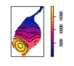
Figure 3.3
Credit: Blanford, 2019
|
Quadrat Analysis 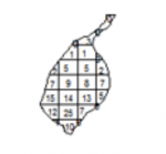
Figure 3.4
Credit: Blanford, 2019
|
Nearest Neighbour Analysis 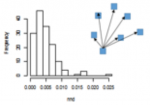
Figure 3.5
Credit: Blanford, 2019
|
Ripley's K 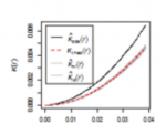
Figure 3.6
Credit: Blanford, 2019
|
|---|---|---|---|---|---|
| Description | Exploratory Data Analysis Measuring geographic distributions Mean Center; Central/Median Center Standard Distance; Standard Deviation/Standard Deviational Ellipse |
Exploratory Data Analysis Is an example of "exploratory spatial data analysis" (ESDA) that is used to "visually enhance" a point pattern by showing where features are concentrated. |
Exploratory Data Analysis Measuring intensity based on density (or mean number of events) in a specified area. Calculate variance/mean ratio |
Distance-based Analysis |
Distance-based Analysis Measures spatial dependence based on distances of points from one another. K (d) is the average density of points at each distance (d), divided by the average density of points in the entire area. |
Density-based point pattern measures [pages 28-30, 247-249, 256-260]
It is worth emphasizing the point that quadrats need not be square, although it is rare for them not to be.
With regard to kernel density estimation (KDE) it is worth pointing out the strongly scale-dependent nature of this method. This becomes apparent when we view the effect of varying the KDE bandwidth on the estimated event density map in the following sequence of maps, all generated from the same pattern of Redwood saplings as recorded by Strauss, and available in the spatstat package in R (which you will learn about in the project). To begin, Table 3.2 shows outputs created using a large, intermediate and small bandwidth.
| Bandwidth = 0.25 | Bandwidth = 0.01 | Bandwidth = 0.05 |
|---|---|---|
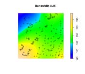
Figure 3.7
Credit: O'Sullivan
|
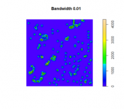
Figure 3.8
Credit: O'Sullivan
|
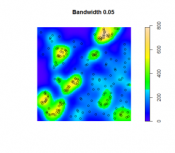
Figure 3.9
Credit: O'Sullivan
|
| Using a larger KDE bandwidth results in a very generalized impression of the event density (in this example, the bandwidth is expressed relative to the full extent of the square study area). A large bandwidth tends to emphasize any first-order trend variation in the pattern (also called oversmoothing). | The map generated using a small KDE bandwidth is also problematic, as it focuses too much on individual events and small clusters of events, which are self-evident from inspecting the point pattern itself. Thus, an overly small bandwidth does not depict additional information beyond the original point pattern (also called undersmoothing). | An intermediate choice of bandwidth results in a more satisfactory map that enables distinct regions of high event density and how that density changes across space to be identified. |
The choice of the bandwidth is something you will need to experiment. There are a number of methods for 'optimizing' the choice, although these are complex statistical methods, and it is probably better to think more in terms of what distances are meaningful in the context of the particular phenomenon being studied. For example, think about the scale at which a given data set is collected or if there is a spatial association to some tangible object or metric. Here is an interesting interactive web page visualizing the KDE density function. Here is a good overview of bandwidth selection discussing how bandwidth values affect plot smoothness, techniques for bandwidth value selection, cross validation techniques, the differences between the default bandwidth value in languages like R and SciPy.
Distance-based point pattern measures [pages 249-255]
It may be helpful to briefly distinguish the four major distance methods discussed here:
- Mean nearest neighbor distance is exactly what the name says!
- G function is the cumulative frequency distribution of the nearest neighbor distance. It gives the probability for a specified distance, that the nearest neighbor distance to another event in the pattern will be less than the specified distance.
- F function is the cumulative frequency distribution of the distance to the nearest event in the pattern from random locations not in the pattern.
- K function is based on all inter-event distances, not simply nearest neighbor distances. Interpretation of the K function is tricky for the raw figures and makes more sense when statistical analysis is carried out as discussed in a later section.
The pair correlation function (PCF) is a more recently developed method that is not discussed in the text. Like the K function, the PCF is based on all inter-event distances, but it is non-cumulative, so that it focuses on how many pairs of events are separated by any particular given distance. Thus, it describes how likely it is that two events chosen at random will be at some particular separation.
It is useful to see these measures as forming a progression from least to most informative (with an accompanying rise in complexity).
Assessing point patterns statistically
The measures discussed in the preceding sections can all be tested statistically for deviations from the expected values associated with a random point process. In fact, deviations from any well-defined process can be tested, although the mathematics required becomes more complex.
The most complex of these is the K function, where the additional concept of an L function is introduced to make it easier to detect large deviations from a random pattern. In fact, in using the pair correlation function, many of the difficulties of interpreting the K function disappear, so the pair correlation function approach is becoming more widely used.
More important, in practical terms, is the Monte Carlo procedure discussed briefly on page 266. Monte Carlo methods are common in statistics generally, but are particularly useful in spatial analysis when mathematical derivation of the expected values of a pattern measure can be very difficult. Instead of trying to derive analytical results, we simply make use of the computer's ability to randomly generate many patterns according to the process description we have in mind, and then compare our observed result to the simulated distribution of results. This approach is explored in more detail in the project for this lesson.