Distance Based Analysis with Monte Carlo Assessment
The real workhorses of contemporary point pattern analysis are the distance-based functions: G, F, K (and its relative L) and the more recent pair correlation function. spatstat provides full support for all of these, using the built-in functions, Gest(), Fest(), Kest(), Lest() and pcf(). In each case, the 'est' suffix refers to the fact the function is an estimate based on the empirical data. When you plot the functions, you will see that spatstat actually provides a number of different estimates of the function. Without getting into the details, the different estimates are based on various possible corrections that can be applied for edge effects.
To make a statistical assessment of any of these functions for our patterns, we need to compare the estimated functions to those we expect to see for IRP/CSR. Given the complexity involved, the easiest way to do this is to us the Monte Carlo method to calculate the function for a set of simulated realizations of IRP/CSR in the same study area.
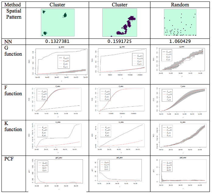
This is done using the envelope() function. Figure 3.10 shows examples of the outputs generated from the different functions for different spatial patterns.
What do the plots show us?
Well, the dashed red line is the theoretical value of the function for a pattern generated by IRP/CSR. We aren't much interested in that, except as a point of reference.
The grey region (envelope) shows us the range of values of the function which occurred across all the simulated realizations of IRP/CSR which you see spatstat producing when you run the envelope function. The black line is the function for the actual pattern measured for the dataset.
What we are interested in is whether or not the observed (actual) function lies inside or outside the grey 'envelope'. In the case of the pair correlation function, if the black line falls outside the envelope, this tells us that there are more pairs of events at this range of spacings from one another than we would expect to occur by chance. This observation supports the view that the pattern is clustered or aggregated at the stated range of distances. For any distances where the black line falls within the envelope, this means that the PCF falls within the expected bounds at those distances. The exact interpretation of the relationship between the envelope and the observed function is dependent on the function in question, but this should give you the idea.
NOTE: One thing to watch out for... you may find that it's rather tedious waiting for 99 simulated patterns each time you run the envelope() function. This is the default number that are run. You can change this by specifying a different value for nsim. Once you are sure what examples you want to use, you will probably want to do a final run with nsim set to 99, so that you have more faith in the envelope generated (since it is based on more realizations and more likely to be stable). Also, you can change the rank setting. This will mean that the 'high' and 'low' lines in the plot will be placed at the corresponding high or low values in the range produced by the simulated realizations of IRP/CSR. So, for example:
> G_e <- envelope(xhomicide, Gest, nsim=99, nrank=5)
will run 99 simulations of and place high and low limits on the envelope at the 5th highest and 5th lowest values in the set of simulated patterns.
Something worth knowing is that the L function implemented in R deviates from that discussed in the text, in that it produces a result whose expected behavior for CSR is a upward-right sloping line at 45 degrees, that is expected L(r) = r, this can be confusing if you are not expecting it.
One final (minor) point: for the pair correlation function in particular, the values at short distances can be very high and R will scale the plot to include all the values, making it very hard to see the interesting part of the plot. To control the range of values displayed in a plot, use xlim and ylim. For example:
> plot(pcf_env, ylim=c(0, 5))
will ensure that only the range between 0 and 5 is plotted on the y-axis. Depending on the specific y-values, you may have to change the y-value in the ylim=() function.
Got all that? If you do have questions - as usual, you should post them to the Discussion Forum for this week's project. Also, go to the additional resources at the end of this lesson where I have included links to some articles that use some of these methods. Now, it is your turn to try this on the crime data you have been analyzing.
#Distance-based functions: G, F, K (and its relative L) and the more recent pair correlation function.  Gest(), Fest(), Kest(), Lest(), pcf()

#For this to run you may want to use a subset of the data otherwise you will find yourself waiting a long time.

g_env <-Gest(xhomicide)
plot(g_env)

#Add an envelope
#remember to change nsim=99 for the final simulation

#initializing and plotting the G estimation
g_env <-envelope(xhomicide, Gest, nsim=5, nrank=1)
plot(g_env)

#initializing and plotting the F estimation
f_env <- envelope(xhomicide, Fest, nsim=5, nrank=1)
plot(f_env)

#initializing and plotting the K estimation
k_env <-envelope(xhomicide, Kest, nsim=5, nrank=1)
plot(k_env)

#initializing and plotting the L estimation
l_env <- envelope(xhomicide, Lest, nsim=5, nrank=1)
plot(l_env)

#initializing and plotting the pcf estimation
pcf_env <-envelope(xhomicide, pcf, nsim=5, nrank=1)
# To control the range of values displayed in a plot's axes use xlim= and ylim= parameters
plot(pcf_env, ylim=c(0, 5))
Repeat this for the other crimes that you selected to analyze.