The first thing you want to do is find out what area is served by each store. The company has learned that customers demand their sushi within 20 minutes of ordering it. Twelve minutes are typically required to make the food, and eight minutes are allotted for delivery. Let’s find out the areas that lie within an eight-minute drive of each store.
- In the ArcGIS.com map viewer, open your Delivery analysis map from the previous section of the lesson.
- Click the Analysis button, which is up on the top menu next to the basemap selector.
- Expand Use Proximity and click Create Drive-Time Areas.
- Change the drive time to 8 minutes, and leave all the other default settings. Notice, however, that there are lots of options for taking into account live and historical traffic. With all this information available on the back end, you can imagine developers writing apps where a route could be calculated using current traffic conditions.
- Click Run Analysis, and wait for a minute for the result to be calculated. You should eventually see some irregularly-shaped polygons appear around each store, showing the area that can be reached within an 8 minute drive of each. These “service area” polygons were not derived from any street data we uploaded, nor did they come from the basemap, which is just an image. They did come from detailed street network data that Esri has assembled for use by its cloud services.
- Change the symbol of the drive time polygons to be about 35% transparent. Note that the layer itself is already 50% transparent, but we want to apply transparency on the individual polygons so that we can better see where there is overlap.
Another way to get a feel for the overlap is by selecting individual polygons. You can do this from the attribute table as described in the next steps.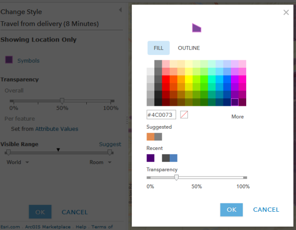 Figure 8.1: Adjusting symbol transparency in ArcGIS Online
 - Click the Show Table icon that appears if you hover your mouse underneath the Travel from delivery layer.
- Click a row in the table to see the corresponding polygon highlighted on the map. This table is also useful because it shows you the number of square kilometers covered by each polygon.
- Look through the table and the map, and consider the following questions: Which store covers the smallest amount of area, and how many square kilometers is this area? Which store covers the largest area? Where is there a lot of overlap between store coverage? Where are there gaps?
- Save your map.
Note that creating service area polygons in ArcGIS Online is not free. Your ArcGIS Online account was just charged some credits for using this service. Fortunately, the Penn State ArcGIS Online organization, of which we are members, is providing the credits to us and we don't need to worry about it. In your own production setting, however, it's good practice to be aware of how many credits an operation will consume before you run it. To learn how many credits all the different operations on ArcGIS Online cost, take a look at the Esri service credits page. At the time of this writing, it says that it costs 0.5 credits per drive time. In the next part of the lesson we will use Data Enrichment, which is listed as 10 credits per 1,000 attributes (data variables).
The service area polygons we calculated were interesting and somewhat useful, but the raw area of the polygon alone is not enough to help us get a feel for the underlying population served. Parts of the city are much more densely populated than others. Also, people in some neighborhoods tend to eat out more than others. Some neighborhoods might also have a higher density of smartphone usage where people would be inclined to order using your app. We’ll explore these variables in the next section of the lesson.