Lesson 5 - Modeling of the Climate System, part 2
Introduction
About Lesson 5
In this lesson, we will continue with our investigation of climate models. We will investigate more complex models of the climate system than in the previous lesson. We will first investigate a slightly more complex version of the EBM encountered in Lesson 4, where we explicitly insert an atmospheric layer above the Earth's surface. We will consider models that represent the full three-dimensional geometry of the Earth system, and model atmospheric winds and ocean currents, patterns of rainfall, and drought, and other key attributes of the climate system. We will also explore the concept of 'fingerprint detection'—a method that allows us to compare model predictions against observations to discern whether or not the signal of anthropogenic climate change can already be detected.
What will we learn in Lesson 5?
By the end of Lesson 5, you should be able to:
- Describe the hierarchy of theoretical climate models, the underlying assumptions, caveats, and strengths and weaknesses of various climate modeling approaches;
- Discuss both the strengths and limitations of current-generation climate models;
- Speak to the issue of how climate models have been 'validated';
- Assess the relative roles of human vs. natural impacts on climate, based on experiments with climate models;
- Assess the state of our current knowledge regarding the equilibrium climate sensitivity of Earth.
What will be due for Lesson 5?
Please refer to the Syllabus for specific time frames and due dates.
The following is an overview of the required activities for Lesson 5. Detailed directions and submission instructions are located within this lesson.
- Read:
- IPCC Sixth Assessment Report, Working Group 1 -- Summary for Policy Makers (link is external) [1]
- Possible Climate Futures: p. 12-23
- Dire Predictions, v.2: p. 36-37, 100-101, 110-111, 148-149
- IPCC Sixth Assessment Report, Working Group 1 -- Summary for Policy Makers (link is external) [1]
- Problem Set #4
Questions?
If you have any questions, please post them to our Questions? discussion forum (not e-mail), located under the Home tab in Canvas. The instructor will check that discussion forum daily to respond. Also, please feel free to post your own responses if you can help with any of the posted questions.
One-Layer Energy Balance Model
We can increase the complexity of the zero-dimensional model by incorporating the atmospheric greenhouse effect in a slightly more realistic manner than is embodied by the ad hoc gray body model explored in the previous lecture. We now include an explicit atmospheric layer in the model, which has the ability to absorb and emit infrared radiation.
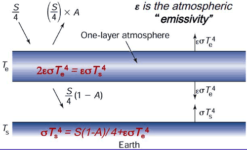
We will approximate the emissivity of Earth's surface as one, that is, we will assume that The Earth's surface emits radiation as a black body. The atmosphere itself has a lower but non-zero emissivity, i.e., it emits a fraction of what a black body would emit at a given temperature. This emissivity is due to property of greenhouse gases within the atmosphere, and we will denote this atmospheric emissivity by (not to be confused with the epsilon of previous lessons which was associated with the emissivity of Earth's surface, which we are approximating here as unity!). According to Kirchhoff's Law, at thermal equilibrium, the emissivity of a body equals its absorptivity (i.e., the fraction of incident radiation that is absorbed by the body). Therefore, is also a measure of the efficiency of the atmosphere's absorption of any infrared radiation (IR) incident upon it. IR radiation that is not absorbed by the atmosphere is transmitted through it; therefore, is the fraction of incident IR radiation that is transmitted through the atmosphere without being absorbed.
An of zero corresponds to no greenhouse effect at all, while an of unity corresponds to a perfect IR absorber, i.e., a perfect greenhouse effect. The true greenhouse effect is, of course, somewhere in between, i.e.,
We denote the effective albedo of the Earth system (i.e., the portion of incoming solar radiation immediately reflected back to space) as A, and we will now distinguish between the atmospheric temperature (which we will envision as representing the mid-troposphere, somewhere around 5.5 km above the surface where roughly half the atmosphere by mass lies below) and the surface temperature TS.
is related to, but not equivalent to, another quantity known as the effective radiating temperature, which we will denote as . is the temperature the Earth would have if it were a black body, i.e., if there were no greenhouse effect. It can be thought of as the temperature at the effective height in the atmosphere from which Earth is radiating infrared radiation back to space. In the limit of a perfectly emissive atmosphere ( ), as you can verify from our mathematical treatment below, we would have the equality = .
You may recall from our earlier discussion (in Lesson 1 [2]) of the vertical structure of the atmosphere, that atmospheric temperatures cool on average roughly in the troposphere — what is known as the standard lapse rate.
For the approximate current value of the solar constant S = 1370 W / m2, we saw in Lesson 4 that the black body temperature, i.e., the effective radiating temperature , is roughly 255 K [3].
Think About It!
Given that the Earth's average surface temperature is = 288 K, the effective radiating temperature is = 255 K, and the standard lapse rate is , can you determine the effective radiating level in the atmosphere?
Click for answer.
This is at the level of the mid-troposphere.
We can now express the condition of energy balance at each level in our simplified model of the Earth:
- The top of the atmosphere
- The atmospheric layer, which we can think of as centered in the mid-troposphere
- The surface
Balancing incoming and outgoing radiation at the top of the atmosphere gives:
Balancing incoming and outgoing radiation from the atmospheric layer gives :
- (Note that short wave radiation is not included in this balance because the atmosphere does not absorb in short wave range.)
Finally, balancing incoming and outgoing radiation at the surface gives:
Solving the system of equations for and gives:
Or more simply
Let us use the standard values of A = 0.3 and S = 1370 W / m2.
- If we take = 0 (which is equivalent to there being no greenhouse effect), we get our original blackbody result = 255 K = -18°C. Too cold!
- If we take = 1 (which is equivalent to a perfectly IR absorbing atmosphere), we get the result = 303 K = 30°C. Too warm!
- However, if we take = 0.77 (i.e., the atmosphere absorbs 77% of the IR radiation incident upon it), we get a result, = 288 K = 15°C. Just right!
Using (7) and = 288 K, we also get the result = 242 K. This is modestly lower than the effective radiating temperature = 255 K, indicating that it is found at about 5.5 km — a modestly higher level in the atmosphere than 5.1 km that you calculated earlier.
Of course, this model is still rather simplistic. For one thing, it only takes into account short wave and long wave radiation. We haven't accounted for important processes involved in the energy budget of the actual atmosphere and surface, which includes convection, latent heating, and the effect of large-scale motion.
We can nonetheless add some further realism to the model by incorporating some of the feedbacks we have discussed [4] previously. In Problem Set 4 you will investigate a slightly more sophisticated version of the standard one-layer model. The model allows for the contribution of clouds to both the Earth's albedo and the longwave absorptive properties of the atmosphere in a very rough way. It also accounts for the positive ice albedo and water vapor feedbacks in a very rough manner.
Each of the feedbacks in the model will be expressed in the form of a feedback factor that you can vary. A feedback factor measures the relative magnitude of a feedback in terms of the amplitude of the response relative to the original forcing. If the response is equal in magnitude to the original forcing, there is no feedback, and the feedback factor is zero. If the response is double that of the original forcing, the feedback factor is one. For example, if a warming of 1°C due to doubling alone causes an increase in water vapor content that adds an additional equilibrium warming of 2°C, so that the net warming is 3°C, the water vapor feedback factor would be two. Feedback factors can be specified for a particular feedback (e.g., the water vapor feedback), or for the sum over all feedbacks under consideration (e.g., water vapor feedback, ice albedo feedback, and cloud feedback). For example, suppose that the initial 1°C warming, which led to 2°C warming due to water vapor feedback, also led to an increase primarily in low cloud cover, which added a relative cooling of -0.5°C, and a melting of ice, which added an additional relative warming of 1°C. Then the cloud feedback factor would be -0.5, the ice albedo feedback factor would be 1.0, and the net feedback factor would be 2 - 0.5 + 1 = 2.5! Alternatively, we could compute the overall feedback factor by taking the total warming (initial 1°C warming + 2°C - 0.5°C + 1°C = 3.5°C) divided by the initial warming, minus one, i.e., (3.5°C/1°C) - 1 = 2.5. The equilibrium climate sensitivity in this case would be 3.5.
While we have measured the feedback factors in terms of the temperature responses, one could also compute these factors in terms of the associated radiative forcing. For example, we know from earlier in the course that the radiative forcing due to doubling is roughly 3.7W/m2. Suppose that the increased greenhouse forcing associated with the water vapor feedback led to an additional downward long wave radiative flux of 7.4 W/m2 (and let us assume for this example that the other feedbacks are zero). Then the water vapor feedback factor would be 7.4/3.7 which is, again, two. The total downward radiative forcing would be 3.7W/m2 +7.4W/m2 =11.1 W/m2 total downward and the overall feedback factor would be 11.1/3.7 - 1 = 2!
Video: One Layer Energy Balance Model (3:56)
PRESENTER: Here is our One Layer Energy Balance Model. Right now it's set for the default settings of the various feedback factors.
The cloud feedback factor is set at a modestly negative value of minus 0.83. The water vapor feedback factor is 2. And the ice albedo feedback factor is 0.5. So these two, the water vapor feedback and the ice albedo feedback, are set at positive values. The cloud ready to feedback is set at a negative value.
And these values are roughly equal to the best current estimates of what those feedback factors are. And so using those default settings gives us sort of a mid-range climate sensitivity. And you'll look at that in your problem set.
So you can calculate the climate sensitivity of course by varying the CO2. And the CO2 can be varied with this lever here. Pre-industrial levels, 280 parts per million. Obviously 560 PPM is twice pre-industrial. If you like, you can even set values outside these ranges by going to the box down below. For example, I could set the CO2 level at 700 PPM.
And we can see the initial temperature-- surface temperature-- to 88k for the standard default settings. The new surface temperature, 292, that was a 4.1 degree warming of the surface. The atmosphere itself-- the mid troposphere-- warmed somewhat less, 3.4k.
We can see what the longwave and the shortwave forcings are. So these are estimates of the radiative forcing due to the combination of the direct influence of changing the CO2 levels, plus the various feedbacks-- the water vapor feedback, increasing the greenhouse gas concentration, giving us longwave forcing, that adds to the longwave forcing from the increase in CO2 alone.
The ice albedo feedback playing into the shortwave forcing. The cloud radiative feedback can influence both a combination of shortwave and long wave forcing. There's the cloud albedo effect, which tends to be a negative feedback. But there's also the greenhouse gas-like properties of clouds, the infrared absorbing properties of clouds which gives us a positive feedback. And as we vary this feedback factor, we can transition from where the negative cloud radiative feedbacks dominate to where the positive cloud feedback dominate.
We can see how the albedo changes as we vary the shortwave feedbacks. We can see how the atmospheric emissivity changes. For example, as we change the CO2 level, the default emissivity in this model being 0.77-- the value that gives us a surface temperature about 280k, the current best estimate of Earth's surface temperature.
Finally, if we like we can vary the solar constant. We can vary the initial albedo-- Earth's planetary albedo-- which will of course be modified as we change some of the feedback factors.
So that's how it works. You're going to explore this model further in your problem set.
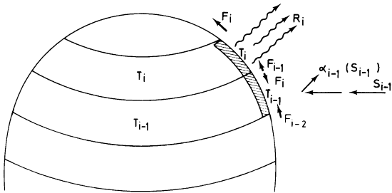
One-Dimensional Energy Balance Model
There are many ways one can generalize upon the zero-dimensional EBM. As we saw in the previous section, we can try to resolve the additional, vertical degree of freedom in the climate system through a very simple idealization—the one layer generalization of the zero-dimensional EBM. If for no other reason than the fact that the incoming solar radiation is symmetric with respect to longitude, but varies quite dramatically with latitude, the latitudinal degree of freedom is the next most important property to resolve if we wish to obtain further insights into the climate system using a still relatively simple and tractable model.
That brings us to the concept of the one-dimensional energy balance model, where we now explicitly divide the Earth up into latitudinal bands, though we treat the Earth as uniform with respect to longitude. By introducing latitude, we can now more realistically represent processes like ice feedbacks which have a strong latitudinal component, since ice tends to be restricted to higher latitude regions.
Recall that we had, for the linearized zero-dimensional gray body EBM, a simple balance [3]:
- where is the Earth's albedo and A and B are coefficients for the linearized representation of the 4th degree term.
Generalizing the zero-dimensional EBM, we can write a similar radiation and energy balance equation for each latitude band i:
- where represents each latitude band.
We have now introduced some extremely important generalizations. The temperature , albedo , and incoming solar radiation are now functions of latitude, allowing us to represent the disparity in incoming shortwave radiation between equator and pole, and the strong potential latitudinal dependence of albedo with latitude—in particular, when the temperature for a particular latitude zone falls below freezing, we represent the increased accumulation of snow/ice in terms of a higher albedo. The global average temperature is computed by an appropriate averaging of the temperatures for the different latitude bands .
Recall that the disparity in received solar radiation between low and high latitudes leads to lateral heat transport [5] over the surface of the Earth by the atmospheric circulation and ocean currents. In the absence of lateral transport, the poles will become increasingly cold and the equator increasingly warm. Clearly, we must somehow represent this meridional heat transport in the model if we expect realistic results. This can be done through a very crude representation of the process of heat advection through a term that is proportional to the difference between the temperature, where is some appropriately chosen constant, and is the global average temperature. This term represents processes associated with lateral heat advection that tends to warm regions that are colder than the global average and cool regions that are warmer than the global average.
This gives the final form of our one-dimensional EBM:
The model is complex enough now that there is no way to simply write down the solution anymore. But we can solve the model mathematically, through a very simple and primitive form of something we will encounter much more of in the future—a numerical climate model.
One of the most important problems that was first studied using this simple one-dimensional model was the problem of how the Earth goes into and comes out of Ice Ages. Use the links below to open the demonstration, which is in 3 parts.
METEO 469: One Dimensional Energy Balance Model Demo - part 1 (3:54)
PRESENTER: Let's now do an actual experiment here with our one-dimensional energy balance model where we've now generalized the energy balance model to allow for discrete latitude zones. And we calculate the energy balance as we did before between the incoming solar radiation, the outgoing long-wave radiation, the reflected radiation. We use the same energy balance principles that we used in the zero-dimensional model, but now we're allowing for different solutions of the energy balance model and different latitude zones.
And importantly, we are going to allow for these fluxes, these lateral fluxes of energy F between latitude zones, which represent the very important role that atmospheric and oceanic motions play in transporting heat on the whole from low latitudes to higher latitudes to make up for the imbalance between outgoing and incoming radiation at the tropics and at the poles. There's a surplus of energy at the equator, a deficit of energy at the poles. And so we need these lateral fluxes to make up for that imbalance
So let's take a look at a problem that was first attacked using this sort of approach, the one-dimensional energy balance modeling approach. We're going to use a program that was written in MATLAB. And you can see, this is sort of the heart of the program. It does the energy bounce calculations for each latitude zone. Here, we've specified the lateral heat flux transport coefficient F.
We're using gray body parameters for the energy balance of the sort you saw before in the zero-dimensional model. And we are now accounting for the possibility that the albedo will be vastly different depending on whether a particular latitude zone is ice covered, in which case it has a relatively high albedo, or not ice covered, in which case it has relatively low albedo.
And we will determine whether or not a latitude band is likely to be ice covered through a simple threshold, a parameterization here where if the average temperature for that latitude band is below minus 10 degrees Celsius in the annual average, then it will be ice covered. And that's the assumption that we'll be making. It's not a bad assumption if you look overall at the relationship between mean annual temperatures and which latitude zones are indeed mostly covered by ice in the real world.
And we will perform experiments in which we slowly change the solar constant from a relatively high value larger than today's solar constant to a relatively low value. And we'll see how the temperature of the Earth and of different latitude zones changes. And then we'll increase the solar constant from that low value to the high original value and again, see how Earth's temperature changes. Now we know that changing albedo will be coming into the problem. There will be transport of heat between different latitude zones. So this is a more sophisticated model than the sorts of models that we've looked at so far.
METEO 469: One Dimensional Energy Balance Model Demo - part 2 (4:40)
PRESENTER: Now that we're dealing with an additional degree of freedom-- we've now got the latitude to deal with-- we'll have to do a little bit of geometry. We have to take into account the geometry of Earth's tilt and the variation in incoming solar radiation at the top of the atmosphere as a function of latitude. So all those calculations-- the geometry and the distribution of insulation as a function of latitude-- is calculated in some subroutines.
And that is incorporated, of course, into our solution of the one-dimensional energy balance model. So let's actually run that model, It's simply run by me executing the command one_dim_ebm-- One-Dimensional Energy Balance Model. OK. And when it's done, first of all, it calculates the insulation at the top of the atmosphere as a function of latitude, where we, of course, have very high values of solar installation near the equator, very low values near the pole.
And it is now varying the solar constant. We're describing that through a solar multiplier. So it varies the solar constant from 40% larger than its current value, a multiplier of 1.4, the way to 40% lower than its current value, a multiplier of 0.6. And a multiplier of 1 is the current value of the solar constant.
What the red curve shows is what happens to the average temperature of the earth, which is constructed by averaging over all the latitude bands, each of which has its own temperature, as you lower the solar constant from a value that's 40% larger than it is today to, let's say, the current-day value.
By the time you decrease the solar multiplier to the current day value, you get a temperature somewhere in the range of 15 degrees Celsius or so, which we know is, in fact, a pretty reasonable estimate of the average temperature of the earth. And as we decrease it further, the temperature, of course, decreases, but something very interesting happens.
Suddenly, we reach a critical point where the temperature drops quite rapidly to well below freezing and, of course, continues to drop further as we lower the solar multiplier further. What's happening here is as Earth temperature is getting colder and colder, the latitude zones that are occupied by ice are spreading further and further towards the equator until eventually we reach a point where the entire earth becomes covered with ice and the albedo plummets dramatically. Sorry, the albedo increases dramatically, and Earth's temperature, therefore, plummets dramatically.
Now we have an ice-covered Earth as we continue to lower the solar constant. It, of course, continues to cool, but the ice cover isn't changing. We have a frozen Earth. Now what happens if we instead start out with a solar constant that is 40% below the current value and continue to increase it? Well, that's what's shown by the blue curve. And something very interesting happens.
As you start with a frozen, ice-covered Earth, solar constant 40% lower than today, it, of course, warms as we increase the solar multiplier, but it's still ice-covered. It's still ice-covered. It's still ice-covered. And it actually remains ice-covered, and the temperature remains very low-- the average temperature of the earth remains well below 0-- all the way until we reach a solar constant of 30% larger than today.
At that point, we now suddenly begin to melt away the ice fairly rapidly. And as soon as we do that, Earth temperature increases very rapidly. Now we have an ice-free Earth, and we're back where we begun. And if we increase the solar multiplier to 1.4, we are precisely where we started out.
METEO 469: One Dimensional Energy Balance Model Demo - part 3 (4:54)
PRESENTER: OK, so what happened here? We found that this system has a very interesting and non-intuitive property that for a given value of the governing parameters-- for example, for a solar constant of 1,370 watts per meter squared, Earth's temperature can potentially have two very different values. It doesn't have a unique value. It can either have a value similar to what we see today or a temperature below 30 degrees below 0 Celsius for the current day solar constant.
And what determines which of those two temperatures it's likely to have is the prior history. The properties of the system depend on its prior history. If we had started out with a frozen Earth and increased the solar constant to its current-day value, we would still have a frozen Earth.
And that's because the ice, once it accumulates and increases the albedo, which is reflecting away most of the solar radiation, it's fairly difficult to get rid of that ice, and only when you turn up the solar constant to a very high value are you able to melt away the ice, suddenly lower Earth's albedo from the albedo of an essentially frozen planet, and Earth's temperature can warm quite a bit.
On the other hand, if you start out with a very warm Earth and slowly lower the solar constant, you're not going to form ice until Earth's average temperature gets well below 0 degrees Celsius, and the various latitude zones now start dropping below that critical threshold temperature of minus 10 degrees Celsius, which is the temperature we specified represents when a latitude zone becomes ice-covered. And then, at that point, of course, the albedo increases dramatically, and Earth's surface temperature cools rapidly.
So the temperature of the Earth depends not only on the value of the governing parameters-- in this case, the solar constant-- but the prior history of the system. That is a property that's known as hysteresis, when the properties of a system depend on its prior history, not just on the governing parameters. It is an intrinsically nonlinear property. It's a property of complex systems which exhibit non-linear behavior. And in particular, in this case, bi-stable behavior that for a given value of the parameter, there are two stable points in terms of Earth's surface temperature.
And under some circumstances in systems like this, it's possible to undergo transitions rapidly between these two stable states. That is one theory for explaining the dramatic changes in the meridional overturning circulation of the North Atlantic Ocean that has taken place in the past, and we've talked a little bit about that in the past. We'll talk a little bit more about that in the future.
This is an example of a non-linear and, in this case, a bi-stable system. And in general, as our models become more complex-- in this case, we've generalized the model from 0 dimensions to 1 dimension. We've allowed for the possibility of a temperature dependent albedo. As soon as we start to make our models more complex, more detailed, more sophisticated, we introduce the possibility of very unusual, potentially unusual behavior of the system, this sort of non-linear behavior. And this is something that we'll talk quite a bit more about in this course.
It's relevant to the issue of thresholds and the possibility that as we continue to warm Earth's climate, we will pass certain critical thresholds where the climate system will undergo rapid transitions from its current state to some new state.
Finally, it's worth noting that this original model, constructed by a Russian scientist named Budyko decades ago in the mid 20th century, represented a real conundrum for climate scientists because it suggested that once Earth goes into a frozen ice-covered state, which it has in the past, it is very difficult to get out of that state. Even at current values of the solar constant, the Earth cannot come out of this frozen state.
The solution, it turns out, to this problem has to do with carbon cycle feedbacks and what happens with the Earth's carbon cycle when this happens. We'll talk more about that later on in the course.
General Circulation Models
Finally, we come to the so-called General Circulation Models or GCMs. GCMs attempt to describe the full three-dimensional geometry of the atmosphere and other components of Earth's climate system. Atmospheric GCMs numerically solve the equations of physics (e.g., dynamics, thermodynamics, radiative transfer, etc.) and chemistry applied to the atmosphere and its constituent components, including the greenhouse gases. In more primitive GCMs (the earlier generation models), the role of the ocean was treated in a very basic way, e.g., as a simple slab of water where only the thermodynamic role of the ocean was accounted for.
Current generation climate models typically include an ocean that plays a far more active role in the climate system. The major current systems are modeled, as is their direct role in transporting heat poleward. When the dynamics of the ocean and its interactions with the atmosphere are explicitly resolved by a climate model, the model is referred to as Atmosphere-Ocean GCM, or AOGCM, or sometimes simply a coupled model. Most state-of-the-art climate modeling centers today run AOGCMs. In addition, many state-of-the-art climate models today include a detailed description of the hydrological cycle (which couples atmospheric, terrestrial, and ocean reservoirs of water and the flows between these reservoirs) as well as the role of terrestrial biosphere, the continental ice sheets, and even the ocean's carbon cycle and its interactions with the ocean and the atmosphere.
Unlike simpler climate models like EBMs, GCMs and AOGCMS can be used to study a variety of climate attributes other than surface temperature, such as atmospheric temperature profiles, rainfall, atmospheric circulation, ocean circulation, wind patterns, snow and ice distributions, and many other variables that are part of the global climate system.
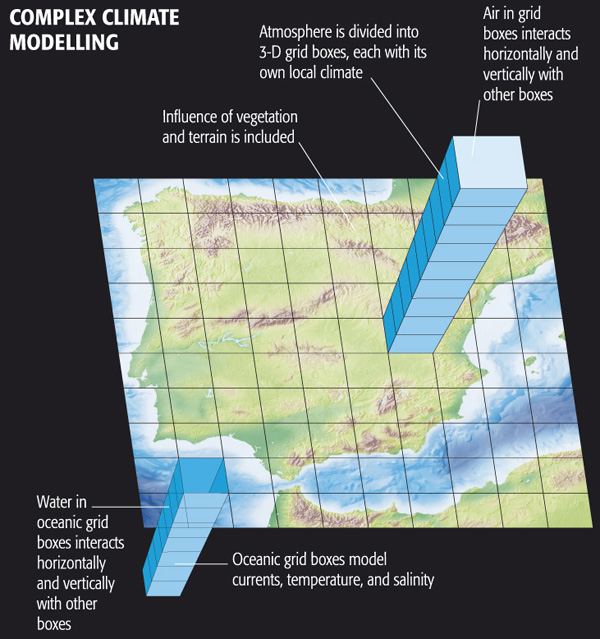
Complex Climate Modelling includes:
- Water in oceanic grid boxes interacts horizontally and vertically with other boxes
- Oceanic grid boxes model currents, temperature, and salinity
- Influence of vegetation and terrain is included
- Atmosphere is divided into 3-D grid boxes, each with its own local climate
- Air in grid boxes interacts horizontally and vertically with other boxes
© 2015 Dorling Kindersley Limited.
EdGCM
The EdGCM project, funded by the U.S. National Science Foundation and spearheaded by scientists associated with NASA Goddard Institute of Space Studies (GISS), uses the GCM originally used in a number of famous experiments (which we will review later in this lesson) by climate scientist James Hansen, Director of GISS. This model was developed in the 1980s and is primitive by modern standards, but it includes much of the important physics that is in current state-of-the-art climate models and it is far less computationally intensive. The scientists at EdGCM have ported the model into a format that can be run on a simple desktop or laptop computer (both PC and Mac). Originally it was free, but to cover expenses for the project, a minor fee is now required for download. Your course author has downloaded EdGCM onto his own laptop (MacBook Pro) and is now going to show you the results of several experiments he has run.
Video: EdGCM Demo - part 1 (3:47)
PRESENTER: OK, so we're going to run a GCM, a very famous GSM, in fact. This is the GCM that was constructed back in the mid-1980s, which was used for a number of very famous climate modeling experiments by James Hansen and his group at the NASA Goddard Institute for Space Studies that we'll be talking about a little bit more later on in this lesson. So that model has actually been taken and put in a format that can be run on a PC, on a Mac or a PC.
Of course by modern standards, the computational requirements of climate models written in the 1980s are far exceeded by current day state of the art models. But because they are a couple of decades old, they can in fact be run fairly efficiently now on simple laptops and PCs like we're going to do. Now, this model is available at the website EdGCM.com.
I would have had students in the class download the model and run it themselves. That was possible a few years ago. Unfortunately, now you actually have to pay to obtain the model. And so I will be doing some experiments with the model. And you will be watching me do these experiments rather than actually downloading it and running it yourself. But if you felt so motivated, you could indeed download this climate model and do the very same sorts of experiments that we're doing right here on your PC, or your Mac, or whatever computer you have.
So let's go ahead. I'm going to look at this Doubled CO2 experiment. If we click here, we can get some information about what that experiment is. It basically takes the CO2 concentration from 1958 and instantaneously doubles that CO2 concentration. And then we see how the climate model responds to that sudden increase in CO2.
Now, because of the presence of a large ocean that has large thermal capacity in this model, it takes quite a bit of time for the climate model to equilibrate to do that increase in CO2 concentrations, in fact, several decades to near a century. So this underscores the point that when we're looking at transient climate change, whether we're looking at observations are looking at the results of a climate model, we are in fact observing a system that is not in equilibrium. And that might take quite a bit of time to equilibrate to whatever change enforcing is imposed.
So ultimately, we know that this model will warm the amount that is consistent with the sensitivity of the model in response to that CO2 doubling. But it will not achieve that equilibrium warming for several decades, again, to nearly a century. And so what I'm going to do now is actually continue a run of that model that I started previously. And I'm just going to click on that. And I should be able to run.
Video: EdGCM Demo - part 2 (3:39)
PRESENTER: OK, so I'm running that experiment. It started in 1957. Then we instantaneously doubled the CO2 concentration. And now we're letting the model equilibrate to that instantaneously doubling of CO2.
And when it comes into equilibrium, it should have warmed by an amount that is consistent with the sensitivity of this particular model. And again, this is the NASA Goddard Institute for Space Studies climate model from the 1980s that was used in a series of famous experiments by James Hansen, by climate scientist James Hansen.
So we're running the model. I've been running this for several days, in fact. And as you can see, I'm now all the way up through September 2012. So we started out in December 1957. The model has now reached September 2012.
And as you can see, I get about one simulation day per second. So it takes the better part of a day running this climate model to simulate anything approaching a century, a long time period. But that's quite fast. By comparison, say, with where things stood in the 1980s when it would take that long to run a simulation like this on a state of the art computer, now we can run it on a desktop.
So we're letting the days tick off day by day. The model is solving all of the equations of motion. It's solving the governing equations of the atmosphere and the ocean. It's calculating the radiative fluxes, the incoming solar radiation. It's computing the distribution of infrared radiation within the Earth's system, the diffusion of heat into a mixed layer ocean.
It's solving the full set of governing three-dimensional equations that describes the coupled ocean atmosphere, cryosphere system. The ocean in this model is fairly simple by modern standards. Today climate models of this sort simulate the complex motions of the ocean currents.
This particular model treats the ocean simply as a slab of water with an appropriate amount of thermal inertia. It can absorb heat. It can give up heat to the atmosphere. It can respond to radiative imbalances.
There is a parameterization of heat transport. So the ocean transports a certain amount of heat poleward. As we know, it needs to. But that heat transport is fixed. It's not variable as it is in modern-day climate models which allow for changes in the intensity of the ocean currents.
So the ocean is pretty primitive by modern standards. And many of the components of this model are in fact primitive by the standards of state of the art models today. But as we'll see, this model is sophisticated enough to have made some surprisingly accurate predictions.
OK, so we're closing in on the end of 2012. And what I'll do is I'll let this model run out to the end of 2012 so I have one more complete year of data. And then we'll start looking at the output of this climate model simulation.
Video: EdGCM Demo - part 3 (2:14)
PRESENTER: OK so let's look at the simulation results. And by the way, there are a number of experiments that can be performed using EdGCM. One of them is the doubled CO2 experiment that we just talked about.
And you can see how there are various settings. You can tell the model what component, what ocean model to use, a mixed layer model with a parameterization of heat fluxes, or a simpler model if you choose to do so. You can change how vegetation and topography is parameterized. So there are lots of different settings in the model that one can change.
And there are various presort of determined experiments that you can just run off of the main menu in EdGCM. But if you liked, you could design your own experiment. You could set all these settings to use that particular version of the model that you want to use. You could specify exactly how to change forcings, whether they be natural forcings like CO2 or other anthropogenic forcings, methane, and CFCs.
You can change natural forcings like solar output or even the Earth orbital geometry changes that we know are important on very long time scales. So there are a variety of experiments that you can perform. And a number of the sort of predetermined experiments are indicated here.
You can simulate the last Ice Age. You can simulate Snowball Earth. We've alluded to the fact that in the past there were periods in Earth's evolution where we believe Earth was entirely frozen. And you can do that Snowball Earth experiment With EdGCM.
But we're going to continue to analyze this CO2 doubling experiment that we were running. And we will look at the output now. As you can see here-- well, we'll do that in a moment.
Video: EdGCM Demo - part 4 (1:57)
PRESENTER: OK, so unfortunately there are quite a few bugs still in EdGCM. And sometimes it freezes up and you have to restart it, which I've done here. So forgive the lack of continuity. But we're going to pick up where we left off. So we have the [INAUDIBLE] doubling experiment. As you can see, we now have years 1958 through 2012 completed. So we've got more than 50 years of output of this [INAUDIBLE] doubling experiment. And this most recent year, 2012, you saw me complete it a little bit earlier.
So we will extract the time series, various variables. You can see that I've selected precipitation, surface air temperature, ocean ice cover, snow cover, water content of the atmosphere, sea surface temperature, and the ground albedo. Or if you like, we could select instead the planetary albedo, which would include both the ground and, for example, cloud albedo. So I've selected these variables.
And now what I'm going to do is generate time series, annual averages for each of these variables for each of the years of the simulation. So I'll be able to plot out time series of the various quantities. And you can see it calculating the annual averages right now. It's going through each month of each year and calculating an annual average. So we'll let it finish that process. And then we will look at the output shortly.
Video: EdGCM Demo - part 5 (4:12)
PRESENTER: OK, so we've calculated all of those values, those annual values of these various quantities that we selected here. Now we're going to extract them, and they are now available to plot. You can see the period is 1958 to 2012. And the quantities we have are the atmospheric water vapor. We have the ocean surface temperature, ocean ice cover. We've got the planetary albedo. We've got surface air temperature. We've got sea surface temperature. And we can start plotting these and seeing what they look like.
Let's start out with the surface air temperature. So this is the global average surface air temperature for the model. And it should be plotting that up for us shortly. There it is. So we can expand that window a little bit. We can change the scale here. So let's go from 9 and 8.5 to 23 on the vertical scale, just to get a finer vertical scale on this.
So the red curve shows us how average global land temperatures are changing over time in the model. The blue curve shows us how the open ocean temperatures are changing the model. Open ocean is going to be warmer, as you can see, by several degrees than land. It's the part of the ocean surface that isn't frozen. And the ocean, in general, warms up more than the land and is warmer than land on average because it doesn't go to as high latitudes, particular in the southern hemisphere.
So ocean temperatures are going to be warmer than land temperatures. The open ocean, the blue curve, is warmer than the full ocean, which includes ice-covered regions of the ocean. It's the green curve. And the black is the global average temperature. It's the average of all the regions, whether they're open ocean, ice-covered ocean, or land. That's what the black curve represents. Let's zoom in on that curve.
So we can say we started out in 1958 with a global average temperature of about 13.8 degrees Celsius, roughly what the global average temperature is prior to the increase in CO2 that's taken place since then. And we've warmed up by 2010 or 2012 to a temperature that's close to 17.8 degrees. So we've gone from about 13.8 to about 17.8. We've warmed up by about 4 degrees Celsius in response to that instantaneous CO2 doubling that took place in 1958.
So you can see how long it's taking the global temperature to equilibrate to that increase in CO2-- many decades. Although we can see that we are asymptotically approaching a new equilibrium value. If we were to extend this several decades into the future, as it turns out, we would probably see a net warming of 4.5 degrees Celsius relative to that initial temperature of 13.8 degrees Celsius.
And that is consistent with the fact that this particular model-- the GISS climate model, the NASA Goddard Institute for Space Studies climate model from the 1980s-- has a relatively high climate sensitivity of about 4.5 degrees Celsius equilibrium climate sensitivity for CO2 doubling. And that's consistent with the transient result that we're seeing here, as the temperature is approaching its equilibrium response to that instantaneous CO2 doubling.
But we can look at many other quantities in this model, in addition to surface temperatures. And so that's what we'll do next.
Video: EdGCM Demo - part 6 (4:45)
PRESENTER: OK. So we looked at surface temperature. Let's look at some other quantities here. These are all global averages. We'll look at the global average snow cover over time.
And we can see that's expressed as percentage-- the percentage of the land surface area that's covered by snow. That's what it looks like. If we look at the global average, that's the black curve. We can zoom in on that. We go from 5 or so to 12.
The global snow cover is decreasing in percentage from about 11% in the annual mean to a little over 7%, as we might expect. As the Earth is warming, snow cover is decreasing. In fact, that's one of the complimentary observations that we looked at earlier in the course that in addition to the warming of the Earth, we see that global snow cover is decreasing. That's just as the models projected to as surface temperatures warm.
We can-- no, I won't save that image-- we could look at the ocean ice cover. And again, we'll focus in on the global mean, so let's try to focus on that black curve. We'll go from a minimum of 1 to a maximum of 5.
And that's the black curve is a global average ice cover, and it is decreasing significantly as the Earth is warming. Again, as we might expect and as we have seen in the observations. Global ice cover is decreasing over time fairly dramatically. Northern hemisphere snow cover, where we have widespread records, is decreasing significantly as the model projects it too. And of course surface temperatures are warming.
So we can look at various variables other than surface temperature in this model and get some sense of what else is going-- what else is going on in this model. What else does this model project that we could look to the observations and see if the things that the models project should happen as we increase CO2 concentrations are indeed happening.
And why don't we take a look at global mean precipitation. And global mean precipitation is increasing. It's wetter over the oceans than it is over land, and the global average, the average of land and ocean regions is the black curve.
If we zoom in on that curve, OK, that gives us an idea of how precipitation is changing. Precipitation, in this case, is expressed as millimeters per day. And in the global average, we've gone from a little over 3 millimeters of precipitation per day in 1958 to something approaching about 3 and 1/2 millimeters of precipitation per day in 2012.
So in the global average, precipitation is increasing. That is also one of the robust projections of climate models. As we increase the surface temperature of the Earth, warmer oceans evaporate more water vapor into the atmosphere. The rate of evaporation increases. And to conserve water, that means that the rate of precipitation has to increase as well. In other words, we get a more vigorous hydrological cycle-- faster evaporation and faster precipitation of water out of the atmosphere.
And so the models project that global precipitation should increase, but what we saw previously in the observations was that, in fact, precipitation is a variable where there are very large regional differences. Certain regions become wetter, but other regions become drier. And so this is a case where looking at the global average, looking at a single time series, is going to be somewhat misleading. We really need to go to the actual spatial patterns of response in the models to see if we can make sense of what the model is projecting, and so that's what we'll do next.
Video: EdGCM Demo - part 7 (2:49)
PRESENTER: OK, so we've now gone to the Maps option. Previously we looked at Time Series, which give us a single number averaged over some region of the globe, typically the entire globe or the oceans or the land regions. But we can also look at the detailed latitudinal and longitudinal structure of these trends in various variables produced from the model.
The easiest way to do that is to pick, say, a five-year period at the beginning of the simulation and a five-year period at the end of the simulation so that we average out some of the year-to-year fluctuations. And we have an early baseline that we can compare to some later average in the model.
And I've already computed averages for various variables here-- snow cover, precipitation, soil moisture, surface air temperature, ocean mixed layer temperature. I've computed those all for a base period of 1958 to 1963, the first five years of the model simulation. And now what I'm going to do is calculate the spatial patterns of those variables for the last five years of the simulation.
So let's do that right now-- 2008, '09, '10, '11, '12. We're going to calculate the averages over that period. And it's doing that right now. You can see it going through the individual months for each of those five years. And it's going to calculate the averages of all those variables for each of the grid boxes in this model.
And the model is fairly low resolution. So as we'll see, the individual latitude-longitude grid boxes are in the order of seven degrees latitude and longitude. So it's a pretty coarse description of the surface. State of the art climate models today are run at much higher resolutions. But this is an earlier climate model. And at that time, it was necessary to resolve the Earth's surface into fairly coarse latitude-longitude grid boxes to run the models efficiently.
So now we're going to take a look at the spatial patterns of some of these variables, and in particular, the difference between the most recent five years and the first five years of the simulation, giving us a sense of how the model simulation is projecting changes over time and over the surface of the Earth.
Video: EdGCM Demo - part 8 (2:46)
PRESENTER: OK. So I've extracted the last five years of the simulation, the period 2008 through 2012, the average for that five-year period. And I'm now going to read it into the Data Browser, where it's available to plot. Then as a baseline, I am going to take the first five years, the average over the first five years of the simulation, read that into the Data Browser.
And you can see that I've got each of these five variables now, Ocean Mixed-Layer Temperature, Precipitation, Snow Cover, Soil Moisture, and Surface Air Temperature, all annual averages for each of these two five-year periods. And what I'm going to do next is to take the difference.
Let me select Surface Air Temperature. We're going to take the difference between the last five years and the first five years of the simulation. And that'll give us the spatial pattern of the trend in temperature over the globe.
So I want Data one minus Data two. It's going to plot that out for me. Unfortunately, it uses a nonsensical color scale. So I am going to change the color scale so that it is more meaningful.
OK. So the warm colors all indicate warming. The cold colors would indicate cooling. Of course, the entire globe is warming in this simulation, warming more at high latitudes, particularly in the northern hemisphere, where, as we know, sea ice is decreasing markedly. And so that ice albedo feedback is kicking in, giving us that additional warming at high latitudes in the northern hemisphere.
And there's some interesting structure in the southern hemisphere, as well, perhaps a little bit more warming over the land regions than over most of the ocean regions, although the variations are fairly small. So that's the projected surface air temperature pattern.
Of course, as I've said before, this is a fairly primitive climate model by modern standards. And a lot of the more interesting variations in ocean circulation and atmospheric circulation that give us more complicated patterns of surface temperature changes in the projections of current state-of-the-art climate models are not really resolved in this relatively primitive model.
But that's what the surface pattern of warming looks like. And we can now look at the patterns of some other variables.
Video: EdGCM Demo - part 9 (4:55)
PRESENTER: OK. So now I've selected Precipitation. And we're going to look at the change in precipitation over the surface of the globe. "Annual" means surface-- precipitation. Differenced-- the first five years minus-- the last five years minus the first five years of the simulation.
OK-- Data one minus Data two. And this is what we get. Again, let's use a more sensible scale. So we'll go from minus 3.09 to plus 3.09.
So we can see that overall, precipitation is increasing over the globe, as we already saw when we plotted out the global average precipitation. But there are some strong regional variations. There is a concentration of increased precipitation in a band near the equator.
The largest increases in precipitation are near the equator, where we have the Intertropical Convergence Zone rising motion in the atmosphere. And since the surface is warmer and there's more water vapor in the atmosphere, we get more rainfall in the region where rainfall tends to occur, which is this Intertropical Convergence Zone.
But as we go to the subtropics, we can see large patches of white. And what that's indicating is that in fact, in the descending branch of the Hadley circulation, where we tend to see deserts, that region is actually expanding poleward somewhat. And so that region of drying is now expanding towards the poles. And that's why we see these large areas of at least small decreases in rainfall in subtropical regions, contrasting with the large increases we see closer to the equator.
And then as we get into higher latitudes again, you can start to see that there's a larger tendency, again, for increased precipitation in the subpolar latitudes. And that is associated with a migration poleward of the mid-latitude band of frontal precipitation in both hemispheres.
So when we look at the pattern of rainfall, there's a far richer pattern of regional variation that tells us that, in fact, if we want to understand projected changes in rainfall, it's important not to just look at global averages or hemispheric averages. But look at the underlying pattern of changes, which is fairly complex, even in this case.
But of course, this is a relatively simple model. In state-of-the-art models today, the patterns of projected change in variables like rainfall are even more complex, even more regionally variable, because these models are able to resolve important changes in ocean and atmosphere circulation that impact on regional precipitation, for example, changes in the El Niño-Southern Oscillation phenomenon, which has a large impact on regional patterns of rainfall.
But even in this fairly basic, this fairly primitive model from the 1980s, we can see this pattern of latitudinal variation in how rainfall changes. Even on the average, there is an increase in global rainfall. That change in rainfall is strongly regionally variable. And there are some regions in the subtropics where this model projects a modest decrease in rainfall.
So we'll leave our discussion of EdGCM there. This, again, is a relatively primitive climate model by modern standards. And yet we can see some of the changes that we know are projected by more state-of-the-art climate models, with regard to changes in temperature, changes in rainfall, changes in sea ice.
And so as we go on into our next couple of lessons and we start to look at projections of state-of-the-art climate models, we will see that many of these predictions with the earliest models are borne out by more realistic models that are available today.
Validating Climate Models
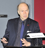
James Hansen [8] is a well known climate scientist who formerly directed NASA's Goddard Institute for Space Studies. [9]
He was the first climate scientist to testify in the U.S. Congress that human-caused climate change had indeed arrived, back during the hot summer of 1988. Today, as far greater evidence has amassed, his early comments appear especially prescient.
During his 1988 congressional testimony, Hansen showed the results of simulations he had performed using the NASA GISS GCM—the very same climate model explored in the EdGCM experiments of the previous section. These simulations included not only historical simulation of past climate changes, but three possible projections of future warming that depended on different possible future fossil fuel utilization scenarios.
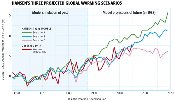
Yogi Berra is quoted as having once said, "predictions are hard—especially about the future". Indeed, there is no better test than making a prediction about the future, and looking back and seeing how it panned out. This sort of post hoc validation is often done with numerical weather models. It's more difficult to do with climate models, however, because you have to wait not days or weeks, but years to see how the prediction actually measured up.
Hansen's 1988 simulations, in this regard, can be viewed as one of the great validation experiments in climate modeling history. In these experiments, Hansen included a high, medium, and low fossil fuel future emissions scenario, corresponding to the green, blue, and purple curves respectively. As it turns out, our actual fossil fuel emissions scenario during the two decades subsequent to Hansen's 1988 projections, has corresponded most closely to his middle scenario, the blue curve. And as you can see from the subsequent observations (the red curve), his prediction for that scenario quite closely matched the observed warming.
Now, you may have noticed, however, that this model simulation didn't capture the observed multi-year cooling in 1992. Is that a fault of the simulation?
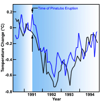
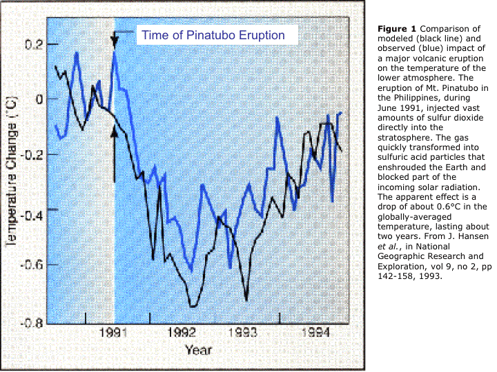
No!—there is no way that James Hansen (or anyone for that matter) could have predicted the eruption of Mt. Pinatubo. And rather than proving a fault with the model, the Pinatubo eruption actually provided Hansen with another key test of the climate models. It takes about 6 months for the volcanic aerosol to spread out around the globe and begin to have a global cooling impact. This gave Hansen about six months to run his model and make a prediction, at the instant Pinatubo erupted. As you can see, he was able to predict quite accurately the short-term cooling of the globe by a bit less than 1°C that would result from this eruption. His model simulation (the black curve below) actually predicted a bit too much cooling (observations shown by the blue curve below). But that, too, wasn't his fault. El Niño events occur randomly in time, and there was no way to know that an extended El Niño event would occur in 1991-1993, offsetting some of the volcanic cooling: As you found in your first problem set, El Niño events warm the globe by about 0.1-0.2°C.
These examples may be the most striking examples of how the models have been validated, but they have been validated in many other, more mundane ways. In fact, the various reports of the IPCC include hundreds of pages of 'model validation' showing the models do a good job capturing the main fluxes of energy and radiative balances, the general circulation of the atmosphere and the major ocean current systems, the amplitude and pattern of the seasonal response to changing patterns of solar insolation, etc.
Detecting Climate Change
So, we have seen in the previous section that climate models have been used to make some very successful predictions in the past, and there is reason to take them seriously. Can we use these models to go a step further than we already have? We have seen in previous lessons that modern-day climate change appears anomalous and without any obvious precedent in the historical past. That alone does not establish that the changes that we are seeing—warming of the Earth's surface, and many other changes—are due to human impacts. Using climate models, we can, however, address this issue of causality. We can use the models to investigate the hypothesis that the observed changes can be explained by nature alone, and the alternative hypothesis that they can only be explained by a combination of human and natural factors. Investigations employing more than 20 state-of-the-art climate models (see below) show that natural factors alone cannot explain the global temperature record of the past century—including the long-term warming trend—while human factors, combined with the natural factors, can.
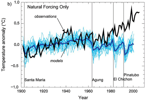
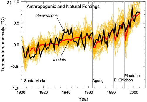
Some might argue that this alone is not convincing evidence. Perhaps, for example, we simply have the trend in solar output wrong and the true trend in solar output closely resembles the trend in human impacts (i.e., greenhouse forcing + anthropogenic aerosols). Then we might be misinterpreting the goodness of the fit shown above.
Let us, for argument's sake, accept that criticism. Is there some other type of comparison of observations and model predictions that might be more robust in this situation? Well, we can try to take advantage of the fact that the patterns of response to different forcings might look different. It turns out that the surface expressions are not that different—the surface expression of warming due to solar output increases actually looks a fair amount like the pattern of surface warming due to greenhouse gas increases. The vertical patterns of temperature change, however, as we alluded to previously in the course [12], are expected to be quite different. They provide a true fingerprint to search for—and indeed, the process of using the expected patterns of response of different forcings to determine which forcings best explain the observed changes is known as fingerprint detection.
The vertical pattern of response to increasing greenhouse gas concentrations is one in which the troposphere warms (as we have seen in previous exercises), but the stratosphere cools at the expense of this tropospheric warming; greenhouse forcing is a zero-sum game and there is no increase in radiation at the top of the atmosphere, but merely a redistribution of energy and radiation within the atmosphere. The vertical pattern of temperature change we would expect for an increase in solar output, however, is one in which the entire atmosphere warms, from top-to-bottom, as there is an increase in the received radiation at the top of the atmosphere which warms the entire atmospheric column. The pattern of temperature response to an explosive volcanic eruption is yet different from either of these patterns. From comparing the observed patterns of vertical temperature change to model simulations of the responses to each of these different factors, we find that only greenhouse surface warming exhibits the vertical pattern consistent with the model's predicted fingerprint (in fact, there is also the impact of ozone depletion on the cooling of the stratosphere, but even after accounting for that effect, the remaining trend can clearly only be accounted for by greenhouse forcing).
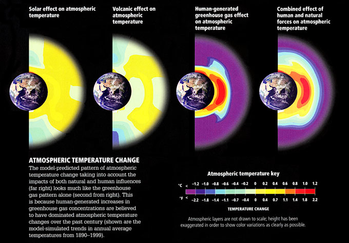
Figures (left to right):
- Solar effect on atmospheric temperature
- temperature ranges from -1.1ºF to 1.1ºF
- Volcanic effect on atmospheric temperature
- temperature ranges from -1.4ºF to 1.1ºF
- Human-generated greenhouse gas effect on atmospheric temperature
- temperature ranges from -2.2ºF to 2.2ºF
- Combined effect of human and natural forces on atmospheric temperature
- temperature ranges from -2.2ºF to 2.2ºF
Atmospheric Temperature Change: The model-predicted pattern of atmospheric temperature change taking into account the impacts of both natural and human influences (far right) looks much like the greenhouse gas pattern alone (second from right). This is because human-generated increases in greenhouse gas concentrations are believed to have dominated atmospheric temperature changes over the past century (shown are the model-simulated trends in annual average temperatures from 1890-1999)
© 2015 Dorling Kindersley Limited.
Estimating Climate Sensitivity
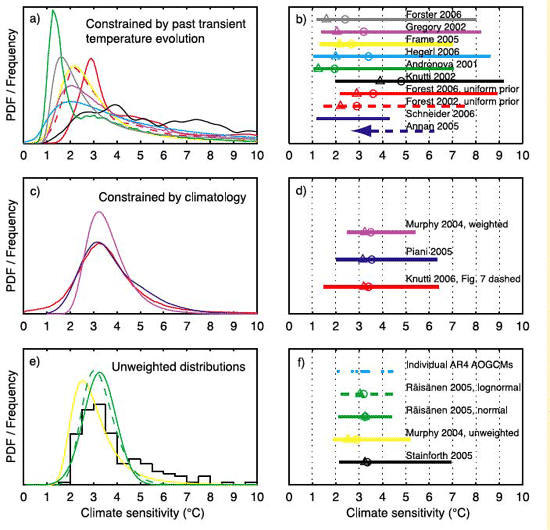
One of the key unknowns in the behavior of the climate, as we have seen, is the sensitivity—how much warming we can expect in response to a doubling of atmospheric concentrations. Current evidence suggests a most likely value of around 3.0°C warming, but there is—as we have seen—a wide range, anywhere from roughly 1.5°C to 4.5°C. Scientists attempt to try to constrain estimates of this key quantity by comparing model simulations with observations.
For example, scientists use models similar to the zero-dimensional EBMs we discussed in Lesson 4, driving them with the estimated changes in both natural factors (volcanoes and solar output) and human factors (greenhouse gas increases and sulfate aerosol emissions). Since the climate sensitivity is simply a parameter that can be changed in the model, scientists can do many simulations using different values of the climate sensitivity, and observe which values yield the best fit with the observations.
Such experiments can be done over the modern period back to the mid 19th century, during which observations of global mean temperature are available.
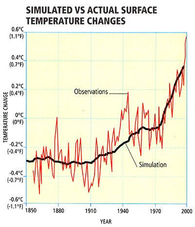
© 2015 Dorling Kindersley Limited.
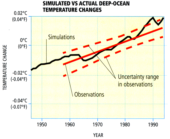
During the shorter period of the past half century when deep ocean temperature observations are available, experiments can be done to compare the model-simulated changes in ocean heat content with those that have been observed.
© 2015 Dorling Kindersley Limited.
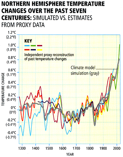
For the longer period of the past millennium during which temperature changes, as we have seen in Lesson 3 [13], have been documented based on climate proxy data—it is possible to compare simulated and observed changes over a longer time period, providing potentially tighter constraints on climate sensitivity. The computer model simulations in this case are driven by longer-term estimates (e.g., from ice core evidence) of natural (volcanic and solar) forcings as well as modern anthropogenic forcing:
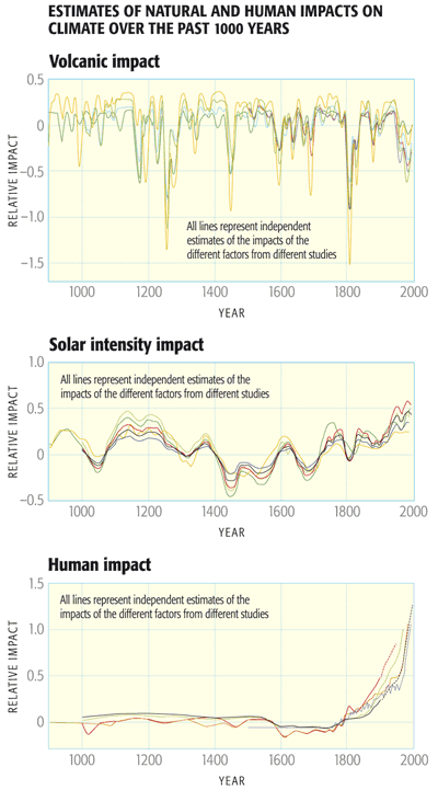
© 2015 Dorling Kindersley Limited.
© 2015 Dorling Kindersley Limited.
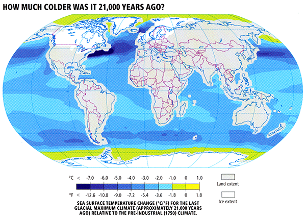
Going further back in time, scientists compare climate model simulations of the cooling during the height of the Last Glacial Maximum (LGM) roughly 21,000 years ago resulting from lowered atmospheric CO2, increased continental ice cover, and altered patterns of solar insolation, and proxy evidence of ocean surface cooling derived from climate-sensitive surface dwelling organisms trapped in ocean sediment cores.
© 2015 Dorling Kindersley Limited.
Finally, going even further back in time, into the deep geological past, scientists compare model results with geological evidence of past warm and cold periods.
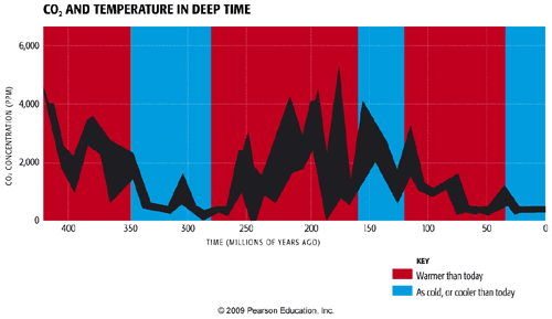
The overall evidence from all of these different lines of evidence regarding both human-caused and natural climate changes over a broad range of time scales, is that the equilibrium climate sensitivity likely falls within the range of 1.5°C to 4.5°C for doubling, with a most likely value of roughly 3°C warming.
Given the full array of available evidence from instrumental and paleoclimate proxy data, and the comparisons of this evidence with theoretical estimates, there is a very low likelihood of either a trivially small (e.g., 1.5°C or less) or extremely high (greater than 7°C) equilibrium climate sensitivity.
Problem Set #4
Activity
Note:
For this assignment, you will need to record your work on a word processing document. Your work must be submitted in Word (.doc or .docx) or PDF (.pdf) format so the instructor can open it.
The documents associated with this problem set, including a formatted answer sheet, can be found on CANVAS.
- Be sure also to download the answer sheet from CANVAS (Files > Problem Sets > PS#4).
Each problem (#2 to #6) will be graded on a quality scale from 1 to 10 using the general rubric as a guideline. For this problem set, each problem is equally weighted. Thus, a score as high as 50 is possible, and that score will be recorded in the grade book.
The objective of this problem set is for you to work with some of the concepts and mathematics around one-layer energy-balance models (1-D EBMs) covered in Lesson 5. You may find Excel useful in this problem set, but you may use any software you wish, keeping in mind that the instructor only can provide help with Excel.
- Re-read the derivation of the equations for planetary surface temperature and planetary atmospheric temperature under the framework of a one-layer energy-balance model, as laid out in Lesson 5 [14]. After re-reading the derivation, write the two aforementioned equations, and, for each equation, explain what each variable in the equation is. Summarize also the assumptions behind the derivation; in other words, explain what a one-layer EBM is and how it differs from a 0-D EBM. This is as straightforward as it seems, but this problem is here to ensure that you understand the underlying concepts because they are referenced often in climate science. Report your discussion on the answer sheet.
- Calculate values of global surface temperature and planetary atmospheric temperature for varying values of the solar constant, ranging from 0 to 2,000 W m-2, incremented by 100 W m-2. Assume that the value of planetary albedo is 0.32, emissivity is 0.77, and Stefan-Boltzmann constant is 5.67 x 10⁻⁸ W m-2 K-4. Construct a table to show your results. Using the values that you calculated, plot both global surface temperature and global tropospheric temperature as a function of solar constant; use the same grid for both sets of temperature values. That is, the horizontal axis of the plot should give values of solar constant, and the vertical axis should give values of temperature. Report all results on the answer sheet.
- Calculate values of global surface temperature and global tropospheric temperature for varying values of planetary albedo, ranging from 0 to 1, incremented by 0.05. Assume that the value of the solar constant is 1,360 W m-2, emissivity is 0.77, and Stefan-Boltzmann constant is 5.67 x 10⁻⁸ W m-2 K-4. Construct a table to show your results. Using the values that you calculated, plot both global surface temperature and global tropospheric temperature as a function of planetary albedo; use the same grid for both sets of temperature values. That is, the horizontal axis of the plot should give values of planetary albedo, and the vertical axis should give values of temperature. Report all results on the answer sheet.
- Calculate values of global surface temperature and global tropospheric temperature for varying values of planetary emissivity, ranging from 0 to 1, incremented by 0.05. Assume that the value of the solar constant is 1,360 W m-2, planetary albedo is 0.32, and Stefan-Boltzmann constant is 5.67 x 10⁻⁸ W m-2 K-4. Construct a table to show your results. Using the values that you calculated, plot both global surface temperature and global tropospheric temperature as a function of planetary emissivity; use the same grid for both sets of temperature values. That is, the horizontal axis of the plot should give values of planetary albedo, and the vertical axis should give values of temperature. Report all results on the answer sheet.
- Explain the relationship between each of the independent variables (solar insolation, planetary albedo, planetary emissivity) and planetary temperature. As well, discuss the various energy-balance models covered in Lessons 4 and 5, comparing and contrasting their assumptions. Write your discussion on the answer sheet, limiting it to one to two paragraphs.
Lesson 5 Summary
In this lesson, we further explored the use of theoretical models of the climate system. We found that:
- A generalization of the zero-dimensional EBM known as the one-layer EBM can be used to provide a more realistic description of the greenhouse effect. This model can be used to estimate both surface temperatures and temperatures of the mid-troposphere. It is also possible to study the effect of feedbacks using a simple model of this sort;
- A further generalization known as the one-dimensional EBM can be used to study the latitudinal dependence of energy balance and temperature distributions. The one-dimensional EBM can be used, among other applications, to try to understand the processes that drive climate into and out of Ice Ages;
- Full three-dimensional general circulation models (GCMs) and coupled Atmosphere-Ocean (AOGCM) versions of the GCM can be used to model the more detailed patterns of climate variability and climate change, and the study not just of temperature changes but other key fields such as precipitation, wind patterns, etc.;
- Theoretical climate models have been validated in numerous ways. Predictions of warming made back in the late 1980s have been borne out, and experiments simulating the response to natural events, such as volcanic eruptions, have demonstrated that climate models have the ability to make accurate predictions of the responses of the climate to both natural and human forcings;
- Comparisons of model simulations and observations, including so-called "fingerprint detection" studies, indicate that natural factors alone cannot explain the observed trends of the past century; only a combination of natural and human factors can explain these trends;
- By comparing model simulations and observations on a variety of timescales, scientists have constrained climate sensitivity—the equilibrium warming expected in response to a doubling of concentrations—to lie somewhere within the range of 1.5 to 4.5°C, with a most likely estimate of around 3°C warming.
Reminder - Complete all of the lesson tasks!
You have finished Lesson 5. Double-check the list of requirements on the first page of this lesson [15] to make sure you have completed all of the activities listed there before beginning the next lesson.