Prioritize...
After reading this section, you should be able to prepare a dataset for a time series analysis, check for inhomogeneity, deal with missing values, and smooth the data if need be.
Read...
As with the statistical methods we discussed in Meteo 815, preparing your data for a time series analysis is a crucial step. We need to understand the ins and outs of the data and account for any potential problems prior to the analysis. If you spend the time investigating and prepping the data up front, you will save time in the long term.
Plot
As with Meteo 815 and most other data analysis courses, you should always begin your analysis by plotting the data. This helps us understand the basics of the data and look for any potential problems. Plotting also allows us to check for missing values or inhomogeneities that may be missed from quantitative approaches. ALWAYS PLOT YOUR DATA!
For a time series analysis, the best plot is a time series plot (as opposed to boxplot, histograms, etc., that we used predominantly in Meteo 815). In R, you can use the function ‘plot’ and set X to time and Y to the data. Or you can use the specific function ‘plot.ts’ that can plot a time series object automatically. You can find more information on ‘plot.ts’ here.
Let’s work through an example. Consider this global SST and air temperature anomaly time series data from NASA GISS. Let’s load the data using the code below:
Your script should look something like this:
# Install and load in RNetCDF
install.packages("RNetCDF")
library("RNetCDF")

# load in monthly SST Anomaly NASA GISS
fid <- open.nc("NASA_GISS_MonthlyAnomTemp.nc")
NASA <- read.nc(fid)
This time series data spans from January 1880 to present. The monthly data is on a 2x2 degree latitude-longitude grid. The base period for the anomaly is 1951-1980, meaning the anomalies are computed by subtracting off the average from the base period. This dataset is a mixture of observations and interpolation. Let’s compute the global average and save a time variable using the code below:
Your script should look something like this:
# create global average
NASAglobalSSTAnom <- apply(NASA$air,3,mean,na.rm=TRUE)

# time is in days since 1800-1-1 00:00:0.0 (use print.nc(fid) to find this out)
NASAtime <- as.Date(NASA$time,origin="1800-01-01")
Now, let’s plot the time series using the ‘plot’ function by running the code below.
You should get a plot like this:

On first inspection, it appears there are no missing data points. There was a steady increase after 1950 and a spike in the 90s. There doesn’t appear to be any super-abnormal points, but the variance seems to change with noisier data points later on (notice the increase in fluctuation from month-month). The figure, to me, suggests we should perform an inhomogeneity test (which we will discuss later on). But before we move forward, let’s also take a look at another dataset of global SST and air temperatures. This dataset comes from NOAA and was originally called ‘MLOST’. You can download it here. Let’s load it in and create our global average using the code below:
Your script should look something like this:
# load in monthly SST Anomaly NOAA MLOST
fid <- open.nc("NOAA_MLOST_MonthlyAnomTemp.nc")
NOAA <- read.nc(fid)

# create global average
NOAAglobalSSTAnom <- apply(NOAA$air,3,mean,na.rm=TRUE)

# time is in days since 1800-1-1 00:00:0.0  (use print.nc(fid) to find this out)
NOAAtime <- as.Date(NOAA$time,origin="1800-01-01")

# create ts object
tsNOAA <- ts(NOAAglobalSSTAnom,frequency=12,start=c(as.numeric(format(NOAAtime[1],"%Y")),as.numeric(format(NOAAtime[1],"%M"))))
tsNASA <- ts(NASAglobalSSTAnom,frequency=12,start=c(as.numeric(format(NASAtime[1],"%Y")),as.numeric(format(NASAtime[1],"%M"))))

# unite the two time series objects
tsObject <- ts.union(tsNOAA,tsNASA)
Now, let's plot the time series using the 'plot.ts' function by running the code below.
You should get a plot like this:

If you examine the figures, you will see that both follow a similar shape, but there are some discrepancies. Let’s overlay the plots to see how different the two datasets are. We will use another time series plot function called ‘ts.plot’. Run the code below.
You should get a figure like this:
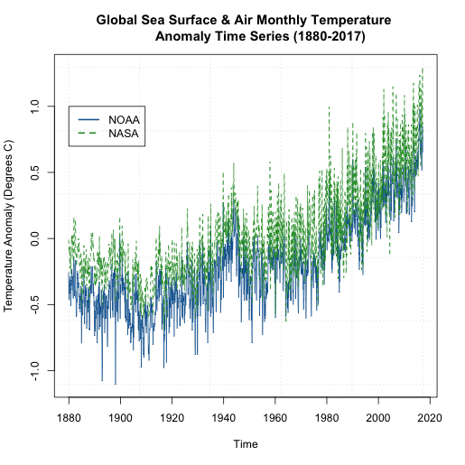
We can see that that the global NASA SST and air temperature anomalies are generally ‘above’ the NOAA dataset. But they are plotting the same thing? How can this be? Well, let’s take a closer look at what the NOAA dataset is. For starters, the temperatures come predominantly from observed data (Global Historical Climatology Network) with an analysis of SST merged in. In addition, the NOAA dataset is on a 5x5 degree grid instead of a 2x2 like the NASA GISS version. Furthermore, the NOAA dataset has limited coverage over the polar regions, so when we create the global averages, we are potentially including more points in the NASA version than the NOAA version, with a significant region being discounted in the NOAA version. You can read more about these two versions as well as a few other well documented and used air/SST datasets here.
But the bigger question is, if we pick one dataset over the other, are we creating a bias in our time series analysis? It really depends on the analysis, but noting these potential problems is important. I want you to start recognizing potential problems that can affect your outcome. Being skeptical at every step is a good habit to get into.
Missing Values
One of the main goals when performing a time series analysis, is to pull out patterns and model them for forecasting purposes. Missing values, as we saw in Meteo 815, can pose problems for the model fitting process. Before you continue on with a time series analysis, you need to check for missing values and decide on how you will deal with them. In most cases, for this course, you will need to perform an imputation. As a reminder, imputation is the process of filling missing values in. We discussed a variety of techniques in Meteo 815. Below is a list of some of the methods we discussed. If you need more of a refresher, I suggest you review the material from the previous course.
- Central Tendency Substitution - We replace missing values with the mean, median, or mode of the dataset.
- Previous Observation Carried Forward - We replace the missing value with the closest neighbor (both temporally and spatially).
- Regression - We fit one variable to another and use a linear regression to estimate the missing values.
I mentioned that a weakness in the NOAA data set was a lack of information in the polar regions. When we averaged globally, we just left out those values. Instead, let’s perform an imputation and then globally average the data. This is going to be a spatial imputation, so for each month, I will fill in missing values to create a globally covered product. I’m going to perform a simple imputation that takes the mean of the surrounding points.
Let’s start by plotting one month of the data using 'image.plot' to double check that there are missing values. To do this, let’s first extract out the latitudes and longitudes. Remember, when using ‘image.plot’ the values of ‘x’ and ‘y’ (your lat/lon) need to be in increasing order.
Your script should look something like this:
# extract out lat and lon accounting for EAST/WEST
NOAAlat <- NOAA$lat
NOAAlon <- c(NOAA$lon[37:length(NOAA$lon)]-360,NOAA$lon[1:36])

# extract out one month of temperature
NOAAtemp <- NOAA$air[,,1]
NOAAtemp <- rbind(NOAAtemp[37:length(NOAA$lon),],NOAAtemp[1:36,])
Now that we have the correct dimensions and order, let’s plot.
Your script should look something like this:
# load in tools to overlay country lines
install.packages("maptools")
library(maptools)
data(wrld_simpl)

# plot global example of NOAA data
library(fields)
image.plot(NOAAlon,NOAAlat,NOAAtemp,xlab="Longitude",ylab="Latitude",legend.lab="Degrees C",
            main=c("NOAA Air & SST Anomaly for ", format(NOAAtime[1],"%Y/%m")))
plot(wrld_simpl,add=TRUE)
You should get a plot similar to this:
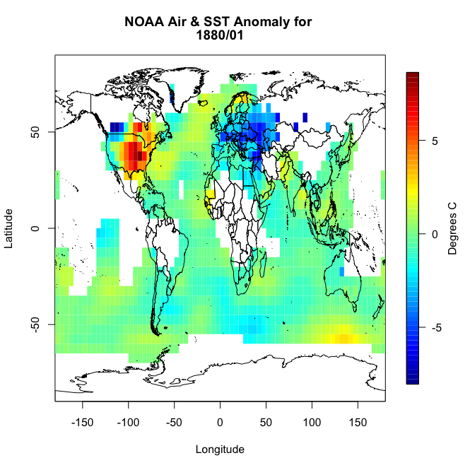
You will notice right away that there are a lot of missing values, not just at the polar regions. So let’s implement an imputation routine. We will apply it first to this particular month so we can replot and make sure it worked. Like I said above, I’m going to fill in a missing point at a particular grid box with the mean of the values surrounding it. Deciding on how far out to go will depend on what data is actually available. We will start with one grid box. Look at the visual below. Let’s say you have a missing point at the orange box. I’m going to look at all the grid boxes that touch the orange box and average them together. The mean of those 8 surrounding boxes will be the new orange value.

In R, you can use the following code:
Your script should look something like this:
# create a new variable to fill in
NOAAtempImpute <- NOAAtemp
# loop through lat and lons to check for missing values and fill them in
for(ilat in 1:length(NOAAlat)){
  for(ilon in 1:length(NOAAlon)){
    # check if there is a missing value
    if(is.na(NOAAtemp[ilon,ilat])){
      # Create lat index, accounting for out of boundaries (ilat=1 or length(lat))
      if(ilat ==1){
        latIndex <- c(ilat,ilat+1,ilat+2) }
      else if(ilat == length(NOAAlat)){
        latIndex <- c(ilat-2,ilat-1,ilat)
      }else{
        latIndex <- c(ilat-1,ilat,ilat+1)
      }
      # Create lon index, accounting for out of boundaries (ilon=1 or length(lon))
      if(ilon ==1){
        lonIndex <- c(ilon,ilon+1,ilon+2)
      }else if(ilon == length(NOAAlon)){
        lonIndex <- c(ilon-2,ilon-1,ilon)
      }else{
        lonIndex <- c(ilon-1,ilon,ilon+1)
      }
      # compute mean
      NOAAtempImpute[ilon,ilat] <- mean(NOAAtemp[lonIndex,latIndex],na.rm=TRUE)
    }
  }
}
This code is laid out to show you ‘mechanically’ what I did. I looped through the lats and the lons checking to see if there is a missing value. If there is, then we create a lat and lon index that encompasses the grid boxes (blue) we are interested in. You can double check this by running the code over one ilat/ilon and printing out the values ‘NOAAtemp[lonIndex,latIndex]’. This will display 9 values (matching each grid box above). I’ve put in caveats to deal with cases where we are out of the boundary (i.e. ilat=1). If you plot up ‘NOAAtempImpute’ you should get something like this:
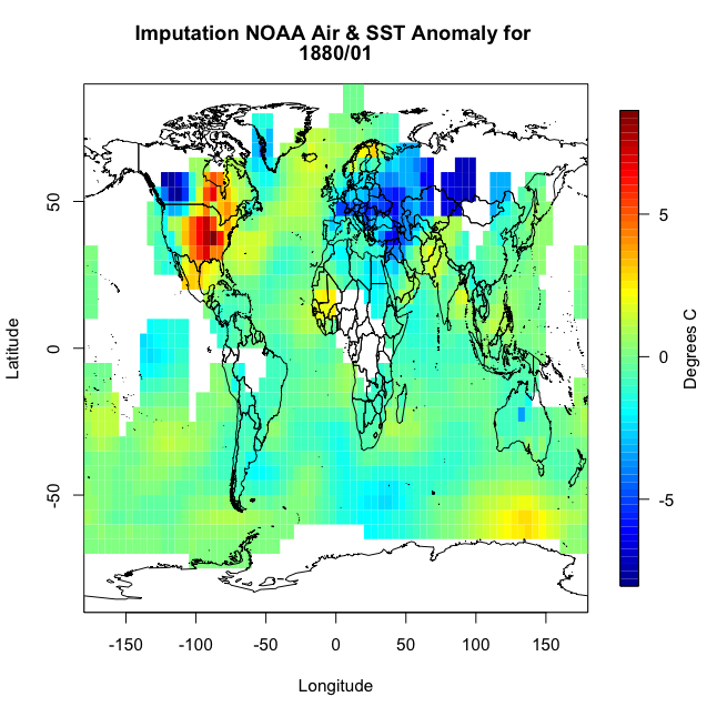
The method has filled in values but not enough. This is probably due to the size of the region in which data is missing. There are simply no data points within the corresponding grid boxes to average. We could expand the nearest neighbor, but instead let’s use a built-in R function called ‘impute’. This function (from the package Hmisc) will perform a central tendency imputation. Use the code below to impute with this function.
Your script should look something like this:
# impute using function from Hmisc
library(Hmisc)
NOAAtempImpute <- impute(NOAAtemp,fun=mean)
If you were to plot this up, you would get the following:
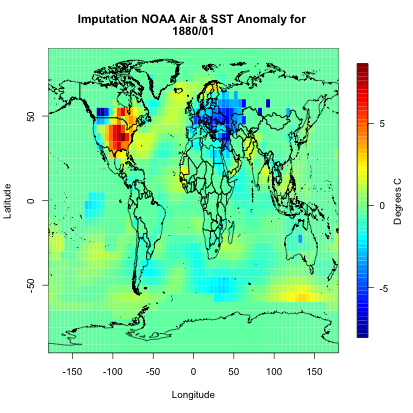
You can see we have a fully covered globe. Now, let’s apply this to the whole dataset.
Your script should look something like this:
# initialize the array
NOAAglobalSSTAnomImpute <- array(NaN,dim=dim(NOAA$air))
# impute the whole dataset
for(imonth in 1: length(NOAAtime)){
  NOAAtemp <- rbind(NOAA$air[37:length(NOAA$lon),,imonth],NOAA$air[1:36,,imonth])
  NOAAglobalSSTAnomImpute[,,imonth] <- impute(NOAAtemp,fun=mean)
}
Now, if we plot the same month from our example (first month), we should get the same plot as above. This is something I would encourage you to do whenever you are working with large datasets. It may take some extra time, but going through one example to check if what you are doing is correct and then applying it to your whole dataset and checking back with your first example is good practice.
Your script should look something like this:
image.plot(NOAAlon,NOAAlat,NOAAglobalSSTAnomImpute[,,1],xlab="Longitude",ylab="Latitude",legend.lab="Degrees C",
           main=c("Imputation NOAA Air & SST Anomaly for ", format(NOAAtime[1],"%Y/%m")))
plot(wrld_simpl,add=TRUE)
I get the following image which is identical to the one used in our example month.
Now we know that the imputation was successful and did what we expected it to do. We have a full dataset and can now move on.
Inhomogeneity & Outliers
We’ve discussed homogeneity before in Meteo 815, but as a review, homogeneity is broadly defined as the state of being same. In most cases, we strive for homogeneity as inhomogeneity can cause problems. For time series analyses, inhomogeneities can result from abrupt shifts (natural and artificial), trends, and/or heteroscedasticity (variability is different across a range of values). This inhomogeneity can make it difficult to pull out patterns and model the data.
We will discuss some of these sources of inhomogeneity in more detail later on. I do, however, want to talk briefly here about artificial shifts. With a time series analysis, you are likely to encounter an artificial shift due to the issues involved in collecting a long dataset. A long dataset can lead to a higher probability of instruments being moved or malfunctioning, inconsistencies in updating algorithms, or a dataset that is pieced together from multiple sources. These can create artificial shifts in your dataset which in turn will skew your results.
It’s pretty hard to detect an inhomogeneity, especially artificial changes. You should really think about the source of your data, the instrument you are using, and where possible problems could arise. You should also utilize the tests for homogeneity of variance that we discussed in Meteo 815, like the Bartlett test, which applies a hypothesis test to determine whether the variance is stable in time. You can also use function 'changepoint' from the package ‘changepoint’.
Let’s go back to our SST dataset and apply this new function to see whether our dataset is homogenous or not. Use the code below to create a new globally averaged dataset for NOAA (using the imputed data) and compute the change point test for the mean and variance.
Your script should look something like this:
# compute global average for NOAA
NOAAGlobalMeanSSTAnomImpute <- apply(NOAAglobalSSTAnomImpute,3,mean)

# load in changepoint
library('changepoint')

# test for change in mean and variance
cpTest <- cpt.meanvar(NOAAGlobalMeanSSTAnomImpute)
You can use the ‘print’ command or plot the result. What you will find is that there is one change point at index 1193 (corresponding to May 1979). If you plot, you would get this figure.

This suggests there are two distinctly different means and/or variances in the dataset. The red line is the mean estimate for each section with the ‘changepoint’ at index 1193 (showcased by the upward shift in the red line). So this dataset is definitely not homogenous throughout the whole time period.
Outliers can also be problematic depending on your analysis. In most cases, however, we rather keep the value than drop it for a missing value. But for reference, you can use the function ‘tsoutliers’ from the package ‘forecast’ which will test for any outliers in your data. Let's try this out on the NOAA dataset.
Your script should look something like this:
# load in forecast
library('forecast')
tsTest <- tsoutliers(NOAAGlobalMeanSSTAnomImpute)
The result suggests one outlier at index 219 (corresponding to March 1898). What is great about this function is it includes a replacement value. In this example, the suggested replacement value is -0.628944, while the original value was -1.1049. It is up to you whether you would like to use the replacement value or not. Since there is only one ‘outlier’, I’m going to leave it as is for now. If there were a lot of outliers, then I would consider replacing them.