Prioritize...
After reading this section, you should be able to prepare a dataset for a time-series analysis, apply various techniques to clean the dataset, and decompose the time series.
Read...
At this point, you should know the different components of a time series (trend, periodicity, and noise) and a variety of common patterns that may exist in your data. Now, we need to actually apply this knowledge to decompose the time series into each individual component. In this section, we are going to work through an example of how to prepare your data for a variety of time series analyses we will learn about in this course. Please note that depending on the time series analysis you pick, these steps may change a bit. But this is the general order you should follow to set up the data:
- Form a Question and Pick the Dataset
- Clean Data
- Plot Time Series
- Smooth Data
- Transform Data
- Plot Again
- Decompose Data into Components (trend, periodicity, and noise)
Forming a Question and Selecting a Dataset
There are a lot of questions we can ask when it comes to performing a time series analysis. However, we need to refine the question to be specific enough to actually perform an analysis and interpret the results. If your question is clear and concise, your interpretation of the results will be more straightforward. For example, let’s say we wanted to look at the global change in temperature. At first glance, you might think that is straightforward…..it’s not. Let’s start with the ‘global’ aspect. Is this a global average? How is global computed? And then, what is the change? The monthly change? The yearly change? How does the global value now compare to the global value 10 years ago? And then, finally, temperature. There are many temperature variables we could be talking about: air temperature, sea surface temperature, the temperature at 2 meters, deep ocean temperatures, temperatures at a specific pressure level... The problem with such a vague question is that if you don’t know what you are trying to ask, then you will have problems selecting the data and the appropriate analysis which, in turn, will lead to poor interpretations of the result.
In short, I tend to be as specific as possible, so I know what I’m trying to solve to make it easier for me to explain my results. You should include something about the spatial aspect, the temporal aspect, vertical if relevant, the name of the dataset, and the variable of choice. Sometimes, however, the question doesn’t fully present itself until after you try a few things….and that is totally fine! Refining your question is always acceptable based on limitations you may meet when it comes to obtaining data or other aspects of the analysis. But when presenting your material, make sure you are clear about what question you are asking.
Now that I said be specific, I’m going to be somewhat unspecific for this example, mostly because I’m trying to show you the different routes you might take based on the question you are asking. I’m going to say that I will look at the gridded monthly global sea surface temperature anomalies from January 1880 through April 2017 from the NOAA MLost dataset. The first caveat is that the NOAA grid is coarse (5 degrees x 5 degrees). This can potentially affect the spatial aspect if I average. Note that I didn’t exactly say what I’m looking at (a change in temperature or something else). That’s because I want to explore the dataset first with the intention of refining the question later on.
Let’s begin the exploration. Start by loading in the two datasets.
Your script should look something like this:
# load in monthly SST Anomaly NOAA MLOST
fid <- open.nc("NOAA_MLOST_MonthlyAnomTemp.nc")
NOAA <- read.nc(fid)

# create global average
NOAAglobalSSTAnom <- apply(NOAA$air,3,mean,na.rm=TRUE)

# time is in days since 1800-1-1 00:00:0.0  (use print.nc(fid) to find this out)
NOAAtime <- as.Date(NOAA$time,origin="1800-01-01")
Now, we can continue preparing the data for the analysis.
Clean Data
When I say ‘clean’ your data, I mean make sure the dataset is ready for the analysis. This means taking care of any known issues with the dataset and dealing with missing values. Whenever you clean your data, the first step is to always look at the ‘readme’ file. This will tell you about questionable data and possible quality control flags you should utilize. It’s a good starting point to make sure you have only good, reliable observations or data points. Unfortunately, with the data we have selected, there is no easily accessible readme file. This will happen from time to time. Instead, they have several journal articles to look through. You can also check the home pages of the datasets, like for NOAA, to see if there is any useful information. A further step is to 'dump' the netcdf file (print.nc command) to check for any notes by the authors of the datasets or for anything that might look like a QC flag. Based on looking through the references and dumping the file, there appear to be no QC flags or anything noted by the authors. So, we can move on.
After we’ve checked for any questionable data points, we need to decide what to do with the missing values. Missing values can come from bad data points (such as the removal process we just talked about) or from the lack of an observation. Sometimes you can just leave the missing values in and the R function will deal with it automatically, but this is incredibly risky if you don’t understand what the R function is doing (meaning the process it uses to deal with the missing values- does it fill it in, drop the point, etc.). We’ve discussed some methods already on how to fill the values in, so I will leave it up to your discretion, but let’s go ahead and fill in our values in the NOAA dataset as we did previously (using the ‘impute’ function from Hmisc package).
Your script should look something like this:
# extract out lat and lon accounting for EAST/WEST
NOAAlat <- NOAA$lat
NOAAlon <- c(NOAA$lon[37:length(NOAA$lon)]-360,NOAA$lon[1:36])

library(Hmisc)
# initialize the array
NOAAglobalSSTAnomImpute <- array(NaN,dim=dim(NOAA$air))

# impute the whole dataset
for(imonth in 1: length(NOAAtime)){
  NOAAtemp <- rbind(NOAA$air[37:length(NOAA$lon),,imonth],NOAA$air[1:36,,imonth])
  NOAAglobalSSTAnomImpute[,,imonth] <- impute(NOAAtemp,fun=mean)
}
Note that I had to reverse the latitudes so I can use the ‘image.plot’ command. Let’s plot the first month to ensure the imputation worked.
Your script should look something like this:
# load in tools to overlay country lines
library(maptools)
data(wrld_simpl)

# plot map of first month of data
image.plot(NOAAlon,NOAAlat,NOAAglobalSSTAnomImpute[,,1],xlab="Longitude",
           ylab="Latitude",legend.lab="Degrees C",
           main=c("Imputation NOAA Air & SST Anomaly for ", format(NOAAtime[1],"%Y/%m")))
plot(wrld_simpl,add=TRUE)
You should get the following figure:
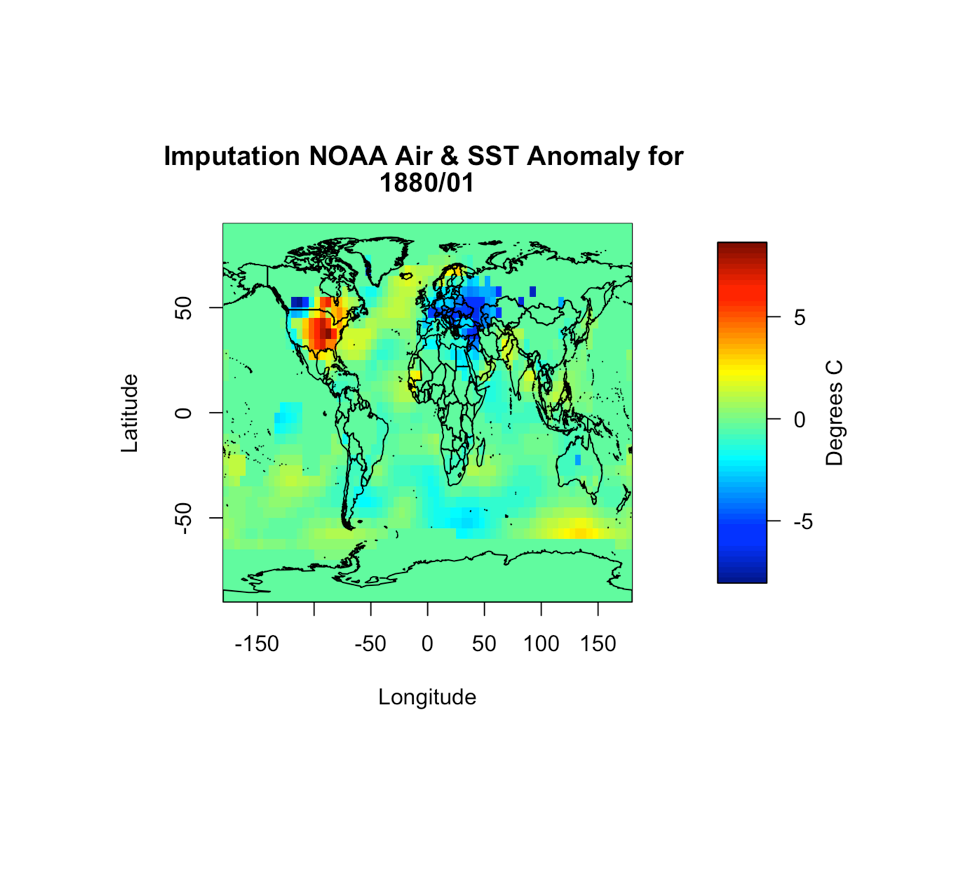
Based on the figure, it appears the imputation worked and all the values are filled in. So now we have dealt with uncertain data values as well as missing values. We can continue on with the process.
Plot Time Series
At this point, we have a good quality dataset to work with. The next actions will be due to the analysis you wish to perform, not due to the data. The first step is to, as usual, plot. But specifically, we need to plot the time series. If you are working with only time (at one location or averaged), you can use the ‘plot’ or ‘plot.ts’ functions. If you are working with multiple locations (several stations, gridded data, etc) like we are, you will have to get creative. If it’s a relatively small number of locations, you can use different colors or symbols. But if it’s the whole globe (like what we have), you should think of ways to ‘chunk’ the data together for plotting. Here are two ways I use often.
The first is to break down the globe by latitude zone. You create the latitude zones to be however big or small as you want, but I typically create 6 zones: 90S-60S, 60S-30S, 30S-0, 0-30N, 30-60N, 60N-90N. You average spatially for all longitudes within each latitude zone. Then, you can plot each zone separately or color-code the lines on one plot. Let’s give this a try with the NOAA data. First, set up your latitude zones.
Your script should look something like this:
# create lat zones
lat_zones <- t(matrix(c(-90,-60,-60,-30,-30,0,0,30,30,60,60,90),nrow=2,ncol=6))
Here’s an example of the boundaries for the latitude zones I created:
Now, loop through each zone for each month and compute the average over all longitudes.
Your script should look something like this:
# create lat zone averages
NOAASSTAnomLatZone <- matrix(nrow=length(NOAAtime),ncol=dim(lat_zones)[1])
for(izone in 1:dim(lat_zones)[1]){
  # extract the latitudes in this zone
  latIndex <- which(NOAAlat < lat_zones[izone,2] & NOAAlat >= lat_zones[izone,1])
  for(itime in 1:length(NOAAtime)){
    NOAASSTAnomLatZone[itime,izone] <- mean(NOAAglobalSSTAnomImpute[,latIndex,itime])
  }
}
Plot the time series by running the code below:
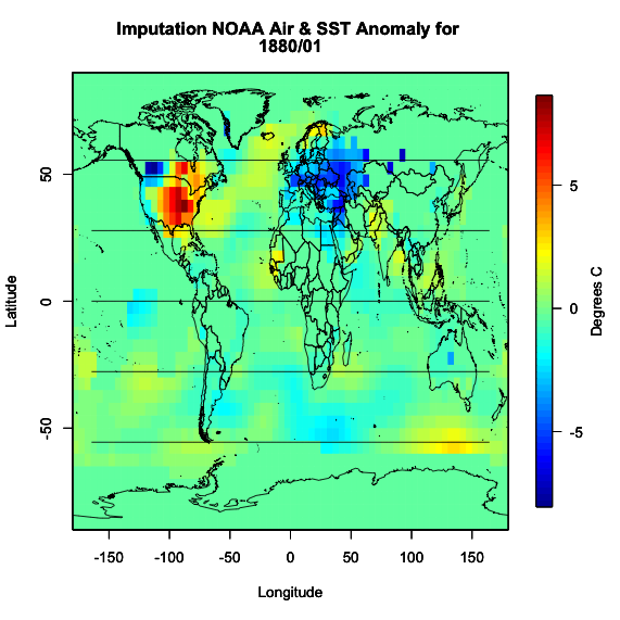
Here is a larger version of the figure:
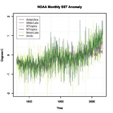
Note that the colors are random and will change each time you run the code.
Another way to chunk your global data is through a classification system. One such system is the Koppen Climate Classification System. This system is broken into 5 major climatic types that are determined by temperature and precipitation climatologies. If you are creating a global analysis, this is a good way to break up the data into 5 plots or colors (1 for each region) and it makes synthesizing the data much easier. Similar to the latitude zones, you average all lats/lons that fall in each climate zone together. One caveat, the Koppen climate system is, in general, only used over land. For this reason, I will not show you an example of breaking our data into it. But what you can do is download the data for the Koppen climate classification. The data is in the format lon/lat/koppen identifier. You can find the classification code on the same page. If you need help or an example of how to set this up, please let me know.
So now we have a time series plot. What next? Well, the next step depends on the analysis you are trying to perform. Since we do not have a clear question, I’m going to focus on the idea that we are trying to determine whether a trend is a component in our dataset. Now, at first glance, you can see some changes in the data suggesting a trend exists, but there is a lot of variability from month to month. So, what can we do? The two main options are to transform the data and/or smooth the data.
We’ve talked about transformation already, so I won’t go into much detail, but when it comes to trends, your best bet is to perform an anomaly conversion. Our example is already looking at the anomaly, so we don’t need to do this. But please remember, many times when examining data for trends, looking at the anomaly first is a good start.
The second aspect is smoothing the data. For smoothing data, we are trying to remove some of the noise by reducing the variability. Again, the most common type is a moving average. We’ve already applied a moving average imputation spatially, but let’s try a moving average temporally. Apply an 11-month smoother and plot the results for Antarctica (zone 1) by running the code below:
Below is a larger version of the overlay:
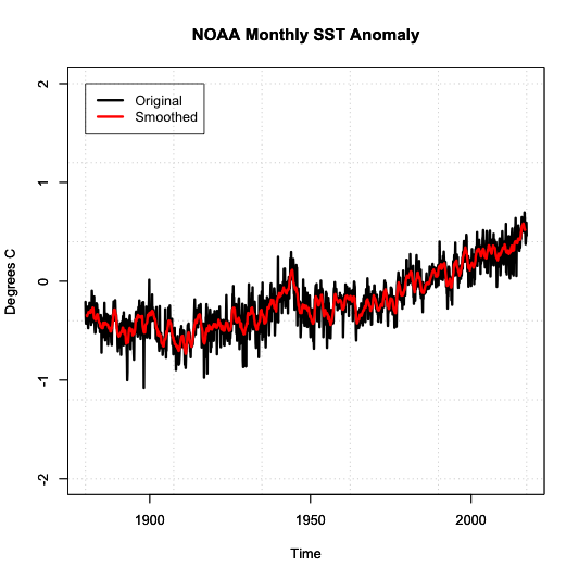
Notice how the variability has decreased. We have a nice smoothed running average of the SST anomaly. The noise has been decreased, and we can start to see the actual trend better.
Types of Decomposition
Now that we have a clean dataset that’s been smoothed to reduce noise and the time series plot suggests a trend exists, we can start to decompose the time series. Decomposing a time series means that we break a time series down into its components. For this course, we will have three components. A periodicity component (P), a trend component (T) and an irregular/remainder/error component (E).
There are two classical types of decomposition. These are still widely used, but please note more robust methods exist and will be talked about later on in the course. The first type is called the Additive Decomposition:
For each time stamp (t), the data (Y) at time t (Yt) can be decomposed into the periodicity component (Pt) at time t (which includes Quasi-Periodic and Chaotic), a trend component (Tt) at time t, and the remainder/error (Et) at time t.
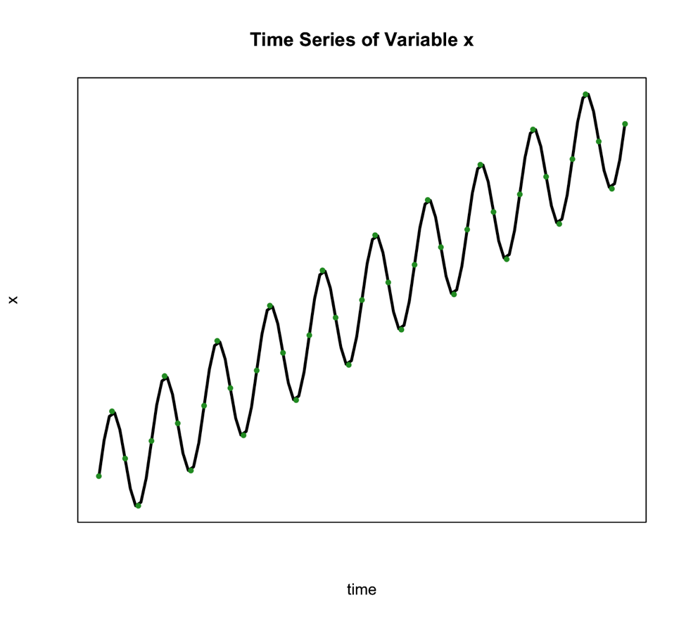
We use this type of decomposition primarily when the seasonal variation is constant over time. Such is the case in the figure below:
The second classical decomposition type is called Multiplicative and takes the form:
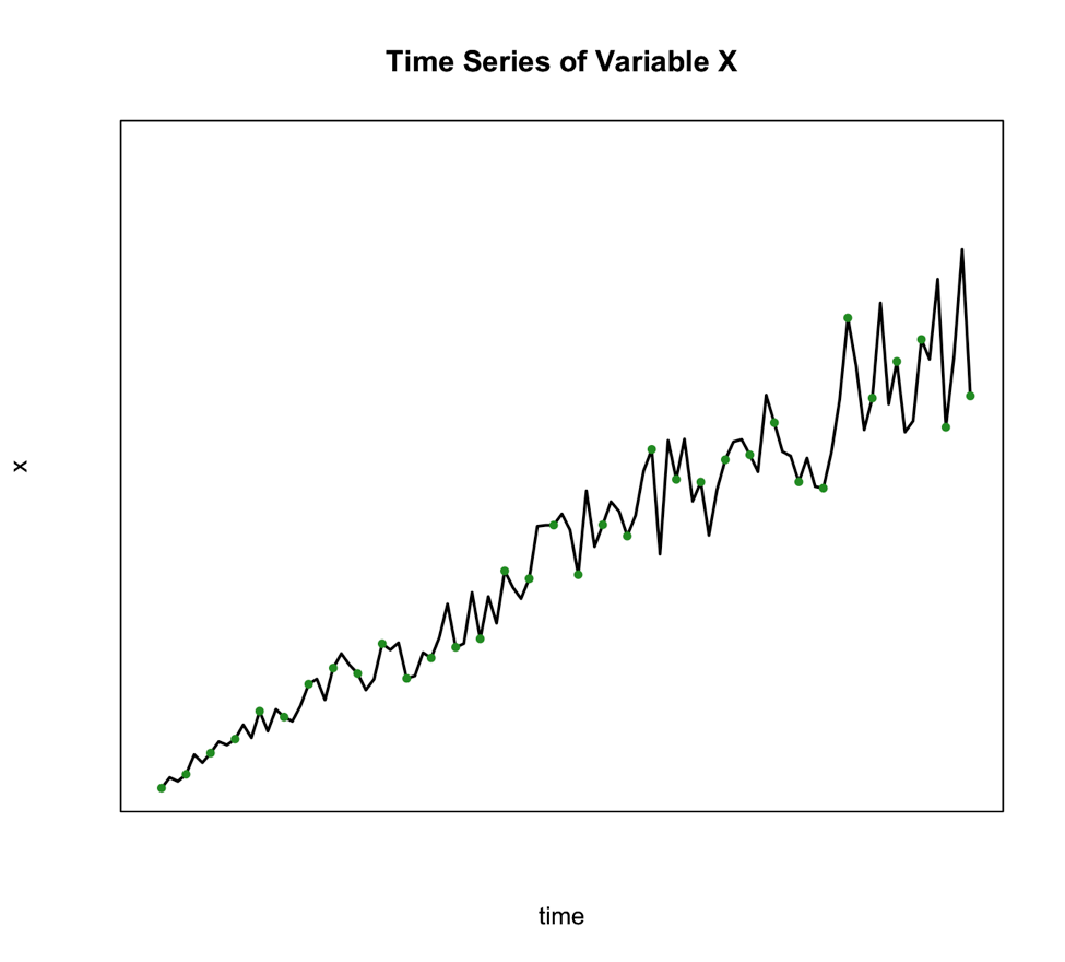
We use this method when the seasonal variation changes over time such as the figure below shows:
An alternative to the multiplicative model is to transform your data to meet the requirements of the additive. One of the best transformations to do this is log.
So, what would you select for our example? Well, for the Antarctica case, the additive might be reasonable as the variation doesn’t change much through time.
Basic Steps of Decomposition
Now that we know which method we are going to use, we can decompose the series into its components. Below is a basic step by step guide you can follow.
- Estimate the trend component (T)
We can do this by using a linear regression model, which you learned about in Meteo 815. The result is your trend component. If the trend, however, is not linear but perhaps exponential, we need to use a log transformation to obtain a linear trend and then perform the linear regression analysis. - Periodic Effects (P)
Before we can obtain the periodic effect, we need to de-trend the series. If the method is additive, you subtract the trend estimate from the series. If it’s multiplicative, you divide the series by the trend values. Then, we average the de-trended values over your periodic time span. For example, if you wanted a seasonal effect, you compute the average of the de-trended values for each climatological season. That is, take an average of all the Decembers, Januarys, and Februarys, then take the average of all March, April, May months, and so on. - Random Component (E)
To obtain the random component if you are using the additive format, you solve for E: To obtain the random component if you are using the multiplicative format, you solve for E again:
Please note that you do not have to perform these calculations yourself. Instead, you can use the function ‘decompose’ in R which allows you to decompose any time series by ‘type’ (set to additive or multiplicative). All you need is a time series function. What is important in these steps is that you understand what’s going on. That is, we simply pull out each component. If it seems basic, it is! Don’t overthink this.
Let’s decompose our Antarctica SST time series in R. Use the code below to first make a time series object.
Your script should look something like this:
# create a time series object
tsNOAA <- ts(movingAveNOAAAnom[,1],frequency=12,start=c(as.numeric(format(NOAAtime[1],"%Y")),as.numeric(format(NOAAtime[1],"%M")))
Now, let’s decompose by running the code below:
If you look at the variables in DecomposeNOAA, you will see each component: Trend, Seasonal (what we call Periodicity in our course) and Random (error). You can also plot the object. Below is a larger version of the figure.

This figure shows you the data in the first panel, the trend component in the second, the periodicity in the third, and the random in the fourth. Note that the seasonality component depends on how we adjust the ‘frequency’ parameter in the metadata (time series object). It is important that you get this right when decomposing.
So there you have it, your time series has been broken down. You know each component. Now, this may seem kind of pointless, but it will be helpful later on when we try to identify other patterns and diagnose different aspects of your time series. This is a very simplistic approach, one you will probably not use, but it is meant to illustrate how these components all add together. We will hit it with more powerful tools in later lessons.