EMSC 100 Lessons
Geography: Maps and the Geospatial Revolution
Introduction
Open Educational Resources
Now available for self study or re-use in your classes - the Maps MOOC [1] offered on Coursera is now offered as an Open Educational Resource by Penn State.
Since 2013, Maps and the Geospatial Revolution has been taught three times, reaching more than 100,000 learners from around the world on Coursera.
Now the course content and assignments are offered here for free for anyone to use, at any time, to support their own learning or to help them teach others about mapping and GIScience.
Want to go deeper? Penn State offers award winning online GIS, GEOINT, Geodesign, and Remote Sensing programs - check them out at the GIS program home page! [2]
About this Material
The past decade has seen an explosion of new mechanisms for understanding and using location information in widely-accessible technologies. This Geospatial Revolution has resulted in the development of consumer GPS tools, interactive web maps, and location-aware mobile devices. These radical advances are making it possible for people from all walks of life to use, collect, and understand spatial information like never before.
This course brings together core concepts in cartography, geographic information systems, and spatial thinking with real-world examples to provide the fundamentals necessary to engage with Geography beyond the surface-level. We will explore what makes spatial information special, how spatial data is created, how spatial analysis is conducted, and how to design maps so that they’re effective at telling the stories we wish to share. To gain experience using this knowledge, we will work with the latest mapping and analysis software to explore geographic problems.
This class has been taught three times on Coursera [1] in a Massive Open Online Course (MOOC) format. More than 100,000 learners from around the world have enrolled in the class over three offerings since 2013. This site provides the primary content of the course as Open Educational Resources for anyone to use for self-study, adapt for their own teaching, or otherwise re-use under a Creative Commons License.
Note:
This course content is provided as-is. It's a free resource that you may use and re-use under a Creative Commons License. We cannot provide service or support for anyone who uses it, sorry.
Course Overview
Lesson One: The Geospatial Revolution; highlighting the massive changes in geospatial and mapping technology in recent years and their impact on people from all walks of life.
Lesson Two: Spatial is special; an exploration of spatial thinking and geographic thought to provide the context necessary to understand the underpinnings of the Geospatial Revolution.
Lesson Three: Spatial data; how spatial data is created, what makes it different from other types of information, and how it is managed using new technologies.
Lesson Four: Spatial analysis; basic techniques for solving geographic problems that take spatial relationships into account.
Lesson Five: Cartographic design; fundamentals necessary to design great maps to tell compelling stories about geographic patterns.
Recommended Background
No background is required; all are welcome. If you're already a Geospatial Guru, then you might find this class a bit basic, in which case I hope you'll consider taking the online courses [3] that we offer at Penn State.
Suggested Readings
No readings aside from the course content are required, but students are encouraged to explore the Nature of Geographic Information [4] and the Geographic Information Science & Technology Body of Knowledge [5].
Course Format
The class consists of short lecture videos, which are 5-10 minutes in length, as well as written and graphical content to cover key geospatial concepts and competencies. Each lesson features a hands-on lab assignment using ArcGIS Online [6] using their free public account option (no downloads or purchases required).
FAQ
- What resources will I need for this class?
- For this course, all you need is an Internet connection and the time to watch lectures, read course content, complete lab assignments, and discuss your lab work with your peers. You do not need to buy or download any software.
- What will I learn if I take this class?
- You’ll learn how to make maps and analyze geographic problems using the latest tools [6], and you’ll know what makes a good map. You’ll also learn why spatial makes things special, and you’ll understand how Geography permeates nearly everything we do.
- What future learning opportunities will this class prepare me for?
- Students who successfully complete this class will be prepared to continue their education in more advanced GIS and Mapping classes [3].
- What if I need help with this course content or its assignments?
- This class content is provided as-is. Unfortunately, I'm not able to provide individual support for its use and re-use. More than 100,000 students have taken this class since 2013 on Coursera, so most of the kinks have been worked out, but I can't guarantee that its elements won't go stale, that the labs will still work, etc...
- I really need to ask you a question - how can I do that?
- If you really need to send me an email, please send it to maps@psu.edu [7] so that I can keep my inbox semi-reasonable. I will do my best to answer questions there whenever I can.
- Will this class be taught again as a MOOC on Coursera (or elsewhere)?
- Coursera is radically changing how it does courses and I am working on converting the Maps MOOC to adapt to their new model. Teaching a MOOC is a voluntary portion of my job (and most others who teach MOOCs), so it's important to understand that what my day job expects from me vs. what people want me to do for free are often incompatible with one another. I hope to relaunch it soon!
- What's the backstory on how this course was developed? What metrics can you share about how many people passed the class?
- Several research articles on aspects of the Maps MOOC are available at my Google Scholar [8] and ResearchGate [9] profiles.
- Where are the quizzes and exams?
- I haven't included those here, as I'd like to reserve the ability to use those assessments in future runs of the MOOC and other classes I may teach.
About the Author

318 Walker Building / 430 EES Building
The Pennsylvania State University
University Park, PA 16802
Email: maps@psu.edu [10]
Homepage: http://sites.psu.edu/arobinson [11]
Twitter: @A_C_Robinson [12]
Availability: E-mail is always the best way to get in touch with me. If you contact me by phone, know that I have two offices here at PSU and only one of them has the phone, so I have to be there to see voicemail messages I might have.
About Me:
Hi! I'm Anthony Robinson, Assistant Professor of Geography and your instructor this term for Planning GIS for Emergency Management. I serve as the Director for our Online Geospatial Education programs here at Penn State, and I split my time between research with the GeoVISTA Center [13] and online education for the John A. Dutton Institute for Teaching and Learning Excellence [14]. My research work focuses closely on design issues with GIS and Geovisualization. I work with end-users and developers alike to help shape new tools and systems for a variety of application areas. I conduct experiments with users to develop design guidelines and to evaluate prototype tools. I also develop design proposals for new systems. Since I started working at Penn State in 2003 I have worked on projects for epidemiology, crisis management, and intelligence analysis domains. My research portfolio [15] is available if you'd like to see some examples.
I have a very strong passion for cartography, and I teach resident courses in cartographic design in addition to this class and GEOG 583 for our MGIS program. Outside of work, I've got plenty to keep me busy. My wife and I have a daughter who likes to break everything in our house. I have a problem collecting hobbies. Among other things, I travel as much as possible, I'm a photographer [16], I have a home studio where I record guitar and drums, I love cooking, I am an airliner [17]/airline fanatic, and I always want to go fishing. Fast cars [18] that make noise are also a passion of mine.
This course content was first presented in 2013 as a Massive Open Online Course (MOOC) on the Coursera [1] platform. Since 2013, the course has been taught three times, reaching more than 100,000 learners from around the world. The purpose of this site is to share the content and assignments from this MOOC to a wider audience who are now free to use and re-use this material under a Creative Commons License.
Cheers,
Anthony
Lesson 1: The Geospatial Revolution
Lesson 1, Lecture 1
Please watch the Lesson 1, Lecture 1 video (5:38):
Okay, let's get started. This is Lecture 1 from Lesson 1.
So I think the geospatial revolution is transforming how we do three major things. One of them is how we navigate, how we get from point A to point B. How we make decisions using geography. And how we share stories about what we do everyday.
Maps are now interactive, as opposed to static. We don't have to go to a bookstore anymore to buy something. You gotta plan way ahead for a trip or anything like that. And maps are now embedded in almost every single thing we do. So there's new technologies that have made spatial information more widely accessible like our phones, laptops, tablets all that kind of stuff. But it's also new science, new geographic science, that's made it possible for us to actually use spatial information in new and more powerful ways. So I'm going to talk about all three of these aspects that use spatial revolution today. So how we navigate is one of the major things that I think has transformed. If you think about even what, what someone like my daughter, who's a year and half old now, what she expects to have available at her fingertips now in terms of navigation is completely different than even someone born in 1980 like me. when I was born you know, the way you get from point A to point B is by already, already knowing the route somehow, having done it yourself. Or you go to bookstore, buy a paper map, hopefully they have one for the place you're going, and then you navigate that way. Or you stop and ask for directions, which is kind of hard and awkward to do.
Now my daughter for example, is born into a world where that's almost an insane notion to have to depend, depend on static technology like that. And for someone like her, her entire life is going to be filled with these digital affordances digital maps that come wirelessly to a device and tell you exactly where to go. So even the time it takes to plan a trip is now completely different than it was about ten years ago, for most people, assuming that you have these devices, right? and we're already kind of annoyed that our technology isn't even perfect yet, right? It's reached the point where it's pervasive at the level that we kind of complain about the free stuff that helps us navigate almost anywhere in the world with almost no notice. and most of the time flawlessly, right, whenever there's a little problems with it we sort of get a little bit upset about it. So I think that's revolutionary that it's now pervasive that anybody can navigate almost anywhere with very little technical ability, right? You can just fire up web browser and use your phone, do it.
Beyond just navigation though, I think what's revolutionary is, is now how we use geography to make better decisions. So, even simple decisions like the wonderful, age-old spousal argument around, where should we eat dinner tonight, are now enabled made easier by geospatial technology, or in some cases, harder because we have more options, right? So my wife and I want to know, want to figure out where we're going to go eat. And that could be like, well, I want to have Chinese food and she wants something with bacon in it, and we need to know where is the nearest restaurant that serves Chinese food with bacon in State College, right? We want to, we want to know whether or not it's open. What's the traffic like between here and there. And we can actually get an answer to that really quickly and help us make a decision. it doesn't actually solve the argument, right? It just kind of makes it a little bit longer in some cases. But, those kinds of decisions are now possible because of geography as well. It's not just navigation, it's actually knowing what to do, right? How, how to do things next. And that's a really mundane, silly kind of example, but the cutting edge of technology in science and geography is focused on way harder questions, such as what parts of this coast should we evacuate for the hurricane that's coming. And that's a way more difficult problem than one where the answers are not quite as clear yet. But there's a lot of effort in the science of geography right now to try to figure out questions like this. And we're going to cover a lot of that stuff in this class.
The third area that I think is quite revolutionary now is the geography can be used to ground the stories of our lives. So pictures, for example, can be really easily geotagged to make maps of your memories. You can, you can add a place to where you did something. you can add a place to your tweet, for example, and say that I talked about this wonderful coffee I had at the coffee place that I bought the drink, right? You can share all these crazy, mundane things. You can start to tell stories about your lives that are grounded in where exactly they happened. And if you think about even ten years ago, this was an extremely cumbersome thing to do. It may have been possible then with the technology that existed, but it was not easy and it certainly wasn't accessible to lots of people. And 20 years ago, it really wasn't even possible, to be honest. I mean there were maybe some people who had at the extreme cutting edge who were using lots of devices to try to do this kind of geotagging, but it certainly wasn't even a little bit common at that point. So I think that's a really transformative thing. So here's an example to look at. this is Flickr, a big popular photo sharing site. And what I've done here is I'm going to capture the priceless memory of my daughter crying during a time when she was getting a bunch of presents, I think this was at Christmas. And I want to ground this in the geographic context in where it happened. So I've assigned a location for it in our neighborhood at the house the place where this happened. And, and now I have this memory attached to a map. And so, for the rest of her life, whenever she wants to go to see exactly this time when she was so upset, so unhappy, and and really couldn't understand how many presents she was getting and, you know, her, her emotional turmoil was connected to this place. I want her to be able to relive that memory in the same depth and richness that I did, when it first happened, right? So I think that telling stories with with maps now is one of the most amazing things that's possible from geospatial revolution.
Look at the great stuff we can capture like this.
The Geospatial Revolution
I think the Geospatial Revolution involves major transformations in the way we do these things:
- How we navigate
- How we make decisions
- How we share stories
What’s unique here is that concepts of space and technologies designed to leverage location information have made huge advances in all three of these areas possible. The past decade alone has seen a complete paradigm shift in how normal people are able to use and think about Geography. It’s not just geeks like me with fancy software and high-tech expensive gear who can make and use maps anymore. And maps aren’t just for naming places or placing pins on the nearest Waffle House, although that’s pretty important too.
How We Navigate
So are we really experiencing a Geospatial Revolution? Let’s use my daughter as an example. Claire was born in 2012. When she arrived, it had already become commonplace for many people to have interactive maps accessible through computers and handheld devices at relatively low cost. In her world, nobody needs to learn how to use a paper road atlas to find their way to Grandma’s house. Instead, directions to and from almost anywhere can be had for free in an instant using easy-to-manipulate tools like Google Maps and MapQuest.
So that’s one way in which personal navigation has been completely transformed. In contrast to Claire, when I was born, it was really important to plan ahead about where you were going (using paper maps, which you had to buy or borrow) or you had to be prepared to take longer, rambling journeys that relied on dead reckoning alone. I still have fond memories of working as the navigator on our family car trips to the beach in South Carolina, spending hours poring over a big paper road atlas that showed only a couple of map scales. When we hit a lot of traffic, I might have to help find an alternate route. Today, we still need to intervene from time to time to find a new way to get somewhere, but it’s as simple as dragging the route around on the map, or telling the GPS to give us another option.
For Claire, by the time she’s ready to drive, I suspect it’s likely that making those alternate route decisions will also be a thing of the past. Our cars will simply know the best way to go given current weather and traffic conditions, and take us there with minimal intervention. We’ll all be a little dumber because we won’t even remember how to navigate the old way. I will be stumbling around an old folks home, dragging a shopping cart behind me filled with dog-eared paper atlases while loudly decrying the downfall of civilization.
Making Decisions
The Geospatial Revolution is much more than just a transformation in how we go from Point A to Point B, however. It’s also about making decisions and analyzing problems using Geography. Let’s consider the age-old problem of deciding where to eat dinner tonight. We’ll assume that we’ve already looked through the cabinets and decided that nothing good was there for us to make, so we’ll need to take a trip. My wife and I are pretty bad at reaching a decision about such matters, and thankfully we can rely on geospatially-enabled stuff to help us reach consensus. Today, we can just fire up Yelp [19] from a phone and ask it to find the nearest restaurant that serves amazing Sushi and also happens to be open on a Monday night. That question can be answered in just a few seconds now, and if we haven’t been there before, we can tap on a little button to tell us how to get from where we’re standing to our reserved table. It won’t help us sort out the personal conflict that arises when I want a sub and she wants tacos, however. That’s what we need Facebook and Twitter for—to gripe about mundane crap and hear what other people think about our mundane crap. But I digress.
Figuring out where to eat is a pretty simple decision for me to describe. What about making decisions like where to locate the next shopping mall in your home town? How about forecasting the potential for a city to be impacted by natural disasters? What about protecting endangered species? Each of these problems requires one to use and make sense of Geography in various ways. What’s exciting is that the Geospatial Revolution has brought about new sources of data and amazing interactive tools that are capable of helping us make those decisions. In each of the five lab assignments you’ll complete in this course, you’ll gain experience evaluating Geographic problems like these and you’ll see how powerful (and how complicated) geospatial analysis can be. You’ll also lose weight, feel happy about yourself, and maximize your earning potential!
Sharing Stories
In less practical, but more engaging terms, we’re also able to use Geography now to share our personal stories in much richer ways. I’m a big photo nerd (and map nerd, and airplane nerd, and… basically just a many-faceted nerd) and even if you’ve barely been paying attention for the past 10 years, you’ve no doubt seen photo sharing sites like Flickr and Picasa. Both services allow you to easily Geotag your photos. Geotagging is a form of geocoding, which is the term used to describe the assignment of location information to a data record. After you upload your pictures to Flickr, you can say where they were taken by either assigning place information manually (“tagging” a photo of the Eiffel Tower by saying it was taken in Paris) or by uploading coordinates that were captured by a GPS device that you used to track your movements (so you can be much more specific about the exact spot on the earth where the photo was taken). I bought a new camera recently (a Canon 6D [20]) that has a built-in GPS tracker to assign coordinates to every photo automatically. As I travel, I’m actually making maps. Awesome.
It’s this kind of revolution that allows us to tell stories using Geography much more easily than ever before. In 1999 if I wanted to make a map that showed all of the places where I stood and took pictures on the epic 5-week trip I took across Bolivia, Peru, and Ecuador, I would have had to buy and carry with me a heavy, cumbersome Global Positioning System (GPS) receiver and develop my own workflow for scanning my photos from film and digitizing everything into Esri’s ArcView 3.0 Geographic Information System [21] (GIS) software. While it was possible, it would have been incredibly difficult to pull off, and it was certainly the type of thing that was well out of reach of most normal people who just want to document their cool travel experiences. If we went back another ten years to 1989, even that clumsy process would have been impossible to imagine unless you happened to also run a huge spy agency.
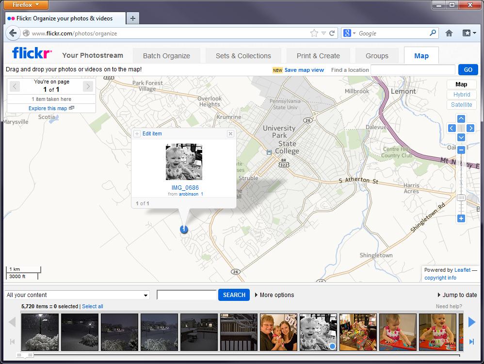
Today, however, I could actually go back and scan those photos, and just drag them onto the map in Flickr (assuming I remember where I took the pictures… but just play along with me). I’ve shown that process here using the current Flickr interface and a picture of my daughter crying which I thought really needed to be on my personal map [22].
Lesson 1, Lecture 2
The Changing Nature of Place
It may seem like the basic attachment of location information to anything and everything reveals a relatively stable future for Geography and Geospatial technology. All we have to do is Geotag everything and we’re done with this Geospatial Revolution thing, right? I don’t think it’s that simple, because the enormous potential of location-enabled everything faces similarly huge barriers for people who want to make sense of interconnected and massive spatial data sources. Moreover, the super-simple common format for a location—one set of coordinates on the Earth—completely fails to describe the richness of Geography.
For starters, it’s often impossible to assign a single relevant location to an observation. Let’s even take something as constrained as a Tweet as an example. You only have 140 characters on Twitter to tell your story, so not much can happen here with locations, right? Wrong. There are multiple relevant locations with any Tweet. Where is the Twitter user from? Where were they when they Tweeted their message? What about the message itself? Does it contain references (explicit or implicit) to locations? We’ve done some research [23] on this area at Penn State and found that many Tweets contain references to many different locations. So how do we show that on a map? Which ones are the most important or explanatory? Like most complex analytical problems, the answer may depend a lot on what you’re trying to learn from that information. Let’s say you’re working for a crisis management organization and you want to monitor what’s happening on Twitter to identify emerging concerns in the wake of a major disaster. What types of locations would you want to see? Could you use location information to establish a basis for comparing the credibility of a particular report? How would you show millions of these reports on maps that could be used by a normal human being who isn’t just studying this stuff after the fact?
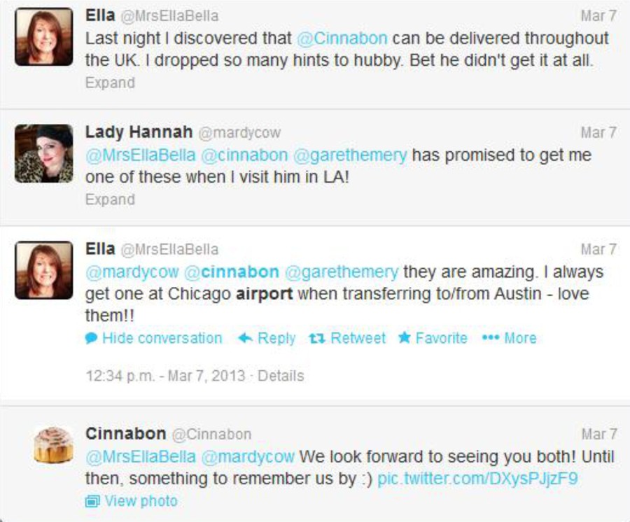
In the more benign example here, which places are relevant to this important discussion on where to find a delicious Cinnabon cinnamon roll? The United Kingdom, Los Angeles, Chicago, and Austin are all mentioned here explicitly. But what about the hometowns for each of these folks, or the place where Cinnabon is headquartered (Yumtown at the corner of Godhelpme Ave. and Gimmeicing Lane)?
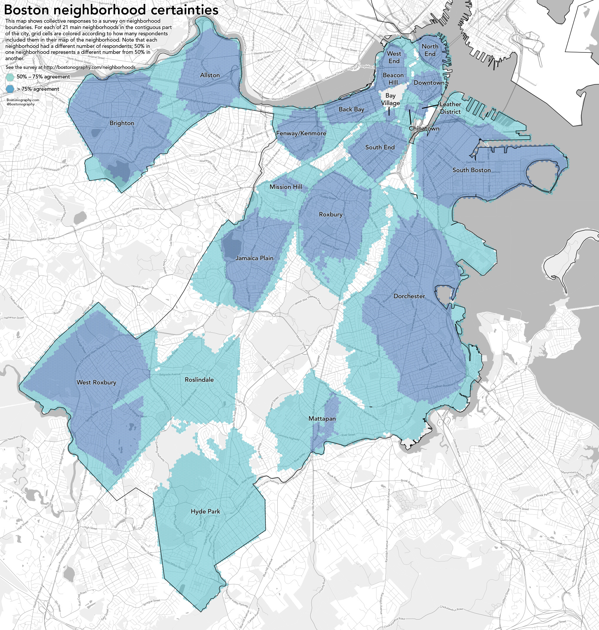
While we’re at it, let’s talk about defining locations more broadly as well. Until now I’ve emphasized a single point in space as a location. Geographic locations can include well-defined formal regions like states and counties, natural areas like watersheds and mountain ranges that can sometimes be formally defined by their observable features, and ill-defined cultural regions like neighborhoods. I live in a place informally known as Happy Valley. It’s not just the city of State College or its surrounding townships and boroughs. It includes space outside of those formal areas, and it cannot be defined precisely despite the fact that it clearly corresponds to a place on Earth. We still have a lot to learn about how to collect people’s conceptions of these sorts of places and use them on maps. The example here by Andy Woodruff [24] and Tim Wallace [25]at Bostonography.com [26] shows how people in Boston conceive of their city’s neighborhoods. It’s pretty blobby and imprecise, and parts of the map are empty. This is a much more faithful representation of what we can actually know about these types of places than the neat and tidy borders we can define for legal boundaries.
What is Geography?
Geography is the science of place and space [27]. It involves the study of spatial (all stuff exists somewhere in space) phenomena of all kinds. I’m pleased to say it’s much more than just naming places on maps. I fly a lot, which means I often have to explain to someone sitting next to me that I’m a Geographer. This prompts one of several typical responses:
- Oh cool, I have a cousin who’s a Geologist!
- Haven’t all of the maps already been made?
- Oh neat, I have no idea what that is!
- Wow, that is so sad!*
*full disclosure, this didn’t happen to me but it did happen to a map nerd friend of mine who said what she did for a living to a guy hitting on her at a bar. It prompted this response.
When I talk about Geospatial stuff in this course, I’m referring to information and technology that has location as one of its key components. So Geography is the science of understanding places and spaces, while Geospatial refers to the data and technologies that allow one to explore Geographic problems. Geospatial is always a modifying term – so I’ll talk about Geospatial information, or geospatial systems, or geospatial bacon, never just “Geospatial” all on its own. This is somewhat simplified, and Geographers are infamous for having almost no ability to reach consensus on how we define ourselves or what we do, but I’ve given it my best shot here.
Maps To Tell Stories, Maps To Provide Context
There are two major categories of maps. Thematic maps are used to showcase geographic data observations. Thematic maps are almost always associated with storytelling of one kind or another. For example, let’s assume I have a dataset showing the proportion of U.S. citizens who are currently talking about something inane on their cellphones. This hypothetical data might be collected at the county-level, and I’d want to tell a story with my map about which places in the U.S. have the most insipid talkers. The pattern of those observations by county would allow map readers to understand the geographic distribution of those folks, and begin to formulate hypotheses about their causes (places with lots of teenagers, middle-aged men roaming airports, etc…).
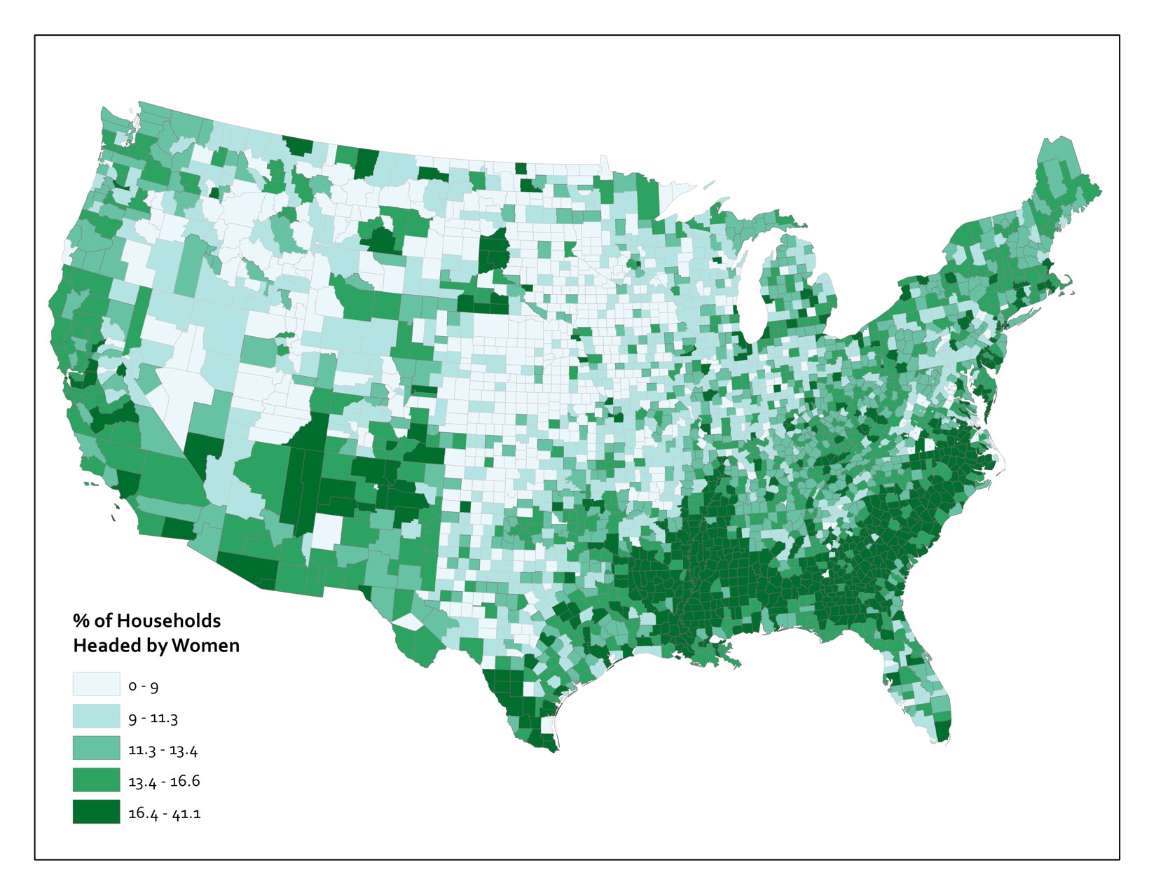
Or you could have a much more serious example, like the one shown below. This map shows the proportion of households in the Lower 48 United States that are headed by women.
Now you’re probably wondering about the kind of maps you thought I’d start with here. Reference maps (also frequently called basemaps) provide the basic Geographic context required to situate other stuff. A good example here would be a Web Map [28] that shows roads, physical, and cultural features. Reference maps are used all the time these days as the backdrops upon which we plop all sorts of digitally-rendered map pins [29]. If you fire up Yelp and search for a nearby place to buy a very large bag of delicious Nacho Cheese Combos at 4AM, you’ll see a bunch of these pins appear on top of a basic, multi-purpose reference map. Designing these map canvases is really hard. To give you a tiny flavor of the challenges here, check out how many named geographic features exist for just one county [30] (select "Pennsylvania" from the state dropdown and type "Centre" into the county field). You should end up with 1177 named features. Now, poke around with the web map example here [31] and pay close attention to which features exist, what they are named, and how they are drawn at different scales. Try zooming in to the area around Grand Canyon in Arizona and see how the labeling and symbols change as you change scales. Computers can’t do this stuff automatically (er… at least not without a lot of human intervention), so there is a huge amount of work that goes into designing these now taken-for-granted reference sources.
The Earth Is Round And Maps Are Flat
That’s really all you need to know, but I guess I need to explain a bit more, huh?
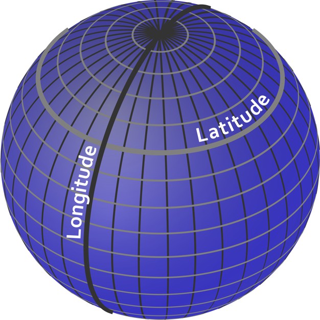
To identify a location for anything, we need to set up a reference system. The one we use most commonly is the geographic coordinate system of Latitude and Longitude. Think of it as an addressing system for the entire planet. It’s really just a grid system, with standard lines of Latitude providing North/South parallels and standard lines of Longitude providing East/West meridians. Latitude varies from +/- 90 degrees from the Equator, and Longitude varies from +/- 180 degrees from the Prime Meridian, which runs through the Royal Observatory in Greenwich, England [32].
Latitude and Longitude coordinates are expressed in either decimal degrees or in degrees, minutes, and seconds. Both methods are useful for different tasks, but it’s a bit beyond the scope of this class and I don’t want you to fall asleep so early in the course.
This is all well and good, but a major problem we have to deal with here is that the Earth is spherical (erm, it’s an imperfect one, so it’s actually an ellipsoid) and we need ways to take stuff off this 3D object and present it in 2D on paper or on screen (since carrying a globe around is pretty annoying). For an illustration on exactly why this is a problem at all, get yourself an orange, draw crude versions of the continents on it, and then try to peel the orange without distorting or tearing the map at all. Don’t do this on top of your iPad or while you’re supposed to be paying attention on a conference call. You’ll notice that it’s very hard to do anything that doesn’t totally ruin the map, and the best you can approximate is something like the image shown here (if you’re really good). Nathan Belz [33] tells a neat little story [34] about what he did to create this example.
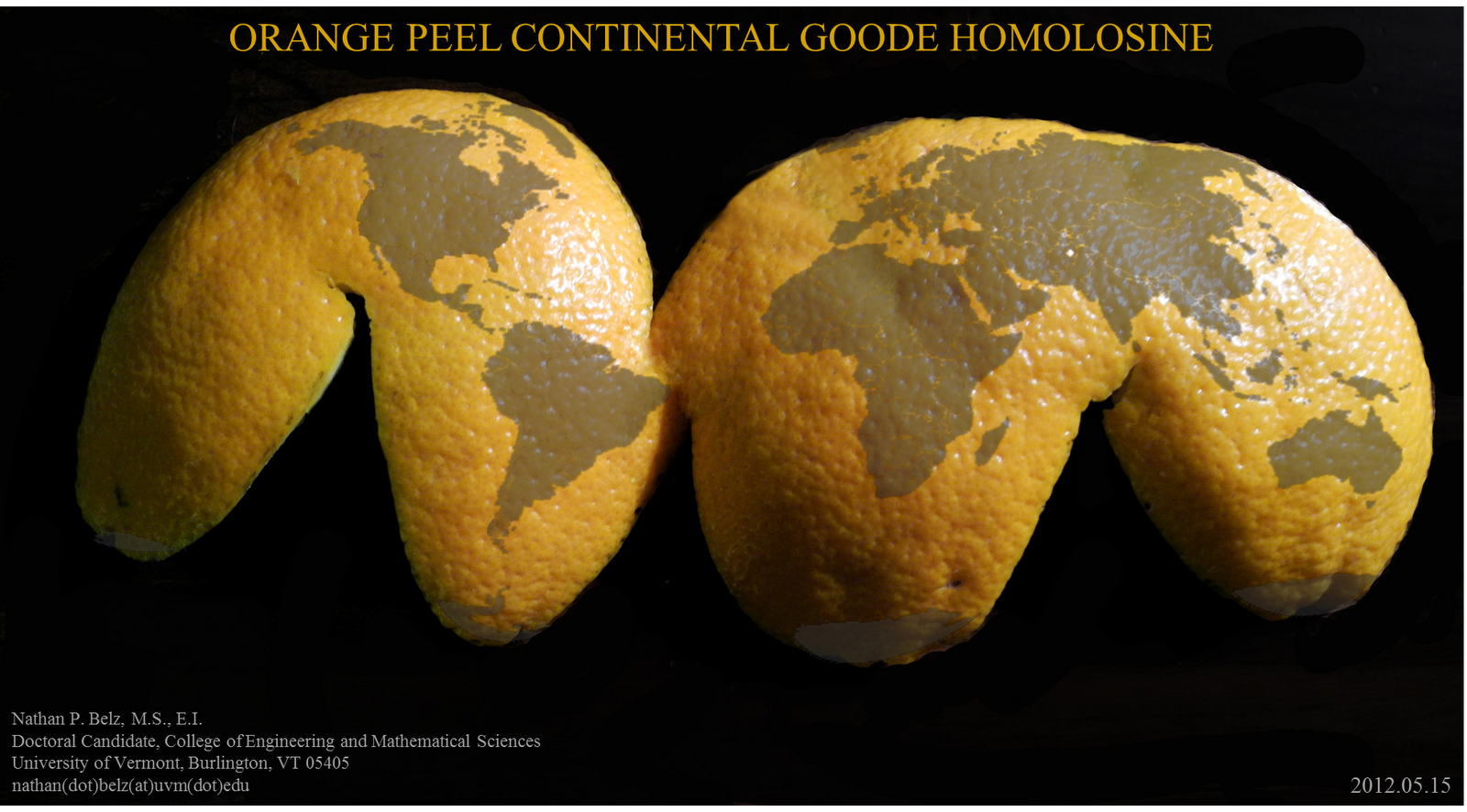
This is all a lead-up to tell you that in order to make maps, we have to flatten the Earth using math. The act of making transformations to translate points on a sphere (Lat/Long) to points on a 2-dimensional plane (a map) is called Map Projection. Because math is fancy witchcraft concocted by devious wizards, there are hundreds and hundreds of possible mathematical transformations from the Earth to a map in the form of named Projections. The one you see above is called the Goode Homolosine. I’m personally partial to the Robinson Projection [35], although I unfortunately had nothing to do with its creation.
What you really need to know is that Projections allow you to preserve some, but never all of the basic characteristics of Geographic relationships. Specifically, you can preserve direction, shape, area, distance, or the shortest route between locations. Alternatively, you can choose to preserve none of these attributes and instead focus on a compromise across them (as is done with the Robinson projection and many other World Map projections).
Video Activity
Now that I’ve set things in motion a little, I want you to watch Episode 1 of the Geospatial Revolution video series [36] produced by WPSU at Penn State [37]. This video is 13 minutes long, so it’s a fair bit longer than most of the other videos you’ll watch in this class. I’ll do everything possible to keep the remaining videos short and snappy – but this one is really compelling and has cool dramatic music so I think you’ll be able to hang in there without snoozing.
Mapping Assignment
Introduction
This week, you learned that geography is the science of understanding places and spaces. You also learned that one of the ways people have sought to understand places and spaces is through maps. As you are discovering, part of what the geospatial revolution means is the advent of geospatial technology. Geospatial technology helps us create content that can be changed. In this lab, you will have the opportunity to get started with web mapping.
You probably already use cloud-based technologies when you use Google Drive, Facebook, Flickr, or Dropbox, for example. Web mapping is GIS in the cloud. Web mapping includes spatial data in the form of maps, databases, map services, and satellite images, and it also contains tools and functions such as the ability to measure things and to do spatial analysis.
Not all digital maps are dynamic; millions of maps exist in presentations, PDFs, and as static images like the ones I’ve made for this class. But unlike static digital maps, dynamic digital maps can show real-time things like weather, floods, or traffic. Layers of information can be added or subtracted from them so that you can change the map design yourself at will. The scale, colors, symbols, and the way their data is classified can all be changed. They can be embedded into live web pages, changed from 2D to 3D, and formatted for a smartphone. Therefore, they move beyond being simply reference documents (“Where is Uzbekistan? OK, great! Next?”) to being tools of geographic inquiry, used to understand spatial and temporal patterns in order to solve problems.
To give you hands-on experience making your own maps and doing spatial analysis, we’ll be using Esri’s (cloud-based GIS called ArcGIS Online [38]). Joseph Kerski works for Esri’s Education Team and has done a ton of great work to develop these labs for you. ArcGIS Online does many of the things a desktop GIS system can do, but it has a much easier learning curve, can be used right in your web browser, and makes it really easy to share interactive maps you make with others. Esri paid me zero dollars to say that and use this stuff in this MOOC and they have been enormously helpful to make sure that you can do awesome stuff in this class using their software.
In addition to tools made by companies like Esri, there is a flourishing community of free and open-source software for doing all things geospatial (see osgeo.org [39] for an overview and live.osgeo.org/ [40] for tools). For the final assignment in this course you’ll have the opportunity to explore an open-source options (like CartoDB [41], for example) or use ArcGIS Online.
Investigating Global Population and Ecoregions
Have you heard about “big data?" Since they seek to understand the whole world and everything in it, geographers were into big data way before the term existed. With the explosion of datasets of all types, geospatial data abounds as well, at scales from local to global, and across themes ranging from natural hazards, to energy, to water, and geology. For example, in terms of population, not only can you obtain the locations of cities, but the size of those cities, and not only total population counts, but also population density, how population is changing, and characteristics of the population such as age, ethnicity, income, education, life expectancy, and other variables. You can examine the relationship of population to other phenomena, represented as map layers. In this lab, you will examine the relationship of where people have settled to the physical environment. You will also determine how population impacts the physical environment in which it exists.
Before you start using the tools, try to answer the following questions as best you can. You don't need to submit your answers, but you may want to write them down someplace.
- What is an ecoregion? You’ll probably want to fire up your Google to sort this out. That’s what I’d do.
- In what ecoregion do you live?
- What is one factor that influences population density in a given area?
- Describe the population density in the neighborhood in which you work. Make a little note of what you think this is. You’ll need it later in this lab.
Let’s Make a Freaking Map Already
When you’re ready, click here to begin building a map [42]. You may want to open links like these in a new window so that you can switch between the lab instructions and the mapping tools.
This map was built using ArcGIS Online. First, note that you have the map occupying most of the screen (as it should be!). Second, you have a set of map layers on the left. Third, you have tools—some of which are at the top, and some are available through the list of layers on the left.
This map shows Ecoregions, Population Density, and Imagery. To see these, select “Modify Map” in the upper right of the interface, then click Content above the Legend to see the list of available layers.
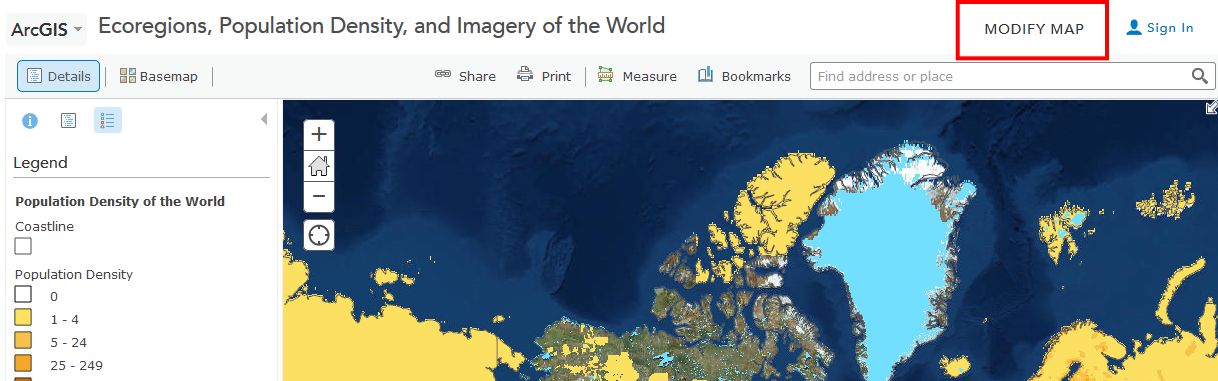
Take some time now to explore the About, Content, and Legend buttons directly above the Legend. Get comfortable with what these buttons do. Zoom using the vertical scale bar at the left side of the map—the middle scroll wheel of your mouse if you have one—or by holding the shift key and drawing a box on the map with your mouse. Bookmarks are another way to zoom in or out (change the map scale).
Now use Bookmarks (just left of the search bar at the top) and select World. Show the map legend. Your map should look like this:
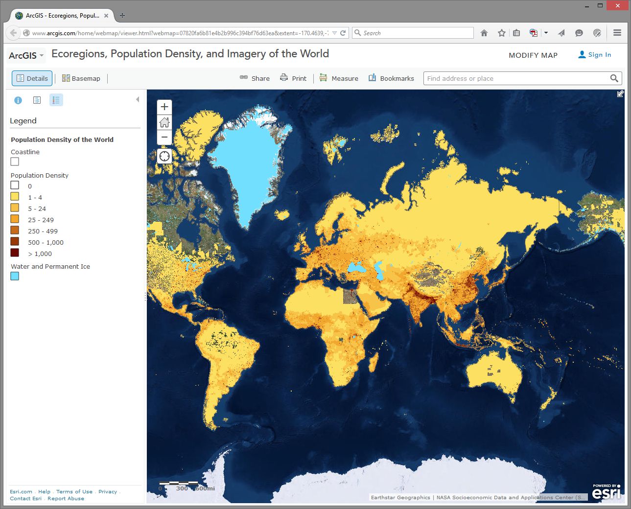
How would you describe the pattern of world population density?
Change the Basemap back and forth from Imagery to Terrain With Labels so that you can refer to country and city names that are part of the Terrain with Labels layer.
- As we will discuss later in this course, knowing where data comes from is, to put it into geographical terms, a Very Big Deal, particularly with maps. To start thinking along these lines, examine the “details” of the population density layer by clicking the right arrow next to the layer and selecting Description.
- Who created this data, and what sources did they use?
Use Bookmarks and select India-Nepal. Toggle between population density and the imagery base map. Try making the population density layer transparent by clicking on the small right arrow next to the layer name, selecting Transparency, and using the slider bar that appears.
- What is one reason you can think of for the difference between the population density in northern India compared to that of Nepal?
- Use the Measure tool and determine the distance between the area of highest population density in India to the area of lowest population density in Nepal. Be sure to note the distance units you are using (miles or kilometers).
- Switch from the Legend view to the Contents view and turn on the Ecoregions layer. Turn the Population layer on and off and note the predominant ecoregions in the most densely settled regions of northern India. Also, explore the relationship between population density and major rivers. How do you think the dense settlement here may have an effect on the ecoregions of this area?
- Describe the ecoregion and the population density in the region in which you live using the map. How does the population density compare with your earlier observation where you were asked to reflect upon the population density of your area without the aid of a map?
Exploring Population Dynamics (That’s A Lot Of Babies)
Let’s take a deeper look now at how population is changing all over the world and explore what might be driving those patterns.
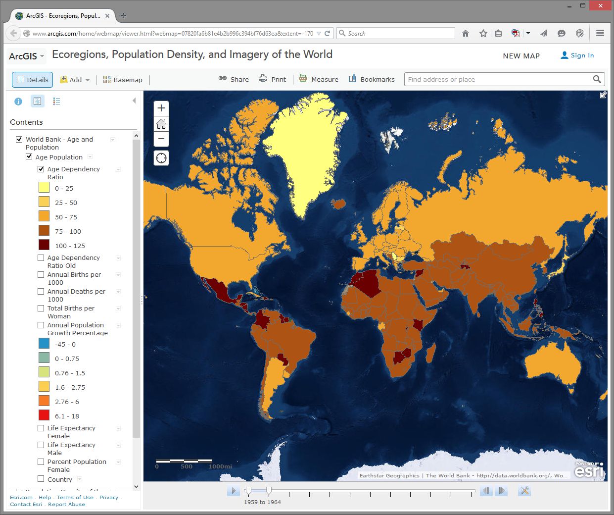
Use the Add button, then Search For Layers and search for: World Bank Age and Population in ArcGIS Online. Select the one authored by “Intl_User_Community.” Then click the big blue Done Adding Layers button at the bottom to add this layer to your map.
First, select the Content button to show the map layers instead of the legend. Then, expand your newly added age and population layer by clicking on its title and then click on Age Population. You will see that this map is actually a set of 10 layers (ideally, every map should be turned up to 11 though). Uncheck any layers in this set of 10 that might already be selected - we want to start with a clean slate.
Next, select the checkbox for the Annual Population Growth Percentage, show the legend by clicking on the layer name, and note how much the growth rate varies around the world. Make sure that no other layers listed before this one are turned on, since those could obscure the layer you want to see. Now turn on Age Dependency Ratio. Age Dependency Ratio [43] is the ratio of dependents (people younger than 15 or older than 64) compared to folks in the working age population (15-64). Click the Age Dependency Ratio layer name to display its legend. Your map should look similar to the one shown here:
Which statement is correct?
- Countries with a higher growth rate typically have a higher age dependency ratio.
- Countries with a higher growth rate typically have a lower age dependency ratio.
Why do you suppose the growth rate and age dependency ratio are related in the way that you've indicated above? The percentage of working age population is also known as the “dependency ratio,” because this number represents how much of the population (young and old) that is dependent upon the working age population.
- What impact do you think a high population growth rate has on a country?
Note that these data sets go back in time—to 1960 in some cases. My parents were born in 1960. Every photograph automatically looked like an Instagram back then. You can use the arrows in the popup boxes to access the different years. You can use the slider bar under the map and the play button to animate the data over time, or slide the marker all the way to the right to 2014 to display the most recent data. So with these maps you can examine not only the spatial dimensions, but also the temporal ones.
Pick a country that interests you and examine the growth percentage and life expectancy in that country over time. If you’re a rockstar student you’ll share something you discovered with your peers in the discussion forums. You can always click on the Share button to get a link to embed in your post.
- Recall your recent reading about map projections. This map uses the Web Mercator projection. How are the areas near the North and South Pole shown on this map?
- How does the projection that this map is using affect your interpretation of what you are studying?
Geodemographics – Having Fun With Stereotypes
The statistics you are examining about population tell only part of the story about the people in those places, of course. People live and behave in ways that might be described with a combination of variables, not all of which are captured on census surveys. One of the ways to measure this aspect of demography is through the creation of a variable that captures a “lifestyle” by neighborhood. It is this variable that marketing folks often use to send you forty catalogs of gourmet food products and coupons for discounted hair transplant surgery (wait - you mean that’s just me?). Marketing folks use this stuff to help determine what is stocked on your local stores’ shelves, what types of cars or bicycles or breakfast sandwiches are sold in your area, what sorts of movies are shown, and a whole lot more.
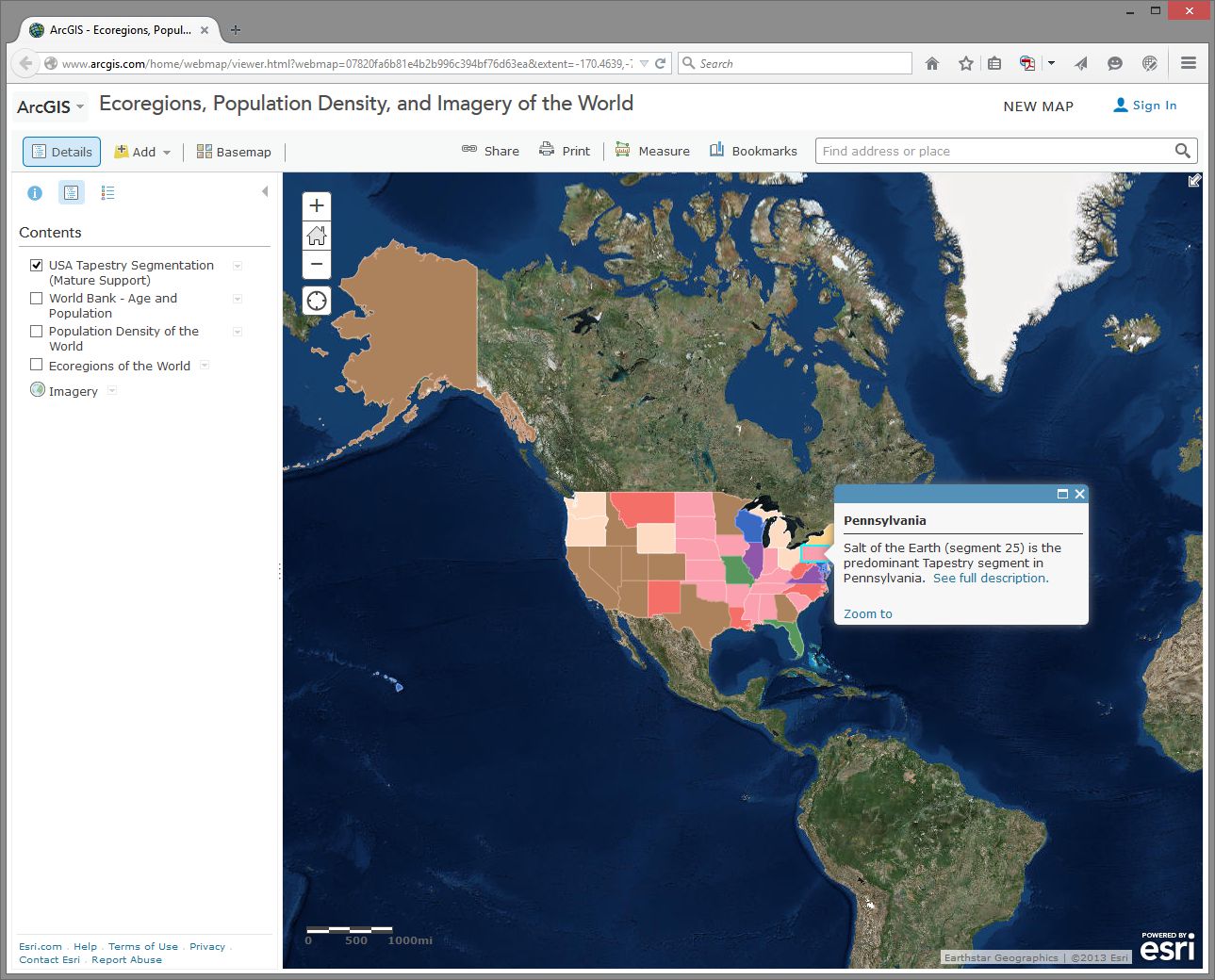
Go to Bookmarks and select the North America bookmark. Turn off all map layers. Then use the Add button and search for the data layer called Tapestry in ArcGIS Online. The “Tapestry segment” is one of these lifestyle variables we have been discussing. Add the USA Tapestry Segmentation (Mature Support) layer to your map (it should be the first result in your search results list). Zoom in and out a couple levels and watch what happens to your map (you should see counties turn into states as you zoom out to show the entire world).
Click on the state you live in (or, if you live outside the USA, pick one that sounds cool). What is the predominant tapestry segment for your state? In the popup box that appears, select See full description to learn more about how that segment is defined. Your map should look something like this:
- What is the tapestry segment of your neighborhood or a neighborhood you are interested in?
- Would you say that the tapestry segment describes you accurately? Does it describe some of your neighbors? Does the segment description make you laugh, or laugh nervously?
- What influence does the map scale have on the data you are analyzing?
Now change the Basemap in the neighborhood you are examining to Imagery and then make the Tapestry layer semi-transparent.
Is there anything on the imagery that gives a clue as to the neighborhood’s lifestyle? What do the structures and streets tell you about this place?
If you have time, feel free to explore additional data layers inside ArcGIS Online. We’ll be using it throughout this course, so if you can become more familiar with it now, it will serve you well later. Add other population data of interest to you, such as median income, median age, and median home value. Do these variables help explain the tapestry segment of your chosen neighborhood and surrounding ones?
Congratulations – You Just Made Some Maps!
Awesome job. You have just been using maps in exciting ways to explore the relationships between the environment and people and to examine components of the population, using a web mapping system. Along the way, you have considered scale, data, the map projection, and other geographic concerns.
Credit Where It's Due
This lab was developed by Joseph Kerski [44] and Anthony Robinson [45].
Discussion Prompts
Privacy and the Geospatial Revolution
Have a look at a map that was created by students who took this class in 2015. [46] This map shows student's self-reported locations and some basic demographic information. It's incredibly interesting and helpful for me as the instructor, because now I have a better sense of all of the amazing places where people were experiencing this course. Some shared what seem to be very specific locations (down to a specific house, for example). Others shared locations that seem to be much more generic. People have always had conceptions of private and public space, but geospatial privacy is more relevant than ever due to the proliferation of ways in which your personal location can be shared.
Here are some prompts you can use to discuss what you've learned in this lesson:
- Why did you feel comfortable sharing what you shared?
- What is scary about potentially losing control over your geospatial privacy?
- What are some positive things that could come from openly sharing your personal location with others?
- What about geospatial privacy has really changed over time? 200 years ago, would it have been possible to live in your current location without your friends and family knowing where you were most of the time?
- Have a look around at what people submitted for answers to the question “How do you use maps?” Are there spatial patterns associated with certain types of answers?
Lesson 2: Spatial is Special
Lesson 2, Lecture 1
Spatial is Special

Leading off with a cliché is always dangerous, but I do really believe that Geography as the science of place and space depends in part on the axiom that what is Spatial is Special. This Lesson focuses on spatial thinking and spatial relationships that underpin everything we try do to with mapping and geographical analysis. A lot of this stuff will seem like common sense when you see the examples, and other aspects are likely to represent a new way of thinking about the world.
Most sciences have associated laws and axioms that govern fundamental principles and methodological approaches. In Geography we really just have one: Tobler’s First Law of Geography. In 1970, in a paper describing an urban growth model for the city of Detroit [47], Waldo Tobler proposed “the first law of geography: that everything is related to everything else, but near things are more related than distant things.”
If this law makes you say, “Well, yeah, duh!” – Great. That’s how I felt when I first encountered it too. Of course that’s true, as it makes perfect sense when you think about any possible example. I’m more likely to interact with people in my neighborhood in Central Pennsylvania than I am to interact with folks in Kolkata. The law of course extends well beyond stuff related to humans – you can expect animals, plants, and people sending too much email to each other to generally follow this law as well. Note that Tobler is talking about relationships between things. Near things are more related, but that doesn’t mean they’re necessarily more similar. The measure of similarity of observations that are close to one another is called spatial autocorrelation. While it’s not necessarily true that stuff nearby is in fact similar, there are often aspects of similarity that can be observed and measured (e.g. there are a lot of people at Dulles Airport who wear those annoying Bluetooth headset things, and they often buy very large Soy Lattes at Starbucks).
Plenty of studies have attempted to formally evaluate Tobler’s Law, and there remains consensus that it is a fundamental principle of Geography. It turns out that it even extends to something like Wikipedia if you explore the spatial relationships that underpin thousands of its articles [48].
So I think it’s quite clear that Spatial is Special, and it’s what helps separate Geographic analysis from all other forms of investigation. We aim to take location into account and leverage what we know about spatial relationships to answer questions.
However, I’d be remiss if I didn’t point out that Geographers are a really self-conscious lot (we cry if someone shouts), and there’s been considerable debate on whether or not Spatial is Special (maybe if we exclude the IT part? [49]), and whether or not Tobler’s Law is really a law [50] after all or if it matters. I’m pointing out these debates here to acknowledge that my perspective, while it’s certainly the most common one in Geography, isn’t the only valid point of view. Academics love some navel gazing, that's for sure.
Thinking like a Geographer
(by thinking Aspatially)
Chances are that you already think like a Geographer all the time, you just don’t know it yet. You compare places to one another based on their distance and their similarity across a range of attributes. You talk with your friends about Red States and Blue States [51] whenever there’s a Presidential election. You decide where to buy a house based on how long it takes for you to drive to the nearest delicious breakfast food [52] and based on which school district it’s in.
But I want you to go a couple steps deeper here, and a good way to do that is to first try to ignore space and place entirely while exploring a problem. Consider the following dataset:
| # of Annoying People | Total Population | Average Age | Average Income | # of SUVs | County | State |
|---|---|---|---|---|---|---|
| 72 | 998 | 26 | 48000 | 72 | Hatchback | Wholefood |
| 48 | 2000 | 65 | 32000 | 48 | Dialupia | Wholefood |
| 776 | 2250 | 44 | 72000 | 750 | Sriracha | Traderjo |
| 789 | 3500 | 36 | 12000 | 700 | Muffintown | Wholefood |
| 469 | 1200 | 31 | 22500 | 461 | Fixieplaid | Traderjo |
| 525 | 1400 | 43 | 66000 | 400 | Burb-on-Burb | Wholefood |
| 62 | 65 | 33 | 92000/td> | 59 | Bluetooth Village | Wholefood |
| 2300 | 16450 | 51 | 35000 | 1950 | Pabsto | Traderjo |
| 9654 | 52510 | 44 | 49000 | 8912 | University Collegeville | Traderjo |
| 779 | 1459 | 41 | 61000 | 398 | Kingo | Traderjo |
What are some things we could do to analyze this information *without* considering anything spatial? For starters, we could count how many annoying people exist (14,695). The overall rate of annoying people as compared to all people can be calculated (~18% of all people in this dataset are annoying). We could determine the average age of this sample dataset (~45 years old). You get the idea.
I’ll bet almost anything (a bag of the best Gummi bears ever [53]) that you’re finding it hard to ignore the spatial stuff that’s inherent in this data. You want to see these counties and states, compare them to one another, identify the possible urban areas and rural locales, explore possible cultural differences, etc… If so, then congratulations, you’re a spatial thinker! If not, then allow me to demonstrate further.
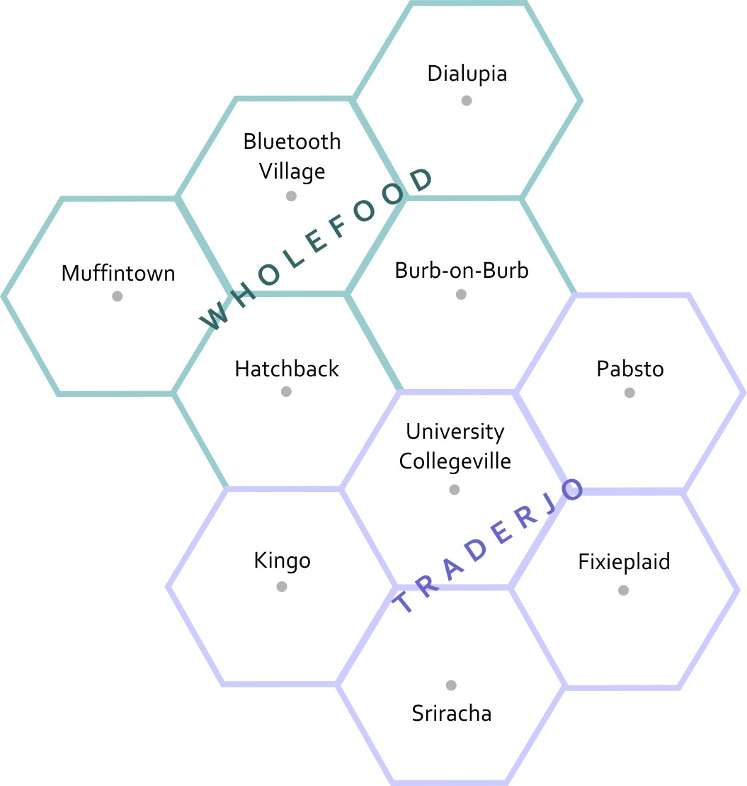
This is a map of the fake states and counties from Table 2.1. The top row of counties is Muffintown, Bluetooth Village, and Dialupia. Below that is Hatchback and Burb-on-Burb. These 5 counties make up the state of Wholefood. Below Wholefood is the 5 counties of Traderjo. The first row of Traderjo is Kingo, University Collegeville, and Pabsto. Below that is Sriracha and Fixieplaid.
Here’s the basic Geography of my fake states and counties.* Now you are able to compare the relative distances between places, right? Let’s overlay some additional information here to give you more context. I’ve made a little population map using graduated circles (each circle size represents a given range, so the smallest circle size here would include everything from 0-1000). Next to it I’ve made a choropleth map (not chloropleth – there’s no chlorine in this map). Choropleth is a fancy way of saying “colored areas.”
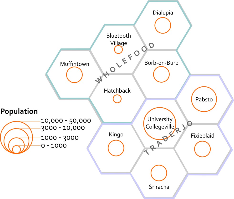
This map estimates the populations of each county. It shows that Bluetooth Village and Hatchback have the 2 smallest populations, at between 0 to 1000 people. Muffintown, Dialupia, Burb-on-Burb, Kingo, Fixieplaid, and Sriracha all have populations between 1000 to 3000. Pabsto has a population between 3000 and 10000. University Collegeville has a population between 10000 and 50000.
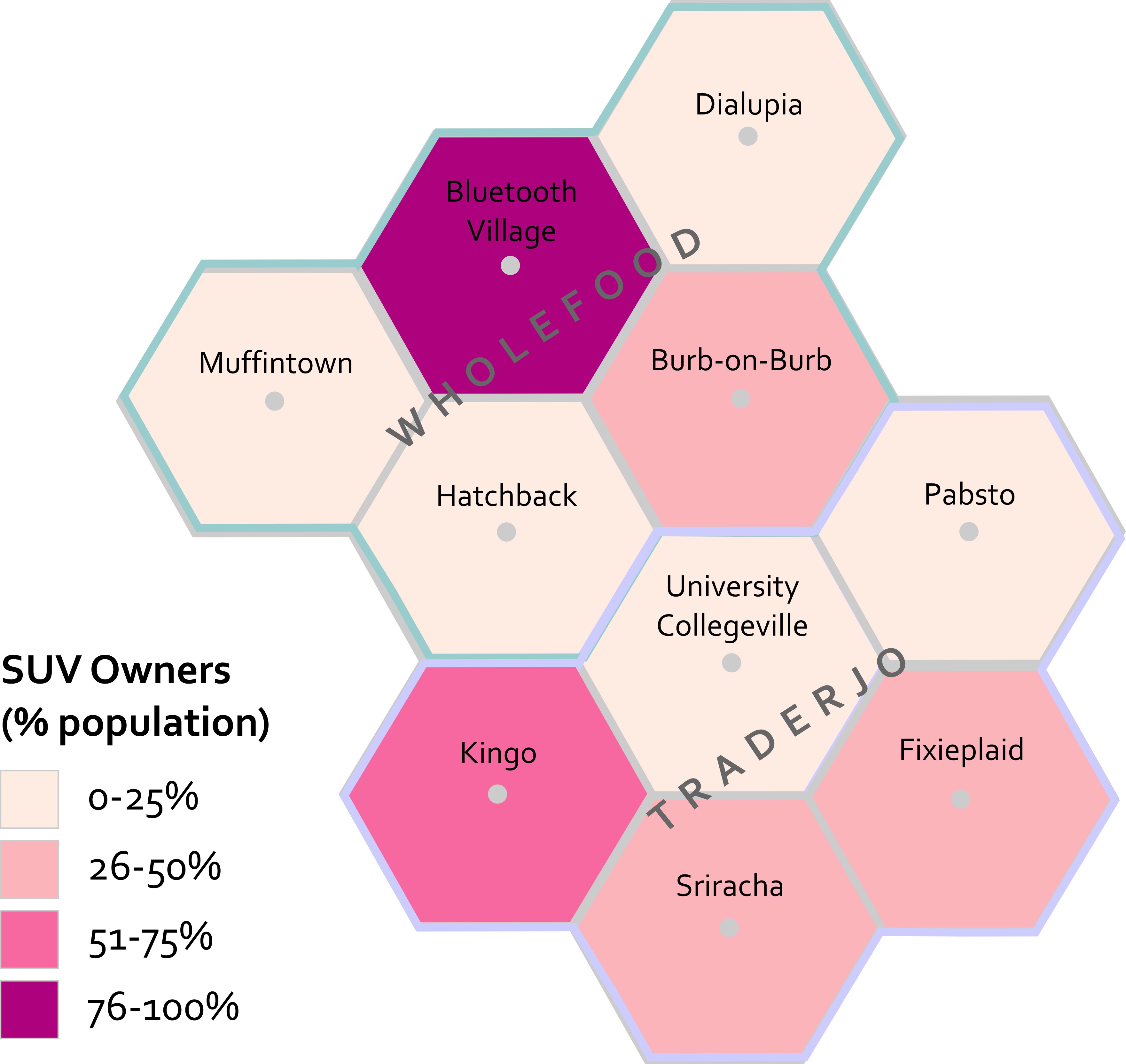
This map estimates the percentage of each county's population that owns SUVs. In Muffintown, Dialupia, Hatchback, University Collegeville, and Pabsto 0 to 25% own SUVs. In Burb-on-Burb, Fixieplaid, and Sriracha 26 to 50% of people own SUVs. In Kingo 51 to 75% of people own SUVs. In Bluetooth Village, 76 to 100% of people own SUVs.
Now that you’ve seen both of these maps, what can you start to say about possible spatial patterns? What other maps would you want to see in order to answer questions about this data? For instance – I’d want to know the location of major roads and businesses. I’d want to see how the population relates to those features. I’d want additional data showing the # of fancy coffee places in each county so I could compare SUVs to Coffee and see if I could develop a community profile much like the ones you explored in Lab 1 [54].
I’m sure you’re thinking spatially now. If you still think this is crazy talk then maybe we’re just not meant for each other after all. :(
*Want to know why I’m using hexagons? Check out Central Place Theory [55].
Lesson 2, Lecture 2
Spatial Relationships
To have a science of place and space, and to investigate whether or not Spatial is Special, you need to set some ground rules for what is possible when it comes to spatial relationships. Spatial Topology is the set of relationships that spatial features (points, lines, or polygons) can have with one another. To make this pretty dry topic a lot more interesting, let’s consider spatial relationships using our personal relationships as a metaphor.
Some common spatial topological relations include:
Equals – A is the same as B
When we first met each other, we felt like we were “one.”
Touches – A touches B
Our first kiss was gentle – no tongue.
Overlaps - A and B have multiple points in common
During our honeymoon we… <deleted>
Contains – A contains B
For 9 months the baby was inside (and much quieter).
Disjoint – A shares nothing with B
Later on, we got sick of each other and watched TV from opposite sides of the room.
Covers – A covers B (or vice versa)
The dog sleeps on top of me, creating a huge amount of heat.
Crosses – A and B have at least one point in common
Although we both know how to find our way home from the grocery store, the only routing point we have in common is our driveway.
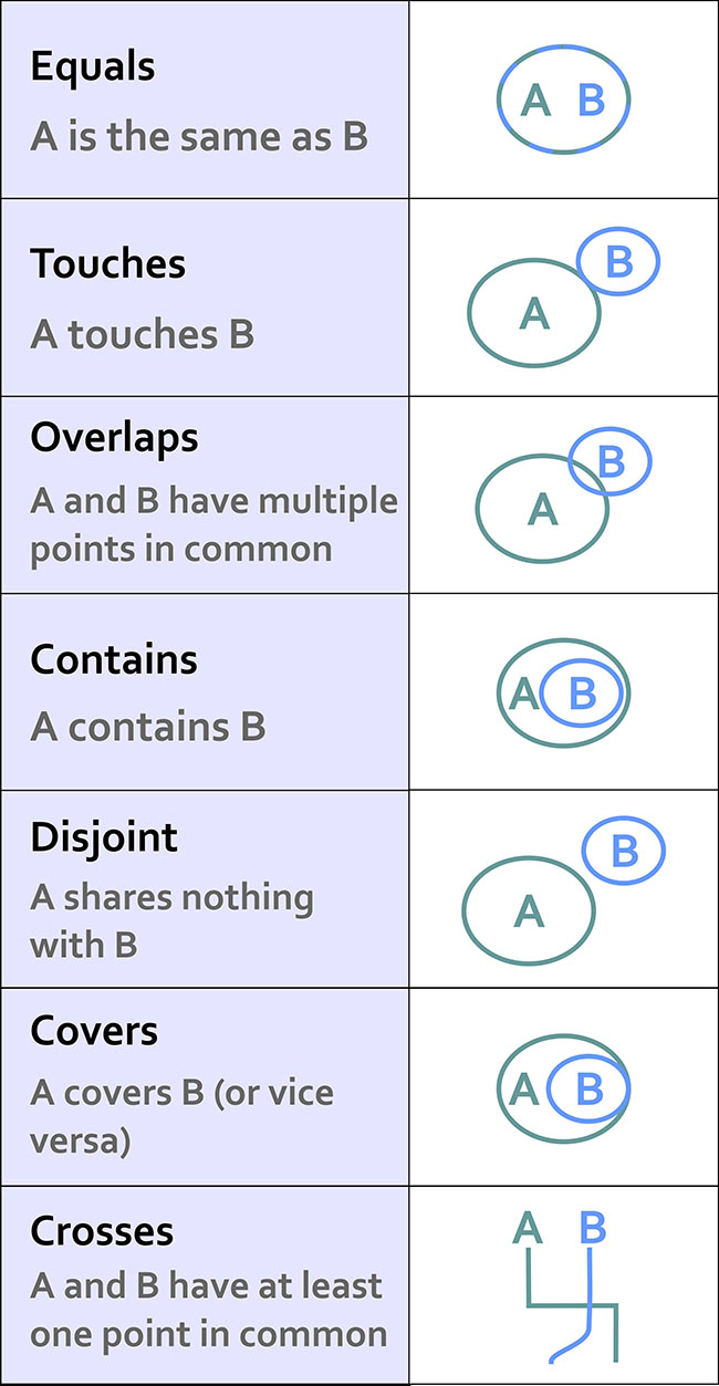
This list isn’t exhaustive, but it’s a good starting point. If you really get excited about this stuff (congratulations on being single!) then there is a ton of literature out there to review. I recommend starting with this paper [56] and spiraling out from there.
This stuff may seem a bit dry, but it’s really important because it formalizes the ways in which we can expect things to interact in space. Moreover, knowing all of the possible spatial relations allows us to create great software tools that can take these relationships into account.
Consider what would happen if we didn’t take these relationships into account. Let’s say you have 500 road segments that you’ve digitized to show your neighborhood’s streets. In order to ask a GIS to identify a driving route from one house to another, all of those road segments have to “know” how they are related to one another. So if your street intersects with the next street, we have to specify how both routes are topologically connected. This is how Mapquest or Google understands that when you leave a highway and go on an offramp that there are certain possibilities for navigation (the offramp is a one-way route and connects to a cross-street), and other things you can’t do (the offramp only allows right-hand turns at the end where it intersects with the cross-street). If you didn’t have a theory behind how things can relate, and ways to specify those spatial relations, you’d just have a zillion streets with their basic locations on Earth, but no way to actually use that information for routing.
Almost all of us have experienced the frustrating case where automagical navigation devices and websites have bad or missing topological information. We exit the highway believing we can make a left turn, but it turns out to be a one-way street and we can only go right. Much cursing ensues. Depending on how well we handle this problem, our topological relationship with our significant other may change drastically that night once we finally make it to the hotel.
Scale and Time
Scale
There are two concepts of scale that are fundamental to Geography. Let’s talk first about scale as it pertains to maps. Map scale is the ratio of the distance on the map to the corresponding real distance on Earth. You’ll often see a bar drawn on a map that says 1 inch equals 10 miles, or something to that effect. This means that one inch of distance measured on the map can be considered equivalent to 10 miles of actual distance on the Earth. It’s common to see these equivalencies written in fractional form instead of plain English, e.g. 1:100 or 1/24000. These are called representative fractions.
You learned a bit in Lesson 1 [57] about why it’s impossible to make perfect translations from the 3D Earth to 2D maps. This has an important impact on map scale. Depending on what map projection you’re using, your map scale will vary across your 2D map. This is another reason why map projections are important. Imagine if I gave you a paper map for a kayaking trip and I designed it using a projection that looked really cool but had scale varying wildly across the map (1 inch in the middle = 1 mile, 1 inch at the top = 50 miles). You might plan out your entire trip without realizing that you’re comparing completely different distances. That would be very mean of me to do, especially if there are lots of mosquitoes and you only brought one bag of beef jerky. At large scales (i.e. “zoomed in”), if you use a conformal projection [58], the differences in scale measurements are small enough to be insignificant for most users.
The second major concept of scale is a more general one. With Geography you have the power to explore and analyze phenomena at different levels of granularity. You could look at really large-scale (1:100) patterns in a neighborhood, or you could look at really small-scale (1:10,000,000) patterns across multiple countries. You did that last week in the lab assignment when you looked at Tapestry data at state, county, and finally neighborhood levels. At each scale the story you could tell totally changed, didn’t it? This kind of scale is often called the scale of analysis by Geographers, as opposed to the specific map scale that refers to how reality is directly translated by a map.
What About Time?
Geography requires space and spatial relationships in order to exist, but it also requires attention to time. Practically all geographic problems take place through some sort of dynamic process – meaning that things are changing from Day 1 to Day 100, for example. If you think about how most maps are made, this presents a problem, doesn’t it? How do you show changes over time? What if you don’t have data for every time step?
It’s outside the scope of this course to delve very deeply into this topic, but I want you to be aware of a couple of key examples so that you can understand the impact that time has on every map you read (and every map that you make).
I am still amazed that we can now poke around tons and tons of high-resolution satellite imagery to look at the Earth from above. Back in the old days when we had to yodel over the phone [59] to connect to the internet, this kind of thing was a total pipe dream. Anyway, let’s do a little exploring right now to have a peek at how time is inextricably linked to Geography.
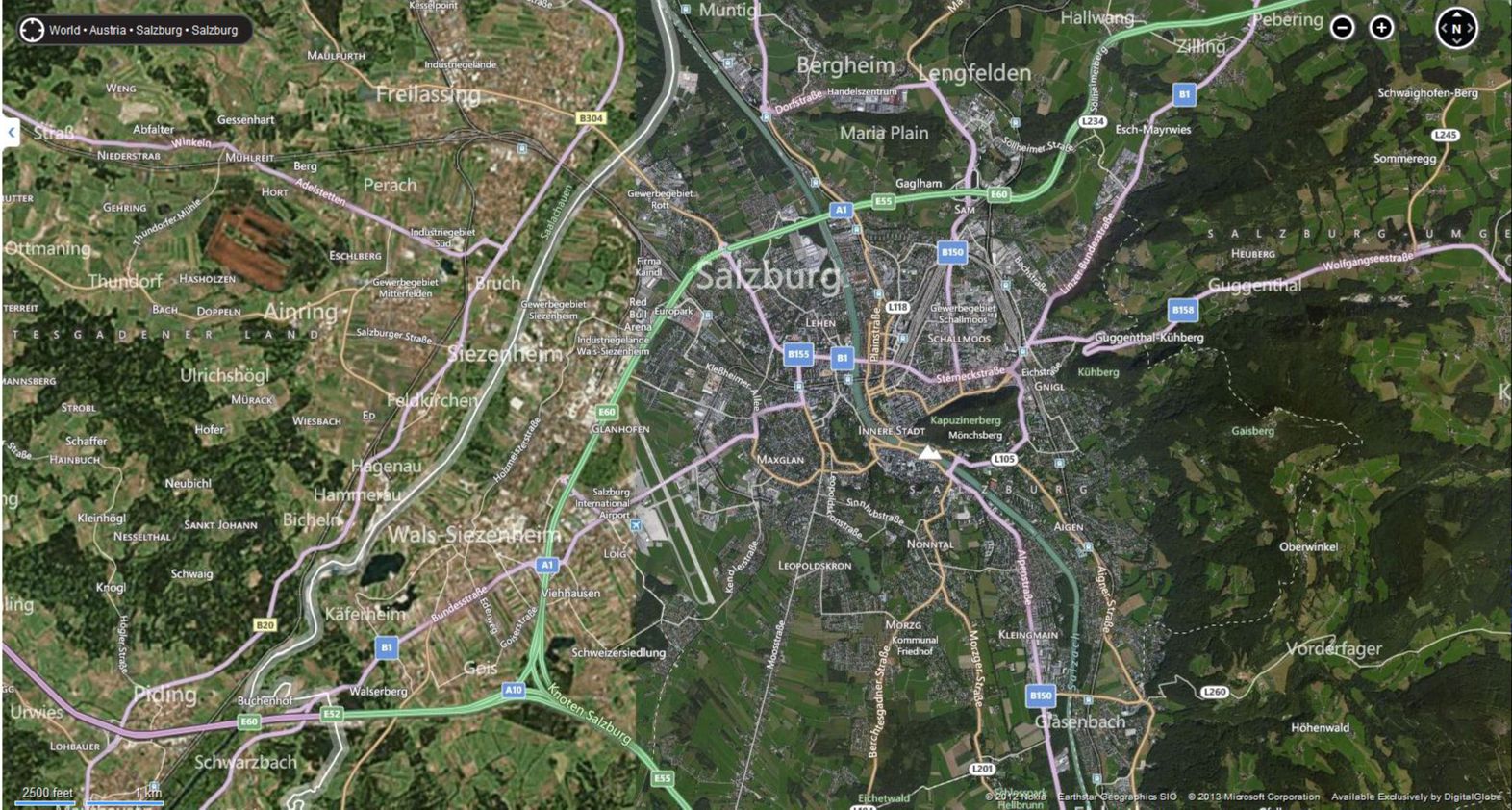
In the first example here, I’m playing around on Bing Maps [60] to look at satellite imagery of Salzburg. My Grandmother was born in Salzburg, met my Grandfather there after the war, and a lot of my extended family lives there today. A summer afternoon on the rooftop at the Hotel Stein [61] is an unforgettable experience if you ever have the opportunity. But I digress. Check out what’s happening on the west side of the city; see how it looks like two pictures have been abruptly slammed together?
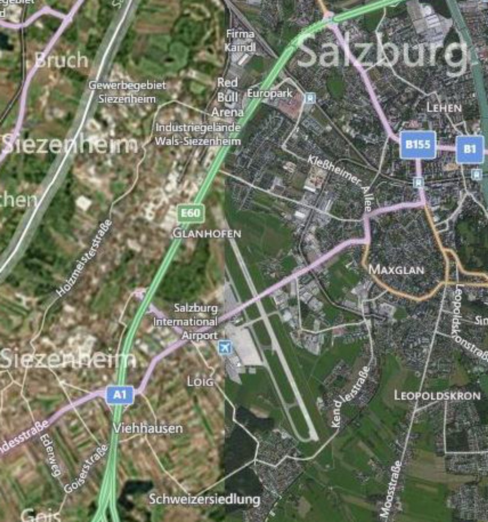
Furthermore, they’re of considerably different quality as well. The stuff on the west is blurry compared to the stuff on the east. So there’s a quality problem that’s immediately apparent, but there’s a bigger issue that you should always pay attention to – look at the lower right corner on any mapping service like this and you’ll see a copyright notice identifying who took the images and when they were copyrighted. In this case, there are two different sources cited from different times (2012 by Nokia and 2013 by Microsoft).
The images were taken at different times and from different sensors. This could be a good thing if you had complete coverage from both times and you wanted to look at changes happening to Salzburg, right? But it’s often the case that Geographers have exactly this sort of scenario where you have part of your data from one time and part from another, without any overlap at all. We don’t know when exactly in each year, but they could be taken during completely different seasons (which would explain some of the color differences), not to mention during different years.
The bottom line here is that time is an important factor to consider, and it’s rare to have perfect information covering every place you want to explore for every relevant time period. It doesn’t mean that you can’t make a useful map. Remember when you worked with demographic data in the Lesson 1 Mapping Assignment [62]? All of that data was based on snapshots at particular times, and frequently you were mixing together measurements taken at one time with measurements taken at another. The Geospatial Revolution has brought us closer, but we’re still a really long way away from having real-time Geographic information about everything at every second.
Video Activity
This Lesson's video assignment is to watch Chapter Two, from Episode Two of the WPSU Geospatial Revolution series [63]. This video highlights how businesses are using geospatial technologies to support better customer service and efficient operations.
Mapping Assignment
Changing Landscapes, Sharing Maps, and Fun With Projections
In this lesson you reflected on spatial relationships across space and time. This lab gives you the opportunity to practice these concepts using GIS tools. GIS was originally created way back in the 1960s to analyze these kinds of relationships. Sure, you could analyze spatial relationships via paper maps or plastic transparencies, but that’s clunky (ever tried to fold a paper map back into its original shape?). And what if you want to change the variables, or the way the data is classified, or the map scale? A GIS gives you the flexibility and power to analyze lots of data efficiently.
Ch-Ch-Ch-Changesm(sorry)
One type of change that is evident all around us is physical change and demographic change in our own communities. Think about your own community:
- What has changed since you moved there? What forces are causing that change? How did your community look in terms of the people who live there and the uses of the land in your community 10 or 100 years ago?
- How will your community look in 10 or 100 years? Could any of these changes be mapped? How do these changes compare in magnitude and scale from those changes in other parts of the world?
Unless you have been living under a rock since the 1950s, you know about space probes that have been launched to observe the Moon, Mars, and other objects in our own solar system and beyond. Since the early 1970s, satellites have also been launched specifically to observe the Earth. Some observe oceans, while others observe agricultural health, atmospheric composition, weather, or other phenomena. The first of these was Landsat [64], short for “land satellite.” Landsat became a series of satellites operated by NASA and the US Geological Survey since 1972. Landsat observes the Earth in the visible and infrared portions of the spectrum. In an infrared image, healthy vegetation appears red, cities appear gray, water appears black, and other interesting colors appear as well. The point is not actually to create weird colors, but that the infrared imagery allows for changes to be detected easily on the landscape, such as urban sprawl, agriculture, deforestation, and fluctuations in water elevation.
Open a web browser and access the Esri Change Matters site [65].
Change Matters uses Landsat imagery and ArcGIS Online. You should see three side-by-side web GIS maps, similar to the image below.
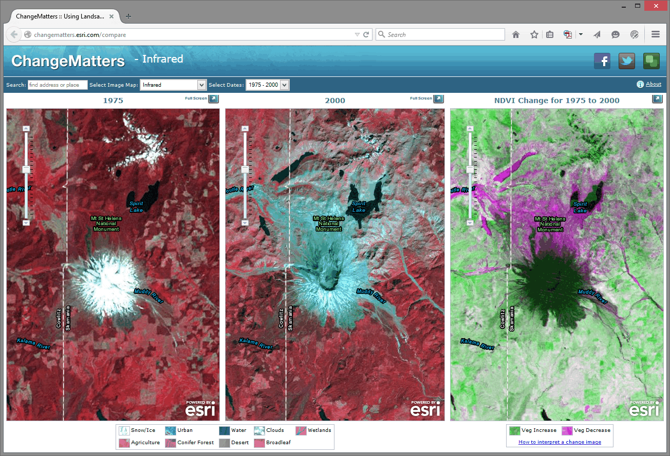
The first set of scenes is that of Mount St. Helens from 1975 and 2000. Use the information provided in the link at the lower right "how to interpret a change image" if you need it, to answer the following questions:
- Describe a few changes you observe in Mount St. Helens from 1975 to 2000.
- What do you think is the reason for those changes? Google about St. Helens if you need to.
Using the search box above the images, enter "Aral Sea."
- Describe the changes in the Aral Sea.
- What do you think are the reasons for those changes? Do some more research if you need to.
Now, examine other places around the world using this resource. What does your hometown look like?
Zoom in on one of the Change Matters image sets. The spatial resolution of Landsat imagery is now 30 meters x 30 meters (it was coarser in its earliest iterations). So, while you can’t peep on people sunbathing at this resolution, you can detect large changes across the Earth’s surface.
To share a map from the Change Matters site: click on the green box icon at the top right of the interface. That will give you a URL you can share, and those Twitter/Facebook buttons work nicely too.
Scale Matters
Now, head over to ArcGIS Online [66].
You are looking at the Northeastern Junior College campus in Sterling, Colorado. Click the Content button at the upper left of the interface to see the map layers that you have at your disposal. You should have Map Notes, USA Topo Maps, and Imagery with Labels.
Click on the pushpin at the intersection of the paths that form an “X” on campus. In the popup box that appears, you should see some notes and a photograph taken on the ground. In a few minutes you’ll create your own map notes and popups. Click on the photograph. You should be directed to a new website.
- What website was the photograph linked to?
Unlike the Landsat images, this satellite image was taken in the visible spectrum. It comes from a satellite operated by DigitalGlobe [67], and it has a much finer resolution than the Landsat imagery. You could definitely use this stuff to count the number of dog turds in someone’s lawn.
- What is the smallest object that you can see on this satellite image?
Now go to Bookmarks and select Sterling. You should now be looking at the town of Sterling, Colorado, with the USA Topo Maps layer as semi-transparent. Earlier, you used a side-by-side set of images to detect change over time. Here, using transparency on layers is another way you can look at change over time. Click the small arrow next to USA Topo Maps in the list of layers and adjust the visibility of that layer by clicking on Transparency and then drag the slider around. The USA Topo maps layer is a USGS [68] topographic map; and in the case of Sterling, the map was created in 1971. Your MOOC instructor was -9 years old at the time.
- Describe two changes you can detect in the town of Sterling from 1971 to 2011.
Now examine the Northeastern Junior College Campus, comparing the current campus as seen in the satellite image to the features on the 1971 topographic map by sliding the transparency control back and forth for the USA Topo Maps layer.
- What feature occupied most of the campus back in 1971?
Until now in our lab assignments you have been using maps and layers created by others. One of the revolutionary things about today’s mapping methods is that you can create your own content, save it, and share it with others quite easily. Let’s start doing that now. To do so, click on Sign In in the upper right hand corner of the map that you are examining.
Your screen should look similar to the one shown below. If it doesn't, navigate to the ARCGIS home page [69] directly.

At the lower left, click the link to Create a Public Account. Follow the steps there to create your account. Where it asks you to name the Organization you're part of, you can just say "Coursera" there. You will also need to give Esri a phone number, but you don't have to give them a real one. Just plug in 999 instead. You also need to review and accept the terms of use before you can click Create My Account. Once you have created your account, you should be automatically logged in. It should drop you at a page where you can edit your profile details if you'd like.
None of this will cost you any money, result in 40 catalogs sent to your house or anything crazy like that – it’s just a way for you to be able to upload stuff, save your maps, and share things more easily.
Now that you are signed into ArcGIS Online, you can do everything that you have been doing last week and earlier in this current lab exercise, but now you can save your maps. You can build on them as you see fit. And because these maps live online, you can share them with colleagues; you can embed them into your own web pages, you can create web applications from them, and you can reduce your cholesterol by 30% while improving your ability to sing opera. But let’s not get ahead of ourselves: let’s begin with those pushpins, popups, and embedded images and links that you were examining earlier by creating your own. On the menu bar at the top of the page, click Map to continue.

Navigate now to a different location in the United States that is of interest to you. If your map still is titled “Northeast Junior College” then click on “New Map” to start creating a completely new map. I would navigate to Princeville, Hawaii because it’s freaking [70] awesome [71]. Add the USA Topo Maps layer from ArcGIS Online (uncheck the "within map area" option) and compare the Imagery layer from the Basemap to the USA Topo Maps layer for your chosen location. Zoom to a location where you can observe change on the landscape between the topographic map and the satellite image.
Add a pushpin, some text, an image, and a link to a point by following these steps: Using the Add button, Add Map Notes and select Create once you’ve given it a name. Select a Point, Line, or Areas from the Add Features menu. Click on the map then to add your point, line, or area to the map. Fill out the popup box that appears with the following:
- An appropriate title.
- A description of the changes on the landscape that you observe.
- Find an image of that community or your chosen location and enter its URL in the “Image URL” box. Note that this image URL should be a link to a JPG, PNG, TIF, or other image.
- Enter an Image Link URL that will take the reader of your map to an appropriate website. The website could be the government site for that community, a local restaurant that you think embodies that place, or whatever else you see fit to use.
Exit the Add Features panel by clicking the Close button at the bottom right corner of the popup. Test your popup by first exiting the "edit" mode and then clicking on your map note. You should see your note title, text, and image. Click on your image - you should be directed to the website that you selected.
Now go to Bookmarks and set up a few bookmarks at different locations and scales in your chosen community. You can do this by clicking Add Bookmark in the Bookmark list, type in a name, and hit Enter to save it. It'll use the map settings at that moment to make a Bookmark, so you'll need to navigate, change your layers, etc... before you add a specific Bookmark.
Once you’ve added a couple map notes and bookmarks, save your map by clicking the Save button. Give it an appropriate title. If you call it “Map” that’d be pretty lame.
In the Tags area you can enter keywords to help people discover your map. In the Summary field you can write a short description about your map that will be helpful to the readers of your map. This is known as the map’s metadata—information about the map. It is sort of like the list of ingredients on a bag of chips.
- Why do you think it would be important to spend time adding metadata like this?
Next, let’s make your map viewable to others: using the Share button, share your map with Everyone. Write down or copy the URL of your map to your clipboard. You can give this to anyone and they’ll be able to load and use your map.
Now click on the ArcGIS in the top left corner of the interface and select My Content. You should see your map listed in your content. In subsequent labs, your content will grow as you create more maps.
Finally, let’s test your map: First, make sure you copied that URL for your map that you created when you shared it just a minute ago. Next, Log out of ArcGIS online. Open a new web browser frame. Add your map URL to the address bar in your browser and see if you can access your map without being logged into ArcGIS Online. This is possible because you shared your map with everyone in the step above. While you are in your map, test your bookmarks.
- Have you made something great? Feel free to share the URL of your map with a friend or classmate and describe what you’ve created.
Examining Resolution
As you learned in the reading this week, different locations on the planet contain different data at different resolutions. You saw a satellite image of Salzburg that featured two different resolutions, and earlier in this lab, you saw that the USA Topo map resolution was at a lower resolution than the imagery.
One reason why maps are noteworthy today is that you can easily create your own content. And so can others - this is commonly called crowdsourced data or volunteered geographic information. In the not too distant past, the only geospatial data providers were government agencies and nonprofit organizations. Nowadays, everyone is empowered to create their own data and share it. Esri has a program called the Community Maps program where folks can contribute content to a topographic basemap.
Log in to ArcGIS Online and start a new Map if you aren't already there. Change your Basemap to Topographic (it may already be set this way by default, that's OK too). Use the search box to search for the following address: 1000 Broadway, Boulder, CO. You should now be in Boulder, Colorado. Broadway is the street that runs from the southeast to the northwest across this part of Boulder. Compare the detail to the northeast of Broadway to the map details shown to the southwest of Broadway.
- Which part of the map – to the northeast of Broadway or to the southwest of Broadway—contains a more detailed basemap?
- What is the most detailed feature that is visible in the higher detail section of the basemap?
The higher detail section of this map was contributed to through the community maps program [72].
Recall that you populated the metadata with information about the map that you created.
- Now that citizens are contributing data to the spatial data “cloud,” what are the implications of data quality?
Projections Aren’t Just To Make Maps Pretty
Everything in a GIS is tied to a specific location on the Earth’s surface. All of those locations are measured based on a mathematically-computed map projection. Recall from Lesson 1 where we talked about why transforming stuff from the 3D globe to a 2D map requires some transformation (and therefore compromises).
The map projection that you use makes a big difference in your spatial analysis. If you are creating zones that consider Tobler’s First Law of Geography and want to determine which things are near other things, you usually create areas of proximity, or buffer zones around map features. These could represent the areas within 100 kilometers of the earthquakes of at least magnitude 7 that have occurred over the past year, for example, or areas within 100 meters of rivers in your local community. Those zones that you create, as well as everything else you do and create in a GIS, are all dependent on the map projection used. Using different map projections will yield different results. The results might not matter so much at a small scale for, say, the list of cities within a certain climate zone, but they would matter at a large scale to determine, say, all of the natural gas pipelines underneath a school building that you would need to be careful about when constructing a new library.
Now I’d like you to start a New Map, zoom out to show the whole world, and compare the size of Greenland versus that of South America. Greenland looks larger than South America, doesn’t it? Greenland is actually only about 12% as large as South America (~2 million square kilometers vs. ~17 million square kilometers). Why does Greenland look huge? The default projection in ArcGIS Online is a modified version of a Mercator [73] projection. In the Mercator projection, latitude and longitude lines are conveniently shown as straight lines and it allows us to plot navigational directions in straight lines. But as you can see, objects near the poles are really distorted.
Next, expand the ArcGIS list in the top left corner and click on Groups. Groups are, as the name implies, sets of maps with a specific theme. Click on the Search box in the top right corner and select Search For Groups and then type Projected Basemaps into the search field before hitting Enter. Click on the group name "Projected Basemaps" to open this group and you will see two pages of projected basemaps. Browse these basemaps and open a few of them. Each is based on a different map projection. Think about the advantages and disadvantages of each projection. The map projections represented here are just a few of the thousands of map projections that exist. Why so many? Each projection has advantages and disadvantages. Each projection preserves some, but not all, of the following properties: Area, shape, direction, bearing, and distance.
- What map projection do you like best, and why?
- Which map projection would be best to analyze tsunamis in the Pacific Basin? Why?
Wrap Up
Nice work! In this lab you’ve examined issues of resolution and map projection. You also explored issues related to change detection in Geography. And you created your own map with your own content and shared it with others. That’s pretty cool, huh?
Credit Where It's Due
This lab was developed by Joseph Kerski [44] and Anthony Robinson [45].
Discussion Prompts
Change Matters In Geography
As food for thought, I suggest building on what you've done in the mapping assignment [74], so if you haven't yet completed that assignment, make sure you do so now. The lab in this lesson focused on change detection, and I want you to find and explain the changes taking place in parts that we didn't explore during the lab activity. Then I'd like you to review what your classmates have posted and weigh in on their explanations and/or provide additional examples.
- Share map links with your classmates that shows another area (that we didn't look at as part of the lab assignment) where you've detected interesting changes, and describe your rationale for explaining those changes.
- Review the maps and explanations that your classmates have posted. Do their explanations make sense? Can you find another example in a different place that shows the same types of changes?
- Find and share a map you've come across on the web that you think does a nice job of showing and explaining Geographic changes. What works (or doesn't) about its design?
Lesson 3: Understanding Spatial Data
Lesson 3, Lecture 1
Spatial Data

Understanding Spatial Data
In this lesson we’ll focus on spatial data itself – it’s what makes maps possible. To be a fabulously awesome geographer you need to understand how spatial data is created, who makes it, and what its limitations are.
Where are we now?
It all begins with measuring location. Back when dragons prowled the oceans [75] and headache relief was achieved by drilling a hole in your head, location was measured rather simply by taking angular measurements using the sun, moon, or stars. These methods are still taught and used [76] by some today, but since this MOOC isn’t about sailing a Sloop to pick up spices in the Orient, I want to focus instead on how locations are measured today.
You’re probably thinking, “Yeah, I know, everything uses GPS to know where things are.” And if I asked you how GPS works, you’d say, “Yeah, Google invented it and there are Magic Laser Genies that send location beam particles to my iPhone.” And that would be incorrect.
The Global Positioning System (GPS) is no doubt one of the most important methods we have available today for measuring locations. GPS is the system designed by the United States starting in the 1970s, originally for military purposes, to provide location services around the world using satellites. GPS is one example of a Global Navigation Satellite System (GNSS). There are several others, like the Russian GLONASS (jeez, awkward acronym - comrades) system or the European Union’s Galileo system. Every GNSS works using the same general principle. You need a network of satellites in space to broadcast signals down to Earth that include position information about the location of each satellite as well as the exact time when the signal was sent. A GNSS receiver (like the GPS antenna on your fancy phone) can listen for these signals and compare the times/locations from multiple satellites to triangulate your exact location on Earth.
There’s much more to learn about GPS and GNSS [77] if you’re so inclined. It’s quite a bit more complicated than my explanation might imply. For example, these systems only work when you have line-of-sight to a collection of satellites (which is why your Garmin is no good if you drive into a parking garage), and there’s an enormous amount of math going on to deal with signals that are constantly moving while you are moving yourself. You can also combine these satellite signals now with cell phone tower signals, wi-fi signals from routers, and other sources to improve accuracy and coverage.
The bottom line is that in the last decade it’s become much more likely for normal people to have access to handheld devices that use a GNSS to determine locations. The consumer-grade stuff you have in your phone or car can figure out where you are to within a few meters in some conditions, while in others you may be several hundred meters off target. Professional surveying equipment using big antennas and fancier computing hardware/software can be accurate to within several centimeters. If you’re trying to find the nearest curly fries while you’re sailing down the highway on a road trip, consumer-grade accuracy will do just fine. If you’re deciding exactly how much property tax someone should pay, you want to have the hardcore professional stuff.
If I use the GPS on my phone, I can see that I'm sitting at [78] Latitude: 40.77004, Longitude: -77.896744 in my house writing this lesson. If I save that information I’ve effectively got a point location on Earth. If I walked around my house collecting multiple points, I could create a polygon by connecting multiple points. If I collected points in a row walking the shortest distance straight from my couch to the fridge (to retrieve delicious chocolate pie [79]) I could connect them and have a line feature. These three location types (point, line, and polygon) comprise the spatial data foundations of modern Geographic Information Systems (GIS). They are considered vector data, because they can represent any kind of geometry. The other major data type is raster data which we’ll cover in the next section.
The Earth from Above
The proliferation of Virtual Globe tools like Google Earth [80] has made imagery of the Earth more accessible than ever. This new mapping technology has also coincided with rapid advances in civilian satellite and airborne imaging systems that can provide extremely high detail images of the Earth. You can even build and launch your own little DIY Drone [81] and create your own imagery quite easily.
Geographic image data is raster data, which captures information by assigning values to cells in a grid. A satellite in space can detect visible light or other invisible parts of the electromagnetic spectrum [82] (infrared heat, for example) and assign values to each grid cell to develop an image. The size of those grid cells has an impact on how much resolution (detail) you have in the final image. Some satellites have a 30 kilometer resolution, meaning each grid cell is 30 km x 30 km in size. This is fine for mapping entire countries and stuff like that, but if you want to spy on what’s in your neighbor’s back yard, you’ll need a sensor that can resolve 10 centimeters x 10 centimeters, right?
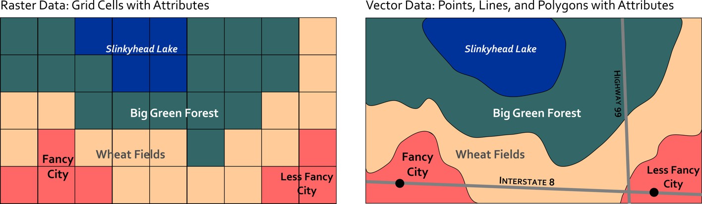
The science and technology associated with imaging the Earth from above is called Remote Sensing. It’s a thriving discipline focused on developing new ways of imaging the Earth as well as methods for interpreting and analyzing those images. In addition to the visible photography we all know and love, some sensors use radar, infrared imaging, and even lasers to create maps. Each has its own particular utility – for example, infrared imaging is often used to map the weather and land use. The infrared image shown here comes from a NASA satellite and shows the wake of a major Tornado [83] that impacted Tuscaloosa, Alabama in 2011. The image looks kind of weird, but because infrared is not visible light, you have to assign false colors to make the image, and in this case they chose red to signify areas where vegetation exists and blue to reveal man-made features and places where there isn’t much vegetation. Both types of land use give off different infrared heat signatures that can be detected by this particular sensor.
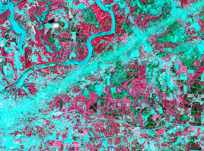
Lasers are now used for Light Detection and Ranging (LIDAR mapping [84]). This technique is capable of generating extremely high detailed 3-dimensional models of the Earth's surface. In the examples shown here, LIDAR was used to map the coastline [85] in New York and New Jersey before and after Hurricane Sandy in 2012. With these images you can see how it’s possible to study really intricate differences before and after the storm by using this radically precise new spatial data gathering method.
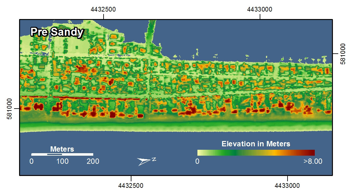
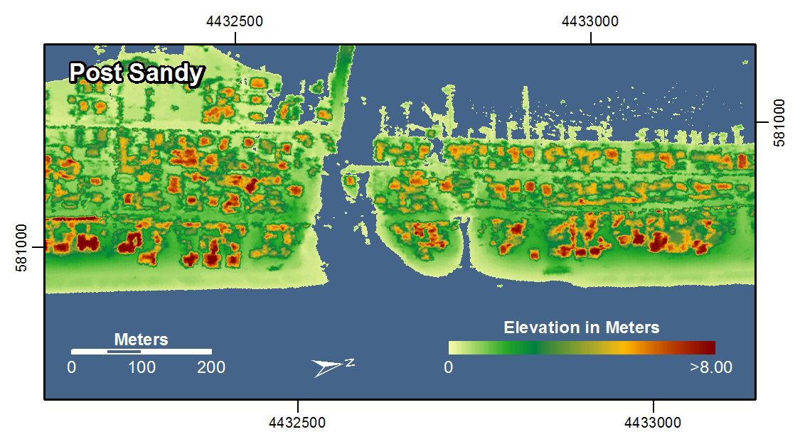
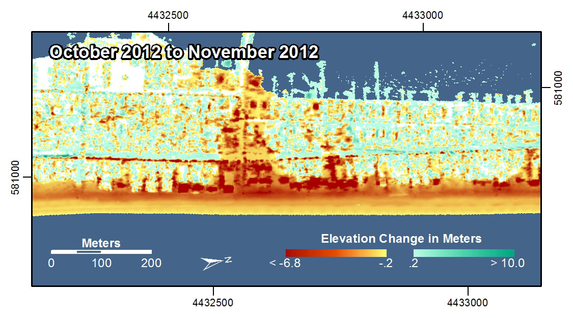
LIDAR [87] has also been used by one of my favorite bands to make a really cool music video [88]. If this sort of stuff intrigues you, there are great organizations in the U.S. [89] and worldwide [90] worth checking out that focus entirely on the science and professional practice of Remote Sensing. And, you could always take a class [91]...
Lesson 3, Lecture 2
Who Makes Spatial Data?
Who Makes Spatial Data? Good question. Today, the answer is more often than not: everyone.
It used to be that the primary developers of spatial data were governments, and more specifically, the military. Defense mapping remains a really important driving force for all-things-mapped, but it’s not the only game in town anymore. Consumer-grade location technology is now widely available, so if you want to make a map, you don’t need to launch your own satellites or enlist cavalry.
In the United States, a critically important source for civilian spatial data is the U.S. Census Bureau [92]. The Census collects all sorts of boundary (points, lines, and polygons – remember?) and attribute data during each decennial population census. These boundaries and their associated attributes allow industry and academia to study changes in population and to analyze social, economic, environmental, and health problems.
The business community often takes these public spatial datasets and modifies them for use in commercial applications. For example, you worked with Esri Tapestry data [93] in the Lesson 1 Lab assignment. Tapestry segment categories (like “Sophisticated Squires [94]” and “Dorms to Diplomas [95]”) are developed using combinations of Census population data [96] such as median age, average income, and home values along with other data sources gathered by private firms that focus on defining other consumer-related variables (most common makes/models of car in a county, for example). Because you’re cool and signed up for this MOOC, you got access to the Tapestry data for free. The idea, however, is to sell specialized data sets like Tapestry to businesses that are looking to improve their market share through location intelligence [97].
In addition to governments and industries that create tons of new spatial data all the time, there’s something more exciting that’s begun in the past few years. You’re creating new spatial data every day, whether you know it or not. Most mobile phone contracts allow for carriers to track your movements [98] and what you do with your device all the time. This information is then stored and analyzed [99] to try and sell you stuff, to design better devices, to sell you more stuff, and… to sell you stuff to go with your other stuff.
So you don’t have a phone, therefore nobody is tracking you? Well, if you’re reading this on the Coursera site, your IP address location [100] is logged. Granted, determining locations from internet site logs is not as tidy as tracking someone with a GPS (certainly less awkward to explain than if your girlfriend/boyfriend finds the GPS you stuck under their bumper), but it’s enough for us to do some basic analysis on which countries have the most visitors to this course page and stuff like that. Therefore, every interaction on this course site has the effect of creating new spatial data.
Now that I’ve gone and made geography scary again, let’s focus on the good stuff that’s happening too. There are now communities of volunteers who actively create spatial data to contribute to the greater good of humanity. OpenStreetMap [101] is one such effort – which aims to create a free basemap of the world, using only volunteer contributions. The basic way this works is that volunteers map their community using GPS trackers, or they digitize roads and features using existing satellite images. Why do this when Google, Bing, and others have already done this for most of the world? Well, those services are not actually “free” in the sense that you have no right to download or re-use the underlying data. All you can do is view the maps the way those companies want you to see them, and if Google decides someday to charge you for asking for directions to your Grandma’s house, you have no right to be upset. OpenStreetMap wants to create a free alternative that can be used and re-used by anyone for any purpose. OSM data is considered to be Volunteered Geographic Information (VGI), since it is spatial data created on a volunteer-basis. VGI [102] is now cropping up in all sorts of contexts; it is quite important for crisis management, as evidenced in the 2010 Haiti Earthquake, when thousands of reports on the ground in Haiti were collected, translated, and mapped by volunteers using a mapping system called Ushahidi [103].
The power of “the crowd” to create spatial data is pretty impressive when the goals are clear and the tools to develop those datasets are usable. Check out this time-lapse video showing how volunteers worked quickly after the 2010 Haiti Earthquake to develop a detailed OpenStreetMap basemap for Port-au-Prince (a place that didn’t have widely accessible digital basemaps before the disaster struck).
OpenStreetMap - Project Haiti [104] from ItoWorld [105] on Vimeo [106].
Describing Spatial Data
Once you have location information from a GNSS, celestial surveying, or carefully studying an Ouija Board, you’ll probably want to attach some attributes to that location data. Even if you’re only interested in mapping the boundaries of something, you’ll want to describe those locations in some way (e.g. this is a county boundary line, this is a highway with four lanes, etc…).
A typical snapshot of spatial data will look something like this.
The basic spatial data items here are point locations (latitude and longitude for each Tweet). The attributes associated with each observation include the Twitter Username, the Tweet itself, and the date/time when the Tweet was posted. You could theoretically have all sorts of other additional attributes – you’d just need to define them and collect them (links to Twitter profile pictures, for example).
Beyond attributes, spatial datasets are often given broader descriptions to identify information sources, when the data was collected, its overall geographic coverage, and measurements of data quality. This data that describes the data is called metadata (have I used “data” enough in one sentence?). You often need metadata in order to understand the value of a particular spatial dataset. There are lots of existing models for defining spatial metadata, and you can read about them [107] if you pine for incredibly boring tasks. This becomes especially important when you make a map that includes multiple layers. Let’s say I’ve got road data from the U.S. Census Bureau, World Region polygons and water bodies from Natural Earth Data [108] (one of the best free sources for excellent geospatial data), and this set of Tweets that I want to map on top of those layers. I’d need to know how and when each dataset was created, and who created it, right?
The answers to these questions will almost always reveal that none of your data came from the same source, and none of it covers the exact same time range or level of detail. Fundamentally, mapping involves dealing with uncertainty at multiple levels. You may have to use data from multiple sources, each having its own relative quality. You may want to show the same phenomenon for two different countries, and have lower quality data for one of them.
Uncertainty sounds scary, but you deal with it every day. Weather predictions are imperfect, your recollection of what happened at last night’s office party is incomplete, and your dog may or may not have an accident on your new bedspread the day after you bought it. It’s OK. It doesn’t mean that maps are useless because they nearly always show less-than-perfect information. It just means that you should be a shrewd consumer of maps, and you should make sure you ask questions about their underlying information.
Video Activity
In this lesson I'd like you to watch Chapter Four from Episode Four of the WPSU Geospatial Revolution [109] series. This episode talks about the ways in which new geospatial technologies can empower community actions that go beyond what governments can (or are willing to) provide.
Mapping Assignment
Mapping Natural Hazards (And Understanding Spatial Data While We're At It)
This week you learned that an increasing amount of data is geographic. You read about and reflected on how data are collected—locations from GPS, and raster and vector data from remote sensing systems and GIS. You learned about how sensors use certain parts of the electromagnetic spectrum to provide fascinating data with which we can learn about the Earth. And the data at your fingertips on your fancy iPad is increasingly available in real time and at increasingly higher resolutions. With this vast increase in the amount of data available comes additional responsibilitu ny: yoeed to be a critical consumer of that data—and be able to evaluate data quality, decide whether you should use certain data, and know how to bring that data into a format that you can analyze.
This week’s lab gives you the opportunity to practice these concepts using GIS tools. You will be analyzing natural hazards at multiple scales. You will upload a data set into the GIS cloud. The maps you make will be glorious and compelling. Your skin will glow from your renewed intellectual energy. You will become inspired to knit a sweater with your professor's likeness on the back.
Let's Smash Some Plates
The earth is a dangerous place sometimes. The study of natural hazards gets into the nuts and bolts of Physical Geography and Plate Tectonics but is also important to Human Geography through understanding human perceptions of risk, human-environmental interactions, and the impacts that hazards have on the life of a community. Because all natural hazards have a spatial component, they can be analyzed geographically. Imagine trying to understand a disaster and its impacts *without* using a map. I bet you can’t.
Let's start with a common natural hazard that impacts people all over the world: Earthquakes.
First, head over to ArcGIS Online [110]. Log in using the account that you set up in Lab 2 [74].
In the search box in the upper right corner of the interface, click on the empty box to see a list of search options and select Search For Maps. Next, type “plates 4 types” (you don’t need the quotes) into the search box and hit Enter. You should see several search results, and the one you want is the first one in the list, which was authored by "jjkerski." Click on Open underneath the map thumbnail and select Open in map viewer. You should now be on this page [111].
Make sure you are still logged in to ArcGIS Online by checking the upper right of your web browser screen, above the map. If it says “Sign In,” it means you are not yet signed in. Fix that.
Now show the map legend by clicking the rightmost button where you can edit your map layers. Your map should look like the map below:
- How would you describe the pattern of plate boundaries around the world?
- Where do you hypothesize that most earthquakes around the world should occur?
A Web GIS like the one you’re using can bring in all kinds of additional data. In the case of earthquakes, we can use the real-time earthquake data feed from the USGS to examine recent earthquakes. To test your hypothesis about where you think earthquakes are likely to occur, go to the USGS earthquakes feed: http://earthquake.usgs.gov/earthquakes/feed/v1.0/summary/2.5_week.csv [112]. On some browsers this action might prompt you to download a file, on others it will just display the raw data. If you are prompted to download a file, do that and view the resulting .CSV file in a text editor like Notepad or a spreadsheet application like Excel / Open Office Calc [113].
- Does the number of earthquakes surprise you? How many did you expect to see for the past 7 days?
This earthquake data is encoded in a comma-separated value (CSV) text file, meaning that its values are separated by commas (imagine that). The first line acts as a blueprint for the data that follows it: the first line is the header line, containing the field names. Each data line below the header line includes a latitude and longitude coordinate pair, which is all a GIS needs in order to map the data. Each line also contains information about each earthquake's magnitude and depth, and some other variables. As with any data, it is important to know the relevant units of measurement. The magnitude is given in the Richter Scale, and the depth is given in kilometers below the surface of the Earth.
- You can open the CSV by using a simple text editor or your favorite spreadsheet application. Look closely at the table: Why are some of the latitude values negative? Why are some of the longitude values negative?
It may seem confusing because in most everyday speech we refer to “latitude and longitude,” with latitude typically mentioned first. So when plotting point locations it’s tempting to think of these as being equivalent to x, y, with latitude being “x” and longitude being “y.” However, latitude is actually “y” and longitude is “x.” In location-enabled devices and tools, such the GIS you’re using here, latitude and longitude are entered as y and x, respectively. Confused yet? Sorry. Being a Geographer is Hard.
The Cartesian coordinate system helps us understand why the sign (positive or negative) of latitude and longitude is important. The Equator divides the area above the X axis, the northern hemisphere, from the area below the X axis, the southern hemisphere. The Prime Meridian divides the area to the right of the Y axis, the eastern hemisphere, from the area to the left of the Y axis, the western hemisphere. Any x value to the right, or east, of the Y axis is positive. Here's what that looks like when you abstract the coordinate system a lot:
Therefore, when given the following coordinate pairs, one can determine their correct hemisphere:
X, Y Eastern and northern hemisphere
−X, Y Western and northern hemisphere
X, −Y Eastern and southern hemisphere
−X, −Y Western and southern hemisphere
- In which 2 hemispheres of the world do you live?
This earthquake data also provides a good illustration for the goals of this class: What’s the big deal about maps? Consider the following:
- How easy is it for you to determine spatial patterns just by looking at this table?
You know spatial patterns are there because you know that earthquakes don’t just happen in random or regular places around the planet (er… hopefully you know that). But unless you are really good at making a mental map from these latitude and longitude pairs, it will be virtually impossible for you to detect any sort of spatial pattern in the data. Therefore, you really need to make a map.
In ArcGIS Online, click the Add button as you have done before, but this time use Add Layer from Web, select the CSV choice from the dropdown list of options, and in the URL field, paste the link to the USGS data feed [112] that you have been examining.
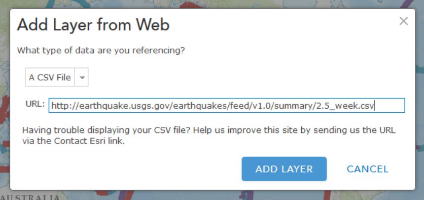
Click Add Layer and you will be prompted to change the style for the symbols used to show your earthquakes. For Choose a Variable to Show select "mag" from the dropdown list. For Select a drawing style select Counts and Amounts (Size). Select Done once you've made these choices.
On your map, you should now see pin markers showing the last 7 days’ worth of earthquakes 2.5 magnitude and above.
- Describe the pattern you see with these earthquakes. Does it match your expectations?
Making Sense Out Of Your Data
You will probably now need to change the visibility of the plate boundaries by clicking on the Content button and then the little arrow next to the layer called plates 4 types proj shp. Click Transparency there and adjust the slider over to the right to make those mostly transparent. While you're in this menu, click Rename to give your layer a more meaningful name than the default "2". Let's name it "Last 7 days of earthquakes 2.5 magnitude and above."
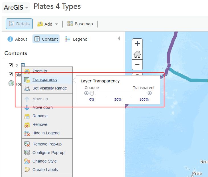
Now you should be able to see the colored points showing the magnitudes of recent earthquakes and their relation to plate boundaries. Cool, huh? This is a good time to save (and share if you like) your map.
- What is the pattern associated with large earthquakes that occur around the world?
The way you classify your data has a big impact on how your map is interpreted and understood. Just like no single map projection is the best option for every situation, no single classification method is perfect either. Choosing one that best meets your needs is a complex subject, and we’ll talk about it more in Lesson 5, but let's play now with several different methods in ArcGIS Online. Try a few of these classification methods for your earthquake points by clicking on the arrow next to their layer (remember, you need to be in the Show Contents of Map mode to see this arrow) and selecting Change Style. From the menu, under Counts and Amounts, click the Options button. Check the box next to Classify Data and you will be able to select Natural Breaks (divides the data at natural breaking points); equal interval (creates the same numeric range for each class); standard deviation (divides your data into one or more standard deviations from the mean); quantile (places the same number of data observations into each class); and manual breaks (categories specified by you, the user).
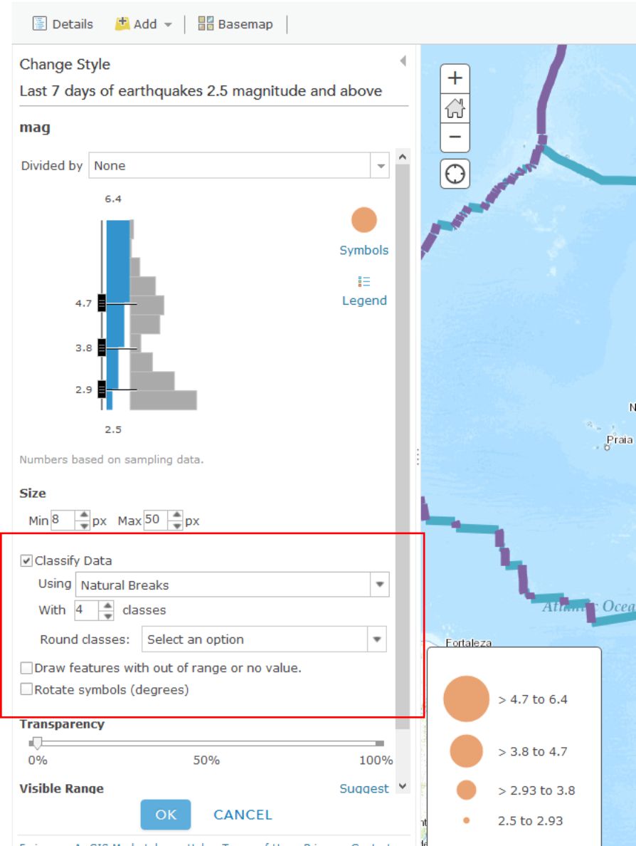
- What do you think is the best classification method for your earthquake data? Why?
When you're finished playing around with different classification methods, click on the little arrow next to your earthquake layer and select Show Table. This shows you the raw data that’s driving your map (which you brought in from the USGS site). In the table, note how many earthquakes have occurred over 2.5 magnitude around the world over the past 7 days. Now click on the time field and Sort Descending. Observe how old the last earthquake in the table is (this is in UTC time). Now click on the mag field and Sort Descending. Click on the field containing the largest earthquake. Then, select Table Options and then select “Center on Selection.” You should see your highlighted earthquake that you highlighted in the table also appear highlighted on the map. Zoom to that earthquake. Set a Bookmark here if you like.
- In which country (or near which country) did the largest earthquake over the past 7 days occur, and what was its magnitude and depth? Fire up Google to research this earthquake to find out if anyone felt this quake and determine what its effects were. There may even be someone in this class who felt it. If that’s you, go post something about that experience in the forums, because that would be really neat and your professor would be forever grateful.
As this course has emphasized a lot, it is critical to understand the sources, dates, data authors, the scale at which data was created, why and how the data was created, and so on, because maps are so easily misinterpreted. In the case of the earthquake data, note the numerous low-magnitude earthquakes in the Western USA. This is due to the fact that the USGS earthquake center recording the data is in Colorado. The earthquake center receives signals from the global seismic network through satellite dishes on the grounds of its facility, but it can also sense seismic waves directly at its facility, and the nearby ones, from western North America, are also added to the data set. So there are not necessarily more small earthquakes in western North America than elsewhere in the world. So sometimes the location of where data is gathered affects the nature of the recorded data. Tobler is right, man.
- How far was the most recent earthquake from where you live? Use the Measure tool and note the units you are using. How long ago did it occur, and what was its magnitude?
Change your symbology now to map the earthquake depth instead of magnitude. Remember that depth is measured in this case in kilometers beneath the Earth’s surface. This is a good time to save your map if you haven't done so recently.
- What is the pattern of the deep earthquakes occurring around the world?
If you have time, visit the USGS feeds page [114] and download and map other earthquakes—for the past hour, past day, 30 days, or for historically significant earthquakes. If you’re not enjoying this at all then I will be happy to provide you a full refund within the next 90 days.
Tornadoes Are Freaking Scary
You have now analyzed one type of natural hazard from a global to local scale, spatially and temporally. Let's do the same thing with one more natural hazard that is unfortunately quite common in the United States - tornadoes.
Close the data table for your earthquake layer by clicking the X in the top right corner of the table. Next, turn off your plate boundary and earthquake layers by unchecking their checkboxes in the Content view of your layers. Add a new tornado data service by clicking Add and then Add Layer from Web, and select An ArcGIS Server Web Service, and enter the following address (noting the underscores in the URL):
http://maps1.arcgisonline.com/ArcGIS/rest/services/NOAA_US_Historical_Tornadoes/MapServer [115]
Save your map and adjust the metadata and title so it reflects the fact that you are now mapping earthquakes and tornadoes.
Zoom to the United States so that you can see the lower 48 states.
- What is the pattern of tornadoes at this scale in the USA? Does it reflect the map showing the most frequent tornado zones in “tornado alley” below? Why or why not?
Turn on the map legend. You can now see that you were only examining Fujita 4 and Fujita 5 intensity tornadoes at this scale. You can also see that the data set goes back to the 1950s.
- Even though you can zoom in to a very large scale for any particular tornado, do you think the spatial accuracy of a tornado recorded during the 1950s and 1960s is the same as that of a tornado recorded during recent years? Why or why not?
- Do you think that if you zoom in, you will see some tornadoes in Colorado and in other western states? Test your hypothesis by searching for “Colorado” in the search box in the upper right and zooming there.
- Was your hypothesis correct? Describe the pattern of tornadoes in Colorado and why the pattern looks the way it does.
Tornadoes are not devastating because they simply touch down, of course, but because they move across the landscape. Zoom in to a larger scale until you see some of the tracks of the tornadoes. Keep in mind what you learned about resolution from this week’s course discussion. The tornado data are stored not only as points, but as lines, and the storage is scale dependent.
- What is the predominant direction that tornadoes move in eastern Colorado? Does the map above help you understand why?
In May 2013, an enormous tornado destroyed parts of Moore, Oklahoma. Search for and zoom to Moore, Oklahoma on your map. In the Content panel click on the arrow next to the NOAA US Historical Tornadoes layer and expand the Large Scale Data group so that you can click the arrow next to Historical Tornadoes there and Enable Pop-ups. Now when you click on tornado points at large map scales (e.g. zoomed in fairly far) you can see a bunch of additional information about each Tornado.
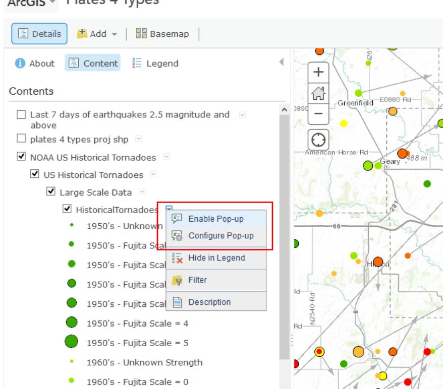
- Describe the number, pattern, and direction of historical tornadoes to strike Moore in the past. How typical is the post 1990 activity in Moore compared to prior decades?
Wrap Up
You’re doing very well – you definitely know enough to be dangerous with maps at this point. You have used data spanning different resolutions and time periods. You classified data in different ways and examined tabular attributes. You have added data from different types of servers. You have saved new data into the GIS cloud and shared it with others. You’re becoming quite the Cartographer now!
Credit Where It's Due
This lab was developed by Joseph Kerski [44] and Anthony Robinson [45].
Discussion Prompts
Where Do Disasters Happen, And How Can Maps Help?
In the mapping assignment for this lesson you've been working with data on Earthquakes and Tornadoes. These aren't the only types of disasters that receive attention from mapmakers, and nearly every government agency or NGO that deals with disaster management has a wide range of geospatial needs in such circumstances. For our discussion this week I'd like to focus on disasters and the kinds of things we can learn about them from using maps and geospatial technology. Here are some prompts for this week's discussion:
- Identify the most frequent natural hazards in the region in which you live and work in terms of damage to infrastructure and human impact (injuries and fatalities)
- Compare these hazards to the ones that happen most frequently in another region
- Describe a natural hazard that you have personally witnessed, and talk about the scales at which the natural hazard had an impact (local, regional, global – some disasters impact all of these in some way), make a map to show what you experienced.
- Find and share examples of good (or bad) maps about recent disasters. Describe what you think makes them work well (or not work at all), and propose your vision for better disaster mapping in the future. What would need to happen to make your ideas possible?
Lesson 4: Doing Spatial Analysis
Lesson 4, Lecture 1
Spatial Analysis
Overlay (and Beyond)
Now that you’ve got a grasp on the basics about thinking like a geographer and understanding geographic information, it’s time to focus on how to understand geography through analysis.
The most basic method of spatial analysis uses a really simple technique: overlay. It’s exactly as it sounds – all you do is stick one layer (number of people currently talking too loudly on their cell phone) on top of another layer (one that shows Starbucks locations) and compare the results (look, lots of people talking too loudly are standing in/around a Starbucks!). You could do this with lots of layers and end up with a composite overlay that lets you explore all sorts of possible relationships.
Overlay analysis also goes beyond simply looking at where two things overlap. You could also do overlay analysis to extract just the area where two things intersect, to delete any areas where two or more things intersect, to join two datasets into one larger dataset, and more. Check out some of the options here at the ARC GIS Resources page, [116] if you’re interested.
Put A Ring On It
In the previous example, I mentioned the area around a Starbucks location. Identifying these areas is part of another common spatial analysis technique. Buffering identifies areas of interest around locations based on distance or time. This could include a 20-mile radius around a terribly disgusting diaper that my daughter creates, or an irregular shape that shows the places that are reachable within a 20-minute drive of my house if I try to escape this terrifying situation.
Surface Analysis and Interpolation (Heat Maps Are Not Always Hot)
Another common spatial analysis scenario occurs when you’ve got lots of individual observations and you want to create a map that shows the overall trends that correspond to an area. Let’s say you have a bunch of temperature readings for a collection of cities and small towns. In the maps shown below, you can see what I can do just using colors assigned to each point observation. You can get a sense of the overall pattern this way, but temperature doesn’t just exist at discrete points, does it? It’s a continuous phenomenon, so it would be nicer to show this data in a way that communicates this aspect more clearly.
In the map on the right hand side you can see how this would look if you interpolate between those observations to estimate the overall pattern of temperatures in this region. There are many mathematical methods [117] for interpolating between values and creating surfaces (hence the label “surface interpolation” below). These types of maps are frequently called heat maps, after the “hot” color scheme normally used in their design. A more correct name would be "density surface," but cartographers seem to have lost that battle, as heat map is way more popular (it sounds cool, so why let the actual name for things get in the way?). I don’t know what you should do if you want to create a heat map to show the density of ice bars [118] in Scandinavia.
In the Geospatial Revolution video you'll watch later in this lesson, you will learn about John Snow’s famous map of a cholera outbreak in London. Dr. Snow’s work revealed that cholera cases were happening close to one particular water source. A set of spatial observations that differ from the expected variation around a point or region is called a cluster. In the example from John Snow, the cluster was detected based on his intuition. Today we have the advantage of mathematical methods that can detect clusters automatically. More importantly, these methods can help us identify spatial clusters that are unlikely or impossible to detect through our own intuition or visual inspection alone. While it’s outside the scope of this course to learn the inner-workings of cluster detection, I do want you to know that today the folks who work in epidemiology would never rely on their intuition alone to detect clusters. They’ve got fancy software [119] that uses fancy space-time math [120] to do that.
Lesson 4, Lecture 2
Analysis Pitfalls
Rain Causes Lung Cancer (No, It Doesn’t)
Now that you know a bit more about ways to do spatial analysis, I want you to understand some all-too-common ways in which these analyses can fall apart if you’re not careful.
Most of the analysis techniques mentioned earlier in this lesson will cause you (or the people who read your maps) to start making assumptions about the correlation between observations. To put it plainly, just because there appears to be co-occurrence between two things, it doesn’t mean that one of things is causing the other to happen.
To explore this pitfall further, let’s check out a wacky example that we wrestled with here at the GeoVISTA Center [121] back in the early 2000s. At the time we had a research project with cancer epidemiologists from the National Cancer Institute [122]. Dan Carr [123] from George Mason University (who was also working with the same folks at NCI at the same time) had discovered a really intriguing pattern while trying to explore geographic patterns of cancer mortality and its possible correlation to a bunch of social, economic, and environmental variables. Here’s what he found – lung cancer mortality correlates quite well with… mean annual precipitation. Yeah. Rain. Does that sound plausible to you?
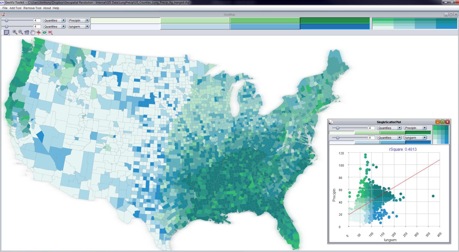
You can see the in map above (created using the GeoViz Toolkit [124]) that there are a lot of counties that show up as dark blue/green. This is a bivariate (two variable) choropleth map. The Y-axis here (with green category colors) is used to show the precipitation variable, and the X-axis (with blue category colors) shows the lung cancer mortality rates. When you see the dark blue/green color at the high end of both X and Y axes, you’re looking at counties that are high in both of those variables. Places that are only green or only blue are lower on the other respective variable. The scatterplot shown in the bottom right corner shows the data distribution of both variables. You probably can’t read the correlation measure, but it says that the R-squared value is .48 – this was a strong correlation measurement compared to most of the known relationships between lung cancer mortality and other variables (poverty and smoking show strong associations too, for example).
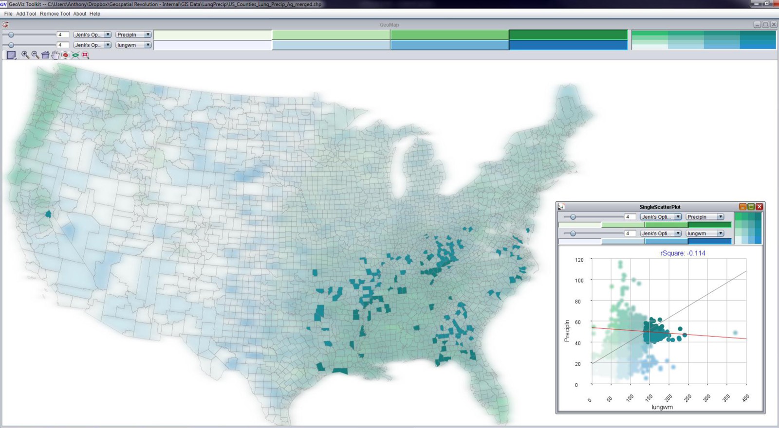
When I select just the counties that are both high in precipitation and high in lung cancer mortality, you get the map above. Most of the counties are located in the Southeast United States. We spent awhile working with Dan Carr and the epidemiologists at NCI to try and tease this apart further, to no avail. There’s nothing there to report – it’s just correlation, nothing causal. It’s not that rain has any real impact on lung cancer mortality. It just happens to rain more where there are people who meet a range of other risk factors. This is a perfect example to demonstrate how correlation is not the same as causation.
Playing Tricks with Scale
Another major pitfall here relates to the scale at which you conduct spatial analysis. Depending on the scale at which you look at a Geographic pattern, you can derive completely different results from the exact same underlying data. This is called the “Modifiable Areal Unit Problem” or MAUP in acronym form (and said aloud it sounds like the noise that comes out of your throat after eating too many nachos).
Let’s explore this issue now by looking at some data about Solar Potential in the lower 48 United States. Solar Potential refers to the suitability of a particular place to develop solar power. The data [125] I’m working with here is from the National Renewable Energy Laboratory (NREL [126]). The first map shows the average annual solar potential by States. You can see right away that some states look better than others.
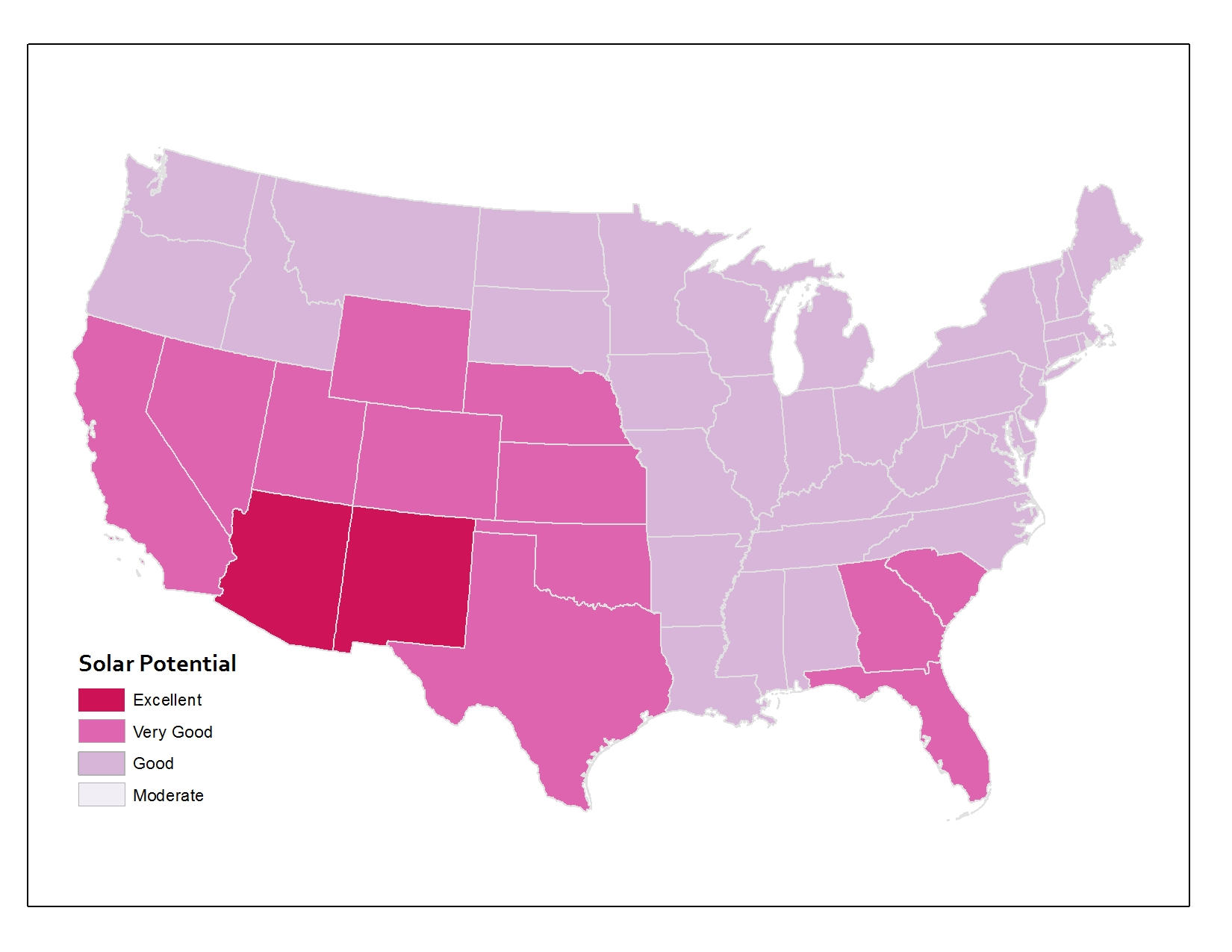
But what if I use the same underlying data and instead of aggregating to States, I come up with measures for counties instead? You can see the map below showing the same data if it’s represented at the county level. The picture is already a lot more nuanced than the state map, right? A lot of states that were shown in one color up above actually include members of several categories when you look at the data by county.
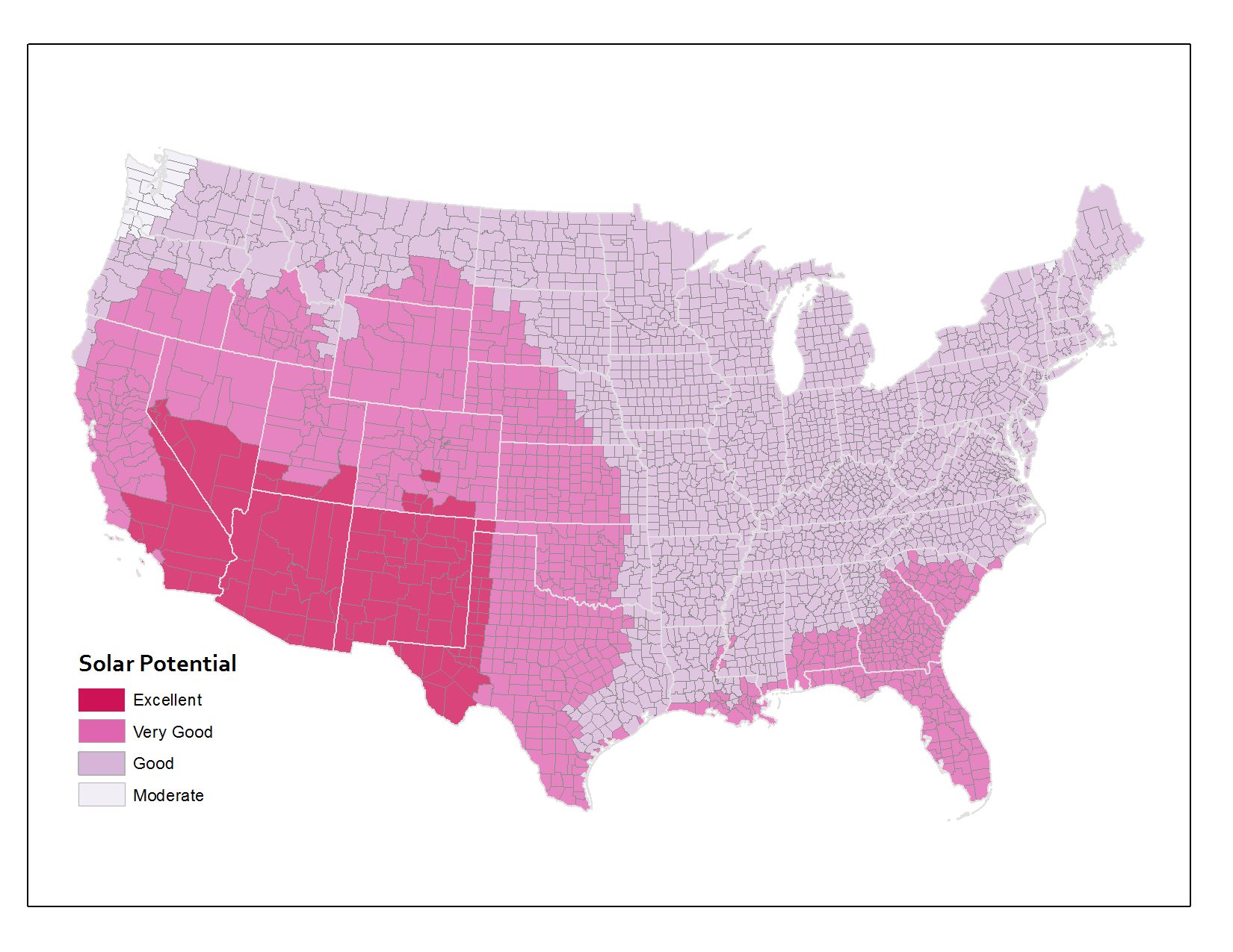
And the third map here shows the original underlying data that the other two maps were based on. The original data source calculates solar potential in 10 kilometer grid cells. So that’s why things look a bit rough at the edges. This is actually the most precise measurement level, however. I’ve overlaid the state and county boundaries so that you can see how the raw data compares to the units by which we typically try to aggregate things.
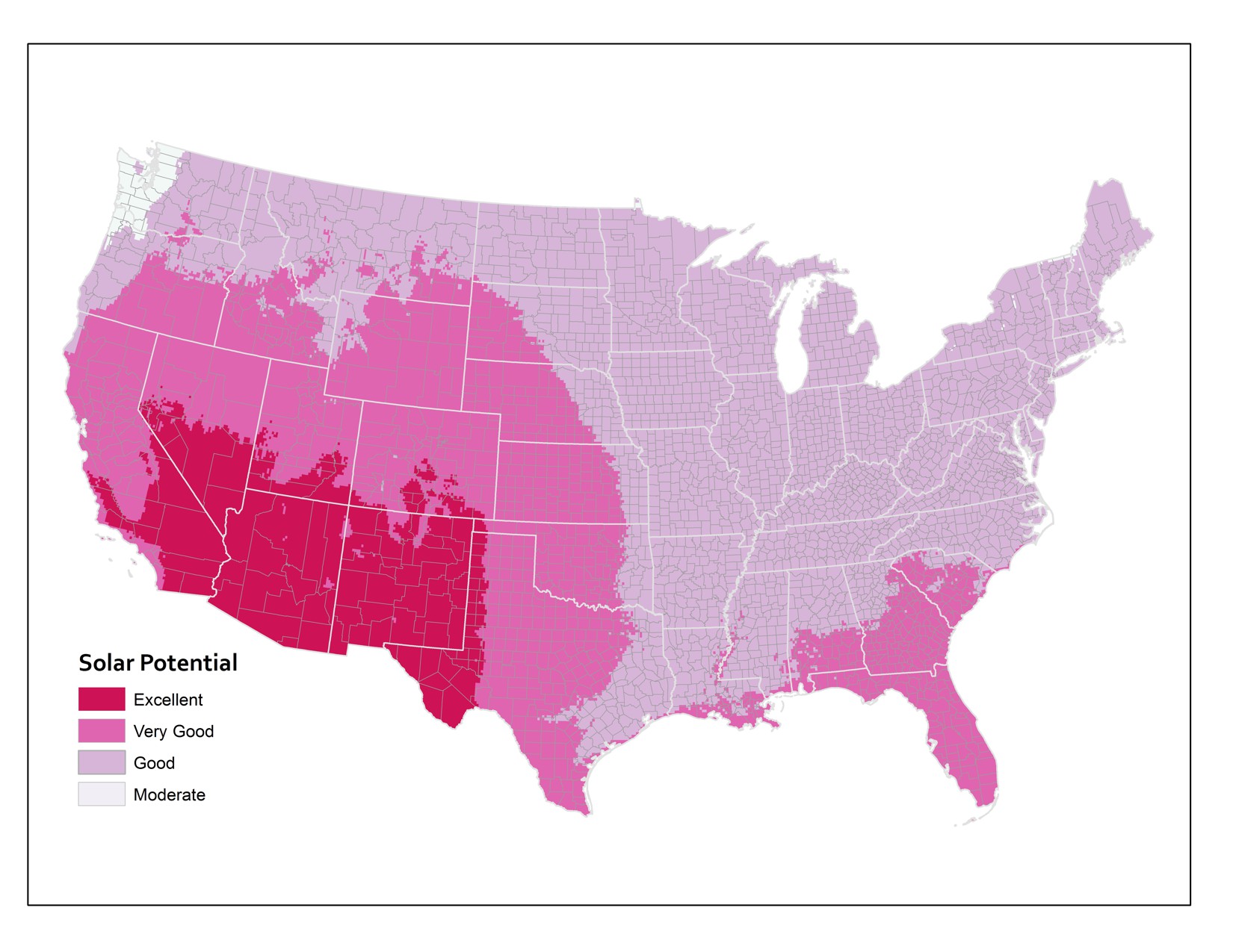
Normalization
Mapping Rates, Not Totals
A stunningly common analytical mistake by newbie mapmakers is to neglect normalization when you’re working with population-dependent data. Let me to say that in normal-people language instead: if you map something about people without calculating the rate based on the how many people live at that place, you’ll get a really stupid map. Same goes for if you’re mapping something about dogs (how many of them have breath that smells like dead fish? – there’s one at my house, for sure). You’d want to normalize your observations against the total number of dogs that could be mapped.
Check out what happens if you don’t normalize your data. This map shows the number of vacant houses by county in the lower 48 United States (you can find this data, along with tons of other stuff at the U.S. Census website [127]). What does it tell you? It looks like there are lots of vacant houses in and around major cities. And that’s it.
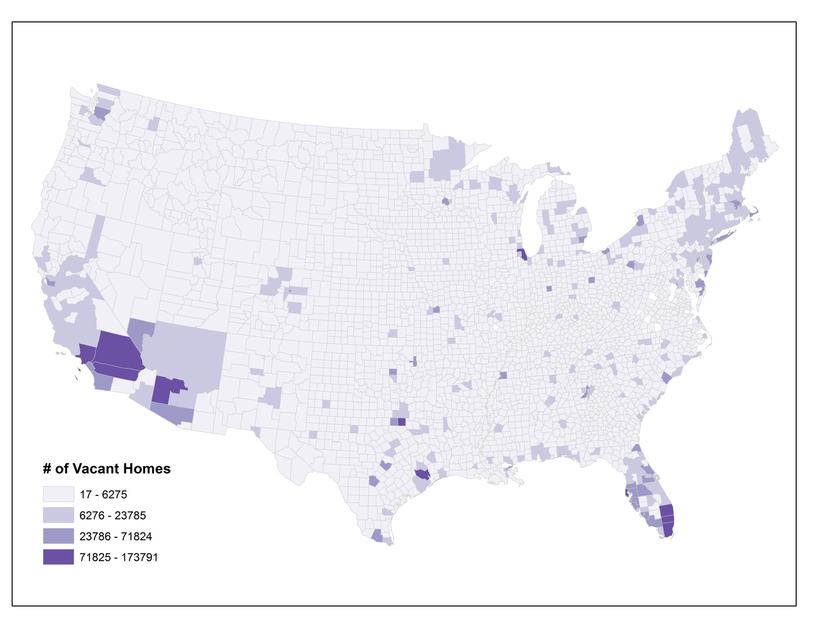
Here’s a version of this map that’s been normalized. I calculated the proportion of vacant homes to the overall population in each county (in thousands). That gives me a rate, rather than a raw total value. Now I can see which counties have high percentages of vacant homes, relative to all other places. It turns out that there’s an interesting pattern happening in northern Michigan, Wisconsin, and Minnesota where vacant homes are more common per person than in many other parts of the country. I did a little digging around and I think I know why – can you figure it out? If you think you have the answer, post it in the forums and debate the possible reasons with your classmates. There are different reasons why different counties across the country might have a lot of vacant homes, of course, but I think there are a few key reasons why these particular counties show this pattern.
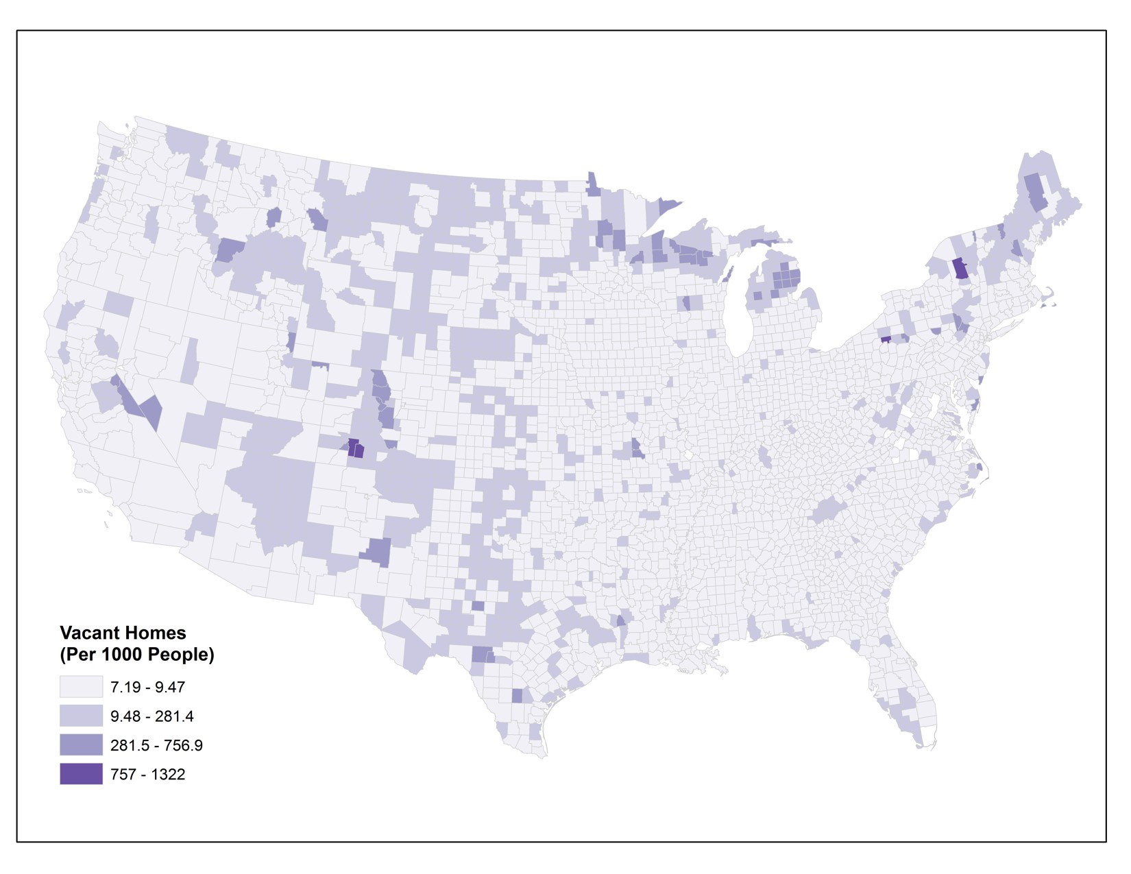
A normalized map is much more useful, right? If you don’t normalize data for choropleth maps like these, you’ll end up having a zillion versions of the first map above – where there are more people, more houses, more dogs, whatever – you’ll have more of the thing you’re interested in and it’ll always just highlight the major population centers. This phenomenon is called population dependence because the thing you want to know about (nasty dog breath), will vary depending entirely on the size of the overall population (number of dogs that are breathing).
Video Activity
For this lesson I'd like you to watch Chapter Three from Episode Four of the WPSU Geospatial Revolution [109] series. This video highlights how geospatial technologies and analytical methods are transforming how we conduct disease surveillance and implement health interventions to prevent major outbreaks.
Mapping Assignment
Real Time Data, Social Media Mapping, and Finding The Best Place For Things
This week, your reading and lectures focused on understanding geography through analysis. You learned about map overlays, buffer zones, heat maps, and other methods. You also learned that simply having a plethora of spatial analysis tools at your fingertips to apply to your maps does not mean you can let the tools do the work with your brain taking a much needed coffee break. On the contrary, with the power you have comes responsibility: You need to consider things like the scale that is appropriate for analyzing your data, mapping totals vs. mapping rates, and correlation vs. causation.
This week’s lab gives you the opportunity to practice these concepts in ArcGIS Online. You will be evaluating relationships among different variables. You will examine maps that show geolocated social media in all of its ephemeral glory. You will analyze data using tables and maps. And you’ll do some spatial analysis, including the creation of buffers and routes.
Analyzing Real Time Weather Data
Real-time data is increasingly available, and much of it also includes geographic data. Let’s analyze some weather-related real time data by opening Esri’s public information map on severe weather [128].
This map should look similar to the map below. Note that this map is an example of a live map embedded in a web page. If you are using a browser with language settings other than English, this may not work for you. In that case, please check out this similar example [129].
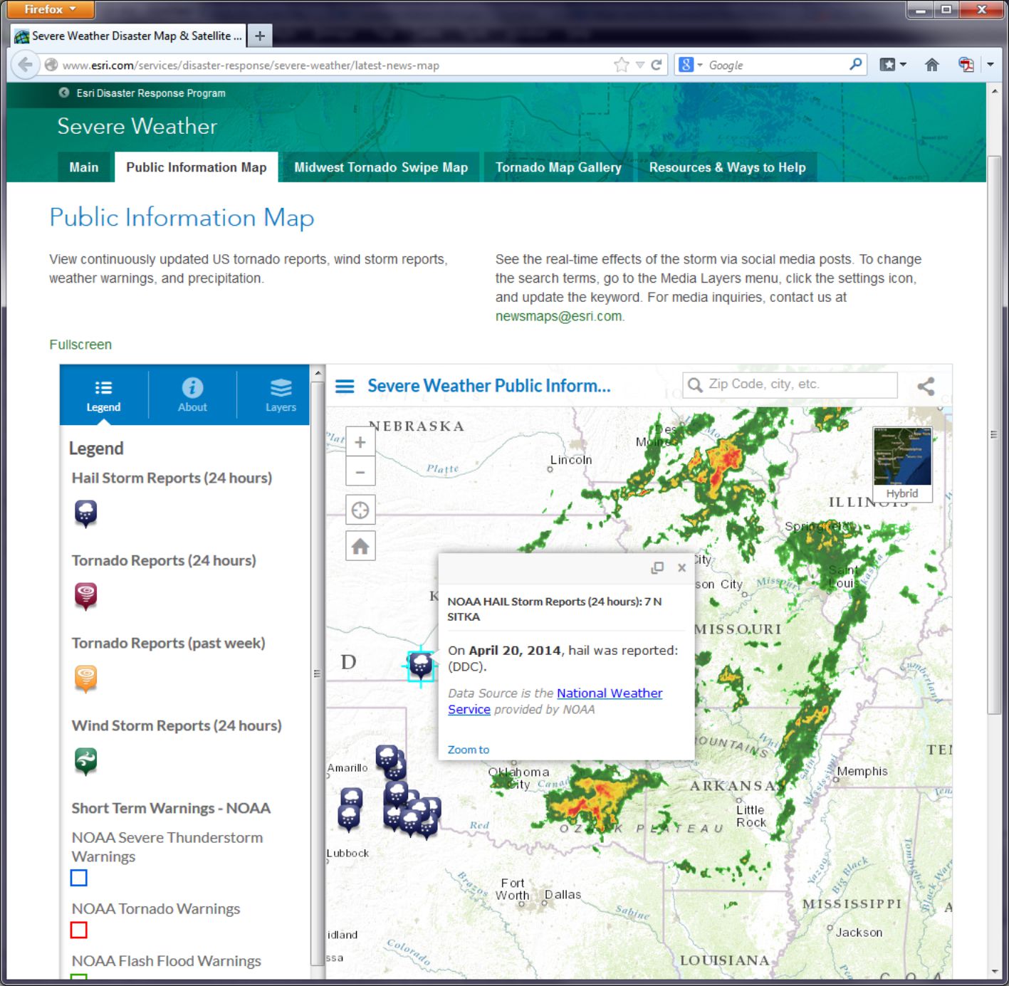
- How would you say that tornadoes, wind storms, hail storms, and precipitation are related in space and in time?
Now head over to Esri’s Flood public information map [130].
This information on flood warnings and observed floods comes in part from USGS stream gauges along rivers. These stream gauges upload data to a national network which is then fed in as a live web mapping service in ArcGIS Online. Click on the “i” information button and then the link to More Information to explore details about where the data are coming from.
- Which agency provides the flood data? How often is it updated?
- Can you find a relationship between where precipitation is falling and floods on the map?
Think about how the duration of precipitation and the time between when precipitation falls and when a flood might start to occur. Then think about how the size of the watershed that is drained by the rivers that flow by a particular gauging station influences the river height at that gauging station. Several factors influence the relationship between precipitation and floods as displayed on a map. You can examine the other Esri disaster response program maps on Esri's disaster response page [131].
- Can you find a spatial and temporal relationship between data layers on the hurricanes and cyclones, wildfires, or earthquakes pages?
In the next section you will examine geospatially-oriented social media [132] related to severe weather events. Who knew that thunderstorms would cause a Flickr apart from the lights going out in your house?
Mapping Social Media
Social media frequently contains geographic information, because social media posts are often sent from devices that can snag a location from a GNSS. Therefore we can make maps showing social media in many cases. Entire platforms like Ushahidi [133] and Tweak The Tweet [134] are built around the use of social media mapping. So let’s see what we can do with it ourselves.
Head over to the Esri severe weather public information page [128].
Click the Layers button in the panel on the left side of the map and scroll down until you see Media Layers. Notice that you have a choice of Instagram, Flickr, Twitter, and Webcams. On Flickr, click on the gear icon to look at the Flickr Search Settings. Notice that it is currently set to storm or tornado. Change it to hail or tornado and select Search.
- Can you find any correlation between the locations of hail and the locations of tornadoes?
Zoom to different scales and pan the map to explore multiple locations, and see if you can observe any patterns (or lack thereof). Next, change the Flickr settings search term to Oklahoma. You may expect that your results will only show Oklahoma, but what happens if someone refers to Oklahoma in a photograph they take in Pennsylvania? If the search term you use is in the metadata that the sender of the post, video, or photograph provided, it will appear on the map, even if the post did not originate from the place listed in the post.
- What are a few benefits and limitations associated with gathering and using data from social media?
Raw Data Analysis
Let's have a look now at the information behind the map, which is stored as a table.
The Human Development Index (HDI) is a composite statistic used by the United Nations to rank countries by level of "human development." It can be considered a synonym of the older terms “standard of living” or “quality of life,” and countries can be thought of as "very high human development," "high human development," "medium human development," and "low human development" in terms of the UN HDI. This index is used to make decisions on policy issues for economic, social, political, and cultural development worldwide.
You can read about the HDI here: Human Development Reports [135]
- What benefits (or limitations) do you see from these documents about the HDI?
- Where do you think HDI will be highest and lowest around the world?
Now navigate to ArcGIS Online [110]. Log in using the account you set up in Lesson 2.
Copy and paste this web link into your browser navigation bar: http://www.arcgis.com/home/webmap/viewer.html?webmap=da264828e12741948799e9d8ffac3a48 [136]. You can also just click the link here and it should open the map just fine. You want to make sure you're logged in, though, because later you'll want to save the changes you make to this map.
- Is your hypothesis about where HDI will be highest and lowest supported by what you see on the map?
Next, click the little arrow to the right of the HDI 2006 layer and select Show Table. Use the Sort Ascending or Descending Order function on the HDI2006 column to answer the following questions (note that some countries come up as -99, which is the value assigned when there is missing data):
- What country is the lowest in HDI? What is its HDI rank?
- What country has the #1 HDI Rank? What is its HDI value?
Now click Table Options at the top right of the table view and choose Filter. In the following dialog box, select Human Development Index 2006 (HDI2006) from the first dropdown list. Then select is less than from the second dropdown. And finally, enter .5 into the Value field. Click Apply Filter when you're ready.
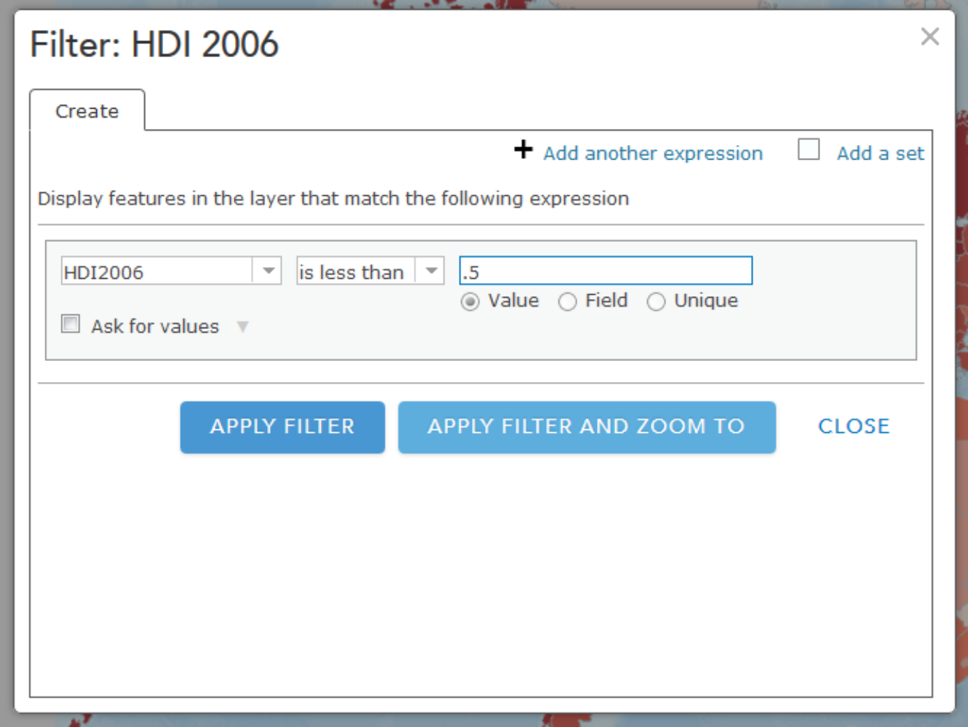
You should now see only the filtered countries on your map that have an HDI of less than .5. Now is a good time to try out other filtering operations that you think might be interesting. You might also want to save this map (every Map is sacred).
Spatial Analysis
Note: Some of the apps you'll try in this section of the assignment will take a little while to return results. Please be patient! Clicking lots of times really fast won't help.
This week you read about one type of spatial analysis called buffering. Click this link to try creating your own buffers: http://developers.arcgis.com/en/javascript/samples/util_buffergraphic/ [137]
Let’s say you are seeking to start a new boat repair service (Salt Lake Sloops or Saline Sails) near the Great Salt Lake, Utah, and you want to locate your service within 25 kilometers of the lake to maximize the number of potential customers. Under the Buffer Parameters heading, set the distance to 25 kilometers. Then use the Freehand Polygon tool to trace the outline of the Great Salt Lake in the north-northwest section of Utah.
- Would Salt Lake City be included in your list of cities to consider? What about Provo?
Another kind of buffer is a temporal buffer, which calculates the amount of time required to walk, bicycle, or drive to or from a certain location. Open this map to create some buffers to show drive times:
http://developers.arcgis.com/en/javascript/samples/gp_servicearea/ [138]
Click on a location in Lawrence, Kansas and wait for the drive time buffer to appear. Click on Interstate Highway 70 (a limited access highway) and note the differences. Click just north of the river and note the effect of the river on access to areas south of it. Observe that the drive time buffers depend not only on the street density, but they have intelligence beyond street location: they take into account one-way streets, stop signs and stop lights, traffic volume, speed limit, and terrain. Pan the map to a rural area outside Lawrence and click on the map in that location.
- What is the difference in the amount of terrain someone could reach in 1, 2, and 3 minutes from a rural area vs. from an urban area?
Now that you've seen how drive times might be helpful for understanding service areas, let's check out what happens when you use a similar method to explore attributes about people in a particular area. Open this map to explore population in Census Block groups [139] within 1 mile from whichever place you click.
Each of the purple dots represents a block that is included in the total count of the population within the 1 mile buffer. Notice that at the upper right of the display you can see the total population inside this buffer. You can use this sort of data to drive a more sophisticated service like this one:
http://developers.arcgis.com/javascript/samples/geoenrichment_infographic/ [140]
In this example, when you click on the map a population pyramid is created for the buffer area. You can compare the population categories for each place vs. all of Los Angeles, California, or the entire United States. A good way to start exploring this example is to click first right on the center of downtown Los Angeles. Take note of the overall shape of the pyramid. Next, try clicking on Bel Air (to the northwest of Downtown LA, home of the Fresh Prince). What differences do you see? What other data would you want to have to explore these differences further?
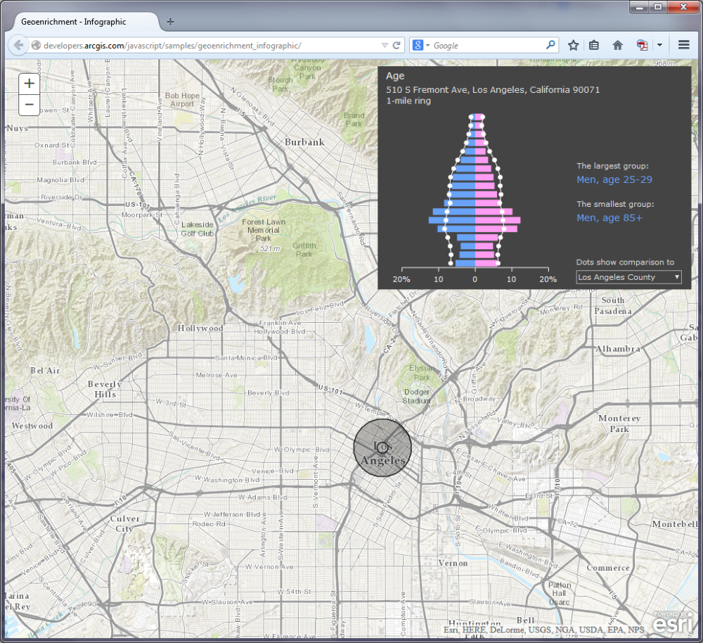
Viewsheds and Zonal Statistics
Viewsheds are another type of buffer. Viewsheds indicate how much terrain is visible from specified locations. Viewsheds are important not only in planning scenic overlooks along trails and highways, but help in everyday decisions such as siting cell phone towers, determining how much terrain would be in shadow if a certain high-rise were to be constructed, helping plan safe roadway curves, and much more.
Use this map to create your own viewsheds [141].
This map service shades the terrain viewable within 5 miles of your chosen point. Let's say you are interested in taking photographs in San Francisco but you only have two hours to do so, since you’re on a layover at SFO on your way to Sydney. You want to be as efficient as possible, choosing locations that allow you a magnificent view. Click several locations on the map and observe the viewshed for each location. Your viewshed should be better if you click on one of San Francisco’s hills. For example:
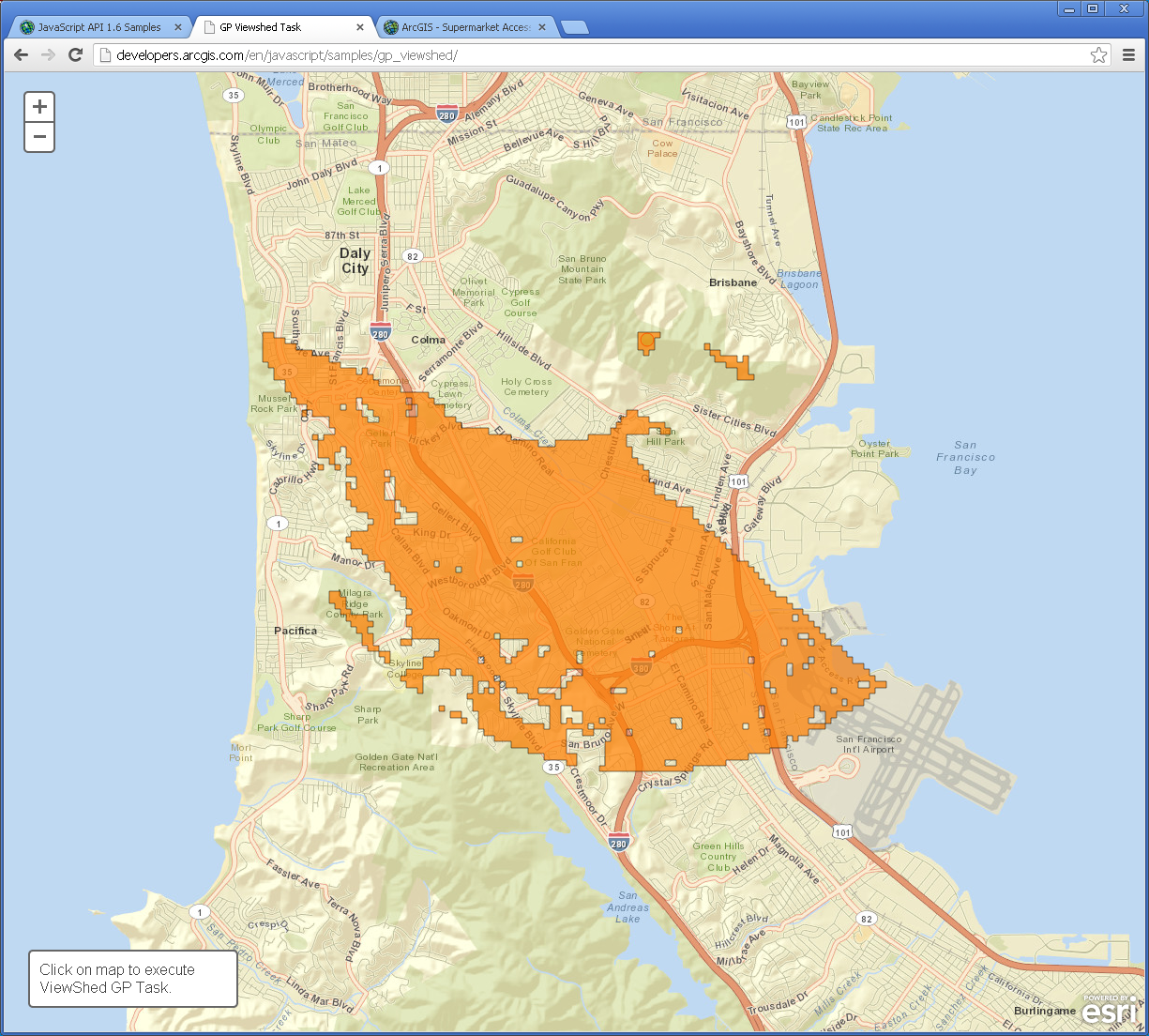
- Judging from the shape of this viewshed, would you be standing on a south-facing hillside or a north-facing hillside?
Click on the Golden Gate Bridge (leading northward from San Francisco on US 101).
- Why is the 5-mile viewshed so much greater in area at this location?
Another type of spatial analysis that computes and summarizes data from rasters is called zonal statistics. Try this little application to summarize population in specific areas [142].
Click on the words Summarize Population in the lower left section of the map and then draw a polygon that encompasses Atlanta, Georgia.
- What is the population in and around Atlanta?
- Why is your result different each time you draw the polygon?
- What aspect of the population data layer influences the results you receive from these area calculations?
Routing
Finally, we also have a whole set of functions to determine the best route and the closest facilities to specific locations. This is important for a wide range of applications, from emergency services bringing people in an ambulance to the nearest hospital to finding the nearest competitor for your planned new Taco & Donut Gastropub (Carnitas & Crullers).
Open the following map: http://developers.arcgis.com/en/javascript/samples/routetask_closest_facility/ [143] and click on the map.
What is the closest competing restaurant to your chosen point? Change the choice under the map to find the routes to show the two closest facilities instead of just one.
- Can you think of an application where knowing where two or more closest facilities would be really important?
Often, as in the case of the Kansas River that you earlier examined in Lawrence, Kansas, there are barriers. Barriers may be physical (rivers or mountains), or they may be human-caused, such as construction projects, one-way streets, or a blockage due to a car accident.
Examine this map on route barriers. [144] (if you do not have access to a browser that can display Adobe Flash, then you can try something similar [145] which uses Javascript)
Let's assume you are running a bicycle courier service in downtown San Diego. Your pick up point is at 1st Avenue and Market Street. Your destination is at 10th Avenue and Market Street. Add these 2 stops and have the map calculate your route, shown in blue. Now let’s say there is construction at 8th Avenue and Market. Use Add Barriers and add a barrier at 8th Avenue and Market (2 blocks West of 10th and Market).
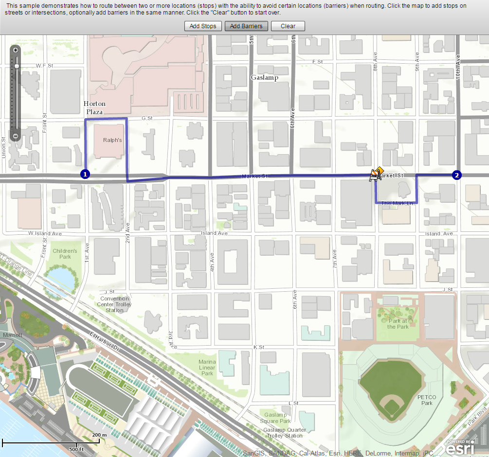
- What changed on your map after you added a barrier?
Supermarket Sweep
Open the following map that incorporates point, line, and polygon data and some of the spatial analysis techniques that you have been exploring above:
ARCGIS Map [146]
This map shows access to supermarkets. The supermarkets have been buffered for walking (1 mile) and driving (10 minutes), and aggregated poverty data is also shown. If you click on the Legend button you'll see that supermarkets and farmers' markets are also shown. Notice how the symbology changes as you zoom out from Detroit to the county level.
- What is the purpose of this map? Why is access to supermarkets a concern in Detroit?
- How has at least one of the spatial analysis techniques you have been exploring in this lab been used to create this map?
Wrap Up
Wow, you're a mapping machine now. In this lab you analyzed real time data and studied the relationships among different variables. You also worked a bit with mapping social media. You used a variety of spatial analysis techniques including buffers, viewsheds, drive time analyses, and routing algorithms. You pretended like you were repairing boats, running a restaurant, and working as a bike courier. It would be cool to have all of that on one resume.
Credit Where It's Due
This lab was developed by Joseph Kerski [44] and Anthony Robinson [11].
Discussion Prompts
Mapping Social Media: What's It Good For?
You've now had some experience playing around with mapping Flickr photos and other social media sources, so let's talk about what this means for the future. Let's say everyone registered for this MOOC tweets five times (once each week) and mentions locations in each message (plus they have profile locations, and a GPS-recorded place where the phone was located when the Tweet was posted). That would result in tweets all over the world by the tens of thousands.
- Look for some examples outside of the ones we've used in class that use maps to show social media. Share them if you like. Can you understand the stories they're trying to tell? Why or why not?
- Scale is an issue for multiple reasons when it comes to mapping social media. What are some ways scale plays a role in social media mapping?
- How would you propose to show tens of thousands of messages on a map so that you could actually do something with this sort of data?
- What real-world tasks do you think can be accomplished (at least in part) by using social media maps?
Assignment: Mapping the Candidate Sites for Jen and Barry's Shop
If you've taken my other programming classes, I apologize for once again dredging up this scenario! In the project that you'll submit for grading this week, you are required to create a map that displays the locations of the four candidate cities from that scenario. You will depict these sites using a custom ice cream cone icon. Here are the detailed instructions:
- Download a shapefile [147] of the candidate cities and the ice cream cone image.
- Load the shapefile into ArcMap and obtain the latitude/longitude coordinates for the four sites. One way to do this would be to click on the sites using the Identify tool and copy/paste the coordinates of your click as reported by the tool. Be sure the data frame's Display units are set to Decimal Degrees.
- Modify the createMarker() function from earlier in the lesson so that it creates an icon using the provided image. You should set the icon and shape properties of the MarkerOptions object.
- An info window should open when a marker is clicked. This info window should contain the name of the (fictional) city in bold. Beneath the name, you should list its population in normal print.
- This project does not require the plotting of lines or polygons.
- Because there are only four cities to depict, it is OK to hard-code their coordinates and info window text in the body of the script. We'll discuss how to work with larger datasets in more practical ways in the next lesson.
Deliverables
This project is one week in length. Please refer to the course Calendar tab, in ANGEL, for the due date.
- Post the map of Jen and Barry's candidate cities to your e-portfolio. (80 of 100 points)
- Below the map, include some reflection on what you learned from the lesson and/or any concepts that you found to be confusing (minimum 200 words). (20 of 100 points)
- Complete the Lesson 4 quiz.
Summary and Final Tasks
In this lesson, you've seen how to modify the Google Maps user interface, open info windows when markers are clicked, implement a custom marker icon, and code the addition of line and polygon overlays. To this point, we've only dealt with a small number of points and have been able to hard-code their locations in our JavaScript code.
In the next lesson, you'll learn how to handle a larger number of markers in a more realistic way by storing their attributes in an XML file. You'll also learn how to add a sidebar that lists the names of your markers and how to use the API's address geocoder.
Lesson 5: Making Great Maps
Lesson 5, Lecture 1
Making Great Maps
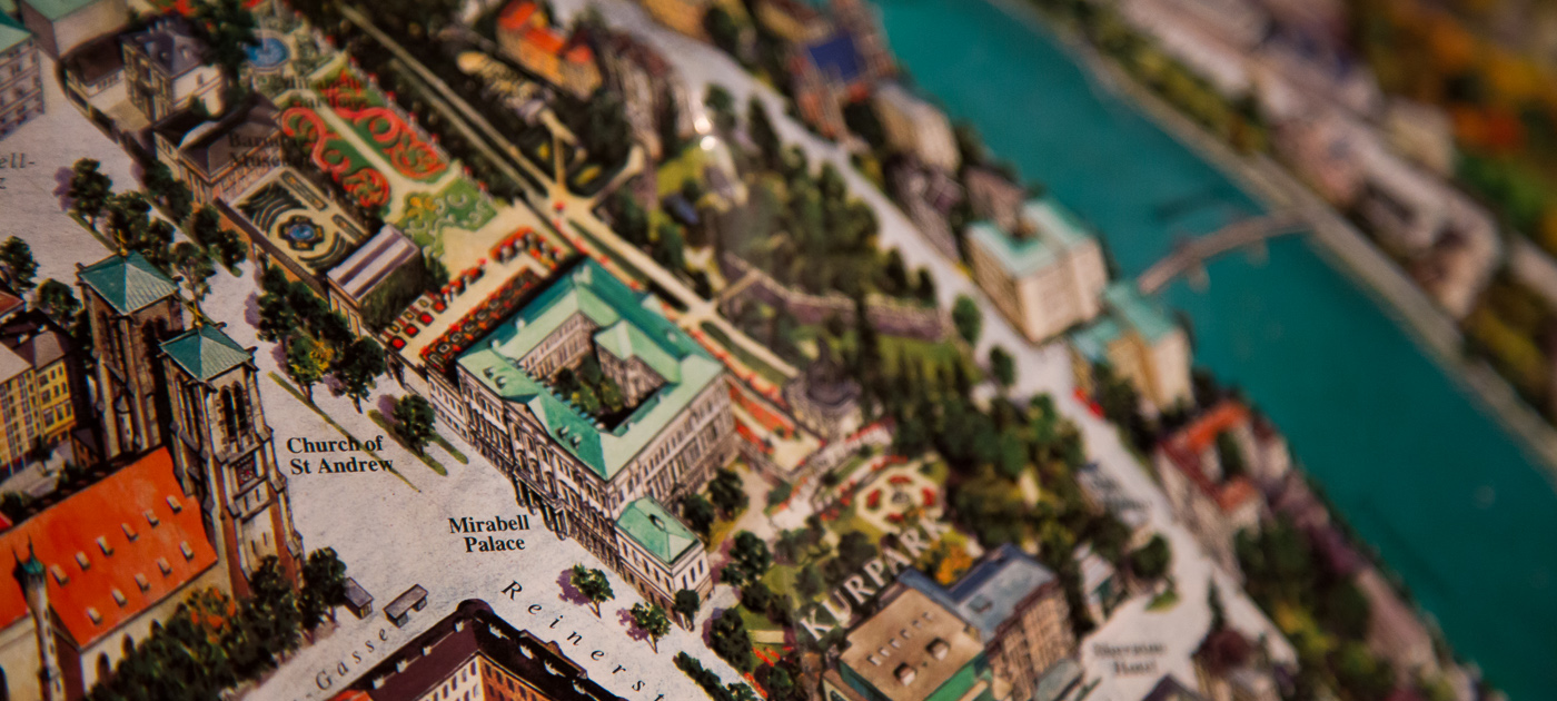
Making Great Maps
In this Lesson I want you to understand some of the essentials of Cartography – the art and science of making maps. We Cartographers [148] are an eccentric lot, caught between several really distinct priorities. Every map has an audience, a target format, and a specific purpose. There isn’t a single “right” map for a given problem situation. Maps are not the objective truth, but they offer enormous help for us to understand the world. By default, they are simplifications of reality because we can’t show all of the infinite detail that makes up what exists on Earth (or elsewhere if you’re mapping planets, genomes, whatever). This simplification actually helps us make decisions, identify patterns, or realize where we made a wrong turn on the way to buy a bucket of chicken. Quite often maps are intended to tell a story, or at least to serve as the context for a story to take place. Maps are like snowflakes or children; they can’t be easily compared on objective metrics, and only some of them are truly good looking.
Maps are products of a design process. There are lots of decisions to be made, and every design decision influences the final outcome. To be a Cartographer, you have to understand and accept the responsibility [149] that comes along with making those design decisions. Depending on what I want you to think, I can design my map accordingly to try and sway you. What you choose to include, how you symbolize features, how you show data patterns through analysis, and even the colors you assign to things all have a huge impact on how people will interpret a map. John Krygier [150] and Denis Wood [151]’s book called Making Maps: A Visual Guide to Map Design for GIS [152] has some great examples of how maps can use different representations of the same underlying data to tell very different stories:
Who Wants A Map? Where Will It Be Seen? What Is Its Purpose?
These are the three key questions you have to answer when approaching a map design task. Failure to adequately think through any of these three areas will result in great shame to you and your family. I like to start by thinking about the proposed audience for whatever I’m designing. Who are the people who will look at this map? Is it a group of ten experts, or 40,000 anxious parents who are wondering if schools are closed today due to a 6 micron layer of snow outside? In the case of this class, I’m designing maps to work for thousands of map readers, most of whom I will know very little about aside from the fact that they thought this class would be cool to take. Since I know that my Grandpa, my Mom, and most of my friends are taking this class, I at least have some sense of the range of users I need to design my maps to serve.
After you determine who your map should be serving, you need to consider the place where it’ll be seen. Are you making something to print and take on a canoe trip through a fly-infested backwater? Are you planning on showing off your mad iPad skillz by making a fancy digital slippy map [153]? Perhaps you want to make a digital map that’s not interactive like I’ve done in lots of examples for this course. Maybe you need to design something that’ll work in digital formats and printed formats, including black and white. We’re working on lab assignments in this MOOC that only focus on designing interactive digital maps. If you took a Cartography class [154] with me or any of my fellow academic cartographers around the world, you’d gain experience with all of these other mapping formats as well. Each one has its own constraints, naturally. The design I make to work for black and white prints would be totally different from one that has to be legible and work with interactive tools on your cell phone.
Finally, the third, and potentially most important question you need to answer pertains to the purpose of your map. Simply put, what story are you trying to tell (Thematic Mapping)? Or are you just trying to provide the context for other stories to take place (Reference Mapping)? Everything you do to design your map should correspond to the purpose you’re trying to serve. Maybe I need to design a digital interactive map for college students to easily find the nearest place selling cheap yoga pants. Or maybe I need to design a printed black and white map designed to help first responders instantly recognize the location of hazardous materials in a 2-mile radius of a football stadium.
Layout and Symbolization
Designing a Layout
When you design a map, you need to carefully consider the relative balance of all of its visual elements. You have the map itself, and perhaps you have multiple maps (an inset showing where the location of interest is in relation to the rest of the world, for example). You’ll also probably have a title, a legend, scale bar, source information, and other little bits and pieces. Map nerds (cartographers) call those bits and pieces (aside from the main map) marginalia. The act of sorting things out so that clarity is maximized is called establishing a visual hierarchy. Consider the two examples below from Designing Better Maps: A Guide for GIS Users [155] by Cindy Brewer [156]to see what this means in practice. It’s all about shaping the layout items around your message. The map on the top has all of the necessary elements, but they’re not balanced on the page. The example on the bottom shows the same elements arranged in a way that promotes clarity and harmony in the map design. The first example is a bad layout. The second one is a good layout.
Symbolization
By this point you’ve encountered a wide range of ways in which things can be represented on maps. You’ve worked a lot with choropleth (colored-area) maps in labs and you’ve seen a lot of those as examples in the course content. There are many other ways to show stuff though, and I want you to be aware of some of the most common methods.
Point Symbols
One of the simplest things you can do is to use icons to represent point features. We call these point symbols, and they can range from very detailed in their design (you could even use small photographs if you really wanted to), to very abstract and iconic. Here’s an example of point symbols used to show the locations of important services in Lower Mapistan. Good resources for point symbols include MapBox’s Maki [157] set and our own Penn State Symbol Store [158].
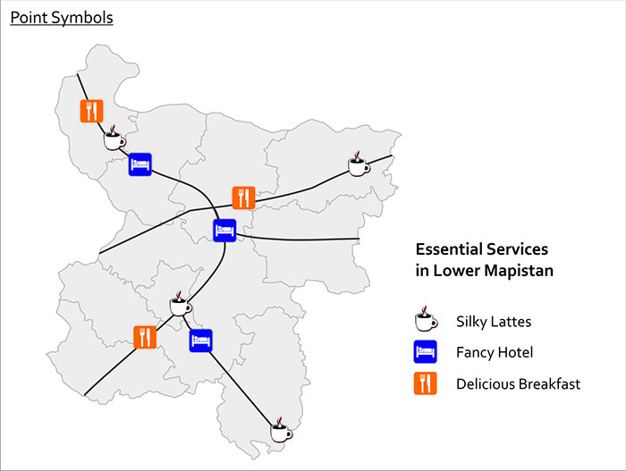
Proportional & Graduated Symbols
Another form of point symbol is one that changes its size based on underlying data values. These are called proportional symbols when you size each symbol in relation to its attribute value. In a proportional symbol map it’s possible for every symbol to be a slightly different size, since size relates to the data value itself. In contrast, graduated symbols use preset symbol sizes to represent a category of values. It’s usually easier for people to make quick comparisons with graduated symbols, while proportional symbols do a nicer job of revealing the underlying diversity in your dataset. You can see the difference here with this map of cable bill delinquency. Both methods are good to use if you want to map raw values rather than rates (remember our previous work on normalization?).
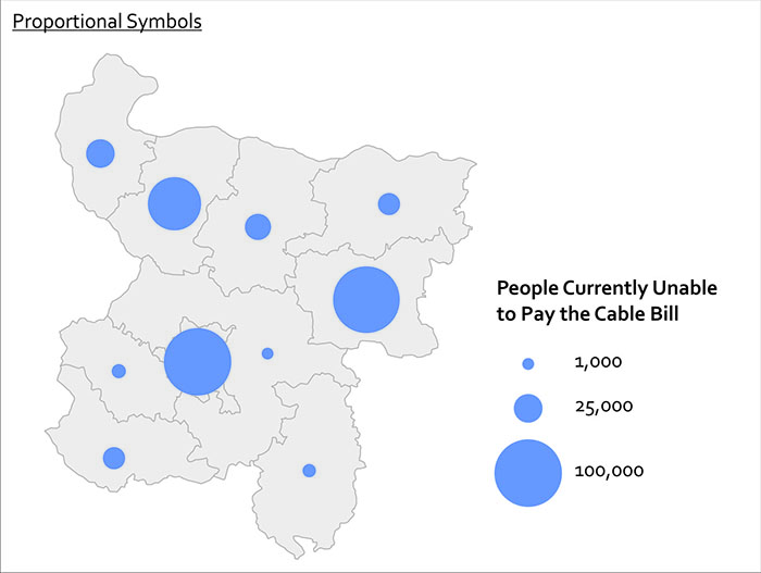
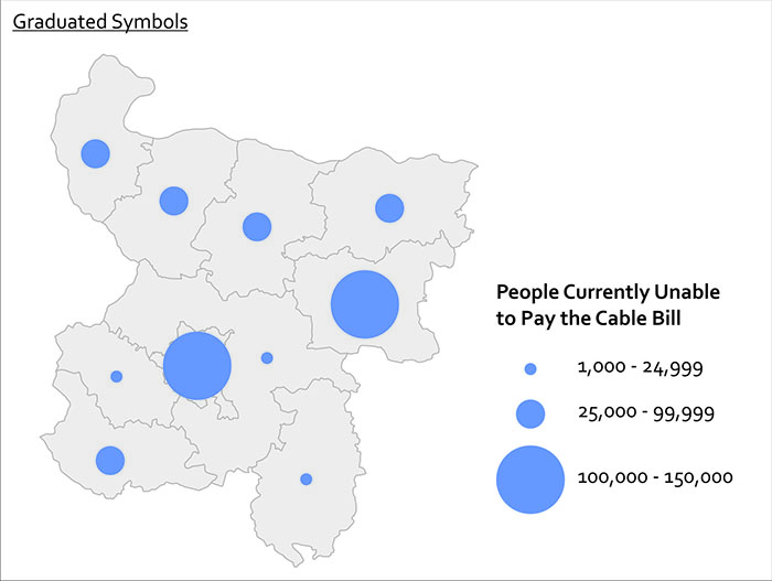
Quite often you want to show more than one thing at a time with your symbols. You can use bar charts, pie charts, and other fancy things like cartograms [159] and bivariate choropleth [160] maps to show more than one variable at once. Pie charts work reasonably well if you just have a few variables you want to show.
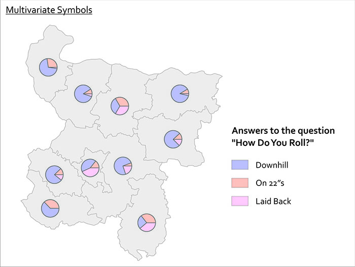
Lesson 5, Lecture 2
Choosing Colors
Match Colors To Your Data
The best way to get you thinking about color design on maps is to think first about the data you’re trying to show. There are four primary levels of measurement [161] associated with data, but I can make it even simpler for you. Are you dealing with numerical data or are you dealing with categorical data? In the former case you might have conducted a neighborhood census to count the number of households that leave their children’s toys in the front lawn. In the latter case you might be recording what all of your coworkers consider their favorite curse word. Mine rhymes with “duck.”
When you’re choosing colors for a map, you have three major categories to choose from. Color schemes exist for sequential (less-to-more), diverging (+ / - deviation from an average value), and categorical (movie genres in your Netflix queue) data. And fortunately for you, very clever folks have already done all sorts of science [162] around designing effective color schemes for each of these three types. I’m extremely lucky to work quite a bit with Cindy Brewer [156] here at Penn State, who developed something fabulous called ColorBrewer [163], which is a handy web-tool you can use to choose and preview color schemes. Go try it now.
These color schemes work well for all sorts of things outside of mapping. I’ve even used them to choose paint colors at home (we have a green kitchen that couples nicely with a purple wall, like one of Cindy’s diverging color schemes shows). Note that ColorBrewer gives you the ability to choose schemes that are still OK for colorblind [164] viewers, suitable for printing, and usable with a digital projector. 5-8% of males are colorblind, and ~1% of females are colorblind, so it's a really important audience to consider when designing anything. You can use tools like VisCheck [165]to predict what a colorblind person will see when they come across your image.
Below I’ve made two examples to show you why thinking about your data first makes color scheme selection easy. I’ve got data here showing the number of Internet Users per 100 people [166] by country. In the first map, you see a sequential color scheme from ColorBrewer. In the second map I’ve used a categorical color scheme from ColorBrewer. Which one is super-easy to understand? The first one, right? The categorical one doesn’t work – you have to study it over and over to determine which places are high and low, respectively, and at a glance you could not interpret this map easily.
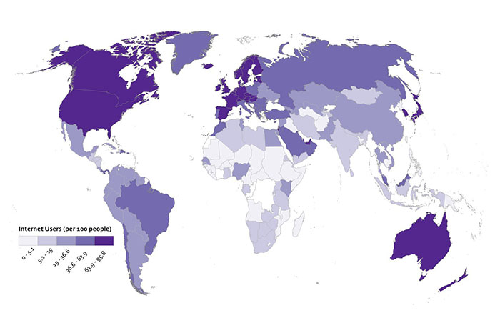
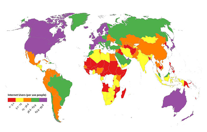
Diverging color schemes are really useful for when you want to show which places are above and below an average value. A lot of the time what you want to do with a map is to convince people to pay attention to particularly high and low outliers in your data, not the stuff that is expected or normal. You can see here what happens when I use a ColorBrewer diverging scheme for the Internet User dataset. I think you’ll agree that this works nicely to show which places are above and below the middle category.
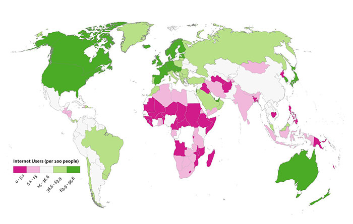
Since this is numerical data that’s not appropriate to represent with a categorical color scheme, I cooked up another example here to show you when using a categorical color scheme would make sense. I may have completely made up this data myself, or it may be absolutely accurate. You decide.
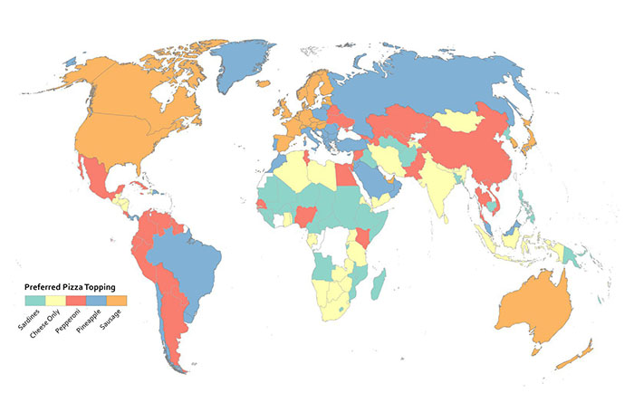
Rainbows Kill People, So Stop Using Them On Maps
Do I have your attention? Good. Resist the urge to use continuous rainbow color schemes to assign colors to things on your map. They’re formally referred to as spectral color schemes, as they typically use most of the named colors in the visible spectrum. They’re also a type of qualitative color scheme. You see them all the time on maps, and they’re a default choice of many folks when visualizing nearly anything you can imagine. They are almost always the wrong choice.
Here’s why they’re awful – 99% of the time when you see them, they have been applied to data that is sequential or divergent in nature, not qualitative. For example, they’re used a lot to show different levels of rainfall on weather maps. Ask yourself this question; how much more does purple represent than orange? See what I mean? You have to learn how to interpret data categories on a map that uses a rainbow of colors to represent something sequential (more or less rain) – it’s never intuitive. A spectral scheme also emphasizes variation where there may not be anything significant. It may also hide the variation you’re actually supposed to be revealing with your data. They don’t work well for color blind users, either. Many others (misleading maps) [167] aside from me have elaborated on these and other reasons to stop the rainbow scourge (here’s one example (no more rainbow scales) [168], and another (color and design) [169]).
They’re popular in part because they result in very bold-looking, colorful maps. More exciting ≠ better when it comes to making any kind of data graphic (such as a map). It’s much more intuitive to have your color scheme match closely with the kind of data you’re using. If it’s a “less-to-more” dataset as in the rainfall example, then you should be using something that goes from a light to dark range with the same hue.
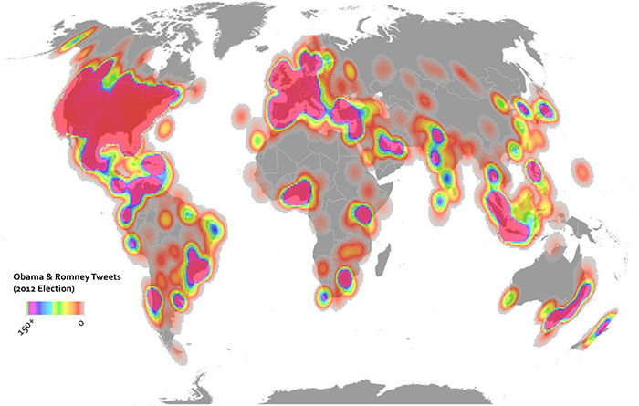
Here are two examples showing some Twitter data from the 2012 U.S. Election. In the above map I’ve used the terrible rainbow thing to symbolize my data. It looks really bright and exciting. All it’s supposed to show though is where things are high and low, so you have to study the color scheme closely to see what bright yellow means in comparison to bright purple, and so on. The map below uses a single hue increasing in saturation in a sequential manner. It’s more subtle, but it’s also more honest when it comes to showing what’s really in this data, and the reader will have no problem identifying the trend immediately.
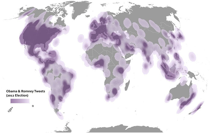
But don’t just rely on my rant here – check out what scientists have learned from studying doctors [170] as they try to interpret heart scanning images using spectral schemes vs. sequential schemes. Doctors make worse decisions (ones that would impact serious healthcare decisions) using rainbow color schemes. People could die, so don’t use rainbows on maps.
Data Classification
Breaking Up Is Hard To Do
Most thematic maps require the mapmaker to assign individual data observations to categories. The act of assigning observations to categories in mapmaking is called data classification. We use it as a verb in Cartography – I classify my data before I design a map. If you map everything on a 1-to-1 basis, e.g. you show every observation and identify it as a unique thing on your map, then you’re not using classification. An example would be if I had reports from every city in the world about the number of babies who refuse to sleep through the night. I could report each value individually, but most likely I’d want to group similar values together to make it easier to reveal patterns in the data. In every choropleth map in this course, you’ve seen classified data – I collected values within a certain range and assigned one color to describe them.
There are three major types of classification that I want you to know about. There are many other types too, but I’m sure someone will be along shortly to teach a MOOC just about data classification. Equal Interval classification sets category boundaries at a specified data value interval. Quantile classification works the other way around – you decide how many categories you want and then add observations to each class until you’ve got equal members in each subset. This can help your map look nice and visually balanced because there are equal numbers of each color for a choropleth map, for example. The last type I want you to know about is called Natural Breaks, which uses some fancy math to look for “natural” breakpoints in the overall data distribution to place category boundaries there. There’s no best solution for every map – you have to understand your data, understand the story you want to tell, etc… and choose a method that makes sense given those constraints.
Each method is shown below on a histogram showing some fake data. I’ve got 50 observations (hollow circles), and each observation has a particular value (shown on the axis). In this case let’s say I did a survey of all 50 U.S. States to identify the number Audi A4 Avant [171] admirers per 100 people. I would really enjoy doing this survey.
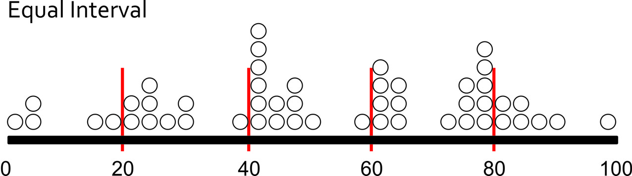
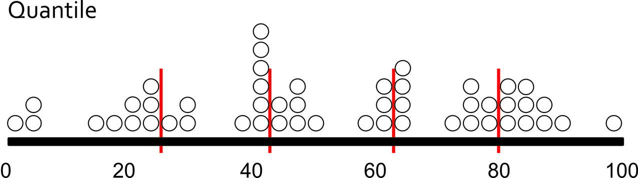
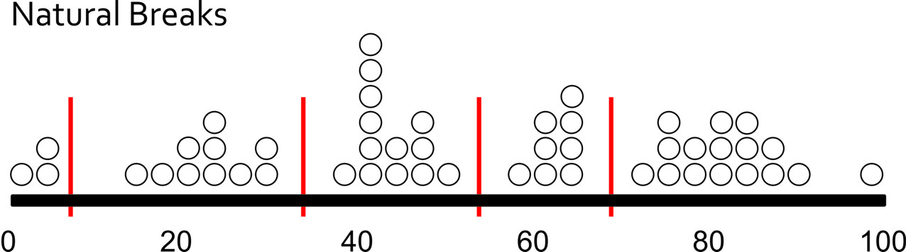
Map Examples
Using Equal Interval classification, I would set class breaks at intervals of 20 Avant Fans Per 100 People and end up with five classes to represent my data.
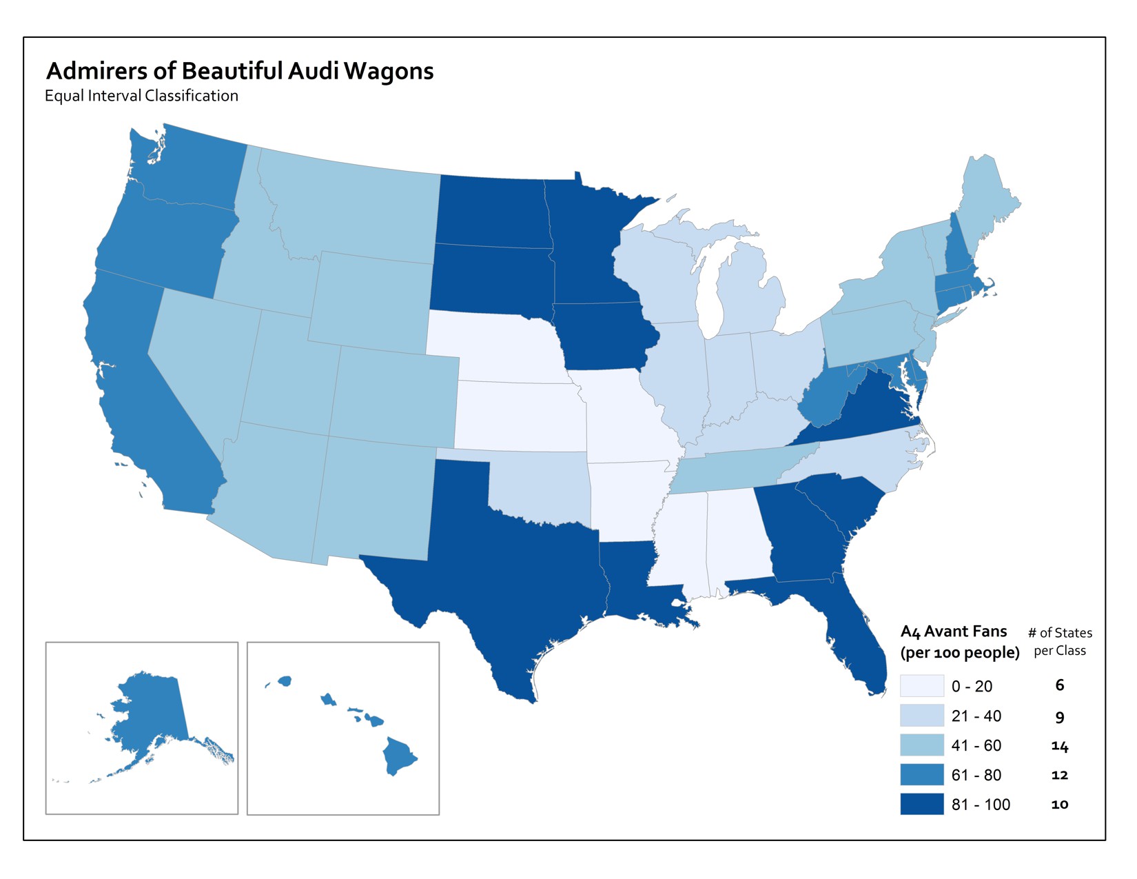
With Quantile classification, I decide I want five classes first, and then add observations to each class until I’ve got equal numbers in each one. Since I have 50 people who responded to my survey, I need to put 10 observations in each class. So I move from left to right on the data distribution axis and set my classes accordingly.
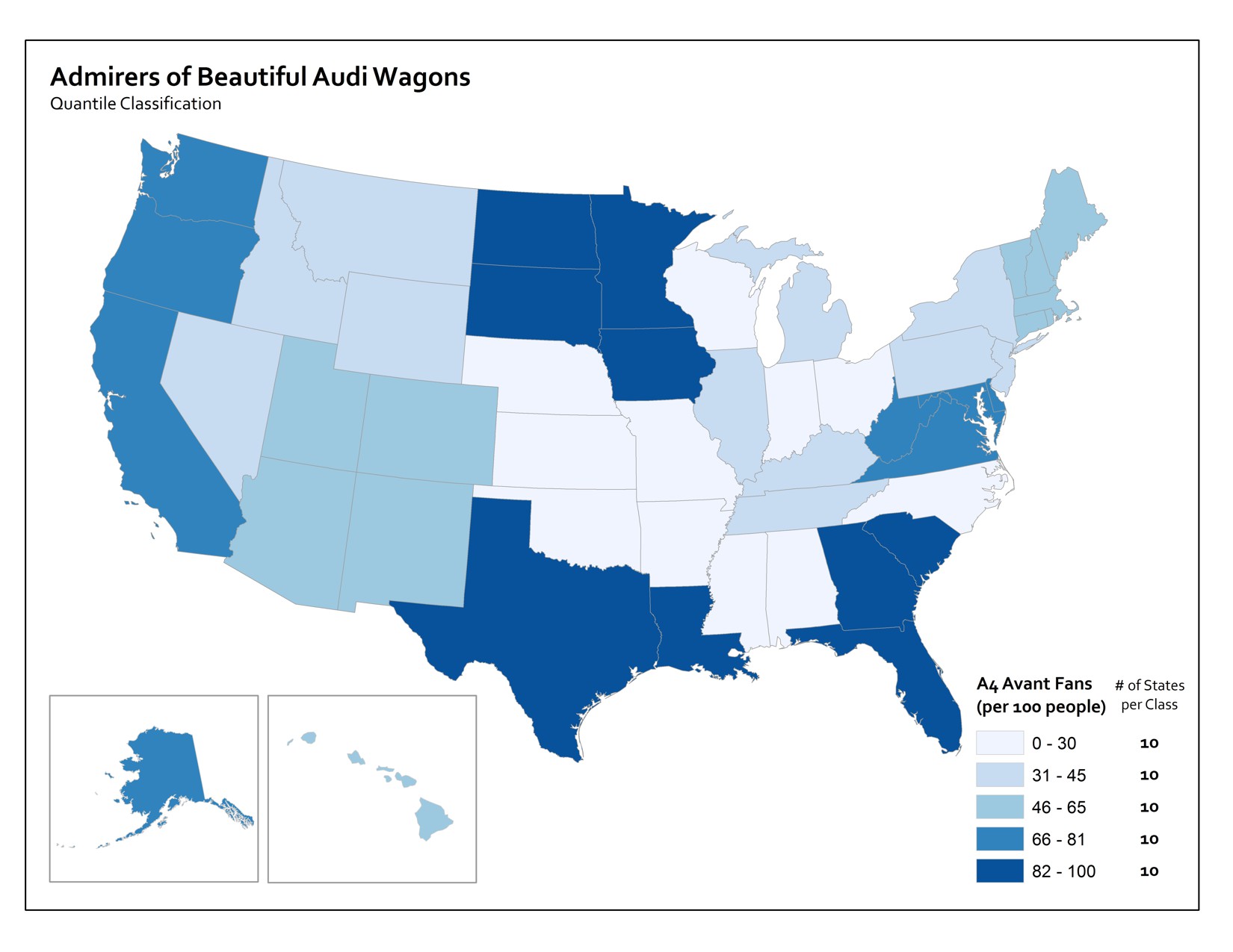
Using Natural Breaks, I let the fancy math decide where to put breaks in between the most consistent groupings that appear in the responses.
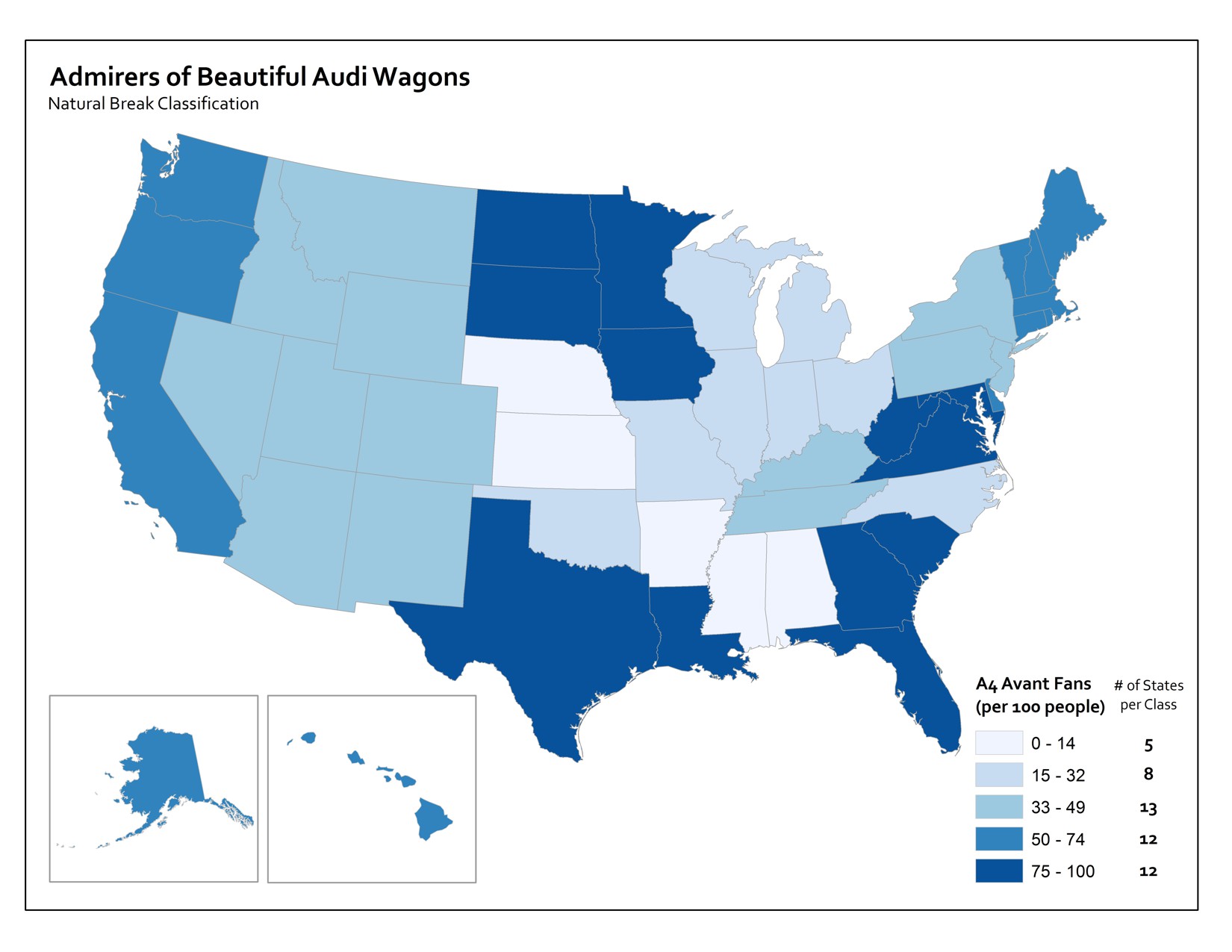
If you’re intrigued by this stuff, check out this excellent article (Visualizing Cancer Data using GIS) [172] by Cindy Brewer on how classification impacts mapping in the context of public health.
Text on Maps
While it’s a bit outside of the scope of this introductory class, I’d be doing you a disservice if I didn’t at least briefly describe the role of labeling and type design on maps. Cartographers often spend a huge amount of effort just trying to decide where to locate labels on a map layout (the map itself and its marginalia). Normally there are too many labels to show in too small of a space, so we need to design a clear visual hierarchy by varying the characteristics of text [173] to emphasize the important bits and de-emphasize the less important bits. Fortunately for you, there are some easy rules to follow – the graphic here shows the priority you should place on label location.
And when you’re faced with the daunting task of choosing among zillions of fonts [174] for the text on your map, Ben Sheesley [175] from Axis Maps [176] has created a great little tool called TypeBrewer [177] (in the spirit of ColorBrewer). Avoid Comic Sans [178] and Papyrus [179] (the default font choice for restaurant menus around the world, unfortunately), please.
Video Activity
For the final lesson of this class, I'd like you to watch this video from Chapter One of Episode Four in the WPSU Geospatial Revolution [109] series. This video shows how geospatial technologies and analytical methods are used to monitor and predict the impacts of climate change. Among others in this video, you'll see Richard Alley [180], another Penn State professor who happens to have his own quite interesting MOOC [181] on Coursera.
Mapping Assignment
Storytelling with Maps
For your final mapping assignment, I want you to take initiative and design a map that tells a story about a topic of your choice. You have some decisions to make:
-
Which mapping platform will you use? You can use anything you like, so long as you’re able to link to an interactive web map or a static image of your map in your peer assessment submission. I’ve listed your options here in order of their relative difficulty.
- Easy: For many of you, sticking with ArcGIS Online will be the easiest option. You know by now how to get to ArcGIS Online, search for data, make a map, and share it with a link.
- Moderate: If you’d like to try something a bit more sophisticated, you can also use ArcGIS Online’s Story Maps [182] capability. You can also review a video series [183] showing how to make a Story Map, and read "Web Maps, Web Apps, Story Maps" [184] to explore what makes them different from other web maps. You should also consider CartoDB [185]. CartoDB offers very nice animated map tools and features to style your web maps and share them with the rest of the world. They have excellent documentation [186], so this is a great option if you want to branch out a bit and try a popular open source web mapping platform.
- Hard: Make use of free, open source desktop GIS software like QGIS [187] or GRASS [188] (see the excellent OsGeo Live site [189] for tons of open source options and tutorials), or commercial software like ArcGIS Desktop. To use the latter, you’d need to have a license already (I can’t help you with that, sorry).
-
What story do you want to tell? I really want you to come up with ideas on your own (be creative!). But here are a few examples if you have no idea how to get started:
- Convince me (and your classmates) that your hometown is vulnerable to one or more types of disasters.
- Show how your home country/state/neighborhood has changed over time in relation to its neighbors.
- Tell a story about your most recent travels, augmenting the map with photos and other media to highlight your experiences.
- Use spatial analysis to identify good locations for your favorite type of restaurant.
-
Where will your data come from?
- You've got tons of options available searching inside ArcGIS Online [190], and you know how to bring in an outside dataset in CSV format from your earlier lab work.
- You should also consider making your own geospatial data. See below for some simple tips on making your own data using a smartphone or GPS.
Collect Your Own Geospatial Data
One thing I'd like to encourage is for you to go out and collect your own data about your community, a problem you'd like to solve, or something else that you think would make good fodder for telling a story. You don't have to do this - I know some of you may not have the time, energy, or devices to pull this off. But it's a cool option for those of you who want to go the extra mile. These are basic guidelines that will cover a lot of the bases, but there is no way for me to provide technical support for thousands of people who might all use different devices.
- Before going out into the field, think carefully about what you would like to collect, the story you would like to tell about it, and your final audience. Think about what attributes you will collect, and how many points you need. Then consider how you will collect the data: Your route, what equipment you will need, and any relevant safety precautions. If you are planning on collecting GPS locations while in free-fall from a basejump off of a radio tower then I want nothing to do with it.
- You will need to gather two pieces of information: (1) a latitude-longitude coordinate (ideally in decimal degree format), and (2) Attributes about each point you are collecting. This could be tree height and species, type of litter or graffiti, length of mullet haircuts, noise from loud car stereos, soil types, jaywalking pedestrians in a 5 minute timespan, or anything you are interested in. Be creative!
- Collect latitude-longitude coordinates for the desired data you want to examine. A few ways to do this include:
- Use a handheld GPS to collect waypoints and tracks. Make sure the GPS is set to WGS 84 datum, and that the coordinate system is set to decimal degree, if possible.
- Use a Smartphone to manually collect waypoints (iPhone: Utilities, Compass) (Android: you'll need GPS Status [191] or another latitude-longitude app). Make note of latitude/longitude using phone notes or on an old fashioned piece of paper.
- Use a Smartphone to collect automatically collect waypoints with MyTracks [192] (Android) or Motion X [193] GPS (iPhone). Make sure the datum is set to WGS 84.
- Use ArcGIS app on iPhone or Android to obtain latitude-longitude coordinates for your current position.
- If you have no field collection device, go to the ArcGIS website [110] and create a new map. Navigate to the locations where you wish to gather information. Change the base map to imagery or another base map that best meets your needs. Click on the measure tool and then the point symbol to obtain the latitude-longitude for each of the points you wish to gather information about. Write down the latitude-longitude coordinates in a digital file or on paper.
- Collect attributes for each of your points that you collect. Use your phone’s note function, or an actual paper notebook to record the attribute data. Make sure that your attributes correspond to each waypoint that you collected.
-
Map and analyze your field data.
- Create a text file or an Excel table with the following column structure as an example: Point ID (1,2,3,4 etc...), Latitude, Longitude, Attribute 1, Attribute 2, and so on.
- Convert your latitude-longitude values into Decimal Degrees if they're not in that format already.
- For example if I was doing a neighborhood tree census: Point ID, Latitude, Longitude, Tree Species, Tree Height (m) might have a first row showing: [A, 34.01234, -117.23946, palm tree, 30]
- Save your file as a CSV file. In ArcGIS Online, Use Add data to Add data from file to import your CSV file. Your points will appear on the map. Symbolize and classify your data how you see fit, and save and share your map through a link for your peer assessment assignment.
For more information on adding field data to ArcGIS Online, see videos explaining the process at the ESRI page "Add Features from a File" [194] and the geographyuberalles YouTube channel [195].
Suggested Grading Rubric for Storytelling Assignment
This assignment can be rated on these four criteria with scores ranging from 1 to 5 (strongly disagree to strongly agree). The four main criteria that you will rate your agreement with are:
- This map tells a complete story.
- This map tells a compelling story.
- This map is designed in a way that reflects the use of best practices in cartographic design and geospatial analysis.
- This map has a look and feel that reinforces the objectives of the story it tells.
You'll also provide a brief written statement to explain your ratings.
Credit Where It's Due
This lab was developed by Anthony Robinson [11] and Joseph Kerski [44].
Meteorology: Tools of the Trade
About this Class
Welcome!
This course is offered as part of the Open Educational Resources initiative of Penn State's John A. Dutton e-Education Institute. You are welcome to use and re-use materials that appear in this site (other than those copyrighted by others) subject to the licensing agreement linked to the bottom of this and every page.
Not registered? Students who register for this Penn State course gain access to assignments and instructor feedback, as well as earn academic credit. Information about registering for this course is available at the Penn State World Campus [196].
Quick Facts about METEO 3
METEO 3 is a General Education course offered by the Department of Meteorology. The course is designed specifically for distance learners seeking general science credit. METEO 3 will introduce to you a wide variety of basic atmospheric concepts so that you can become a better "weather consumer" (better understand and evaluate weather information) and gain a better understanding of "how the weather works."
Why learn about the atmosphere?
Most everyone is familiar with Benjamin Franklin's foray into cloud electrification using a kite. However, did you know that Franklin was an avid student of the weather? He was the first person to note that storms generally traveled from west to east at predictable speeds. Franklin also noted in 1743 that storms do not always travel in the direction of the prevailing winds - in fact can travel against the prevailing winds in some cases. Here's even a figure from a paper entitled "Waterspouts and Whirlwinds" [197] written by Franklin.
Granted, Benjamin Franklin dabbled in many diverse topics, but why did he find the study of weather so important? Well, I'm of the opinion that it might have been because weather affects all of us. Think about it. No matter where you live or what you do, weather is going to have some impact on your life. It may be that the effect is on the periphery of your life (such as determining what you wear on a certain day), or it may affect you more substantially (such as having a directly impact on your sources of income). Or, in rare cases, it may affect your very life (in an extreme event like a hurricane or a tornado). In whatever way the weather affects you, one thing is for sure… the weather does affect you.
So then, doesn't it make sense to know something about how the atmosphere works and make use of the many types of weather data available to you? I certainly think so. However, I am continually startled that a lot of people know so very little about something that plays such a pivotal role in their lives. Indeed, many people are interested in the weather, but not necessarily interested in learning about the weather. Hopefully, as a result of this course, you will come away with some very practical knowledge about the weather. This knowledge will make you a better weather consumer (that is, someone who can intelligently process weather information presented to you). And, who knows, this knowledge may even save your life! In the words of Ben Franklin, you'll be "weather-wise."
What will you learn in this METEO 3?
METEO 3 seeks to give you a better understanding of atmospheric structure and processes so you can better apply the weather information you encounter. With this knowledge of how the atmosphere works, you'll be able to understand what controls the evolution of storms and appreciate why weather forecasts are sometimes highly uncertain. You will also learn to "read" the sky so you can make your own short-term forecasts and adjust your behavior accordingly. You will also be better able to assess the validity of the commonly expressed concerns about climate change and deteriorating air quality.
Lesson 1: Weather Analysis Tools (composition of the atmosphere, map features (latitude lines, meridians and projections), UTC and common U.S. time zones, temperature scales, common statistical measures (range, mean, and normal), reading isoplethed maps, gradients, station models, meteograms)
Lesson 2: The Global Heat Budget (electromagnetic spectrum, Stefan-Boltzmann Law and Wien's Law, radiation processes, albedo, energy budgets, radiation at the Earth's surface, clouds and radiation, greenhouse effect, conduction and convection)
Lesson 3: The Global and Local Controllers of Temperatures (seasonal changes, climatic temperature variations, vertical temperature variation, air masses and fronts, advection, diurnal temperature changes)
Lesson 4: The Role of Water in the Atmosphere (hydrological cycle, water phase changes, vapor pressure and equilibrium vapor pressure, air "holding" water fallacy, relative humidity, cloud and fog formation, dew point temperature)
Lesson 5: Remote Sensing of the Atmosphere (remote sensing versus in-situ measurements, polar orbiting versus geostationary satellites, visible imagery, IR imagery, water vapor imagery, radar)
Lesson 6: Surface Patterns of Pressure and Wind (atmospheric pressure, "station pressure" vs "sea-level pressure", decoding station model pressure, troughs and ridges, wind (forces, direction at surface and aloft), convergence and divergence)
Lesson 7: Mid-Latitude Weather Systems (pressure decrease versus temperature, pressure heights, convergence / divergence effect on surface pressure, vorticity, short waves, jet streaks, mid-latitude cyclones (development, features, weather, conveyor belts))
Lesson 8: Stability and Thunderstorms (hydrostatic equilibrium, vertical velocity, buoyancy and stability, clouds vs stability, Bergeron-Findeisen process, lightning (terms and safety), thunderstorms (climatology, types, terms and life cycle))
Lesson 9: Severe Weather (flash floods, hail, microbursts, watches and warnings, squall line, derecho, bow echo, tornadoes (climatology, supercells, terms, radar signature, safety, Fujita scale, myths), other vorticies)
Lesson 10: The Human Impact on Weather and Climate (anthropogenic climate change (terms, processes, impacts), carbon-cycle, volcano impacts, global climate models, ozone layer, ozone hole, deforestation and urbanization)
Lesson 11: Patterns of Wind, Water, and Weather in the Tropics (tropics importance to general circulation, Hadley circulation, ITCZ, subtropical high pressure regions, Trade Winds, subtropical jet stream, Asian Summer Monsoon, Ekman Transport, El Niño (and La Niña), teleconnections)
Lesson 12: Hurricanes (tropical cyclone terms, hurricane climatology, tropical-cyclone naming conventions, tropical cyclone formation, easterly waves, structure of a mature hurricane, land-falling hurricane impacts)
How does this course work?
METEO 3 combines a traditional textbook (A World of Weather: Fundamentals of Meteorology, 5th Edition, by Lee M. Grenci and Jon M. Nese, 2010) with digital video, audio, simulation models, virtual field trips to online data resources, and interactive quizzes that provide instantaneous feedback. The course consists of 12 lessons, plus a course orientation week at the beginning of the semester. Lessons consist of an offline reading assignment, along with online interactive exercises, links, animations, movies, and supplementary explanations of basic scientific principles.
About the Author
David Babb, Course Instructor

I came to love weather rather early in life. Growing up in Chattanooga, Tennessee, I used to marvel at the squall-lines that came through during the summer. When I was sixteen, my family spent a year on a sailboat [198] cruising around inland river systems, the East Coast, and Bahamas. We weathered Hurricane Gloria, saw steam devils on the Tennessee River, had waterspouts on Lake Ontario, and experienced many other kinds of weather phenomena. This experience sealed my fate as a meteorologist. I also learned first hand how important understanding and forecasting the weather can be (especially for mariners).
By the time I attended college at the University of Kansas [199], I had decided to make a career out of studying the atmosphere. My real enthusiasm at the time was centered on tornado-chasing [200] which I did as often as possible, and led to summer internships at the National Severe Storms Laboratory [201] in Norman, Oklahoma. After completing my Bachelor's degree, I attended Penn State where I received my Doctorate in Atmospheric Science, studying radar measurements of clouds and precipitation. Over the course of my career, I have held many different positions including researcher, instructor, meteorological consultant, and instructional designer. Currently, I am an Assistant Professor in the Department of Meteorology [202] here at Penn State. I also serve as a Fellow in the John A. Dutton e-Education Institute [203] which promotes the development of high quality online education initiatives like the Certificate of Achievement in Weather Forecasting.
When not at work, which usually involves being online, I try to satisfy my glass addiction. I have been blowing glass for nearly ten year. Off-hand glass blowing uses a blowpipe to make much larger pieces such as vases [204], bowls [205], and goblets [206]. Here are a few photos of me making a vase (photo 1 [207]; photo 2 [208]).
Like many meteorologists, I am also a "weather weenie". I am always pulling over on the highway to take a picture of some cloud or optical phenomenon. I am simply amazed by the complexity and diversity of what I observe going on in the atmosphere (check out the picture of frost on the right). I hope that throughout this course you begin to appreciate some of this complexity and beauty that the atmosphere provides us. Take some time every day to stop and look up at the clouds, become aware of the weather around you, look for patterns in what you observe, and try to figure out what's going on. I'm confident that you'll be rewarded.
Introduction
Overview
What role do tools play in your daily life? You might be tempted to say something like, "Well, I'm not really a handy person... I don't use tools very often." Well, I'm not just talking about the hammer or screwdriver kind of tools. If you search for a general definition of a tool, you might run across something like the following: "A broader definition of a tool is an entity used to interface between two or more domains that facilitates more effective action of one domain upon the other." (definition from Wikipedia). Umm... what does this mean, exactly? One simple interpretation is this, "A tool makes a particular task easier". Think about it. Everything that you use to make something easier is a tool. When you clean your teeth, you use a tool. When you communicate with someone, you most often use some sort of tool. When you want to collect and analyze information, you use tools. Indeed, you are surrounded by a multitude of tools that you use without even thinking about it. Does this realization change your perspective about "tools"?
Now that we've established the importance of tools, how important is it to know how to use them properly? Think back to the last time you got a new cell phone or some other such device made to make your life easier. It wasn't necessarily so labor-saving in the beginning, was it? In fact, until you became familiar with the new tool, it often took longer than the "old" way of doing things. But once you integrate the new tool into your life, you can't imagine life without it. This is typical of all tools. Not only do you have to know what it is and how it is used, but you must get yourself to the point of being comfortable using it. Only then can you realize the power of the tool itself. Alas, the only way to get comfortable with using a certain tool is to actually use it. This is an important fact that we will return to in a moment.
So, what's all this talk about tools have to do with learning about the weather? Well, Lesson 1 is all about the tools that meteorologists use to fashion understanding of the atmosphere out of raw observations. We'll start off examining such tools as map projections, universal time, temperature scales, and mathematical tools such as unit conversions and statistics. Then we'll move on to tools that deal with the analysis of meteorological data, in both time and space. Remember, these tools exist to make learning about the atmosphere easier (you need to learn them well). And, as with all tools, you not only need to learn about them, but you also need to practice using them. That is the only way to make these tools work for you.
Before you dive into the reading material, take a moment to consider the Learning Objectives on the next page. Understanding the learning objectives is very important because they very clearly define what tools you will be required to know about and use (and they specifically outline what you will be tested on).
Objectives and Assignments
What will we learn in Lesson 1?
Objectives play a key role in learning, in that they provide you, the student, with a road map as you read the material. When reading a long passage of text, it is often difficult to identify which concepts are of critical importance and which are more ancillary in nature. Having the objectives in mind helps you to focus on the important topics. These objectives also give you a preview to the lesson's quiz -- each quiz question will be mapped to a particular objective. They are the answer to the often asked question, "Is this going to be on the test?" We suggest that you print off the objectives, or otherwise make reference to them in your textbook and/or reading notes.
By the end of Lesson 1, you should be able to:
- discuss the composition of the atmosphere;
- identify/discuss map features such as latitude lines, meridians and projections. Orienting one's self on a certain projection is also required;
- convert to and from UTC and common US time zones;
- perform an estimated conversion between various temperature scales;
- place certain features within the categories of synoptic, mesoscale, and micro scale;
- provide statistical measures such as range, and mean, and normal;
- read specific point values off of an isoplethed map;
- determine through which "gate" a given isotherm will pass ( given a choice of paths);
- estimate and compare gradients in temperature (etc.);
- interpret a station model. This includes temperature, wind speed/direction, cloud cover, and obstruction to visibility;
- make observations of surface data displayed in a meteogram format.
What is due for Lesson 1?
Lesson 1 will take us one week to complete. Please refer to the Syllabus in Canvas for specific time frames and due dates.
The chart below provides an overview of the requirements for Lesson 1. For assignment details, refer to the lesson page noted.
| Requirement | Location | Submitted for Grading? |
|---|---|---|
| Lab 1: Collect your data, perform the analysis, and submit your answers in the "Lab Exercise #1" drop box. |
Canvas Modules page "Lab Exercise #1" |
Yes - This laboratory exercise will count towards your class grade. |
| Lesson Quiz #1 |
Canvas Modules page "Lesson 1 Quiz" |
Yes - Taking this Canvas-based quiz will count towards your overall quiz average. |
Questions?
If you have any questions, please let me know in class or via Canvas email.
Reading Assignment
Reading Assignment
The reading assignment for Lesson 1 is the following:
Chapter 1 (pages 1-31)
in A World of Weather: Fundamentals of Meteorology, 5th Edition (PDF file linked in Canvas modules)
Questions to think about...
When you read this chapter, make sure that you keep the learning objectives listed on previous page in mind. In addition, it's important that you keep your eye on the "big picture." To help you do so, consider these following questions (These might make good discussion topics in the "Classroom" discussion):
- Why is it important to have a good understanding of maps and map projections before starting to study the weather? What might be some common mistakes made if you don't have a good grasp of these concepts.
- Why do we need a common time format when looking at meteorological data? How might you easily remember the conversion from UTC to your local time?
- Memorizing the conversion from Fahrenheit to Celsius can be difficult. What would be an easy way to remember the formula?
- Why do you have to be careful when using statistics to describe the climate for a particular location? How might these statistics mislead your understanding of what to expect, weather-wise, for that location?
- Which is better... to have a map plotted with actual numbers, or contoured? Is there a case to be made for both methods of presenting data?
- Sometimes, having a map full of station models can be a little overwhelming. When might you want to look at individual station models, and when might you want to look at more "processed" form of data (like contour maps)?
- What role do meteograms play in understanding the state of the atmosphere? Do you think this type of data is important or does it fall more into the "gee-wiz" category?
When you have completed the textbook reading assignment, check out the "Additional Resources" on the next page.
Questions?
Remember, if you have any questions, please discuss them in class or drop me a note via Canvas.
Additional Resources
In addition to just reading the text, you may find these interactive exercises, media, and external links to be of great help in understanding and practicing certain skills.
Station Model Tool
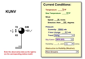
A good way to learn about how station models are coded is to use this tool. Using the Station Model Tool [212], explore different scenarios (of temperature, dew point, wind, and weather) and test yourself to see if you know what the station model will look like. Another good exercise is to look at an existing station model from a weather map. Here's the current map of NE station models [213]. Decode the observation and enter it into station model tool. If you decoded the observation correctly, the tool's station model should look like the one on the map. If you want to choose a different region go to The National Center for Atmospheric Research (NCAR) Real-Time Weather Data: Surface [214] and click on any region of the map.
Time Conversion Quiz Tool
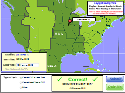
Converting time between GMT and local time is a difficult skill to learn for many folks to master. If you need more practice, use this handy Time Conversion quiz tool [215]. Select whether you want to practice converting local time to GMT or GMT to local time (or "Either"). Then hit the "Quiz me" button. Fill in the missing time and hit "Submit" to check your answer. Just a word of caution... follow the requested format or the tool gets confused.
Wind Direction on a Polar Stereographic Map
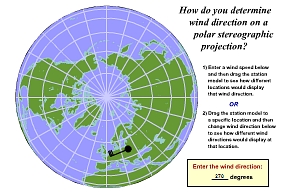
Many students find it difficult to get their sense of direction on a polar stereographic map. The Polar Stereographic Wind Direction Tool [216] will help you practice this skill and your skill at interpreting wind direction off of a station model. Open this tool and explore what the same wind direction looks like at several different locations on a polar stereographic map. Test yourself... Can you predict what the station model with a wind from 270° will look like over central Siberia? Another approach is to look at the surface map from the National Weather Service at Anchorage, AK [217] (it's polar stereographic). Find a station model and see if you can determine the wind direction. Check your answer by moving the station model to the proper location on the map and see if your station model matches the one on the map.
Contouring Tool
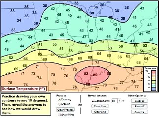
If you feel you need some "hands-on" practice check out this interactive contour tool [218]. With this tool, you can draw your own contour lines and then compare them to how the tool draws them. If it's tough at first, use the "Show hints" button to get you started. For more advanced practice, first go to The Surface Plotting Tool [219] and create a map of observations to contour (For example, choose "Temperature" over the "Northeast Region"). Print off the resulting map and contour it. To check your work, go to The Surface Contour Maker [220] and make a contour plot of the same variable and region. Note: these are computer generated contours and may differ slightly from your hand-drawn ones.
3-D Hawaii
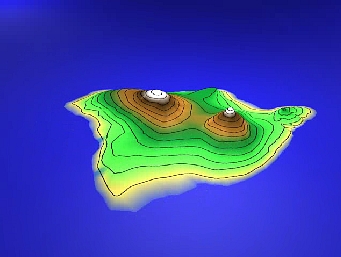
Do you have trouble visualizing contour spacing with the steepness of the gradient? If so, check out this 3-D model of the island of Hawaii [221](complete with contours of elevation). You can grab the model and look at it from many different angles. Notice that when elevation changes rapidly, the contours are spaced close together (and vice-verse).
Mini-Lectures...
If you're looking for a little extra discussion and some examples involving some key topics from the lesson, check out the short videos below. Note: These videos are designed to be viewed after you've thoroughly read the lesson's reading assignment.
Video transcript: The Station Model - Wind [222]
Video transcript: Interpreting Contour Plots [223]
Video transcript: Interpreting Gradients on Contour Plots [224]
Lab Exercise #1
Overview
Welcome to your first laboratory exercise. This particular laboratory exercise is designed to give you some practice with concepts from Lesson 1 while exposing you to learning tools available in METEO 3.
Before you get started, there are a few over-arching things to consider when approaching laboratory exercises.
- Follow directions. We find that most of the time, students lose points on these exercises simply because they don't follow directions. Make sure that you include all of the proper data sources that each lab requires and that you perform all the steps of the analysis that are required of you. You may find it helpful to print off these instructions.
- Don't procrastinate. Each week's exercise should not take you very long to complete, but I recommend that you get started early and not wait until the last minute. Doing so will prevent you from being adversely affected by any technical snafus. Websites you'll need to complete this assignment, like all websites, can go down unexpectedly (that's bad news for you if it happens near the assignment deadline). Another reason not to procrastinate is that the weather doesn't necessarily cooperate on a single day's notice. Suppose a given week's lab exercise requires you to work with a specific type of "weather" (low visibility, for example). If you wait until the last minute to do your assignment, the weather conditions that you are asked to document and analyze may not be present (in which case you will be out-of-luck).
With these simple suggestions in mind, let's get started.
Activity
Collect the Data
- Check out this station model [225] showing the weather conditions from an unknown time and date at KUNV -- University Park, PA. You'll need this station model to answer some of the questions below.
- Go to "Classroom" Discussion: Lesson 1 in Canvas and read my Lesson 1 comments. Not only do my comments have some important tips for Lesson 1, but it's also the basis for one of your lab questions. Also, click on the link for "Additional Resources" in my post as you'll need some of the tools and "Mini-Lectures" on that page to complete the lab.
Analyze the Data
- (1 point) Based on the station model given for KUNV, state the temperature of the station in both Fahrenheit and Celsius. Note: For questions 1, 2, and 4, you may want to use the interactive "Station Model Tool" on the "Additional Resources" page. The tool allows you to enter your own data to see what the corresponding station model will look like, giving you an opportunity to check your work.
- (1 point) State the sky cover and any obstructions to visibility (if any).
- (1 point) See the following statement:
Interpreting a Station Model: You should be able to interpret station models at the end of this lesson, which for the most part means familiarizing yourself with where temperature, dew point, sky cover, and obstructions to visibility are located on the model (and familiarizing yourself with the basic weather symbols and sky coverage indications). That's all covered on p.26 in the textbook. But, you should also be able to determine wind direction and speed from the station model. The first key to that is remembering that wind direction is always expressed as the direction FROM which the wind is blowing, based on the compass angles shown in figure 1.26 on p. 27.
What does the statement in bold tell you about the convention for expressing wind direction? - (1 point) With your answer to #3 in mind, state the direction and speed of the wind on the KUNV station model. For wind direction, specify the numerical direction (for example, 135 degrees) and describe it using words (for example, "southeast"). For wind speed, proper units are a must.
- (1 point) In my "Mini-Lecture" titled "Interpreting Contour Plots" (the second "Mini Lecture" on the "Additional Resources" page), what is the UTC time and date of the map of surface temperatures I use in the video? Convert the UTC time to local time in St. Louis, Missouri on that date (Central Standard Time). Note: the graphic in the video is a little small, so you may want to view a full-screen version of the video.
Submit Your Lab
Please follow the instructions for lab submission in Canvas.
Summary and Final Tasks
So how's your atmospheric toolbox? Hopefully it is full of some useful items. Don't forget how to use them! We are going to need them in the Lessons to come and it's going to be up to you to use them correctly without being prompted. If I had to pick three of the most important tools, I would say they are: time-conversion, figuring out wind direction, and reading contour maps. I think that you will use these tools often and many students have trouble with them (especially time conversion). If you have a good handle on these tools, you will be rewarded with an easier time of learning the more challenging topics that lie ahead if you take METEO 3.
Reminder - Complete all of the lesson tasks!
You have finished Lesson 1. Double-check the list of requirements on the Lesson 1 Overview page (2 graded assignments) to make sure you have completed all of the activities listed.
Materials Science: Introduction to Materials
Overview: Materials Classification
In today’s society, virtually every segment of our everyday life is influenced by the limitations, availability, and economic considerations of the materials used. In this lesson you will be introduced to the interconnectivity of processing, structure, properties, and performance to the design, production, and utilization of materials; the role of materials scientists and engineers; and the three important criteria in materials selection. You will also be introduced to the classical classification of materials: metals, ceramics, and polymers, as well as, composites and the advanced materials classification used in modern high-tech applications.
Learning Outcomes
By the end of this lesson, you should be able to:
- Describe, with specific examples, the role of materials in human development during the Stone Age.
- List the six different property classifications of materials that determine their applicability.
- Cite the four components that are involved in the design, production, and utilization of materials, and briefly describe the interrelationships between these components.
- Describe the way in which scientists and engineers differ in their utilization of materials.
- Cite three criteria that are important in the materials selection process.
- List the three primary classifications of solid materials, and then cite the distinctive features of each.
- Briefly define smart material/system.
- Note the four types of advanced materials and, for each, its distinctive feature(s).
- Judge which material is most likely to be a promising candidate for utilization when given the primary or advanced material classifications of a list of candidate materials and one design selection criteria.
Lesson Roadmap
Lesson 1 will take us 1 week to complete. Please refer to Canvas for specific due dates.
| To Read |
Pages 10 to 21 (Chapter 1) of Materials for Today's World, Custom Edition for Penn State University Reading on course website for Lesson 1 |
|---|---|
| To Watch | Secrets of the Terracotta Warriors |
| To Do | Lesson 1 Quiz |
Questions?
If you have general questions about the course content or structure, please post them to the General Questions and Discussion forum in Canvas. If your question is of a more personal nature, feel free to send a message to all faculty and TAs through Canvas email. We will check daily to respond.
Why Study Materials?
When materials scientist and narrator of The Secret Life of Materials videos (used in this course), Mark Miodownik, opens up the video on metal, he is at Piccadilly Circus in London, England. He marvels at how strange but wonderful it is that everything around him is man-made. This is not unique to London. A visit to the center of New York, Tokyo, Hong Kong, Beijing, Dubai, Paris, or any other 21st-century modern city would yield a similar situation. It might seem like a cliché but we are surrounded by materials. And with the range of materials available - whether it be in our professional or personal lives - we are constantly being asked to make choices about materials.
Something as routine and every day as purchasing carbonated beverages is an example where materials choice could come into play. As we will see in the textbook, carbonated beverages can be purchased in glass, metal, or plastic containers. What factors drive manufacturers of carbonated beverages to offer their products in a range of different materials? What are the advantages and disadvantages when comparing the different materials choices for carbonated beverage containers? When selecting a material for a product there are many factors that must be taken into account, including properties, performance and lifetime of the material; availability of raw materials; costs and energy usage in all steps of the processing; sustainability; waste disposal, etc.
Why is it important for you to understand materials? Products, devices, and components that you purchase and use are all made of materials. To select appropriate materials, and processing techniques for specific applications, you must have knowledge of the material properties and understand how the structure affects the material properties.
Throughout history, material advancement has gone hand-in-hand with societal advancements. The Stone Age, Bronze Age, and Iron Age were all significant materials and societal periods in humankind's development. One question I would pose to you: what is today's materials age? Is it the polymer age? Or perhaps we have already advanced past that one. Are we in the age of silicon, i.e. the electronic materials age? Or, are we possibly moving into a nanomaterials age? A biomaterials age? Some might suggest that we moved into the information age or the digital age. In any of these cases, it is clear that the materials and the capability of the materials underlying these technologies are integral to the current and future capabilities in these areas.
Now let us explore how deep-seated materials are in our culture by looking back at materials in antiquity.
Materials in Antiquity
Three of the greatest ‘cultural’ revolutions occurred in antiquity, and they are named for the material use associated with these revolutions. They were predominantly bloodless, occurred over a millennium, and were revolutionary, not evolutionary. These three revolutions occurred during the Neolithic Age (part of the Stone Age), the Urban Age (Bronze Age), and the Iron Age.
Before we look at the Neolithic Age revolution, let’s take a look at the pre-Neolithic Age. If we look at the human timeline below we can see that the usage of stone tools began about 3.4 million years ago. This marks the beginning of the Stone Age, which lasted until the advent of metal working and ended at different regions from ~9000 BCE to 2000 BCE. The genus Homo emerged during the Stone Age and has existed 99% in the Stone Age. The earliest usage of cooking, clothes, and fire occurred during this pre-Neolithic Age. In addition to cooking, fire was particularly important from a materials point of view. Fire was used for the tempering of wood arrowheads, annealing flint, and creating charcoal before the Neolithic Age, and has been an important component of materials processes throughout all ages of human existence.
The first of these revolutions was the Neolithic Revolution, which was highlighted by the transformation from a hunter/gatherer population to a farmer/skilled artisan population. It has been argued that three steps were required for the Neolithic Revolution: 1) hunter/gatherer population increase, 2) food production in marginal areas, and 3) several communities at similar stages of development. Near the end of the Stone Age, there were six civilizations that had emerged that satisfied these requirements.
Now we will take a closer look at the materials used during the Stone Age.
Flint (and Obsidian)
Flint and obsidian were very important Stone Age materials. Commonly found with chalk and limestone, flint is a form of the mineral quartz. Obsidian is a naturally occurring volcanic glass. Both were widely used in weapons and tools. As we will learn in this lesson, flint and obsidian are classic examples of ceramics. Both are hard and can be worked to produce a sharp edge, but both materials are prone to breakage. Slowly heating flint to 150 to 260 °C (300 to 500 °F), holding the temperature there for 24 hours (annealing), and then slowly cooling it back to room temperature, can relieve internal stresses which can improve the ability to produce flint tools or weapons with a sharper cutting edge. As discussed later, since flint is typically found with chalk and limestone, it is possible that the annealing of flint led to the discovery of lime mortar.
Charcoal
Charcoal is perhaps the greatest invention of the Paleolithic (Stone) Age. Charcoal is produced by partially burning organic matter (wood, bone, etc.) while limiting the supply of oxygen. One way of producing charcoal is to pile a large amount of wood, as shown in the figure, and covering it with soil so as to limit the amount of oxygen feeding the fire. During the burning process, considerable water is released, and at the completion of the burn, the wood is reduced to black brittle lumps of carbon (charcoal).
Charcoal played an important role throughout the Stone Age, the Bronze Age, and the Iron Age. Why? Very few elements (noble metals and copper in very limited quanities) occur naturally in their pure form. Elements usually occur bound with other elements forming compounds, and typically occur in a mixture with other compounds. Heat is usually applied to break the compounds or melt the element to produce the raw material needed for manufacturing, such as copper and iron.
The temperatures required depend on the compounds and elements involved and can vary considerably. The temperatures obtainable by fire depend on the fuel used and the supply of air. If wood is used as the fuel in an open fire, temperatures in the fire might range from 350 to 500° C. Charcoal, being a denser and drier fuel source, can provide temperatures up to 800 °C under similar conditions. If the fire is confined, such as in a kiln or a furnace, and air is forced into the fire, it is possible to obtain even higher temperatures. For charcoal, it is possible to reach temperatures above 1000 °C.
Later, in our lesson on metals, we will see that this temperature is insufficient to melt pure iron, which is why the processing of impure iron (iron plus carbon) was developed first. Impure iron has a much lower melting temperature than pure iron. We will see that an advanced design furnace coupled with a hotter burning fuel source (coke, a form of coal) was needed to obtain molten pure iron.
Lime Mortar
When annealing flint, you can expect chalk or limestone to be present. Chalk and limestone are composed primarily of calcium carbonate (CaCO3), which is the same mineral present in hard water. It often shows up as a white residue on plumbing fixtures. If chalk or limestone is heated above 800° C (obtainable with charcoal), the gas carbon dioxide is released from the calcium carbonate leaving lime (CaO). Lime produced in this matter is referred to as quicklime or burnt lime. If water is added, this quicklime or burnt lime hydrates to form a white pasty substance known as slaked lime.
It is quite possible that an observant fire tender or cook could have noticed that, after encountering rain, this material would dry and form a hard substance. We refer to the substance as lime mortar, a type of cement. It is common to confuse the term cement with concrete. Cement is a binder or material that glues things together. Concrete, on the other hand, is a combination of cement and aggregate (sand, stone, etc.). Concrete is one example of a composite material. As we will see in this lesson a composite material is a material that is composed of two or more distinct materials in combination. Cement is the material within concrete that binds the stone and sand together.
In addition to the development of lime mortar in the Fertile Crescent, the Incas, and the Mayans independently discovered lime mortar around 5000 BCE, and it was widely used in ancient Rome and Greece around 4000 BCE.
"Plaster of Paris"
Originally, the term ‘plaster of Paris’ was coined in the 1700s to describe plaster produced from gypsum located outside of Paris. Over time, the term ‘plaster of Paris’ has become the generic term for gypsum-based plaster. Many ancient Egyptian tomb paintings are created on plaster. It is produced in a way that is similar to lime mortar, except gypsum is used in place of lime and much lower temperatures are needed. The resulting plaster is not as hard as lime mortar. Plaster vessels dating from 6000 BCE have been found from ancient Egypt.
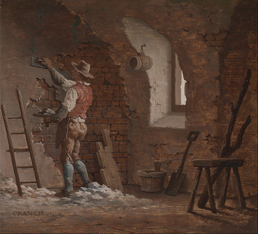
Primary Civilizations
As mentioned before, near the end of the Stone Age there were six civilizations that emerged that satisfied the requirements considered necessary for the Neolithic Revolution. If you look at the map below, you can see that there were two New World civilizations and four Old World civilizations.
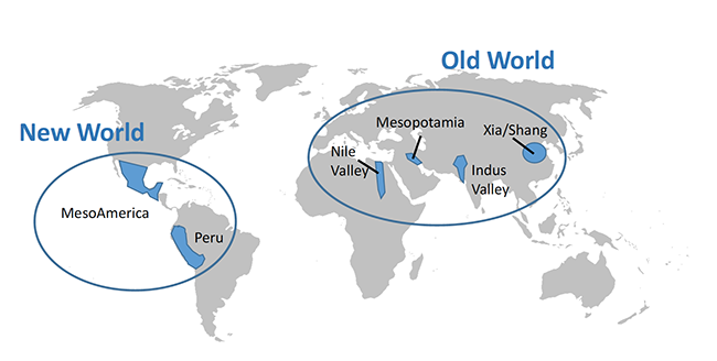
The four Old World civilizations had two very important advantages over the two New World civilizations, namely, they were situated along great river systems and, being more numerous, had a more robust trade system in place. The great river systems were very important components in trade, but possibly of equal or greater importance was the benefit of annual flooding. Annual flooding reinvigorates farmland and, before the advent of modern farming techniques, allowed for the successful growth of crops year after year over multiple decades without the need for artificial fertilizers or crop rotation management schemes.
Two of the Old World civilizations, the Nile Valley and Mesopotamia, formed what has been called the Fertile Crescent, which is widely regarded as the birthplace of civilization. As can be seen in the figure below, both locations possessed great river systems and, due to their close proximity, had well-established trade routes. At the close of the pre-Neolithic age, these two civilizations were experiencing increasing populations, had extensive food production capabilities, and had several communities at similar stages of development.
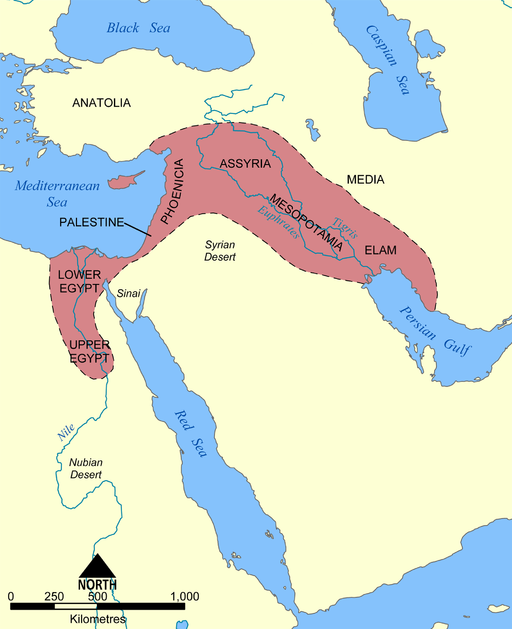
Mudbrick
The mudbrick was developed during the pre-pottery (Aceramic) Neolithic Age. Mudbricks were composed of a mixture that might have included clay, mud, loam, sand, and water mixed with a material to inhibit crumbling such as straw or rice husks. This was another example of a composite material. The ceramic material (clay, mud, loam, sand) by itself could support compressive loads but could be easily pulled apart. The second component of the composite, straw or rice husks, reinforced the first material, making it more difficult to pull the mudbrick apart. Water was used to allow the brick to be easily formed during manufacturing.
Since the early civilizations were located in warm regions with very limited timber, early bricks were sun-dried. The bricks needed to be dried before installation. Otherwise, shrinkage and cracking would occur that would destabilize the building.
Before the usage of bricks, structures were limited to wood and piling of stone. Creation of the brick unleashed creative design of buildings, and the architect was born! Clay or mud (raw material) was readily available everywhere, as was the strengthening material, straw or rice husks.
Later gravel and bitumen were used for stronger bricks. Bitumen is a naturally occurring (thermoplastic) polymer that, when heated, becomes a liquid and, when cooled, becomes solid. It is a black, tar-like substance with a consistency similar to cold molasses. Adding bitumen to bricks makes them both waterproof and much stronger. Bitumen is a mixture of hydrocarbons, which contains anywhere from 50 to thousands of carbon atoms. It is found in nature in rock asphalt, lake asphalt, and near other fossil fuels. In addition to being a structural improvement, bitumen, and crude oil sometimes found near bitumen deposits, provided fuel for brick kilns.
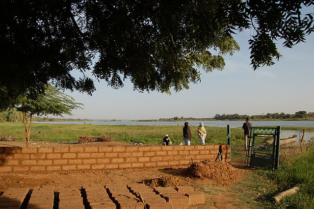
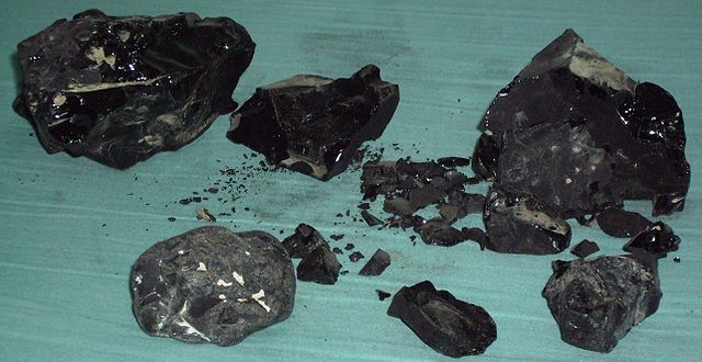
Pottery
The development of pottery in Mesopotamia was important for the storage of food protected from moisture and insects. Pottery takes clay and water which, in the proper proportions, form a mass that can be readily shaped. Once in the desired shape, the piece is dried to remove the water and then fired to improve mechanical stability. Clay was readily available and thus an inexpensive material to create from.
Initially, unfired clay was used to line woven baskets. Although these unfired clay baskets were not particularly robust they did provide much-needed waterproofing. Possibly one of these early clay-lined woven baskets was discarded at the end of its usefulness. One could suppose that at some point the discarded basket was put into a fire to dispose of it. Later, in the cooled coals, someone could have discovered pottery shards and had the eureka moment where they realized that the firing of clay structures would produce pottery.
The development of pottery occurred in Mesopotamia around 7000 BCE. The invention of the pottery wheel occurred in Mesopotamia sometime between 6000 and 4000 BCE. The earliest ceramic objects (figurines) known have been found in what is now the Czech Republic and have been dated as being created between 29,000 and 25,000 BCE. The earliest pottery has been found in China and dates from around 18,000 BCE. In 10,000 BCE, Japan was using roping or coiling to produce pots. In the videos of this lesson, Secrets of the Terracotta Warriors, you will see that coiling was the method used to produce these warriors.
The Near East, at the end of the Neolithic Age (c.a. 4500 BCE), had mastered fire to produce and/or modify a number of materials. They had flint tools and weapons, buildings of mudbrick with plaster finish, pottery, well-established trade routes from Mesopotamia to the Indus Valley, and a robust agrarian economy. Discussions about the Bronze Age and the Iron Age await us when we get to the lessons on metals and metal alloys. But now, let's take a look at what is materials science and engineering.
Materials Science and Engineering
In my experience in this course, students have difficulty understanding the difference between materials scientists and materials engineers. In the reading for this lesson, materials science is defined as investigating relationships between structures and properties of materials, and concern with the design/development of new materials. Materials engineering is defined as the creation of products from existing materials in the development of new materials processing techniques. I would restate the roles of material scientists and materials engineers as:
- Materials scientists study materials and create new materials.
- Materials engineers use materials and create new processes.
Now, these statements of the roles for material scientists and engineers are, of course, oversimplifications. As I think you will see in the following video (5:34) produced by the Penn State Department of Materials Science and Engineering we believe that cutting-edge materials research and development require a thorough understanding of both materials science and engineering.
To Watch
GARY L. MESSING: Materials Science and Engineering at Penn State is one of the larger departments of Materials Science in the country. By virtue of that we are able to offer a full spectrum of research and teaching in the field of materials. We're strong in all aspects of materials - ceramics, metals, polymers, composites, semi-conductors. That brings a certain uniqueness to the education of a Penn State graduate.
R. ALLEN KIMEL: We've tried to basically give the students a very strong core into the fundamentals of Materials Science and Engineering which are structure, property, relationships, but because of the breadth and depth of the expertise in this department they can choose to take courses that go towards interest which brought them here in the first place. They could choose to focus in biomaterials or they could choose to focus in energy - it really allows a student to make their own Materials Science and Engineering degree.
ANGELA LEONE: Being at Penn State you get the large university feel where you are one in thousands of students at the same time you get the experience of the small college where everyone in the Materials department knows you by name. I'm currently studying the corrosion of nuclear waste glass fibers with Dr. Pantano. I found out that he's studying glass and I'm really interested in glass. So I just set up a meeting with him and about a week later he was showing me his labs. I think the most special thing I've done is to get involved in glass blowing. I really enjoying doing it it's very unique and I don't think I'd have that experience anywhere else. A lot of the professors look for undergrads to do research for them, to give them a feel and it helps you choose if you want to go on to grad school or go into industry.
JAME ADAIR: At any given time I'll have four to six undergraduates working in my laboratory right now i have about six. I bring both my research into my lectures for the undergraduates and my lectures into my research. The curriculum focuses on cutting edge technology We also run a very strong research experience for undergraduate programs - it's a summer science program where we bring in undergraduates from all over the United States, including Penn State, into our laboratories. We're at the cutting edge in terms of early detection of cancer and much more benign delivery chemotherapeutics, as well as a host of new surgical instruments based on our ceramic powder processing.
R. ALLEN KIMEL: We even take it beyond the department and this country have our own international internship program. We have relationships with fourteen different universities in Europe and Asia and we send our students there to join research groups for a semester and actually perform research - so it's not a study abroad, take classes, but it's actually going there with a research question in mind and then joining a research group and actually performing that research. So it's getting involved in the research enterprise - and it's global.
STEPHEN WEITZNER: I've traveled to Germany with the department's International Internship in Materials Science Program. That was great, I was in Germany for seven months doing research at the Technical University of Darmstadt, where I was also doing some work with computational modeling and provided a nice background for coming back to campus and starting my senior thesis.
GARY L. MESSING: Materials at Penn State is actually a very big enterprise not only do we have the Department of Materials Science and Engineering, but we also have the Materials Research Institute The Institute represents all of the faculty on campus that are working in the field of materials. The Institute brings the strength of community as well as the research facilities.
MICHAEL HICKNER: At Penn State, we have great opportunities for high-level research in Materials Science. Penn State has a long history in solving real-world problems in industry, we have over a hundred million dollars of research that the entire university does with companies per year and we work with both large companies like General Electric and Dow Chemical Company as well as small startup companies either in State College or in Silicon Valley, and so I think that the research and the ideas here are flexible. We have a lot of unique capability.
JOAN REDWING: The research that we are doing at Penn State in the area of low dimensional materials is impacting the field of material science by providing new routes for the synthesis of low dimensional materials and also providing new insights into how these materials behave and ultimately how we can integrate them into devices. It feeds into other activities here at Penn State that are focused on on the fabrication of devices so their faculty members in Electrical Engineering who are using the low dimensional materials to fabricate transistors or other types of electronic devices.
MICHAEL HICKNER: The of material science that we do at Penn State is really creating new opportunities and pushing new frontiers in material science. Our research that we do in our labs everyday makes a big difference to new types of batteries or new types of medical devices or new types of structural steels that had better corrosion resistance, or are harder, or more ductile. And so I think that we both make a difference in real-world problems, but also, we open up new ways to think about science and new ways to think about materials.
When utilizing a material, one needs to understand that the structure, properties, processing, and performance of the material are interrelated. This is represented by the materials science tetrahedron shown in the figure above. If one alters the processing, there is a direct connection with the structure, properties, and performance of the material. Adjusting any one of the factors will have varying degrees of impact on the other three factors. Characterization is the heart of the tetrahedron, signifying its role in monitoring the four components.
In this course, we will be looking at the four components (structure, properties, processing, and performance) of materials, beginning with properties. Properties of materials can be classified into six categories: mechanical, electrical, thermal, magnetic, optical, and deteriorative. We will start by looking at mechanical properties in lesson four and electrical properties in lesson 12. Unfortunately, we will not have time in this course to look at the other four properties. In lessons 3, 5, 7, and 8 we will look at structure, both atomic and micro-structure. Lesson 10 will be concerned with the processing of materials, and performance of material will be addressed throughout the course.
Classification of Materials
Matter is composed of solid, liquid, gas, and plasma. In this course, we are going to be looking at solids which we will break down into three classical sub-classifications: metals, ceramics, and polymers.
In the reading for this lesson, representative characteristics of the three sub-classifications will be presented. In lesson three the chemical makeup and atomic structure will be further explored. The microstructure of the three classifications will be explored in their individual lessons.
Composites is a special additional classical sub-classification. Composites are composed of two (or more) distinct materials (metals, ceramics, and polymers) to achieve a combination of properties. Composites are introduced in this lesson in the reading and we will have a later lesson devoted to them as well. (Note: composites should not be confused with alloys. We will learn later that alloys are a mixing of a metal with other elements. In an alloy the elements are blended together, they are not no longer distinct components.)
Advanced materials are materials that are utilized in high-tech applications. These materials are typically enhanced or designed to be high-performance materials - many times with very specific tasks in mind.
Semiconductors are materials that can be made to switch from an insulator (off) to a conductor (on) by the application of voltage. The flow of electrons in semiconductors is somewhere between insulators, i.e. those that do not readily conduct electricity, and conductors, those materials which freely allow the flow of electrons. These materials have enabled our digital electronic age. The development of semiconductors for integrated circuits has allowed for the electronics and computer revolution that we have experienced in the last 50 years.
Nanomaterial, whose sizes typically range from 1 to 100 nanometers, are materials in which size and/or geometry can play a significant role in the dominant materials properties. In this size range, quantum mechanical effects can dominate, as well as, chemistry due to a large number of the atoms being surface atoms instead of atoms in the bulk. In addition to size effects, these materials sometimes exhibit unique functionality due to their geometry. For example, gold nanoparticles can be very chemically active, unlike bulk gold. This effect is due to the large number of unsatified bonds on the surface of the gold nanoparticle.
Biomaterials are materials implanted into the body. In addition to performing their design function, they also have to have the ability to survive in the body (be biocompatible). The body can be a 'hostile' environment for materials. The body might attack the biomaterial as a foreign body (immune response) and the environment (wet and chemically active) in the body is typically one that leads to corrosion.
Smart materials are materials that are designed to mimic biological behavior. They are materials that, like biological systems, ‘respond to stimuli’. When determining whether a material system is utilizing a smart material it is usually useful to identify the stimuli and the response that the material will exhibit, as well as, what biological system it is mimicing.
The readings and videos in the last two lessons of this course will explore advanced materials in more detail. Now that I have set the stage it is time for you to begin the additional reading for this lesson.
Reading Assignment
Things to consider...
When you read this chapter, use the following questions to guide your reading and always remember to keep the learning objectives listed on the overview page in mind.
- What are the materials properties that determine materials applicability?
- What is the differences between material science scientists and engineers?
- What are the differences between metals, ceramics, and polymers?
- Does ‘best of both worlds’ apply to composites?
- Which of the materials classifications (metal, ceramics, polymers, composites, semiconductors, smart materials, biomaterials, and nanomaterials) are distinct class of materials versus a group of materials with defining function composed of materials from distinct classes of materials?
Reading Assignment
Pages 7 to 21 (Chapter 1) of Materials for Today's World, Custom Edition for Penn State University.
Video Assignment: Secrets of the Terracotta Warriors
Now that you have read the text and thought about the questions I posed, take some time to watch this 54-minute video about determining how 8,000 terracotta warriors were manufactured in later third century BCE in China. As you watch this video please note some of the problems that needed to be overcome and the assembly line approach that was necessary to complete everything in a two-year period.
Video Assignment
Go to Lesson 1 in Canvas and watch the Secrets of the Terracotta Warriors Video. You will be quizzed on the content of this video.
Summary and Final Tasks
Summary
Anthropologists, archeologist, and historians use the level of materials development (Stone Age, Bronze, Iron Age) to designate the stages of societal development. In today’s society, materials and materials development continue to shape our society’s development and advancement. In this lesson you were introduced to the important overarching themes of this course: materials scientists investigate the relationships that exist between the structures and properties of materials; materials engineers design the structure of a material to produce a predetermined set of properties; structure and properties are interlinked; processing, structure, properties, and performance are interconnected; environment, wear, and economics are three important criteria in materials selection; classical classification of materials (metals, ceramics, and polymers, as well as, composites); and the advanced materials classification used in modern high-tech applications. We will utilize the important concepts introduced in this lesson throughout the rest of the course.
Reminder - Complete all of the Lesson 1 tasks!
You have reached the end of Lesson 1! Double-check the to-do list on the Lesson 1 Overview page to make sure you have completed all of the activities listed there before you begin Lesson 2.
Geosciences: Lakagígar Eruption
Introduction
Location: Eastern Volcanic Zone, Iceland
Eruption Dates: 1783-84
Volcano Type: Fissure Eruption
Volcano Explosivity Index (VEI): 6
Background and Learning Objectives
In this module, you will learn about the devastating basaltic fissure eruption of Lakagígar (Laki Fissures), also known as the Skaftar Fires eruption, which took place between June 1783 and February 1784. The sequence of events and resulting destruction was recorded in great detail by Jón Steingrímsson, a priest in a nearby village who observed the eruption as it occurred. Much of what we know of the eruption and its aftermath comes from the writings of Steingrímsson and his contemporaries, combined with modern observations of the tephra deposits. Although Lakagígar was by no means a small eruption – it produced ~15 km3 of basaltic lava and tephra – what made the eruption particularly deadly was the large mass of volcanic gases and aerosols released into the atmosphere. Some of these aerosols remained in the upper atmosphere, reflecting the sun’s radiation and causing global mean temperatures to drop, while some fell out as acid rain, destroying crops and livestock. Most of the estimated 9,000 deaths in Iceland and as many as 20,000 worldwide that have been attributed to the eruption resulted from famine and disease, which were widespread across western Europe in 1784.
This said week, and the two prior to it, more poison fell from the sky than words can describe: ash, volcanic hairs, rain full of sulfur and salt peter, all of it mixed with sand. The snouts, nostrils, and feet of livestock grazing or walking on the grass turned bright yellow and raw. All water went tepid and light blue in color and gravel slides turned gray. All the earth's plants burned, withered and turned gray, one after the another, as the fire increased and neared the settlements.
- Rev. Jón Steingrímsson, Fires of the Earth, The Laki Eruption (1783-1784)
Upon completing this module, you will be able to:
- Describe the difference between tephra and lava
- Distinguish between Strombolian, Hawaiian, and phreatomagmatic eruption styles
- Explain how mantle convection drives plate tectonics
- Explain how decompression beneath a mid-ocean ridge causes mantle melting
- Identify two ways in which volcanic gases can result in human casualties after an eruption has ended
- Calculate the total mass of volatiles released during an eruption
- Collect data and calculate standard deviation from the mean
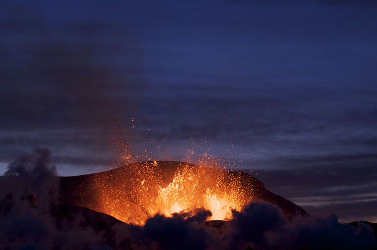
What is due for Module 2?
This module will take us one week to complete. Please refer to the Course Syllabus for specific time frames and due dates. Specific directions for the assignment below can be found within this module.
| REQUIREMENTS | ASSIGNMENT DETAILS |
|---|---|
| TO DO | Review all the Module 2 Material. |
| TO WATCH | BBC Volcano Live: Iceland Erupts [239] |
| DISCUSSION | Add your post and comments to the Module 2 Discussion in Canvas |
| QUIZ | Be sure to submit the Module 2 Quiz in Canvas |
| LAB ASSIGNMENT | Mentos and Diet Coke / Volcano Degassing |
Questions?
If you have any questions, please post them to our Questions? discussion forum (not e-mail) in Canvas. I will check that discussion forum daily to respond. While you are there, feel free to post your own responses if you, too, are able to help out a classmate.
Icelandic Volcanism
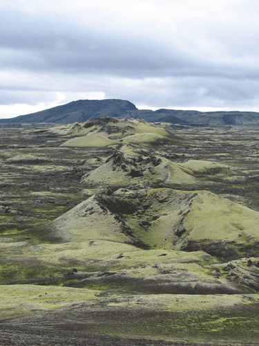
Before proceeding to the description of events at Lakagígar, please watch this video about Icelandic volcanism featuring the great David Attenborough. The footage will give you a sense of what a fire fountain emerging from a fissure looks like up close.
Video: David Attenborough on volcanoes, Filmed at Eldfell Heimaey (7:56)
[VOLCANO ERUPTING]
DAVID ATTENBOROUGH: I'm in Iceland. This fantastic funnel to the fire, rising 200 feet or so into the air behind me is Norter Rock. Fine ash is falling all around, there are gusts of choking poisonous gas, and it's so hot that this is just about as close as I could get.
The sheer weight of these molten [INAUDIBLE] of rock prevents them from being swept away by the gate of the veil. So there's little danger of them suddenly coming our way.
This is dramatic [INAUDIBLE], but perhaps most sinister is this tide of black slag that is slowly creeping over the surface of the land. In parts, it's red hot and molten and feels like [INAUDIBLE], but on the edges it's cold enough for me to be able to handle it. It's black, it's heavy and it's called basalt. And basalt like this has been welling up from deep in the Earth's crust ever since the beginning of the history of [INAUDIBLE].
A flow may travel for as much as 25 miles. Sometimes it moves no faster than a man can walk, but sometimes it races along at an extraordinary speed, 40 miles an hour, and nothing, nothing can stop it.
Sometimes so much lava is produced that it accumulates in flows 100 feet or so thick. Then the center layers of it cool exceptionally slowly and very evenly, and this is the result. Here at the John's Courseway in Ireland, the top of the lava flow has been eroded away for the eruptions took place 50 million years ago. The cooling contractions have produced the effect you can sometimes see in drying mud, though here the cracks extend to a much greater depth to produce six-sided columns about a foot and a half across.
Over the sea in the Hebrides, there's another lava flow that erupted at about the same time and formed the Fingal's Cave. The blanketing layer of lava that slowed down the cooling of the interior is still uneroded and beneath it the near perfect basalt columns rise almost 20 feet high.
Basalt that doesn't contain very much gas wells out from below almost quietly. But if the lava has been extruded under great pressure, it may be full of gas and then it behaves very different. Sometimes a flow sweeps down over a forest incinerating the trees in its path. Most dramatic of all, the lava sometimes wells up inside the deep crater and can't escape. Then it forms that most fieresome of nature's spectacles, a lava lake like this one in Outer Congo in Africa. This lava is at a temperature over 1000 degrees Centigrade, 2000 degrees Fahrenheit. The bubbles of gas that burst from its surface may be 50 feet across. Sometimes having got rid of much of its gas, like beer losing its fizz, it sinks back down the vast pipe from which it rose and returns to the lava chamber a mile or so below. But lava lakes fed by pipes are not common. Basalt will usually come to the surface of the Earth in a rather different way.
These Icelandic Volcanoes erupt from huge cracks or fissures which regularly open up in the line which runs right across the width of the island. When that line itself is only the Northern end of a huge line of weakness that runs for thousands of miles southwards from Iceland right around the side of the [INAUDIBLE].
Iceland lies between Norway and Greenland just South of the Artic Circle. The crack ridged over by lava, is for the most part under water which is why its existence wasn't known until the beginning of this century. From Iceland it runs midway between Europe and Africa to the East and the Americas to the West. In places it rises above the seas to form volcanic islands: the Azores, the Cape Verde, Ascension, Centilia, Tristan da Cunha. But below the surface the lava is continually erupting unseen by human eyes until only a few years ago.
The clouds of gas come from the lava itself, they're not steep. The pressure of the water of these depths prevents that from being produced. The heat is rapidly absorbed by the vastness of the ocean itself, so that the lava cools and congeals much more quickly than it would do in the air.
Events of May-July, 1783 (Southwest Fissures)
Note: the description of events given below is taken from contemporary written accounts, summarized and translated from the Icelandic by Thordarson and Self (Bulletin of Volcanology, v. 55, p. 233-263, 1993).
Weak seismic tremors were first reported in the areas around Laki Mountain and the Skafta River in mid-May, 1783. The seismic activity grew in intensity over the next several weeks, until people were so unsettled by it that they took to sleeping in tents outside of their homes. The first fissure opened at 9 AM on June 8, 1783, producing fire fountains that were visible from the nearby towns of Skaftártunga, Medalland, and Sída. By reconstructing the line of sight from Prestbakki over Mörtunga, a ranch mentioned by name in Steingrímsson’s account, it can be determined that these first fire fountains were located near Hnúta, at the southwest end of the Laki fissures. Strong earthquakes were felt again on June 9-11, and were followed by more fire fountaining a bit farther to the north (contemporary accounts say the second fires were to the north – most likely they were actually to the northeast, following the trend of the fissure). The eruptions of June 8 and June 10 produced tephra deposits up to 60 cm thick extending to the north and east, and lava flows extending southwest towards the Skaftá River Gorge. Another earthquake swarm on June 13 preceded the rupture of a third fire fountain on June 14. This event produced a significant amount of Pele’s hair, which we learned about in Module 1 [240]. Lava flows from the June 14 fissure followed a somewhat more southerly path before joining with the flows still emerging from the June 8 and June 10 fissures at the Skaftá River Gorge. An earthquake on June 23 was followed two days later by explosive fountaining that peaked on June 27-28, raining ash and tephra on nearby towns. Interaction with the shallow water table resulted in a phreatomagmatic eruption, producing a large tuff cone centered on the fourth fissure. Lava flows emerging from the mouth of the Skaftá River Gorge were more or less continuous from June 12-29, with a surge following the opening of each new fissure. The fifth and most sustained explosive event on the Laki fissures occurred between June 30 and July 25, 1783. The initiation of this stage is not well documented, but it is known that earthquakes occurred on June 30, and tephra fell on local villages July 9-10. It is believed that all of the first five fissures were fountaining during this time. A lava surge—the last to be reported—emerged from the Skaftá River Gorge July 13-14. Tephra fall and seismic activity continued intermittently through July 25. The fissure that opened during this episode bisected the western flank of the older Laki hyaloclastite mountain, from which Lakagígar takes its name.
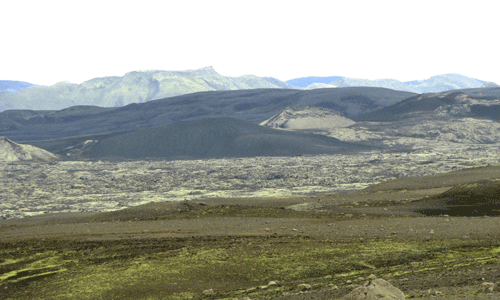
Events of August 1783 - February 1784 (Northeast Fissures)
Eruptive activity northeast of Laki mountain commenced on July 29, 1783, marked by explosive phreatomagmatic activity. The phreatomagmatic eruption lasted 2-3 days, producing a second tuff cone. Lava flowed both to the south and to the north, ultimately entering the Hverfisfljót River Gorge to form a second flow channel that would drain the lavas produced by the northeast fissures. The lava flow rate reached a maximum of 4 km/day between August 3-7, continuing at a lower rate until the next surge on September 1 (preceded by an earthquake swarm on August 23). Another earthquake swarm on September 26 was accompanied by intense volcanic activity, and both the Skaftá and Hverfisfljót rivers dried up during this time. Another fissure opened October 24-29, delivering a final surge of lava to the Hverfisfljót River Gorge. Effusive eruption continued at a diminished rate until February 7, 1874.
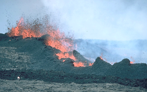
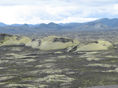
Video: Fissure eruption at Eyjafjallajokull, Iceland, in 2010 (0:47)
Styles of Basaltic Eruption
Basaltic liquids are characterized by low viscosities and relatively low volatile contents, such that basaltic eruptions tend to be more effusive than explosions. However, this doesn’t mean that basaltic lavas always flow quietly from the Earth. Explosive basaltic eruptions and fire fountains can send volcanic tephra tens to hundreds of meters into the air – sometimes more than a kilometer! The table below explains the eruptive styles observed at Lakagígar; it is by no means exhaustive.
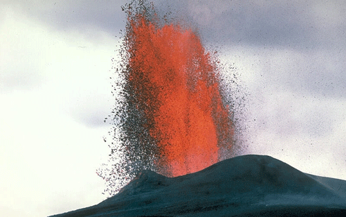
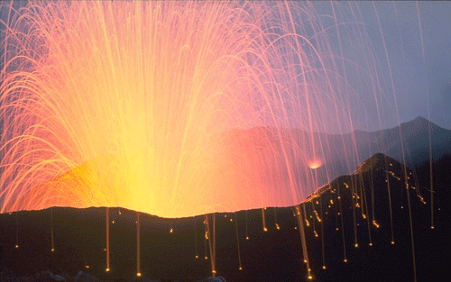
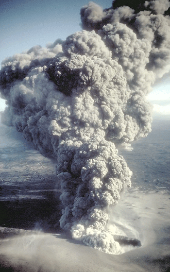
Styles of Basaltic Eruption at Lakagígar
Two types of tephra are found today at Lakagígar, providing physical evidence of the styles of volcanism during the 1783-84 eruption. The two tephra types are classified by Thordarson and Self (1993) as strombolian and phreatomagmatic. The strombolian tephra is most common and is characterized by a glassy skin covering the surface of each clast (lapillus), indicating that it was still partially molten as it was falling. These lapilli in fact could be the products of either strombolian or hawaiian style volcanism. The phreatomagmatic tephra has no glassy skin and is entirely vesiculated, indicating that it was completely fragmented upon eruption.
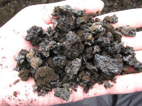
Video: Eruption Animation (0:19)
Check Your Understanding
Question - Multiple Choice
What style of volcanism is shown in the movie above?
Click for answer.
This is an example of a strombolian eruption, characterized by short bursts of lava fountaining.
Background: Mantle convection, decompression melting, and mid-ocean ridges
Iceland is unique in that it is the only place in the world where a mid-ocean ridge protrudes above sea level. Iceland straddles the Mid-Atlantic Ridge, with the North American Plate to the west and the Eurasian Plate to the east, and ~2 cm/yr relative motion in opposing directions. Much, although probably not all, of the magmatism at Iceland is a result of mantle decompression beneath this divergent plate boundary.
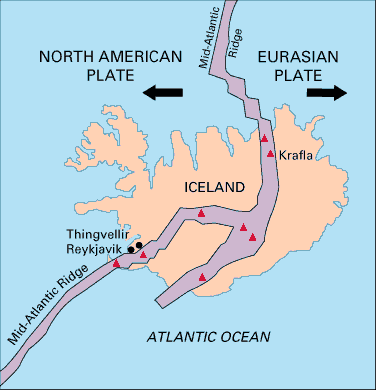
Mantle Convection and Plate Tectonics
In Module 1, we learned that tectonic plates move across Earth’s surface relative to a more or less fixed reference frame of mantle plumes. So what are these plates, and why do they move? The Earth’s lithosphere – which consists of the crust and the rigid upper portion of the mantle – is broken up into 15 major plates, plus several micro-plates. The tectonic plates move with respect to one another – some moving apart at divergent boundaries, some coming together at convergent boundaries, and some sliding past each other at transform boundaries. The lithospheric plates ride on top of the flowing, plastic mantle asthenosphere.
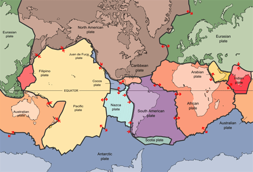
The geothermal gradient inside the Earth is such that temperature increases with depth. The higher temperatures at the core-mantle boundary (~2,900 km depth) relative to the lithosphere-asthenosphere boundary (~100-200 km depth) drive convection in the plastic, flowing asthenosphere. This works very similarly to water convecting in a pot that’s being heated on the stove – hot fluid is less dense and therefore it rises, while the dense cooler fluid sinks. Just remember that the “fluid” in the mantle is actually a flowing solid; it is more viscous and flows much more slowly than water in a pot – at a rate of millimeters per year. Most geoscientists agree that there is a close relationship between mantle convection and plate tectonics, although it remains unclear to what extent the convecting mantle “drags” the lithospheric plates along its surface, or if instead the sinking of lithospheric plates at subduction zones serves to initiate convection cells in the mantle. In the most general sense, we can imagine that tectonic plates move away from each other at places where the mantle is rising, and together at places where the mantle is sinking.
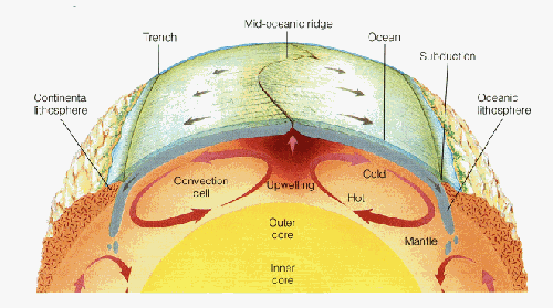
New oceanic crust is more or less continuously being formed at mid-ocean ridges, which are a type of divergent plate boundary. It was mentioned above that the North American and Eurasian plates are moving away from each other at ~2 cm/yr at Iceland. As it turns out, this is a pretty representative average spreading rate for the Mid-Atlantic Ridge, which means that if you were to fly from John F. Kennedy International Airport in New York to London’s Heathrow Airport today, the trip would be 1 meter longer than if you had taken the same flight 50 years ago!
Check Your Understanding
Question 1 - Short Answer
The central Pacific Ocean is spreading at a rate of ~5 cm/yr. How many years does it take for the distance between Mexico City and Hawaii to increase by 1 meter?
Click for answer.
20 Years
Question 2 - Short Answer
Now let’s scale it up to geologic timescales. At a spreading rate of 5 cm/yr, how much would the distance between Hawaii and Mexico City increase in 100 million years? Give your answer in kilometers.
Click for answer.
5,000 km
Question 3 - Multiple Choice
How does this distance compare to the distance between New York and Los Angeles?
Click for answer.
a little bit more - about 1.25 times as far.
Decompression Melting
In Module 1, we learned how the mantle sometimes melts as a result of a thermal anomaly (“hot spot”) that elevates the local geotherm above the mantle solidus. A close look at the diagonal orientation of the mantle solidus on a pressure-temperature diagram suggests that the mantle should also be able to melt under the influence of a pressure anomaly. That is, a rapid decrease in pressure can cause the mantle to melt, even without an increase in temperature. We call this kind of melting adiabatic – or, more commonly, decompression melting. Decompression melting commonly occurs at divergent plate boundaries, where two tectonic plates are moving away from each other. Mid-ocean ridges are the classic example, but adiabatic melting also occurs during continental lithospheric extension and in some mantle plumes.
Check Your Understanding
According to the diagram above, at approximately what depth does adiabatic melting begin?
Click for answer.
Melting begins where the adiabat intersects the solidus, at about 125 km depth.
Iceland is unique in that many researchers believe that a mantle plume is rising up through the Mid-Atlantic Ridge here. Thus melting at Iceland probably involves both high-temperature melting due to a thermal anomaly and decompression melting related to the divergent boundary. This may explain why eruption rates are so high (a significant eruption occurs once every 2-3 years), and why it is the only place on Earth where a mid-ocean ridge is exposed above sea level. The relative travel times of seismic waves beneath Iceland (seismic waves travel more slowly through hot or partially molten materials) have been used to map a narrow anomaly extending to at least 400 km depth, which many believe to be evidence of an Icelandic mantle plume. However, it is important to keep in mind that 400 km depth is still only the uppermost part of the asthenosphere, nowhere near the 2,900 km depth of the core-mantle boundary (which is generally believed to be the origin of hot mantle plumes). Some scientists believe that the plume does extend into the deep mantle, but cannot be imaged at depth because it is so narrow that it cannot be resolved using seismic imaging techniques.
Death, destruction, and degassing from the 1783-84 eruption of Lakagígar
The Skaftar Fires eruption was one of the five deadliest eruptions of the past 250 years. More than 9,000 people are estimated to have died within Iceland, nearly all due to starvation and disease in the months that followed the eruption itself. This accounts for ~20% of the population of Iceland at the time of the eruption, but the devastation was not limited to the island. Approximately 10,000-20,000 additional deaths across Europe in 1784 are attributed to respiratory ailments, a severe winter, and failed crops, which very likely were exacerbated by - if not entirely a result of - the Lakagígar eruption.
The Icelandic word móðuharðindin, meaning “mist hardships”, is used to describe the difficult times following the Lakagígar eruption. Acid rain destroyed crops and about three quarters of the island’s livestock. Animals that grazed on plants or drank from rivers contaminated with volcanic fluorine developed skeletal fluorosis, making it painful to eat or move. Sulfur is a minor component of the Earth’s mantle that tends to be concentrated in basaltic magmas. When basalt erupts as lava above the surface, the large pressure decrease allows the sulfur to be released in the form of sulfur dioxide (SO2) – the process is similar to the way carbon dioxide is released from a bottle of soda when you reduce the pressure by removing the lid. Scientists estimate that ~122 megatons of SO2 were released during the Lakagígar eruption. Upon combining with water in the atmosphere, this would have been converted to ~200 megatons of atmospheric aerosols, which were predominantly H2SO4. A little less than 20% of these aerosols are released from the lava flows and remain close to the surface as a local haze, while the remaining ~80% are carried up into the lower stratosphere by the eruption column (fire fountains and phreatomagmatic events) and transported over long distances by atmospheric circulation.
Of the total aerosols that were produced during the Lakagígar eruption, almost 90% would have fallen out as acid rain (mostly over Europe), with a little over 10% remaining in the upper atmosphere and circulating for several years. Aerosols in the upper atmosphere increase the Earth’s albedo (percent of the Sun’s energy that is reflected into space before reaching the surface), resulting in global cooling, usually on the order of ~1˚C, lasting for months or years. This effect is referred to as volcanic winter, and may last right through the summer growing season and into the next year. Coming on the heels of an unusually hot summer, the winter of 1784 was one of the coldest and longest winters on record in much of Europe and North America. Crop yield was extremely poor, and thousands of people died of starvation.
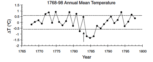
Benjamin Franklin: Politician, Inventor, Climatologist
In addition to being a father of the American Revolution, Ambassador to France, First Postmaster General of the United States, Governor of Pennsylvania, and inventor of the lightning rod, Franklin stove, and bifocal glasses, Benjamin Franklin was also an amateur meteorologist and oceanographer. Franklin observed that the severely cold winter of 1784 was preceded by an unusual haze, and he was the first to suggest that atmospheric contamination from volcanic eruptions might reduce the intensity of the sun’s energy reaching the Earth, resulting in winter weather so cold as to pose a hazard to society. The theory excerpted below was originally written as a letter and subsequently presented at a reading in 1784. In the letter, Franklin suggests that the “dry fog” observed in Europe and North America may have originated from Hecla (sic). Hekla, an Icelandic volcano, erupted in 1766 and not again until 1845. The eruption Franklin is referring to in his letter is almost certainly that of Lakagígar.
METEOROLOGICAL IMAGINATIONS and CONJECTURES
by BENJAMIN FRANKLIN.
During several of the summer months of the year 1783, when the effect of the sun's rays to heat the earth in these northern regions should have been greater, there existed a constant fog over all Europe, and great part of North America. This fog was of a permanent nature; it was dry, and the rays of the sun seemed to have little effect towards dissipating it, as they easily do a moist fog, arising from water. They were indeed rendered so faint in passing through it, that when collected in the focus of a burning glass they would scarce kindle brown paper. Of course, their summer effect in heating the earth was exceedingly diminished. Hence the surface was early frozen; Hence the first snows remained on it unmelted, and received continual additions. Hence the air was more chilled, and the winds more severely cold.
Hence perhaps the winter of 1783-4, was more severe, than any that had happened for many years.
The cause of this universal fog is not yet ascertained. Whether it was adventitious to this earth, and merely a smoke, proceeding from the consumption by fire of some of those great burning balls or globes which we happen to meet with in our rapid course round the fun, and which are sometimes seen to kindle and be destroyed in passing our atmosphere, and whose smoke might be attracted and retained by our earth; or whether it was the vast quantity of smoke, long continuing to issue during the summer from Hecla in Iceland, and that other volcano which arose out of the sea near that island, which smoke might be spread by various winds, over the northern part of the world, is yet uncertain . It seems however worth the enquiry, whether other hard winters, recorded in history, were preceded by similar permanent and widely extended summer fogs. Because, if found to be so, men might from such fogs conjecture the probability of succeeding hard winter, and of the damage to be expected by the breaking up of frozen rivers in the spring; and take such measures as are possible and practicable, to secure themselves and effects from the mischiefs that attended the last.
Published in Memoirs of the Literary and Philosophical Society of Manchester, 1789, (pp. 373-377). T. Cadwell in the Strand: London.
Lab Activity: Mentos and Magma
In Part 1 of this lab activity, you will conduct the famous "Mentos and Diet Coke eruption", under more-or-less controlled experimental conditions. In Part 2, you will make some degassing calculations of your own. First, you will calculate the amount of CO2 released from a 2-liter bottle of Diet Coke. Then you will apply the same principles to calculate the amount of SO2 released during the 1783-84 eruption of Lakagígar.

Part 1: Mentos and Diet Coke Eruption
Materials
- One pack of mint Mentos
- One two-liter bottle of Diet Coke
- Paper tube made by rolling a half-sheet of paper loosely around the Mentos roll and securing with tape – or you can just use the Mentos label
- Index card or other piece of thin cardboard
- Measuring tape
- Towels, water (to clean up)
Before You Begin
This is going to be messy. I strongly recommend that you perform this experiment outside. If you can’t go outside, you can do it in the bathtub or shower using only one or two Mentos. You can also use soda water in place of Diet Coke. The fountain won’t be as high, but it will be easier to clean up! Make sure you have plenty of water on hand to rinse down the area after your experiment.
Method
- Slowly open the 2 liter bottle of Diet Coke.
- Load the paper tube with four Mentos.
- Place the index card over one end of the tube and invert it.
- Set the card and the tube with the Mentos inside on top of the open mouth of the bottle, making sure the opening of the tube lines up with the mouth of the bottle.
- Quickly remove the index card, allowing the Mentos to drop into the bottle
- Step back quickly!
- Record the height of the geyser
- Optional: repeat using a new bottle of Diet Coke and more Mentos – how high can you go?
- Enter your data on the spreadsheet provided. Once we have data for the entire class, we will do some statistical analysis on our results.
Pointers
- Determining the height can be a little tricky in the moment. It helps to have two people – one to load the bottle, and one to observe. Or set up a video camera and record your experiment so you can estimate the height after the fact.
- If you can, the best way to determine fountain height is to make markers at one-foot intervals on a wall, tree, or pole (see green tape markers on garage door in image below). You can use masking tape or chalk to make the marks. This is easier than trying to hold up a measuring tape.
- Or, you can use a person of known height for a reference. Was the geyser waist-high? Chest-high? Above the head?
- It’s best to put the bottle on a flat surface if possible so it doesn’t tip over.
- Make sure the Mentos can fall freely from the tube before you begin. If the tube is wet or crushed, the Mentos can get stuck inside. If this happens, make a new tube.
- Try not to shake the bottle before you open it, or you will lose some CO2 before the experiment begins. Also, it’s difficult to get the Mentos to go down into a bottle that’s already foaming over.
Just for Fun
If you have someone to help you (or a trusty tripod), record a video of your eruption and turn it in! I’ll make a compilation of “greatest hits” for the website.
Video: Diet Coke & Mentos | MythBusters (1:57)
NARRATOR: The Mythbusters are going to have a blast.
ADAM: The most common theory about what's going on in this reaction between the candy and the soda is what's called nucleation. Basically the idea is that the surface of the candy is covered with microscopic pits and lots of more surface area than you can actually see and each little pit, each little corner provides what's called a nucleation site or a place where carbon dioxide bubble can form and escape.
NARRATOR: Look at a Mentos close up and it's like the surface of the Moon and that might be the candy key. Drop one in cola and every tiny crater provides a site where a CO2 molecule can change to gas. Because Mentos are so pitted the theory is that millions of CO2 bubbles are formed in a very short space of time, and because the candy sinks and this rapid release of gas happens at the bottom of the cola you get that famous fountain.
To test this nucleation theory they're going to start with a control. One regular mint Mentos dropped in soda water and sure enough it gets the bubbly party started. Now to do a comparison.
JAMIE: These two candies are made by the same manufacturer and as far as I'm aware even using the same process, but the colored version of this actually has a glazing over it. It's a wax coating or a sealer that inhibits the nucleation process that the other one achieves quite readily.
NARRATOR: The shiniest surface should lower the nucleation sites meaning less of an immediate eruption.
JAMIE: That's not doing anything more than the wall of the plastic bottle itself.
NARRATOR: Sure enough with the smooth mentos there ain't no Wiz with the fizz. The Mythbusters can say they finally cracked the case of the candy and cola cascade.
Video: Science of Mentos - Diet Coke explosions explained (1:26)
The fountain of foam produced when you drop mentos into diet coke has been seen millions of times on YouTube. Until now there's not been a scientific explanation. A study in the US has identified the two main factors involved. They turn out to be one the roughness of the surface of the sweet and two how fast it plummets to the base of the bottle. Students compared the effects of fruit and mint Mentos as well as various other ingredients. Here they are testing sound. previous theories put the reaction down to the acid in the coke or the gum arabic and gelatine in the sweets these explanations have not been properly tested. With no ph change occurring and acidic reaction was ruled out as a cause as was gum arabic following less impressive results when tested independently as can be seen here. Instead the fountain effect was explained by the rough dimply surfaces of the mentos encouraging carbon dioxide bubble growth. These are scanning electron microscope images of the mint Mentos on the left and fruit Mentos on the right. The scale bars represent lengths from 20 to 200 micrometers. Mentos are also fairly dense and sink rapidly quickly creating bubbles seed further bubbles as they rise.
[Music]
Video: Original Mentos Diet Coke Geyser - Cool Science Experiment (2:13)
MAN: This is really good. All right. So here's the setup. Mentos, and the reason we choose Mentos is because they have this chalky like quality to it.
WOMAN: Right.
MAN: What we want is.. we're just gonna put them into the test tube so they go down to the test tube like this. So there's your test tube got it. 13 Mentos is just in case you're counting. All right, so there it is. So now let me open this up here. And yours, you can open yours up as well all right okay. So and we're just using diet just because it's less sticky when it finally there's a disaster.
WOMAN: Oh when there is...
All right, so now here's what's going to happen. We put the card on. We turn the whole thing upside down we're gonna put it over the top. We're gonna position it so it's right over the top. You got it? Right there, okay. All right, now when we pull it out those are going to fall real fast and when they do all of the bubbles that are inside are going to rush to them and we might see a little eruption. Are you ready? Alright so we're going to go three, two, one pull ready three, two, one pull good ...ahh!
Tell me that's not awesome. So sorry look at you you! Wasn't that fun? That was fine that's the best I have ever seen! Is that are.. you good? Alright so. So just ask them is it better for diet or regular go ahead and ask?
WOMAN: Is it better for diet or regular?
MAN: Let's go find out. Come on let's go works in a big way it does not let you you go there I'm going go here 'cause you that's this is, this is the regular. All right.
Okay we're good. Alright so you remember then the carbon dioxide is coming out. Alright hey so this is ... you're okay alright so turn it over and remember they're gonna come rush into it. So let's do it together. Ready three, two, one, pull...
Awesome! Mine didn't even fall in ... get out of the way I'll do this with me so here we go. Three, two, one .. now that is awesome! Is that great? So here, yeah you look great no you look awesome, and guess what I put it all on the website so a teacher can be amazing to learn about states of matter and gases. I'm so sorry, look at you, you're a mess.
The Science
A bottle of soda contains dissolved carbon dioxide (CO2) under pressure. When you remove the lid, the pressure is released, and the CO2 exsolves in the form of tiny bubbles. When exsolution occurs faster than the gas can escape, the soda gets whipped up into a foam that quickly overflows the confined volume of the bottle – if you have ever shaken or dropped a bottle of soda before opening it, you have probably observed this effect yourself. In this experiment, the Mentos encourage the rapid formation of bubbles by providing a nucleation site. In the absence of a nucleation site, the CO2 gas must overcome the surface tension of the liquid before it can form a bubble, which inhibits the process a bit, especially at the beginning. Mint-flavored Mentos have a pitted surface with lots of surface area, which provides plenty of nucleation sites for bubble growth. The more Mentos, the more nucleation – hence, a soda eruption! It is less clear why Diet Coke works better than regular Coke, but based on observation this seems to be the case. Some people have suggested a chemical reaction involving the artificial sweeteners. However, any carbonated beverage will produce a fountain when Mentos are added, some will just be more dramatic than others. Incidentally, fruit-flavored Mentos do not produce an eruption. This is because they have a smooth waxy coating that does not provide nucleation sites for bubble formation.
Lab Worksheet
Download the Excel Spreadsheet [244] to enter your experimental results
Download and complete the Worksheet for Lab 2: Degassing [245]
You will need to submit the results spreadsheet and the complete worksheet to the Module 2 Lab Assignment in Canvas.
Part 2a: Degassing Calculations
The idea here is to determine the mass of CO2 you released into the atmosphere during the first part of your experiment. Watch your unit conversions!
First, a few assumptions:
- We shall assume that the physical properties of Diet Coke are the same as those of water (H2O) at room temperature (20˚C)
- We shall assume that a typical soda contains ~0.5% CO2 by weight prior to being opened (in reality this may vary by quite a bit)
We start by determining the total mass of CO2 present at the beginning of the experiment (prior to opening the bottle). In order to do this, first you will need to determine the mass of Diet Coke. Use the graph below to determine the density of water at 20˚C; we will assume your Diet Coke has the same density. Note that 1 cm3 = 1 mL.

- Approximately how many grams of Diet Coke (water) are in a 2 liter bottle?
- Given that the concentration of CO2 in soda is ~0.5% by weight, how many grams of CO2 are in the bottle?
Solubility is the amount of a compound that will remain in solution under a given set of conditions. Use the graph below to estimate the solubility of CO2 in water at 20˚C and atmospheric pressure.

The amount of CO2 released is given by the total amount present prior to opening the bottle minus the amount retained after the degassing experiment.
- How many grams of CO2 will remain dissolved in our 2 liters of Diet Coke after the experiment is done?
- What was the mass of CO2 released?
Part 2b: Degassing of Lakagígar
We can use the same approach to calculate the mass of SO2 released from the lava during the Lakagígar eruption. First, we need to estimate the mass of SO2 dissolved in the magma prior to eruption. But how does one determine the concentration of a volatile component prior to degassing, when all the lava and tephra samples we have are already degassed? The answer lies in tiny bits of glass trapped inside of crystals. We call these bits of glass melt inclusions, because they represent the magma that was present at the time the crystals formed. Once a melt inclusion has been overgrown by a crystal, the volatiles are trapped inside and cannot escape*.
The concentration of sulfur measured in melt inclusions from Lakagígar ranges from ~1200 to 1800 parts per million (ppm). We can use the best estimate of 1675 ppm from Thordarson et al., 1996. In order to convert this concentration into an equivalent mass of S, we need to multiply by the total mass of lava erupted. We can assume a best estimate of 15 km3 of lava erupted.
*In detail this is not entirely true – volatiles can still diffuse out through the solid crystals at high temperatures – but for the purposes of our calculations we can assume that they remain perfectly entrapped.
1. Assuming a basalt density of 2750 kg/m3, what is the total mass of lava erupted in megatons (109 kg)? Watch your units! Not only do you need to convert kilograms to megatons, but you also need to convert cubic kilometers to cubic meters.
Now multiply the mass of lava you just calculated by 1675/106 to get the mass of sulfur in the magma prior to degassing.
2. What is the total mass of sulfur before degassing?
Now, just as with the CO2 in Coke experiment, you will also need to estimate the mass of sulfur after degassing, which is determined by measuring the concentration of sulfur in the degassed tephra and lava. The best estimate given by Thordarson et al. is 205 ppm.
3. Using the same total mass of lava you used above, calculate the mass of sulfur remaining after degassing.
The difference between these two masses is the mass of sulfur released to the atmosphere.
4. What is the total mass of sulfur released to the atmosphere (in megatons)?
One last thing. The sulfur released to the atmosphere is not pure elemental sulfur, it is mostly in the form of SO2 gas. In order to convert the mass of S into the equivalent mass of SO2, you will need to multiply by the mass ratio of SO2 to S. You can use any periodic table (I like WebElements [248]) to calculate the molar mass of SO2. Then simply divide this by the molar mass of S, and you have the mass ratio. Multiply by the total mass of sulfur released, and you’re done!
5. What is the total mass of SO2 released to the atmosphere (in megatons)?
6. Thordarson et al. calculated 122.1 megatons of SO2 released. How close did your calculation come to theirs?
Summary and Final Tasks
Summary
In Module 2, we learned about fissure eruptions by studying the 1783-84 eruption of Lakagígar in Iceland. Hopefully you noticed that although the type of lava erupted here - basalt - is the same type of lava erupted in Hawaii, the style of volcanism during this eruption was very different from what we typically see at Kilauea today. This basaltic fissure eruption produced fountains of lava that shot high into the air, and more importantly, emitted massive amouts of volatlie gases and aerosols into the atmosphere, with grave consequences for thousands of people living in the Northern Hemisphere. We also learned about mantle convection, mid-ocean ridges, and decompression melting. For our hands-on experiment this week, we created Diet Coke and Mentos "volcanoes" and used a little math to calculate gas emissions.
Final Tasks
Congratulations! You have completed Module 2. Please return to the Assignments table on Page 1 to be sure you have completed all tasks.
Questions?
If you have any questions, please post them to our Questions? discussion forum (not e-mail) in Canvas. I will check that discussion forum daily to respond. While you are there, feel free to post your own responses if you, too, are able to help out a classmate.
Energy and Mineral Engineering
About the Author
Hi,

My name is Sarma Pisupati and I am your instructor for this course. I have been at Penn State for the past 26 years doing research and teaching courses related to Energy and Environment. Teaching is the most enjoyable part of my job at the University. I enjoy every minute and I promise that every one of you will get my full attention so that you can succeed in this course and your life.
My research interests are combustion and gasification of coal, pollution reduction from combustion processes, coal and biomass utilization and energy conservation. I have seven graduate students working with me on these topics towards their PhD and MS degrees.
You can visit my website [249] to see more about my activities.
Please do not hesitate to call me or email me if you have any questions!
Sarma Pisupati
Introduction and Checklist
Welcome to Lesson 4!
Lesson 4 deals particularly with Energy and the Environment. As I mentioned before in the unit overview, this lesson is divided into 3 parts. Part A is basically looking at the products that are formed when we burn fossil fuels and the environmental effects of these fossil fuels products.
In part B we are going to look at global effects, global warming. We will also look, in part C, at acid rain, and again, ozone layer destruction up above in the stratosphere. We'll also look at Ozone formation because of the chemicals that we emit -- the pollutants that we emit -- at the ground level and the fact that Ozone is formed at the ground level, where it is not supposed to be. Ozone is supposed to be in the stratosphere, which we are destroying by some of our actions, and where it is not supposed to be, we are forming it. So this lesson basically talks about some of those aspects.
Go through part A, part B, and part C; together there will be one quiz for this lesson. Your job is to complete all parts and do all the practice quizzes or study mate questions -- different activities. And then, actually, part of lesson 5 will also be included for your next exam. Although we call this a unit, it consists of only one lesson, so some of the next lesson will be included in the next exam.
Alright!
Lesson 4 Objectives
Upon completion of this lesson, you will be able to:
- Demonstrate a familiarity with fossil fuel composition
- Describe basic combustion chemistry
- Explain the quantitative implications of fossil fuel combustion
- State the health and environmental effects of products of combustion
- Describe the effects of primary and secondary pollutants
Checklist for Lesson 4
Here is your "to do" list for this lesson. There is a lot of reading for lesson 4 so I have given you more time to complete this lesson.
| Step | Activity | Access / Directions |
|---|---|---|
| 1 | Read |
|
| 2 | Watch | Lesson 4 - Guided Review (Flash movie). (A printable Review Sheet is also provided.) |
| 3 | Read | Lesson 4 - Questions for Review and Discussion |
| 4 | Review | Lesson 4 - Resources (supplemental materials that are optional...but informative!) |
| 5 | Complete | Lesson 4 - StudyMate Activities. (You will obtain feedback for these exercises, but they will not count toward your final course grade.) |
| 6 | Take | Lesson 4 - Quiz (graded) The quiz is available in Canvas. |
| 7 | Complete | Home Activity 2: Energy Usage and Analysis
|
See the Calendar tab in Canvas for due dates/times.
Questions?
If you have any questions, please post them to the Discussions tab located in Canvas. I will check that discussion forum daily to respond. While you are visiting the discussion board, feel free to post your own responses to questions posted by others - this way you might help a classmate!
Lesson 4a: Fossil Fuels and Products of Combustion
Introduction to Fossil Fuels and Products of Combustion
In the first lesson on the world and the U.S. energy supply, we clearly established that the dependence on fossil fuels is high (about 84 percent of the total energy), and this dependence is likely to increase in the next two decades.
In this section, we are going to look at what the fossil fuels are and the consequences when these fossil fuels are burnt.
As you may recall from an earlier lesson, these fuels, which we primarily depend on, were formed over millions of years by compression of organic material (plant and animal sources) prevented from decay and buried in the ground. They include:
- Coal
- Natural Gas
- Petroleum Oil
Fossil Fuel Elements
Fossil fuels are hydrocarbons comprised primarily of the following elements: carbon and hydrogen and some sulfur, nitrogen, oxygen, and mineral matter. Mineral matter turns into ash when burnt.
The composition and the amounts of these elements change for different fossil fuels (coal, petroleum, and natural gas), but the elements are the same. For example, there is more hydrogen in liquid fuels than in coal per unit mass.
Instructions: Click on the images of fossil fuels below to find out their compositions.
Combustion is rapid oxidation of the fossil fuel’s elements resulting in the generation of heat. When these elements oxidize (or combine with oxygen), products of combustion are formed.
Instructions: Click on each element shown in the piece of coal below to determine what products are formed from each during combustion.
Products of Combustion
Some of the fuel (hydrocarbon) may not completely burn during combustion and therefore is released into the atmosphere along with the products. The products that are formed during combustion of fossil fuels are shown in the image below:
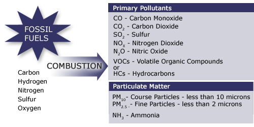
Long Description of the Products of Combustion image. [252]
We will now look at six products of combustion:
- Carbon Dioxide
- Carbon Monoxide
- Sulfur Dioxide
- Nitrogen Oxides
- Lead
- Particulate Matter
Carbon Dioxide (CO2)
Carbon dioxide is the principal product of combustion of fossil fuels since carbon accounts for 60–90 percent of the mass of fuels that we burn.
China has emerged as the largest single emitter of energy related CO2 emissions, reaching an all-time high of 8320 million metric tons of carbon dioxide in 2010. The United States emitted about 5610 million metric tons in 2010. The chart below shows the trend in carbon dioxide emission from 1980. Asia and Oceania, particularly China and India emission can be seen to increase significantly in the past two decades.
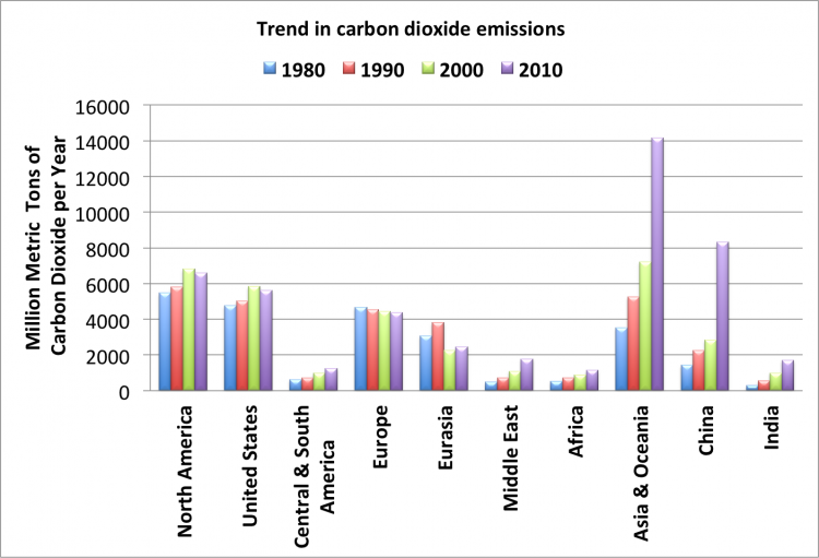
Each of the end sectors (users) and their contribution (percent) to the overall CO2 emissions is shown in the table below.
| Sources | Residential | Commercial | Industrial | Transportation | Electric Power | Source Total |
|---|---|---|---|---|---|---|
| Coal | 1 | 5 | 151 | 0 | 1,718 | 1,874 |
| Natural Gas | 256 | 171 | 419 | 39 | 411 | 1,296 |
| Petroleum | 78 | 49 | 345 | 1,802 | 25 | 2,299 |
| Other | 11 | 11 | ||||
| Electricity | 827 | 767 | 567 | 4 | ||
| Sector Total | 1,162 | 992 | 1,482 | 1,845 | 2,166 | 5,481 |
1= preliminary data
Data was pulled from the US Energy Information Administration

In 2010, 41.9 percent of U.S. fossil-fuel emissions came from the consumption of petroleum products, and coal usage accounted for 35.4 percent of U.S. fossil-fuel CO2 emissions. About 22.5 percent of the CO2 emissions were a result of natural gas use.
Carbon Monoxide (CO)
Carbon monoxide, or CO, is a colorless, odorless gas that is formed when carbon in fuel is not burned completely. The figure below shows the contribution of various sources to the emissions of CO:
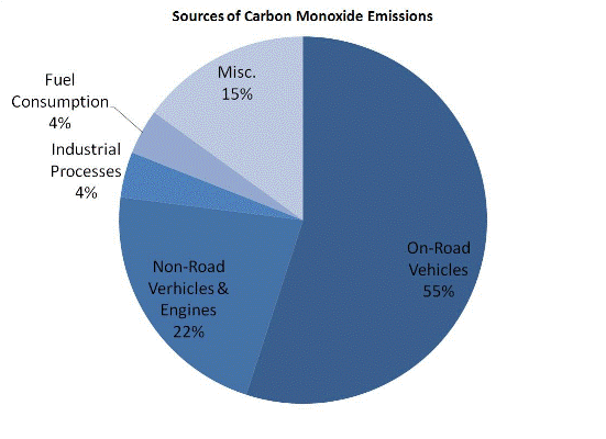
Carbon Monoxide is a component of motor vehicle exhaust, which contributes about 55 percent of all CO emissions nationwide. Other non-road engines and vehicles (such as construction equipment and boats) contribute about 22 percent of all CO emissions nationwide. Higher levels of CO generally occur in areas with heavy traffic congestion. In cities, 85 to 95 percent of all CO emissions may come from motor vehicle exhaust.
Other sources of CO emissions include industrial processes (such as metals processing and chemical manufacturing), residential wood burning, as well as natural sources such as forest fires. Woodstoves, gas stoves, cigarette smoke, and unvented gas and kerosene space heaters are sources of CO indoors.
The highest levels of CO in the outside air typically occur during the colder months of the year when inversion conditions are more frequent. An inversion is an atmospheric condition that occurs when the air pollutants are trapped near the ground beneath a layer of warm air.
Sulfur Dioxide (SO2)
Sulfur dioxide, or SO2, belongs to the family of sulfur oxide gases (SOx). These gases dissolve easily in water. Sulfur is prevalent in all raw materials, including crude oil, coal, and ores that contain common metals, such as aluminum, copper, zinc, lead, and iron.
SOx gases are formed when fuel containing sulfur, such as coal and oil, is burned, and when gasoline is extracted from oil, or metals are extracted from ore. SO2 dissolves in water vapor to form acid and interacts with other gases and particles in the air to form sulfates and other products that can be harmful to people and their environment.
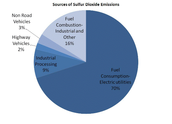
Nitrogen Oxides (NOx)
Nitrogen oxides, or NOx, is the generic term for a group of highly reactive gases, all of which contain nitrogen and oxygen in varying amounts. Many of the nitrogen oxides are colorless and odorless.
Nitrogen oxides form when fuel is burned at high temperatures, as in a combustion process. The primary sources of NOx are motor vehicles, electric utilities, and other industrial, commercial, and residential sources that burn fuels as shown in the figure below.
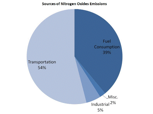
Although many of the nitrogen oxides are colorless and odorless, one common pollutant, nitrogen dioxide (NO2) along with particles in the air can often be seen as a reddish-brown layer over many urban areas.

Lead (Pb)
The major sources of lead emissions have historically been motor vehicles (such as cars and trucks) and industrial sources.
Due to the phase-out of leaded gasoline, metals processing is the major source of lead emissions to the air today. The highest levels of lead in air are generally found near lead smelters (devices that process lead ores). Other stationary sources are waste incinerators, utilities, and lead-acid battery manufacturers.

Lead is used in the manufacturing of many items, including glass, rubber, paint, batteries, insecticides, plumbing and protective shielding for X-rays.
Particulate Matter (PM)
Particulate matter (PM) is the general term used to describe a mixture of solid particles and liquid droplets found in the air. Some particles are large enough to be seen as dust or dirt. Others are so small they can be detected only with an electron microscope.
Different sizes of Particles include:
- PM 2.5 describes the “fine” particles that are less than or equal to 2.5 µm (micro meter) in diameter.
- “Coarse fraction” particles are greater than 2.5 µm, but less than or equal to 10 µm in diameter.
- PM 10 refers to all particles less than or equal to 10 µm in diameter (about one-seventh the diameter of a human hair). PM can be emitted directly or formed in the atmosphere.
Different Sources of Particles include:
- "Primary" particles are formed from combustion sources and are emitted directly into the atmosphere. Examples of primary particles are dust from roads or black carbon (soot).
- "Secondary" particles are formed in the atmosphere from primary gaseous emissions. Examples of secondary particles are sulfates formed from SO2 emissions from power plants and industrial facilities; nitrates formed from NOx emissions from power plants, automobiles, and other combustion sources; and carbon formed from organic gas emissions from automobiles and industrial facilities.
The chemical composition of PM depends on location, time of year, and weather. Generally, primary particles make up coarse PM and secondary particles make up most of fine PM.
Health and Environmental Effects of Primary Pollutants
The pollutants that are emitted directly from a combustion process – or the products of combustion - are called “primary pollutants.” We just described these products earlier in the lesson, now we will look at their impact on the environment and human health.
Carbon Dioxide (CO2)
Carbon dioxide (CO2) is not a pollutant that would harm our health but it is a proven greenhouse gas. It has an ability to absorb infrared radiation that is escaping from the surface of the earth causing the atmosphere to warm up. Excessive emission of CO2 along with other greenhouse gases is thought to contribute to the undesirable climate change.
Carbon Monoxide (CO)
As we learned earlier, Carbon monoxide, or CO, is a colorless, odorless and tasteless gas that is formed when carbon in fuel is not burned completely.
At much higher levels of exposure not commonly found in ambient air, CO can be poisonous, and even healthy individuals can be affected. Exposure to elevated levels of CO may result in:
- visual impairment;
- reduced work capacity;
- reduced manual dexterity;
- poor learning ability;
- difficulty in performing complex tasks.
The health threat from levels of CO sometimes found in the ambient air is most serious for those who suffer from cardiovascular disease such as angina pectoris.
In the human body, Hemoglobin (an iron compound) in the blood carries the oxygen (O20) from the lungs to various tissues and transports back carbon dioxide (CO2) to the lungs. Hemoglobin has 240 times more affinity toward CO than it does for oxygen. Therefore, when the hemoglobin reacts with CO, it reduces the hemoglobin that is available for the transport of O2. This in turn reduces oxygen supply to the body's organs and tissues.
Sulfur Dioxide (SO2)
High concentrations of SO2 can result in the following health problems:
Short-term exposure
- Adults and children with asthma who are active outdoors will experience temporary breathing impairment.
- Individuals with asthma may experience breathing difficulties with moderate activity and may exhibit symptoms such as wheezing, chest tightness, or shortness of breath.
Long-term exposure (along with high levels of PM)
- Aggravation of existing cardiovascular disease
- Respiratory illness
- Alterations in the lungs’ defenses
The subgroups of the population that may be affected under these conditions include individuals with heart or lung disease, as well as the elderly and children.
The body's reaction to regular and acidic air
Instructions: Click on the types of air and observe what happens for each.
Together, SO2 and NOx (discussed on the next page) are the major precursors to acidic deposition (acid rain), which is associated with the acidification of soils, lakes, and streams and accelerated corrosion of buildings and monuments. We will talk more about this in the next section. SO2 also is a major precursor to PM 2.5, which is a significant health concern, and a main contributor to poor visibility.
Health and Environmental Effects of Primary Pollutants, page 2
Nitrogen Oxides (NOx)
Nitric oxide (NO) and nitrogen dioxide (NO2) together are represented by NOx. Most of the emissions from combustion devices (approximately 90%) are in the form of NO.
NOx react in the air to form ground-level ozone and fine particulates, which are associated with adverse health effects.
- Short-term exposures (e.g., less than 3 hours) to low levels of NO2 may lead to changes in airway responsiveness and lung function in individuals with preexisting respiratory illnesses. These exposures may also increase respiratory illnesses in children.
- Long-term exposures to NO2 may lead to increased susceptibility to respiratory infection and may cause irreversible alterations in lung structure.
NOx contributes to a wide range of environmental effects directly and when combined with other precursors in acid rain and ozone.
- Increased nitrogen inputs to terrestrial and wetland systems can lead to changes in plant species composition and diversity.
- Direct nitrogen inputs to aquatic ecosystems such as those found in estuarine and coastal waters (e.g., Chesapeake Bay) can lead to eutrophication (a condition that promotes excessive algae growth, which can lead to a severe depletion of dissolved oxygen and increased levels of toxins harmful to aquatic life).
- Nitrogen, alone or in acid rain, also can acidify soils and surface waters.
Acid rain can ruin a fishing trip!
Acidification of soils causes the loss of essential plant nutrients and increased levels of soluble aluminum that are toxic to plants. Acidification of surface waters creates conditions of low pH and levels of aluminum that are toxic to fish and other aquatic organisms. NOx also contributes to visibility impairment.
Particulate Matter (PM)
Particles smaller than or equal to 10 µm (micro meter or millionth of a meter) in diameter can get into the lungs and can cause numerous health problems. Inhalation of these tiny particles has been linked with illness and death from heart and lung disease. Various health problems have been associated with long-term (e.g., multi-year) exposures to these particles. Shorter-term daily and potentially even shorter term peak (e.g., 1-hour) exposures to these particles can also be associated with health problems.
Particles can aggravate respiratory conditions, such as asthma and bronchitis, and have been associated with cardiac arrhythmias (heartbeat irregularities) and heart attacks. People with heart or lung disease, the elderly, and children are at highest risk from exposure to particles.
Particles of concern can include both fine and coarse-fraction particles, although fine particles have been more clearly linked to the most serious health effects.
- Particles larger than 2 micro meters (µm) do not penetrate beyond the nasal cavity or trachea.
- Particles smaller than 0.1 µm tend to deposit in tracheobronchia tree and are removed when exhaling.
- Particles between 0.1 and 2.0 µm penetrate deep into the lungs and settle in respiratory bronchioles or alveolar sacs
In addition to health problems, PM is the major cause of reduced visibility in many parts of the United States by scattering and absorbing some of the light emitted or reflected by the body reducing the contrast. Airborne particles can also impact vegetation and ecosystems, and can cause damage to paints and building materials.
How particulate matter is breathed into the human body
Instructions: Click the name of each size of particulate matter and observe what happens for each.
Lead
Exposure to lead occurs mainly through inhalation of air and ingestion of lead in food, water, soil, or dust. It accumulates in the blood, bones, and soft tissues and can adversely affect the kidneys, liver, nervous system, and other organs.
- Excessive exposure to lead may cause neurological impairments such as seizures, mental retardation, and behavioral disorders.
- Even at low doses, lead exposure is associated with damage to the nervous systems of fetuses and young children, resulting in learning deficits and lowered IQ.
- Recent studies indicated that lead may be a factor in high blood pressure and subsequent heart disease.
- Lead can also be deposited on the leaves of plants, presenting a hazard to grazing animals and to humans through ingestion.
Instructions: Click the "start" button to see the impact of using unleaded rather than leaded gasoline.
Secondary Pollutants
The pollutants that are emitted directly from a combustion process are called “primary pollutants.” When emitted into the atmosphere, these primary pollutants combine with other reactants and form “secondary” pollutants.
An example of a secondary pollutant would be ozone. When hydrocarbons are emitted and they react with NOx in presence of sunlight, they form ozone. Health and environmental effects of secondary pollutants are discussed in the next section: Global and Regional Effects of Pollutants.
Lesson 4b: Global and Regional Effects of Secondary Pollutants
Introduction to Global and Regional Effects of Secondary Pollutants
The Earth is continuously receiving energy from the sun. Energy also leaves the Earth in the nighttime (of course in the form of invisible infrared energy!). Otherwise, the Earth would be continuously warming up. This delicate balance between the energy coming in and leaving due to natural greenhouse effect is what keeps the planet warm enough for us to live on.
It is very obvious that if more energy comes in than the energy that leaves, the planet will become warm. Similarly, if the energy that leaves is more than the energy that comes in, the planet will become cool. The atmospheric temperature fluctuates over centuries due to certain natural causes.
Go to the next screen to view an animation of the greenhouse effect.
Greenhouse Effect
In the first lesson, we saw that energy can be transformed from one form to another, and during this conversion, all the energy that we put into a device comes out. However, all the energy that we put in may not come out in the desired form. Please watch the following 4:17 presentation:
This diagram explains to us about the greenhouse effect. Basically what greenhouse effect is, is the sun, which emits mostly long radiation and shortwave radiation, all this radiation comes in in the morning or during daytime without any problem. The atmosphere, which has various kinds of gases like oxygen, nitrogen, little bit of carbon dioxide, et cetera, these radiations basically pass through. And the solar radiation, part of it actually gets reflected back out into the space from these clouds. Whatever reaches the Earth, here down below, part of it heats up the atmosphere or the Earth's surface, some of it is used for growing plants, some of it evaporates waters and runs the hydrological cycle. And during nighttime, all this energy that has come in during daytime generally will go back into the space as longwave radiation, which is infrared radiation. So it comes in shortwave and longwave, but all of it tries to go back or will go back in longwave radiation. Now, the gases, like CO2, in the atmosphere generally have the unique capability to trap this infrared radiation that is going out. And these gases absorb the infrared radiation, keeping a part of the radiation that would've otherwise gone out within the atmosphere. So this is called greenhouse effect, and due to this effect, because of these gases, the atmosphere right now is at an average temperature of 59 degrees Fahrenheit. Without this effect, for example if there was no CO2 in the atmosphere, no greenhouse gases, it's totally of oxygen and nitrogen, all the energy that would come in in the daytime if it had gone out in the nighttime, the Earth would be freezing at 0 degrees Fahrenheit. So at this temperature, nothing can grow on this planet, and the planet would be uninhabitable. So this greenhouse effect is what is turning this planet into a habitable planet by keeping the average temperature at about 59 degrees Fahrenheit. This temperature is the temperature that we normally see averaged over entire year at all places, including North Pole, South Pole, equator, day, night, various seasons, et cetera. So greenhouse effect is what is actually making this planet habitable by warming up little bit. Unfortunately, if we emit more and more greenhouse gases into the atmosphere like what we have been doing-- the CO2 concentration has gone up from 275 parts per million to now about 370 parts per million--if we keep on doing these kinds of things, more and more thermal energy will be trapped inside the atmosphere, and this 59 degrees temperature is likely to increase. And that's what we call global warming, or climate change, or increase in this temperature is detrimental. So the question is whether we should blame greenhouse effect for this or global warming as a bad phenomenon.
Current levels of CO2 in the atmosphere - 392 ppm in 2011. (Data shown in Excel Sheet)
Greenhouse Gases
Based on the animation of the Greenhouse Effect on the previous screen, respond to the question below:
The concentration of greenhouse gases in the atmosphere has been changing over the past 150 years. Since pre-industrial times atmospheric concentrations of the gases have increased:
- CO2 has climbed over 31 percent.
- CH4 has climbed over 151 percent.
- N2O has climbed 17 percent.
Scientists have confirmed that this is primarily due to human activities, which include burning coal, oil, and gas, and cutting down forests.

Check this out!
Instructions: Click on the greenhouse gas in the left column below to see:
- What percentage of that gas accounts for the total greenhouse emissions in the United States.
- Its source of emission
As you can see, energy related CO2 and CH4 accounts for 90 percent of the total greenhouse gas emissions in the United States. This highlights the impact of energy use on the environment.
How Has CO2 Concentration Changed?
The table below shows the change in greenhouse gas concentration between Pre-Industrial times and 2010, as well as the Atmospheric Lifetime and Global Warming Potential.
| Greenhouse Gases | Pre-Industrial Concentration (PPBV) | Concentration (2010 (PPBV) | Atmospheric Lifetime (years) | Global Warming Potential (GWP) |
|---|---|---|---|---|
| Carbon dioxide (CO2) | 278,000 | 390,000* | Variable | 1 |
| Methane (CH4 | 715 | 1810.5 | 12 | 25 |
| Nitrous oxide (N2O) | 270 | 322.5 | 114 | 298 |
| CFC-12 | 0 | 0.533 | 100 | 10900 |
| HCFC-22 | 0 | 0.208 | 12 | 1810 |
| Perfluoromethane (CF4)** | 0 | 0.07 | 50,000 | 6,500 |
| Sulfur hexa-floride (SF6) | 0 | 0.007 | 3,200 | 22,800 |
*Recent CO2 concentration (390.5 ppm) is the 2011 average taken from globally averaged marine surface data given by the National Oceanic and Atmospheric Administration Earth System Research Laboratory.
**2005 data
Source: CDIAC.org [264]
Atmospheric lifetime is the period of time during which a gas changes and is either transformed or removed from the atmosphere.
GWP is an index defined as the cumulative radiative forcing (infrared radiation absorption) between the present and some chosen time horizon caused by a unit mass of gas emitted now, expressed relative to a reference gas such as CO2, as is used here. GWP is an attempt to provide a simple measure of the relative radiative effects of different greenhouse gases.
Try This!
Instructions: In the graph below, observe how CO2 concentration in the atmosphere has changed over the past 50 years. Based on your observations, answer the questions that follow.
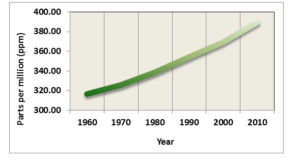
Data from the graph above was obtained from ice core samples of trapped air. More specifically, ice in the Polar Regions traps air from that particular time period, and then new ice is deposited over the previously deposited ice, trapping more air from the past. Thus, the analysis of ice core samples provides the composition of past air, which can be used to determine the past temperatures.
The increase in the greenhouse gases between 1950 and 2010 is believed to have caused an increase in the global temperature. The mean increase in the global temperature over the past one century is about 1 degree Fahrenheit.
Instructions: Review the graph below, showing the Annual mean for the Global surface temperature between years 1960 and 2010. The annual mean will show the detailed fluctuations.
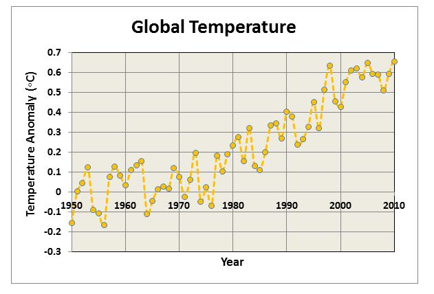

Since 1880, about when the industrial age first started, the average increase in global temperature has been 1 degree Fahrenheit.
Not only has there been an increase in temperatures with the increase of greenhouse gasses, there has also been an increase in CO2 emissions from fossil fuels – this has been apparent over the last 150 years (since about 1850).
The graph below depicts data from ice core samples showing temperature and CO2 concentrations in the atmosphere from 400,000 years ago to about the year 2000.
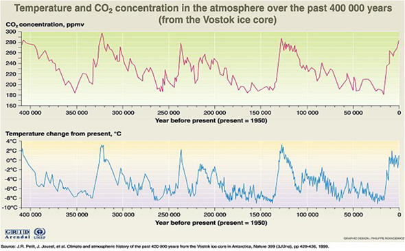
Based on the graph above, it can be determined that during periods of time where there was no human activity:
- The average global temperature increase was 2 degrees Celsius or 4 degrees Fahrenheit.
- The average temperature decrease was 8 degrees Celsius or 17 degrees Fahrenheit.
CO2 and Temperature Fluctuations
Unanswered Question
We have seen that there have been fluctuations in both temperature and CO2 emissions in the past 400,000 years. This leads to an important question:
- Did the atmospheric CO2 concentrations and temperatures change prior to the pre-industrial period or only after it?
Or more specifically:
- If we attribute the mean global temperature increase of 1ºF over the past century to human activities, how do we explain the mean global temperature fluctuations between +4ºF to -17ºF that occurred thousands of years ago, when there was no human activity?
Possible Answer
Some argue that temperature change is natural and cyclical. Thus, since it is cyclical, we, the humans, might not be influencing the current change in the climate.
The most important difference between now and then that we have to keep in mind is the human species. More than six billion people live on this planet now, who were not there during those earlier natural temperature cycles, and any chances that jeopardize the existence of this humankind must be taken seriously. The reasons for concern are discussed next.
More than 6 billion people live on this planet now who were not here during the earlier natural temperature cycles, and any chances that jeopardize the existence (land and food supply) of this humankind must be taken seriously.
The significant temperature fluctuations shown in the earlier graph of the ice core samples led to the glacial and inter-glacial ice ages. The temperature increase over the last 150 years, however, is not significant compared to the changes in the past known history. Let’s take a closer examination of the CO2 profile.
Instructions: Click on the buttons below to graph and compare CO2 and temperature on one graph, and then respond to the question that follows:
From the graph above, we know that CO2 concentration did not rise above 310 ppmv at any time from 400,000 years ago to the year 1950, even though the temperatures continued to increase. Based on this information, we can conclude that this increase is something that the atmosphere did not experience earlier, which means that the increase is the result of human activity.
Now let’s look at how CO2 concentration and temperature have changed in the last 50 years, since 1960.

Based on your observations of the above graph, reflect on the questions discussed below:
- In the past, 310 ppm of CO2 increased the temperature by about 4 degrees F, so how do you think the current CO2 concentration of 370 ppm is impacting the temperature?
- How long will it take for the temperature to come to a level that corresponds to the CO2 concentration of 370 ppm? Or are we already there?
- What will the consequences be if the concentration of CO2 increases to 550 ppm (double the pre-industrial concentration), or even to 70 ppm (both of which are proposed to be likely scenarios with the increased fossil fuel consumption?)
If the temperature already reached the maximum temperature corresponding to 370 ppm, then some other factors are cooling the planet that were absent in the previous cycles.
Now, let’s examine the reasons or causes for the natural fluctuations.
Global Warming
The sun is the main source of energy and, as we discussed earlier, it is the net balance between the incoming solar energy and the outgoing energy that causes the temperature changes.
The Earth is continuously moving around the sun. Based on its position, the incoming energy changes. The Earth’s axis of rotation is tilted at an angle of 23.5°, and this tilt goes from one side to the other and back over in 40,000-year cycles. Earth’s axis of rotation takes about 21,000 years to complete a cycle.
Instructions: Click the play button below to view the earth’s movement around the sun.
The Earth’s orbit around the sun changes from a circular path to an elliptical path and back to a circular path over 100,000 years. These are long-term changes. On a much shorter term, the radiation from the sun can be affected by the activity on the surface of the sun. Sun spots (intense flares on the surface) can increase the radiation from the sun. The increase in the solar activity occurs over an 11-year cycle.
Like many fields of scientific study, there are uncertainties associated with the science of global warming. This does not imply that all things are equally uncertain. Some aspects of the science are based on well-known physical laws and documented trends, while other aspects range from 'near certainty' to 'big unknowns.'
On the following pages, we will discuss the following:
- What is known for certain? Human activities change the Earth's Atmosphere.
- What is likely? Greenhouse gases contribute to global warming. Several factors impact temperature (clouds, fine particles, oceans). Global Warming affects health, water resources, polar regions, coastal zones and forests.
- What is uncertain? The long term effects of global warming, especially for smaller areas.
What is Known for Certain
Human activities change the earth's atmosphere.
Scientists know for certain that human activities are changing the composition of Earth's atmosphere. Increasing levels of greenhouse gases in the atmosphere, like carbon dioxide (CO2), have been well documented since pre-industrial times. There is no doubt this atmospheric buildup of carbon dioxide and other greenhouse gases is largely the result of human activities.
It's well accepted by scientists that greenhouse gases trap heat in the Earth's atmosphere and tend to warm the planet. By increasing the levels of greenhouse gases in the atmosphere, human activities are strengthening Earth's natural greenhouse effect. The key greenhouse gases emitted by human activities remain in the atmosphere for periods ranging from decades to centuries.
A warming trend of about 1oF has been recorded since the late 19th century. Warming has occurred in both the northern and southern hemispheres, and over the oceans. Confirmation of twentieth-century global warming is further substantiated by melting glaciers, decreased snow cover in the northern hemisphere, and even warming below ground.
What is Likely but Uncertain: Greenhouse Gases Contribute to Global Warming
Greenhouse gases contribute to global warming.
Determining to what extent the human-induced accumulation of greenhouse gases since pre-industrial times is responsible for the global warming trend is not easy. This is because other factors, both natural and human, affect our planet's temperature. Scientific understanding of these other factors—most notably natural climatic variations, changes in the sun's energy, and the cooling effects of pollutant aerosols—remains incomplete or uncertain; however…
- The Intergovernmental Panel on Climate Change (IPCC) stated there was a "discernible" human influence on climate; and that the observed warming trend is "unlikely to be entirely natural in origin."
- In the most recent Third Assessment Report (2001), IPCC wrote "There is new and stronger evidence that most of the warming observed over the last 50 years is attributable to human activities."
In short, scientists think rising levels of greenhouse gases in the atmosphere are contributing to global warming, as would be expected; but to what extent is difficult to determine at the present time.
As atmospheric levels of greenhouse gases continue to rise, scientists estimate average global temperatures will continue to rise as a result. By how much and how fast remain uncertain. IPCC projects further global warming of 2.2 - 10oF (1.4 - 5.8oC) by the year 2100.
What is Likely but Uncertain: Factors Affecting Temperature
Some factors that affect the Earth's temperatures include clouds, fine particles, and oceans.
Clouds
- Low, thick clouds primarily reflect solar radiation and cool the surface of the Earth.
- High, thin clouds primarily transmit incoming solar radiation; at the same time, they trap some of the outgoing infrared radiation emitted by the Earth and radiate it back downward, thereby warming the surface of the Earth.
- Whether a given cloud will heat or cool the surface depends on several factors, including the cloud's height, its size, and the make-up of the particles that form the cloud.
- The balance between the cooling and warming actions of clouds is very close - although, overall, cooling predominates.
Fine Particles (aerosols) in the atmosphere
The amount of fine particles or aerosols in the air has a direct effect on the amount of solar radiation hitting the Earth's surface. Aerosols may have significant local or regional impact on temperature.
Atmospheric factors shown in the image below include natural factors such as clouds, volcanic eruptions, natural biomass (forest) burning, and dust from storms. In addition, human-induced factors such as biomass burning (forest and agricultural fires) and sulfate aerosols from burning coal add tiny particles that contribute to cooling. Please watch the following 2:41 presentation: "The Cooling Factors."
There are several factors that have an influence on the earth's climatic change. Some of these happen to be clouds, fine particles, et cetera. Low, thick clouds primarily reflect solar radiation and cool the surface of the earth. High, thin clouds primarily transmit incoming solar radiation. At the same time, they trap some of the outgoing infrared radiation emitted by the earth's surface and radiate it back downward, thereby warming the surface of the earth. Whether a given cloud will heat or cool the surface depends on several factors, including the cloud's height, size, and the make of the particles that form the cloud. there in the atmosphere also change. As we talked about, the fine particles are coming into the atmosphere from volcanic eruptions, for example, or biomass burning, including natural forest fires, and also dust from the storms, sandstorms, et cetera. And we have very fine sulfate aerosols from burning coal and oil that come into the atmosphere. And these fine particles sometimes contribute to cooling. This is well known. For example, when Mount Pinatubo erupted in Philippines in 1991, there were a lot of fine particles that were spewed into the atmosphere which covered the surface, and it caused, basically, cooling. So again, at this point we do not know exactly how these factors will affect in future. Forest fires release carbon dioxide into the atmosphere, and, as we all know, carbon dioxide traps heat. And volcanic eruptions, these particles can cool sometimes-- oceans, clouds. And prediction of these kinds of things for future is a difficult task, and that is the reason predicting what is likely to happen is not so certain at this point in time.
When Mount Pinatubo erupted in the Philippines in 1991, an estimated 20 million tons of sulfur dioxide and ash particles blasted more than 12 miles high into the atmosphere. The eruption caused widespread destruction and human causalities. Gases and solids injected into the stratosphere circled the globe for three weeks.
Volcanic eruptions of this magnitude can impact global climate, reducing the amount of solar radiation reaching the Earth's surface, lowering temperatures in the troposphere, and changing atmospheric circulation patterns. The extent to which this occurs is an uncertainty.
Below is a picture of Mount Pinatubo next to a map of its location and how far the ash from its eruption spread.
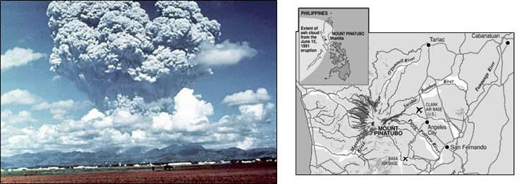
Water vapor is a greenhouse gas, but at the same time, the upper white surface of clouds reflects solar radiation back into space. Albedo—reflections of solar radiation from surfaces on the Earth—creates difficulties in exact calculations. If, for example, the polar icecap melts, the albedo will be significantly reduced. Open water absorbs heat, while white ice and snow reflect it.
Oceans
Oceans play a vital role in the energy balance of the Earth. It is known that the top 10 feet of the oceans can hold as much of the heat as the entire atmosphere above the surface. However, most of the incoming energy is incident on the equatorial region.
The water in the oceans in the equatorial regions is warmer and needs to be transported to the northern latitudes. This is done due to natural variations in the temperatures of the water and prevailing winds that cause the disturbances in the surface waters.
The Intergovernmental Panel on Climate Change (IPCC) states that even the low end of this warming projection "would probably be greater than any seen in the last 10,000 years, but the actual annual to decadal changes would include considerable natural variability."
Instructions: Click the play button to learn about the Ocean Conveyor Belt in the 2:52 presentation:
Oceans play a vital role in the energy balance of the earth. It is established that the top 10 feet of the oceans, which is roughly 3 meters, can hold as much of the heat as the entire atmosphere above the surface. However, most of the incoming energy is incident in the equatorial regions where the water gets warmer. And the water in these regions is much, much warmer compared to the water near the polar regions. And this warm water in the equatorial region needs to be transported to the northern latitudes. And this upper-layer water is not so rich in nutrients, whereas under the ocean it is rich in nutrients. Generally, this transportation is done due to natural variations in the temperature of the water, prevailing winds that cause the disturbances in the surface waters. The cold and dense water, from the polar regions basically, flows into the ocean, sinks to the bottom, and, pushing the warm waters from the surface, move towards the, again, northern latitudes. So this basically establishes a kind of oceanic conveyor belt. Warm, salty water is chilled when it is sinking in the northern Atlantic and it flows southwards towards Antarctica. And this is cooled further at the bottom of the oceans into Atlantic, Indian, and Pacific basins. The water returns to the surface, again primarily in Pacific and Indian Oceans, and again it comes back to the surface and goes to the northern Atlantic. While traveling deep in the ocean, the originally nutrient-depleted water becomes increasingly enriched by organic matter decomposition in the important nutrients, particularly phosphates, nitrates, and silicates. And that's how this is a very, very important process here in transporting the CO2 and the heat that is available to the surface water. So this oceanic conveyor belt plays a very important role in the heat distribution.
What is Likely but Uncertain: Impact of Global Warming
Impact of Global Warming on such things as health, water resources, polar regions, coastal zones, and forests is likely but it is uncertain to what extent.
Health
The most direct effect of climate change would be the impacts of the hotter temperatures, themselves. Extremely hot temperatures increase the number of people who die on a given day for many reasons:
- People with heart problems are vulnerable because one's cardiovascular system must work harder to keep the body cool during hot weather.
- Heat exhaustion and some respiratory problems increase.
- Higher air temperatures also increase the concentration of ozone at ground level.
- Diseases that are spread by mosquitoes and other insects could become more prevalent if warmer temperatures enabled those insects to become established farther north; such "vector-borne" diseases include malaria, dengue fever, yellow fever, and encephalitis.
Water Resources
Changing climate is expected to increase both evaporation and precipitation in most areas of the United States. In those areas where evaporation increases more than precipitation, soil will become drier, lake levels will drop, and rivers will carry less water. Lower river flows and lower lake levels could impair navigation, hydroelectric power generation, and water quality, and reduce the supplies of water available for agricultural, residential, and industrial uses. Some areas may experience increased flooding during winter and spring, as well as lower supplies during summer.
Polar Regions
Climate models indicate that global warming will be felt most acutely at high latitudes, especially in the Arctic where reductions in sea ice and snow cover are expected to lead to the greatest relative temperature increases. Ice and snow cool the climate by reflecting solar energy back to space, so a reduction in their extent would lead to greater warming in the region.
Coastal Zones
Sea level is rising more rapidly along the U.S. coast than worldwide. Studies by EPA and others have estimated that along the Gulf and Atlantic coasts, a one-foot (30 cm) rise in sea level is likely by 2050.
In the next century, a two-foot rise is most likely, but a four-foot rise is possible. Rising sea level inundates wetlands and other low-lying lands, erodes beaches, intensifies flooding, and increases the salinity of rivers, bays, and groundwater tables. Low-lying countries like Maldives located in the Indian Ocean and Bangladesh may be severely affected. The world may see global warming refugees from these impacts.
Forests
The projected 2°C (3.6°F) warming could shift the ideal range for many North American forest species by about 300 km (200 mi.) to the north.
- If the climate changes slowly enough, warmer temperatures may enable the trees to colonize north into areas that are currently too cold, at about the same rate as southern areas became too hot and dry for the species to survive. If the Earth warms 2°C (3.6°F) in 100 years, however, the species would have to migrate about 2 miles every year.
- Poor soils may also limit the rate at which tree species can spread north.
- Several other impacts associated with changing climate further complicate the picture:
- On the positive side, CO2 has a beneficial fertilization effect on plants, and also enables plants to use water more efficiently. These effects might enable some species to resist the adverse effects of warmer temperatures or drier soils.
- On the negative side, forest fires are likely to become more frequent and severe if soils become drier.
What is Uncertain
The long-term effects of global warming
Scientists have identified that our health, agriculture, water resources, forests, wildlife, and coastal areas are vulnerable to the changes that global warming may bring. But projecting what the exact impacts will be over the twenty-first century remains very difficult. This is especially true when one asks how a local region will be affected.
Scientists are more confident about their projections for large-scale areas (e.g., global temperature and precipitation change, average sea level rise) and less confident about the ones for small-scale areas (e.g., local temperature and precipitation changes, altered weather patterns, soil moisture changes). This is largely because the computer models used to forecast global climate change are still ill-equipped to simulate how things may change at smaller scales.
Some of the largest uncertainties are associated with events that pose the greatest risk to human societies. IPCC cautions, "Complex systems, such as the climate system, can respond in non-linear ways and produce surprises." There is the possibility that a warmer world could lead to more frequent and intense storms, including hurricanes. Preliminary evidence suggests that, once hurricanes do form, they will be stronger if the oceans are warmer due to global warming. However, the jury is still out whether or not hurricanes and other storms will become more frequent.
Solutions for Global Warming
Today, there is no single solution that is agreed upon, because scientists are still debating whether the problem is a real one or a perceived one. The main question is whether we want to wait to see the effects for sure and then act, or whether we want to start to do something now?
Like many pioneer fields of research, the current state of global warming science can't always provide definitive answers to our questions. There is certainty that human activities are rapidly adding greenhouse gases to the atmosphere, and that these gases tend to warm our planet. This is the basis for concern about global warming.
The fundamental scientific uncertainties are these: How much more warming will occur? How fast will this warming occur? And what are the potential adverse and beneficial effects? These uncertainties will be with us for some time, perhaps decades.
Global warming poses real risks. The exact nature of these risks remains uncertain. Ultimately, this is why we have to use our best judgment—guided by the current state of science—to determine what the most appropriate response to global warming should be.
What difference can I make?
When faced with this question, individuals should recognize that, collectively, they can make a difference. In some cases, it only takes a little change in lifestyle and behavior to make some big changes in greenhouse gas reductions. For other types of actions, the changes are more significant.
When that action is multiplied by the 270 million people in the U.S. or the 6 billion people worldwide, the savings are significant. The actions include being energy efficient in the house, in the yard, in the car, and in the store.
Everyone's contribution counts, so why not do your share?
Energy Efficiency Means Doing the Same (or More) with less Energy. When individual action is multiplied by the 270 million people in the U.S., or the 6 billion people worldwide, the savings can be significant.
How Can I Save the Environment?
Instructions: You can help save the environment by making changes from the top to the bottom of your home. Roll over the numbers below to see how you can make a difference:
Review
To review, these are the things you can do in your home – from top to bottom - to protect from the environment:
- Purchase "Green Power" - electricity that is generated from renewable sources such as solar, wind, geothermal, or biomass - for your home's electricity, if available from your utility company. Although the cost may be slightly higher, you'll know that you are buying power from an environmentally friendly energy source.
- Insulate your home – you’ll learn more about this in Home Activity Three.
- Use low-flow faucets in your showers and sinks.
- Replace toilets with water-saving lavatories.
- Purchase home products—appliances, new home computers, copiers, fax machines, that display the ENERGY STAR® label - You can reduce your energy consumption by up to 30 percent and lower your utility bills! Remember, the average house is responsible for more air pollution and carbon dioxide emissions than is the average car.
- When your lights burn out, replace them with energy-efficient compact fluorescent lights.
- Lower the temperature on your hot water tank to 120 degrees.
- Tune up your furnace.
- Insulate your water heater and all water pipes to reduce heat loss.
When you remodel, build, or buy a new home, incorporate all of these energy efficiency measures—and others.
Each of us, in the U.S., contributes about 22 tons of carbon dioxide emissions per year, whereas the world average per capita is about 6 tons.
The good news is that there are many ways you and your family can help reduce carbon dioxide pollution and improve the environment for you and your children.
Lesson 4c: Acid Rain and the Ozone
Introduction to Acid Rain and the Ozone
Acid rain is a serious environmental problem around the world, particularly affecting Asia, Europe, and large parts of the U.S. and Canada. The acidic pollutants such as SO2 and NOx are emitted into the environment by combustion of fossil fuels.
Most of the sulfur in any fuel combines with oxygen and forms SO2 in the combustion chamber. This SO2 when emitted into the atmosphere slowly oxidizes to SO3. SO3 is readily soluble in water in the clouds and forms H2SO4 (sulfuric acid).
Most of the NOx that is emitted is in the form of NO. This NO is oxidized in the atmosphere to NO2. NO2 is soluble in water and forms HNO3 (nitric acid).
Acid Deposition
Sunlight increases the rate of most of the SO2 and NO reactions. The result is a mild solution of sulfuric acid and nitric acid. "Acid rain" is a broad term used to describe several ways that acids fall out of the atmosphere. A more precise term is acid deposition, which has two parts: wet and dry.
- Wet deposition - refers to acidic rain, fog, and snow. As this acidic water flows over and through the ground, it affects a variety of plants and animals. The strength of the effects depend on many factors, including:
- the acidity of the water;
- the chemistry and buffering capacity of the soils involved;
- the types of fish, trees, and other living things that rely on the water.
- Dry deposition - refers to acidic gases and particles. About half of the acidity in the atmosphere falls back to earth through dry deposition.
- Acidic particles and gases are blown by the wind onto buildings, cars, homes, and trees.
- Dry deposited gases and particles can also be washed from trees and other surfaces by rainstorms. When that happens, the runoff water adds those acids to the acid rain, making the combination more acidic than the falling rain alone
Process of Acid Deposition
Prevailing winds blow the compounds that cause both wet and dry acid deposition across state and national borders, and sometimes over hundreds of miles. Please watch the 1:22 presentation below to learn more about the process of acid deposition.
In this diagram, we are seeing how the acid deposition occurs. When the sources emit pollutants such as SO2, NOx, mercury, and volatile organic compounds, primarily SO2 and NOx, which are acidic gases, are deposited in two ways. One is dry deposition, the other one is wet deposition. The SO2 and NOx when they deposit back either gaseous pollutants or as particulates, it's called dry deposition. When these pollutants dissolve in water, cloud water, and then deposit, it's called wet precipitation. Or that is what we call acid rain. The dry, gaseous pollutants or particulate matter can sometimes get dissolved in water and come down again as wet precipitation. Receptors are the species that receive this acid rain and get affected. These receptors can be materials that we care about, or aquatic life, human beings, or lakes and streams.
pH Scale
Acid rain is measured using a pH scale.
pH is a measure of hydrogen ion concentration, which is measured as a negative logarithm. In other words, acids produce hydrogen ions and alkalis produce hydroxyl ions, so pH is the power of a solution to yield hydrogen ions [H+].
The pH scale ranges from 0 to 14 and indicates how acidic or basic a substance is.
- A pH of 7 is neutral.
- A pH less than 7 is acidic.
- A pH greater than 7 is basic.
The lower a substance's pH, the more acidic it is. Each whole pH value below 7 (the neutral point) is ten times more acidic than the next higher value.
- For example, a pH of 4 is ten times more acidic than a pH of 5 and 100 times (10 times 10) more acidic than a pH of 6.
The higher a substance’s pH, the more basic or alkaline it is.
- Each whole pH value above 7 is ten times more alkaline (another way to say basic) than the next lower whole value.
- For example, a pH of 10 is ten times more alkaline than a pH of 9.
Effects of Acid Rain
Overview
Pure water has a pH of 7.0. Normal rain is slightly acidic because carbon dioxide dissolves into it, so it has a pH of about 5.5. As of the year 2000, the most acidic rain falling in the US has a pH of about 4.3.
Below is a video demonstration that replicates the effect of acid rain on plant life. In this video, beans are placed in: a) water, b) slightly acidic water and c) acidic water, and their growth is observed over a period of three days. Please watch the following 5:35 video:
We are learning about the environmental effects of acid rain. Acid rain is basically the compounds that form acid are mixing with the water in the clouds and coming down acidic rain. As it can be created at home using various day-to-day ingredients, one of them is vinegar, or you could use, also, lemon juice, that has a lot of acid. So what we are going to do in this demonstration today is to see the effect of acid rain on spouting off moon beans. These are a special kind of beans. And you can use, actually, most of the types of beans which have hard shell on the outside. So we are using here three different bowls here. Each of these bowls is filled with 20 beans, 20 seeds of these moon beans. And we are going to pour plain water in this one, and slightly acidic water in this bowl, and highly acidic water in this bowl, and see every day-- tomorrow, day after, and a day after that-- how this acid changes the spouting off these beans. So let's actually prepare this and add plain water to the first one. This is plain water, just water from the faucet. I'm going to add enough water so that these beans are all immersed in the water. Now the slightly acidic water I'm preparing by adding vinegar that I have here. And now this is a bottle of vinegar. And I'm going to add two spoons of vinegar to this. So this water in this cup is slightly acidic. I'm going to mix this and use this water. This is slightly acidic water. And I'm going to pour slightly acidic water in here. There are 20 beans in this cup, in this bowl, also. And I'm going to prepare highly acidic water here with the same vinegar. I'm going to add five spoons-- one, two, three, four, five. This is a little bit stronger than the other acid that we prepared. Now I'm going to add this highly acidic water to this bowl to the same level. And as the water evaporates, whatever type of water-- as the water evaporates, we need to refill with the same kind of water-- plain water in this bowl, slightly acidic water in this bowl. And highly acidic water in this bowl-- and observe the results. And what I want you to now hypothesize is which one would have the significant effects. Which one would have the significant effect? Or which one of these bowls will have more sprouting then the other? And when you look at day one, day two, day three, I need you to count the number of seeds that are sprouting. And you can prepare a plot. Let's say on day one, the plain water ones sprouted six out of 20, which means 30% have sprouted. Slightly acidic ones four out of 20. So that's 25%. Highly acidic one, six out of 20. That's, again, 30%. So you can plot that as a function of time and see at the end of four or five days how many of these seeds sprout. Let's watch for three days. OK. We are on day three today. And you can see on day one itself we had all 20 out of 20 sprouted in this plain water. And slightly acidic water, we didn't have any sprouts. Even today we don't have any sign of sprouting in highly acidic water. That is the impact that you can see of the acidity on sprouting of seeds. Now you can imagine what it would be like for the entire planet if it is covered with acidic rain. And what would be the impact on agriculture? What would be the impact on food supply chain to the humanity? So that is what we learned from this exercise.
Negative Consequences
Acid rain results in many negative consequences. Place your mouse over the image below to see the effects of acid deposition.
Effects of Acid Rain on Forests and Aquatic Life
Effects of Acid Rain on Forests
Acid rain does not usually kill trees directly. Instead, it is more likely to weaken trees by:
- damaging their leaves;
- limiting the nutrients available to them;
- exposing them to toxic substances slowly released from the soil.
Quite often, injury or death of trees is a result of these effects of acid rain in combination with one or more additional threats. Move your cursor over the numbers in the image below to see the effects of acid rain on the forest:
Effects of Acid Rain on Aquatic Life
Acid rain causes acidification of lakes and streams and contributes to damage of trees at high elevations (for example, red spruce trees above 2,000 feet) and many sensitive forest soils. Several regions in the U.S. were identified as containing many of the surface waters sensitive to acidification. They include the:
- Adirondacks and Catskill Mountains in New York State;
- Mid-Appalachian Highlands along the east coast;
- Upper Midwest;
- Mountainous areas of the Western United States.
Some types of plants and animals can handle acidic waters. Others, however, are acid-sensitive and will be lost as the pH declines. Click on the name of the fish, shellfish, and insects below to see what pH levels they can tolerate:
Effects of Acid Rain on Materials, Visibility, and Human Health
Effects of Acid Rain on Materials
Acid rain and the dry deposition of acidic particles contribute to the corrosion of metals (such as bronze) and the deterioration of paint and stone (such as marble and limestone). These effects seriously reduce the value to society of buildings, bridges, cultural objects (such as statues, monuments, and tombstones), and cars.

Effects of Acid Rain on Visibility
Sulfates and nitrates that form in the atmosphere from sulfur dioxide (SO2) and nitrogen oxides (NOx) emissions contribute to visibility impairment, meaning we can't see as far or as clearly through the air.
Eastern United States
Sulfate particles account for 50 to 70 percent of the visibility reduction in the eastern part of the United States, affecting our enjoyment of national parks, such as the Shenandoah and the Great Smoky Mountains.
Through the Acid Rain Program, SO2 reductions will be completed to improve visual range at national parks located in the eastern United States. Based on a study of the value national park visitors place on visibility, these reductions are expected to be worth over a billion dollars annually by the year 2010.
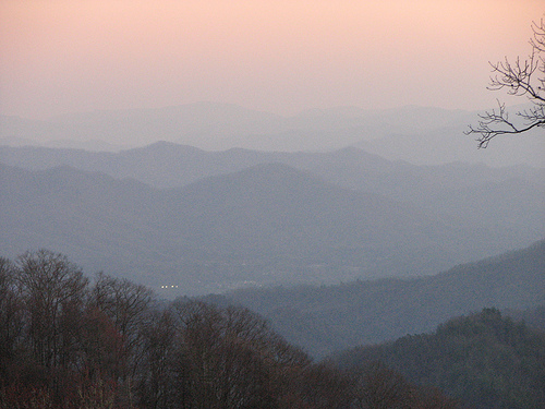
Western United States
In the western part of the United States, nitrates and carbon also play roles, but sulfates have been implicated as an important source of visibility impairment in many of the Colorado River Plateau national parks, including the Grand Canyon, Canyonlands, and Bryce Canyon.
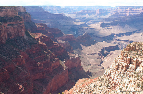
Effects of Acid Rain on Human Health
Acid rain looks, feels, and tastes just like clean rain. The harm to people from acid rain is not direct. Walking in acid rain, or even swimming in an acid lake, is no more dangerous than walking or swimming in clean water. However, the pollutants that cause acid rain also damage human health.
- Effects of Sulfur Dioxide (SO2): These gases interact in the atmosphere to form fine sulfate and nitrate particles that can be transported long distances by winds and inhaled deep into people's lungs. Fine particles can also penetrate indoors. Many scientific studies have identified a relationship between elevated levels of fine particles and increased illness and premature death from heart and lung disorders, such as asthma and bronchitis.
- Effects of Nitrogen Oxide (NOx): Decrease in nitrogen oxide emissions are also expected to have a beneficial impact on human health by reducing the nitrogen oxides available to react with volatile organic compounds and form ozone. Ozone impacts on human health include a number of morbidity and mortality risks associated with lung inflammation, including asthma and emphysema.
Protecting the Environment from Acid Rain
You can do the following to protect the environment from acid rain:
- Turn off lights, computers, and other appliances when you're not using them.
- Use energy efficient appliances: lighting, air conditioners, heaters, refrigerators, washing machines, etc.
- Only use electric appliances when you need them.
- Keep your thermostat at 68°F in the winter and 72°F in the summer. You can turn it even lower in the winter and higher in the summer when you are away from home.
- Insulate your home as best you can.
- Carpool, use public transportation, or better yet, walk or bicycle whenever possible.
- Buy vehicles with low NOx emissions, and maintain all vehicles well.
Introduction to Ozone
Ozone (O3) is a triatomic oxygen molecule gas that occurs both in the Earth’s upper atmosphere and at ground level. Ozone can be good or bad, depending on where it is found: It is a bluish gas that is harmful to breathe. Therefore, it is bad at the ground level.
The Ozone Cycle
The presentation below shows the process of ozone depletion. Ozone depletion is caused by chlorofluorocarbons (CFCs) and other ozone-depleting substances. Please watch the following 1:16 video.
In this picture we are seeing how the ozone layer is destroyed and the effects of that destruction. Certain compounds such as chlorofluorocarbons, CFC’s, are released into the atmosphere by human activities, and these CFC’s particularly, they are very, very unreactive at the atmospherical ground level and they go all the way up to the stratosphere and then the CFC’s dissociate or give up the chlorine. Each chlorine atom is capable of destroying or basically turning ozone into oxygen and which again doesn’t have the same capability as ozone does in shielding us from the UV radiation. And once that ozone layer or the number of ozone molecules in that layer goes down, more and more UV rays can pass through the atmosphere and reach the surface and can cause more skin cancer and cataracts in older people.
Production and Destruction of Ozone
Ozone is constantly produced and destroyed in a natural cycle, as shown in the figure below. However, the overall amount of ozone is essentially stable. This balance can be thought of as a stream's depth at a particular location. Although individual water molecules are moving past the observer, the total depth remains constant. Similarly, while ozone production and destruction are balanced, ozone levels remain stable. This was the situation until the past several decades. Please watch the following 1:32 video about ozone destruction.
Here we are looking at the ozone science. How the ozone is produced and how the ozone is destroyed. In the first step, the oxygen molecules are photolyzed or converted by the UV rays that are coming from the sun into two oxygen atoms; nascent oxygen atoms. Oxygen atoms are very, very reactive and they react with another oxygen molecule and form ozone, O3. Ozone and oxygen atoms are continually being interconverted as rays break the ozone and turns into nascent oxygen and oxygen molecules. And the oxygen atom again reacts with the oxygen molecules forms ozone. Our activities, which are producing the CFC’s and liberating into the atmosphere, they are going and these chlorine atoms are destroying the ozone molecules in addition to the natural process of formation and destruction. That is what is causing the reduction in the concentration of ozone in the stratosphere and when the concentration goes down below certain levels, like 220 Dobson units we call that ozone hole. Ozone hole does not mean that there is a big hole up there but what it means is that the concentration is below a certain level.
Large increases in stratospheric chlorine and bromine, however, have upset the balance of the Ozone. In effect, they have added a siphon downstream, removing ozone faster than natural ozone creation reactions can keep up. Therefore, ozone levels fall.
Since ozone filters out harmful UVB radiation, less ozone means higher UVB levels at the surface. The more the ozone is depleted, the larger will be the increase in incoming UVB radiation. UVB has been linked to:
- skin cancer;
- cataracts;
- damage to materials like plastics;
- harm to certain crops and marine organisms.
Although some UVB reaches the surface even without ozone depletion, its harmful effects will increase as a result of this problem.
Ozone-Depleting Substance(s) (ODS) are:
- CFCs;
- HCFCs (used in the energy related to refrigeration and air conditioning in homes, commercial buildings, and cars, and manufacture of foam products);
- Halons (used in fire extinguishers);
- Methyl bromide, carbon tetrachloride;
- Methyl chloroform (used as solvents in chemical industries).
The Ozone Hole
Recent studies by NASA and others have indicated that about 40 percent of the ozone in the Antarctica has been destroyed and that about 7 percent of ozone is destroyed from the Arctic Circle. The destruction of ozone is also called “Ozone Hole."
Ozone hole does not mean that there is no ozone in the region. The ozone hole is defined as the area having less than 220 dobson units (DU) of ozone (concentration) in the overhead column (i.e., between the ground and space).
The image below shows the reduction in ozone concentration over Antarctica. This hole in the Antarctica is unfortunately allowing more Australians to be exposed to UV radiation. However, if this kind of ozone destruction ever takes place in the Arctic zone, more humans (in the Northern hemisphere) would be exposed to higher levels of UVB radiation.

A Dobson Unit is the measure of the amount or thickness of ozone in the atmosphere. It is based on a measurement taken directly above a specific point on the Earth's surface. One Dobson unit refers to a layer of ozone that would be 0.001 cm thick under conditions of standard temperature (0 degree C) and pressure (the average pressure at the surface of the Earth). The Dobson unit was named after G.M.B. Dobson, who was a researcher at Oxford University in the 1920s. He built the first instrument (now called the Dobson meter) to measure total ozone from the ground.
The size of the Southern Hemisphere ozone hole as a function of the year is shown in the figure below. The graph compares the size of the hole over a twenty year period, from 1980 to 2010. It can be seen that the size increased each year. Each year in the spring, the ozone hole is at its largest.

Effects of Ozone Depletion on Skin
Effects of ozone depletion can result in 1) increased cases of skin cancer, 2) skin damage, 3) cataracts and other eye damage, and 4) immune suppression.
Skin Cancer
The incidence of skin cancer in the United States has reached epidemic proportions. One in five Americans will develop skin cancer in their lifetime, and one American dies every hour from this devastating disease.
Medical research is helping us understand the causes and effects of skin cancer. Many health and education groups are working to reduce the incidence of this disease, of which 1.3 million cases have been predicted for 2000 alone, according to The American Cancer Society. The figure below shows the sources of ozone depleting substances.
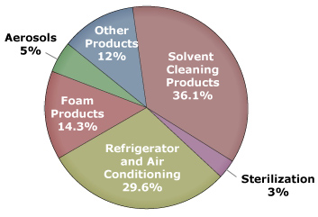
Melanoma
Melanoma, the most serious form of skin cancer, is also one of the fastest growing types of cancer in the United States. Many dermatologists believe there may be a link between childhood sunburns and melanoma later in life. Melanoma cases in this country have more than doubled in the past 2 decades, and the rise is expected to continue.
Nonmelanoma Skin Cancers
Nonmelanoma skin cancers are less deadly than melanomas. Nevertheless, left untreated, they can spread, causing disfigurement and more serious health problems. More than 1.2 million Americans will develop nonmelanoma skin cancer in 2000 while more than 1,900 will die from the disease. There are two primary types of nonmelanoma skin cancers.
- Basal Cell Carcinomas are the most common type of skin cancer tumors. They usually appear as small, fleshy bumps or nodules on the head and neck, but can occur on other skin areas. Basal cell carcinoma grows slowly, and rarely spreads to other parts of the body. It can, however, penetrate to the bone and cause considerable damage.
- Squamous Cell Carcinomas are tumors that may appear as nodules or as red, scaly patches. This cancer can develop into large masses, and unlike basal cell carcinoma, it can spread to other parts of the body.
These two cancers have a cure rate as high as 95 percent if detected and treated early. The key is to watch for signs and seek medical treatment.
Other Skin Damage
Other UV-related skin disorders include actinic keratoses and premature aging of the skin.
- Actinic keratoses are skin growths that occur on body areas exposed to the sun. The face, hands, forearms, and the "V" of the neck are especially susceptible to this type of lesion. Although premalignant, actinic keratoses are a risk factor for squamous cell carcinoma. Look for raised, reddish, rough-textured growths and seek prompt medical attention if you discover them.
- Chronic exposure to the sun also causes premature aging, which over time can make the skin become thick, wrinkled, and leathery. Since it occurs gradually, often manifesting itself many years after the majority of a person's sun exposure, premature aging is often regarded as an unavoidable, normal part of growing older. With proper protection from UV radiation, however, most premature aging of the skin can be avoided.
Protect yourself against sunburn. Minimize sun exposure during midday hours (10 am to 4 pm). Wear sunglasses, a hat with a wide brim, and protective clothing with a tight weave. Use a broad spectrum sunscreen with a sun protection factor (SPF) of at least 15. To be safer, 30 is better.
Effects of Ozone Depletion on Eyes and Immune System
Cataracts and Other Eye Damage
Cataracts are a form of eye damage in which a loss of transparency in the lens of the eye clouds vision. If left untreated, cataracts can lead to blindness. Research has shown that UV radiation increases the likelihood of certain cataracts. Although curable with modern eye surgery, cataracts diminish the eyesight of millions of Americans and cost billions of dollars in medical care each year.
Instructions: Place your mouse over the image below to see the effect cataracts can have on vision.
Other kinds of eye damage include pterygium (i.e., tissue growth that can block vision), skin cancer around the eyes, and degeneration of the macula (i.e., the part of the retina where visual perception is most acute). All of these problems can be lessened with proper eye protection from UV radiation.
Immune Suppression
Scientists have found that overexposure to UV radiation may suppress proper functioning of the body's immune system and the skin's natural defenses. All people, regardless of skin color, might be vulnerable to effects including impaired response to immunizations, increased sensitivity to sunlight, and reactions to certain medications.
Protecting the Environment - Ozone Depletion
Your “Power” in Protecting the Environment from Ozone Depletion
- Make sure that technicians working on your car air conditioner, home air conditioner, or refrigerator are certified by an EPA-approved program to recover the refrigerant (this is required by law).
- Have your car and home air conditioner units and refrigerator checked for leaks. When possible, repair leaky air conditioning units before refilling them.
- Contact local authorities to properly dispose of refrigeration or air conditioning equipment.
International Action in Protecting the Environment from Ozone Depletion
In 1987, the Montreal Protocol, an international environmental agreement, established requirements that began the worldwide phase out of ozone-depleting CFCs (chlorofluorocarbons). These requirements were later modified, leading to the phase out in 1996 of CFC production in all developed nations.
Ground Level Ozone and Photochemical Smog
Ozone is a secondary pollutant that forms from the primary pollutants such as Volatile Organic Compounds (Hydrocarbons) and nitrogen oxides (NOx) in the presence of sunlight. Its formation is mainly from the automobile emissions.

Below is a demonstration on how ozone forms at the ground level (note ground level ozone is also known as “bad” ozone). Please watch the following 5:29 video:
This demonstration is basically looking at how ozone forms or how photochemical smog forms at the ground level because of the pollutants that we emit.Ozone emission or ozone formation depends on two ingredients, nitrogen oxides that are emitted by pollutants that are going out to the tail pipe of a car and in a power plant with a stack. Nitrogen oxides react with volatile organic compounds. Volatile organic compounds are also emitted by the tailpipe of the cars and some of them are coming from petroleum refineries and petroleum industries. VOCs + NOx = Ozone. These volatile organic compounds react to form ozone only in the presence of sunlight. That is the critical thing, only in presence of sunlight. So, to see this demonstration, we need sunlight. Obviously, we don’t have the sunlight here but I can create sunlight or the wave lengths that are important to create the same effects. That is the reason I am using a UV lamp. You see this lamp here? This blue light is producing the UV light that is required to create ozone. And this ozone again reacts with volatile organic compounds to produce photochemical smog. So first of all I am trying to create here ozone. The way I am creating ozone is not with Nitrogen oxides and volatile organic compounds but turning the oxygen that is there in the beaker into ozone by using this UV light. So let me close this and in about three or four minutes, the oxygen that is there inside will turn into ozone.So we have one ingredient. The second ingredient that is required is Nitrogen oxides or volatile organic compounds to produce smog. Once ozone is formed, I can introduce one of those ingredients and we can see the smog. Ok, I guess we have probably enough ozone in there.Now we need to add Nitrogen oxides and volatile organic compounds to form the photochemical smog that we are seeing or that we should be seeing. Ozone + VOCs + NOx = Photochemical Smog. Since I don’t have my car with me or the tail pipe, I need to somehow produce hydro-carbons in this room.So what I am doing is hydro carbons and Nitrogen oxide, cause even is nitrogen oxides are not there, we can form photochemical smog if we have hydro carbons. The composition will be slightly different. So now I am taking my orange, this is the orange, and you know the beautiful smell that you normally smell with an orange is because of linolenic acid. Linolenic acid is the orange smell that you get.And I’m just taking a small peel of this orange, this is the source of hydrocarbons, and I am trying to put it in here - nothing big deal.And this ozone that is there inside will slowly react with this hydrocarbon that are produced, that are emitted from this orange peel and produce the photochemical smog. Do you see anything going on here? Are you able to still see through the beaker? Is the atmosphere clear in the beaker or is it becoming hazy? Let me turn this little bit around and you may be able to see now, I don’t know. Can you see anything coming out of this? That is the photochemical smog actually. Let me open this and show you. That is the smog that you see and when the smog or when this smoke kind of smog is in the beaker or in the atmosphere, you can not see through and since this has ozone in it, it is not good for our health. When you live in cities filled with this kind of smog, you generally experience breathing problems and other health problems. Your eyes start to water when you drive home from work late in the afternoon or your nose starts to run because your body tries to get rid of, get rid of these pollutants. So that is photochemical smog and if we keep this orange peel like this we probably can generate enough smog for about 24 hours to 36 hours like this, with this little orange peel.Now you can see what we are doing to the atmosphere by emitting roughly 10, 12, 13 million tons of nitrogen oxides into the atmosphere and several million tons of volatile organic compounds into the atmosphere.
As previously mentioned, the formation of ozone is mainly from automobile emission. A typical profile of pollutants in the air of major cities is well repeatable and is shown in the figure below. Note how the formation changes over the course of a day:
- Early in the morning - During peak traffic hours, NO and Hydrocarbons are emitted along with CO.
- Mid-morning - NO is slowly oxidized to NO2.
- Mid-afternoon - In the presence of sunlight, NOx react with VOCs to form ozone.
Ozone, by itself, is damaging to health and also to the environment. Ozone triggers a variety of health problems even at very low levels and may cause permanent lung damage after long-term exposure. Ozone also leads to the formation of smog or haze, causing additional problems such as a decrease in visibility as well as damage to plants and ecosystems.
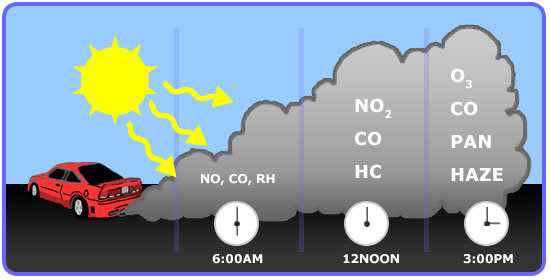
Basic Chemistry and Sources
As we have learned, volatile Organic Compounds (Hydrocarbons) combine with nitrogen oxides (NOx) in the presence of sunlight to form ozone.
In turn, sunlight and hot weather cause ground-level ozone to form in harmful concentrations in the air. As a result, it is known as a summertime air pollutant.
Many urban areas tend to have high levels of "bad" ozone, but even rural areas are also subject to increased ozone levels because wind carries ozone and pollutants that form it hundreds of miles away from their original sources.
View the graph below to compare the major sources of NOx and VOC that help to form ozone.
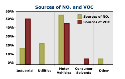
Health and Environmental Impact
Several groups of people are particularly sensitive to ozone—especially when they are active outdoors—because physical activity causes people to breathe faster and more deeply. In general, as concentrations of ground-level ozone increase, more and more people experience health effects, the effects become more serious, and more people are admitted to the hospital for respiratory problems. When ozone levels are very high, everyone should be concerned about ozone exposure.
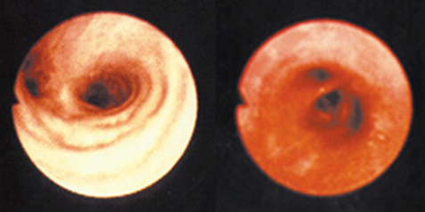
Below is a listing of Health Effects of Ground Level Ozone
- Ozone can irritate your respiratory system, causing you to start coughing, feel an irritation in your throat and/or experience an uncomfortable sensation in your chest.
- Ozone can reduce lung function and make it more difficult for you to breathe as deeply and vigorously as you normally would. When this happens, you may notice that breathing starts to feel uncomfortable. If you are exercising or working outdoors, you may notice that you are taking more rapid and shallow breaths than normal.
- Ozone can aggravate asthma. When ozone levels are high, more people with asthma have attacks that require a doctor's attention or the use of additional medication. One reason this happens is that ozone makes people more sensitive to allergens, which are the most common triggers for asthma attacks. Also, asthmatics are more severely affected by the reduced lung function and irritation that ozone causes in the respiratory system.
- Ozone can inflame and damage cells that line your lungs. Within a few days, the damaged cells are replaced and the old cells are shed—much in the way your skin peels after a sunburn.
- Ozone may aggravate chronic lung diseases such as emphysema and bronchitis and reduce the immune system's ability to fight off bacterial infections in the respiratory system.
- Ozone may cause permanent lung damage. Repeated short-term ozone damage to children's developing lungs may lead to reduced lung function in adulthood. In adults, ozone exposure may accelerate the natural decline in lung function that occurs as part of the normal aging process.
Protecting the Environment
Move your cursor over the objects in the image below to find out what you can do to protect the environment.
Review and Extra Resources
Review
Watch the 8:41 Lesson 4 Review presentation below.
--coal and we also talked about what they are made up of-- primarily carbon, hydrogen, nitrogen, sulfur, and other minerals. And we need to know what forms when these carbon, hydrogen, nitrogen, sulfur, and other minerals burn. And their primary combustion products. Primary combustion products are basically what forms when an element reacts with oxygen. So primary products of carbon dioxide, carbon moNOxide, hydrogen and water, sulfur dioxide, nitrogen oxides, and lead, when we used to use unleaded gasoline. And you also need to know how each of these are forming. Like carbon dioxide, how does it form? Carbon moNOxide, when does it form? How does it form? And which are the sources that emit most of these carbon moNOxide, sulfur dioxide, et cetera, et cetera. Secondary pollutants and difference between primary and secondary pollutants. OK, you must be careful about that. Secondary pollutant is a pollutant that forms after primary pollutants are released and they react amongst themselves or something in the atmosphere, and forms secondary pollutants. And similarly, particulate matter-- what sizes they form, how they form, when they form, et cetera. And you also need to know the health and environmental effects of each of these pollutants like CO2, CO, SO2, et cetera. All these pollutants, health and environmental, what concentrations-- and you don't have to remember the numbers or anything, but how does it affect us? And which are the sources that emit these things, as I said. And particulate matter is PM, and it is classified based on size. And which size particles-- how they're classified-- which size are most dangerous. As you can see, intermediate-sized particles are the most dangerous one between 0.1 micron and 2.0 microns in size. And also, the regional effects of these particles we need to concentrate on-- global and regional effects. For example, CO2 causes global warming or sort of global climate change, and SO2 and NOx cause acid rain, et cetera, et cetera. All right, and greenhouse effect, what is it, basically? What is greenhouse effect-- definition or precisely what happens? And which of the gases that contribute to greenhouse effect? These are the gases that contribute to greenhouse effect, you need to know these. And some of these gases are more powerful than the others, so you need to understand what is global warming potential, or GWP. And you need to go through the textbook or your notes about CO2 and temperature profiles-- how they changed in the past 150 years and even before that. And what are the reasons for those changes? And as we talked about in the textbook, basically what is responsible for these kinds of changes? And preindustrial concentration and concentration right now, what it is and reasons for concern. And you also have to think about natural causes. Some people argue that it is happening naturally, so you need to know what are the arguments that are made for natural as well as human-made changes. Global warming, what is it? And difference between greenhouse effect and global warming, and factors affecting global climate change. What happens? What happens when global climate changes? Global temperature changes? And sea level changes? And polar ice caps melt? And precipitation levels change? Precipitation generally increases because there's more cloud cover. And also, what is for certain? What is not certain? And feedbacks--, feedbacks are like when low-level clouds form, it can reflect the sunlight, actually, increase the fraction of sunlight that can penetrate through thick clouds. And so the planet might be cooling down. And if the higher-level clouds form, it may be warming up. So those are the things that we don't know yet completely, know what kind of clouds form. So uncertainties and certainties-- for example, the great ocean belt conveyor phenomenon and so on, and so forth. And you also need to know what you can do to reduce potential global warming-- individual steps. When I say individual steps, you need to really know which gas, by which step which gas is reduced-- not just list those five steps or six steps that you know of. Drive less, that's not an answer. By driving less, I'm going to produce less CO2, because gasoline when burned produces CO2, kind of thing. You know you have to go to the reasoning part. And acid rain and ozone. Acid rain and ozone, how they form, basic chemistry you need to understand. Basic You don't have to write balanced equations, but what goes into it, and under what conditions these things form. And the gases that are responsible and conditions under which these things form. The difference between wet deposition, dry deposition, and how we measure acid rain on a pH scale. What is acid? What is base-- alkaline or basic? How we measure pH? And also the effects of these acid rain on various things. Effects on human health-- when we breathe SO2, NOx, what happens? What happens, when acid rain falls on soils, to vegetation and aquatic life? For example, fish cannot survive at lower pHs. And so different species. And effects of visibility, because acid rain components can form fine particulates which can reduce visibility. And different materials that we care about, like monuments, et cetera, statues, et cetera. You need to understand those differences. And ozone. Ozone-- basically two types, good ozone and bad ozone. So you need to understand why this is called good ozone, why this is called bad ozone. This good ozone shields us from UV light, and because it's far away in the stratosphere-- and this should be stratosphere, not troposphere here. And ground-level ozone. Ground-level ozone is formed by NOx and VOCs reacting in presence of sunlight. And why we call this bad ozone, why, we call this good ozone, and ozone hole, what is it? Is this really a hole? Or what is that ozone hole? Why we call that ozone hole. When the concentration goes down below a certain level it cannot shield us from the UV rays that are coming from the sun, so we call that an ozone hole. And how we are destroying that ozone and causing depletion of ozone, and causing the problem of more UV rays coming in. And also you need to understand, at the ground level, how the ground-level ozone is forming and turns into photochemical smog. Basic chemistry, what are the reactants that are going in. You don't have to actually balance the reactions or anything, but you need to understand the conditions and what are the reactants that are involved in it. And health and environmental effects. For example, ground-level ozone can cause human health problems, and also it can cause--
Review Sheet Lesson 4 – Energy and the Environment
- Fossil fuels
- Natural gas, Petroleum, Coal
- Fossil fuel composition (Carbon, Hydrogen, Nitrogen, Sulfur, Minerals)
- Products of Combustion
- Primary pollutants
- Carbon Dioxide (majority), Carbon Monoxide, Sulfur Dioxide, Nitrogen Oxides, Lead
- Secondary Pollutants
- Difference between primary and secondary
- Particulate matter
- Primary particles
- Secondary particles
- Primary pollutants
- Health and environmental effects of
- CO2, CO, SO2, NOx, Lead
- PM
- Very Small (smaller than 0.1 μm)
- Intermediate (between 0.1 μm and 2 μm) Most dangerous
- Coarse size (larger than 2 μm)
- Global and Regional effects of Secondary Pollutants
- Greenhouse effect - What is it?
- Greenhouse gases and GWP
- CO2, H2O, CH4, N2O, Other gases [CFC-12, HCFC-22,Perfluoromethane (CF4), Sulfur hexafluoride (SF6)]
- CO2 and temperature fluctuations (pre-industrial and current concentrations and temperature changes)
- Global warming:
- What is it?
- Difference between greenhouse effect and Global warming
- Factors affecting Global climate change
- Potential consequences on global temperature, change in sea levels, polar icecaps, precipitation levels, etc.
- What is known for certain?
- What is likely but uncertain?
- What is uncertain?
- Solutions for global warming
- Acid Rain and Ozone
- Acid Deposition, Basic chemistry of formation, gases responsible for acid deposition
- Wet deposition
- Dry Deposition
- pH scale (ranges from 0 to 14)
- pH of 7 is neutral
- pH less than 7 is acidic
- pH greater than 7 is basic
- Effects of acid rain on human health, vegetation, aquatic life,visibility, and materials
- Ozone
- Good Ozone (stratospheric ozone) vs. Bad Ozone (ground level ozone)
- Ozone Hole (Dobson units)
- Effects of Ozone depletion – basic chemistry
- Ground level Ozone and Photochemical smog formation- Basic chemistry
- Health and Environmental effects
- Your power in protecting the environment
- Acid Deposition, Basic chemistry of formation, gases responsible for acid deposition
Test Yourself
The questions below are your chance to test and practice your understanding of the content covered in this lesson. In other words, you should be able to answer the following questions if you know the material that was just covered! If you have problems with any of the items, feel free to post your question on the unit message board so your classmates, and/or your instructor, can help you out!
- What is the difference between primary and secondary pollutants?
- How can scientists extrapolate historical climate changes by analyzing ice cores?
- What is the greenhouse effect? Explain the difference between greenhouse effect and global warming? Which gases contribute to the greenhouse effect?
- Explain how ozone is formed at the ground level with the help of the basic reactions. Which end users of energy are responsible for the emissions of the compounds involved?
- Explain how the stratospheric ozone layer is being destroyed. Which sector is responsible for the emission of the gases that are responsible for this?
- What is acid rain? How is it formed? What are the effects of acid rain?
- List five steps that you, as an individual, can take to reduce potential global warming, and explain how each of these steps will reduce the emissions.
- List 5 ways in which you, as an individual, can reduce gaseous emissions that contribute to acid rain.
- State the arguments that scientists who say that global warming is not due to burning of fossil fuels are making.
- What are the effects of ground level ozone?
- Briefly describe the methods by which information is gathered and used to show that the planet is warming up.
Extra Resources
For more information on topics discussed in Lesson 4, see these selected references:
- CDIAC [287]
- EPA page on emissions [288]
- Vital Climate Graphics [289]
- The Science of Ozone Layer Depletion [290]
- EPA page on climate [291]
- Yosemite EPA [292]
- GW debate [293]
- EPA page on acid rain [294]
- Acid Rain [295]
- Visibility [296]
- Six Common Air Pollutants [297]
- Carbon Monoxide [298]
Home Activity: Energy Use and Analysis
Complete the following Home Activity. After working through the activity you will be asked to submit your work. Your grade for the activity will be posted to the gradebook approximately 1 week after the due date. Please refer to the Canvas calendar for time frames and due dates.
Note: If you don't see the Home Activity on your screen, try reloading the page. Also, be sure to check out the helpful links below the activity.
Use the following link to check your Home Activity Submission [299].
If you have already submitted your Home Activity and want to change an answer, watch this video, "How to modify an answer on your answer Home Activity. [300]"