Predicting Frequency and Magnitude
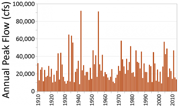
We can do similar calculations to estimate the frequency and magnitude of floods. For example, Figure 3 shows the annual maximum series of flows for the Lehigh River at Bethlehem, PA from 1910 to 2013. The annual maximum series is simply the highest flow value recorded for each year (typically for the water year, October 1 – September 30 as discussed in module 3). The largest flow on record (92,000 cfs) occurred in 1942 (on May 23, to be exact). Note that these are daily flow values which average flow over the course of the entire day, so the actual peak that occurred on May 23 was probably slightly higher. Interestingly, the year that had the smallest peak discharge on record was April 6, 1941 (only 8210 cfs, less than 10% of the whopper flood that came through the following year). But note that we are still talking about the highest flow for that particular year, which is still considerably higher than the average annual flow which is about 1,300 cfs. How can we use this information to predict what might happen in the future to support decisions about development, flood risk, or factors that may influence biota in the river or floodplain (e.g., factors limiting the return of certain fish)?
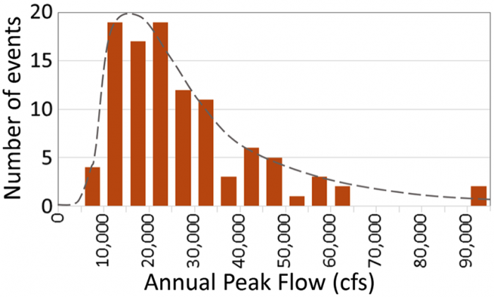
Similar to the precipitation example above, it helps to reorganize the data. The histogram shown in Figure 4 illustrates the frequency of events in 19 different “bins”. For example, the Lehigh River at Bethlehem, PA has never experienced an annual peak flow less than 5,000 cfs, so there is no orange bar in that bin. But it has experienced 4 peak flows that fall between 5,000 and 10,000 cfs. It has experienced a total of 55 peak flows that fall within the range of 10,000 to 25,000 cfs. These are the most common peak flows for the Lehigh River. And you can see the two outliers at the high end (92,000 cfs in 1942 and 91,300 cfs in 1955).
Typically, hydrologists will approximate the distribution of events that you see in Figure 4 as a probability density function, represented by the smooth, dashed-grey curve superimposed on the plot. This allows them to integrate under the curve above a value of interest to determine the probability that a flood of that magnitude (or larger) will occur. For example, integrating to find the area under the grey dashed curve above 60,000 cfs in Figure 4 would tell you the probability in any given year (in the future) that a flood of that magnitude (or larger) will occur. From that information, you can build your bridge to the appropriate size, or set your flood insurance rates accordingly, etc. Calculating probabilities associated with floods of a given magnitude is discussed in greater detail in the exercise associated with this module.
The same general principles apply to studying droughts. However, as we discuss below, droughts are more difficult to define and quantify because they build up over time and vary immensely over any given area. Nevertheless, similar plots of drought frequency, severity and duration can be developed for droughts, similar to Figure 4, to make sense of all the messy variability we observe in water deficiencies. With this brief introduction hopefully you can appreciate the great challenges in predicting the occurrence and severity of floods and droughts, and you can begin to see the implications for socio-economic systems and ecosystems.