
Consider the Layout
Now that you have an outline of what you want to present, it is time to choose a layout. As you can imagine, creating an effective infographic is a bit more complicated than simply putting facts and images together. The information must also be efficiently organized to demonstrate the connections between important concepts or ideas. There are several ways in which you can organize your content. Please watch the following video for some ideas.
10 Types of Infographics (3:50)
PRESENTER: So you have your idea, you've done your research, and you've collected your data. Now you're probably wondering what type of infographic format would best represent and communicate your information effectively. There are many different types of infographics. And sometimes a combination of these types is used in a single infographic. So as you plan your infographic design, consider these 10 types of infographics.
Number 1, a visual article infographic makes a piece of writing more visual. It is best used to cut down on text or make an article more interesting and enjoyable to consume. It also increases sharing potential through social networks.
Number 2, the list-based infographic, supports a claim through a series of steps. It is best used to support a specific claim or argument. Your list can go from top to bottom, left to right, or it can even move across your page.
Number 3, a map infographic showcases data trends based on location. It is best used to compare places or cultures with setting-centric data or demographics.
Number 4, the comparison, or versus infographic compares two things in a head-to-head study. It is best used to highlight differences between two similar things or highlight similarities between two unlike things. It can also be used to prove how one option is superior or inferior to the other option.
Number 5, the flowchart infographic offers specific answers to a question via reader choices. It is best used to provide personalized solutions for readers or show how multiple situations can reach the same conclusion.
Number 6, a data visualization infographic communicates complex data through charts and graphs. It can even showcase data through design. It is best used to make data driven arguments easier to understand and make facts or statistics more enjoyable to absorb.
Number 7, the timeline infographic tells a story through a chronological flow. It is best used to show how something has changed over time or make a long, complicated story easier to understand. It can also show how one thing leads to another.
Number 8, a visual resume turns text-based resumes into stunning visuals. It is best used to help job candidates get noticed during the recruitment process. It also helps candidates stand out in non-traditional industries or positions that are looking for creative and out-of-the-box thinking.
Number 9, a process infographic helps explain a series of steps or actions to complete a task. It is best used to simplify a complex process or to break down each step with information that is easy to digest.
Number 10, an animated infographic adds motion to complex information and ideas. It is best used to capture and hold your viewer's attention. It can also direct the attention where you want it.
Now that you're familiar with these 10 types of infographics and when to use them, it's easy to choose a format that works for your content. So grab your information and data because you're ready to organize it visually.
Your experience probably best fits into one of the following: the visual article, the flowchart, the timeline, or the map. But, you don't have to use these types, feel free to improvise, combine, or modify any of them to reach your desired outcome!
Layout Cheat Sheet
The image below offers some additional layout ideas for your infographic.
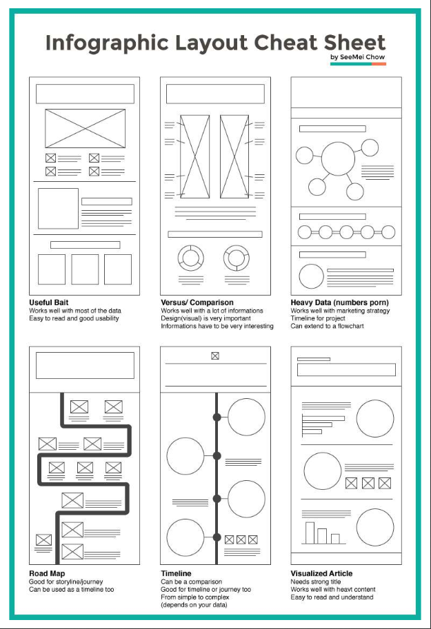
- Useful Bait: Works well with most of the data; Easy to read and good usability
- Versus/ Comparison: Works well with a lot of information; Design(visual) is very important; Information has to be very interesting
- Heavy Data (numbers porn): Works well with a marketing strategy; TImeline for the project; Can extend to a flowchart
- Road Map: Good for storyline/journey; Can be used as a timeline too
- Timeline: Can be a comparison; Good for timeline and journey too; From simple to complex (depends on your data)
- Visualized Article: Needs strong title; Works well with heavy content; Easy to read and understand
Again, some of the layouts shown above may fit your story better, but there is no prescription here, be creative!
Your experience probably best fits into one of the following: the visual article, the flowchart, the timeline, or the map. But, you don't have to use these types, feel free to improvise, combine, or modify any of them to reach your desired outcome!
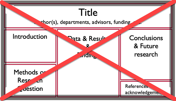
Example of what not to do
Below is an example of a traditional poster. Most of your infographics should not look like this.
Special thanks to Hailley Fargo, Head of Education and Outreach Services, Northern Kentucky University, for much of the guidance and information contained on this page.