Learning Objectives Self-Check
Read through the following statements/questions. You should be able to answer all of these after reading through the content on this page. After going through the content, check the boxes next to the questions/statements that you feel at least somewhat confident answering. I suggest writing or typing out your answers, but if nothing else, say them out loud to yourself. This is to help you reflect on important content, and will help you prepare for this week's quiz. It will also help lay the foundation for future course content.
It should be clear by now that energy can take many different forms and is often converted from one form to another. Though different forms of energy cannot always be used the same way (ever tried to watch TV by plugging into a lump of coal?), you can always express the amount of energy present in different forms using the same units by using unit conversions. There are many energy units, but the most common unit you’ll see in the U.S. is the British Thermal Unit or Btu. Joules are considered the international unit of energy (you may see these from time to time in the U.S.), but since we like to make things difficult for scientists in the U.S. by using English units instead of metric, we’ll stick mostly to Btus in this course.
A Btu is defined as the amount of heat required to heat up one pound of pure water one degree Fahrenheit. To give you some perspective, a single match releases about one Btu if it is allowed to burn entirely.
The following are examples of commonly used energy equivalencies, i.e., unit conversions:
- One kilowatt-hour (kWh) of electrical energy is equivalent to exactly 3412 Btus of energy.
- Each time you burn a gallon of gasoline in a car, you convert approximately 120,000 Btus to other forms of energy (mostly as waste heat, it should be noted).
- Every 100 cubic feet (ccf) of natural gas that is burned releases approximately103,700 Btus of energy. (Note that 1 ccf = 100 cubic feet, so there are approximately1,037 Btus in 1 cubic foot, or cf).
- You know the calorie labels on the side of packaged food? Those are actually kilocalories, and each one is equivalent to just under 4 Btus of energy.
- There are about 1,055 Joules (J) in 1 Btu.
These are but a few examples - you can pick any amount and any form of energy, and it can be converted to Btus or any other energy unit. The US EIA has a useful unit converter.
This is useful in many ways, one of them being that it is possible to tally up all of the energy “used” by a given person or group of people – including a city, state, country, continent, or even planet – and convert that number to a single quantity to see how much energy is being used. Further, it is often possible to separate total energy use into categories to compare uses. This can provide a nice snapshot of energy use and can tell you a lot about the energy regime in an area, including how much is being wasted.
Visualizing Energy Use
The U.S. Department of Energy (DOE) is part of the Executive Branch of the U.S. government. According to whitehouse.gov: "The mission of the Department of Energy (DOE) is to advance the national, economic, and energy security of the United States." The DOE is another excellent source of information (the US EIA is run by the DOE). In addition to providing information, the DOE funds a lot of research, much of which is performed by people in the national labs. There are 17 national labs in the U.S., each with a different research focus. The national labs host some of the top researchers in the U.S., and because they are funded by taxpayers, all of the non-sensitive information is published for free. These are great sources of reliable and cutting-edge information. (Feel free to browse the national labs' website.)
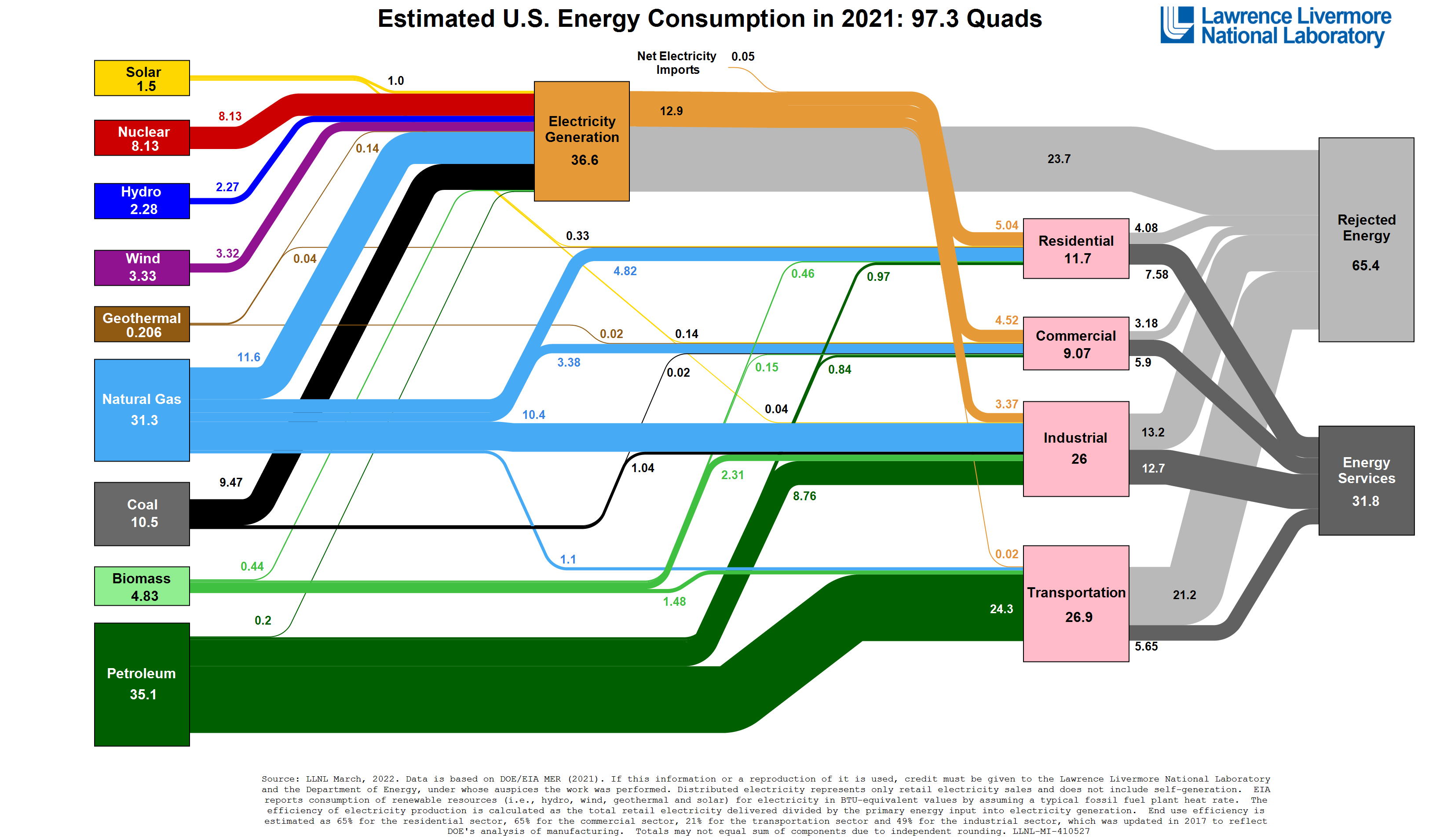
Apropos to our discussion of energy use, Lawrence Livermore National Lab (LLNL) in California publishes annual energy use data for the U.S. and often for U.S. states. The image below (click on it to see a larger version) shows the most recent estimate of energy use in the U.S., divided by source. IMPORTANT: LLNL uses quads as their fundamental unit. As mentioned in a previous reading, a quad is a quadrillion Btus, which is 1,000,000,000,000,000 BTUs, or 1 x 10¹⁵ Btus. (Side note: This is one of my favorite charts! I appreciate the amount of information it provides and the ease with which it can be interpreted. It tells a robust - and important - story about energy use in the U.S. I can't be the only one that has favorite charts, can I? Anyway, moving on...)
You can click on the chart to open a larger version in a new window.
he "blocks" on the left are energy sources (also called primary energy), the pink blocks on the right are end-use sectors (note that electricity is NOT an end-use sector), and the grey blocks to the far right indicate whether or not the energy was successfully used ("Energy Services") or wasted ("Rejected Energy"). All of the numbers in the chart indicate total energy flows or uses. Think of this as a flow chart - follow the lines from left to right to see how energy is used in the U.S.
Let's look at coal as an example. (Find coal on the left side of the chart, then follow the lines coming from coal on the chart and observing the numbers associated with those lines.):
- The U.S. used about 10.5 quads of coal in 2021 (this is up from 9.7 in 2020 and down from 17.9 quads in 2014, by the way).
- Of that, 9.47 quads were burned to generate electricity, and
- 1.04 quads were used in the industrial sector (mostly to create heat for things like making steel), and
- 0.02 quads were used in the commercial sector
You can see where each energy source was "used" by following the chart. Oil is mainly used in the transportation sector but is used in all others as well. Natural gas is used in many sectors too. Nuclear is only used for electricity generation. All of this can be seen by following the energy sources on the left to the end uses on the right of the chart.This type of diagram is called a Sankey diagram and can be used for any number of purposes. Lawrence Livermore creates Sankey diagrams for each state, and many countries have diagrams as well. There are even some used to describe water and carbon flows in the U.S. At any rate, it is a useful tool for analyzing energy and other resource flows.
Check Your Understanding - Chart Analysis
Answer the following 2 questions.
Optional (But Strongly Suggested)
Now that you have completed the content, I suggest going through the Learning Objectives Self-Check list at the top of the page.