Label Placement
Ideal label placements are always context dependent—many factors, such as the density of map features or character length of place names, will determine the best way to place your labels. Even so, it is helpful to understand best-practice guidelines for placing labels on maps. In this section, we will learn how best to place map labels for point, line, and area (polygon) features. As a cartographer, you will apply these guidelines using both automatic labeling procedures in GIS software and though the manual editing of graphic text.
Point labels
When placing point labels, two factors are of primary importance: (1) legibility, and (2) association. You don’t want your reader to struggle to read your map labels, and it should always be clear to which point each label refers.
The first guideline to remember is that adding point labels is not like making a bulleted list—your labels should be shifted up or down from their associated point feature. An example ordered ranking of label placements for point feature labels is shown in Figure 2.4.1.
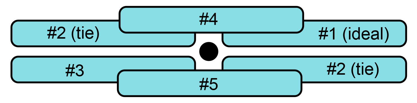
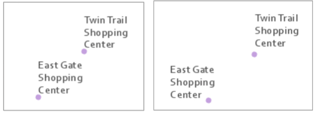
Though the placement ranking guidelines in Figure 2.4.1 provide a good starting point, it is notable that cartographers do not always agree on this specific order. If you are a very astute reader, you may notice that these recommendations vary slightly from the point label placement guidelines given by Field (2018) in this week's required reading. Cartography is not only a science but an art, and sometimes there is more than one right answer. Additionally, while such guidelines are helpful, label placement is a continuous balancing act. Figure 2.4.2 (left) shows two labeled points, both placed at the ideal label position shown in Figure 2.4.1. This arrangement of point labels, however, makes it seem ambiguous to which point “East Gate Shopping Center” refers. In Figure 2.4.2 (right), this label is moved to the second position. The ambiguity disappears.
In addition to the orientation of point labels, you will also need to decide how closely to place them to your point features. In the left image, labels are placed very close to points, while on the right, labels are placed at a greater distance from their associated point symbols. Though map elements that appear too tightly packed are generally undesirable, how closely your labels and points are placed will depend on the size, shape, and density of your labels, points, and map. Most important is maintaining consistency throughout your map design.
Another important consideration is when and where you will apply line breaks to the text on your map. When it fits on the map, showing the entire label on one line (Figure 2.4.3; left) is appropriate. However, due to the density of map features and length of feature names, this is often not possible.
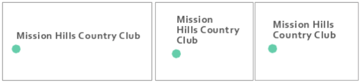
When line breaks are used, place them at natural breaks in the feature name. For example, Mission Hills Country Club looks strange as Mission/Hills Country/Club (Figure 2.4.3; middle) but natural as Mission Hills/Country Club (Figure 2.4.3; right). You should also use spacing between lines that is smaller than the spacing between other labels on the map, clearly demonstrating that these lines of text belong together.
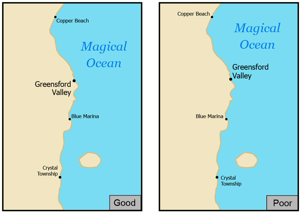
Point labeling is further complicated when labeling multiple types of point features. Your goal should be again to avoid ambiguity—labels should help demonstrate feature categories. As shown in Figure 2.4.4, it is best to label land features on land, and coastal features in water.
Label design is about the details, and often very small changes to label placements can really improve the readability of your map. Figure 2.4.5 below shows how a couple of small edits were used to improve a set map labels. From left to right, line spacing within the “Shawnee Nieman Center” label was decreased to -2 pts., and then the "Nieman Plaza label" was shifted to the left.
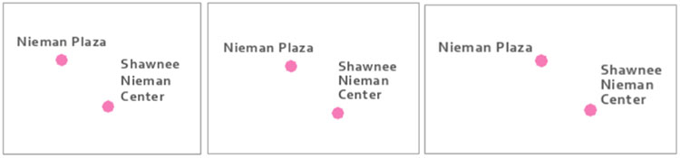
Note that though counterintuitive, the use of -2 line spacing, or leading, does not create overlapping lines. Negative leading is generally recommended for multi-line labels—too much space between lines makes them look disjointed, which may cause map readers to incorrectly perceive them as separate labels (referring to separate features).
Line Labels
When labeling line features, similar guidelines as for point labeling exist—design for association, but not at the expense of legibility. Labels should generally follow line features—but not cross over perpendicular lines—as this makes the text harder to read. In some instances, this advice will not be practical, but it is best to first learn the rules so you can more thoughtfully break them.
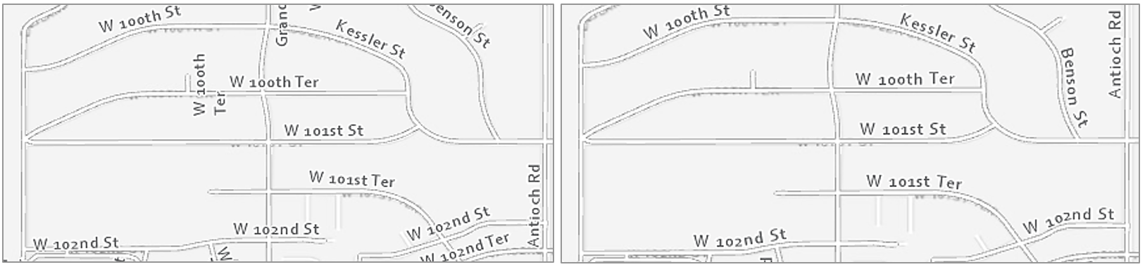
Figure 2.4.6 shows two maps with labeled streets; the right-sided image is a definite improvement. Unlike in the left map, labels in the right map are aligned with streets and do not cross other lines. Labels in the right map are also better aligned for the eye to understand the naming conventions of the neighborhood: see W 100th Ter, W 101st St, and W 101st Ter, from North to South (maps are North-up). It is much easier to understand this progression in the right map. This sort of line placement is also useful when labeling contour lines, which have an even more important orderly progression.
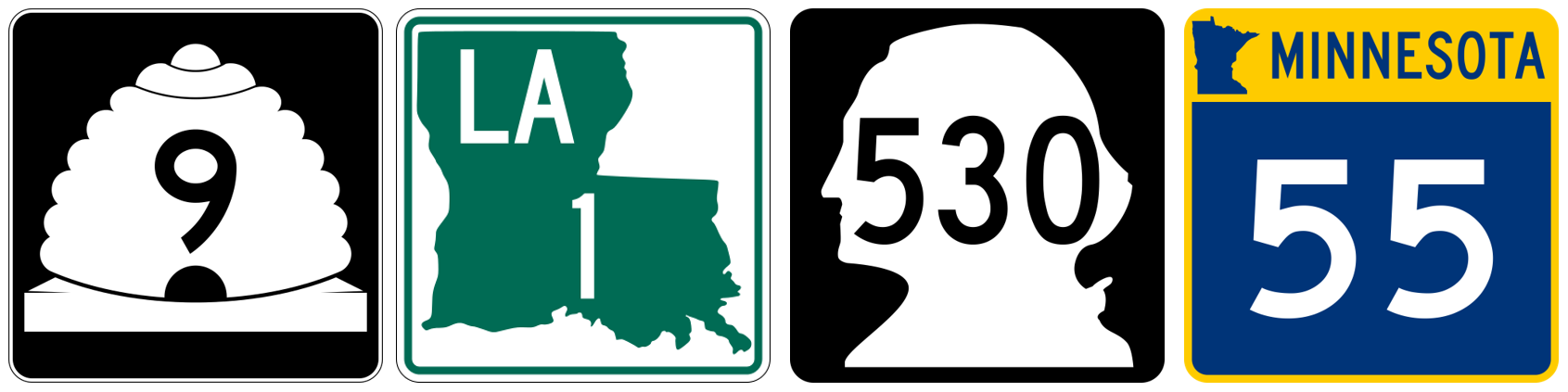
In lieu of map labels, shields are often used to label highways and other important roads. Though interstate shields in the US are consistent, many states have unique highway shield designs. Using these custom shields in your maps is not always practical, but it can give them local character, and create a better match between the map and the real world.
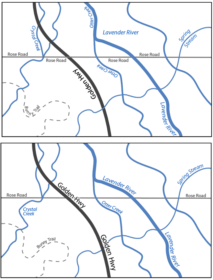
Similar but additional guidelines exist for labeling non-road line features, such as flowlines. Streams, rivers, and other waterlines should be labeled with text that shows their categorical difference from road features. This is often done with italics (text posture), and/or by using a hue that matches the feature symbol. Figure 2.4.7 shows several examples of labels applied to the stream “Little Cedar Creek”. The label in the map at the left is legible but does not follow the flow of the creek—it looks rigid, as if it is a road label. In the middle map, the label does follow the creek, but this time too much so—it is difficult to read. The label placement in the far-right map is best—a gentle curve makes it clear that this label refers to a water feature, but not at the expense of legibility.
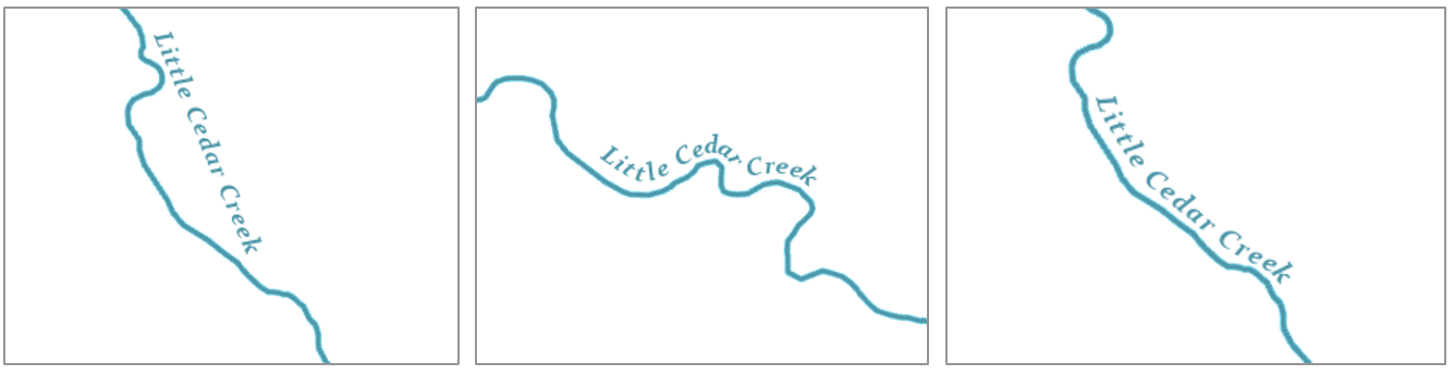
Figure 2.4.9 contains additional examples of line label improvements. Three general guidelines are demonstrated by this figure: (1) follow the feature, but not at the expense of legibility, (2) place labels above lines rather than below, (3) don’t write upside down.
If a line feature is quite long, the label will need to be repeated periodically. The interval at which your line labels repeat is up to you as the map designer and will depend on the map’s feature density, audience, presentation medium, and purpose.
Area labels
Just as rivers are labeled with curves to follow the flow of water, area features should be labeled in a way that highlights their most characteristic feature: extent. Labels for natural features such as water bodies and mountain ranges should demonstrate their physical extent across the landscape. Use UPPERCASE letters and stretch the label across the area of the feature.
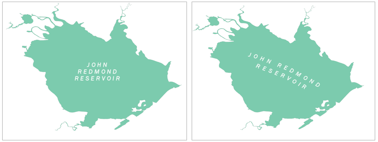
When covering areal extent with labels, focus on finding a balance between character spacing and size. Increasing spacing is generally best—recall that increased font size suggests increased importance. To cover the extent of a feature, however, you may want to increase font sizing somewhat—too distant spacing with a small font size is likely to be challenging to read.
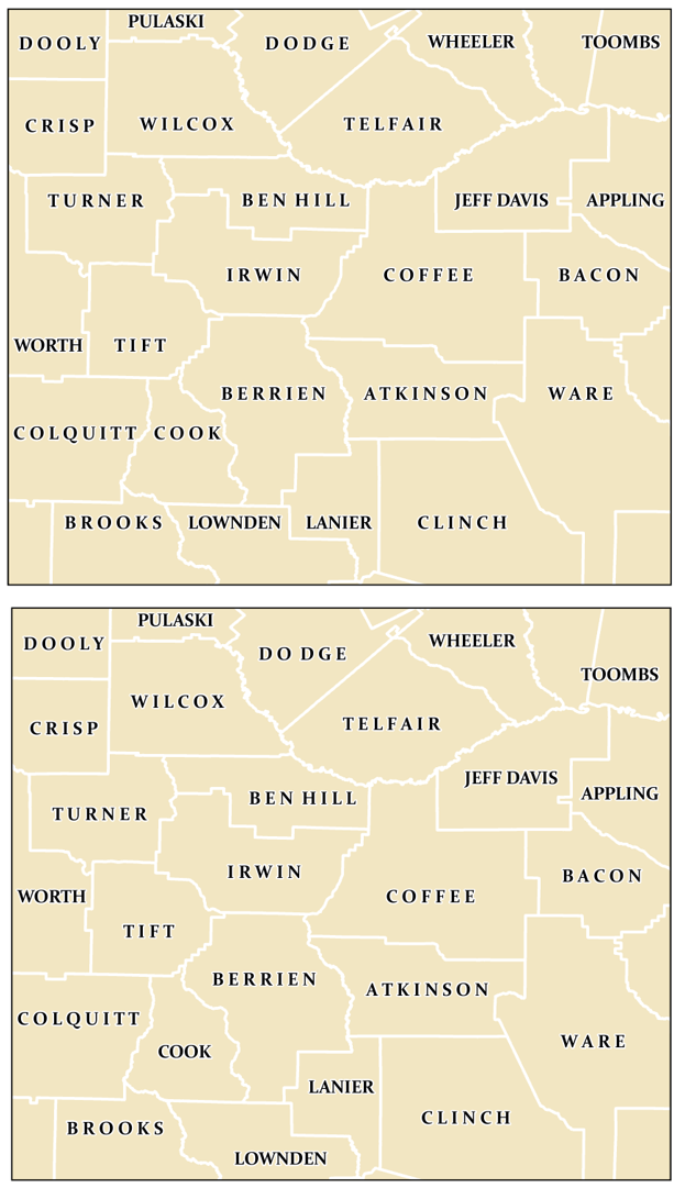
A common mistake to avoid is aligning area labels horizontally across the map frame. Though horizontal alignment is helpful when reading large blocks of text, this design is off-putting when viewed on a map (Figure 2.4.11; top). Stagger area labels for increased legibility (Figure 2.4.11; bottom).
Like regular line feature (e.g., roads, rivers) labeling, avoid labeling across boundary lines when prudent. When labels must cross over map lines, ensure that this does not compromise their legibility, nor overly obscure the feature underneath.
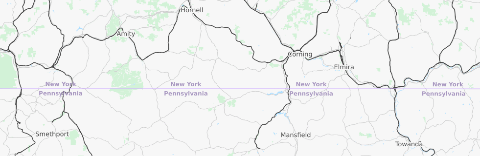
In some instances, particularly for political boundaries, it makes more sense to label the boundary of a feature, rather than its extent. You have likely seen this implemented in maps for navigation, or other interactive basemaps (Figure 2.4.12).
When labeling maps, you will often encounter locations with a lot of features in need of labels; this can pose a significant challenge. Leader lines can be used to connect features with labels that do not fit on or directly adjacent to their respective feature on the map. However, you should not overuse text halos, as these can obscure the map features underneath (Figure 2.4.13; top left). Nor should you overuse leader lines (as shown in Figure 2.4.13; top right)—this leads to a visually confusing map. Instead, find a balance between these techniques; experiment with label hue contrast and use leader lines sparingly. With practice, you will be able to create a well-balanced set of labels, such as shown in Figure 2.4.13 (bottom).
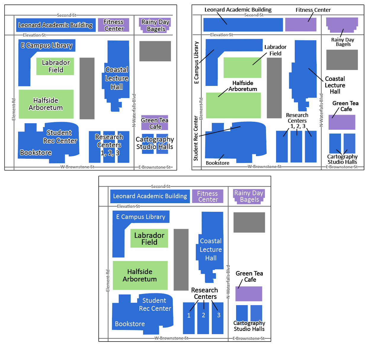
Further improved cartographic design is shown in Figure 2.4.14. This map shows how text color contrast, sizing, and occasional use of leader lines can create a balanced, legible, and aesthetically pleasing map design—even in a complicated map with many labels.
In summary: when creating a map feature label, balance different techniques, and continually ask yourself two over-arching questions: (1) Is the label clearly associated—both in style and positioning—with the feature being labeled? (2) Can I read it?
Recommended Reading
- Imhof, Eduard. 1975. “Positioning Names on Maps.” The American Cartographer 2: 128–144.
- Chapter 6: Labeling Maps. Brewer, Cynthia A. 2015. Designing Better Maps: A Guide for GIS Users. Second. Redlands: Esri Press.
- Placing type (pgs. 346-350): Field, Kenneth. 2018. Cartography. Esri Press.
- Axis Maps. 2017. “Labeling and Text Hierarchy in Cartography.” Cartography Guide.