Layout Essentials
“Design is as much an act of spacing as it is an act of marking.” – Ellen Lupton, Thinking with Type
When designing a map layout, it is important to design using visual hierarchy—arrangement of graphic elements in a way that signifies their order.
The following map elements are listed by (Slocum et al., 2009) in their general order of importance:
- Frameline and neat line
- Mapped Area
- Inset (e.g., locator map)
- Title and Subtitle
- Legend
- Metadata (Author, Date when map was made, Data Source, Data Source Year)
- Scale
- Orientation (e.g., a north arrow)
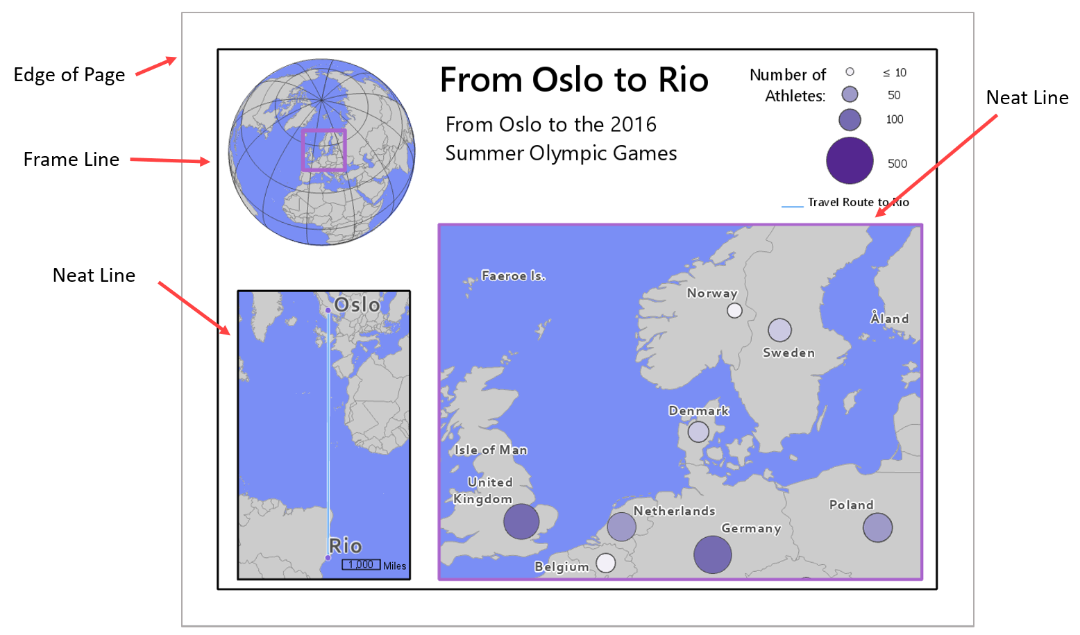
Frameline
Most of these elements are intuitively named, but the difference between a map’s frameline and neat line can be confusing. A frame line encloses all elements on the map layout, while a neat line crops the map area. A graphic explanation is shown in Figure 2.5.1. A frame line might also act as a neat line if all elements (e.g., legend, title) are shown within the map area (Slocum et al., 2009).
Organizing Space
It is typically efficient to place the most important features first, as they will take up the most space on the page. Be cautious, however, not to just start adding items wherever there are holes in the layout—good design is about balancing white space, which does not mean just filling it in. Often, the best way to find a good layout arrangement is to try many different arrangements and note what works. There will never be just one correct way to arrange all map elements.
Important Reading!
The graphics and explanations in Designing Better Maps are exceedingly helpful for developing an understanding of layout balance and design. This would be a good time to complete the required reading for this week.
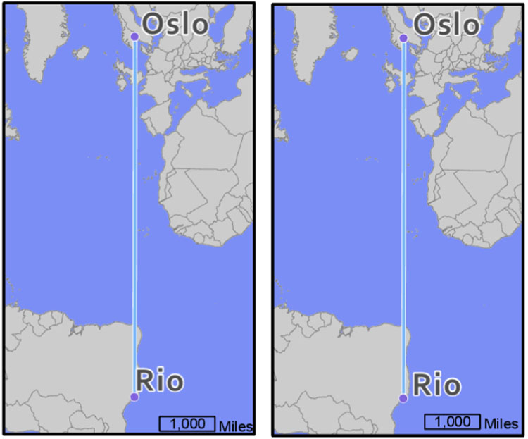
When placing elements on the page, be cautious to leave enough space between them. For example, Figure 2.5.2 below shows how adding just a bit of negative space can result in a cleaner, clearer map design.
Another important component of layout design is the intentional reduction of ambiguity. For example, if your layout includes multiple maps (e.g., a primary and a locator map), and multiple scale bars, it should be clear which scale bar is associated with which map.
Using boxes (e.g., boxed legends) will often seem like an easy solution, but you should use these sparingly, as they tend to create crowding and making aligning map elements more challenging. As you finish designing your layout, ensure that all elements are visually aligned. See the recommended reading below, as well as the required reading for this week, for additional detail and images of proper layout alignment and design.
Recommended Reading
Chapter 11: Map Elements and Typography. Slocum, Terry A., Robert B. McMaster, Fritz C. Kessler, and Hugh H. Howard. 2009. Thematic Cartography and Geovisualization. Edited by Keith C. Clarke. 3rd ed. Upper Saddle River, NJ: Pearson Prentice Hall.