Types of color schemes
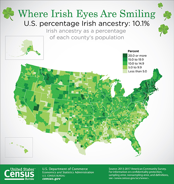
When applying color schemes to maps, there are many factors to consider. First and foremost, keep this rule in mind: the perceptual structure of the color scheme should match the perceptual structure of the data. For example, if your data go from high to low (sequential data), you should use a color scheme that demonstrates this order, as shown in the map in Figure 4.3.1.
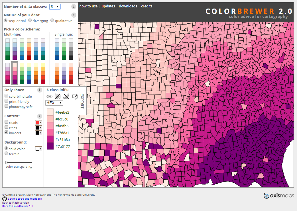
There are three main types of color schemes: sequential, diverging, and qualitative. A popular tool for choosing color schemes on maps is ColorBrewer, designed by Dr. Cynthia A. Brewer at Penn State. ColorBrewer’s interface is shown in Figure 4.3.2. You may find it helpful to explore the many color schemes available on the site as you read more about types of color schemes in this lesson and consider how you might apply them to your maps.
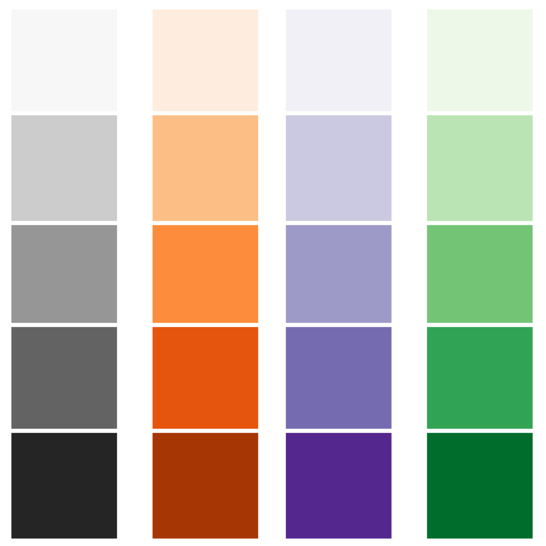
Sequential color schemes are the most popular color schemes used in thematic mapping, as they are excellent for demonstrating the order of data values. Several examples of sequential color schemes are shown in Figure 4.3.3.
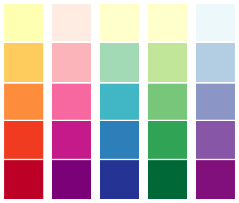
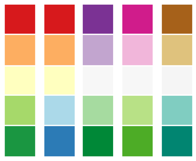
Though color lightness is effective on its own, sequential color schemes are also often designed with multiple harmonious hues, such as in the color schemes shown in Figure 4.3.4. The multi-hued nature of these color schemes can make it easier for viewers to discriminate between all data classes on the map. They also often create more aesthetically-pleasing visualizations. As long as it doesn't take away from readers' comprehension of your data, why not make a better-looking map?
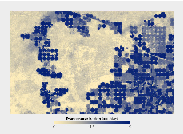
As shown in Figure 4.3.5, when hue is paired with lightness it can create a dramatic effect in a sequential map. When making such maps, ensure that they accurately reflect the progression of your data—it is challenging to create an effective sequential color scheme that relies heavily on hue.
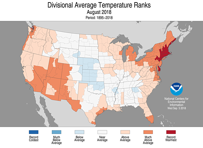
Diverging color schemes are similar to sequential color schemes, as they also demonstrate order. Instead of showing a single progression, however, they visualize the distance of all values from a critical point. These color schemes work well for depicting data that have a critical middle value or class (such as maps showing percent change).
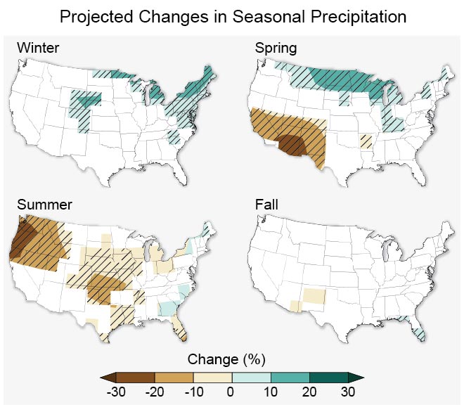
If your data has a natural midpoint—such as the absence of change— a diverging color scheme works well, as it permits the reader to easily identify values on the map as either above or below that value. An example of this is shown in Figure 4.3.7 below.
Other values can also serve as helpful midpoints in mapped data. For example, a map might use a diverging color scheme to demonstrate values that fall above or below the data’s mean, or perhaps some external goal-worthy value (e.g., a choropleth map of median income where a diverging color scheme is centered around a calculated value of a living wage).
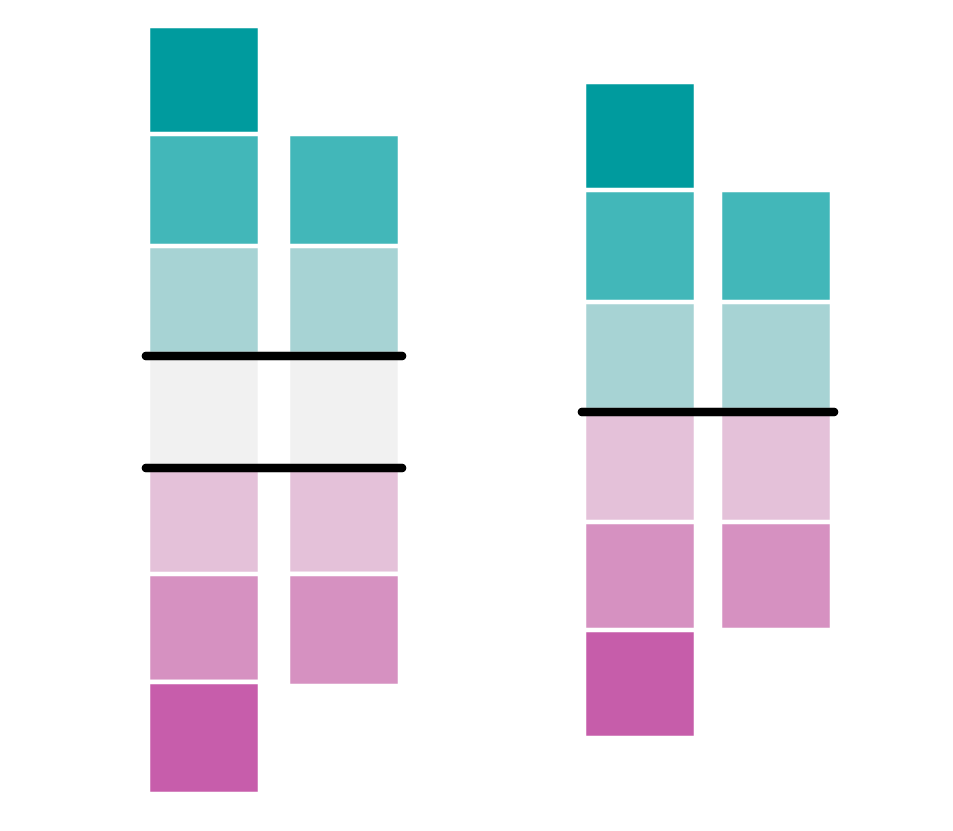
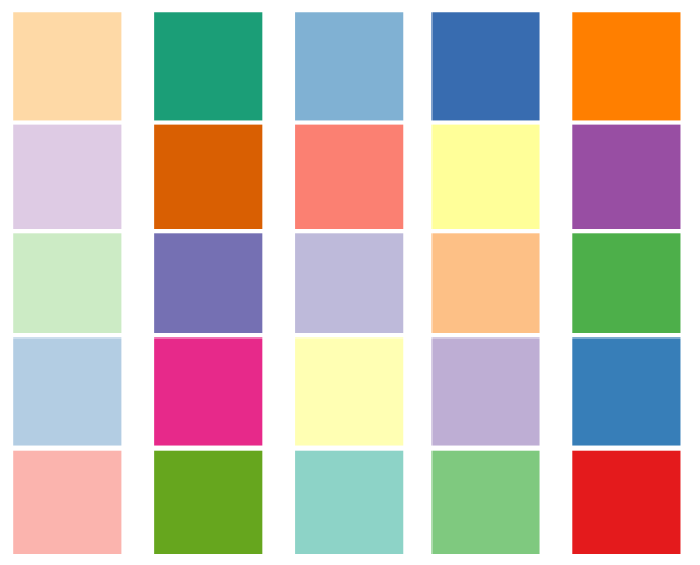
An important consideration when applying a diverging color scheme is whether your data has a critical break or a critical class (Figure 4.3.8). Using a diverging scheme with a critical class will highlight a critical group of areas on your map, as well as those above and below. A critical break will show all areas as either above or below a critical value –there is no “neutral” color class in this scheme. Diverging schemes also do not always have to be symmetrical. Your critical break/class will often be near the center of your data range, but it in no way needs to be.
Keep the divergent schemes shown in Figure 4.3.8 below in mind as we discuss data classification for choropleth mapping later in the lesson.
Student Reflection
View the map in Figure 4.3.9 below. Why is a diverging color scheme used here? What does the map tell you? What doesn’t it tell you? Would you design it differently?
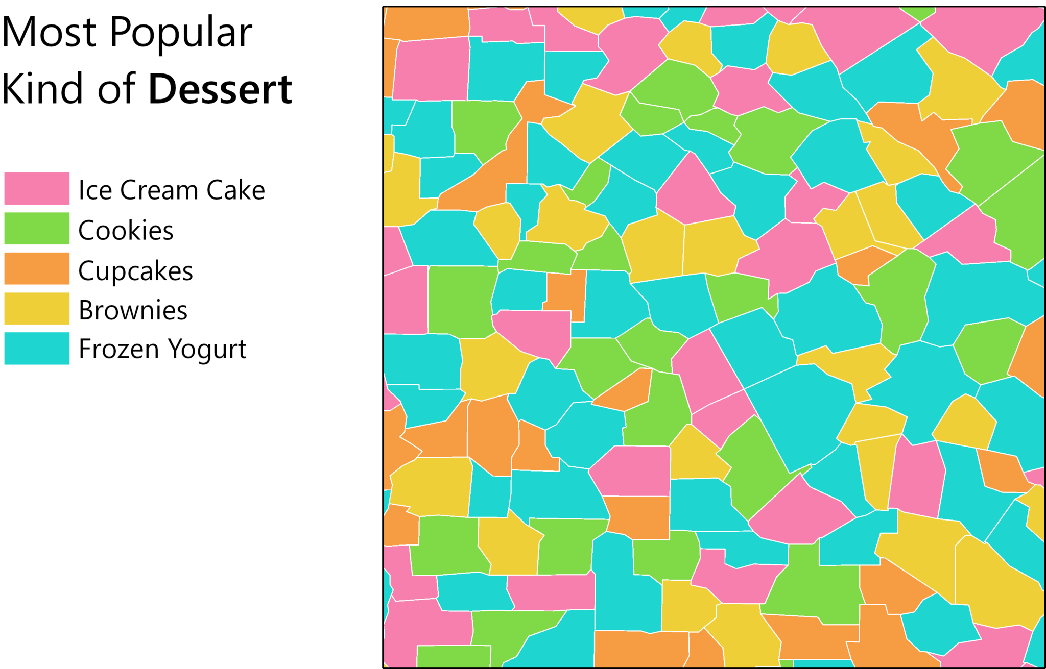
The third type of color scheme is the qualitative color scheme. These schemes are used to demonstrate differences—but not order—between map features. Several examples are shown in Figure 4.3.10 below.
Qualitative color schemes are often used when creating maps of political boundaries, or to create categorical choropleth maps, such as the one in Figure 4.3.11. As the term choropleth is composed of the Greek words for “area/region” and “multitude,” it is technically incorrect to refer to a map of nominal values as a choropleth map, despite the characteristic enumeration-unit shading such maps employ. These maps should instead be called chorochromatic maps.
Perhaps the most common use of qualitative color schemes in mapping is in land use/land cover maps. These maps seek to demonstrate category (e.g., residential vs. commercial) but not to demonstrate order. An example of a land cover map is shown in Figure 4.3.12.
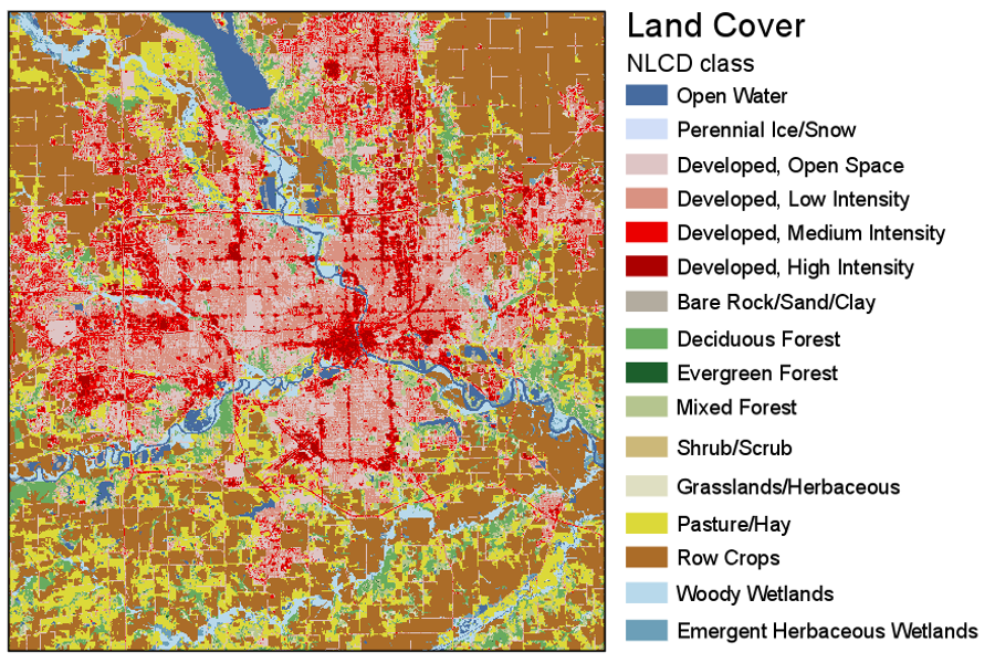
The (color vision unimpaired) human eye can discriminate between about twelve different hues; dependent on the reader and the design of the map, often even less. Many maps, and land use/land cover maps in particular, contain more than this number of categories. A frequent strategy is to group categories into hue classes (e.g., green for vegetation) and then to use lightness and saturation to create intra-class differences. In Figure 4.3.12, for example, green hue is used for forest, and lightness variations are used to differentiate between forest types.
Student Reflection
View the categories of land cover in Figure 4.3.12. Does the perceptual structure of the data match the perceptual structure of the colors assigned? Does it do so in more ways than one?
Recommended Reading
- Chapter 8: Color on Maps. Brewer, Cynthia A. 2015. Designing Better Maps: A Guide for GIS Users. Second. Redlands: Esri Press.
- Chapter 14: Choropleth Maps. Slocum, Terry A., Robert B. McMaster, Fritz C. Kessler, and Hugh H. Howard. 2009. Thematic Cartography and Geovisualization. Edited by Keith C. Clarke. 3rd ed. Upper Saddle River, NJ: Pearson Prentice Hall.