Part I: Visually Explore Trends
Part I, we will explore several tools and technique to make it easier to visually interpret patterns in your data using ArcGIS. These can be especially helpful when you have multiple datasets to compare.
-
Organize Your Map and Data
- Open a new blank Map and save the project in your L4 folder (uncheck "Create a new folder for this project").
- Set your Current Workspace and Scratch Workspace to your L4 folder by navigating to the Analysis tab, Geoprocessing group, Environments
 .
. - Add the study area boundary (Study_Site), Ottawa National Wildlife Refuge boundary (OttawaNWR), polygons of vegetation groups (60s_VegGrp, 70s_VegGrp, 00s_VegGrp), and polygons of invasive species classes (60s_Invasive, 70s_Invasive, and 00s_Invasive) from your L4 folder.
- Change the study site and refuge boundaries symbology to hollow outlines. You don’t need to alter the symbology of the remaining layers since we will be doing this in Step 3.
- Check the projection of the current Map by right-clicking on “Map” in the Contents pane > Properties > Coordinate System. It should say “NAD_1983_UTM_Zone_17N.”
- Add the Open Street Map layer as a Basemap.
- Save your project.
-
Review Contextual Information
- One of our main research questions is how vegetation within our study area changes over time in response to fluctuating water levels. We need to know what the water elevation was for our study area for each of our study years. Since the wetlands in our study area are hydraulically connected to Lake Erie, we know they will both have the same water elevation.
- The water levels in the table below are from the Lake Erie Hydrograph (graph of water level over time). Compare the water levels for each year and rank them as high, medium, or low.
Year water Level (m) High, Med, Low 1962 173.9 1973 174.9 2005 174.2 
Based on the Lake Erie Hydrograph, how do the water levels for 1962, 1973, and 2005 compare to the long term averages for Lake Erie? Which years had the highest and lowest water levels between 1920 and the present?
-
Set Layer Symbology
- One of the first steps to understand trends in your data is to simply look at the spatial patterns. To compare time-series datasets, you want to make sure all of your layers have the same symbology settings. If not, it won’t make sense to visually compare them because changes in patterns may be related to different symbology settings instead of changes in your actual data.
- Layer files (.lyr) are a way to save symbology settings in ArcGIS. I’ve already created layer files for you for two purposes, first to save you time and second to demonstrate some of the tools available in ArcGIS to make your life easier.
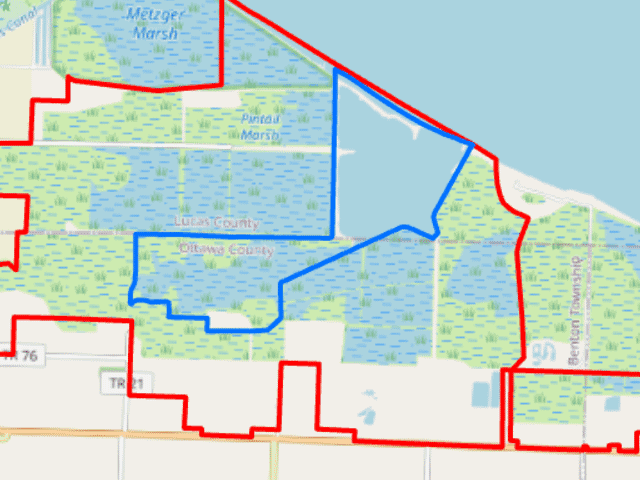
- Highlight the 00s_VegGrp in the Contents pane. Under Feature Layer, on the Appearance tab, in the Drawing group, click Import. This will allow you to import symbology from symbology layer file. Browse to the 00s_VegGrp.lyr file in your L4 folder. Make sure the Value Field matches as shown below. Click OK to apply and import the Symbology. Repeat for the 70s_VegGrp and the 60s_Veg_Grp layers in the Contents pane. Import the 00_VegGrp.lyr as the Symbology layer for both.
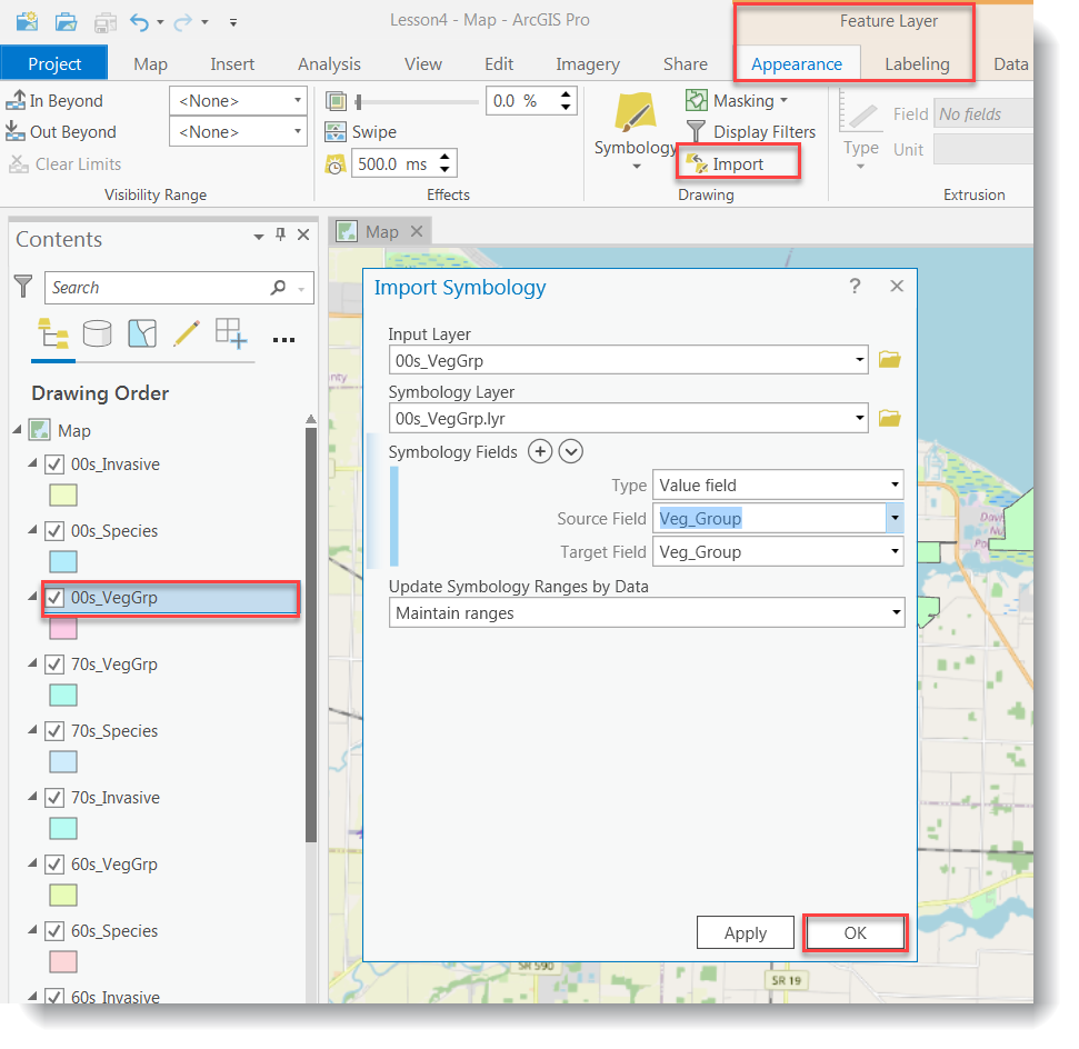
- Use the 00s_Invasive.lyr layer in your L4 folder to set the symbology for the time series invasive shapefiles. Save your map.
- Turn the different layers on and off to explore the changes over time.

One of the challenges of looking at time-series data of the same location is that all of the datasets overlap each other. It is very difficult to see all of the datasets at the same time if you have them all on the same map, especially if they are polygon files.
-
Create Time Series Animation
- Turning layers on and off manually is not really the best technique to visualize changes over time, especially if you have a lot of datasets or if you want to repeat the task many times. ArcGIS has a tool that allows you to set up animations of datasets that are in the same Map.
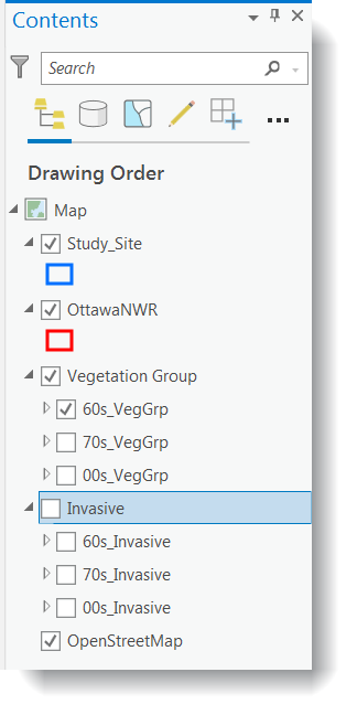
- To use this tool, I like to organize our data into different group layers within the Contents pane. Hold down the Ctrl key and select the “60s_VegGrp,” “70s_VegGrp,” and “00s_VegGrp” layers. Right-click > Group.
- Name the group “Vegetation Groups.” Repeat for the invasive species shapefiles. Name the group “Invasive.”
- The order in which the layers appear in the animation we are going to create is based on the order the layers are arranged Contents. Arrange the layers within each group so they increase in time from top to bottom like the example below.
In this lesson, we arranged the layers within each group chronologically. You could also arrange them in a different order, such as by their water level (low, medium, high) to visualize how the vegetation changes correlate with water level changes.
- We’ll start by creating an animation of the vegetation groups over time. Turn the “Invasive Group Layer” off in the Contents pane.
- In the Contents pane, make only the "Study_Site" and "OttawaNWR" layers visible. Go to the View tab, Animation group, and select Add
 .
. - Select the Append tool
 from the Create group. An Animation Timeline window will open with one thumbnail image in the Keyframe Gallery (showing the study site and Ottawa NWR layers at zero seconds).
 - Continue to append keyframes for each Vegetation Group layer by clicking the append next keyframe button
 after updating your map by turning the layers off and on.
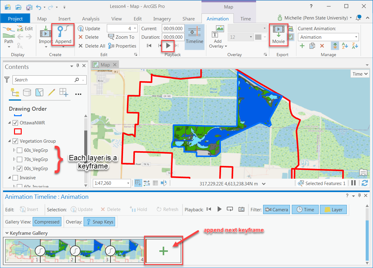
- Click the play button
 to preview your animation. You can adjust the duration if necessary.
 -

Make sure you have the correct answer before moving on to the next step.
When you preview your animation, you should see one layer turned on at a time beginning with the VegGrp_60s and ending with the VegGrp_00s.
If your data is not close to the example, go back and redo the previous step. You’ll need to clear the animation first by going to the View tab, Animation group, select Remove.
- Once you think that the animation is ready go to the Animation tab, Export group, and select Export Movie
 . Export the animation to your L4 folder (the example was exported to a .gif).
 - Now we’ll create an animation of the invasive species data over time using the Invasive Group Layer. Make sure you uncheck the “Vegetation Group Layer” and check the “Invasive Group Layer” in the Contents pane.
- Go to the Animation tab, Manage group, and select Create Animation
 to create a second animation within the Lesson4 project.
 - Repeat steps g and h using the Invasive Group layers.
- Preview your animation. Once you are satisfied with it, save it in your L4 folder. Go to the Animation tab, Export group, and select Export Movie.
If you want to be able to view your animation outside of ArcGIS, you can export your animation to a video file. You can also make your animations more sophisticated by exploring the available animation tools and options within ArcGIS. For example, you can add looping, string multiple animations together, add time-series labels, and add graphs that update over time along with your animation. You can find more information, such as help articles, sample animations, and tips in the Esri help topics.
-
Create a Map Layout with Multiple Map Frames
Animations are great for emailing to a client or adding to a presentation. However, if you want to print your maps, you need to create a layout. We are going to create a layout with multiple map frames to make it easier to compare our data over time. When working with multiple map frames that show similar information, it is easier to set the symbology, extent, and scale in one map, then make copies of the map, instead of setting up each map separately.
The final map layout should include all of the following elements:
- 7 map frames:
- The six main map frames should show the study area boundary, the Ottawa National Wildlife Boundary, and the Open Street Map layer.
- 3 of these map frames should show the vegetation group data, one for each time period (60s, 70s, 00s), each with its own title.
- 3 of these map frames should show the invasive species data, one for each time period (60s, 70s, 00s), each with its own title.
- 1 map frame should contain a locator map (see instructions below). This should be at a scale to show the study area in relation to the state of Ohio. It should include the Open Street Map layer and the location of the study area.
- The six main map frames should show the study area boundary, the Ottawa National Wildlife Boundary, and the Open Street Map layer.
- Legend (do not use default layer names with “_” or abbreviations)
- The water level during each time period (m)
- Scale (with units of km or miles)
- North Arrow
- Source Information:
-
In ArcGIS Pro, if two or more map frames reference the same map, any manipulation to the layers in the map (such as turning any layer on or off or zooming in or out) affects both map frames because the layout is referencing the same Map. To bypass this, a separate Map must be referenced for each Map Frame in a Layout. Go to the Insert tab, Project group, and select New Map. Insert six New Maps to your project (each should default to a different name Map, Map1, Map2, Map3...).
-
Switch back to your original Map. Switch off the Open Street Map Basemap for now, as it will increase the loading time while you are setting up your layout. Adjust your scale and extent, right-click on “Study_Site” in the Contents pane > Zoom to Layer. Turn on the 60sVegGrp layer.
-
Hold down the control key and highlight the "Study_Site", "OttawaNWR", "Vegetation Group" and "OpenStreetMap" layers in the Contents pane. Right-click and select Copy.
-
Go to Map1, right-click on the map name in the Contents pane > Paste. Turn the Study_Site, OttawaNWR, and 70sVegGrp layers on. Do the same in Map2 but turn Study_Site, OttawaNWR, and 00sVegGrp layers on.
-
Switch back to your original Map. Adjust your scale and extent, right-click on “Study_Site” in the Contents pane > Zoom to Layer.
-
Hold down the control key and highlight the "Study_Site", "OttawaNWR", "Invasive Group" and "OpenStreetMap" layers in the Contents pane. Right-click and select Copy.
-
Go to Map3, right-click on the Map name in the Contents pane > Paste. Turn the Study_Site, OttawaNWR, and 60s_Invasive layers on. Do the same in Map4 but turn Study_Site, OttawaNWR, and 70s_Invasive the layers on. And, then in Map5 turn on Study_Site, OttawaNWR, and 00s_Invasive the layers on.
-
Go to Map6, right-click on the Map name in the Contents pane > Paste. Turn the Study_Site, and OttawaNWR layers on.
- Go to the Insert tab, Project group, and select New Layout.
- Set up the page layout. Choose a Portrait page size of Tabloid (or another 11x 17-inch equivalent).
- Go to the Insert tab, Map Frames group, and click on the Map Frame tool
 . Select the default extent of the original Map in the gallery. On the layout, click and drag a rectangle to create the map frame for the original Map. Insert a total of 7 map frames (i.e., Map, Map1, Map2, Map3, Map4, Map5, and Map6) in your layout.
 - Select the Map6 map frame in the layout to activate it, and then right-click > Properties. In the Format Map Frame pane, select the placement button, and adjust the Width and Height. Resize the Map6 map frame to be 3 inches by 2 inches. This will become the locator map.
- Next, we’ll organize the map frames in the layout. Go to the Layout tab, Show group, and check the Rulers and Guides boxes.
- We’ll start by setting up guides and snapping to make it easier to format your layout. To add guides, right-click the ruler and pick "Add Guide" or "Add Guides". Pick Add Guide to create a single vertical or horizontal blue guide at the location you right-clicked the ruler. Pick Add Guides to open a dialog box with options for placing guides at exact locations.
- At the bottom of the layout view, click the Snapping button on. Also, click on the “Snap to guides” and "Snap to other elements" while in this option.
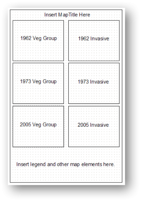
- Drag or reposition the map frames so they look like the example in the following template example. The locator map should fit in the area that says “Insert legend and other map elements here” in the graphic below.
- If one of your map frames has a handlebar border, this means it is the active map frame. The title of the active map frame will also appear bold in the Layout Contents pane. You can change which map frame is active by either selecting it in the layout or right-clicking on its name in the Contents pane > Activate.
Notice that all of the map frames are named “Map Frame.” Next, we’ll rename each map frame so we can tell which map frame belongs to which contents entry. It may help to click the arrow next to the titles in the Contents pane to hide the contents.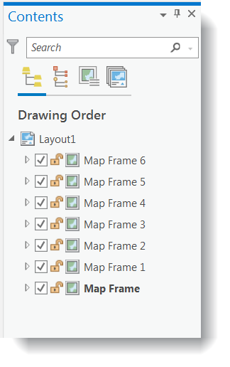
- In the layout, right-click on the map frame in the top left > Properties. The Format Map Frame pane will open, under General type “1962 Veg Groups” in the “Name”. Notice the map frame name also updates in the Contents pane. Rename the remaining map frames as shown in the graphic from step g above. Name the smallest map frame “Locator Map.”
- Remove the datasets that do not belong in each of the map frames. For example, in the “1962 Veg Group” remove the 70s and 00s VegGrp and all the invasive shapefiles.
- Insert a legend, scale bar, north arrow (you only need one of each since all of the map frames have the same symbology and scale), titles for each map frame, and source information.
- You will have to adjust the Legend to show all the layers in the map frames. After you insert the legend, right-click > Properties to see the Format Legend pane. Go to Options > Legend Items > Show properties and try turning off the Layer names to see multiple items in the legend. You may have to experiment a bit.
- Include the water levels for each year, from the table earlier in this document, on your map layout to aid in showing relationships between the water levels and the map layers.
- Turn back on the base maps in all of the map frames and save your project.
Adding neatlines to your map layouts helps to visually group elements together. This is helpful when your map has a lot of information. Go to the Insert tab, Graphics and Text group, and then click on Rectangle. After you place the rectangle in the layout, you can select it and right-click to format and adjust the symbology settings of the neatline.
- 7 map frames:
-
Visually Interpret Trends Using Maps
- Use the map layout you created in Step 5 to try to answer the following questions. We will repeat this exercise in Part II using statistical techniques instead of visual techniques.
- How has the amount and location of emergent vegetation changed over time? For example, has it increased or decreased?
- How has the amount and location of invasive species changed over time?
- How has the quality of habitat changed over time?
- How has the amount of emergent vegetation changed in response to water level fluctuations?
- Use the map layout you created in Step 5 to try to answer the following questions. We will repeat this exercise in Part II using statistical techniques instead of visual techniques.