Part II: Statistically Explore Trends
Visually exploring your data is a good way to start interpreting your results. However, it is difficult to determine the magnitude of change just by looking at a map. Calculating statistics allows you to have actual numbers to work with, allowing you to say that “variable x increased by 12%” instead of “variable x increased.”

While calculating statistics, it is very easy to make mistakes such as typos, choosing incorrect input layers, or using incorrect order of operations. To avoid possible errors, you should first visually explore your data so you have an idea of the trends that exist in the data. After calculating statistics, you can compare your results to your visual interpretation to make sure your statistical results seem reasonable.
-
Calculate Area Statistics
- Use the attribute tables of the vegetation groups and invasive species data to fill in the table below. You will use this table to answer some of the Lesson 4 Quiz questions.
Study Results Work Table Study Year Water Level (High, Med, Low) Area Open Water (sq m) Area Emergent Vegetation (sq m) Area Invasive Species (sq m) Area Controlled Invasive Species (sq m) 1962 1973 2005 
Which year has the most emergent vegetation? Which year has the most open water? Did you find it difficult to compare such complex numbers (lots of digits and decimal places)?
- Another technique to compare multiple datasets is to use percent of total area values instead of actual areas. It is important that all of the datasets you want to compare have the same area to use this technique, which is why we had to union and clip our starting data with the Study Area Boundary in Lesson 3.
- Add a new short integer field to the 60s_VegGrp named “pct_tot.” In this case, we are using an integer data type since we are not concerned with decimal places.
- Calculate the percent total of each vegetation group using the field calculator. (Percent Total Area = Area of Each VegGroup/Area of All VegGroups * 100). Hint: You can use the Statistics tool to easily find the combined area of all VegGroups. Right-click the SUM_sqm field. The graphics below show the area value from the 60s_Veg_Group file. There may be a slight difference in the total area values between the different layers.
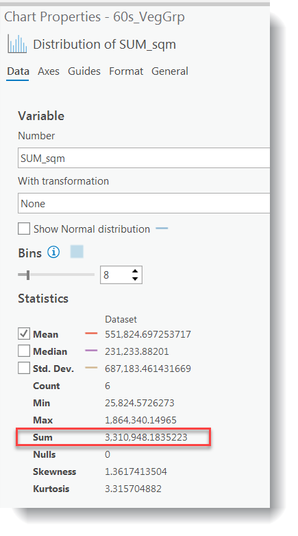
![screenshot pct_tot= [SUM_sqm]/(sum from previous image) * 100](/geog487/sites/www.e-education.psu.edu.geog487/files/image/lesson04/pct_tot.png)
- Repeat for all of the remaining vegetation and invasive shapefiles.
- Fill in the table below based on your results. You will use this table to answer some of the Lesson 4 Quiz questions.
Study Results Work Table 2 Study Year Water Level (High, Med, Low) % Tot. Area Open Water % Tot. Area Emergent Vegetation % Total Area Invasive % Tot. Area Controlled Invasive 1962 1973 2005 Which year has the most invasive species? Which year has the least open water? How does this correlate with water levels? Which files have the most missing data? After comparing several datasets using calculated areas and percent total areas, which technique do you find is easier to detect trends between multiple datasets?
- Use the attribute tables of the vegetation groups and invasive species data to fill in the table below. You will use this table to answer some of the Lesson 4 Quiz questions.
-
Create Graphs from Attribute Tables
- You can combine statistical techniques with visual techniques by creating graphs from your attribute tables. There are many different types of graphs to choose from. In this lesson, we will look at two options: pie charts and vertical bar charts.
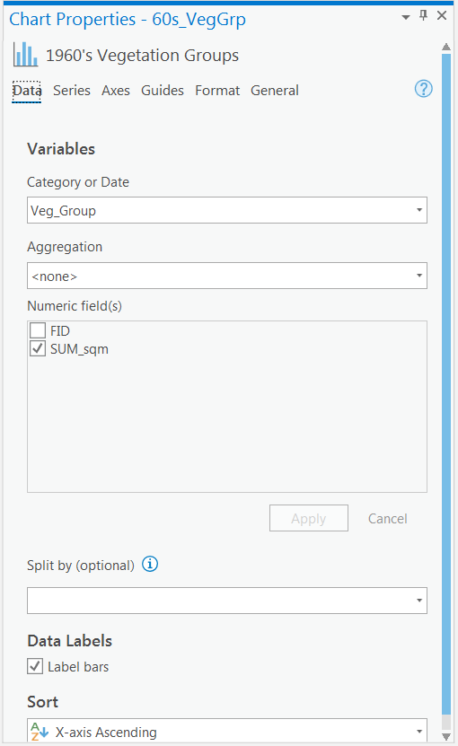
- Let's look at a vertical bar chart. In the Contents pane of your original Lesson 4 Map, right-click the 60s_VegGrp layer > Create Chart > Bar Chart. A Chart Properties pane will open that guides you through the graph creation process. Use the settings below:
- Category or Date: Veg_Group
- Aggregation: <none>
- Numeric field (s): SUM_sqm
- Check the box “Label bars”
- Click Apply
- Click General, give the graph a meaningful title and meaningful axis titles. Note: Do not use the default names, which have “_” and abbreviations that may be confusing to your target audience.
- Accept the defaults for the remaining options. You may need to resize it to view all of the labels.
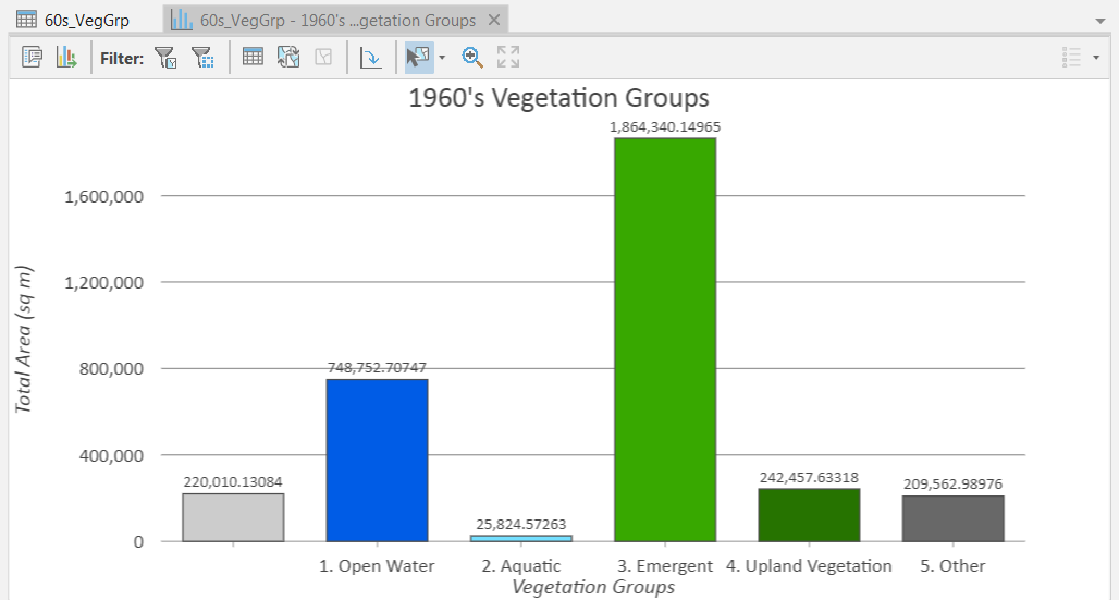
- Look at the output graph. Is it easy to tell how the amount of vegetation within each group compares to other groups? Notice how the y-axis defaults to the highest value in your dataset. If you wanted to compare graphs from multiple datasets, you would need to make sure that all of the graphs have the same minimum and maximum values on the y-axis. You can add the graph directly to your layout. We are not going to do this in this lesson, but you could see how this may be valuable for other projects, especially if you combined it with the available animation tools.
-
Interpret Trends Using Statistics and Graphs
- Use the statistics and graph you calculated to answer the following questions again. Compare them to your answers from step 6 of Part I.
- How has the amount and location of emergent vegetation changed over time?
- How has the amount and location of invasive species changed over time?
- How has the quality of habitat changed over time?
- How has the amount of emergent vegetation changed in response to water level fluctuations?
- Use the statistics and graph you calculated to answer the following questions again. Compare them to your answers from step 6 of Part I.
After experimenting with both visual and statistical techniques to determine trends in your data, can you think of any scenarios in which one is preferable over the other?
That’s it for the required portion of the Lesson 4 Step-by-Step Activity. Please consult the Lesson Checklist for instructions on what to do next.