Prioritize...
At the end of this section, you should be able to describe autocorrelation.
Read...
At this point, we have seen that a time series can provide lots of information on a specific variable. In particular, we learned about the periodicity component of a time series which can include components that are partially cyclic, occurring at roughly equal intervals, or chaotic, occurring now and then with some consistency. But how do we determine that interval? Read on to find out!
Autocorrelation Definition
Let’s start by reminding ourselves about correlation. Correlation is the measure of strength and direction of a linear relationship between two variables. A linear relationship is when one variable X is scaled by a factor A with an offset B to fit another variable Y (Y=AX+B). The correlation coefficient quantifies the degree to which this scaling and offset can be used to fit the data.
Autocorrelation, sometimes called serial correlation, is the correlation of the value at a given point in time with other values of the same variable at different times. It is, thus, the relationship between the value at time t and the values lagged before (t-1, t-2, t-3,…) and/or after (t+1, t+2, t+3,…). So, instead of comparing one variable, Y, with another variable, X, you are comparing one variable against itself, offset in time.
Mathematically speaking, the autocorrelation is defined as:
The values Y1, Y2, …,YN are taken at time T1, T2,…., TN, where the values are equally spaced in time. This formula is similar to the correlation coefficient we previously saw in Meteo 815 and values closer to 1 indicate a strong relationship (positive or negative) while values closer to 0 suggest a weaker relationship.
Importance of Autocorrelation
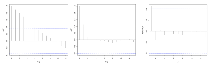
There are two primary reasons we will look at autocorrelation in this course. The first is to test for stationarity (statistical properties such as mean, standard deviation, etc. are constant in time). Stationarity is a key assumption we will utilize in future analyses, so determining whether a time series meets the requirement is essential. If the autocorrelation decreases slowly from lag to lag (or remains relatively constant), the data is non-stationary. Furthermore, for non-stationary data, the autocorrelation at lag 1 is usually very large and positive. Whereas, if the autocorrelation drops to 0 relatively quickly, the data is considered stationary.
The second reason to compute autocorrelation is to determine if there are patterns with specific timescales. Many atmospheric variables will have periodic behavior that can be detected through the use of autocorrelation. However, this is not a rigorous method for forecasting. Remember from the correlation lesson, I emphasized that even if there is a strong correlation coefficient, it CANNOT be interpreted as causation. Similarly, even though there might be a strong autocorrelation coefficient at a particular lag, suggesting periodicity, it is ill-advised to use this for forecasting purposes. But, the autocorrelation can be used as a stepping stone to determine the significance of temporal patterns.
Plots
Unlike the correlation coefficient where the result was a single value, the autocorrelation coefficient is generally computed for a number of lags. So although you could look at individual autocorrelation coefficient values, it is generally easier to interpret the autocorrelation if you plot the values as a function of lags. This will allow you to look at as many lags as you want, which can be handy when trying to detect patterns.
In R, you can use the function ‘acf’ from the package ‘stats’ which will compute the autocorrelation for as many lags (lag.max parameter) as you want. You can also use the function ‘pacf’ which is the partial autocorrelation. The partial autocorrelation is similar to the autocorrelation but the linear dependence between lags is removed. The figure below shows an example of the ACF for a non-stationary dataset (left panel), an ACF for a stationary dataset (middle panel - notice how the values drop to 0 faster than in the left panel), and the PACF of a stationary dataset (right panel).