Prioritize...
At the end of this section, you should be able to perform and interpret the autocorrelation computed over a number of lags for a given dataset.
Read...
At this point, you probably have a vague idea of what autocorrelation is but may still be uncertain about why and how we use it. Well, let’s work through an actual problem that shows you not only the computational side (how we use R to compute the coefficient(s)), but also the interpretation and framework for a larger picture. So let’s begin!
Question and Data
For this example of autocorrelation, we want to determine if an event occurs regularly with a certain periodicity, i.e., time scale. That is, does a large autocorrelation coefficient occur at a specific lag? Monsoons are seasonal shifts in the wind that generally result in changes in precipitation. Bangkok, Thailand is one city impacted by monsoons. They have three main seasons: the hot season, the rainy season, and the cool season. Generally, during the months of July to October, Bangkok is wet. Every year, they can expect the rain to come during these months and be relatively (key word here) dry the other months. This is an example of a quasi-periodic event.
So, the real question is: Can we observe this seasonal pattern in the data? Let’s find out. Here is a 50-year dataset of daily precipitation for Bangkok, Thailand. Let’s open and prepare the data for analysis using the code below.
Your script should look something like this:
mydata <-  read.csv("daily_precipitation_Bangkok.csv", header=TRUE, sep=",")

# replace data with bad quality flags with NA
mydata$PRCP[which(mydata$Quality.Flag != " " )] <- NA

# replace missing values with NA
mydata$PRCP[which(mydata$PRCP < 0)] <- NA

# extract out precipitation (units = inches)
precip <- mydata$PRCP;

# convert date string to a real date
date<-as.Date(paste0(substr(mydata$DATE,1,4),"-",substr(mydata$DATE,5,6),"-",substr(mydata$DATE,7,8)))
Setup and Computation
Now that our data is extracted, we can set up the data specifically to compute the autocorrelation. The goal here is to determine whether a seasonal shift is observed in the precipitation data. Monthly totals are more logical than daily totals. Use the code below to estimate the monthly totals.
Your script should look something like this:
# Determine the number of unique months/years
unique_time <- unique(format(date,'%m%Y'))

# create monthly totals for each unique month/year combo
monthlyPrecip <- {}
time_index <- {}
for(itime in 1:length(unique_time)){
  index <- which(format(date,'%m%Y') == unique_time[itime])
  monthlyPrecip[itime] <- sum(precip[index])
  time_index <- c(time_index,index[1])
}
Now we can begin the analysis. We will first, as usual, make a plot of our time series. This is again to visually inspect the data for any missing or bad values, as well as to check if we can visually detect the pattern. Run the code below to create a time series plot.
Here is a larger version of the figure you should generate from the code above.
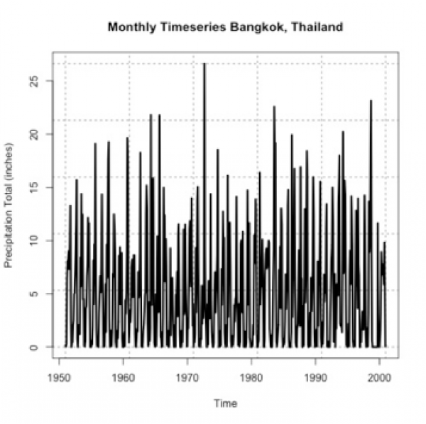
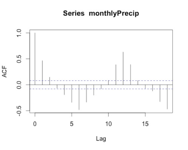
If you stare at it long enough, you will probably notice a pattern of high/low monthly precipitation totals. However, the timescale of the pattern is not entirely clear. So let’s compute the autocorrelation to assess the periodicity better. Use the function ‘acf’ on the monthly precipitation by running the code below.
I chose a max lag of 18 months, which is equivalent to a year and a half. We believe the correlation is seasonal, so we want to explore at least one cycle. A year and a half allow us to observe this pattern. Below is a larger version of the figure.
Interpretation
What does the result show? To start, we must ignore the correlation of 1 at lag 0 because this is the correlation of each month with itself. As a side note, you will sometimes see the ACF with lag 0 and sometimes without, so it’s important to always check. The correlation at lag 1 is almost 0.5. This means that there is a positive correlation for each month with the month after and the month before. We think of the lags as since correlation is symmetric. At lag 3, the correlation flips to negative. At lag 6, half a year, there is an equal but opposite correlation to that at lag 1. This suggests a shift in the opposite direction (positive to negative and vice versa) every 6 months. We then see at lags 11-13 we have positive correlations, again ranging between 0.3-0.5. Suggesting the precipitation of a given month is positively correlated with the precipitation 11-13 months before or after---or more simply every year. This type of pattern definitely signals a seasonal change of precipitation.
I know this can be confusing, so let’s think of the lags in another way. I mentioned above that the rainy season is June-October. If the month we are examining is August (lag 0), then lag 1 would be July/September. Lag 2 would be June/October. These both show positive correlations, which is what we expect because the rainy season is June - October. At lag 3 (or months May/November), the correlation flips. This marks the transition to a different season.