Prioritize...
After reading this section, you should be able to explain what an autoregressive model is and discuss its strengths and weaknesses.
Read...
It makes sense that if there is a repeating pattern, like the change from the rainy season to the dry, we should be able to use that, to some degree of accuracy, for prediction. Autocorrelation tells us the strength of the relationship of a variable in time. But it doesn’t really harness that information for prediction. To do this, we need to use the Autoregressive (AR) model.
Definition of an AR Model
An autoregressive model or AR model predicts future behavior using past behavior. The model utilizes the autocorrelation results, which means we must use past data to model the behavior. The AR model can be viewed as a linear regression model where the current data value is predicted from past values. The outcome variable (Y) at some point in time, t, is predicted using a linear regression with the lagged values (Y at points in time earlier than t) as predictors. In short, the AR model is a regression of the variable against its own history.
When and Why to use?
An AR model assumes that error terms are uncorrelated and have a mean of zero. This means we should only use an AR model if the data is stationary. We need to look at the ACF and or the PACF to determine whether an AR model is feasible. Generally, we are looking for 1 or 2 lags that are strongly correlated while the rest are not. Here is an example of the PACF for data that would make a good candidate.
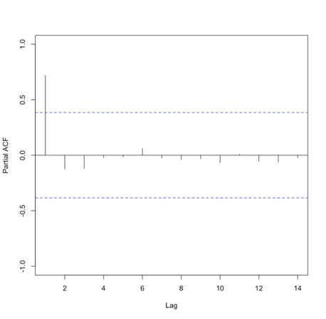
Please note that in this example, the function suppressed the useless lag zero value. So, the high correlation is at lag 1.
Solve Parameters
Mathematically, the AR model looks very similar to the linear regression equation and takes the form:
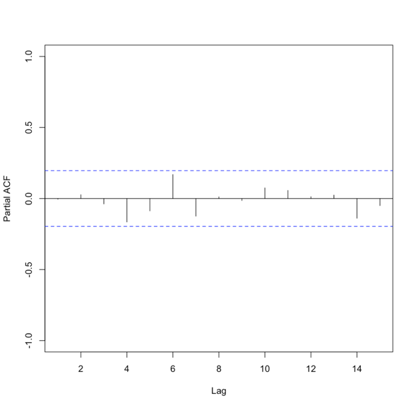
where A is the parameter stemming from the autocorrelation, B is a constant, and e is the white noise (random signal). When using this model, we use the order to describe the number of preceding values that we use to predict the new values. So the order represents the number of lags we will use. The equation above is for a first-order autoregressive model, written as AR(1), since only the previous value, Yt-1, is used to compute the new value, Yt. A second order AR model, AR(2), would be written as In this case, the Y value at time t is predicted using the value at t-1 and t-2, two previous values hence the order of 2. To generalize the model, we can say that the pth-order autoregressive model, AR(p), is:We can make a first guess at the order by looking at the ACF or PACF. Take a look at the example of the PACF from above that showed the data was stationary. There is one high correlation at lag 1. This suggests an order of 1. Whereas the PACF below is less clear.
To create an AR model when the order is not known, we can use the function ‘ar’ from the ‘stats’ package. This particular function will choose the order by using the Akaike Information Criterion (AIC). As a reminder, the AIC is a measure of the relative quality of the models. The function will create multiple models of multiple orders, compute the AIC, and then select the best model by minimizing the AIC.
The results include the coefficients, ’ar’, the order, ‘order’, the aic score, ‘aic’, and the residuals from the fitted selected model, ‘resid’. Similar to our linear regression fits from Meteo 815, we can use the residuals to compute several metrics of best fit, such as MSE, RMSE, MAE, etc.
Advantages and Disadvantages
There are many advantages and disadvantages to the AR model, so I will only discuss a few. The most notable advantage is that it’s easy to compute. It’s a simple function and is not computationally expensive. This is great if you need to create many models. An AR model is also easy to understand - it’s the autocorrelation and a reflection of the periodicity that exists in the data.
A noticeable disadvantage is that the data must be stationary. This can be a difficult requirement to meet. Also, there needs to be a strong cycle in your dataset for the AR model to exploit. Furthermore, if there are extremes, an AR model can have trouble characterizing and modeling them, so this will create larger errors.
AR Example
Let’s return to our precipitation data from Bangkok. Run the code below to plot the PACF for the monthly precipitation data.
Below is a larger version of the figure: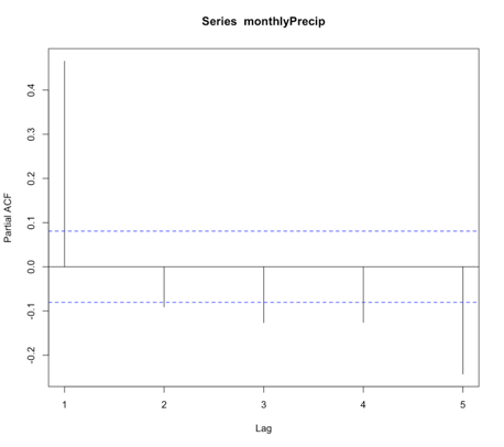
You will notice a strong correlation at lag 1 that drops significantly right after. This appears to be a candidate for an AR model, specifically of order 1. So let’s give it a try. Run the code below to create an AR(1) model of the monthly precipitation data.
Notice that I didn’t use all of the observations. I want to save some for comparison later on. For this particular model, the coefficient (Precip_AR1$ar) is 0.45. As a reminder, an AR(1) model follows the form:
‘a’ in this example is 0.45. The element ‘var.pred’ tells us the predicted variance or the variance of the time series that is not explained by the AR model. In this case, it is 20.6. But as a reminder, variance does not have easily understandable units (units^2). So instead, let’s compute some of our own metrics using the residuals. Start with the MSE (Mean Square Error) and RMSE (root MSE).
Similar to the variance, the MSE units are hard to utilize, so we use the RMSE. The RMSE is 4.53 inches. As a reminder, the RMSE represents the sample deviation between the predicted and observed values. So, we can say that each prediction value has a range of 4.53 inches.
Now, let’s use the model to predict some values and plot the observed vs. predicted. We will predict only for the values we didn’t use to create the model, i.e., we’ll test on independent data so as to get an honest assessment of how well the model will do in practice.
Your script should look something like this:
# predict values
dataPredict_input <- monthlyPrecip[(length(monthlyPrecip)-100):length(monthlyPrecip)-1]
precipAR1_predict<-{}
for(i in 1: length(dataPredict_input)){
  precipAR1_predict[i] <- predict(Precip_AR1,dataPredict_input[i])$pred
}
We loop through the data and take the prior value and use it to predict the future event one step forward (AR(1)). Now run the code below to plot the predicted values against the observed values.
Below is a larger version of the plot:
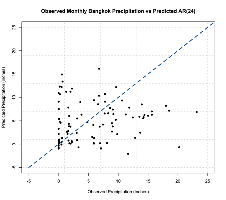
As a reminder, the closer the values (dots) are to the 1-1 line (blue dashed line) the better the model. We can definitely tell the AR(1) model is NOT a good model for monthly precipitation. So let’s revisit the PACF, and this time I’m going to expand the maximum lag length to 2 years or 24 months. Use the code below:
Your script should look something like this:
# plot pacf
BangkokPrecipPACF <- pacf(monthlyPrecip,lag.max=24)
You should generate a figure like this:
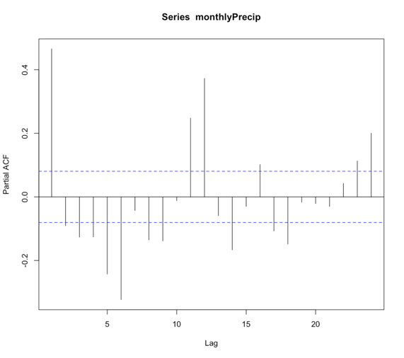
We see that there are multiple lags of relatively strong correlation. And therefore an AR(1) model is not ideal. But what is the correct number? Well, instead of figuring this out by hand, let R select the best order for you!
Using the function ‘ar’, we can choose to let the 'order.max' parameter be NULL, thereby allowing the function to estimate multiple AR models of varying order and selecting the best by using the AIC. Let’s see what it does!
Your script should look something like this:
# load in library
library(forecast)
# create AR model
Precip_AR <- ar(monthlyPrecip[1:(length(monthlyPrecip)-100)])
We can check the order of the AR selected by looking at the value $order. In this case, the order is 24! There are 24 coefficients ($ar), and we can compare the AIC scores ($aic) which shows you the difference in AIC between each model and the best model (in this case order 24). If you look at the AIC values, you will notice that it did compute models of order 25 and 26. So it really did create multiple models and minimize the AIC. Let’s compute the MSE and RMSE to see if it changed.
Your script should look something like this:
# compute MSE
precipMSEAR <- mean(Precip_AR$resid^2,na.rm=TRUE)

# compute RMSE
precipRMSEAR <- sqrt(mean(Precip_AR$resid^2,na.rm=TRUE))
In this case, the RMSE is 3.24 inches compared to 4.53 inches in the AR(1), so we have decreased the RMSE, which is good!. Now, let’s predict some values and compare them to the observed.
Your script should look something like this:
# predict values
dataPredict_input <- monthlyPrecip[(length(monthlyPrecip)-124):length(monthlyPrecip)-1]
precipAR_predict<-{}
for(i in 1:100){
  precipAR_predict[i] <- predict(Precip_AR,dataPredict_input[seq(i,24+i-1,1)])$pred
}
A note on the code, we need to look at the 24 values preceding the one we are trying to predict. This is shown by the sequence command for subsetting the data. If you look at how I created the data input values, I took the 100 values I want to predict plus the 24 preceding them. This allows me to use the AR model of order 24 for prediction. Let’s plot the predicted values against the observed values.
Your script should look something like this:
# plot predicted and observed values
dataObserved <- monthlyPrecip[(length(monthlyPrecip)-99):length(monthlyPrecip)]
plot.new()
grid(nx=NULL,ny=NULL,'grey')
par(new=TRUE)
plot(dataObserved,precipAR_predict,xlab="Observed Precipitation (inches)",
     ylab="Predicted Precipitation (inches)",main="Observed Monthly Bangkok Precipitation vs Predicted AR(24)",
     xlim=c(-5,25),ylim=c(-5,25),pch=16) par(new=TRUE) plot(seq(-5,30,1),seq(-5,30,1),type='l',lty=2,col='dodgerblue4',lwd=3,xlab="Observed Precipitation (inches)",
     ylab="Predicted Precipitation (inches)",main="Observed Monthly Bangkok Precipitation vs Predicted AR(24)",
     xlim=c(-5,25),ylim=c(-5,25))
This is the figure you should get:
You should notice something very suspicious in this figure. Negative precipitation is NOT possible! It is worth noting that many statistical models, including AR, lack a means of imposing such physical constraints. In this instance, there was no constraint that precipitation cannot be negative. We can fix this by replacing all the negative values with 0. This is a prime example of why we need to plot our results!
Your script should look something like this:
# replace negative values with 0
precipAR_predict[which(precipAR_predict < 0)] <- 0
If we replot, we get this figure (note that I changed the x and y limits, but I assure you there are no negative values)
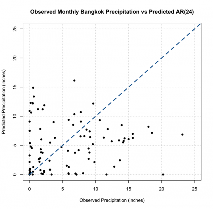
This, however, is not the most promising result. The predictions are not very close to the 1-1 line and this, paired with the RMSE, suggest the AR model, even with the seasonal repetition of the monsoon, may not be the best choice for prediction.