Download this lab as a Word document: Lab 8: Stream Flow (Please download required files below.)
In this lab, we will observe the impact of precipitation on stream flow and flooding. The practice and graded sequence of steps are identical. Please go through the following sequence of questions for the practice, check your answers in the Practice Lab, then take the Graded Lab when ready.
Practice Questions
The US Geological Survey maintains the water watch website, which shows the current state of stream flow, drought, flood, and past flow and runoff. We will focus on stream flow data, and you will be required to summarize national trends. The data are expressed as percentiles over normal stream flow for the date of interest. The site has an animation builder that allows you to observe changes in stream flow over short periods and intervals back to 1999. The animations show both regular stream flow and flood stage locations.
Observe the flood and stream flow animations for the following intervals, and describe what you see in terms of major floods and general stream flow. (You can toggle back and forth between these two kinds of animations using the Map Type menu on the animation panel; Real-Time is general stream flow, while the Flood maps show black triangles for places where the streams are actually flooding above their banks.)
Using the USGS animation builder, answer the following practice questions:
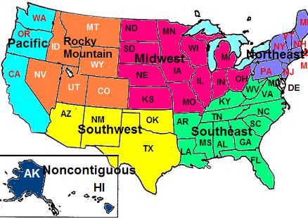
- Between 1st July and 31st August 2010 — which region of the US experienced the most flooding? Use the map below of regions in the US to help you answer this question. Note, this is the first part of a two-part question.
- When do the major floods occur, between 1st July and 31st August 2010? Note, this is the second part of a two-part question.
- How does the July and August 2010 flooding relate to precipitation anomalies? To figure this out, go to the Federal Ministry of Transport, Building and Urban Affairs website and set up the visualization parameters according to this screenshot:
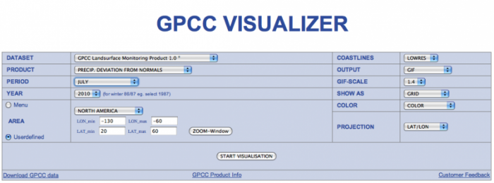 GPCC VisualizerCredit: U. Schneider, P. Finger, E. Rustemeier, M. Ziese, S. Hänsel. “GPCC Visualizer tool”. Global Precipitation Climatology Center, DWD, Deutscher Wetterdienst, Offenbach a. M., Germany, May 2022 .
This will show you precipitation anomalies relative to the monthly mean for the 1950-2000 period, in millimeters per month. Then review the months of June, July, and August, comparing these images with the flood occurrences. During June, July and August 2010, the increase in flooding coincided with ________________? - In what region do major floods happen in August 2011? (Refer to the map in Question 1 to see which states are in which regions.)
- How does the timing and location of August 2011 flooding relate to hurricane activity in the Atlantic? (Hint: Do a Google search for 2011 Atlantic hurricane season). The peak flooding in August 2011 coincides with the landfall of which hurricane?
- Where are the major floods in early December 2010?
- Are the December 2010 floods in the eastern portion of the country more likely related to a prolonged period of high precipitation, a hurricane, or a brief, strong storm system moving through the area?
- What is the relationship between the December 2010 floods in the western part of the country to ENSO? December 2010 was during a La Niña event. Go to the National Weather Service Climate Prediction Center to see what the typical pattern of precipitation is for the US during a La Niña event.
If you run your cursor along the column of letters on the left side, you can see the maps of precipitation anomalies for 3-month periods, so you could look at the maps for NDJ (November, December, January) and see what the typical precipitation anomaly is. For more explanation of these maps, click on the link in the upper right of the window that says "Information on Data, Methods, and Interpretation."
December 2010 was a La Niña year. During a La Niña year, the southern US experiences _______precipitation and the northern US experiences ______precipitation.
In the second part of the lab, in Google Earth, we will observe discharge (in cubic feet per second) for various points along the Mississippi during the devastating floods of 2011. Stream gages are planted in the middle of the river, and the gage measures the volume of water passing through a known volume during a known time. The units are in cubic feet per second.
River Height and Discharge
Please load the Google Earth Mississippi River Stream Gages Updated kmz file. Make sure you look at the dates correctly as well as the discharge axis scale. Please answer the following questions: - Roughly when is peak discharge at Winona, Minnesota (give your answer in month date format. e.g., November 05 for November 5th).
- Roughly when is peak discharge at St. Louis, Missouri (give your answer in month date format. e.g., November 05 for November 5th).
- What is the peak discharge (in cubic feet per second) at Winona? (to nearest 50,000 cubic feet per second). Just give a number.
- What is the peak discharge (in cubic feet per second) at St Louis (to nearest 50,000 cubic feet per second)? Just give a number.
- Generally, is stream flow increasing up or down river?
- Why does discharge increase so abruptly at St. Louis? (Hint: Look at the Google Earth Map in the St. Louis area very closely.)
A. Because of runoff from the city
B. Because the Missouri River flows in at that point
C. Because the river triples in width
D. Because the river deepens significantly