Symbol Design: Visual Order and Categories
When designing your maps, two ideas should be at the forefront of your symbol design process: (1) order, and (2) category. Map symbol design relies heavily on the proper use of visual variables—graphic marks that are used to symbolize data (White, 2017).
Cartographer Jacques Bertin (1967) was the first to present this system of encoding data via graphic elements. Suggestions of supplemental visual variables (e.g., transparency), as well as analyses of their utility in different cartographic contexts, have been brought forth by multiple well-known cartographers (e.g., MacEachren 1994).

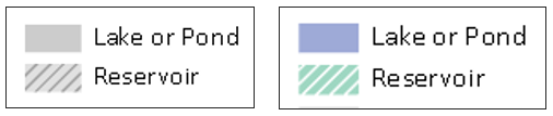
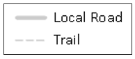
Some visual variables (e.g., size, color saturation, and color lightness) clearly indicate quantitative changes in magnitude. These are best for encoding data that has an order (e.g., a county-level map of population density; a road map with both highways and local roads). Other visual variables (e.g., color hue, pattern, and shape) signify qualitative—but not quantitative—differences. These are best applied when data categories have no inherent ordering (also often called nominal, or qualitative data), such as in a choropleth map showing political boundaries.
Figures 1.7.2, 1.7.3, and 1.7.4 demonstrate how visual variables can be used to symbolize common features in general purpose maps. These variables can be used either independently or in combination, to create the best visual representation of the underlying data.

Edward Tufte, a statistician and data visualization expert, said “the commonality between science and art is in trying to see profoundly—to develop strategies of seeing and showing” (Zachry and Thralls 2004, pg. 450). The goal of cartography, both an art and a science, is to optimally visualize—and help others see—the world, and various phenomena within it. To do so takes patience, practice, and skill—all of which you will continually develop throughout this course.
Student Reflection
Do a simple web search for maps of a topic that interests you. What visual variables are used in these maps? Are they effective?
Recommended Reading
- White, T. (2017). Symbolization and the Visual Variables. The Geographic Information Science & Technology Body of Knowledge (2nd Quarter 2017 Edition), John P. Wilson (ed.). DOI: 10.22224/gistbok/2017.2.3
- Tufte, Edward R. 2001. The Visual Display of Quantitative Information. Second. Graphics Press.
- Bertin, Jacques. 1967. Sémiologie Graphique. Vol. 30. doi:10.1037/023518.