Design Matters
“Not only is it easy to lie with maps, it’s essential.” – Mark Monmonier, How to Lie with Maps, pg. 1
When making a map, it is impossible to map everything. In fact, to be a useful model of our world and of any phenomena in it, maps must always obscure, simplify, and/or embellish reality. These actions—which make maps useful—also make their construction subjective. Cartographic design, even when informed by well-established conventions, is an art as much as a science. Every design choice a cartographer makes ultimately influences the map readers’ comprehension, appreciation—and even trust—of the map that he or she creates.
Though maps may include or be supplemented by text or other media (even by sound, smell, or touch), map creation at its core is about visual design. As such, cartographers often talk of graphicacy and its importance in facilitating visual communication with maps (e.g., Field 2018, pg. 194). Graphicacy was first defined by Balchin and Coleman (1966) as “the intellectual skill necessary for the communication of relationships which cannot be successfully communicated by words or mathematical notation alone.” Graphicacy—like literacy—has its own grammar and syntax, and learning the rules of graphic language is essential for designing effective maps (Field 2018, pg. 194).
Student Reflection
Which map of the two below best communicates the trend of the data? Why?

In the map on the left (Figure 1.1.1), the rainbow color scheme makes it easy to view the states as grouped into categories by hue, but the lack of an obvious order between the selected colors makes the overall trend unclear. A sequential color scheme (right), however, makes it easy to view the trend of the data, as low-to-high values as are encoded intuitively from light to dark.
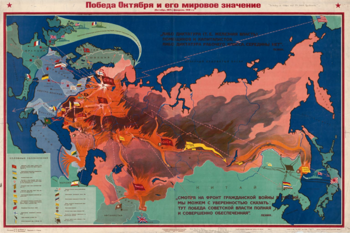
The design decisions that go into making a map often go far beyond choosing a color scheme for a simple state-by-state choropleth map. The map below is a Russian Civil War map – flames and smoke are used as symbols of the Bolshevik uprising. This map not only communicates information; it conveys emotion.
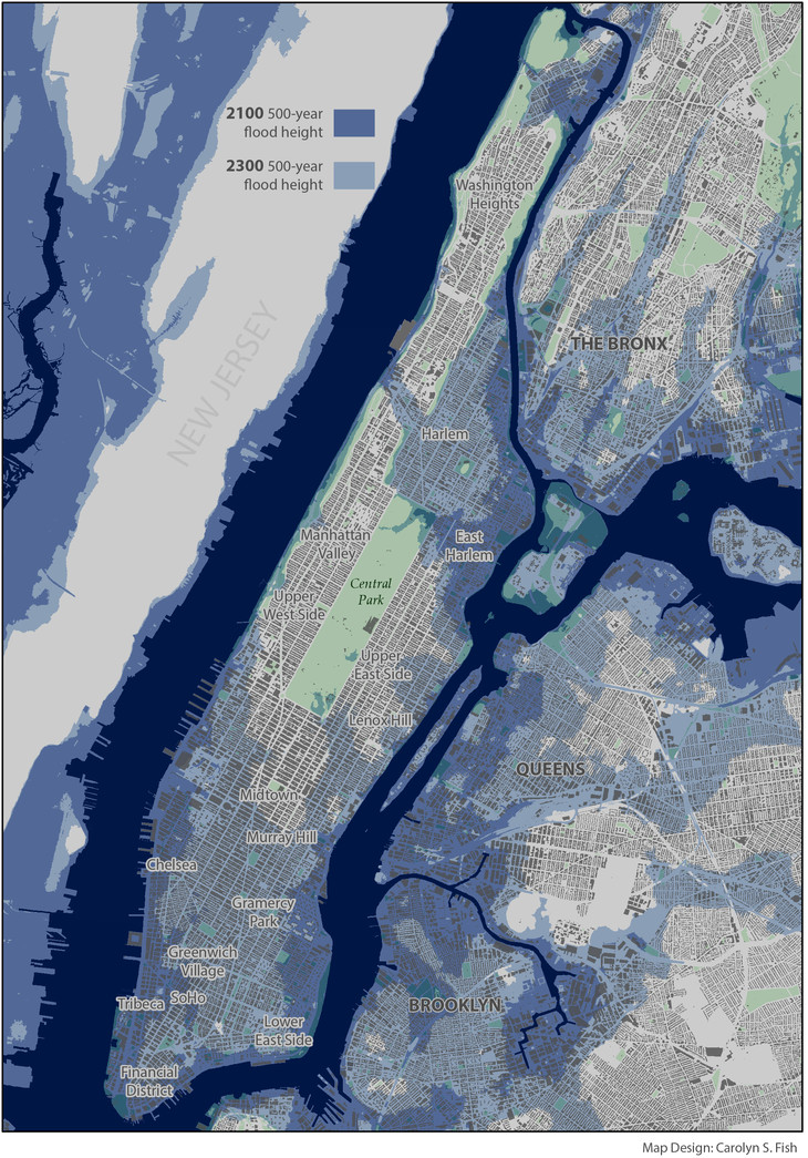
As demonstrated by the examples above, the way in which you design a map can deeply influence how your readers interpret it. A well-designed map can intrigue and even surprise its readers, leaving a meaningful and memorable impression. Shown below is a map of projected future storm surge in New York City, designed by Penn State alum and cartographer Carolyn Fish. The map doesn't ask the reader to imagine what NYC might look like under future climate scenarios - it shows them.
Following cartographic conventions—such as applying sequential color schemes for sequential data—typically results in more effective maps. However, some maps diverge from these guidelines. Learning cartographic best practices will help you to both apply them—and thoughtfully disobey them—when prudent.
Student Reflection
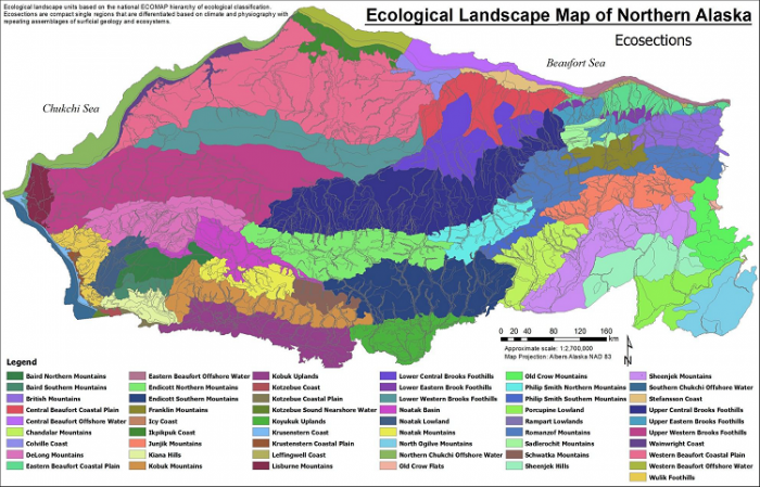
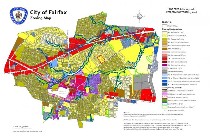
View the maps in Figures 1.1.4 through 1.1.7 below: Do you think they are effective? Is there anything you think should have been done differently?
Recommended Reading
- Chapter 1: Slocum, Terry A., Robert B. McMaster, Fritz C. Kessler, and Hugh H. Howard. 2009. Thematic Cartography and Geovisualization. Edited by Keith C. Clarke. 3rd ed. Upper Saddle River, NJ: Pearson Prentice Hall.
- Maps that Kill (pgs. 300-301): Field, Kenneth. 2018. Cartography. Esri Press.