Introduction:
Scale is very important in societal perceptions of phenomena. One such phenomenon that is subject to significant scale differences in relation to its perception is gun violence. Global perception is that gun violence and gun related homicide is prevalent throughout the United States, with statistics being shown in media outlets like the BBC. Using ArcGIS Online and media sources, this exercise will allow you to examine global, state, and county data related to firearm-related fatalities to examine and interrogate the impact of scale on the perception of firearm-related fatalities.
All the data you need for the assignment is uploaded to the ArcGIS Online Group that we set up for this course. To gain access to the group:
- Log into Penn State’s ArcGIS Online organization.
- Go to your Groups page by clicking on the 'Groups' link in the menu at the top of the page.
- In your groups, look for the GEOG 571 Group.
- Dr. Kantor's students should use the GEOG 571 T1-Kantor group.
- Dr. Sulewski's students should use the GEOG 571 T2-Sulewski group.
- Dr. Gaertner's students should use the GEOG 571 - Gaertner group.
- If you do not already have access to the group, please contact your instructor to request membership.
Overall Task:
Using the data and sources provided in the ArcGIS Online group, utilize ArcGIS Online and ArcGIS StoryMaps to explain the role of scale in understanding (or misunderstanding) the prevalence of homicides committed by firearms.
Choropleth Map
In this exercise, we will be creating choropleth maps to help visualize the data.
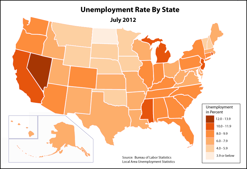
A choropleth map is a type of map that uses quantitative (numerical) data to categorize enumeration units (such as countries, states, and counties) into a series of groups. Different colors or shading for each group of data are used to differentiate between groups.
Take, for instance, the choropleth map of July 2012 unemployment rates below. This map has six classes, and each class is represented by a different shade of red. Each state is then assigned to a class and corresponding color depending on the unemployment rate for that state.
| State | Unemployment (%) |
|---|---|
| Alabama | 8.9 |
| Alaska | 7.2 |
| Arizona | 8.7 |
| Arkansas | 7.8 |
| California | 10.9 |
| Colorado | 8.3 |
| Connecticut | 9.3 |
| Delaware | 7.1 |
| District of Columbia | 9.1 |
| Florida | 9.4 |
| Georgia | 9.5 |
| Hawaii | 6.3 |
| Idaho | 6.9 |
| Illinois | 9.3 |
| Indiana | 8.3 |
| Iowa | 5.1 |
| Kansas | 6.7 |
| Kentucky | 8.5 |
| Louisiana | 7.9 |
| Maine | 7.4 |
| Maryland | 7.1 |
| Massachusetts | 6.6 |
| Michigan | 10.3 |
| Minnesota | 5.9 |
| Mississippi | 10.2 |
| Missouri | 7.6 |
| Montana | 5.9 |
| Nebraska | 4.3 |
| Nevada | 12.5 |
| New Hampshire | 5.7 |
| New Jersey | 10.1 |
| New Mexico | 7.4 |
| New York | 9.1 |
| North Carolina | 9.9 |
| North Dakota | 2.9 |
| Ohio | 7.4 |
| Oklahoma | 5.2 |
| Oregon | 8.8 |
| Pennsylvania | 8.4 |
| Rhode Island | 11.2 |
| South Carolina | 9.7 |
| South Dakota | 4.4 |
| Tennessee | 8.7 |
| Texas | 7.5 |
| Utah | 6.2 |
| Vermont | 5.3 |
| Virginia | 6.1 |
| Washington | 8.4 |
| West Virginia | 7.2 |
| Wisconsin | 7.4 |
| Wyoming | 5.3 |
Metadata
When you are working on exercises in ArcGIS Online, we will provide you with several data sets. It is important for you to know about the metadata for those data sets.
Metadata is simply data about your data. It explains some of the nuances about your data, including but not limited to: how it was collected, how it should be used, when it was collected, etc. This information is incredibly useful, and should always be viewed. It will help you gain a greater appreciation for the data you are using and understand its uses and limitations. In spatial data, if this information is present, it is often attached to the data. In the ArcGIS Suite, there is a special place for it in the “Catalog” part of the Suite.
ArcGIS Online also has a space for metadata. If you go into the GEOG 571 group space for this class, you will see several thumbnails that include data and anything that has been shared with the group. In the blue bar running across the top, you’ll see the group’s name on the left and several options on the right side. One option is “Content.” As you and your classmates work through the variety of exercises throughout the course, this content will increase in quantity.
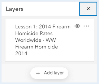
On the left side of the Content page, you have several options to filter the content. Under “Item Type” choose “Layers.” This will minimize the content just to the layers available. If you click on the name of the layer “Lesson 1: 2014 Firearm Homicide Rates Worldwide,” a new page will open up with all of the metadata that has been populated for that layer. Each dataset you will use in this class should have some level of metadata associated with it to help you understand it. It is recommended that you view the metadata for the datasets before using them.
Rate
All of the data you’ll be dealing with in this exercise are “rates.” How exactly do we define rate? The Merriam-Webster Dictionary definition of rate is “a quantity, amount, or degree of something measured per unit of something else.” At its heart, rate is a normalized value. The raw value is measured against another value. As the metadata demonstrates for the World Firearm Homicide rates, the values are the number of deaths per 100,000 people. Each of the datasets you will use in this exercise will use a similar rate, so be sure to check the metadata!
Global Patterns:
A data set for 2020 global Firearm Homicide Rates can be found in the ArcGIS Online group. It is labeled Lesson 1: 2020 Firearm Homicide Rates Worldwide:
- Beginning from your 'My Groups' page. Once you have identified your correct group, click "view details."
- Dr. Livecchi's students should click on the GEOG 571 T1-Livecchi group.
- Dr. Sulewski's students should click on the GEOG 571 T2-Sulewski group.
- Dr. Gaertner's students should use the GEOG 571 - Gaertner group.
- Click on the three dots below the Lesson 1: 2020 Firearm Homicide Rates Worldwide link and click on the 'Open in Map Viewer.’
- The data will load automatically and you will see a map that is zoomed in on the Unites States. You can zoom in and out using your mouse or the '+' and '-' buttons on the map.
- When the map opens in the viewer, all of the countries are one color. We need to symbolize the countries based on the Firearm Homicide rates for 2020.
- If a Layers pane is not visible, click the 'Layers' button.
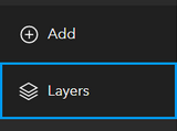
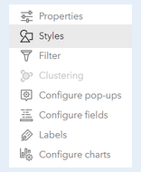
- In the left Layers pane, you’ll see your dataset. To change the symbology for your dataset, make sure that you select the dataset (if it is selected, a blue vertical bar will appear on the left side of the name of the layer). If the layer is selected, a series of options will be enabled on the right side of your map. Select 'Styles.'
- To the left of this dialog, options for styles appear. Click on the button to add a field:
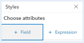
The attribute you will choose is: FAHR_2020 - Once you choose the attribute, new drawing styles will appear to help you symbolize your data. We are generating a choropleth map. Under 'Counts and Amounts,' click the 'Style options' button. By clicking on 'Symbol Style' you can choose a different color ramp. Ensure the color ramp you have chosen depicts low values with a lighter color and high values with a darker color.
- Just below the color ramp/histogram, there will be a slider bar for 'Classify Data.' Slide the bar to the right to enable classifying data. Continue scrolling down on the pane. This is where you will see options to change your classification scheme (keep the default: 'Natural Breaks') and change the number of classes (for now, keep the default: 4).
- Once you complete your amending this dataset, click 'Done' and 'Done' again.
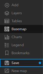
- Once you’re done, you can save your map by clicking the Save button in the far left menu. Add a title, tags, and description. In the title of the map, at the end have your last name.
- Make sure to add tags, as they are required to save the map.
- Please include your last name as part of the title of your map. (e.g. Map Title - LastName )
Review the results of your map:
What spatial patterns are you seeing in the data? Where are the highest rates of firearm-related homicides? Where are the lowest?
Read the following articles:
- America's gun culture in charts
- Gun Violence Deaths: How The U.S. Compares With The Rest Of The World
How do these articles' portrayals of gun violence and firearm-related homicides compare to your observations of the 2020 spatial patterns?
Record your observations and comparisons. They will be used in your final compiled StoryMap.
United States Patterns:
The overall perception from media reports may be that gun violence and firearm-related homicides are widespread throughout the United States. Is that really true? Or are there spatial patterns to where there are higher rates of firearm-related homicides?
- To add the United States data to the map, click the 'Add Layers' button at the bottom of the layers pane.
- Change the search options from 'My Content' to 'My Groups.'
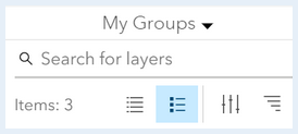
- Search for this dataset:
Lesson 1: 2020 Firearm Homicide Rates United States - Click on the plus sign at the bottom of the dataset:

- Follow the same procedure for symbolizing the United States data as you did for the global dataset.
- The field you will use to generate the choropleth map is called:
FHR_2020
Reminder: When you save your map, be sure to include your last name at the end of it.
Review the following articles:
Review the results of your map:
What spatial patterns are you seeing in the data? Are there variations in the crude rates of firearm-related homicides across the United States or is it more evenly distributed?
What does this say about the considerations of scale when thinking about perceptions of firearm-related homicides for a whole country?
Record your observations and comparisons. They will be used in your final compiled StoryMap.
Missouri Patterns:
Media articles about firearm-related fatalities in the United States often cite Missouri as a state with high rates, as likely evidenced in your review of spatial patterns in the United States data. You will now review firearm-related fatalities from 2020 to see if there are variations in the fatality rates across the state.
Follow the same procedures for creating a Missouri map as you did for the global and United States map.
The dataset is called:
Lesson 1: 2020 Firearm Fatality Rates Missouri
Important note about the Missouri data:
Unlike the other datasets in this assignment, the Missouri data include all firearm fatalities, not just homicides. The reason for this is the relative lack of comparable county-level, firearm homicide-specific data (we have to work with what's available). The availability or lack of data is something you may encounter in professional settings, and as the analyst, it is part of your job to consider this in your work. As you look at the data, you may find it worth discussing these differences and their impact on your analysis in your StoryMap.
The field you will use to generate the choropleth map is called:
FAF_2020
Important Note:
Your map may default to using graduated symbols for your data (varying sizes of circles, with small circles representing smaller values and larger circles representing larger values). To change your symbolization to a choropleth style, scroll down through the 'Try a drawing style' options, select 'Counts and Amounts (color).' The process is now the same as the previous sections.
Review the following article:
Review the results of your map:
What spatial patterns are you seeing in the data? Are there variations in the crude rates of firearm-related fatalities across Missouri, or is it more evenly distributed?
Record your observations and comparisons. They will be used in your final compiled StoryMap.
Creating Your StoryMap:
To access StoryMaps in ArcGIS Online, click the square of nine circles in the upper right corner of the ArcGIS Online webpage, next to your name and user ID. You will see a series of Esri ArcGIS online 'Apps.' Scroll down and select StoryMaps.
Using the maps you have created throughout this exercise, create a StoryMap describing your observations with regards to firearm-related fatalities across the three scales we investigated: global, national, and state. Be sure to include the information listed in the StoryMap checklist below.
StoryMap Checklist:
Ensure your StoryMap includes the following:
-
Contains the three web maps for all three scales of interest,
-
Answers to the questions you were asked to engage with for each map,
-
Ensure your answers also incorporate the media sources you were asked to read,
-
Synthesizes your observations between all three maps and illustrates how scale is important in understanding human-related spatial phenomena. Your synthesis should include answers to the following questions:
-
How does scale impact the perception of firearm-related fatalities?
-
Why is it important to consider scale when discussing phenomena such as firearm-related fatalities?
-
Deliverable:
When you have finished compiling your StoryMap for this assignment and your StoryMap has been 'Published', save the URL for your StoryMap.
The URL for your StoryMap should look something like this:
- https://storymaps.arcgis.com/stories/223f1885402c44626ad614e5b844c2b4
To submit the URL for your StoryMap exercise, return to the Lesson 1: Foundations of Cultural Geography module in Canvas and look for the Lesson 1 StoryMap Exercise dropbox. The dropbox has instructions for submitting the assignment.
Please check the Canvas Syllabus or Calendar for specific time frames and due dates.
Sharing your data and maps in ArcGIS Online groups:
Make sure your StoryMap is shared with the PSU organization and with the GEOG 571 group. Go to your 'My Content' page, and click on your StoryMap. On the page for your map, there will be a series of buttons on the right side of the browser for opening in a Map Viewer, opening in ArcGIS, opening in Field Maps, creating a presentation, creating a web app, and finally, sharing.
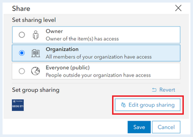
- Ensure your StoryMap or data is shared to the course’s ArcGIS Online Group:
- Go to the metadata page for your story.
- On the right side click the button 'Share'.
- Set the share level to 'Organization' and Set the group settings to the course’s group by clicking 'Edit Group Sharing.' make sure there is a check mark next to the course’s group.