Exploring your data through descriptive statistics and graphical summaries assists understanding if your data meets the assumptions of regression. Many statistical tests require that specific assumptions be met in order for the results of the test to be meaningful. The basic regression assumptions are as follows:
- The relationship between the y and x variables is linear and that relationship can be expressed as a linear equation.
- The errors (or residuals) have a mean of 0 and a constant variance. In other words, the errors about the regression line do not vary with the value of x.
- The residuals are independent and the value of one error is not affected by the value of another error.
- For each value of x, the errors are normally distributed around the regression line.
Before you start working with any dataset, it is important to explore the data using descriptive statistics and view the data’s distribution using histograms (or another graphical summary method). Descriptive statistics enable you to compare various measures across the different variables. These include mean, mode, standard deviation, etc. There are many kinds of graphical summary methods, such as histograms and boxplots. For this part of the assignment, we will use histograms to examine the distribution of the variables.
### Chunk 3: Descriptive statistics and plot histograms
```{r}
# Summarize the Poverty Dataset
# describe() returns the following descriptive statistics
# Number of variables, nvalid, mean, standard deviation (sd), median, trimmed median, mad (median absolute deviation from the median), minimum value, maximum value, skewness, kurtosis, and standard error of the mean.
attach(Poverty_Data)
descriptives <- cbind(Poverty_Data$PctFamsPov, Poverty_Data$PctNoHealth, Poverty_Data$MedHHIncom, Poverty_Data$PCTUnemp)
describe(descriptives)
# skew (skewness) = provides a measure by which the distribution departs from normal.
# values that are “+” suggest a positive skew
# values that are “-“ skewness suggest a negative skew
# values ±1.0 suggests the data are non-normal data
# Create Histograms of the Dependent and Independent Variables
# Percent families below poverty level histogram (dependent variable)
# Note that the c(0,70) sets the y-axis to have the same range so each histogram can be directly compared to one another
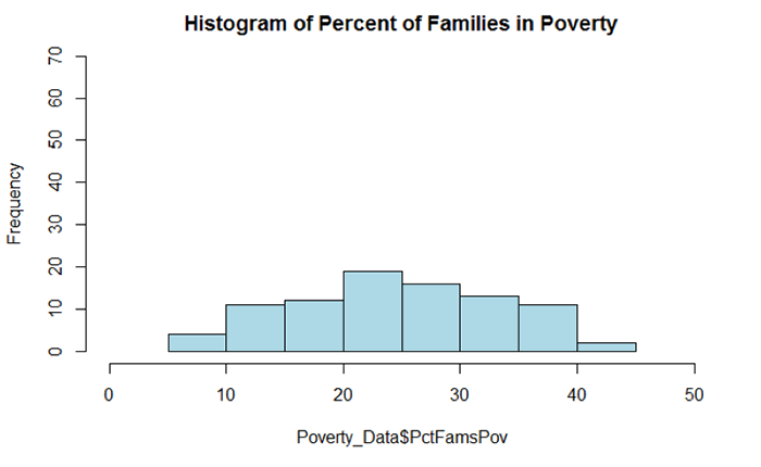
hist(Poverty_Data$PctFamsPov, col = "Lightblue", main = "Histogram of Percent of Families in Poverty", ylim = c(0,70))
# Percent families without health insurance histogram
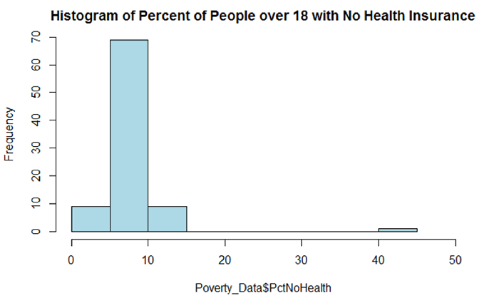
hist(Poverty_Data$PctNoHealth, col = "Lightblue", main = "Histogram of Percent of People over 18 with No Health Insurance", ylim = c(0,70))
# Median household income histogram
hist(Poverty_Data$MedHHIncom, col = "Lightblue", main = "Histogram of Median Household Income", ylim = c(0,70))
# Percent unemployed histogram
hist(Poverty_Data$PCTUnemp, col = "Lightblue", main = "Histogram of Percent Unemployed", ylim = c(0,70))
```
Figure 5.4 shows a summary of the various descriptive statistics that are provided by the describe() function. In Figure 5.4, X1, X2, X3, and X4 represent the percent of families below the poverty level, the percent of individuals without health insurance, the median household income, and the percent of unemployed individuals, respectively.
| X1 | X2 | X3 | X4 | |
|---|---|---|---|---|
| vars <dbl> |
1 | 2 | 3 | 4 |
| n <dbl> |
88 | 88 | 88 | 88 |
| mean <dbl> |
24.55 | 7.87 | 51742.20 | 6.08 |
| sd <dbl> |
8.95 | 3.99 | 10134.75 | 1.75 |
| median <dbl> |
24.20 | 7.30 | 49931.50 | 5.85 |
| trimmed <dbl> |
24.49 | 7.48 | 50463.38 | 6.02 |
| mad <dbl> |
9.86 | 2.08 | 8158.75 | 1.70 |
| min <dbl> |
5.8 | 3.3 | 36320.0 | 2.6 |
| max <dbl> |
43.1 | 40.2 | 100229.0 | 10.8 |
| range <dbl> |
37.3 | 36.9 | 63909.0 | 8.2 |
| skew <dbl> |
0.00 | 6.04 | 1.82 | 0.41 |
| kurtosis <dbl> |
-0.86 | 46.36 | 5.22 | 0.08 |
| se <dbl> |
0.95 | 0.42 | 1080.37 | 0.19 |
We begin our examination of the descriptive statistics by comparing the mean and median values of the variables. In cases where the mean and median values are similar, the data’s distribution can be considered approximately normal. Note that a similarity in mean and median values can be seen in rows X1 and X4. For X1, the difference between the mean and median is 0.35 percent and for X4 the difference is 0.23 percent. There is a larger difference between the mean and median for the variables in rows X2 and X3. The difference between the mean and median for X2 and X3 is 0.57 and $48,189, respectively. Based on this comparison, variables X1 and X4 would seem to be more normally distributed than X2 and X3.
We can also examine the skewness values to see what they report about a given variable’s departure from normality. Skewness values that are “+” suggest a positive skew (outliers are on located on the higher range of the data values and are pulling the mean in the positive direction). Skewness values that are “–“ suggest a negative skew (outliers are located on the lower end of the range of data values and are pulling the mean in the negative direction). A skewness value close to 0.0 suggests a distribution that is approximately normal. As skewness values increase, the severity of the skew also increases. Skewness values close to ±0.5 are considered to possess a moderate skew while values above ±1.0 suggests the data are severely skewed. From Figure 5.4, X2 and X3 have skewness values of 6.04 and 1.82, respectively. Both variables are severely positively skewed. Variables X1 and X4 (reporting skewness of 0.00 and 0.41, respectively) appear to be more normal; although X4 appears to have a moderate level of positive skewness. We will examine each distribution more closely in a graphical and statistical sense to determine whether an attribute is considered normal.
The histograms in Figures 5.5 and 5.6 both reflect what was observed from the mean and median comparison and the skewness values. Figure 5.5 shows a distribution that appears rather symmetrical while Figure 5.6 shows a distribution that is distinctively positively skewed (note the data value located on the far right-hand side of the distribution).