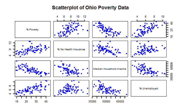
An underlying idea of regression analysis is that the variables are linearly related. To begin to visualize that linear relationship, we will start with an examination of a scatterplot matrix showing the variables in the sixth chunk of RMarkdown. In its simplest form, a scatterplot graphically shows how changes in one variable relate to the changes in another variable.
### Chunk 6: Scatterplot Matrix
```{r}

# Create a Scatterplot Matrix
pairs(~Poverty_Data_Cleaned$PctFamsPov+Poverty_Data_Cleaned$PctNoHealth+Poverty_Data_Cleaned$MedHHIncom+Poverty_Data_Cleaned$PCTUnemp, main = "Scatterplot of Ohio Poverty Data", lwd=2, labels = c("% Poverty", "% No Health Insurance", "Median Household Income", "% Unemployed"), pch=19, cex = 0.75, col = "blue")

```
Figure 5.8 shows a scatterplot matrix of the variables selected for this regression analysis. The labels in the main diagonal report the variables. In the upper left box, the percent of families below the poverty line appears. Reading to the right, we see a scatter of points that relates to the correlation of percent of families below the poverty line with the percent of families without health insurance. In this case, the percent of families below the poverty line is the dependent variable (y) and the percent without health insurance is the independent variable (x). The scatter of points suggests that as the percent of people without health insurance increases, the percent of families below the poverty line also increases. This relationship suggests a positive correlation (the variables both change in the same direction). Continuing reading to the right, we see that as the median household income increases, then the percent of families below the poverty line decreases. This relationship illustrates a negative correlation (e.g., as one variable increases, the other variable decreases). By examining the scatterplot matrix, it is possible to see the relationships between the different variables.
After examining the scatterplot matrix and getting a visual sense of the variables and their relationships, we can derive a quantitative measure of the strength and direction of the correlation. There are several measures of correlation that are available. One of the more common is the Pearson product moment (or Pearson’s r), which is used in Chunk 7 of RMarkdown. From Figure 5.8, we can see that the main diagonal of the matrix is 1.00. This means that each variable is perfectly correlated with itself. Elsewhere in the matrix, note that the “-“ sign indicates a negative correlation, while the absence of a “-“ sign indicates a positive correlation.
Values of Pearson’s r range from -1.0 (perfectly negatively correlated) to +1.0 (perfectly positively correlated). Values of r closer to -1.0 or +1.0 indicate a stronger linear relationship (correlation). From Table 5.2 we see that the percent of families below the poverty line and median household income have a Pearson’s r value of -0.76, which suggests a rather strong negative linear correlation. On the other hand, the percent of individuals with no health insurance has a rather low Pearson’s r value of 0.29 indicating a rather weak positive correlation.
| PctFamsPov | PctNoHealth | MedHHIncom | PCTUnemp | |
|---|---|---|---|---|
| PctFamsPov | 1.00 | 0.52 | -0.76 | 0.71 |
| PctNoHealth | 0.52 | 1.00 | -0.52 | 0.29 |
| MedHHIncom | -0.76 | -0.52 | 1.00 | -0.62 |
| PCTUnemp | 0.71 | 0.29 | -0.62 | 1.00 |
### Chunk 7: Correlation Analysis
```{r}

# Remove the non-numeric columns from the poverty data file
Poverty_corr_matrix <- as.matrix(Poverty_Data_Cleaned[-c(1,2,3)])
# Truncate values to two digits
round (Poverty_corr_matrix, 2)

# Acquire specific r code for the rquery.cormat() function
source("http://www.sthda.com/upload/rquery_cormat.r")
col <- colorRampPalette(c("black", "white", "red"))(20)
cormat <- rquery.cormat(Poverty_corr_matrix, type = "full", col=col)

# Carry out a Correlation Test using the Pearson Method and reported p-values
corr.test(Poverty_corr_matrix, method = "pearson")

```
Table 5.3 shows the p-values for each correlation measure reported in Table 5.2. The p-values report the statistical significance of the test or measure. Here, all of the reported Pearson’s r values are statistically significant – meaning that the correlation values statistically differ from an r value of 0.0 (which is a desirable outcome if you are expecting your variables to be linearly related).
| PctFamsPov | PctNoHealth | MedHHIncom | PCTUnemp | |
|---|---|---|---|---|
| PctFamsPov | 0 | 0.00 | 0 | 0.00 |
| PctNoHealth | 0 | 0.00 | 0 | 0.01 |
| MedHHIncom | 0 | 0.00 | 0 | 0.00 |
| PCTUnemp | 0 | 0.01 | 0 | 0.00 |
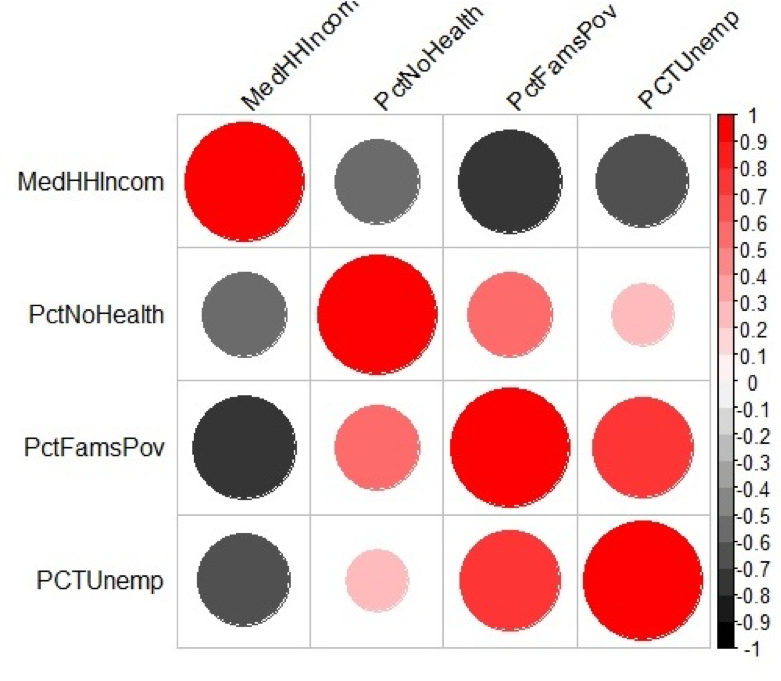
Figure 5.9 shows a graphical method of illustrating Pearson’s r values. Values of grey represent a negative correlation while values of red indicate a positive correlation. The size of the circle represents the correlation strength – the larger the circle the greater the correlation strength. Large dark grey circles (e.g., between percent families below the poverty line and median household income) represent a strong negative correlation (-0.76) while large dark red circles (between percent unemployed and percent families below the poverty line) represent a strong positive correlation (0.71).