Now that you have examined the distribution of the variables and noted some concerns about skewness for one or more of the datasets, you will test each for normality in the fourth chunk of RMarkdown.
There are two common normality tests: the Kolmogorov-Smirnov (KS) and Shapiro-Wilk test. The Shapiro-Wilk test is preferred for small samples (n is less than or equal to 50). For larger samples, the Kolomogrov-Smirnov test is recommended. However, there is some debate in the literature whether the “50” that is often stated is a firm number.
The basic hypotheses for testing for normality are as follows: H0: The data are ≈ normally distributed. HA: The data are not ≈ normally distributed.
Note that the use of the ≈ symbol is deliberate, as the symbol means “approximately.”
We reject the null hypothesis when the p-value is ≤ a specified α-level. Common α-levels include 0.10, 0.05, and 0.01.
## Chunk 4: Carry out normality tests on the variables

```{r}

# Carry out a normality test on the variables
shapiro.test(Poverty_Data$PctFamsPov)
shapiro.test(Poverty_Data$PctNoHealth)
shapiro.test(Poverty_Data$MedHHIncom)
shapiro.test(Poverty_Data$PCTUnemp)

# Examine the data using QQ-plots
qqnorm(Poverty_Data$PctFamsPov);qqline(Poverty_Data$PctFamsPov, col = 2)
qqnorm(Poverty_Data$PctNoHealth);qqline(Poverty_Data$PctNoHealth, col = 2)
qqnorm(Poverty_Data$MedHHIncom);qqline(Poverty_Data$MedHHIncom, col = 2)
qqnorm(Poverty_Data$PCTUnemp);qqline(Poverty_Data$PCTUnemp, col = 2)

```
Using the shapiro.test() function two statistics are returned: W (the test statistic) and the p-value.
| Variables | W | p-value |
|---|---|---|
| Percent Families Below Poverty | 0.981 | 0.2242 |
| Percent Without Health Insurance | 0.50438 | 9.947e-16 |
| Median Household Income | 0.85968 | 1.219e-07 |
| Poverty_Data$PCTUnemp | 0.97994 | 0.1901 |
In Table 5.1, the reported p-values suggest that the percent families below the poverty level and percent unemployed are both normal at any reasonable alpha level. However, the p-values for percent without health insurance and median household income are both less than any reasonable alpha level and therefore are not normally distributed.
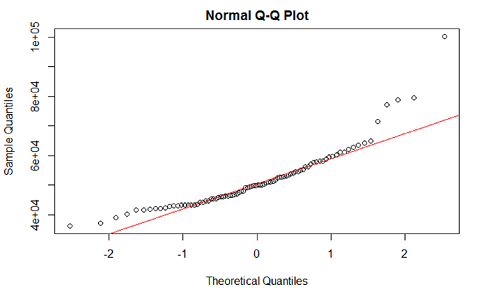
The normality of the data can also be viewed through Q-Q plots. Q-Q plots represent the pairing of two probability distributions by plotting their quantiles against each other. If the two distributions being compared are similar, the points in the Q-Q plot will approximately lie on the line y = x. If the distributions are linearly related, the points in the Q-Q plot will approximately lie on a line, but not necessarily on the line y = x, If the distributions are not similar (demonstrating non-normality), then the points in the tails of the plot will deviate from the overall trend of the points. For example, the median household income shown in Figure 5.7 does not completely align with the trend line. Most of the middle portion of the data do align with the trend line but the data “tails” deviate. The data “tails” signal that the data may not be normal.
A good overview of how to interpret Q-Q plots can be seen here.
What should I do if data are not normally distributed?
We see that two variables are not normal: percent families with no health insurance and median household income. Based on the evidence supplied by the descriptive statistics, histograms, and Q-Q plot, we suspect that outliers are the reason why these two datasets are not normal. Generally speaking, an outlier is an atypical data value.
There are several approaches that are used to identify and remove outliers. To add a bit of confusion to the mix, there isn’t a single quantitative definition that describes what is atypical. Moreover, there isn’t a single method to detect outliers – the chosen method depends on your preferences and needs. For an overview of how outliers are defined and some of the methods used to identify those outliers, check out the following two websites:
### Chunk 5: Conduct outlier test and clean the data
```{r}

# Check for Outliers and Clean those Variables of Outliers
outlier <- boxplot.stats(Poverty_Data$PctFamsPov)$out

outlier # Report any outliers

# Check for Outliers and Clean those Variables of Outliers
outlier <- boxplot.stats(Poverty_Data$PctNoHealth)$out

outlier # Report any outliers
# An outlier was detected.
# Find the row number.
row_to_be_deleted <- which(Poverty_Data$PctNoHealth == outlier)

# Delete the entire row of data
Poverty_Data_Cleaned <- Poverty_Data[-c(row_to_be_deleted),]

# Redraw the histogram to check the distribution
hist(Poverty_Data_Cleaned$PctNoHealth, col = "Lightblue", main = "Histogram of Percent of People over 18 with No Health Insurance", ylim = c(0,70))

# Check for Outliers and Clean those Variables of Outliers
outlier <- boxplot.stats(Poverty_Data_Cleaned$MedHHIncom)$out

outlier # Report any outliers
# An outlier was detected.
# Use another method to remove rows of data. Find the minimum outlier value
outlier <- min(outlier)
# Subset the data values that are less than the minimum outlier value.
Poverty_Data_Cleaned <- subset(Poverty_Data_Cleaned, Poverty_Data_Cleaned$MedHHIncom < outlier)

# Median household income histogram
hist(Poverty_Data_Cleaned$MedHHIncom, col = "Lightblue", main = "Histogram of Median Household Income", ylim = c(0,70))

# Carry out a Normality Test on the Variables
shapiro.test(Poverty_Data_Cleaned$MedHHIncom)
outlier <- boxplot.stats(Poverty_Data_Cleaned$PCTUnemp)$out

# Report any outliers
outlier

# Find the row number.
row_to_be_deleted <- which(Poverty_Data_Cleaned$PCTUnemp == outlier)

# Delete the entire row of data
Poverty_Data_Cleaned <- Poverty_Data_Cleaned[-c(row_to_be_deleted),]

# Redraw the histogram to check
hist(Poverty_Data_Cleaned$PCTUnemp, col = "Lightblue", main = "Histogram of Percent of People over 18 with No Health Insurance", ylim = c(0,70))

# Carry out a Normality Test on the Variables
shapiro.test(Poverty_Data_Cleaned$PCTUnemp)

```
You should realize that removing outliers does not ensure that your data will be normal. Even after removing outliers, your data may still not be normal. If removing outliers does not remediate the normality issue, then you can attempt to transform the data. A data transformation applies a specific mathematical function to the data, attempting to normalize the data. For example, data that exhibit extremely strong positive skewness can be transformed by applying the log10 transformation to the data. Applying a transformation has the effect of changing the scale of the data and therefore the distribution’s “shape” and hopefully skewness. There are several data transformations available, but the more common include log10(x), x2, sqrt(x), and ln(x).
Here is a brief but useful site that covers most of the major data transformations.
It is important to note that in most cases, your data are not going to be normally distributed. The degree of departure from normality can be extremely challenging to deal with especially as some statistical tests require that the data be normal before running the test (like regression). This assumption has a lot to do with making the regression model residuals more symmetric since one assumption in linear regression is that the errors are Gaussian (normally distributed). Not meeting the normality assumption has serious consequences in the ability of the correlation and regression analysis to produce meaningful results.