Now that the packages and the data have been loaded, you can start to analyze the crime data.
Before Beginning: An Important Consideration
The example descriptive statistics that are reported below are just that, examples of what is possible - not necessarily a template that you should follow exactly. In a similiar light, the visuals that are shown below are only examples of the evidence that you could create for your analysis. In other words, avoid the tendancy to simply reproduce the descriptive statistics and visuals that are shown in the sections that follow. This analysis you create should be based on your investigation of the data and the kinds of research questions that you want to answer. Think about the questions about the data that you want answered and the descriptive statistics and visuals that are needed to help you answer those questions.
Descriptive Statistics
Use various descriptive statistics that have been discussed or others that you are aware of to analyze the types of crime that have been recorded, when these crimes were most abundant (e.g., during what year, month, and time of the day), and where crimes were most abundant. Refer to the RtheEssentials.pdf for additional commands and visualizations you can use.
#Summarise data
summary(crimesstl)

#Make a data frame (a data structure) with crimes by crime type
dt <- data.frame(cnt=crimesstl$count, group=crimesstl$crimetype)
#save these grouped data to a variable so you can use it other commands
grp <- group_by(dt, group)

#Summarise data from library (dplyr)
#Summarise the number of counts for each group
summarise(grp, sum=sum(cnt))
#transpose the table
tapply(crimesstl$count, crimesstl$crimetype,sum)
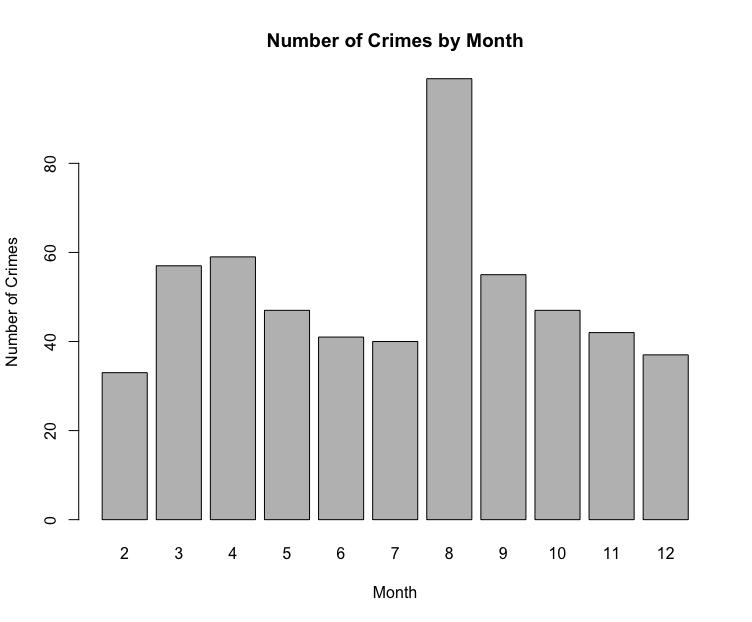
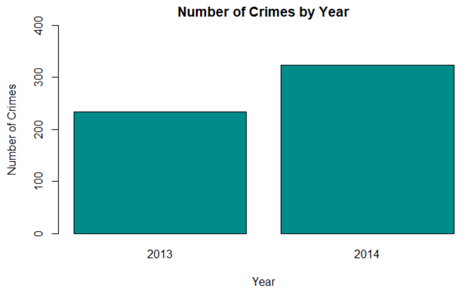
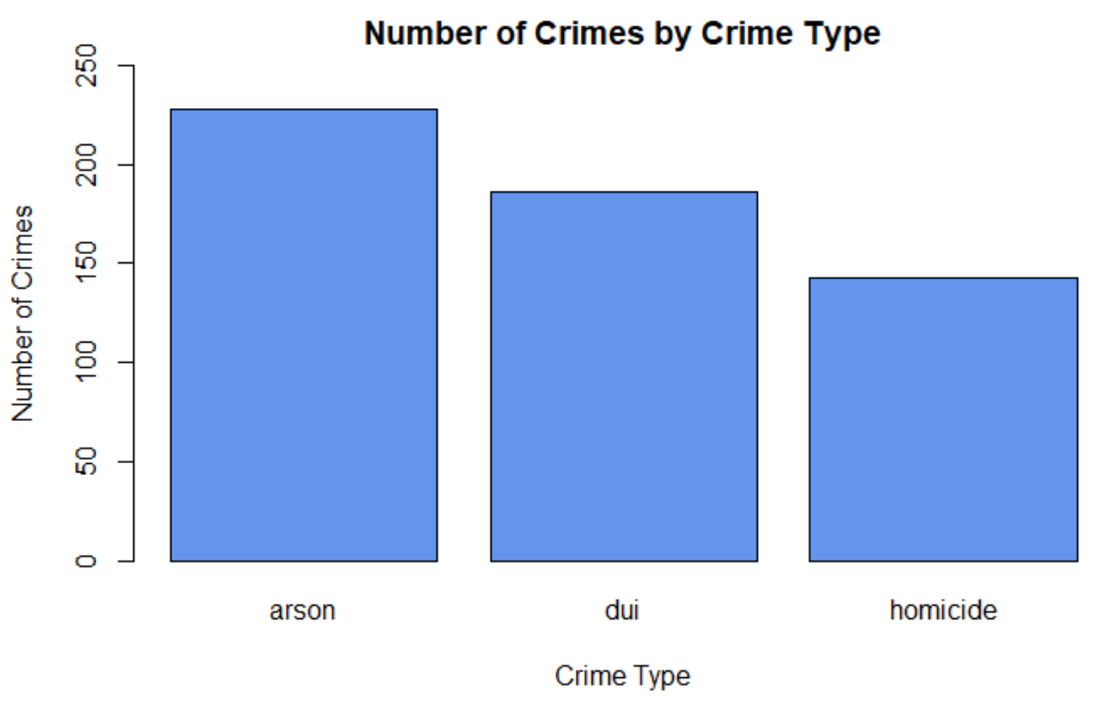
Visualizations of the data
#Descriptive analysis
#Barchart of crimes by month
countsmonth <- table(crimesstl$month)
barplot(countsmonth, col="grey", main="Number of Crimes by Month",xlab="Month",ylab="Number of Crimes")
#Barchart of crimes by year
countsyr <- table(crimesstl$year)
barplot(countsyr, col="darkcyan", main="Number of Crimes by Year",xlab="Year",ylab="Number of Crimes")
#Barchart of crimes by crimetype
counts <- table(crimesstl$crimetype)
barplot(counts, col = "cornflowerblue", main = "Number of Crimes by Crime Type", xlab="Crime Type", ylab="Number of Crimes")
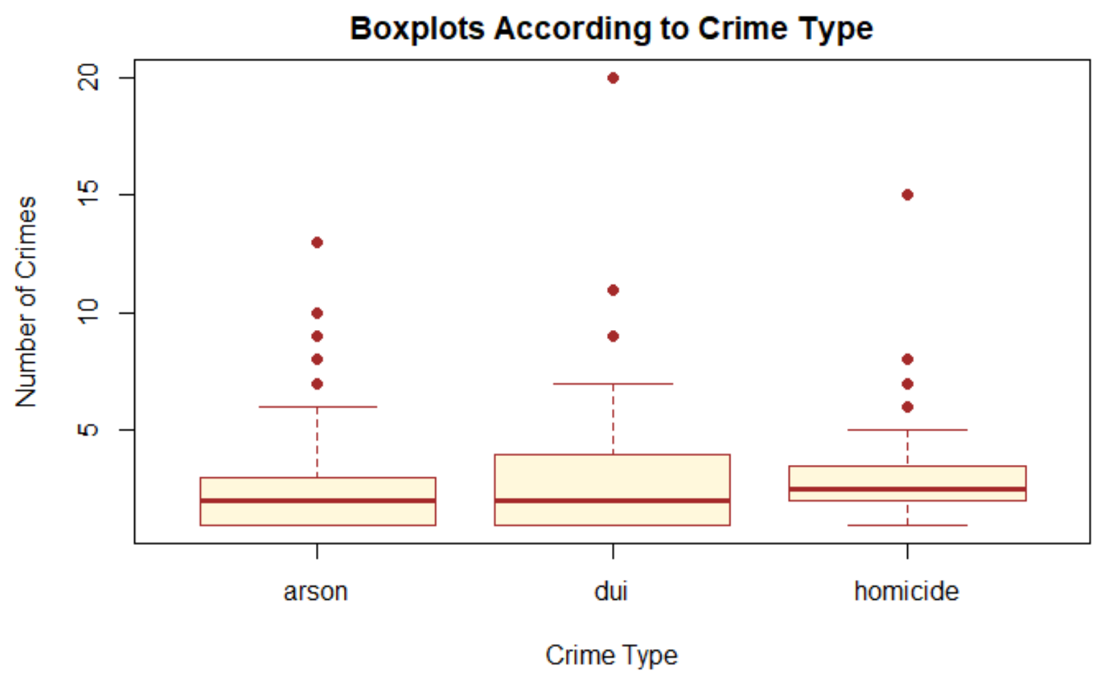
#BoxPlots are useful for comparing data.
#Use the dataset crimeStLouis20132014b_agg.csv.
#These data are aggregated by neighbourhood.
agg_crime_file <-paste(file_dir_crime,"crimeStLouis20132014b_agg.csv", sep = "")
#check everything worked ok with accessing the file
file.exists(agg_crime_file)
crimesstlagg <- read.csv(agg_crime_file, header=TRUE,sep=",")

#Compare crimetypes
boxplot(count~crimetype, data=crimesstlagg,main="Boxplots According to Crime Type",
            xlab="Crime Type", ylab="Number of Crimes",
            col="cornsilk", border="brown", pch=19)
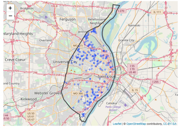
Mapping the data
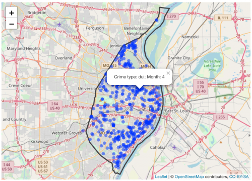
Now let’s see where the crimes are taking place. Create an interactive map so that you can view where the crimes have taken place.
#Create an interactive map that plots the crime points on a background map.

#This will create a map with all of the points
gis_file <- paste(file_dir_gis,"stl_boundary_ll.shp", sep="")
file.exists(gis_file)

#Read the St Louis Boundary Shapefile
StLouisBND <- read_sf(gis_file)

leaflet(crimesstl) %>%
  addTiles() %>%
  addPolygons(data=StLouisBND, color = "#444444", weight = 3, smoothFactor = 0.5,
                  opacity = 1.0, fillOpacity = 0.5, fill= FALSE,
                  highlightOptions = highlightOptions(color = "white", weight = 2,
                                                      bringToFront = TRUE)) %>%
  addCircles(lng = ~xL, lat = ~yL, weight = 7, radius = 5,
    popup = paste0("Crime type: ", as.character(crimesstl$crimetype),
                              "; Month: ", as.character(crimesstl$month)))
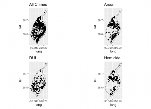
Viewing different crimes
To view different crimes you will need to refer back to the section where you viewed the different crime types in the datasets so that you can specify what crimes to select. View either the boxplot you created or the summaries you created. You will map the distribution of arson, dui, and homicide in the St. Louis area.
To create a map of a specific type of crime you will first need to create a subset of the data.
#Now view each of the crimes
#create a subset of the data
crimess22 <- subset(crimesstl, crimetype == "arson")
crimess33 <- subset(crimesstl, crimetype == "dui")
crimess44 <- subset(crimesstl, crimetype == "homicide")

#Check to see that the selection worked and view the records in the subset.
crimess22
crimess33
crimess44

#Create an individual plot of each crime to show the variation in crime distribution.
# To view a map using ggplot the shapefile needs to be converted to a spatial data frame.
stLbnd_df <- as_Spatial(StLouisBND)

#create the individual maps using ggplot
g1<-ggplot() +
      geom_polygon(data=stLbnd_df, aes(x=long, y=lat,group=group),color='black',size = .2, fill=NA) +
      geom_point(data = crimesstl, aes(x = xL, y = yL),color = "black", size = 1) + ggtitle("All Crimes") +
      coord_fixed(1.3)

g2<- ggplot() +
     geom_polygon(data=stLbnd_df, aes(x=long, y=lat,group=group),color='black',size = .2, fill=NA) +
      geom_point(data = crimess22, aes(x = xL, y = yL),color = "black", size = 1) +
  ggtitle("Arson") +
      coord_fixed(1.3)

g3<- ggplot() +
       geom_polygon(data=stLbnd_df, aes(x=long, y=lat,group=group),color='black',size = .2, fill=NA) +
        geom_point(data = crimess33, aes(x = xL, y = yL), color = "black", size = 1) + ggtitle("DUI") +
      coord_fixed(1.3)

g4<- ggplot() +
  geom_polygon(data=stLbnd_df, aes(x=long, y=lat,group=group),color='black',size = .2, fill=NA) +
  geom_point(data = crimess44, aes(x = xL, y = yL), color = "black", size = 1) + ggtitle("Homicide") +
      coord_fixed(1.3)


#Arrange the plots in a 2x2 column

grid.arrange(g1,g2,g3,g4, nrow=2,ncol=2)
#Create an interactive map for each crimetype
#To view a particular crime you will want to create a map using a subset of the data.
#Or use leaflet and include a background map to put the crime in context.

leaflet(crimesstl) %>%
  addTiles() %>%
  addPolygons(data=StLouisBND, color = "#444444", weight = 3, smoothFactor = 0.5,
                  opacity = 1.0, fillOpacity = 0.5, fill= FALSE,
                  highlightOptions = highlightOptions(color = "white", weight = 2,
                                                      bringToFront = TRUE)) %>%

  addCircles(data = crimess22, lng = crimess22$xL, lat = crimess22$yL, weight = 5, radius = 10,
    popup = paste0("Crime type: ", as.character(crimess22$crimetype),
                              "; Month: ", as.character(crimess22$month)))


#Turn these on when you are ready to view them. To do so remove the # and switch off the addCircles above by adding a #
#addCircles(data = crimess33, lng = crimess33$xL, lat = crimess33$yL, weight = 5, radius = 10,
    #popup = paste0("Crime type: ", as.character(crimess33$crimetype),
                              #"; Month: ", as.character(crimess33$month)))

#addCircles(data = crimess44, lng = crimess44$xL, lat = crimess44$yL, weight = 5, radius = 10,
    #popup = paste0("Crime type: ", as.character(crimess44$crimetype),
                              #"; Month: ", as.character(crimess44$month)))