
Now that we have looked at the basic data, we need to talk about how to analyze the data to make inferences about what they may tell us.
The sorts of questions we might want to answer are:
- Do the data indicate a trend?
- Is there an apparent relationship between two or more different data sets?
These sorts of questions may seem simple, but they are not. They require us, first of all, to introduce the concept of hypothesis testing.
To ask questions of a data set, one has to first formalize the question in a meaningful way. For example, if we want to know whether or not a data series, such as global average temperatures, display a trend, we need to think carefully about what it means to say that a data series has a trend!
This leads us to consider the concept of the null hypothesis. The null hypothesis states what we would expect purely from chance alone, in the absence of anything interesting (such as a trend) in the data. In many circumstances, the null hypothesis is that the data are the product of being randomly drawn from a normal distribution, what is often called a bell curve, or sometimes, a Gaussian distribution (after the great mathematician Carl Friedrich Gauss):
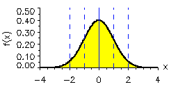
In the normal distribution shown above, the average or mean of the data set has been set to zero (that is where the peak is centered), and the standard deviation (s.d.), a measure of the typical amplitude of the fluctuations, is set to one. If we draw random samples from such a distribution, then roughly 68% of the time the values will fall within 1 s.d. of the mean (in the above example, that is the range -1 to +1). That means that roughly 16% of the time the data will fall above 1 s.d., and roughly 16% of the time the data will fall below 1 s.d. About 95% of the time, the randomly drawn values will fall within 2 s.d. (i.e., the range -2 to +2 in the above example). That means only 2.5% of the time the data will fall above 2 s.d. and only 2.5% of the time below 2 s.d. For this reason, the 2 s.d. (or 2 sigma) range, is often used to characterize the region we are relatively confident the data should fall in, and the data that fall outside that range are candidates for potentially interesting anomalies.
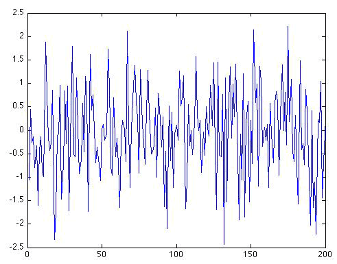
Random Time Series
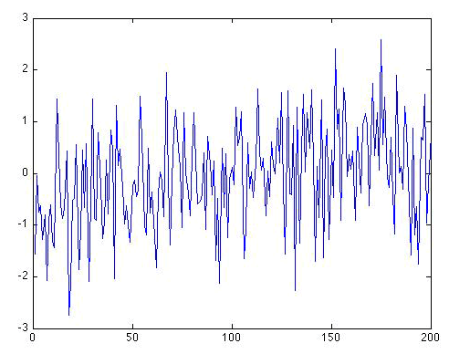
Here is an example of what a random data series of length N = 200 which we will call ε(t), drawn from a simple normal distribution with mean zero and standard deviation one looks like (for example, you can think of this data set as a 200 year long temperature anomaly record).
This sort of noise is called white noise because there is no particular preference for either higher-frequency or lower-frequency fluctuations. The fluctuations have equal amplitude.
There is another form of random noise, known as red noise because the long-term fluctuations have a greater relative magnitude than short-term fluctuations (just as red light is dominated by low-frequency visible wavelengths of light).
A simple model for Gaussian red noise takes the form
where ε(t) is Gaussian white noise. As you can see, a red noise process tends to integrate the white noise over time. It is this process of integration that leads to more long-term variation than would be expected for a pure white noise series. Visually, we can see that the variations from one year to the next are not nearly as erratic. This means that the data have fewer degrees of freedom (N' ) than there are actual data points (N). In fact, there is a simple formula relating N' and N:
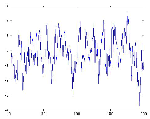
The factor measures the "redness" of the noise. Let us consider again a random sequence of length N = 200, but this time it is "red" with the value ρ = 0.6. The same random white noise sequence used previously is used in equation 2 for ε(t):
Self-Check
How many distinct peaks and troughs can you see in the series now?
Click for answer.
I counted about 55 distinct peaks and troughs in the series.
Self-Check
How many degrees of freedom N ' are there in this series?
Click for answer.
That's how many effective degrees of freedom there are in this red noise series.
This is roughly the number of troughs and peaks you should have estimated above by eyeballing the time series!
As ρ gets larger and larger, and approaches one, the low-frequency fluctuations become larger and larger. In the limit where ρ = 1, we have what is known as a random walk or Brownian motion. Equation 2 in this case becomes just:
You might notice a problem when using equation 3 in this case. For ρ = 1, we have N' = 0! There are no longer any effective degrees of freedom in the time series. That might seem nonsensical. But there are other attributes that make this a rather odd case as well. The time series, it turns out, now has an infinite standard deviation!
Let's look at what our original time series looks like when we now use ρ = 1:
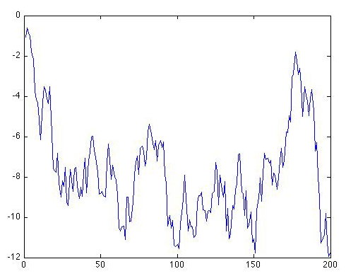
As you can see, the series starts out in the same place, but immediately begins making increasingly large amplitude long-term excursions up and down. It might look as if the series wants to stay negative. But if we were to continue the series further, it would eventually oscillate erratically between increasingly large negative and positive swings. Let's extend the series out to N = 1000 values to see that:
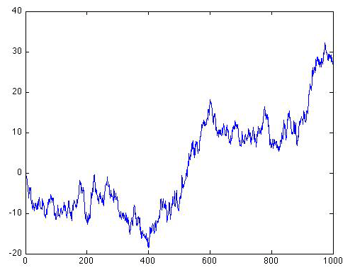
The swings are getting wider and wider, and they are occurring in both the positive and negative direction. Eventually, the amplitude of the swings will become arbitrarily large, i.e., infinite, even though the series will remain centered about a mean value of zero. This is an example of what we refer to in statistics as a pathological case.
Now let's look at what the original N = 200 long pure white noise series look like when there is a simple linear trend of 0.5 degree/century added on:
Can you see a trend? In what direction? Is there a simple way to determine whether there is indeed a trend in the data that is distinguishable from random noise. That is our next topic.