
When it comes to climate change projections, the most obvious first thing to look at is the increases in global mean temperature projected by the climate models. When we do that, we are immediately confronted with two major uncertainties each of a fundamentally different nature.
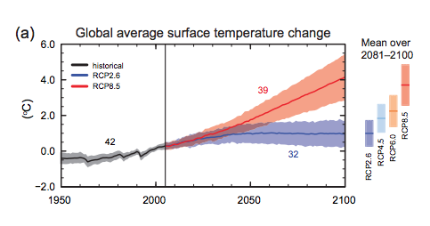
The first of the two uncertainties is the scenario uncertainty, which is represented by the different families of color-shaded regions in the graph below. It corresponds to the uncertainty in what pathway of future behavior we will follow. That uncertainty, in a crude sense, is spanned by the various RCP scenarios explored in the previous lesson. In reality, this set of scenarios alone implies greater constraint on the true spread of potential future pathways of anthropogenic activity, since there are numerous wild-cards, including (i) future anthropogenic aerosol emissions and (ii) potential carbon cycle feedbacks which may accelerate the rate at which the airborne fraction of increases with future emissions. That having been said, it is likely that a lower bound corresponding to RCP2.6 and an upper bound specified by the RCP8.5 scenario, reasonably brackets the range of future emissions pathways that human civilization will choose to follow. As a side note, validation of these projections and previous global surface projections is ongoing and can be found here.
The second of the two uncertainties is the physical uncertainty, and it corresponds to the width of each of the shaded regions (the width of the shading indicates the one standard error range among the 20+ models used in the IPCC assessment; the wider gray bars shown on the right indicate the full range of warming over all 20+ models). Much of this uncertainty comes from the previously discussed uncertainty in cloud radiative feedbacks. On average, as we know from our previous lesson, cloud radiative feedbacks are estimated to be negative. The uncertainty, however, is huge. Among the 20+ models used in the IPCC assessment, the cloud radiative feedback for doubling varies anywhere from around (offsetting roughly half of the direct radiative forcing by the increase ) to nearly (adding nearly half of the radiative forcing due to the increase alone).
Collectively, the various scenarios and their physical uncertainty ranges span a very large spread of projected warming for the next century. In the most optimistic of scenarios—indeed, an arguably unrealistic scenario—where we could manage to keep fixed at the year 2005 concentration (this would require immediate cession of all activities—including fossil fuel burning, deforestation, etc.—contributing to anthropogenic emissions), warming nonetheless persists for decades owing to the "commitment to warming" we investigated in the previous lesson in our EdGCM experiments. This is warming already in the pipeline, but not yet realized because of the delayed response of ocean warming to greenhouse gas concentration increases that have already taken place. The additional warming by 2100 might be anywhere between 0.2 and 0.6°C depending on the precise sensitivity of the climate, with most likely warming of 0.4°C. At the upper end of the scenarios is the RCP8.5 scenario, which yields anywhere from 3 to 5.5°C additional warming (with the most likely warming of about 4°C) depending, again, on the sensitivity of the climate. Interestingly, we find that the scenario uncertainty and physical uncertainty are, in a sense, of nearly the same magnitude. While the most likely warming (i.e., the central estimates for each scenario) ranges from 0.4 to 4°C, i.e., just under a range of 4°C, the range for any one scenario (i.e., RCP8.5, which ranges from 3 to 5.5°C warming) also corresponds roughly to a maximum 4°C range. In this sense, roughly half the spread shown in the various projections of future warming is under our control, i.e., it depends on choices we make about future emissions.
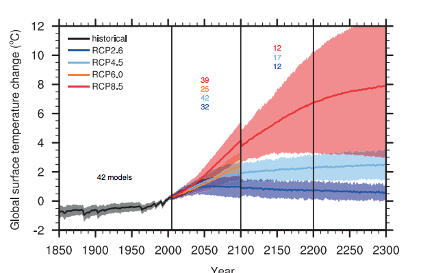
There is so much focus on climate projections through 2100 that it is easy to lose sight of the fact that the climate does not magically stop changing at 2100 in the emissions scenarios we have been exploring—indeed, there is, in many cases, significant additional warming and associated changes in climate for several more centuries.
We already discussed that global warming is not predicted to be uniform. High northern latitudes are expected to warm more and faster due, in large part, to the positive ice-albedo feedback, which becomes very strong as Arctic sea ice melts. Land regions are expected to warm faster than ocean regions, owing to the ocean's delaying thermal inertia. Some regions will warm more than others, and some may even cool slightly, due to changing atmospheric and oceanic circulation patterns.
Can we see this effect in the actual spatial temperature patterns projected by a state-of-the-art climate model? Let us take a look—we are going to examine the yearly average spatial patterns of surface temperature change in a simulation of the GFDL CM2.1 coupled model (one of the models that contributes to the 20+ member IPCC CMIP3 model ensemble using in the 4th Assessment Report), subjected to the A1B scenario, as it evolves over the entire course of the 21st century.
As you watch the animation below, take note of the overall pattern of warming. Note the latitudinal breakdown of the warming shown to the right of the map. What patterns do you see—are they what you expect? Take note of the variability, both spatially and temporally. Do you see events that resemble El Niño events? Are there any particularly conspicuous, persistent anomalies that emerge over time which you did not expect? You might want to restart the video several times, so you can absorb all of the information contained in the animation.
Think About It!
One anomaly you may have noted is the cooling in a small region of the North Atlantic south of Greenland. Any idea what might be responsible for that?
Click for answer
If you guessed that it has something to do with the North Atlantic thermohaline circulation, i.e., the "conveyor belt" ocean circulation pattern, you're on the right track.
The fact that in some simulations a very small region in the North Atlantic cools—and some neighboring regions of North America and Europe consequently warm less than they ought to—is the very small grain of truth to the movie The Day After Tomorrow!
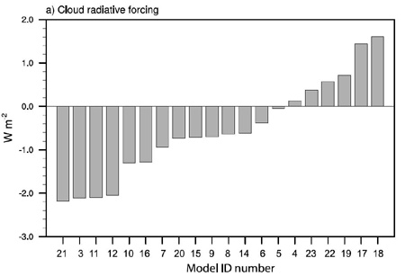
How much did the model warm in the global mean from 2000 to 2100? How does this compare to the overall spread of projected warming for the A1B scenario shown earlier? If you had to make an educated guess, what "model number" might you suspect this is, looking at the figure comparing cloud radiative forcing for the different IPCC models? Why?
Click for answer.
The model warms about 4.5°F (i.e., roughly 2.5°C) from 2000-2100. This places it slightly below the mid-range shown earlier for the A1B (green family) scenario.
Thus, we might suspect that the model has a slightly lower than average sensitivity compared to the other models shown, which implies for example a slightly more negative cloud radiative feedback than average.
So, model #7 is a reasonable guess. The GFDL CM2.1 model is known to have an equilibrium sensitivity of roughly 3.4°C for doubling.
Surface temperature changes are of course just one of a myriad effects of anthropogenic climate change. Equally, if not more important, in terms of its impact on civilization and our environment, are the shifts in rainfall and drought patterns. What do the models have to say about this?