Prioritize...
In this section, you will learn how to create more complex plots, including graphs for comparisons and graphs using special elements.
Read...
Graphs Making Comparisons
Previously, we saw how R could be used to graph simple relationships. Now, let’s examine how we might present more complex ideas. For these exercises, we'll be moving to R-Studio exclusively. You'll need to save the T_compare2017.csv data file to your R working directory. This file contains the daily maximum temperatures for three locations in central Pennsylvania (State College - SCE, Lewistown - LEW, and Philipsburg - PLB). We want to see how closely the observations from these three relatively close stations agree. Open a new R-script file and load the data using the following code:
# you can find this code in: max_temp_compare.R

# This code plots the comparison between two station's
#  temperature observations

# read in the dew point data file
T_compare2017 <- read.csv("T_compare2017.csv", header=TRUE, sep=",")

# tell R about how the date column is structured
T_compare2017$Date<-strptime(T_compare2017$Date, "%m/%d/%Y")
Now, let's plot a comparison of daily maximum temperature for State College vs. Lewistown using the following commands:
# get the full range of all the data
data_range<-range(T_compare2017$SCE_T,T_compare2017$LEW_T,T_compare2017$PLB_T)

# force a square plot
par(pty="s")

# set up the plot
plot(T_compare2017$SCE_T,T_compare2017$LEW_T, type="n",
     xlim=data_range,
     ylim=data_range,
     main="Comparison of 2017 Daily Maximum Temperatures\n(State College vs. Lewistown)",
     xlab="State College Temperature (F)",
     ylab="Lewistown Temperature (F)")

# plot the points
points(T_compare2017$SCE_T, T_compare2017$LEW_T, pch=16)

# plot a comparison line with intercept=0 and a slope of 1
abline(0,1)

# Note you can also use the line below to replace the
# second line in the main title. It give you slightly
# better control... notice I decreased the font size.
# Uncomment the line below.
#title(main = ("(State College vs. Lewistown)"),  line = 0.5, cex.main = 0.9)
Here is the graph that this code produces. Before we talk about what the graph actually shows, let's look at a few new commands and parameters introduced in this code snippet. First, notice that I calculate the total range of all the temperature data. The range(...) function returns the absolute maximum and minimum values from a series of variables that you provide. That range is then used in the xlim and ylim plot parameters to set the axis limits on the plot. For comparison plots, equal axis values make for easier interpretation. I also fix the plot to be square using par(pty="s"). Next, notice that I have split the title into two lines using a "new line" character (\n). You might want to use this technique when you have a long title (alternatively, you can use the title(...) function to add subtitles). Finally, notice that I plotted a reference line using the abline function. This function plots a line with a specific slope and intercept.
Now, on to examining the plot itself... what do you notice? Certainly there is alignment between the two observations; however, notice that Lewistown is consistently warmer than State College (by an average of 4 degrees). The reason? Well, I would say that some of the discrepancy would be due to State College's increased elevation (~600 ft higher), but we would need to look at other factors such as site selection to really understand the different. The real question is, could we use Lewistown temperature data as a proxy for State College if we needed to? What about Philipsburg? Change the plot script to compare State College and Philipsburg temperature data to judge for yourself.
Graphs Using Polygon Regions
Before we get into creating some more sophisticated graphs, I though I would show you how to make the following graph climatology graph...
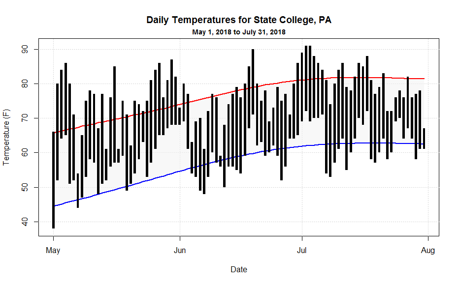
In this graph, I'm doing several interesting plots that you might make use of when looking at your data. Grab the may_july_2018.csv data file and then let's walk through the code:
# you can find this code in: climatology_graph.R

# This script plots a standard climatology graph showing
#  max/min temperature observations along with normals

# read in the data file
may_july_2018 <- read.csv("may_july_2018.csv", header=TRUE, sep=",")

# tell R about how the date column is structured
may_july_2018$Date<-strptime(may_july_2018$Date, "%Y-%m-%d")

# I need to make the graph fit all of the data, so I will set up
# the plot using the "range" command
X_range<-range(may_july_2018$Date)
Y_range<-range(may_july_2018$MaxTemperature,may_july_2018$MaxTemperatureNormal,
               may_july_2018$MinTemperature, may_july_2018$MinTemperatureNormal)

# standard plot set-up
plot(X_range,Y_range, type="n",
     main="Daily Temperatures for State College, PA",
     xlab="Date",
     ylab="Temperature (F)"  )

# adding a subtitle
title(main = ("May 1, 2018 to July 31, 2018"),  line = 0.5, cex.main = 0.9)
In this first chunk of code, I first grab and condition the data. Next, I'm going to set up the plot, but instead of using a one specific variable to base the plot on, I calculate the total range of all y-axis variables then make the plot based on that range (I have to do the same with the x-axis variable to keep the inputs the same size). If you don't do this, then likely part of your data will not be shown. Finally, I show you how I made the subtitle (as we just discussed). You're also welcome to use the "\n" method as well.
Now, let's work on the plot...
# plotting some gridlines, notice how I plotted the date axis
abline(h=seq(40,90,10),col = "lightgray", lty = "dotted")
abline(v=seq(may_july_2018$Date[1], by="month", length.out = 4),col = "lightgray", lty = "dotted")

# draws the shaded region between the normal min and max temperatures
polygon(c(may_july_2018$Date,rev(may_july_2018$Date)),
     c(may_july_2018$MaxTemperatureNormal,rev(may_july_2018$MinTemperatureNormal)),
     col=rgb(0.85,0.85,0.85, 0.5), border=NA)

# plots the normal min and max temperature lines
lines(may_july_2018$Date,may_july_2018$MaxTemperatureNormal, lwd=2, col="red")
lines(may_july_2018$Date,may_july_2018$MinTemperatureNormal, lwd=2, col="blue")
First, we add some grid lines using the abline command. Note that when drawing horizontal or vertical lines, you can just use "h" and "v" respectively. Also, note how I use the seq(...) command to draw a series of lines (even for the "date" axis!). Next, I draw the the shaded polygon region that bounds the normals. I pass the function an ordered sequence of x and y coordinates. Note that I first do the dates in ascending order and then (for the return trip) in descending order by rev(...) the variable. I follow suit with the normals data so that they match the dates. Finally, I draw two colored lines for the normals.
Now I'm ready to draw the black rectangles that represent the observed temperature range for each day. The tricky thing here is that the width of the rectangles must be a function of time (seconds actually) because my x-axis is time. Because I wanted to be able to easily adjust the width of the bars, I first defined a variable that gave me seconds as a function of hours. This is a standard coding practice... anywhere you have a value, used in many places, that you might want to change, define it as a variable instead. That way, you can make one change to the variable and the value will be updated everywhere. It will make your life so much easier. Here's the final section of code:
# plots the rectangle bars for observed min and max temperatures
# notice that I define a bar width in seconds because the x-axis is
# a date.
bar_width=3600*7

rect(may_july_2018$Date-bar_width, may_july_2018$MinTemperature,
     may_july_2018$Date+bar_width, may_july_2018$MaxTemperature,
     col="black", border = NA)
Once you've played with this code and understand how it works, you're ready to move on to histograms and box-and-whisker plots.
Note:
Did you get a square plot when you tried climatology_graph.R? If you did, then the R-Studio graphics device is remembering the square comparison plot that you created earlier (remember the par(pty="s") command on line 16 of max_temp_compare.R?). Graphics settings are remembered as long as the graphics device is open. So, you can do a few things to clear out the square plot setting. First, you can "Clear All Plots" in R-Studio using the little broom icon in the plots toolbar. This resets the graphics device in R-Studio (but it also erases all of your plots). Or, you can add the line par(pty="m")right above the plot command (line 18). This switches the graphics device from making square plots to maximal area (default) plots. If you are curious, you can read more about R's many Graphical Parameters.