Prioritize...
In this section, you will learn the "histogram(...)" and "boxplot(...)" commands to produce quick looks at the distribution of a data set.
Read...
Remember, in the last lesson, we discussed ways to visualize the distribution of large data sets without too much computational hassle. Namely, we looked at histograms and box plots. Let's look at some code.
Histograms
First, let's load the dew point data set (UNV_maxmin_td_2014.csv) that we have used before. I realize that this data set may already be loaded in your R memory space, but unless the file is very large, I always have my script reload and re-parse the data. This prevents the data that may have been changed (in a previous exercise) from being used in my current calculations. I've learned the hard way to always start with "fresh" data. (I also suggest opening a new R-script file rather than just appending on to an existing one.):
# you can find this code in: histogram.R

# This code plots a histogram of daily differences in
#  dew point temperatures.

# read in the dew point data file
mydata <- read.csv("UNV_maxmin_td_2014.csv", header=TRUE, sep=",")

# tell R about how the date column is structured
mydata$date<-strptime(mydata$date, "%Y-%m-%d")
Now add the following lines of code to plot the histogram of daily dew point difference.
hist_output<-hist(mydata$max_dwpf-mydata$min_dwpf,
     main="Distribution of Daily Difference Dew Point in 2014",
     xlab="Daily Dew Point Difference (F)",
     ylab="Number of Observations",
     las=1,
     breaks=10,
     col="green",
     xlim=c(0,60)
)
Here’s the graph that you should see…
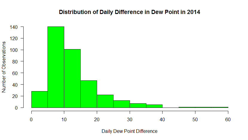
This histogram shows the frequency of occurrence for dew point observations that fall within select “bins”. You can control the number of bins with the “breaks” command. Breaks can be a number or a sequence of numbers. If you just specify a number, R makes a judgment on how to divide the data. If you use a sequence, you can precisely control how the data are distributed.
For example, substitute: breaks=20, in the histogram command. Now you can see counts for every 5 degrees. Does this new graph communicate some different information than a standard time series graph? Later, you will learn more about distributions and how they can help you make inferences about the probability that a certain event will occur.
Note: I also added a new parameter, “las”. This sets the orientation of the tick labels. Play around with the values to see what happens (valid values are: 0, 1, 2, 3).
There's one more thing I wanted to point out. The hist(...) function not only creates a plot. Like many functions of R, the hist(...) returns a data structure that contains all of the precise values for the bins. I captured this information in the variable hist_output (remember, you can examine its contents by simply typing the name in the console or using R-studio's Environment tab. With this data, you can use the values to perform computations on the data, or add this information to the plot itself (like labeling values, etc). Adding a line such as...
text (hist_output$mids, hist_output$counts+5, labels=hist_output$counts, cex=1.2, col="black")
allows you to add custom text to your graph (here's my example). You can read more about the text command and play around with the settings if you wish.
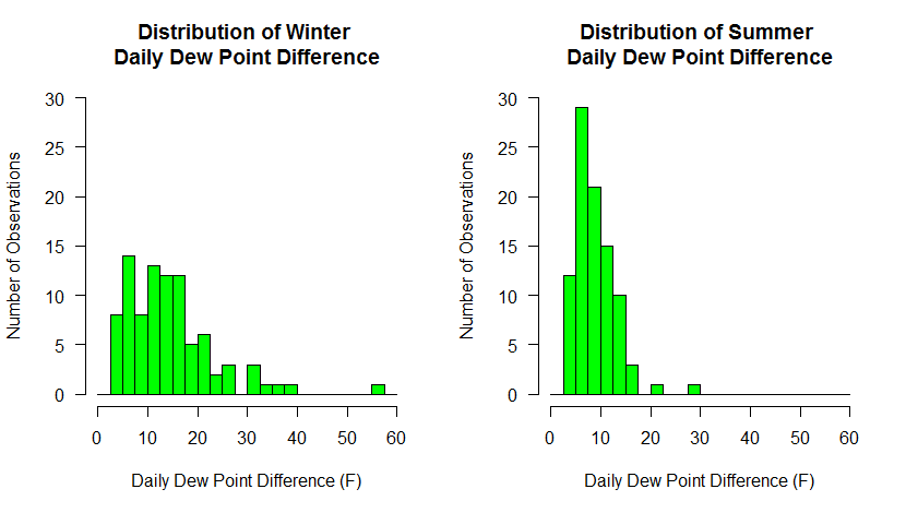
Finally, allow me to show you one more bit of code that combines what we have learned so far. Substitute the following code for the single histogram plot command
# make two plots... 1 row x 2 columns
par(mfrow=c(1,2))

# calculate a column of dew point differences
# BTW, I could have done this for the last set of histograms
mydata$dwpt_diff<-mydata$max_dwpf-mydata$min_dwpf

# plot only the differences in DEC, JAN, and FEB
hist(mydata$dwpt_diff[mydata$date > "2014-11-30" |
    (mydata$date >= "2014-01-01" & mydata$date < "2014-03-01" )],
     main="Distribution of Winter \nDaily Dew Point Difference",
     xlab="Daily Dew Point Difference (F)",
     ylab="Number of Observations",
     las=1,
     breaks=seq(0,60,2.5),
     col="green",
     xlim=c(0,60),
     ylim = c(0,30)
)

# plot only the differences in JUN, JUL, and AUG
hist(mydata$dwpt_diff[(mydata$date >= "2014-06-01" & mydata$date < "2014-09-01" )],
     main="Distribution of Summer \nDaily Dew Point Difference",
     xlab="Daily Dew Point Difference (F)",
     ylab="Number of Observations",
     las=1,
     breaks=seq(0,60,2.5),
     col="green",
     xlim=c(0,60),
     ylim = c(0,30)
)
Here we've done a couple of things. First, we've divided the plotting region into two panels (1 row by 2 columns). That means that each hist(...) call will go to a different panel, rather than one replacing another. Next, we have created a column in our data frame to hold the dew point differences. We could have done this at the very beginning of the histogram discussion but we do it now so that it makes the winter/summer selection easier. Finally, we make two hist(...) calls, using the technique we learned to partition the data. Make sure you understand how subsetting like this is accomplished... it is so powerful. To ensure that both graphs had the same breakpoints and axis scales, I specified the breaks explicitly with a sequence of numbers and I also added an explicit axis limits using xlim and ylim. Make sure you experiment with each of these new commands to see how they work.
Below are the graphs produced. What trends do you observe in the data? Do these graphs tell you something different about the data than the first set of graphs did?
Box Plots
Remember that box plots are also a nice way to look at distributions of data, especially discriminated by a third variable. In this example, we will look at the distribution of dew point temperature in State College by month for the year 2014. To begin, start a new R-script file, enter the following code and source it:
# you can find this code in: boxplot.R

# This code plots a box-and-whisker plot of daily differences in
#  dew point temperatures.

# read in the dew point data file
mydata <- read.csv("UNV_maxmin_td_2014.csv", header=TRUE, sep=",")

# tell R about how the date column is structured
mydata$date<-strptime(mydata$date, "%Y-%m-%d")

# create a column of numerical months
mydata$month<-as.integer(format(mydata$date, "%m"))

# reset the plot area just in case you have just
# come from the two histogram exercise
par(mfrow=c(1,1))

boxplot(max_dwpf~month, mydata,
        xlab="Month",
        ylab="Daily Maximum (F)",
        main="Daily Maximum Dew Point Observations for 2014",
        las=1,
        xaxt="n",
        pars=list(medcol="red", whisklty="solid", whiskcol="blue", staplecol="blue")
)

# create custom axis labels
axis(1, at=c(1:12), labels=rep(month.abb, 1))
Your graph should look like the one below. If we look at the code, you will notice it resembles the histogram code with the exception of a few lines. First, there is the line that creates a new column in the data frame called "month". We parse the date column and extract a numerical representation of the month. We need this information because a box-and-whiskers plot needs to know how to partition the data. In this case, we want the max_dwpf variable to be binned by month and we indicate that by the expression: max_dwpf~month in the boxplot function call (the tilda symbol "~" is often used in R as a representation of the word "by"). A second addition is the line that contains the function: axis(...). This adds a custom axis to the bottom of the graph. Notice in the plot call, I have the command xaxt="n". This means to turn off the default x-axis so that I can add one of my own (try it without the custom axis to see what you get). You can learn more about the many ways to customize plots and axis values by simply Googling "R custom axis".
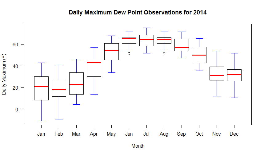
Remember that in a box-and-whiskers plot, the median is represented by a line running through the center of the box (in the code above I have set the median line to red). The second and third quartiles are defined by the top and bottom of the box. Fifty percent of the observations, therefore, lie within the box (the width of the box is called the interquartile range). The first and fourth quartiles are represented by the whiskers on either side of the box. An outlier is a point that lies more than one and a half times the length of the box from either end of the box. In R, outliers are shown as small circles plotted beyond the end of the whiskers.
Finally, know that you can also add lines and points to box graphs, just like you did to other kinds of plots. For example, if we wanted to plot the mean of the observations along with the boxes, you might add the following code:
# Calculate and plot the mean max dew point for each month
points(aggregate(max_dwpf~month, mydata, mean), pch=18, cex=2)
The aggregate(...) function is a very powerful way to calculate simple statistics on columns of data. The result is a data structure that in our case provides the x and y coordinates for plotting our mean values for each month. Run the script again to see the means plotted as diamonds on top of the box plots.