Prioritize...
After completing this section, you will be able to plot data sets that contain two independent variables. Plots covered in this section are contour plots, filled contour plots, and image plots.
Read...
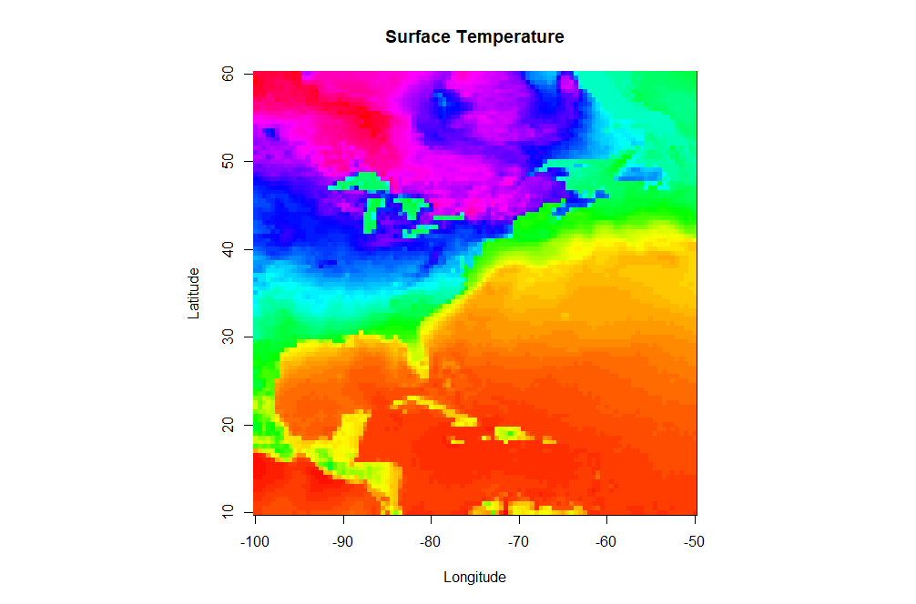
Up to this point, we have been working with data that only contains one independent variable (for example, temperature versus time). However, meteorological data is inherently spatial and often requires two or more independent variables. The simplest type of 2-D plot you might use to visualize this type of data is an image plot. Image plots essentially display pixelated values of a single dependent variable as a function of two independent variables (latitude and longitude, for example).
Open a new script file and copy the script below. You will need to load this gridded dataset of surface temperature that I have prepared for you. Save the file (right-click -> Save As...) to your R-script directory (and don't forget to set R-Studio's working directory to match). Note this is an .RData file. These files are essentially R-objects (variables) saved from a previous session of R. Because they are already defined as an R-object, you don't need to "read" them in. Instead you simply "load" them. It's a nice way of storing a permanent copy of some R-data that you've been working on and want to keep between sessions. If you want to read more, check out this article about various ways to save R data.
# you can find this code in: image_plot.R

# This code creates an image plot of surface temperature

# load a pre-made R dataframe called model.grid
load("sample_grid.RData")

# define a palette of colors
colormap<-rev(rainbow(100))

# Set the display to be a square
par(pty="s")

# create an image plot
image(model.grid$x, model.grid$y, model.grid$z, col = colormap,
           xlab = "Longitude", ylab = "Latitude",
           main = "Surface Temperature")
There are a few new commands in the script above that I want to highlight. In addition to the aforementioned load command, note that I defined a specific color palette for my plot. I first define a vector of 100 colors selected from the default palette "rainbow" (I also reverse the order). Then I set the col parameter equal to my vector of colors in the image(...) command (col=colormap). R can give you almost any color scheme you might want. If you want to read more about color, I suggest starting with this color cheatsheet. You might try removing the col=colormap to see the default color map for image(...).
Finally let's look at the image(...) command. First, remember that you can ?image or Google "R image" to find out all of the possible optional parameters that this plotting function takes. As a bare minimum, you must specify a vector of X-values, vector of Y-values, and a matrix (2-D) of Z values that map onto the X and Y space. I have provided you these basic vectors as part of the dataframe model.grid that was saved in the RData file (Can you see it in your environment space?). However, you will likely find that the data you want rarely comes in such a format (for example, some data might be a triplet-pair: {x, y, z}). Therefore, know that you might have to do some data manipulation to get things in the right format... this function is picky! Also note that image(...) does not give you a legend strip along with the plot. If you want the legend, you can substitute the command: image.plot(...) instead. This function however is not built-in to the base functions of R. To use image.plot(...) you are going to need to install the package "fields" (we'll discuss packages on the next page).
Contour Plots
Perhaps a pixel-by-pixel plot will not tell us what we want to know about a particular 2-D data field. In such cases we might want to look at a contour plot of the data. Contour plots strive to group regions of similar value. Contour lines can pinpoint specific values better and the contouring process tends to smooth the data. In case you’re not familiar with interpreting contour plots, you can take this little detour...
Let's now look at how we might contour our pre-loaded data set. Modify your image.plot script or start a new one.
# you can find this code in: contour_plot.R

# This code creates an contour plot of surface temperature

# load a pre-made R dataframe called model.grid
load("sample_grid.RData")

# Set the display to be a square
par(pty="s")

# create a contour plot
contour(model.grid$x, model.grid$y, model.grid$z,
           xlab = "Longitude", ylab = "Latitude",
           main = "Surface Temperature")
Here's the contour plot this script produces. Note that the contour function and image function take input data in the same structure and the function call is quite similar. Let's look at what else we can do with this command. Try specifying the contour intervals using the levels parameter:
# create a contour plot
contour(model.grid$x, model.grid$y, model.grid$z,
           levels=seq(-30,80, by=5),
           xlab = "Longitude", ylab = "Latitude",
           main = "Surface Temperature")
What about stacking two contour plots For example, let's add a second contour plot that consists only of the freezing (32F) contour as a thick blue line. Directly below the first contour function call, add (don't replace) this command to your script:
# create another contour plot
contour(model.grid$x, model.grid$y, model.grid$z,
           levels=c(32),
           xlab = "Longitude", ylab = "Latitude",
           main = "Surface Temperature",
           lty=1, lwd=2, col="blue",
           add=TRUE)
Note the addition of the add=TRUE parameter. This simply adds the second contour plot on top of the first one.
Solve It!
Using the data set from this page, create the following image showing an image plot with an overlaid contour.
Here is a possible solution:
# This code creates an image plot with contours of surface temperature

# load the data
load("sample_grid.RData")

# specify our color palette
colormap<-rev(rainbow(100))

# Set the display to be a square
par(pty="s")

# draw the image plot
image(model.grid$x, model.grid$y, model.grid$z,
           col = colormap,
           xlab = "Longitude", ylab = "Latitude",
           main = "Surface Temperature")

# now draw the contours on top (note the "add=TRUE")
contour(model.grid$x, model.grid$y, model.grid$z,
        add=TRUE)
Remember that you need not memorize all of these commands (recall my philosophy statement). Just make sure that you save examples of each type of graph for future reference. We’ll make use of such plots in greater detail in future lessons and you'll probably develop a few key "go-to" plots that you can tweak, depending on what is needed. Now let's examine R's ability to display data using custom plots created by others.
Read on.