Prioritize...
After this section, you should be able to perform various transformations on a dataset and determine which type of transformation would work best.
Read...
Sometimes unruly data is not caused by missing values, but rather is difficult to visualize due to range or clustering issues. In such cases, we may want to apply a data transformation to better visualize or communicate your message. A data transformation is the application of a mathematical function on each data value. In essence, while data transformations may change the value of the data, they do so in a known (and reversible) manner.
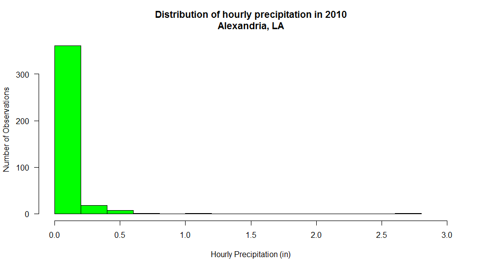
To illustrate when a data transformation might be needed, consider the histogram below that shows the distribution of hourly non-zero rainfall observations during the year 2010 for Alexandria, LA. You'll note right away that this graph is not at all informative. This is because most hourly observations are located in the first bin (<0.5 inches) while at the same time, there are some observations that exceed an inch. Increasing the bin number doesn't help us that much because once again, 1) most of the observations are contained in the lowest bin and 2) that bin is so large that smaller count values are difficult to read. This type of distribution is referred to as having a right skew because most values are small (a left-skewed distribution would have mostly large values).
But what if we wanted to understand the distribution of observations better? How might we transform the data to give us more insight? In order to combat the large discrepancy in scale of the histogram bins, let's look at what happens if we apply a base-10 logarithmic transform to the observations. In case you are not familiar with logarithms, all you basically need to know is that a logarithm transforms a number into the exponent of its base. For example, the base-10 logarithm of 100 is 2 because 100=102. Likewise, log10(10)=1 and log10(1)=0. Logarithms of numbers smaller than 1 are negative, so log10(0.1) is -1 because 10-1=0.1. This means that I can represent a large range such as 0.1 to 100 on an axis that only spans -1 to 2. To plot the log-base-10 histogram, you just need to make your histogram call: hist(log10(mydata$precip), ....). Here's the log10 histogram of the precipitation observations. (Note: I should also point out that a logarithmic transformation cannot be applied to negative or zero data values).
Working with transforms can be a bit tricky to interpret, for you and your audience. Make sure that you clearly label any transform that you have performed and be prepared to explain what you have done (and why). Notice in the log10 histogram, I have changed the x-axis label to reflect that I have taken the log10 of the data before binning. Still, it may be hard to recognize that "-2" on the x-axis is actually 0.01 inches. One approach is to change your x-axis labels back to the untransformed values. In R, you can turn off the automatic x-axis using the plot parameter xaxt='n', then add your own axis command such as: axis(side=1, at=seq(-2,0.5, 0.5), labels=c(0.001, 0.031, 0.1, .31, 1, 3)). The result is a histogram that is much easier to read even though the labels are not equally spaced.
Finally, note that the first bin has a very large number of counts and the bins to the right have very small count values -- so much so, that it's hard to determine their actual values. Perhaps we could apply a log10 scale to these values as well. The answer is "yes" of course, but we need to approach things a bit differently. Examine the code and output below...
 # Let's assume that column "precip" is in a dataframe "mydata"
# I have assigned NA to all missing, trace, and 0 values.

# Perform the histogram calculation but do not plot the results
# Save the results in a dataframe called "hist_plot"
hist_plot<-hist(log10(mydata$precip),breaks=20,plot=FALSE)

# Now make the plot.  Notice the log="y" that sets the y axis to a log scale
plot(hist_plot$breaks[1:25],hist_plot$counts, log="y", type='h',
     lwd=25, lend=3,col="green",
     main="Distribution of hourly precipitation in 2010\nAlexandria, LA",
     xlab="Hourly Precipitation (in)",
     ylab="Number of Observations" )
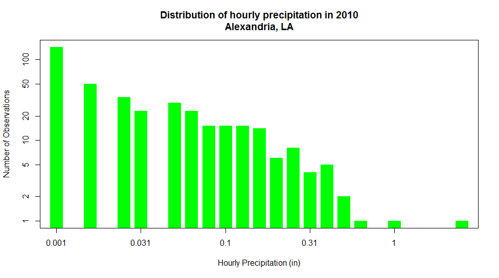
Notice now, that not only can we see all of the detail in bins of the histogram, we can clearly distinguish the values of each bar (from the largest to the smallest). I should note that we might lose the perspective on the shape of the distribution of observations, we gain detailed insight into the various amounts of precipitation and their frequency of occurrence over during the year.
While log transforms are by far the most common, there are several other methods to chose from depending on the characteristics of your data. Check out the table below for a summary of various other data transforms.
| Method | Math Operation | Good for: | Bad for: |
|---|---|---|---|
| Log | ln(x) log10(x) |
Right skewed data log10(x) is especially good at handling higher order powers of 10 (e.g., 1000, 100000) |
Zero values Negative values |
| Square root | √x | Right skewed data | Negative values |
| Square | x2 | Left skewed data | Negative values |
| Cube root | x1/3 | Right skewed data Negative values |
Not as effective at normalizing as log transform |
| Reciprocal | 1/x | Making small values bigger and big values smaller | Zero values Negative values |
NOTE: Before we leave this topic, there are two points that I think are very important... 1) Data transformation is only useful when displaying data. Do not transform your data if you are going to be applying any sort of statistical analysis on them. Applying a data transform before you process it may have unpredictable and erroneous results. 2) When you show transformed data, make sure that you are very clearly indicating the type of transform that has been applied. You should do this both in a graphic's title (e.g., "Log10(Pressure) versus Temperature") and in axis labels (e.g., "1/Temperature (1/oC)").