Animated Maps
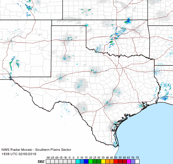
Though animated maps may also have interactive components, they are uniquely defined by their use of animation to display spatial data. A type of animated map you have likely seen and used is a weather radar map, such as the one shown in Figure 8.5.1. These maps typically contain little user-interaction capabilities—they are watched by the user as if watching a movie—though they may contain zooming or panning functionality, or the option to pause the animation at a point in time.
Animated maps are used to visualize a wide range of data topics, from weather to health data, demographic statistics to travel routes. Most common among these maps is the inclusion of time as the variable that is changed as the animation is performed. Though, theoretically, any quantitative variable could be depicted via animation, the use of animation to depict data through time is supported by the congruence principle which states that the external graphic representation of data should match its intrinsic characters (e.g., in the case of animation, the animation plays across time, and represents temporal data) (Tversky, Morrison, and Betrancourt 2002).

Despite the popularity of animated maps for data visualization, little research has yet been conducted that supports its use as a replacement for static graphics such as small multiple maps (Tversky, Morrison, and Betrancourt 2002; Griffin et al. 2006). Animated maps present unique challenges for users, who are often hindered by perceptive constraints, such as change blindness – the inability to detect changes in maps across animated frames, often combined with user overconfidence in map comprehension (Fish, Goldsberry, and Battersby 2011).
Griffin et al. (2006) conducted a map-cluster detection study with animated maps and small multiples and found that users did tend to be more successful with animated rather than static maps for this task. They note an important challenge in animated map design, however—that the pace or speed of the animation is influential on user success, and that different paces are more useful for different maps. There is no ideal animation pace for maps, though cartographers ought to consider what pace might be most useful for their map’s intended audience and purpose. One way to sidestep this decision is to add simple interaction features to animated maps, such as the ability to pause or step through time, so the user might adjust the animation to a speed that works best for them (Tversky, Morrison, and Betrancourt 2002). Though many visual variables are used in animated mapping, pace is among the visual variables used specifically for encoding data via animation. Other animation-relevant variables include rate of change – how much the map changes between each animated frame, and order (DiBiase et al. 1992), which is the order in which individual frames are presented (often chronologically, but not always).
Student Reflection
Consider a mapping purpose for which you might want to create an animated map with frames in non-chronological order. Why would this design choice benefit the map user?
Alan MacEachren (1995) extended the above-mentioned visual animation variables to include display date – the starting time of a temporal sequence, frequency – the number of unique states within each unit of time (e.g., animated frames per year), and synchronization – the coincidence (or otherwise) of time series when two or more are displayed at once (e.g., snowfall and school attendance might be displayed out of sync).
Recommended Reading
- Tversky, Barbara, Julie Bauer Morrison, and Mireille Betrancourt. 2002. “Animation: Can It Facilitate?” Int. J. Human-Computer Studies Schnotz & Kulhavy 57: 247–262. doi:10.1006/ijhc.1017.
- Griffin, Amy L, Alan M MacEachren, Frank Hardisty, Erik Steiner, and Bonan Li. 2006. “A Comparison of Animated Maps with Static Visually Maps for Identifying Clusters Space-Time.” Annals of the Association of American Geographers 96 (4): 740–753.
- Dibiase, David, Alan M. MacEachren, John B. Krygier, and Catherine Reeves. 1992. “Animation and the Role of Map Design in Scientific Visualization.” Cartography and Geographic Information Systems 19 (4): 265–266. doi:10.1080/152304092783721295.