Lesson 1 Lab Visual Guide
Note:
Before you look through the Visual Guide, please watch the following video (6:28) entitled "Lesson 1 Lab ArcGIS Pro Tips & Tricks." Doing so will give you a few hints on how to start with this lesson. You should not expect to follow the video exactly as the map design process and the decisions made on how to design the map is up to you.
(0:01)
This is the ArcGIS Pro starting screen which you'll see when you open the map file for Lab 1.
Here are some of the base maps we read about in Lesson 1. I've pre-selected to include the gray canvas basemap which we'll be working with for this lab. The basemap also comes with a reference layer (that you can use to help locate an area of interest to map) that you can toggle on and off, but we won't be including any labels on our map in Lab 1. I encourage you to toggle off the basemap before you submit the map as the basemap includes labels that disturb your design. Besides, we will work with labeling in the next lesson.
For Lab 1 and 2, we'll be working in Louisiana. The data we'll be using was all downloaded from The National Map, and I've pre-loaded all the features you will need. You can expand groups of layers as well as toggle layers on and off in the contents pane, which is on the lefthand side of the ArcPro environment. All the data you'll need for this lab is in the database. You won't really need to worry about this for Lab 1 unless you accidentally delete a layer from your map. In that case, you can drag it back onto the map from the database. For example, if we accidentally remove the roads layer we could drag it back.
(1:10)
When designing symbols, it's often helpful to focus on one layer at a time, so I'm going to toggle all but this rails layer off. We can right-click on the layer and then select the symbology option to open the symbology pane. For this layer, we have just a single symbol, which we can edit in the symbol properties pane. Within this pane, the first tab is most helpful for making simple adjustments such as changing symbol color or width. For example, we can change these lines to red and we can increase their width - and you'll see that preview appear at the bottom of the pane.
(2:00)
More detailed edits can be made in the layers and structures pane. For example, we can add an additional layer to create a multi-layer line, and we could also rearrange these layers if we wanted to. Back in the layers tab, we can change the line's colors and make additional edits. It's a good idea to explore all the design options available in the layers tab.
You may notice that our lines have a strange "caterpillar" look. This can be corrected by enabling symbol layer drawing which will fix the ordering of your layers and clean these lines right up. Some layers, such as roads, contain multiple feature types. The roads in this map are classified by their TNMFRC value. Different values signify different types of roads. You can explore this more by opening the attribute table for this layer.
(3:17)
There's some interesting design you can do with area features as well. We'll work from the symbology pane to edit our water bodies; just as we did with lines, we can change the fill color - so let's go into the color picker and do yellow (you wouldn't do yellow, but let's try yellow) and then we can add another fill layer on top. Go back to the layers pane, and we can change this to a hatched fill. I really don't like the yellow let's change to green - so there you have a pretty easy example of creating a pattern effect.
(3:58)
Another helpful feature is the show count option which displays the count of each feature type in your dataset. You can see there's only one feature in this underground conduit classification - and we're just going to remove that. Unlike the codes, which are linked back to the database, you're free to change the labels as much as you want. We'll talk about this more in Lab 2. You can also change the ordering of features by clicking one and using the arrows to move it up or down.
(4:28)
To make the second map for this lab, we'll start by saving our first map as a map file. You should name it something that makes sense and something that you'll remember. Essentially what we're doing is making a copy of our map that we can then re-import into the same project. So let's do that now by choosing the import map file option. Our map isn't done, but imagine it is - so let's try a new layout using the import layout option. Name your layout something that makes sense, and then you're ready to add your map! I'm going to put in some half-inch margins here and then go to the map frame drop down and click on the appropriate map. You can resize and rescale your map once you add it to the page. To change the location and view on your map though, you'll have to activate it. Once activated you can move your map around as much as you'd like. The final step is to add your name and export your map. Onelast step is to use a text box to add my name. Now, Go to the Share tab and export your map as a PDF: we'll increase to 300 dpi.
Lesson 1 Lab Visual Guide Index
- Starting File
- Explore the pre-loaded data via the Contents pane
- Design symbols using the Symbology pane
- Make your second (smaller-scale) map
- Add each map to a layout
- Finalize and save your layouts
- Additional tips and tricks
-
Starting File
To start this lab, you'll want to download the zipped folder and copy it to a safe space on your computer that has plenty of file space. I recommend dedicating a folder on your computer or a large external drive just to Geog 486 lab projects to keep yourself organized. There will be several large files used in this class.
To open the starting map file, you'll need to extract the folder and open the blue ArcGIS Pro file called "Lab1_START." It should look similar to the file in Figure 1.1 below.
All the features/data you will need have been downloaded by your instructor and pre-loaded into this project file.
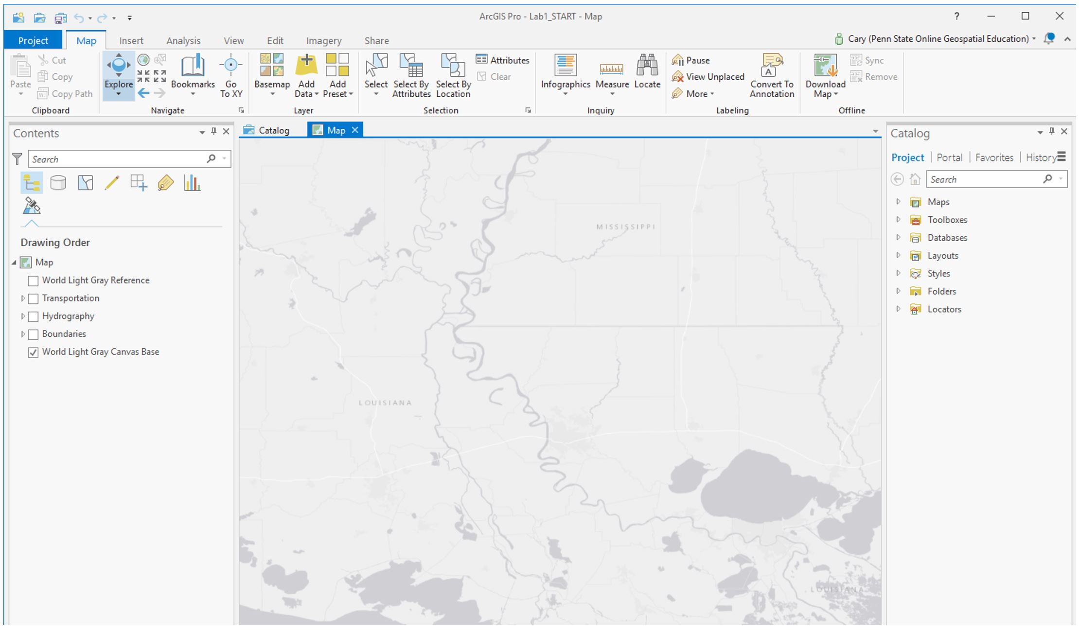 Visual Guide Figure 1.1. Starting file in ArcGIS Pro.
 -
Explore the pre-loaded data via the Contents pane
You can toggle on and off layers using the associated checkboxes in the Contents pane. The light-gray canvas basemap has been included as part of these files. The basemap also comes with a reference layer (that you can use to help locate an area of interest to map) that you can toggle on and off, but we won't be including any labels on our map in Lab 1. We will work with labeling in Lab 2. While you can use the World Light Gray Reference and World Light Gray Canvas Base layers as guides during the map design process, make sure that you toggle off both the World Light Gray Reference and World Light Gray Canvas Base layers before you submit your final maps for this lesson.
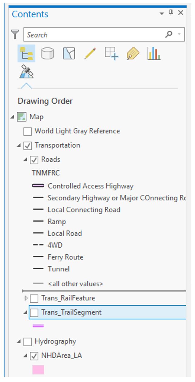
There are Layers Groups (e.g., “Transportation”) as well as individual layers (e.g., “Roads”). Eventually, you will need to look at multiple layers at once, so that you can see how all your symbols look together. It will likely be easiest at first, however, to turn off (un-check) most of the layers so you can focus on one layer at a time.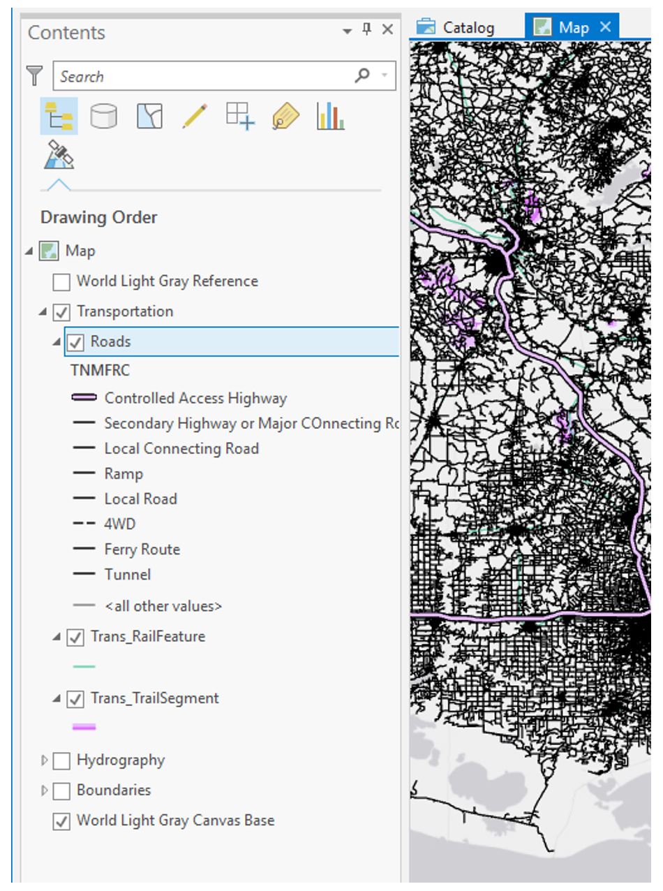 Visual Guide Figure 1.2. Layers in the ArcGIS Pro Contents Pane.
The data you see in the contents pane are stored in the project's geodatabase. You can see this data by expanding the database in the Catalog pane. For this lab, you don't have to worry much about managing the data in the geodatabase - the data you need has already been added to your map. If you accidentally delete a layer from your map, however, you can drag it back onto the map from here.
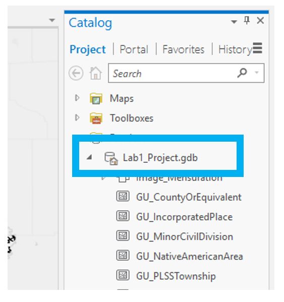 Visual Guide Figure 1.3. Map data in the Catalog pane.
 -
Design symbols using the Symbology Pane
As a suggestoin, it may make sense if you started from the "bottom" layer and worked your way "up." In other words, think about "visually" what is the lowest layer in the list of data. For example, let's assume the area of interest you selected is near a large water body. What color would you assign to that water body? Figure 1.4 shows how to select a layer (here, railroads) and open the Symbology pane. Clicking on the symbol will let you edit its properties. The next layer to work with may be "land." Again, what color do you imagine appropriate for land given you color choice for the water body. How does the land color you selected contrast/compliment with the water color you chose? Upon inspection, you will likely have to change the colors associated with one or more of the layers until you have achieved a visual agreement with all of the layers, their colors, line thickness, and line styles. Continue adding additional layers according to your visual hierarchy.
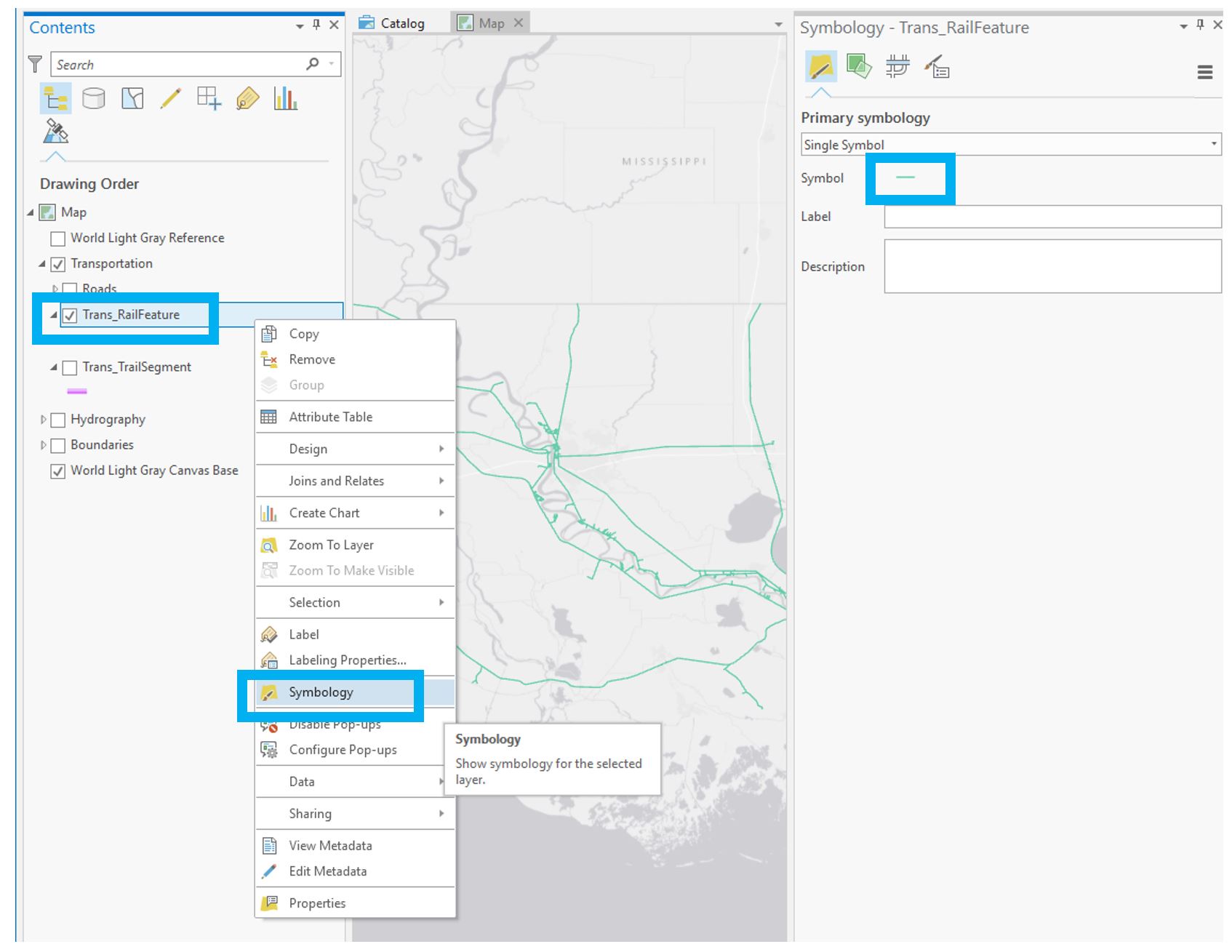 Visual Guide Figure 1.4. Example: Symbolizing Railroads.
Looking in the Gallery of the Symbology pane will give you some ideas, but you should alter these symbols - do not accept the defaults.
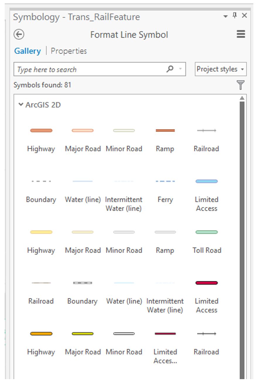 Visual Guide Figure 1.5. The Symbology gallery.
Design changes (e.g., color; thickness, style) are made in the symbol properties tab (Figure 1.6; left tab of the Symbology pane). Note that for Map 1 in this lesson you must work only in greyscale. Think about symbol ordering/importance as you design - more important features should have greater visual emphasis. Most detailed work is done in the symbol layers tab (Figure 1.6; middle tab). Experiment with the many options available (e.g., offsets and dashes). You can also preview your symbol at the bottom of the pane. The Symbol Structure tab (Figure 1.6; right tab) allows you to make multilayer lines. You can also drag to re-order these lines.
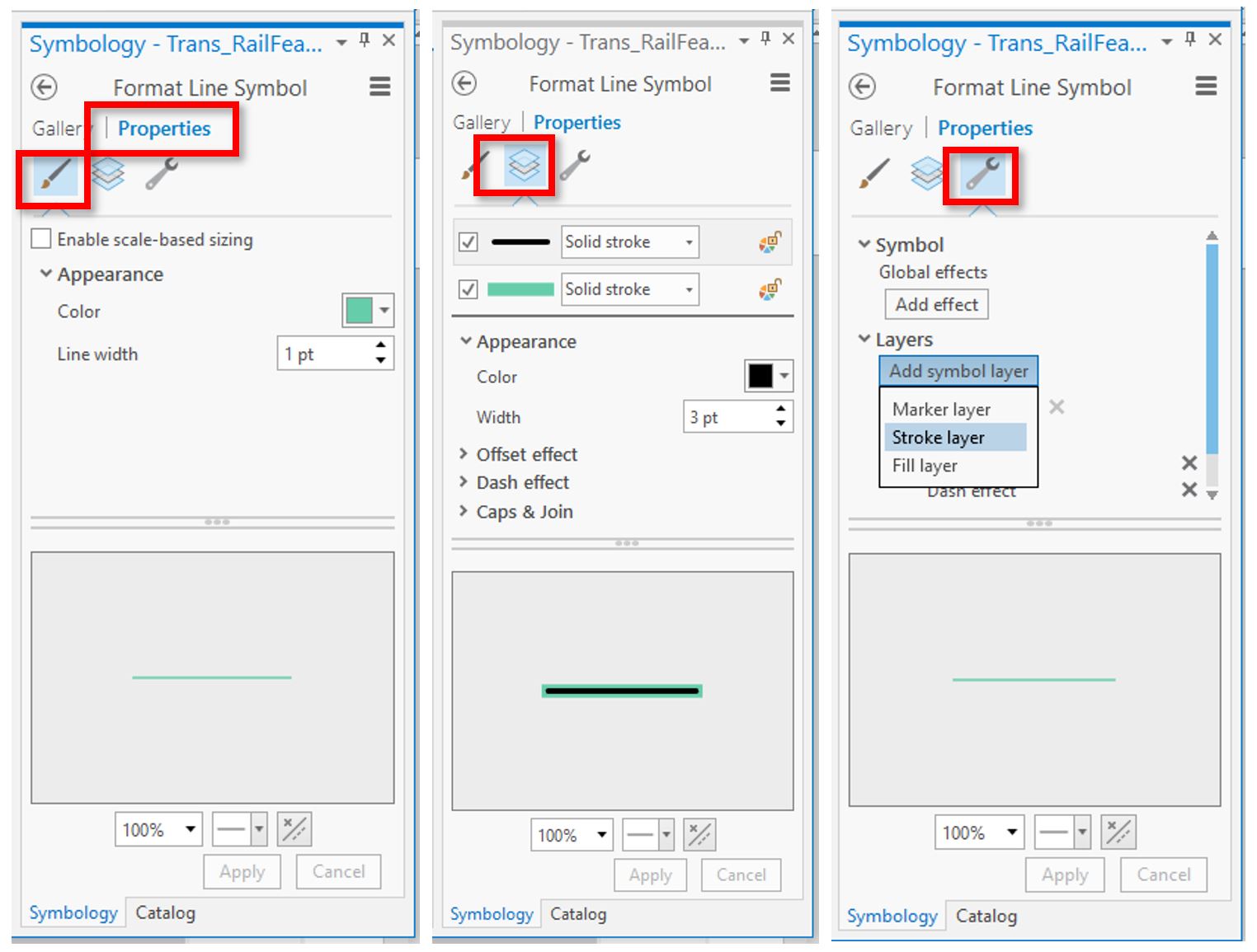 Visual Guide Figure 1.6. The symbol properties, layers, and structures tab.
You may notice a strange “caterpillar” effect when you create multi-layer lines. This is due to the default layering of line segments in ArcGIS Pro, but it's easy to fix.
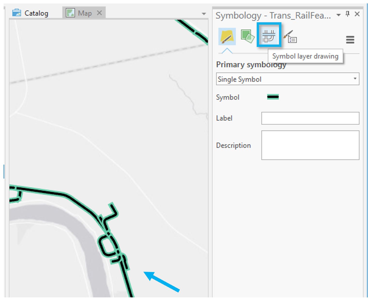 Visual Guide Figure 1.7. Cleaning up "caterpillar" line segments.
You can fix this layering issue by enabling Symbol layer drawing within that layer from the Symbology Pane.
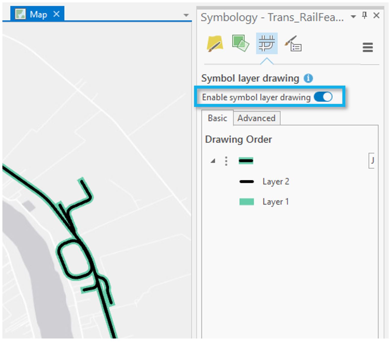 Visual Guide Figure 1.8. Turning on Symbol Layer Drawing.
Some layers, such as roads, have multiple feature types within them - these feature types are specified within that feature's attribute table. For this lab, these have already been classified for you in the Symbology Pane – TNMFRC values are used to specify road types, and FTypes are used for specifying types of waterbodies. Classifying these layers lets us symbolize features based on a crucial attribute, such as road type (e.g., we can make more important road types such as highways more visually prominent).
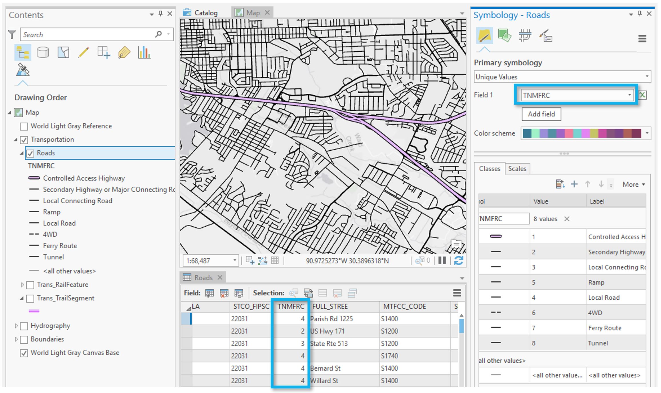 Visual Guide Figure 1.9. Classifying roads by their TNMFRC codes.
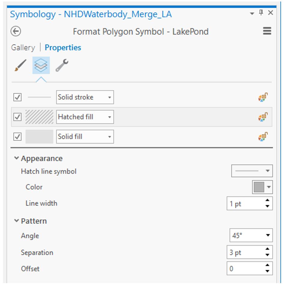
Similar symbol options are available for area features – for these you will be choosing fills and outline colors/patterns. Experiment with different patterns but be careful with their implementation as patterns can look harsh and visually disruptive: remember that your main map must be designed in greyscale. Exploring the Gallery tab may help you develop ideas.
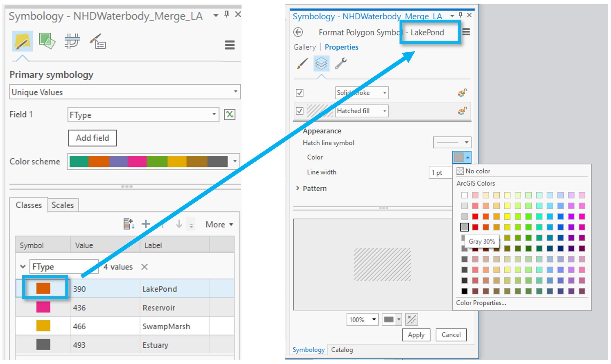 Visual Guide Figure 1.10. Creating area symbol designs. Note that the FType 390 corresponds to Lake or Pond.
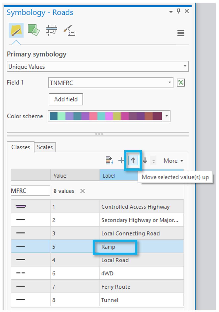
You are free to alter the labels for each feature type, or change their order using the arrows in the Symbology pane. Note that it doesn't really matter what your labels are for this lab, as long as you understand them. We will not be creating a legend in Lab 1, so these labels will only be visible to you.
 Visual Guide Figure 1.11. Changing the drawing order of feature types within a layer.
You can also drag to re-arrange entire layers within the Contents pane. Think carefully about the ordering of the features on your map. Should railroads be drawn above or below lakes and rivers? What about political boundaries? Why? You may want to reference popular general purpose maps such as Google maps to compare your choices, but there is not always a right answer. Think of your audience and map purpose!
 Visual Guide Figure 1.12. Changing the drawing order of layers in the Contents pane.
 -
Make your second (smaller-scale) map
Once you’re happy with your large-scale (1:24,000) map, save it as a map file by right-clicking on the map name in the Contents pane - you should save it in the same folder as this ArcGIS project folder to keep everything organized and connected.
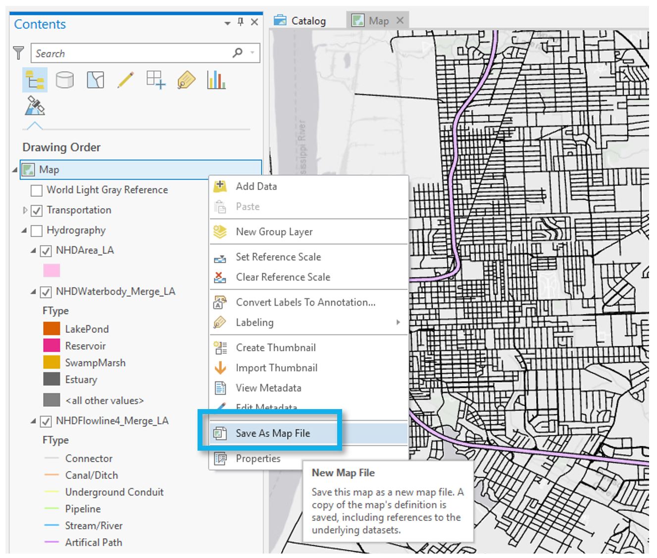 Visual Guide Figure 1.13. Saving your map as a map file.
You can then import that saved map into this map project. Note that a map project can contain several different maps and map layouts. Once you re-import your map, this will create a duplicate map within the project file. You can then use this as a starting map for making your smaller scale map. Your main tasks then will be to add color and adjust your symbols for this smaller scale.
Creating a duplicate map this way is not required. Another option is to start your second map from scratch. I recommend creating and editing a copy of your first map instead, as this map will likely have a similar design to your first map, and creating a copy will prevent you from having to re-do a significant amount of design work (unless your second map has a different scope and purpose than the first map).
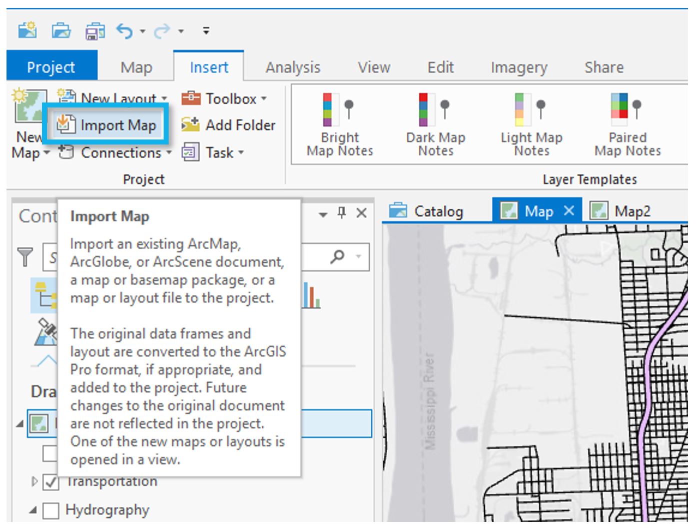 Visual Guide Figure 1.14. Importing a map file.
Staying organized will help you tremendously in the long run. A big part of this is saving your map files with useful file names. Use the Properties dialog box to change your map names to something memorable and descriptive - you don't want to mix them up.
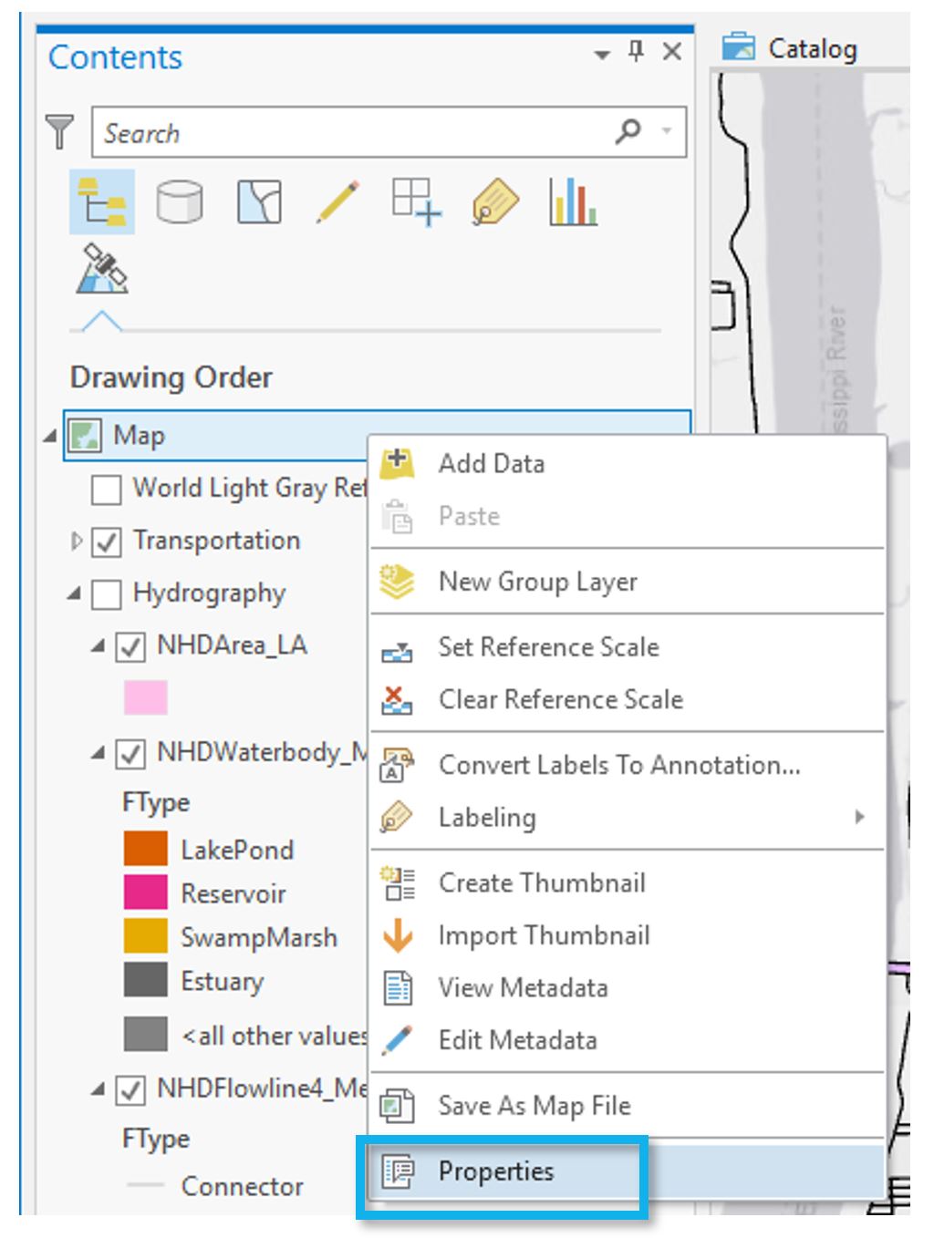 Visual Guide Figure 1.15. Opening the properties dialog box.
Some ideas for descriptive map names are shown below:
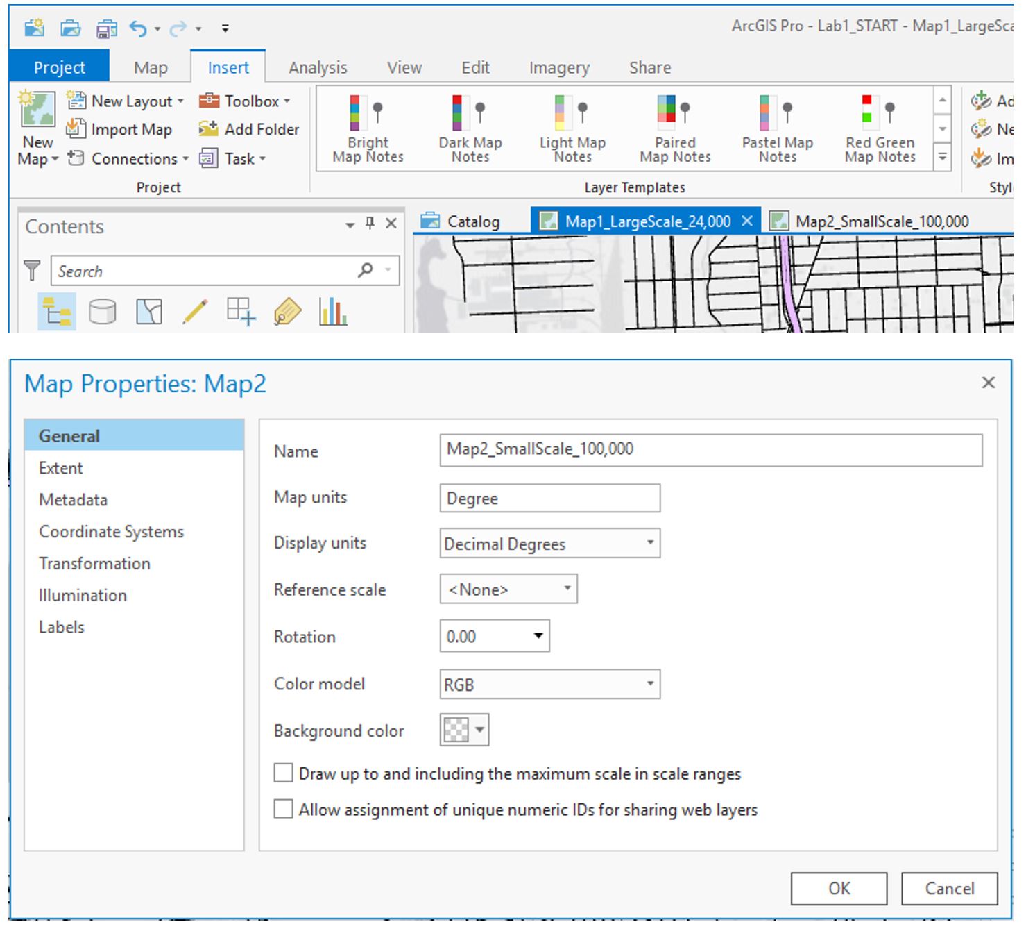 Visual Guide Figure 1.16. The properties dialog box - creating descriptive map names.
 -
Add each map to a layout
Use the Insert tab to create an 8.5" by 11" layout. Either Portrait or Landscape layouts are fine—but either way, use guides to create a ½ inch margin all around. Once you've created a layout, you can import your map as shown below. Use the labeled map rather than the "default" map to insert your map at the appropriate scale.
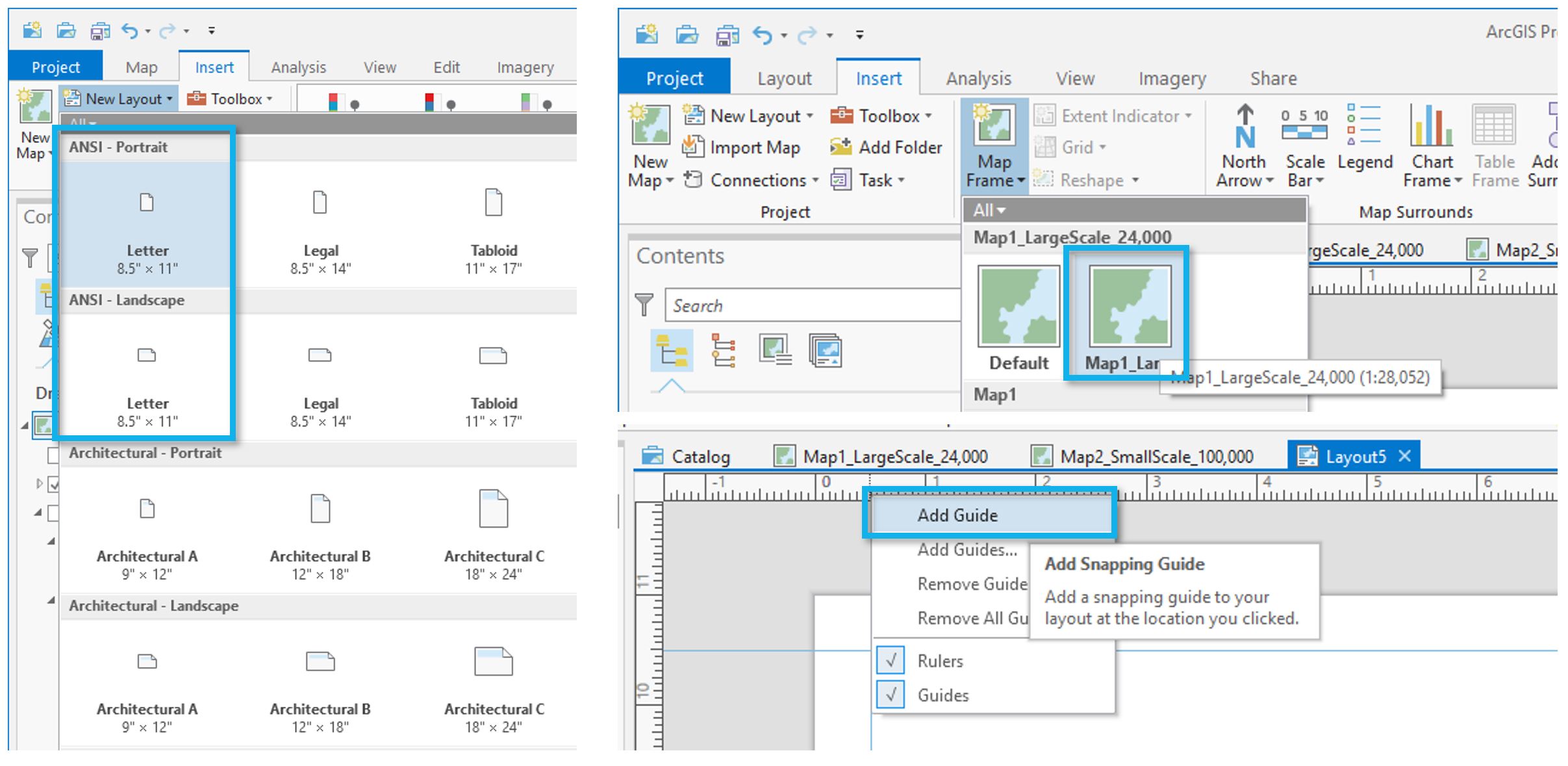 Visual Guide Figure 1.17. Creating a layout and inserting a map.
 -
Finalize and save your layouts
Once you've added your map to a layout, you'll want to make some final adjustments.
- You'll need to activate your map as shown below to pan around the area.
- Make sure you've chosen an area of interest that suits the map requirements. It's ok to adjust your map's location at the end - when you designed your map symbols, they were automatically applied to the entire dataset.
- Whether or not your map is activated, you can adjust its scale at the bottom of the page.
- Make sure that you toggle off both the World Light Gray Reference and World Light Gray Canvas Base layers before you submit your final maps. Except for your name, there shouldn't be any labels or text on the map.
- Note that the map in Visual Guide Figure 1.18 is not well-designed at all - it's intended only as an example of how to insert and activate a map in a layout.
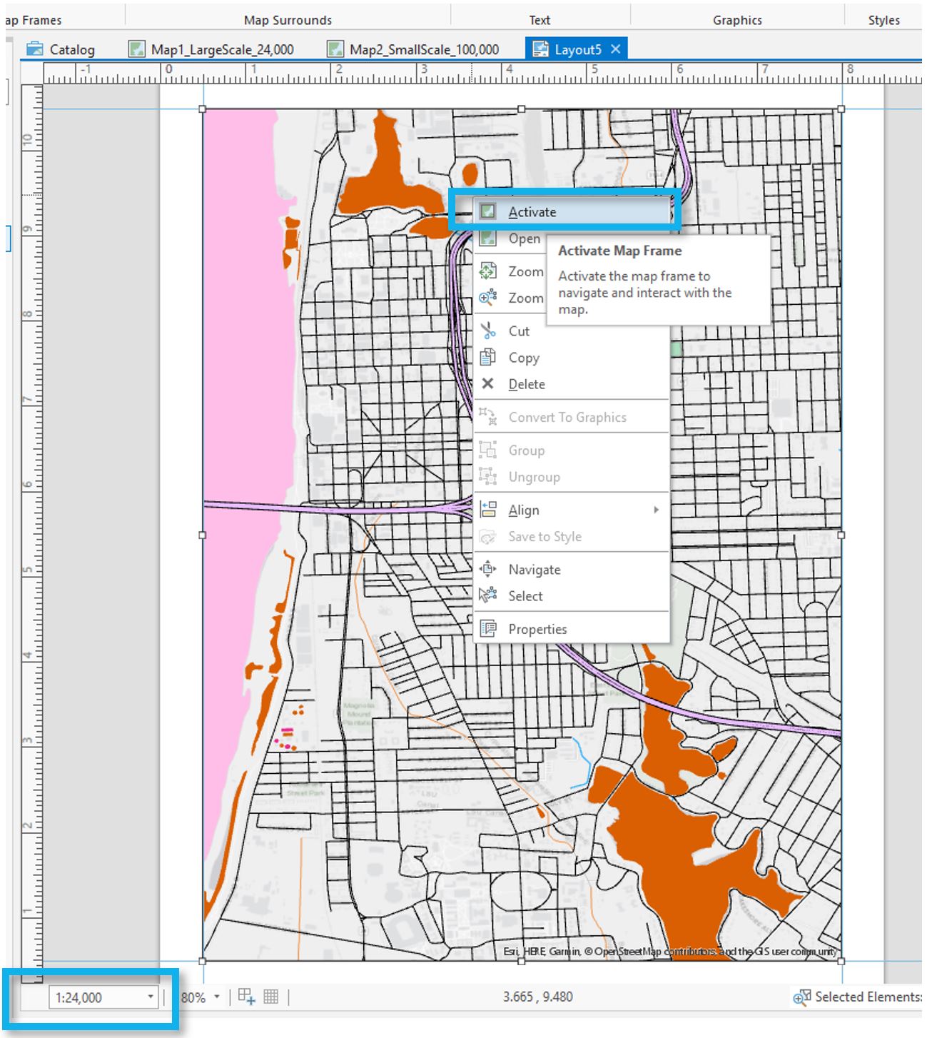
Visual Guide Figure 1.18. Activating a map and changing the scale.
The final step is to export your maps as PDFs. Remember you will have two layouts, one for each map. Use the Share tab to export your layouts.
Considerations when exporting. For most maps, a 300dpi is fine. However, if you use
- gradient area fills
- complex area patterns
- coastline effects
then, change the resolution to 150dpi. Otherwise, the file sizes will become extremely large and Canvas can't display these large file sizes. Once your PDF is exported, check the file size. You should keep your exported PDF's file size to less than 10MB. When I go to look at your maps, Canvas has a difficult time displaying fIles larger than 10MB.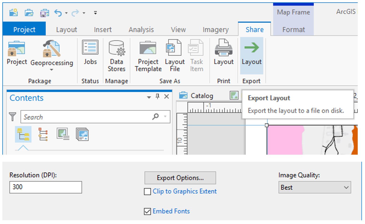 Visual Guide Figure 1.19. Exporting a map layout.
 -
Additional tips and tricks
Use “Show count” to view how many of each feature type are included in the map data.
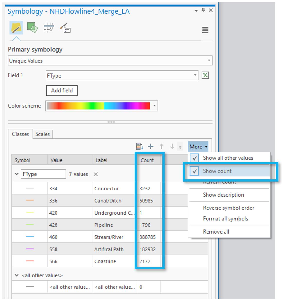 Visual Guide Figure 1.20. Toggling on the "Show count" option in the Symbology pane.
Remember to experiment with multiple layers, verify your map design meets all requirements, and design your 1:24,000 map in only greyscale and your 1:100,000 using color. Designing a map in greyscale may require you to be a bit creative with multilayer symbols and patterns - but that's a good thing! As shown in the example below, you can use different shades of grey and patterns or other fill ideas to create interesting map symbols.
 Visual Guide Figure 1.21. Creating multilayer area/polygon symbols.
That's it! If you have any questions, please post them to the Lab 1 discussion board. You are also encouraged to browse the discussion board if you do not have a question - you may be able to help out a classmate, and you may learn something from a question that someone else has asked.
Credit for all screenshots is to Cary Anderson, Penn State University; Data Source: The National Map.