In Chapter 2, we compared the characteristics of geographic and plane coordinate systems that are used to measure and specify positions on the Earth's surface. Coordinate systems, remember, are formed by juxtaposing two or more spatial measurement scales. I mentioned, but did not explain, that attribute data also are specified with reference to measurement scales. In this chapter, we'll take a closer look at how attributes are measured and represented.
Maps are both the raw material and the product of GIS. All maps, but especially so-called reference maps made to support a variety of uses, can be defined as sets of symbols that represent the locations and attributes of entities measured at certain times. Many maps, however, are subsets of available geographic data that have been selected and organized in response to a particular question. Maps created specifically to highlight the distribution of a particular phenomenon or theme are called thematic maps. Thematic maps are among the most common forms of geographic information produced by GIS.
A flat sheet of paper is an imperfect, but useful, analog for geographic space. Notwithstanding the intricacies of map projections, it is a fairly straightforward matter to plot points that stand for locations on the globe. Representing the attributes of locations on maps is sometimes not so straightforward, however. Abstract graphic symbols must be devised that depict, with minimal ambiguity, the quantities and qualities that give locations their meaning. Over the past 100 years or so, cartographers have adopted and tested conventions concerning symbol color, size, and shape for thematic maps. The effective use of graphic symbols is an important component in the transformation of geographic data into useful information.
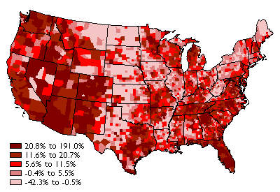
Consider the map above (Figure 3.1.1), which shows how the distribution of U.S. population changed, by county, from 1990 to 2000. To gain a sense of how effective this thematic map is in transforming data into information, we need only to compare it to a list of population change rates for the more than 3,000 counties of the U.S. The thematic map reveals spatial patterns that the data themselves conceal.
This chapter explores the characteristics of attribute data used for thematic mapping, especially attribute data produced by U.S. Census Bureau. It also considers how the characteristics of attribute data influence choices about how to present the data on thematic maps.
Objectives
Students who successfully complete Chapter 3 should be able to:
- use metadata and the World Wide Web to assess the content and availability of attribute data produced by the U.S. Census Bureau;
- discriminate between different levels of measurement of attribute data;
- explain the differences between counts, rates, and densities, and identify the types of map symbols that are most appropriate for representing each; and
- use quantile and equal interval classification schemes to divide census attribute data into categories suitable for choroplethic mapping.
"Try This!" Activities
Take a minute to complete any of the Try This activities that you encounter throughout the chapter. These are fun, thought provoking exercises to help you better understand the ideas presented in the chapter.