The objective of this section is to ensure that you understand how mapping programs like ArcMap classify data for choropleth maps. First, we will step through the classification of the Pennsylvania county population change data. Then you will be asked to classify another data set yourself.
Step 1: Sort the data.
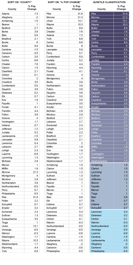
Attribute data retrieved from sources like the Census Bureau's website are likely to be sorted alphabetically by geographic area. To classify the data set, you need to resort the data from the highest attribute data value to the lowest.
Step 2: Define the number of classes.
There are no absolute rules on this. Since our ability to differentiate colors is limited, the more classes you make, the harder they may be to tell apart. In general, four to eight classes are used for choropleth mapping. Use an odd number of classes if you wish to visualize departures from a central class that contains a median (or zero) value.
Step 3: Determine class breaks by dividing the number of observations by the number of classes.
For example, 67 counties divided by 5 classes yields 13.4 counties per class. Obviously, in cases like this, the number of counties in each class has to vary a little. Make sure that counties having the same value are assigned to the same class, even if that class ends up with more members than other classes.
Step 4: Assign color symbols to differentiate the categories.
Figure 3.20.1, below, shows three iterations of a data table. The first (on the left) is sorted alphabetically by county name. The middle table is sorted by percent population change, in descending order. The third table breaks the re-sorted counties into five quintile categories. Normally, you would classify the data and symbolize the map using GIS software, of course. The illustration includes the colors that were used to symbolize the corresponding choropleth map on the preceding page. If you'd like to try sorting the data table illustrated below, follow this link to open the spreadsheet file.